How to Create a Matrix Report in Salesforce 

As organizations navigate the intricacies of decision-making in a data-driven landscape, mastering matrix reports in Salesforce cannot be overstated.

These reports, organized in a matrix or grid format, provide a unique perspective that can be instrumental in unraveling patterns, trends, and relationships within your Salesforce data. By presenting data in a grid structure with both rows and columns, these reports allow for multi-dimensional analysis, unveiling insights that may remain hidden in other reporting formats.

So, in this comprehensive guide, we’ll learn how to create matrix reports in Salesforce. From accessing the Report Builder to customizing and saving your reports, we’ll discuss best practices to ensure your Matrix Reports foster clarity and actionable insights.

Let’s transform your Salesforce data into a visual story that fuels confident decision-making!

What is a Matrix Report Salesforce? 

A matrix report in Salesforce is a dynamic reporting format that presents data in a grid, allowing users to analyze and compare information across two different dimensions. 

Unlike traditional reports that display data in a tabular format, Matrix Reports leverage rows and columns to organize and summarize data, providing a more comprehensive perspective. This format is handy when dealing with data with multiple categorical variables or viewing summarized data in a cross-tabulated format.

To better understand its use, here are some benefits and applications of using matrix reports:

  1. Multi-Dimensional Analysis

Matrix reports excel in scenarios where data analysis involves multiple dimensions. Whether examining sales performance across product categories or evaluating marketing campaign success by region, the matrix structure allows for a nuanced analysis.

  1. Comparative Insights

Matrix Reports facilitate easy comparison of values by organizing data in rows and columns. This is particularly useful when comparing performance metrics across different segments or periods.

  1. Summarized Data View

Aggregating values within the matrix cells provide a summarized data view. This is advantageous for users who seek a deeper understanding of trends and patterns without delving into smaller details.

  1. Efficient Decision-Making

The visual and summarized nature of Matrix Reports enhances decision-making efficiency. Business users can quickly interpret data trends, enabling faster and more informed decision-making processes.

Step-by-Step Guide: Creating a Matrix Report Salesforce

Now that you understand Salesforce matrix reports and their uses we’ll dive into the 5 steps on how to create a matrix report in Salesforce.

If video is your preference, here’s a quick video walkthrough of the process.

There are a few Salesforce report limitations you should be aware of:

  • Salesforce report limits data to 2,000 rows in view
  • No custom reporting is available in some editions
  • There may be constraints caused by limited admin access
  • There are fewer customization options available within Salesforce
  • Salesforce report builders and views commonly experience slow performance and glitches, especially with large datasets

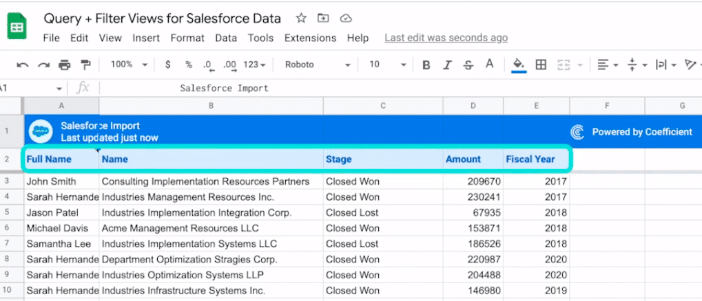
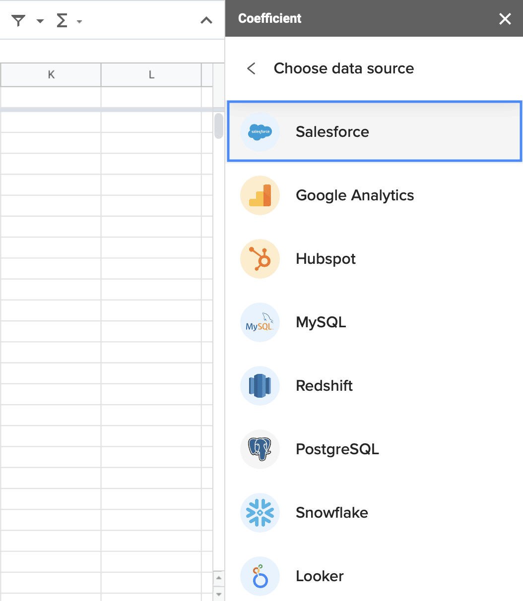
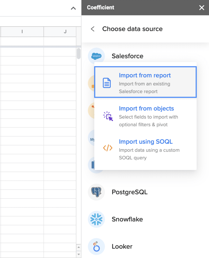
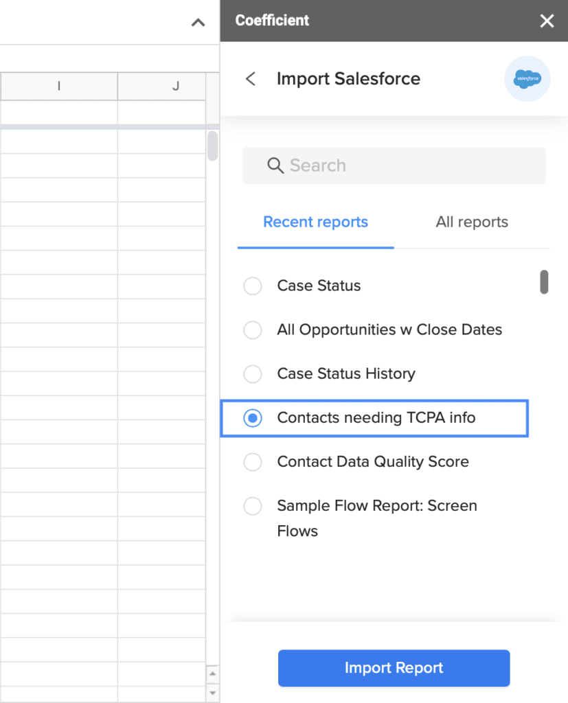
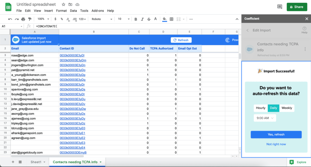
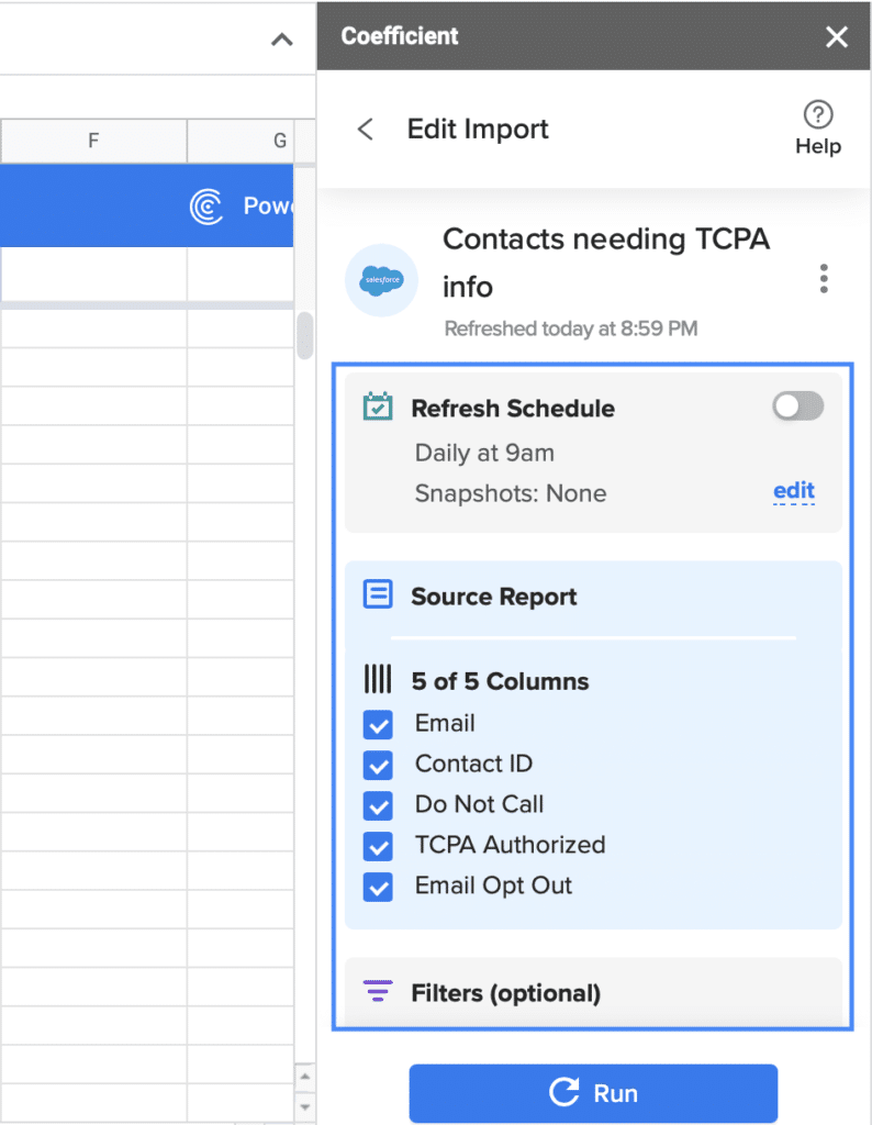
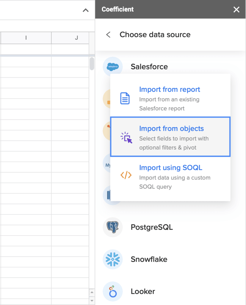
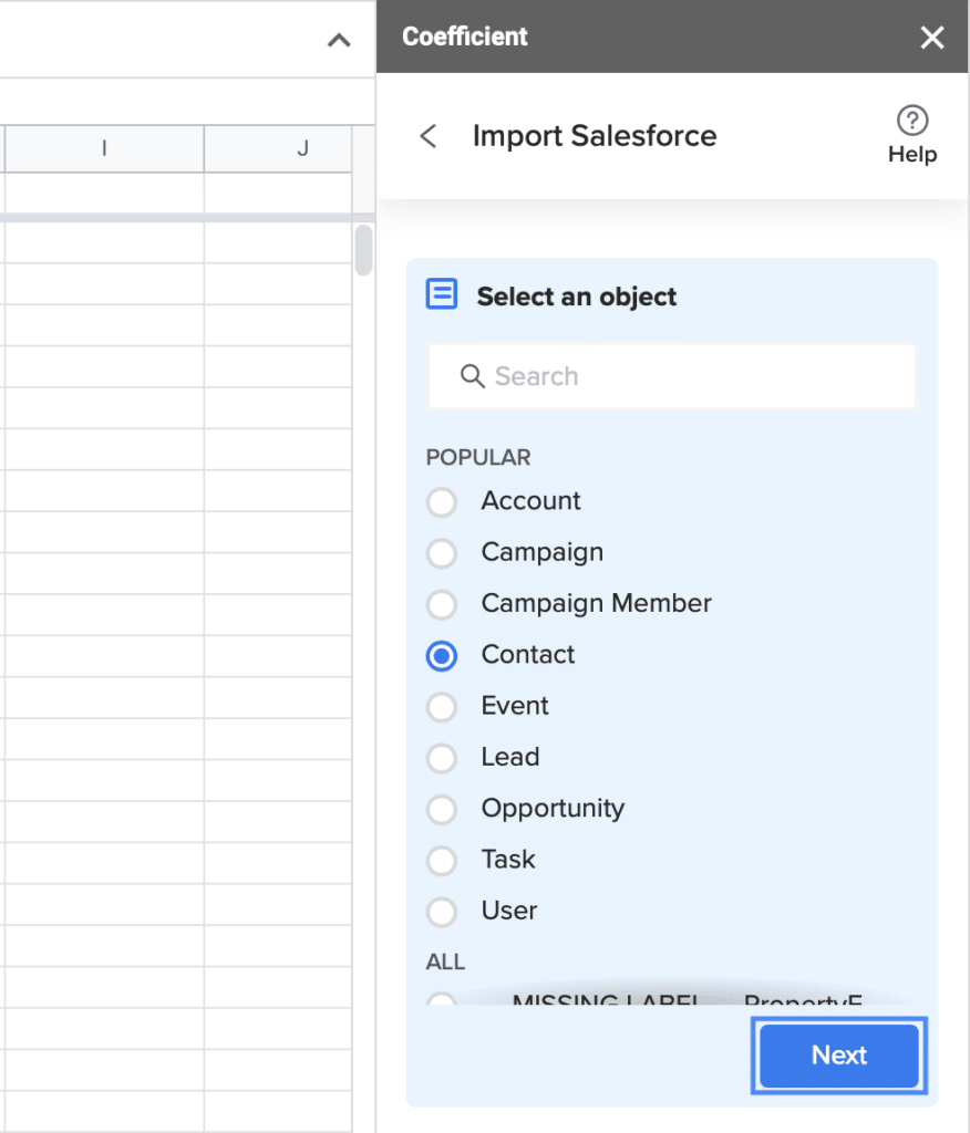
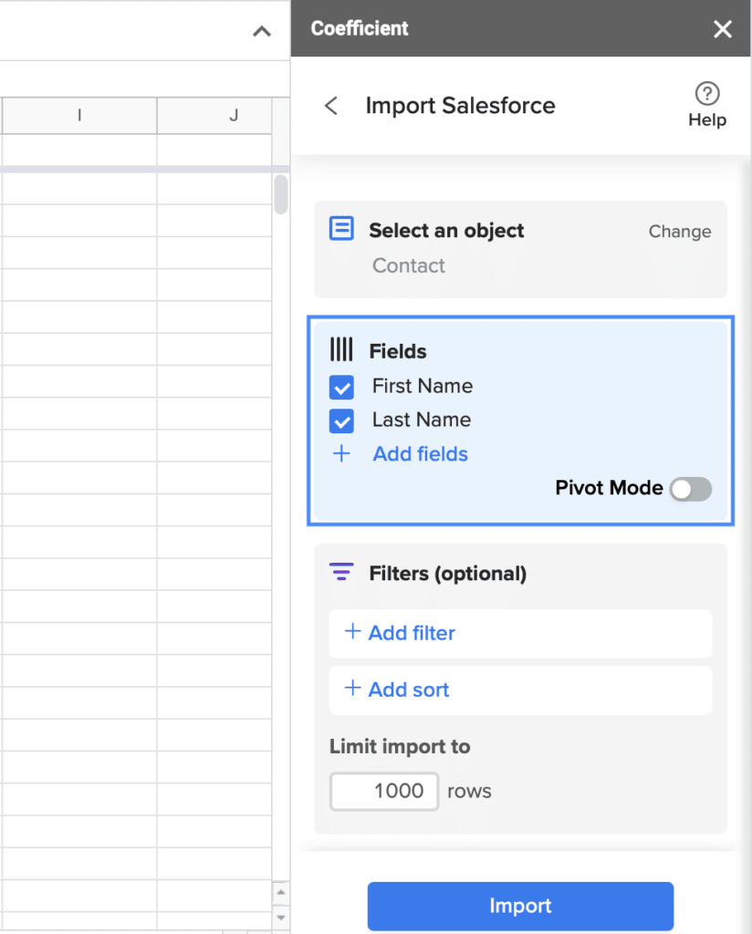
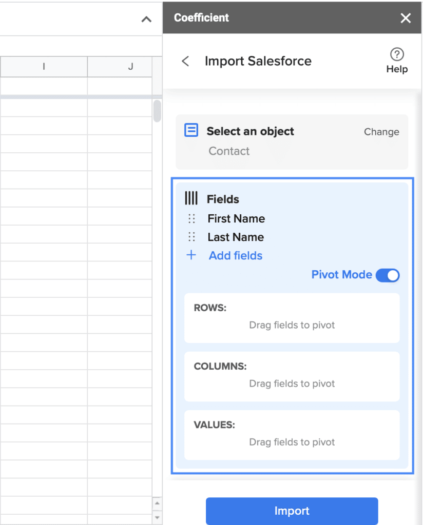
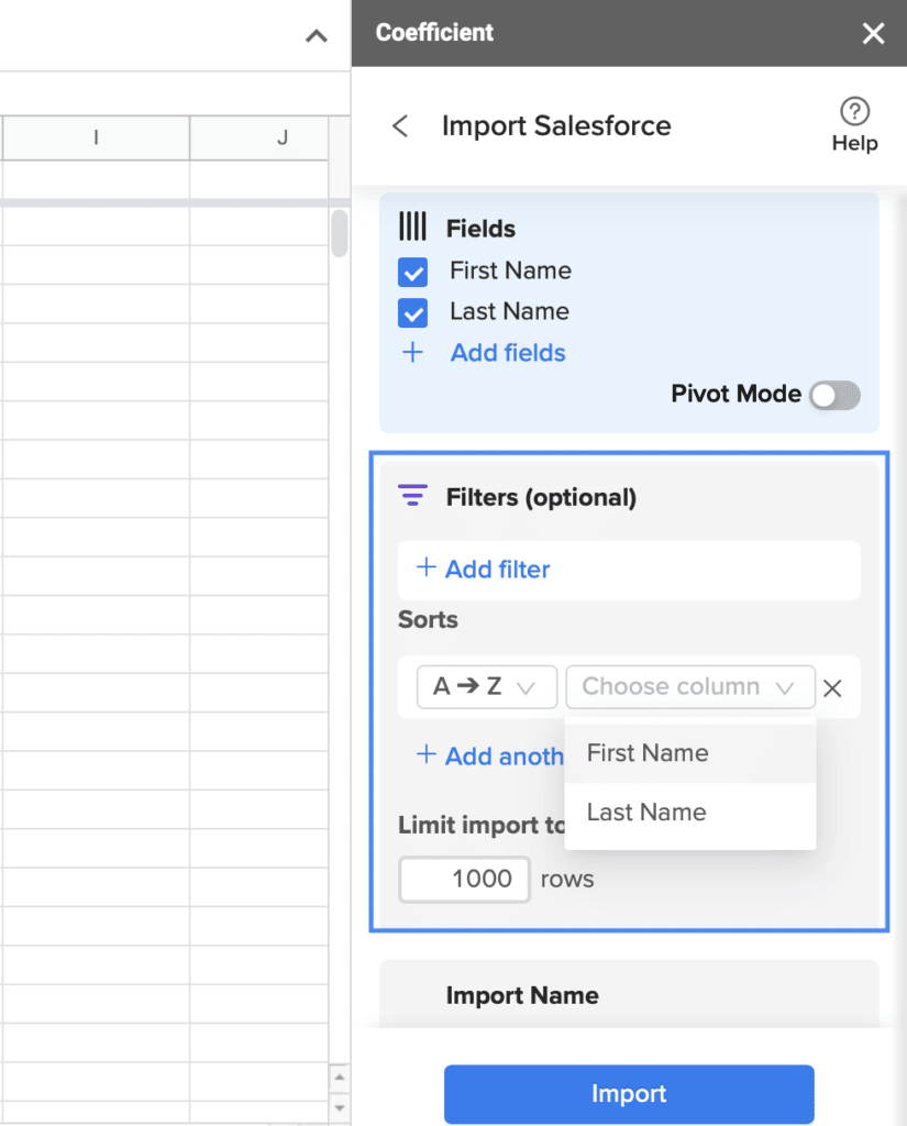
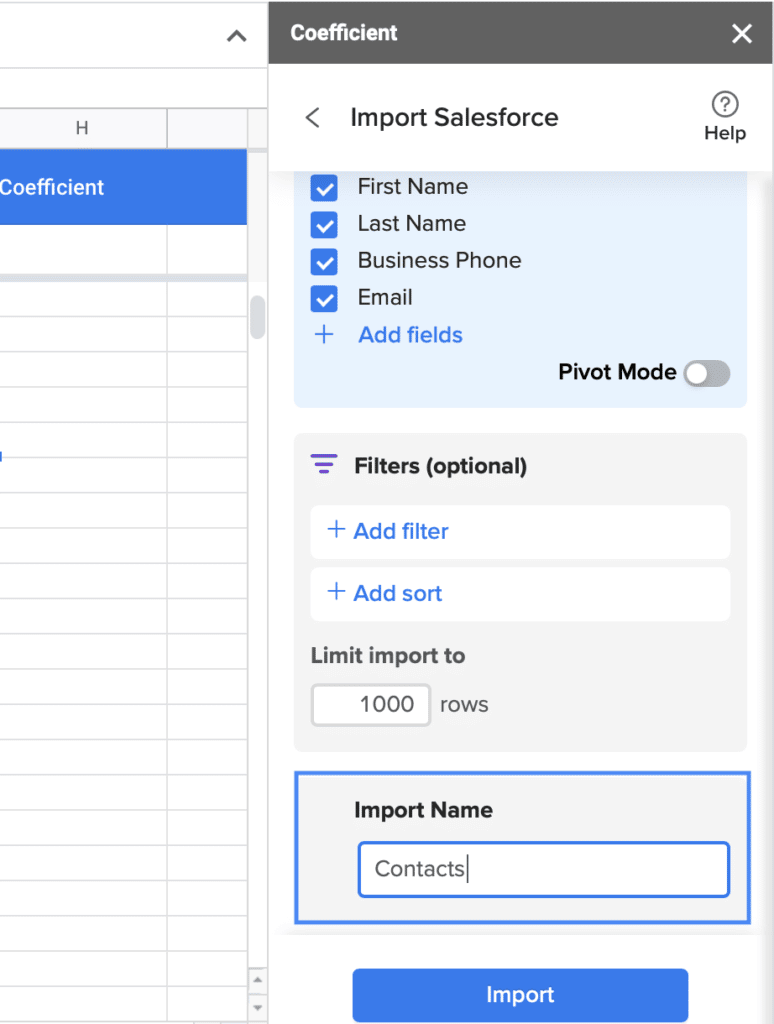
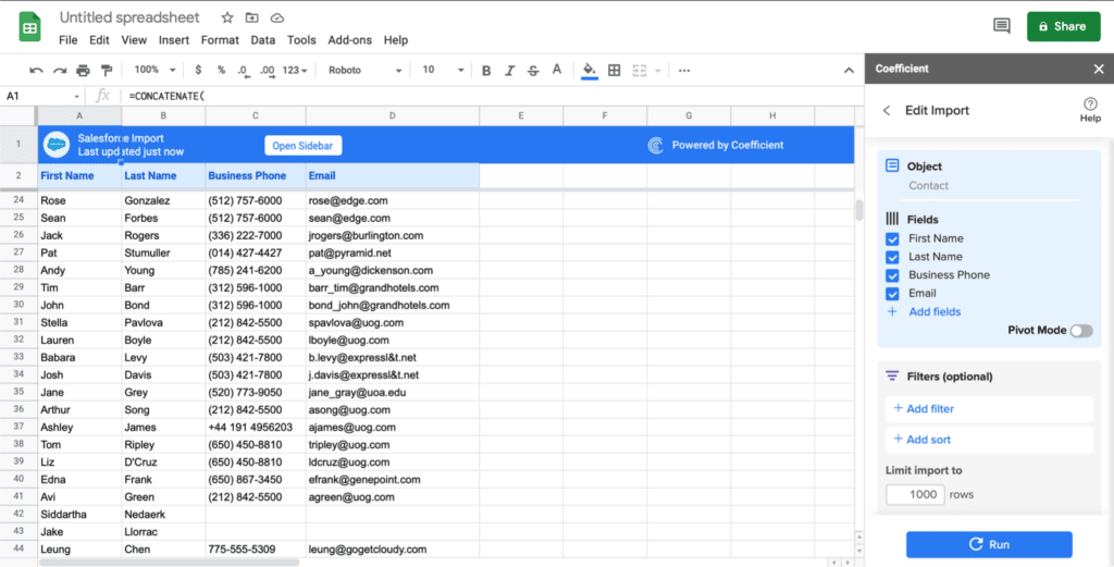
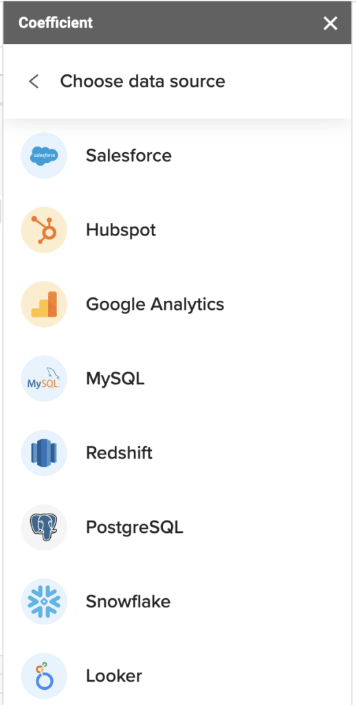
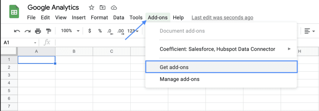
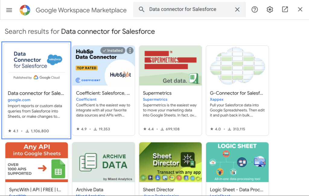
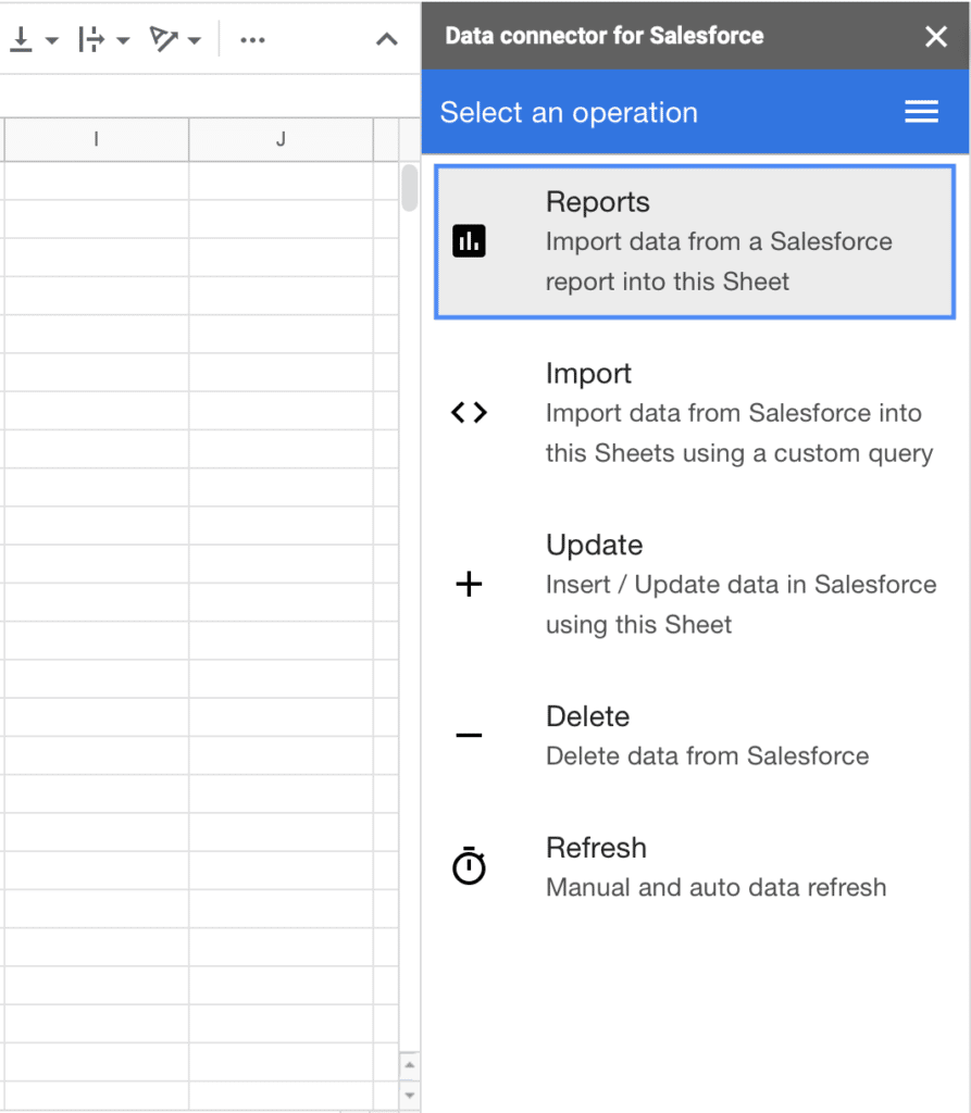
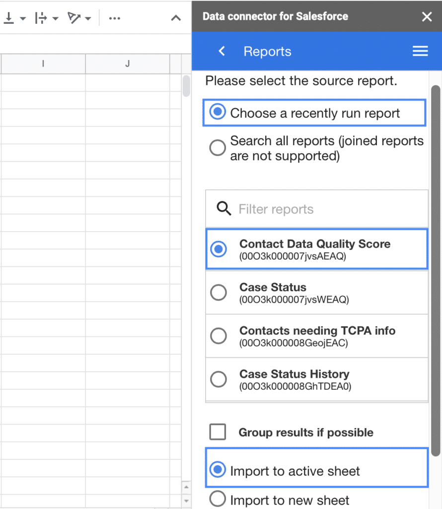
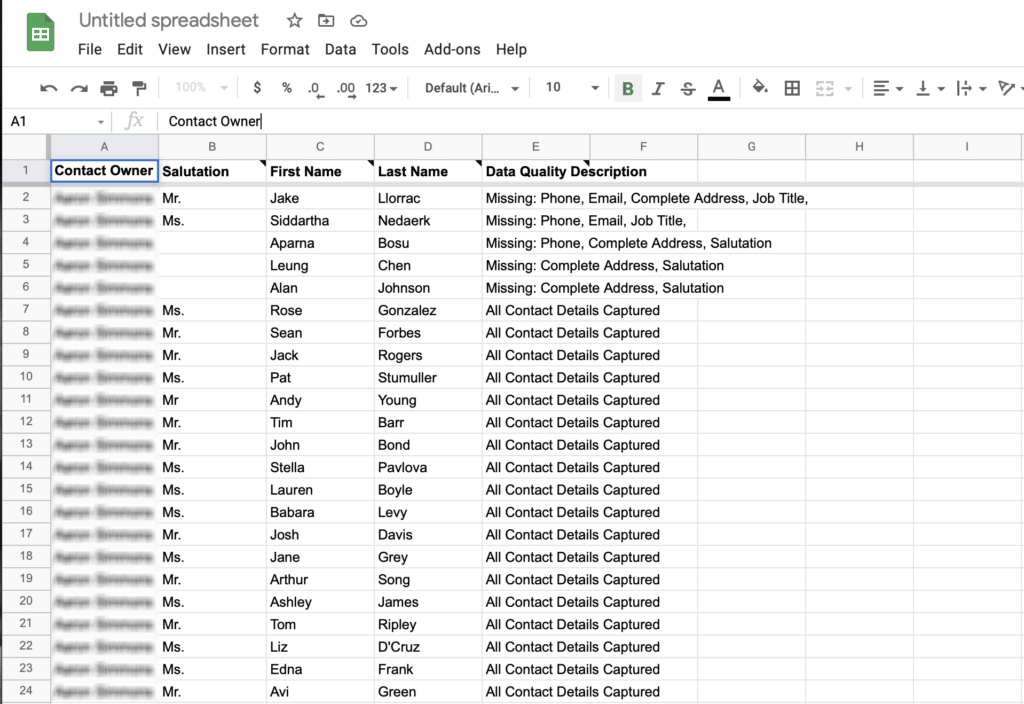
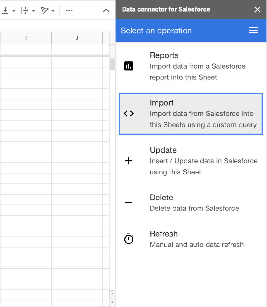
As a solution, many export their data into spreadsheets to get around these limitations. You may have even done so yourself in the past. However, manual data pulls are also exhausting and drain time. Tools like Coefficient offer pre-built spreadsheet connectors for Salesforce and over 35 other commonly used business systems.

With Coefficient:

  • You’ll never leave your spreadsheet to take advantage of your bi-directional Salesforce data sync
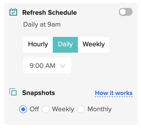
  • You can schedule data refreshes on the cadence you need or update data in real-time with the click of a button
  • You can take advantage of around-the-clock support
  • You can preview your data before making your data import or export
  • You’ll have the flexibility to build whatever you need in your spreadsheet
  • You can blend data from over 35 other pre-built connectors for core business systems

Now, let’s dive in through the written process of building your matrix report in Salesforce.

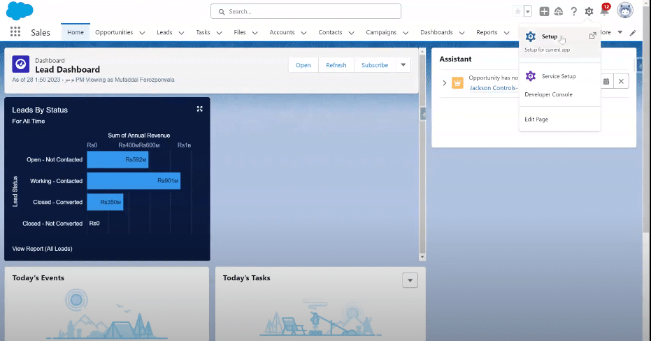
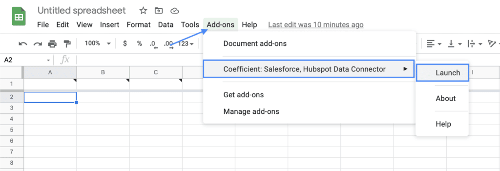
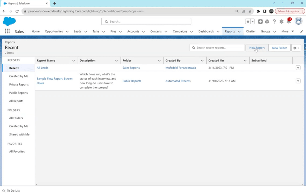
Step 1: Accessing Report Builder in Salesforce 

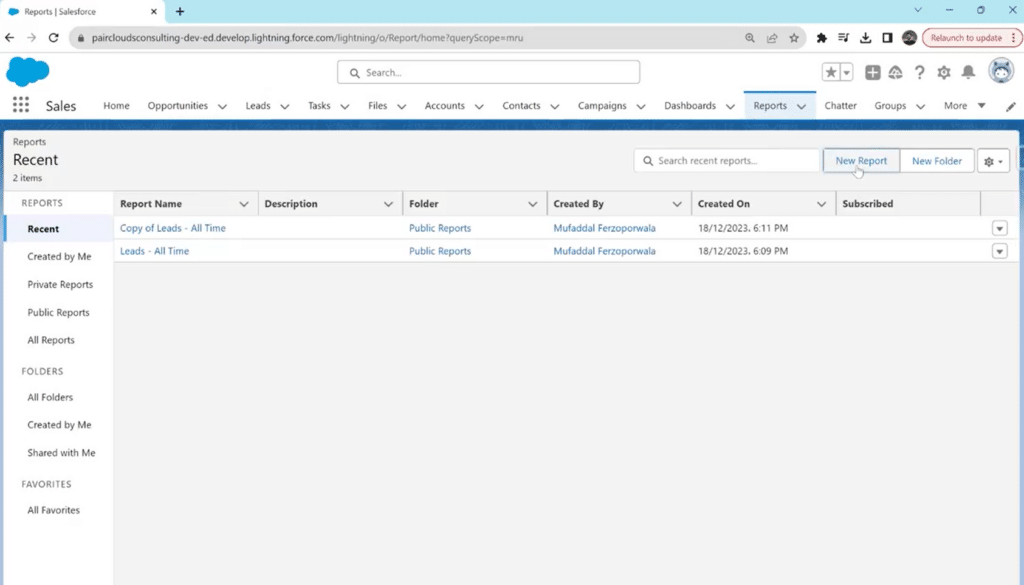
Access your Salesforce account with valid credentials. In the top navigation bar, locate the “Reports” tab and click to access the Reports section.

Click the “New Report” button to initiate the report creation process.

Users, depending on their permissions, might encounter challenges with data accessibility, especially if they need to blend Salesforce data with data from other sources. Coefficient can streamline the process by enabling seamless integration of Salesforce data with data from other business systems, all within Excel or Google Sheets.

Clicking the 'New Report' button in Salesforce for report creation

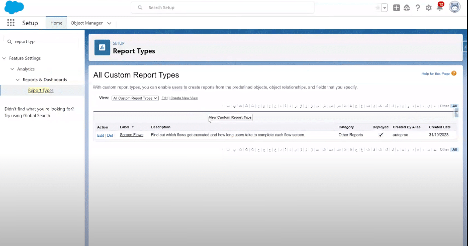
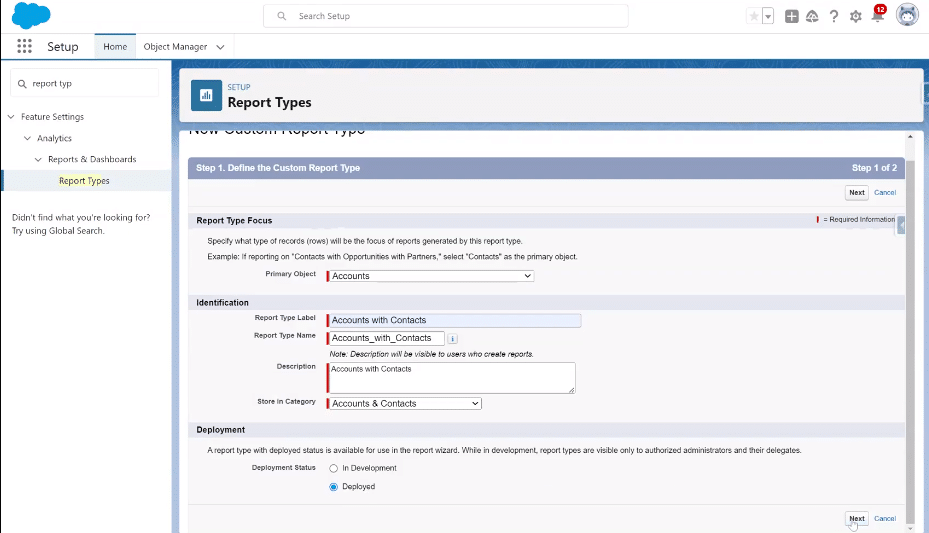
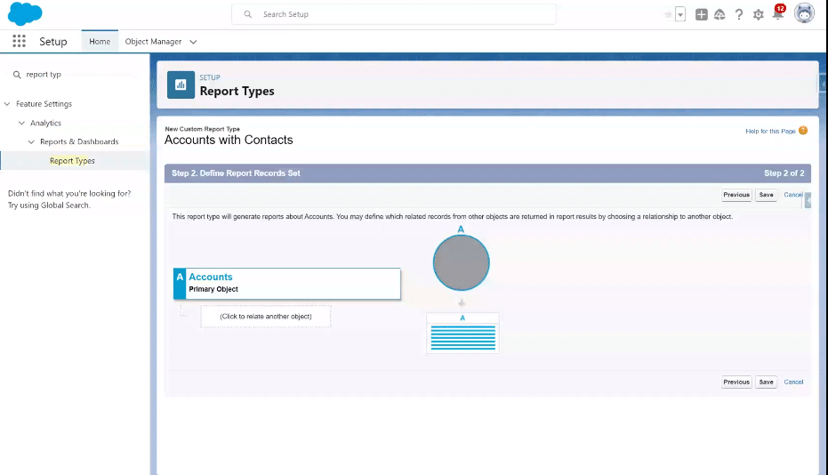
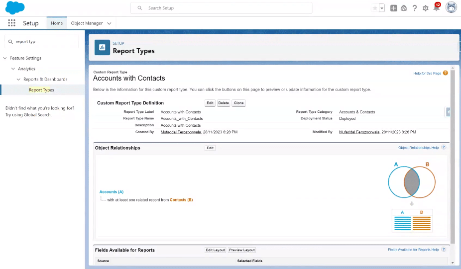
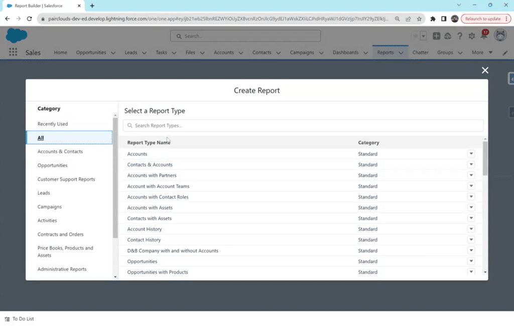
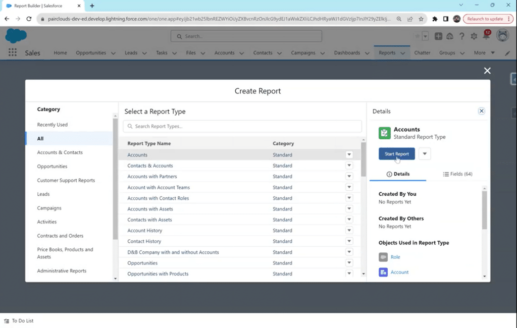
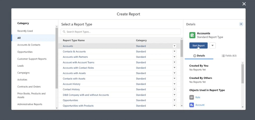
Step 2: Selecting the Report Type

Select the appropriate report type in the new pop-up window based on the data you want to analyze. These types are based on objects that have multiple grouping dimensions.

In the example below, the selected report type is “Accounts.”

You can choose any other type from the standard or custom options and proceed by clicking on “Start Report.”

Navigating to the Report Builder in Salesforce

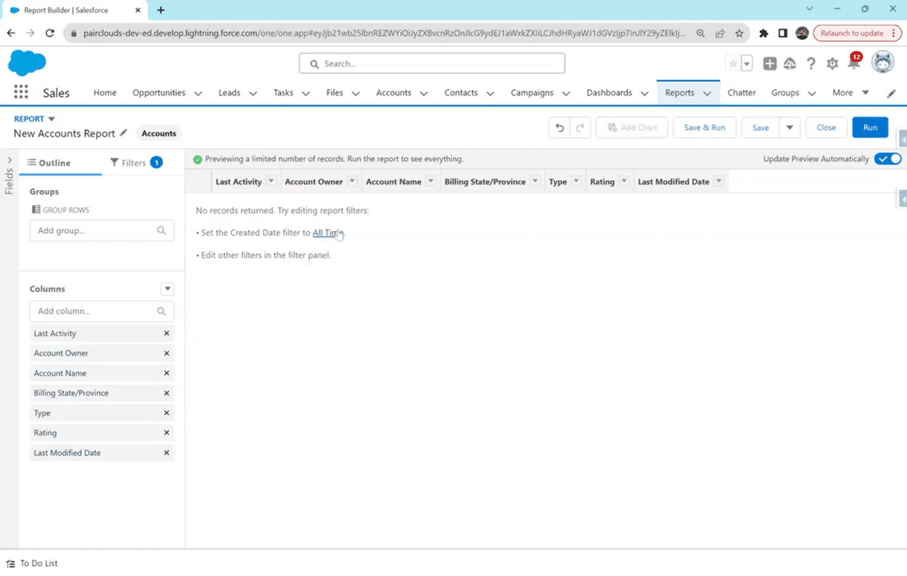
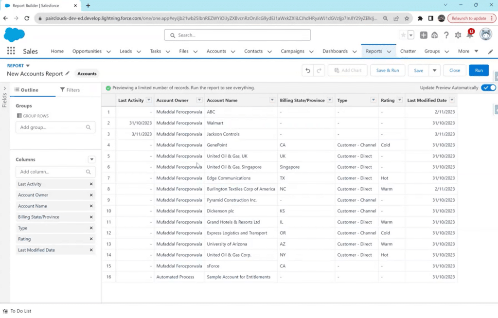
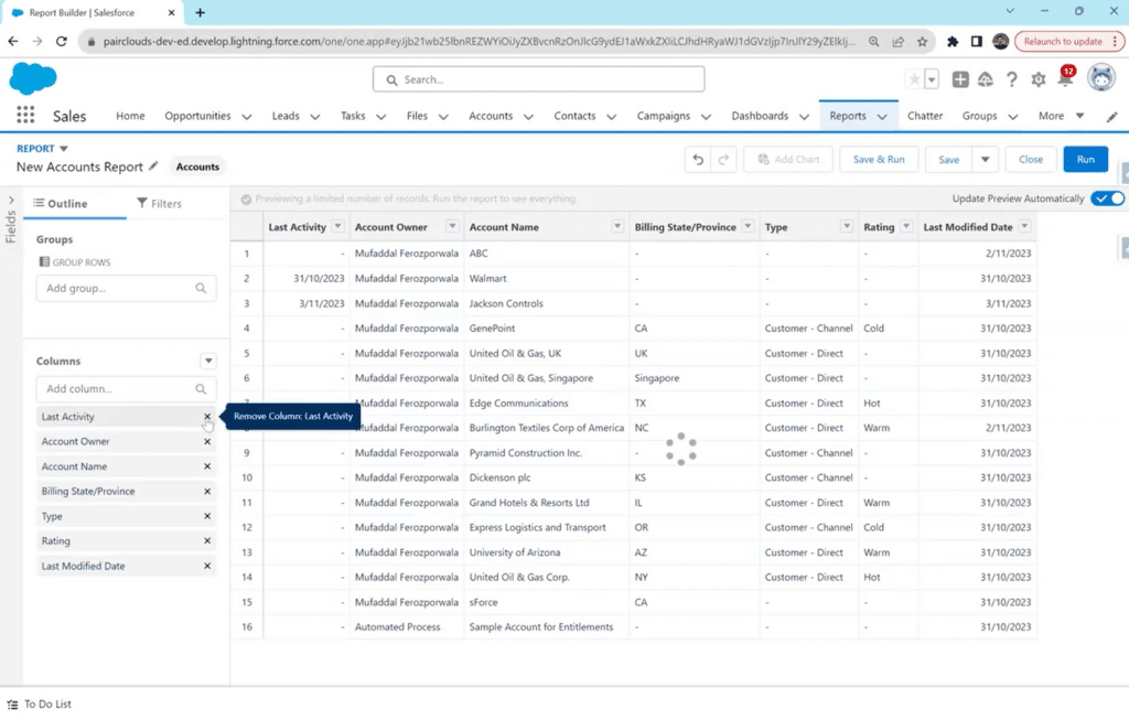
Step 3: Review Columns and Group Data 

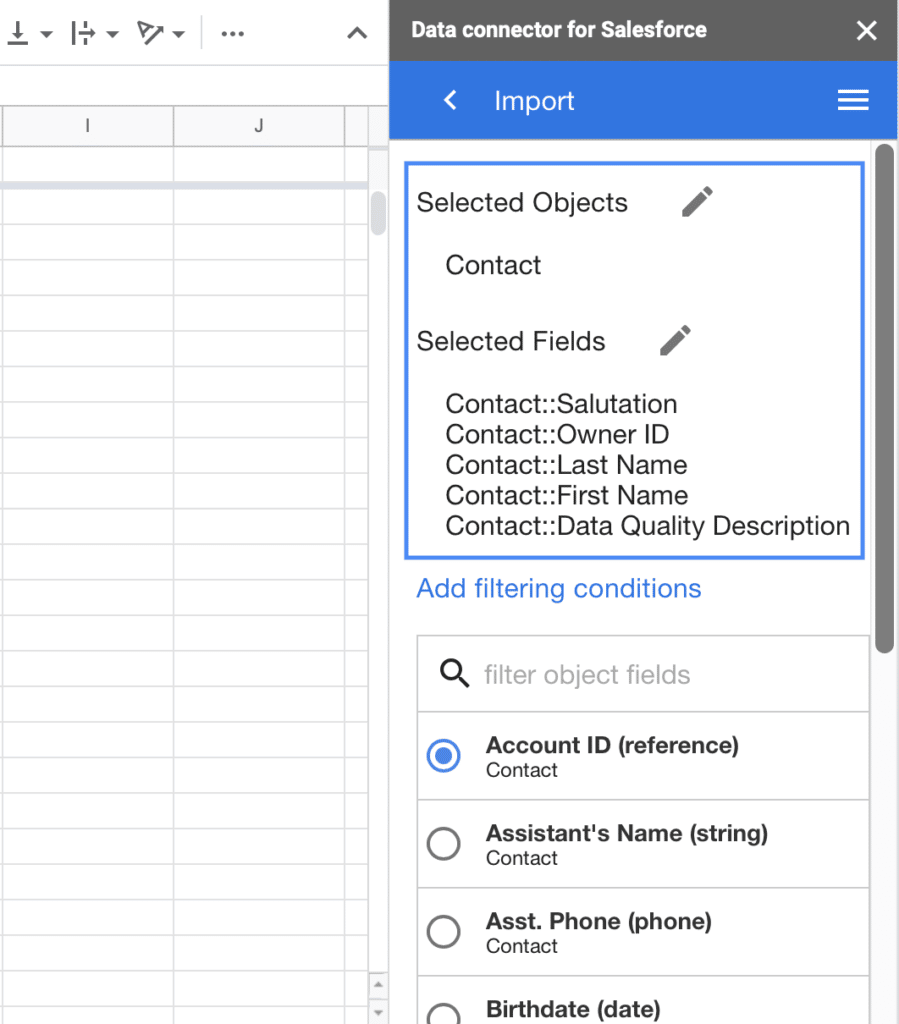
From the left sidebar, review all the columns that are part of your report. You can remove any fields you don’t want to see in the matrix report or add any missing ones from the search bar.

Choosing a report type from standard or custom options in Salesforce.

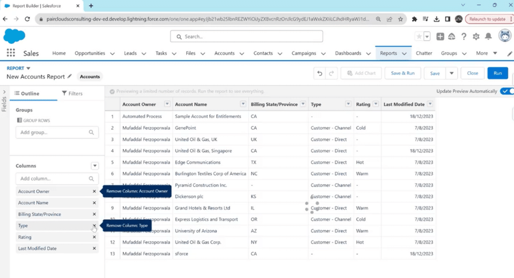
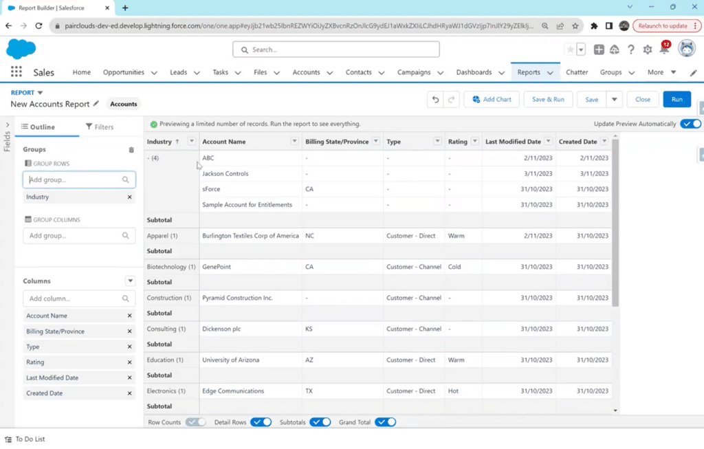
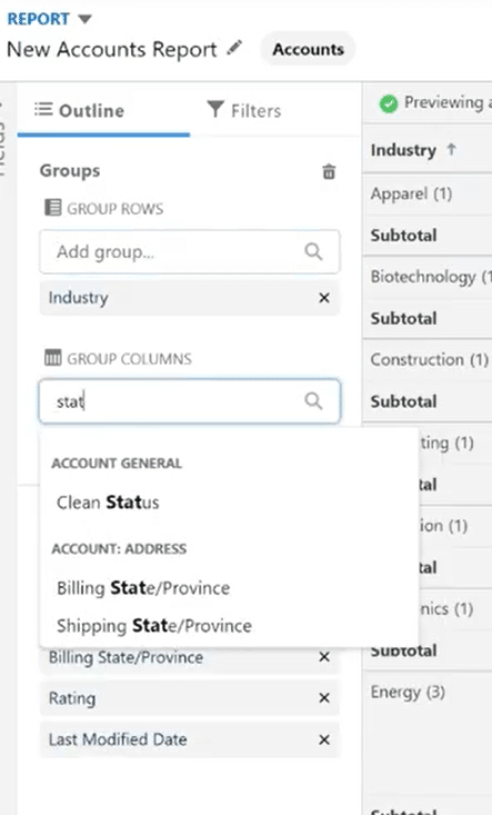
The most crucial part of this step is to Group your rows and columns based on a specific category. It is through grouping both that you can create a matrix report.

Click on the “Group Rows” search bar in the left sidebar and type your category e.g., Account owner, Account name, Created By, Modified By, etc. 

Reviewing and modifying columns in the Salesforce matrix report builde

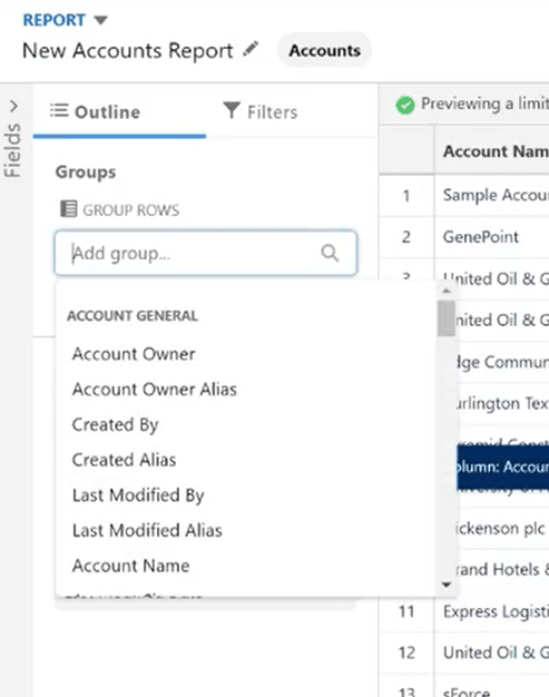
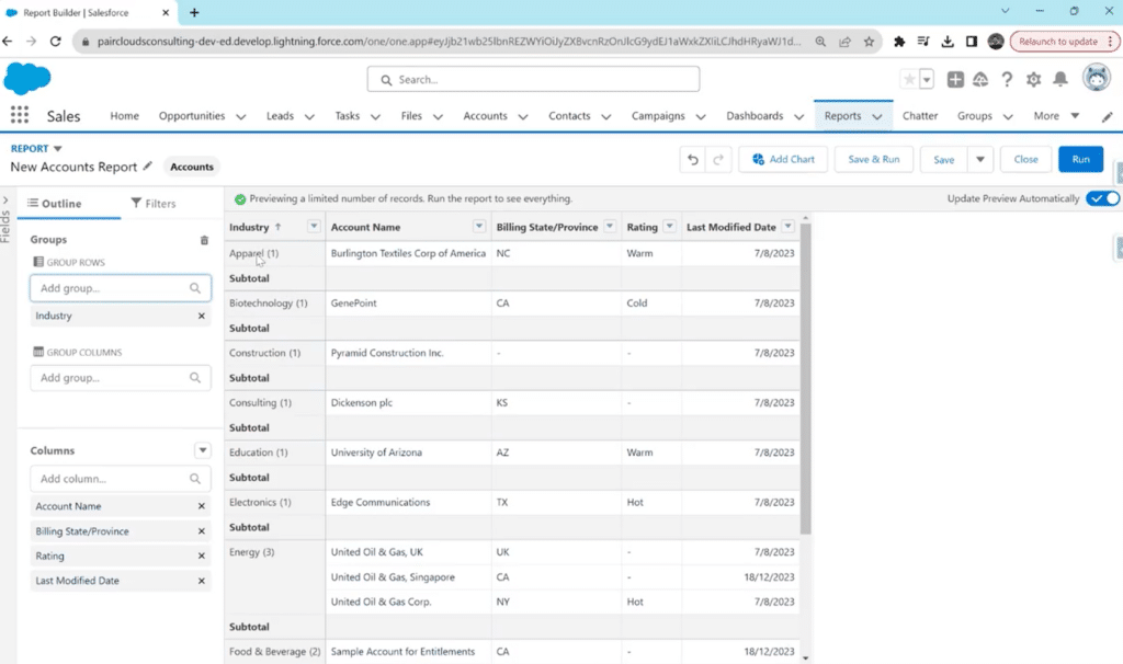
Your report will be grouped by the category selected. Below is an example of rows being grouped by Industries.

Using 'Group Rows' feature to categorize data in Salesforce matrix report.

Repeat the same for the “Group Columns” section. 

Setting up column groups in Salesforce matrix report for multi-dimensional analysis.

When reviewing columns and grouping data, users may face challenges in incorporating additional data fields or making adjustments to the grouping criteria.

Coefficient can simplify this process by offering intuitive data manipulation features that can be used on your live Salesforce data within Excel or Google Sheets, allowing users to easily modify columns, add new fields, or adjust grouping parameters without leaving their familiar spreadsheet environment.

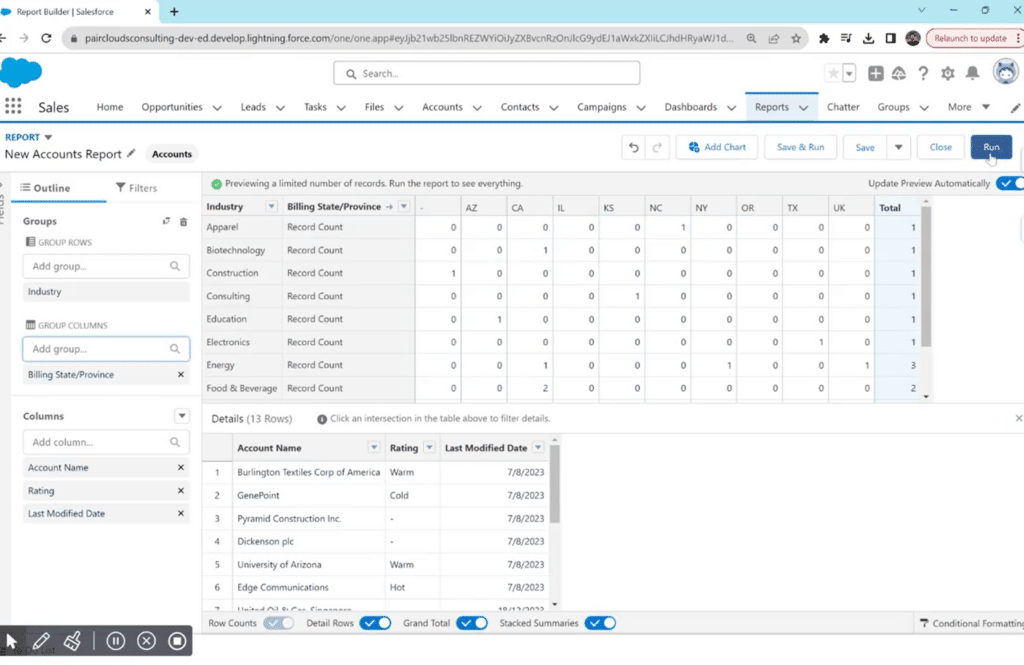
Step 4: Run the Report

The result of adding both row and column groups is a matrix report.

Click on “Run” to see a more comprehensive view of your matrix report in Salesforce.

Previewing the matrix report in Salesforce by clicking 'Run'

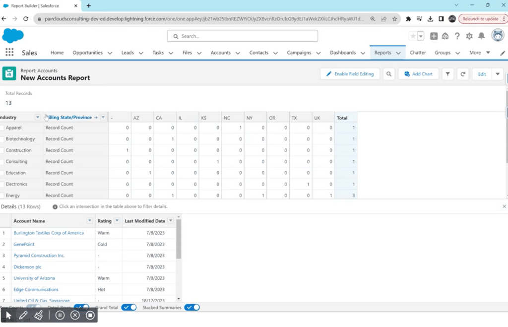
Step 5: Previewing and Saving the Report 

You can also click the “Save and Run” option to save the matrix report immediately. 

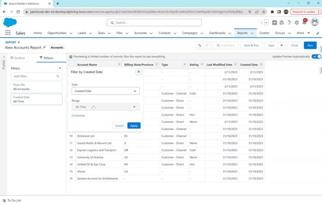
However, run and preview it first to ensure that the data is organized and summarized as desired. This step allows for any necessary adjustments.

Using the 'Save and Run' option for the Salesforce matrix report

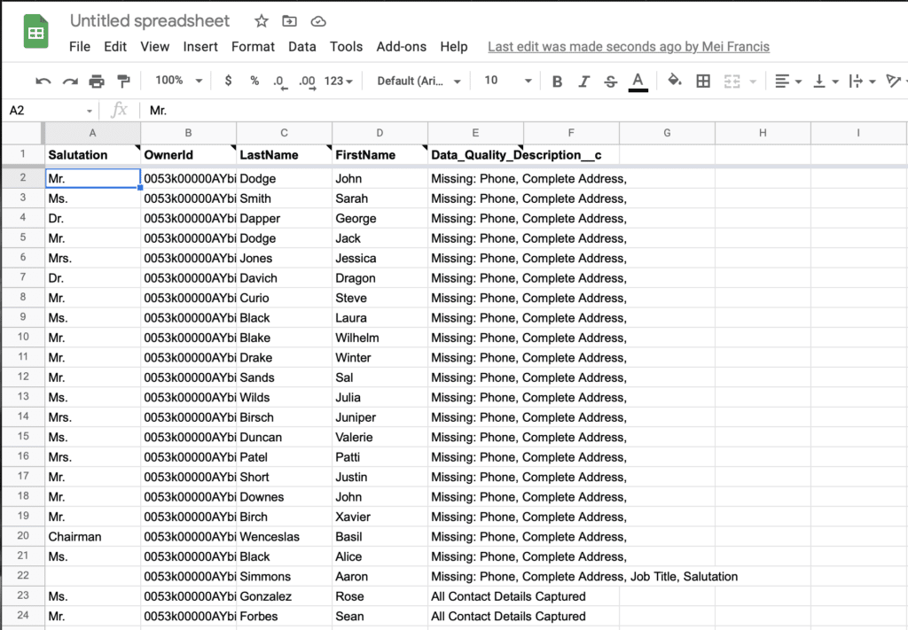
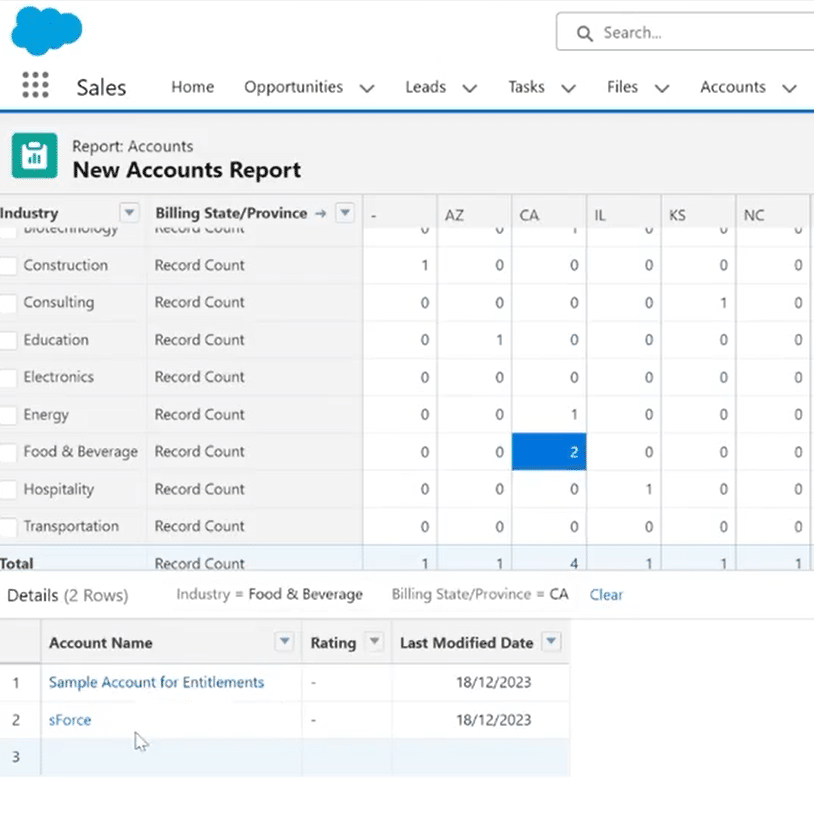
Click on the cells inside your matric report to see more details. For example, by clicking “2” in the Food & Beverage/ CA row, you can see which account names exactly fall in this range. You can also click on these names to see all records related to them and edit them.

Exploring detailed data by clicking cells in Salesforce matrix report.

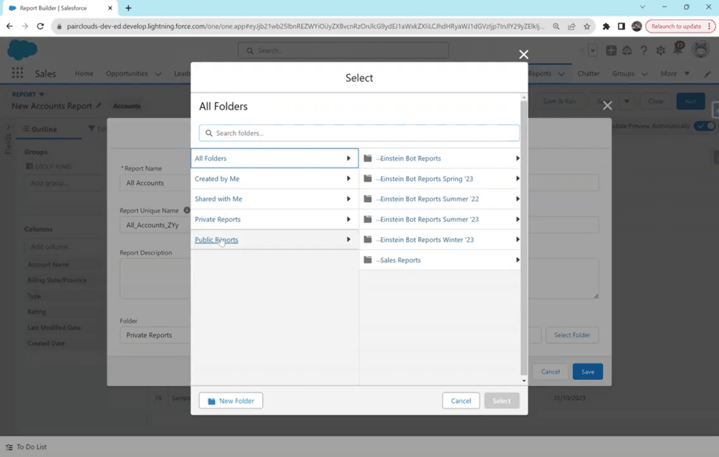
Once satisfied with the preview, save the matrix report by clicking the drop-down arrow icon next to “Edit.” From the drop-down menu, click “Save.” 

Choose the folder where you want to store the report for easy access, and you’re done!

4 Best Practices for Matrix Reports in Salesforce 

You must do more than drop fields into a grid to learn how to create a matrix report effectively in Salesforce. To maximize your reports’ utility and clarity, adhere to best practices that ensure a streamlined and insightful reporting experience. 

Here are the best practices for crafting matrix reports Salesforce:

  1. Plan Your Matrix Structure

Before diving into the Report Builder, plan how you want to structure the rows and columns of your Matrix Report. Consider the specific dimensions and groupings that will provide the most valuable insights for your analysis.

  1. Limit the Number of Groupings

While the matrix format allows multiple groupings, avoid overcomplicating your report with excessive rows and columns. Too many groupings can lead to a cluttered and less comprehensible report.

  1. Use Filters Strategically

Apply filters judiciously to focus on relevant data. Filters help refine the information presented in the matrix, making it more actionable and aligned with your analysis goals.

  1. Utilize Conditional Formatting

Use conditional formatting options to highlight key data points within the matrix visually. Color-coded cells or charts can draw attention to critical information, enhancing the user’s ability to interpret the report quickly.

Integrating Matrix Reports with Coefficient 

With data becoming the center of all progress and businesses, efficient data management is also crucial. The same applies to automating and streamlining creating reports on your Salesforce data.

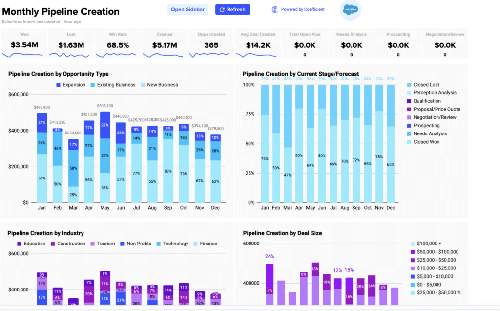
Coefficient’s 2-way Salesforce spreadsheet connector, rated 5-stars on AppExchange, bridges Salesforce data and your spreadsheet environment, whether you use Google Sheets or Excel, offering a path to enhance data workflows, reporting, automation, and overall collaboration, regardless if your team members have Salesforce access or not.

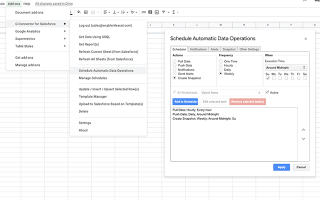
With Coefficient, you can effortlessly connect to Salesforce, pull live data or pre-built reports into Google Sheets or Excel with a single click, and keep it on a refresh schedule to ensure real-time, up-to-date data powers your reports and dashboards. Plus, trigger Slack and email alerts to notify team members of any changes or important insights gleaned from your Salesforce data.

Final Word

Knowing how to create a matrix report in Salesforce is a valuable skill for you if you’re seeking to analyze data in a structured and visually intuitive format. 

By following the step-by-step guide and incorporating best practices, users can harness the power of matrix reports to derive actionable insights from their Salesforce data.

To simplify your process and benefit from a competitive edge that will set your business’ data management apart from competitors, get started for free with Coefficient and revolutionize your Salesforce reports!

A Guide to Custom Report Types in Salesforce

Custom report types in Salesforce are vital for tailoring data analysis to specific business requirements. They enable the creation of reports spanning multiple related objects and provide an in-depth view of their data. 

If you struggle with manually updating reports or using standard reporting, custom reports can be a game-changer in your business operations. With custom reports, you can streamline and automate your reporting process, ensuring tailored and efficient data analysis that meets your business needs. 

In this article, we will explain custom report types, how to create a custom report in Salesforce, and crucial tips for proper optimization. 

Understanding Custom Report Types

Custom report types in Salesforce offer a solution when standard types fall short. They come into play if:

  • Standard report types don’t cover your desired objects.
  • Specific fields you need are not included in standard reports.
  • You wish to customize field names in reports without altering their global settings.

What sets custom report types apart is their flexibility and customization capabilities. 

They allow for specific field selection, primary object definition, and relationship establishment, unlike standard types with limited customization options.

Before you dive into our written tutorial, here’s a video to help guide you through the process!

Step-by-Step Guide: Creating a Custom Report Type in Salesforce  

  1. Accessing the Setup Menu: Start by navigating to the Salesforce setup menu.
Navigating to Salesforce Setup Menu for Custom Reports
  1. Navigating to Report Types: Locate and select the option for report types.
Selecting Report Types in Salesforce
  1. Creating a New Report Type: Click on New Custom Report Type.
Creating New Custom Report Type in Salesforce
  1. Defining the Report Type: Fill in essential details like Report Type, Label, and Description. 
Defining Report Type Details in Salesforce
  1. Adding Fields to the Report: Associate this report type with other objects by selecting “Click to relate another object”. Add up to three related objects to your report. 

Click Save to continue.

Adding Fields to Custom Report in Salesforce
  1. Saving and Testing the Report Type. Finalize and test your new custom report type.

Your Custom Report Type is ready!

Finalizing Custom Report Type in Salesforce

Best Practices and Tips for Optimizing Custom Report Types

  1. Set Clear Object Relationships

Make sure your custom report types have meaningful and well-defined relationships between objects. This helps to improve the report’s usefulness and precision.

  1. Strategic Field Selection

Be careful when selecting fields to incorporate in your custom report types. Pay attention to the data points and key metrics significant to your reporting objectives.

  1. Review User Perspectives

Pay attention to the users’ perspectives and tailor custom report types. Deduce their reporting needs and create types with actionable insights defined for their roles. 

  1. Use Formula Fields

You can utilize formula fields in Salesforce for calculations and the generation of insights within your custom report types. This helps to derive the depth of analysis without tampering with the data model.

  1. Continuously Optimize for Performance

It is vital to keep optimizing for performance by limiting the number of fields and relationships, particularly when handling large datasets. This ensures a smooth user experience and quicker report generation. 

Common Mistakes to Avoid

  1. Including irrelevant fields

When unnecessary fields are included in your custom report, it can add complexity, making it difficult to analyze and slowing down the reporting process.

Irrelevant fields prolong the data retrieval times, affecting the performance of your reports. 

  1. Unclear Naming Conventions

When naming conventions are inconsistent or unclear while creating custom reports in Salesforce, it can cause confusion, hindering your reporting strategy’s effectiveness. 

For instance, users cannot identify and understand each element’s purpose if report types or fields have unclear names. Inconsistent naming conventions can cause mistakes in data interpretation. 

  1. Failure to Document

Lack of documentation can cause confusion between administrators, users and other stakeholders.

 Documentation is important for ensuring understanding, transparency, and maintenance of your reporting structure. Poor documentation causes errors in analysis and holdbacks in resolving problems. 

  1. Lack of User Training

If users are not properly trained, they might struggle to understand how to use custom report types. 

They may be ignorant of the functionalities, best practices, and capabilities for creating and interpreting custom reports. Lack of proper training can cause users to explore inaccurate methods to extract data, affecting data integrity. 

Master Customer Report Types in Salesforce

Mastering custom report types in Salesforce is key to deriving comprehensive insights. By avoiding common pitfalls and employing optimization tips, you can significantly enhance your data analysis capabilities. 

For seamless data integration, consider Coefficient as your go-to tool. It simplifies syncing data into Excel and Google Sheets, elevating your reporting strategy. Ready to transform your data analysis? Get started with Coefficient.

Salesforce Tutorials for RevOps and Data Teams

Top Salesforce Reporting Tools for 2025

Salesforce reporting tools have revolutionized how sales managers extract and analyze customer data, sales rep performance, summary reports, and more with the leading Customer Relationship Management (CRM) tool.

There are several powerful, cloud-based reporting tools available on Salesforce AppExchange today, each offering unique features and capabilities. Let’s explore the pros and cons of each tool to understand which one stands out as the best choice for consumers.

Salesforce Reporting Tools Feature Comparison Table

To help you make an informed decision in the crowded Salesforce reporting tools market, we’ve put together a comprehensive feature comparison table. This side-by-side overview highlights the strengths of each tool and will help inform your decision.

Salesforce Reporting ToolRow Limits Data Sources Builder License Cost Viewer License Cost AI Functionality Refresh frequencyAlerts SOC 2 Compliant
Native Salesforce Reports and Dashboards2000Salesforce only $25-$75$25-$75Limited Einstein AccessLive Data Slack / EmailYes
Tableaunone$70$15“AskData” Natural Language RequestsHourly Slack / EmailYes
Coefficientnone25+$49Free“GPT Copilot:” build formulas, pivot tables and charts using natural languageHourly Slack / EmailYes
Xappex 2000*Salesforce only $25FreeNoneHourly Slack / EmailYes
Coupler 10,000 – 100,00070+$49FreeNoneEvery 15 mins on its top-tier planNoneNo
G-Connector for Salesforce 2000*Salesforce onlyFree FreeNoneEvery 4 hoursNoneNo
*when exporting Salesforce Reports with MFA enabled

1. Native Salesforce Reporting

The Salesforce CRM report builder is a great choice for users who prioritize seamless integration and user-friendliness.

Native Salesforce CRM report builder is a great choice for users who prioritize seamless integration and user-friendliness. But many find its reports fall short to other Salesforce reporting tools regarding advanced visualization, types of reports, and complex data reporting.

Pros

Integration with Salesforce: Salesforce’s native reporting tool integrates with your existing Salesforce data, eliminating the need for external data connections to create Salesforce dashboards.

Ease of Use: It is user-friendly, which makes it accessible to both non-technical and technical users working with metrics.

Real-time Data: You can access real-time Salesforce data without delays, which can be essential for decision-making and measuring KPIs.

Cons

Limited Visualizations: Native Salesforce reporting lacks the advanced visualization capabilities offered by third-party tools, making it less suitable for complex data analysis.

Data Volume Restrictions: Large datasets can cause performance issues, leading to slower reports and limited data exports.

Licensing Restrictions: Employees without SFDC (Salesforce Dot Com) licensing will not be able to access Salesforce reports. Only Salesforce users can create and send reports, which often leads businesses to plug-in additional reporting tools.

2. Tableau

Tableau's exceptional data visualizations make it a top choice for enterprises willing to invest in its high-end features and functionalities.

Tableau’s exceptional data visualizations make it a top choice for enterprises willing to invest in its high-end features and functionalities.

Pros

Robust Visualization: Tableau excels in data visualization, offering a wide range of charts, graphs, and interactive dashboards for comprehensive data analysis.

Data Blending: It allows combining data from multiple sources, providing a holistic view of business data and facilitating more in-depth insights.

Scalability: Tableau can handle large datasets and complex analytical queries, making it a suitable Salesforce reporting tool for enterprises with extensive data needs.

Cons

Costly Licensing: Tableau’s licensing costs can be prohibitive, especially for smaller organizations with limited budgets.

Dependence on Data Engineers: Complex data integrations may necessitate assistance from data engineers, adding to the cost.

Tableau Cloud: The SaaS version of Tableau Server is an additional purchase, and it is necessary for users to publish reports and collaborate.

Pricing

Tableau starts at $70 per month per user for a Tableau Creator license.

Reviews

  • The features of Tableau are very user-friendly, which enables users to merge and present data from data sources and present in such a way that anyone can understand the data. Also, the data can be updated automatically, and there is no need to update it or refresh it every time (source).
  • Some users report Tableau Cloud’s dashboard, and reporting capabilities are limited compared to the desktop version (source).

Note: Add-ons like Coefficient can integrate with Tableau to allow teams to access Tableau data for customer reporting.

3. Coefficient

When it comes to Salesforce reporting tools, Coefficient stands out by combining the best of both worlds: the simplicity of spreadsheets and the power of more traditional data analytics solutions. Coefficient is a free Google Sheets add-on that syncs live data from your favorite business systems directly to your spreadsheet.

It’s the go-to tool for those who love the ease of spreadsheets but also want deep insights from their data. It also offers best-in-class AI solutions to help users new to spreadsheets get started, catering to users of all levels.

Coefficient is a leading tool on the market

Pros

Simplicity in Setup: Coefficient’s easy setup and minimal coding requirements mean that whether you’re a data analyst or a marketing professional, Coefficient’s intuitive interface ensures a short learning curve.

Tailored Data Imports: You can select specific fields from your dashboard, sort and filter them according to your requirements, and seamlessly sync them to Google Sheets.

Automated Data Syncing: You can set up an auto-refresh schedule for your synced data. This means your Google Sheets will always reflect the latest information, eliminating the need for constant manual updates so that your team can focus on more critical tasks.

Cons

User Familiarity: Coefficient is designed for optimal use with spreadsheet tools. For those less familiar with spreadsheets, there might be a slight learning curve. But, thanks to Coefficient’s AI-driven capabilities, the platform becomes more intuitive and accessible to users across different technical levels.

Pricing

With Coefficient, you can import data from any source into Sheets at no cost. For those seeking advanced features, our pricing is set at $49 per user, per month with an annual contract. If you prefer a month-to-month arrangement, it’s $59 per user, per month.

Reviews

  • The sheer brilliance of easily syncing any data from any source into Google Sheets is just amazing. It’s dead simple to use, works smoothly, and gets the job done (source).
  • Coefficient has been incredibly helpful at exporting powerful reporting from various tools to share across our organization, regardless of the licenses we have for the actual tool itself (i.e. Salesforce) – beyond that, you’re able to do more impactful analysis and data manipulation through the export into sheets while still maintaining that real-time information (source).
  • I would have loved to have some templates, and a guide to select which data could be useful in my different google sheets. For someone totally new with datasheets it can be a bit hard to understand (source).

Don’t miss the opportunity to tap into Coefficient’s treasure trove of free Salesforce Dashboard Templates.

4. Xappex

Xappex is a user-friendly Salesforce reporting tool that suits organizations looking for basic reporting features on key metrics, but it may not fulfill the advanced analytics needs of some businesses.

Image6

Pros

Drag-and-Drop Interface: Xappex offers an intuitive drag-and-drop interface, making it easy for users to create reports without coding skills.

Scheduled Reports: It allows users to schedule and automate report generation and distribution, ensuring timely delivery of critical data.

Customizable Dashboards: Xappex provides flexibility in customizing dashboards to match the branding and specific requirements of businesses.

Cons

Data Syncing Delays: Data syncing with Salesforce might encounter occasional delays, affecting real-time reporting accuracy.

Limited Advanced Analytics: While suitable for standard reporting needs, Xappex might lack some advanced analytical capabilities compared to other tools.

Customer Support: Some users might find Xappex’s customer support to be lacking in responsiveness or helpfulness.

Pricing

Xappex starts at $99 per user a year. Xappex is free to pull and refresh data from Salesforce.

Reviews

  • I love that I can do an easy export and upload straight into Salesforce without having to use Salesforce’s data loader. I can set automated schedules with Office 365 (source).
  • Some of the features do not have full documentation and if they do they are not so easy to find (source).

5. Coupler

Coupler is a Salesforce reporting tool sued by reporting teams that work with diverse data sources.

Coupler is well-suited for data analysis and reporting teams that work with diverse data sources.

Pros

Easy Data Import: Coupler simplifies data importing from various sources, making it convenient to integrate data with Salesforce.

Customizable Reporting: Users can customize reports and dashboards to suit their preferences and business requirements.

Affordability: Coupler is often more budget-friendly compared to other sophisticated Salesforce reporting tools.

Cons

Visualization Capabilities: While Coupler offers visualization options, they might not be as extensive as some other tools in the market.

Data Volume Restrictions: Coupler face performance issues when dealing with massive datasets, affecting report generation speeds.

Complex Reporting: For intricate reporting needs, Coupler might have a steeper learning curve.

Pricing

Coupler starts at $19 per person per month for an annual contract.

Reviews

  • Coupler made it easy to create dashboards and reports from different data sources. The sync is reliable and the user experience is amazing (source).
  • It is sometimes difficult to get a clear overview if you have a lot of connectors, and some Quickbooks reports may not be available, but these problems are minor (source).

6. G-Connector for Salesforce

G-Connector is a suitable tool for organizations extensively using Google Workspace, providing real-time data sync and workflow automation capabilities.

G-Connector is a suitable tool for organizations extensively using Google Workspace

Pros

Integration with Google Workspace: G-Connector seamlessly connects Salesforce data with Google Workspace apps, facilitating collaboration and data sharing.

Real-time Data Sync: It offers real-time data synchronization between Salesforce and Google Sheets, ensuring up-to-date reporting.

Automated Workflows: G-Connector allows users to automate workflows, reducing manual effort and improving productivity.

Cons

Limited Features: Compared to other standalone reporting tools, G-Connector might have fewer advanced features and visualizations.

Dependency on Google Sheets: Businesses may prefer a dedicated reporting software instead of relying on Google Sheets for analysis.

Security Concerns: There could be compliance requirements to address related to transferring data between platforms.

Pricing

G-Connector starts at $99 per user per year.

Reviews

  • Essential in my day-to-day access to Salesforce Reports. Would highly recommend it to anyone who wants to automatically update and connect Salesforce Reports in Google Sheets easily. Great product (source).
  • The solution does exactly what it claims to do. However, there are sometimes bugs that are difficult to work around when you’re dealing with larger reports (source).

Conclusion

In the vast landscape of Salesforce reporting tools, each business has unique needs and priorities. While many tools offer standout features, Coefficient is an optimal choice for those seeking the familiarity of a spreadsheet for granular-level analyses and a robust library of pre-built dashboards for reporting.

Install Coefficient for free today and witness firsthand how it can reshape the landscape of your business with unparalleled efficiency and strategic precision.

How to Connect Salesforce to Google Sheets

Salesforce offers a treasure trove of data you can use to optimize your sales and marketing operations.

But there’s a catch. It’s not always easy to make the most of your Salesforce data from the platform alone.

The good news is you can connect Salesforce with Google Sheets, allowing you to pull and manipulate your SFDC data easily using the various familiar spreadsheet tools and functions.

Read on to find out more about the best methods to link Salesforce CRM to Google Sheets.

VIDEO: How to Connect Salesforce to Google Sheets in Clicks

Can You Connect Salesforce to Google Sheets?

Linking your Salesforce data with Google Sheets involves several methods.

You can select specific Salesforce objects and reports, download them as a CSV, XLXS, or XLS file, and open them on Google Sheets to export your data.

An easier method is to use a data connector app, which simplifies and even automates some parts of pulling up Salesforce data into a Google spreadsheet.

TLDR

  • Step 1:

    Install Coefficient from Google Workspace or at coefficient.io

  • Step 2:

    Open Google Sheets, go to Add-ons > Coefficient > Launch to open the sidebar

  • Step 3:

    Click “Import From” and select Salesforce from the list of data sources

  • Step 4:

    Choose your desired report or objects and configure any filters needed

  • Step 5:

    Click “Import” to pull data into Google Sheets

  • Step 6:

    Set up automatic refresh schedule (hourly, daily, or weekly) to keep data synchronized

Ultimately, you’re better off choosing an intuitive tool that lets you automate Salesforce to Google Sheets integration. This allows for seamless and quick data linking, requiring minimal training and with as few usability errors as possible.

Common Ways to Sync Salesforce and Google Sheets

Let’s dive into the two best options for linking Google Sheets to Salesforce, including the pros and cons of each method.

Method 1. Coefficient

Pros

  • Offers a clean, simple interface for a bi-directional sync with Salesforce and Google Sheets
  • Supports direct Formula-based imports from Salesforce to Google Sheets.
  • Allows you to set up automated notifications to Slack or email when your data changes
  • Lets you set up Salesforce data retrieval on Google Sheets on a schedule or using webhook triggers.
  • Supports auto data snapshotting on a schedule to power historical trending reports
  • Allows you to import your Salesforce data directly into a pivot table
  • Integrates with many business systems using only one add-on. Has an around the clock support team available
  • Offers a free plan
  • Offers pre-built Salesforce dashboards
  • 4.9/5 star rating on AppExchange and Google Marketplace

Cons

  • Not a big-name publisher such as Google Cloud

Coefficient’s Salesforce connector has an intuitive UI that allows you to connect your Salesforce account and import data to your Google spreadsheet almost instantly with a few clicks.

Step 1: Get started free here in just a few clicks. You’ll sign up with your email, click on the blue install button, and accept the prompts.

Step 2: Click Add-ons on the Google Sheets menu, select Coefficient, then click Launch.

Step 3: Click Import From and Choose Salesforce from the list of Coefficient’s supported data sources and platforms.

You can either import Salesforce data from reports, objects, or through SQL, but we’ll use Import from report for this example.

Select a report, preferably something from the Recent reports or All reports tabs. You can also use the search bar to find reports quickly. After choosing a report, click Import Report.

Your report should populate your Google spreadsheet within a few seconds. You can also schedule your data to auto-refresh after running an import.

Step 4: Configure when to refresh data – hourly, daily, or weekly, and click Yes, refresh. You’ll also have the opportunity to refresh your data at any time using the Refresh button at the top of your import.

You’ll be directed to an extended import menu where you can easily make additional changes and rerun the report.

Step 5: Now, we’ll try to import a Salesforce report in Google Sheets using the Import from objects function. This time, select the second option from the dropdown menu as highlighted below.

You can search and choose any object, but let’s pick Contact for this example. Click Next once you’ve made your selection.

Step 6: Choose the fields you’d like to see in your report.

Coefficient also lets you enable Pivot Mode so you can automatically generate a pivot table of your reports, making it easy to analyze your data through category groupings.

You can also add filters. For example, you can try filtering for contacts located in the state of California, those that are missing email or phone numbers, active contacts, the list goes on.

Step 7: Once you’re happy with your setup, name your import and click Import.

The sample dataset below shows how a finished import would look like. You can easily adjust the criteria and re-run the import at any time without extra hassle.

Step 8: Enable automatic updates or snapshots of your report by re-opening the import you created and expanding the Refresh Schedule section.

You can configure and set your schedule and Snapshot frequency using the available options.

Additionally, if you want to perform analyses or use your Salesforce data with other datasets from another platform, re-open the Coefficient sidebar and choose a new data source to import into Google Sheets.

You can find many ways to combine data from Salesforce and other platforms in both Google Sheets or Excel. You can find all of our pre-built spreadsheet integrations here.

Setting up Coefficient is a no-brainer, allowing even non-technical users to pull Salesforce data into Google Sheets, conduct analyses, create visualizations, and other data manipulation purposes on the fly.

The process leaves little to no room for error because, unlike manual data importing, you won’t need to map object fields — the Coefficient app does the heavy lifting for you.

Automated Email & Slack Notifications

Another advantage of using Coefficient is it lets you set notifications that automatically trigger an email or Slack message when your import data on the spreadsheet updates.

Just enter the email addresses of your recipients for email alerts or link the Slack channels to where the notifications would be sent.

For instance, an email alert or Slack message is sent as soon as a new row gets added to your spreadsheet.

Alert types are based on your preferences or you can select from Coefficient’s recommended notifications. Set the frequency as soon as it happens or at a specific time.

With this feature, you can easily keep track of any data changes and stay on top of your Salesforce data analyses, reports, and dashboards with minimum effort on your part.

Method 2. Data Connector for Salesforce Pros & Cons

Another nifty way to link your Salesforce data with Google Sheets is via a data connector. We outline the steps below, including the pros and cons of using this method.

Pros

  • Lets you create, read, update, and delete data in Salesforce from Google Sheets
  • Allows you to retrieve data on a schedule
  • Most apps are created and updated by a big-name publisher
  • Totally free
  • 4/5 star rating

Cons

  • 2000 row limit
  • Limited or no support
  • Only works with Salesforce; you’ll need separate add-ons to link other data sources to Google Sheets
  • No data snapshotting functionality
  • No cloud pivot tables
  • Lack of frequent updates and fixes

Data connector for Salesforce is a Google add-on that you can download from the Workspace Marketplace.

The app is simple, providing essential functions, such as importing a report and adding, updating, and deleting data within Salesforce.

Data connector for Salesforce is quite utilitarian. As such, other tools stand on the other side of the spectrum, catering to a niche of needs and providing a fairly complex tool at a not-so-low cost.

Step 1: Head to the top menu bar on Google Sheets and click Add-ons.

You will be taken to the Google Workspace Marketplace. Type in “Data Connector for Salesforce” in the search bar and select the add-on.

Go over the terms of service and click Allow.

The Data connector for Salesforce appears as a sidebar on the right-hand side of the Google Sheets interface.

Step 2: Select the Salesforce environment (usually Production), and click the Authorize button at the bottom.

You should see a menu showing the Reports and Import options.

Step 3: Select Reports as your operation.

For this tutorial, we will choose a recently run report, the first option: Contact Data Quality Score. You can select the current sheet or create a new page.

Step 4: Once you’re done with your selection, import the report by clicking the blue button at the bottom of the menu.

Your import will look similar to this one (depending on the report you chose).

Step 5: Now, let’s use the Import option.

Choose a source object. We’ll use Contact for this example to match the results with the previous exercise.

Step 6: Choose the fields you’d like to include in your import by clicking each one. When you’re done, the confirmation screen will appear, and then click Next.

Verify the criteria established for this import. You can also choose filtering conditions accordingly.

Step 7: Run the report by clicking the blue button at the bottom of the Data connector for Salesforce sidebar menu.

Your import report should look something like this.

Data Connector is free and from a trusted source, but it is somewhat clunky and not very accessible. The UI is monotonous and lacks good user experience practices.

It’s easy to get lost or make an error, and the options it provides are also pretty basic. This would be better suited for tech users or admins as opposed to business users.

If you want to set up snapshots using the Data Connector tool, you’ll need to configure this by creating a time-triggered script. The script copies the import sheet’s data into a new sheet (and renames it with a timestamp).

Another option is to use another add-on to perform the spreadsheet snapshotting for you.

Importing data from another platform, such as Looker, Google Analytics, or MySQL, is also not available. In this case, you’ll need to either import the data manually or use another add-on to load your data.

Why connect Salesforce to Google Sheets?

Salesforce offers a lot of data configuration options, allowing you to analyze and generate reports to gain valuable data insights. This can even make reporting in the Salesforce admin space a specialty of its own.

However, Salesforce reporting can get complex for non-technical users across your company. This often makes it challenging for them to get the exact data and insights they need from Salesforce’s reporting and dashboard tools. (That’s why we love pre-built Salesforce Google Sheets templates.)

Additionally, users might need to apply many changes to your data at once. While Salesforce offers some tools for updating records en masse, it doesn’t work for all fields in the User Interface (UI).

This poses a few challenges since you’re not likely to give all your business users access to the Salesforce Data Loader.

Also, data changes may require a more formulaic approach to updates. For instance, “If the amount is more than $60,000 and less than $260,000 do x unless the Industry is ‘Government’”. Salesforce simply doesn’t have a good solution for this, which adds to the complexity for non-technical users.

Pulling up your Salesforce data to Google Sheets makes reporting, creating charts and dashboards, and other analyses a lot easier, especially for non-Salesforce not-so-savvy users.

With Google Sheets, you can manipulate your Salesforce data beyond using the built-in features, merge information, utilize its functions, and create reports in an environment that your users are more familiar with.

Benefits of Connecting Google Sheets to Salesforce Now

Get the most out of your Salesforce data by connecting it to Google Sheets.

It would help you make sense of your Salesforce data much faster and more easily because of Google Sheets’ familiar functions and tools. Extracting valuable insight to optimize your sales and marketing operations has never been this simple!

Supercharge connecting Salesforce to Google Sheets by leveraging the power of Coefficient.

Coefficient provides the most seamless and hassle-free way to pull up Salesforce data into Google Sheets, even allowing you to automate updates of your imported dataset.

With Coefficient, you get a great user experience, intuitive UI, quick setup, and fast operation, saving you tons of valuable time and money.

Try Coefficient for free today!

How to export opportunities from Salesforce

TL;DR

Getting your Salesforce opportunities data out for analysis doesn’t have to be challenging. You can automate the entire process or export manually.

  • Automated approach: Use Coefficient to pull live opportunity data into Google Sheets/Excel with auto-refresh
  • Manual export: Use Salesforce Data Loader to export static CSV files
  • Best practices: Secure storage, field validation, and regular backups

Navigating the vast functionalities of Salesforce, especially when it comes to managing your opportunities, can be a daunting task.

However, exporting your opportunities data for analysis, backup, or integration purposes doesn’t have to be.

In this comprehensive guide, we’ll walk you through the process of exporting opportunities from Salesforce with ease, ensuring you have the data you need at your fingertips.

Why Export Opportunities?

Exporting opportunities from Salesforce can be transformative for businesses. It allows for deeper data analysis, integration with other analysis tools, and preparation of comprehensive reports that drive strategic decisions.

Whether you’re looking to assess sales trends, forecast future growth, or integrate Salesforce data with other business intelligence tools, mastering the export process is essential.

The Automated Way: Live Data with Coefficient

Skip the manual export altogether. Coefficient connects your Salesforce opportunities directly to Google Sheets or Excel with live data that updates automatically.

Step 1: Connect Salesforce to Coefficient

Open Coefficient in your spreadsheet. Click “Import from…” and select Salesforce.

Authorize the connection to your Salesforce org. You’ll be redirected to Salesforce to log in and grant permissions.

Step 2: Import Your Opportunities

Choose “From Objects & Fields” to build a custom opportunity report.

Select “Opportunity” as your object. Pick the fields you need – Account Name, Amount, Stage, Close Date, or any custom fields your team uses.

Add filters if needed. Want only this quarter’s opportunities? Filter by Close Date. Need opportunities over $10K? Add an Amount filter.

Click “Save & Run” to pull your data.

Step 3: Set Up Auto-Refresh

Here’s where automation shines. Click on your imported data and select “Schedule Refresh.”

Choose your frequency – hourly, daily, or weekly. Your opportunities data will update automatically without lifting a finger.

Set up Slack or email alerts when new opportunities are added or when deal stages change. Your team stays informed in real-time.

Why this matters: Your data is always current. No more stale reports or missed opportunities because someone forgot to export the latest data.

Step-by-Step Walkthrough on Exporting Opportunities from Salesforce

Preparing to Export

Before diving into the export process, ensure you have the necessary permissions in Salesforce and a clear understanding of the data you need.

 Navigating to the Opportunities section within Salesforce to prepare for data export.

Step 1. Accessing Your Opportunities

Navigate to the Opportunities section within Salesforce to view the data you plan to export. This initial step lays the groundwork for a successful export.

 Selecting a target location on the computer to save the Salesforce exported data file.

Step 2. Selecting the ‘Opportunity’ Object for Export

In Data Loader, choose ‘Opportunity’ as your object. This specifies the source of the data you’re exporting.

Customizing the export by selecting specific fields from the Opportunity object in Salesforce.

Step 3. Setting the Target Location for Exported Data

Select a target location on your computer to save the exported file.

This is crucial for organizing and accessing your data post-export.

Finalizing the selection and initiating the export process to move opportunity data out of Salesforce.

Step 4. Selecting Fields for Export

Customize your export by selecting specific fields or choose ‘Select All Fields’ to export every available data point from the Opportunity object.

Verifying the success of the Salesforce opportunities export and locating the data file on the computer.

Step 5. Completing the Export

Confirm your selections and initiate the export process. This step moves the selected opportunity data out of Salesforce and into a designated file on your computer.

Image1

Step 6. Reviewing the Export Results

Once the export is complete, verify the success of your operation and locate the exported data file on your computer.

Image4

Leveraging Third-Party Tools for Enhanced Export Functionality

While Salesforce provides robust tools for exporting data, third-party tools can offer enhanced functionality for specific needs.

For instance, Coefficient is a formidable tool that bridges Salesforce data with Google Sheets or Excel, making data analysis and sharing more accessible and real-time. By integrating Salesforce with Coefficient, users can easily manage, analyze, and share their exported data, enhancing productivity and strategic insight.

Tips and Tricks When Exporting Opportunities

Common Pitfalls and How to Avoid Them.

Data exports can sometimes be tricky. Common issues include exporting incomplete data sets or failing to export certain data fields. To mitigate these risks, always double-check your field selections and filter conditions before initiating an export.

Best Practices for Managing Exported Data.

Once your data is exported, ensure it’s stored securely and organized in a manner that facilitates easy access and analysis. Consider encrypting sensitive data files and backing up important datasets to prevent data loss.

Conclusion

Exporting opportunities from Salesforce can significantly impact your sales analysis and forecasting capabilities.

Ready to take your Salesforce data management to the next level? Explore how Coefficient can streamline your processes and enhance your data analysis capabilities. Get Started with Coefficient.

How to create a report in Salesforce?

From the Salesforce reporting basics to advanced customization, this guide will equip you with the knowledge needed to transform raw salesforce data into creating strategic salesforce reports and tips of automating you SF reporting!

So, buckle up as we learn how to create reports in Salesforce!

PS. If you prefer video tutorials, we’ve got you! If not, keep scrolling for the written tutorial.

What is Salesforce Report Builder? 

Salesforce Report Builder is a dynamic tool designed to unravel the Salesforce data. This tool operates within the Salesforce Classic and Lightning interface, providing an intuitive platform for crafting detailed reports without requiring intricate technical skills.

Capabilities of Salesforce Report Builder

Before we explain how to create reports in Salesforce Lightning, you need to know what features it offers

  • Effortless Report Creation: Simplifies the process of generating reports, allowing users to select relevant data fields and parameters effortlessly.
  • Data Filtering: The tool empowers users to filter data based on specific criteria, ensuring that reports present the information needed for insightful analysis.
  • Visual Representation: Its integration with charts and graphs transforms raw data into visually appealing representations, making it easier to identify trends and patterns.
  • Customization: Tailor your reports to your unique needs by customizing layouts, formatting, filters, and even incorporating conditional formatting to highlight critical data points.

Pre-requisites to start creating a report in Salesforce

Before diving straight into the process of building your report, ensure you have the following essentials in place:

  1. Access Permissions: Confirm that your Salesforce user profile has the necessary permissions to create and edit reports. This ensures a seamless experience without any access hurdles.
  1. Defined Object Relationships: Understand the relationships between Salesforce objects relevant to your report. Clear object relationships pave the way for comprehensive and interconnected data analysis.
  1. Data Availability: Verify that the data you intend to report is populated and up-to-date within Salesforce. Timely and accurate data is the bedrock of meaningful reports.

Salesforce Report Types

Salesforce offers various report types to help you analyze and present your data effectively:

1. Tabular Reports

Tabular reports display data in simple rows and columns, like a spreadsheet. They’re ideal for creating lists of records or exporting data. Use these when you need a straightforward view of your data, such as a list of all contacts or accounts.

2. Summary Reports

Summary reports group data and show subtotals, allowing for a more organized view. They’re perfect for analyzing data by categories, such as sales pipelines grouped by stages. Use these when you need to see data hierarchically, like opportunities by account. Here is the step-by-step guide to create Summary reports in Salesforce.

Salesforce Summary Report

3. Matrix Reports

Matrix reports display data in a grid format, grouping by both rows and columns. They’re excellent for comparing related totals across different dimensions. Use these for complex comparisons, such as sales performance across products, regions, and time periods. Here’s a detailed walkthrough on building a matrix report in salesforce.

Video Walkthrough to create Matrix Reports in Salesforce

4. Joined Reports

Joined reports combine data from multiple report types into a single report. They provide different views of related information side by side. Use these when you need to compare data from different objects, like leads and opportunities, in one comprehensive report. Here’s detailed guide to building joined reports in Salesforce.

5. Standard Object-Specific Reports

Salesforce also provides report types based on standard objects:

  • Accounts and Contacts Reports: For analyzing account and contact relationships.
  • Opportunities Reports: For tracking sales progress and product performance.
  • Leads Reports: For monitoring lead conversion and source effectiveness.
  • Cases Reports: For assessing support case resolution and trends.
  • Activities Reports: For reviewing tasks and events linked to various objects.
  • Campaigns Reports: For evaluating marketing campaign performance and ROI.

6. Custom Report Types

Custom Report Types allow you to create tailored reports for unique data relationships within your organization. These are particularly useful when standard report types don’t meet your specific needs. Here’s a quick guide to building custom reports in Salesforce.

Tips on Report Types in Salesforce: When to Use Them

  1. Tabular Reports: Ideal for simple lists with no subtotals, providing a straightforward data view.
  1. Summary Reports: Perfect for grouping data and displaying subtotals, offering a more organized and structured overview.
  1. Matrix Reports: Suited for complex data analysis with both row and column grouping, allowing for a comprehensive view of relationships.
  1. Joined Reports: Combining data from multiple report types into a single view provides a holistic perspective.

Step-by-Step Guide: How to Create Reports in Salesforce 

You’re all set with your data and Salesforce account in place. Now it’s time to get into report building, so make sure you follow through the steps:

Navigate to Report Builder

To get started with your journey, begin by navigating to the Salesforce Lightning interface. 

Once logged in to your Salesforce account, direct your attention to the taskbar ribbon on your dashboard. This is your gateway to several Salesforce application tabs and tasks. 

log into salesforce and access your dashboard

In the taskbar, directly select the “Reports” tab and navigate to ‘New Report’ to open the Report Builder.  

Accessing Salesforce Lightning's Report Builder

Choose a Report Type

As the next window opens, you must first choose the object you wish to create a report on – your report type.

Select the appropriate category, or navigate to ‘All’ and select the report type based on the data you wish to analyze. 

Selecting Report Type in Salesforce Lightning

Salesforce offers standard report types, including Tabular, Summary, Matrix, and Joined reports. Each type serves a unique purpose, so choose the one that aligns with your reporting needs. 

In our example, we will use ‘Accounts’ as our report type.

Once you’ve selected the report type, click ‘Start Report.’

Once you’ve selected the report type, click ‘Start Report.’

Add Fields to Your Report

Now, you’ll be redirected to the Fields pane. This is where you handpick the data fields you want to include in your report. This step allows you to customize your report to focus on specific information relevant to your analysis.

Start by selecting a date filter. You can choose from various options, from the current fiscal year to last week, or simply ‘All Time.’

Customizing Fields in Salesforce Report

After selecting your data’s time frame, Salesforce will automatically generate the report.

After selecting your data’s time frame, Salesforce will automatically generate the report.

Set Filters and Criteria

Refine your report by adding filters and criteria. Whether it’s narrowing down data based on specific dates, categories, columns, or other parameters, filters ensure your report delivers targeted insights.

You can also remove some columns to make the data more precise by navigating to the left sidebar and simply clicking on the ‘x’ mark to delete all columns from your report that match the criteria.

navigating to the left sidebar and simply clicking on the ‘x’ mark to delete all columns from your report that match the criteria.

You can also add columns not generated automatically by Salesforce from the search bar, e.g., created by date, created by (user), and other specific criteria to further add details to your report.

Group Data (Optional)

For a more organized view, consider grouping data based on specific fields. This step helps in creating a structured report that highlights trends and patterns. 

In the ‘Group Rows’ section, type the word for whatever group you wish to sort for. For example, type “Industry” and your data will be grouped based on industries as shown below:

Grouping Data by Industry in Salesforce Report

Here, customers’ accounts have been grouped into different types of industries they were marked, e.g., apparel, construction, and consulting. For data that does not belong to any specific industry, you can see a ‘-.’ 

Important: You can only add data visualization to your reports if you have created data groups. If you don’t need any data groups or choose not to make any, Salesforce will disable the visualization option.

Add Charts and Filters

Enhance the visual appeal of your report by incorporating charts and graphs. Choose from various chart types to represent your data in a way that is easy to understand and visually impactful.

Also, refine your data set with filters by precisely adjusting ranges. For example, you can sort data based on creation date, publisher, and owner. When setting date filters, consider using dynamic options like “This Month” or “Last Quarter” for reports that require real-time relevance.

Click on the ‘Filters’ tab in the Fields sidebar and type your filter categories in the search bar. Select the right option from the drop-down menu.

Enhancing Report with Charts and Filters in Salesforce

Customizing Salesforce Reports 

Customizing reports goes beyond aesthetics. It’s about presenting data that resonates with your audience, facilitating better comprehension and decision-making. 

Here are some tips for making your reports more readable and informative:

  1. Consistent Formatting – Maintain consistency in formatting throughout your report. A uniform layout improves readability and makes navigating and understanding the information presented easier for users.
  1. Use Conditional Formatting Highlight crucial data points with conditional formatting. Whether color-coding cells based on specific criteria or adding icons for emphasis, this feature draws attention to critical insights.
  1. Strategic Use of White Space – Avoid clutter by strategically incorporating white space. Well-organized reports with balanced spacing create a clean and professional appearance, facilitating easier absorption of information.
  1. Choose Appropriate Chart Types – Select chart types that align with your data and analysis goals. Bar charts are effective for comparisons, while line charts are suitable for showcasing trends over time. Experiment with different options to find the most appropriate visualization for your insights.
  1. Include Descriptive Labels – Ensure clarity by providing descriptive labels for your fields and data points. Descriptive labels contribute to the overall understanding of the report, making it accessible to a broader audience.

For even more customization options, try Coefficient. It lets you pull Salesforce data into spreadsheets, giving you more flexibility to create custom reports. This makes it easier to build exactly the kind of reports you need, with all the features of spreadsheet software at your fingertips. Companies like Miro, Klaviyo has saved so many hours using Coefficient for Salesforce Reporting.

Saving and Sharing Reports 

Once you’ve crafted the perfect report in Salesforce Report Builder, it’s essential to safeguard your hard work. 

Click on the “Save” button, and a dialogue box will prompt you to provide a meaningful name and description for your report. This helps you identify and recall the report later and contributes to organized data management within Salesforce.

You will also be directed to choose a folder to place your report in. Create a new folder or select an existing one. This is a crucial step before your report is saved!

Saving Options for Salesforce Report

Save and Sharing Options

Sharing your insights is as crucial as generating them. It’s important to note that you can only share folders that contain your reports rather than your complete dashboards. When you give access to other users, you will need to manage access limitations to ensure what reports the other user can edit, delete, or only view.

If you want other options to save, click the arrow next to ‘Edit’ and select other methods from the drop-down menu. 

Setting Sharing Options for Salesforce Report

You can save your report mainly as an Excel sheet as an alternative option.

Limitations of Building Reports in Salesforce

Despite its robust capabilities, Salesforce reporting has some significant constraints:

  1. Data Volume Limits: Reports can time out or fail to run when dealing with large datasets (typically over 2,000 records), impacting real-time analysis of big data.
  2. Lack of Real-Time Data: Reports are based on the last data snapshot, which can be up to 30 minutes old, potentially leading to decisions based on outdated information.
  3. Complex Cross-Object Reporting: Creating reports that span multiple objects often requires custom report types, which can be challenging to set up and maintain.
  4. Limited Visualization Options: While Salesforce offers basic charts, advanced visualizations or custom chart types are not natively supported, restricting data presentation options.
  5. Sharing and Collaboration Hurdles: Sharing reports across teams or with external stakeholders can be cumbersome, often requiring manual exports or additional user licenses.

To overcome these limitations and create more flexible reports, consider using Coefficient. It enables you to pull Salesforce data directly into spreadsheets, allowing for real-time updates, advanced visualizations, and easier sharing across your organization.

How to schedule a Salesforce Report?

Scheduling reports in Salesforce lets you automatically run and send reports at set times. Here’s how to do it:

  1. Save your report: After creating or customizing your report, click “Save & Run”. Give it a name and choose where to save it.
  2. Find the scheduling option: Go to the Reports tab, find your saved report, and open it. Click the dropdown arrow next to “Edit” and select “Subscribe”.
  3. Set up the schedule: Choose how often you want the report sent – daily, weekly, or monthly. Pick who should receive it and how it should be delivered (as a summary or full report).
  4. Add conditions (optional): You can set rules for when the report should be sent, like only when certain data changes.
  5. Save and you’re done: Click “Save” to activate your scheduled report.

You can always change or stop these scheduled reports later by going back to the “Subscribe” option.

Coefficient can make this process even easier. It lets you automatically update your spreadsheets with fresh Salesforce data, so you always have the latest info without scheduling multiple reports.

For example, Coefficient’s Sales Pipeline Creation Dashboard offers powerful features:

  • Filter sales activities by team members, sales cycle, time period, or opportunity type directly in Google Sheets.
  • Visualize core pipeline creation metrics with pre-built dashboards.
  • Track pipeline by opportunity type, industry, deal stage, and other key segments.
  • Monitor overall performance, including win rates and closed opportunities.
  • Automatically sync with real-time Salesforce data for up-to-date metrics.

Conclusion

Learning to create salesforce reports opens a gateway to transformative insights, empowering users to navigate and analyze their sales data precisely. From crafting customized reports to seamlessly sharing them with stakeholders, enables companies to gain valuable insights than can help with key decisions with sales strategies. 

However, the need for an automated and advanced approach to saving and sharing reports becomes evident in the ever-evolving data management landscape. 

So, elevate your data integration game with Coefficient.io, revolutionize how you save track, and share your Salesforce reports.