

Log into Salesforce and navigate to the “App Launcher” then select the “Dashboard” app
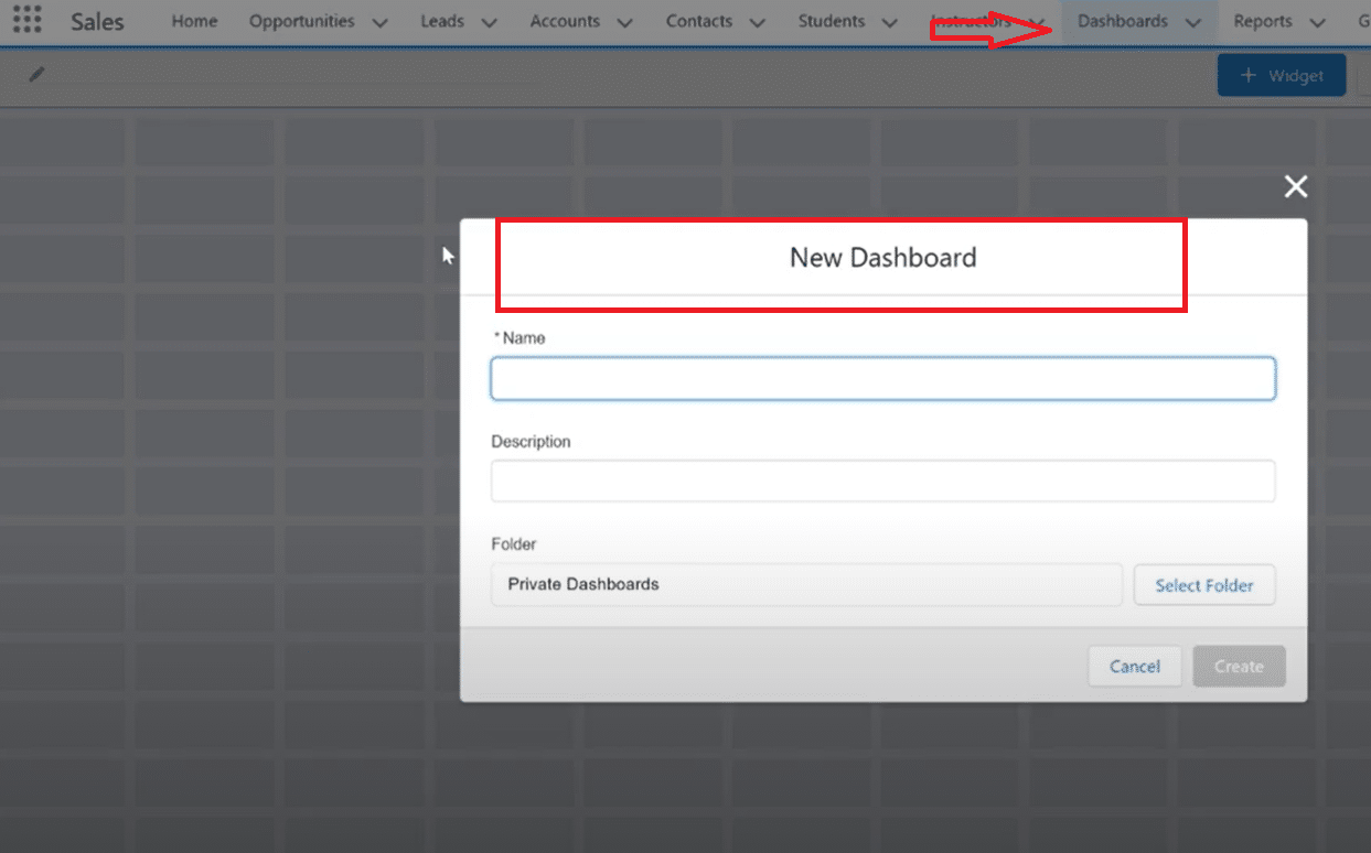
Click “New Dashboard” to create a new dashboard in the Lightning Experience
Select the appropriate report type and dataset for your gauge chart visualization
Click “Add Component” in the Dashboard Builder and select “Gauge Chart” from available chart types
Drag the gauge chart component to your desired location on the dashboard
Configure the data source by selecting the relevant dataset or report from your Salesforce reporting tools
Define the metric to visualize and establish threshold levels with color coding (green, yellow, red)
Customize the scale, colors, and formatting to match your organization’s preferences
Click “Save” to store configurations and “Done” to exit Dashboard Builder
Test the chart in both standard and dynamic modes to ensure proper functionality
Salesforce dashboards serve as powerful tools for data-driven decision-making, providing a visual representation of key metrics. One dynamic element that significantly enhances this visualization is the incorporation of Dynamic Gauge Charts.
Dynamic Gauge Charts provide an intuitive way to track performance, goals, and key performance indicators (KPIs).
Let’s delve into the process of creating these dynamic charts and explore their relevance in amplifying the impact of Salesforce dashboards.
Understanding Dynamic Gauge Charts
Dynamic Gauge Charts are visual elements within Salesforce dashboards that dynamically represent a single metric or key performance indicator (KPI).
Unlike traditional static charts, dynamic gauge charts provide an interactive and real-time gauge or dial, offering a clear visual indication of performance against predefined thresholds or goals. This dynamic representation allows users to quickly assess whether a metric is within acceptable ranges.
Here are some of the importance and use cases of dynamic gauge charts in Salesforce Dashboards:

Explore 8 cutting-edge techniques that are revolutionizing how Salesforce admins manage their daily tasks. Contribute more significantly to business outcomes and become a key driver of efficiency and innovation.
See the Techniques
- Instant Performance Assessment: Dynamic Gauge Charts enable instant assessment of performance against targets or benchmarks. The visual gauge provides a quick overview, allowing users to gauge success or identify areas that require attention.
- Goal Tracking: These charts are instrumental in tracking progress toward goals. Whether it’s sales targets, service response times, or project completion rates, Dynamic Gauge Charts offer a visual snapshot of achievements and areas needing improvement.
- Real-time Monitoring: The dynamic nature of these charts ensures that users receive real-time updates. This is particularly crucial in scenarios where continuous monitoring and immediate responses to fluctuations are necessary.
- Threshold Alerts: Set threshold levels within the gauge chart to trigger alerts when metrics fall below or exceed predefined limits. This proactive approach allows teams to address issues promptly.
- Performance Metrics Display: Showcase performance metrics, such as customer satisfaction scores, response times, or sales conversion rates, in a visually engaging and easily interpretable manner.
- Workflow Integration: Dynamic Gauge Charts seamlessly integrate into the Salesforce workflow, enhancing the efficiency of dashboard components.
- Customization: With Salesforce’s Lightning Experience, these charts can be customized in terms of formatting, segment ranges, and chart targets, making them highly adaptable to specific business needs.
In addition, the dynamic gauge chart in comparison with other forms of informational and statistical charts such as pie charts, line charts, etc. provides more detailed information and representation of the organization’s data. Below is a brief comparison of the charts with the dynamic gauge chart:
- Bar Charts and Line Graphs: While bar charts and line graphs are effective for comparing multiple data points or trends, Dynamic Gauge Charts excel in presenting a single metric against a target, providing a focused view of a specific goal or KPI.
- Pie Charts: Unlike pie charts, which display the proportion of parts to a whole, Dynamic Gauge Charts focus on a singular metric’s relation to a predefined target, making them more suitable for goal-oriented tracking.
- Scatter Plots: Scatter plots are ideal for showing relationships between two variables. In contrast, Dynamic Gauge Charts are designed for a straightforward representation of a single metric’s performance against a target, emphasizing simplicity and clarity.
Prerequisites for Creating Dynamic Gauge Charts in Salesforce Dashboards
Before creating a dynamic guage chart Salesforce dynamic chart, you must tick the following requirements:
- Salesforce Account: Ensure you have an active Salesforce account with the necessary permissions to create and modify dashboards. Access to the Salesforce dashboard builder is essential for the creation of Dynamic Gauge Charts.
- Access to Dashboard Builder: Familiarize yourself with the Salesforce Dashboard Builder. This tool is integral to designing and customizing dashboards, including the addition of Dynamic Gauge Charts.
- Understanding of Metrics: Have a clear understanding of the metric or key performance indicator (KPI) you intend to visualize using the Dynamic Gauge Chart. Define the target or threshold levels for effective gauge configuration.
- Data Availability: Ensure that the data relevant to the metric you’re visualizing is available in your Salesforce instance. Dynamic Gauge Charts derive their real-time nature from the underlying data, so data accuracy and availability are crucial.
Step-by-Step Guide to Creating Dynamic Gauge Charts in Salesforce Dashboards
Follow the steps below to create a dynamic gauge chart on the Salesforce dashboard
Step 1: Accessing the Salesforce Dashboard
- Log in to your Salesforce account and navigate to the “App Launcher.”
- Select the “Dashboard” app to access the Salesforce Lightning Dashboard. Familiarity with the Lightning Experience is beneficial for a smoother creation process.
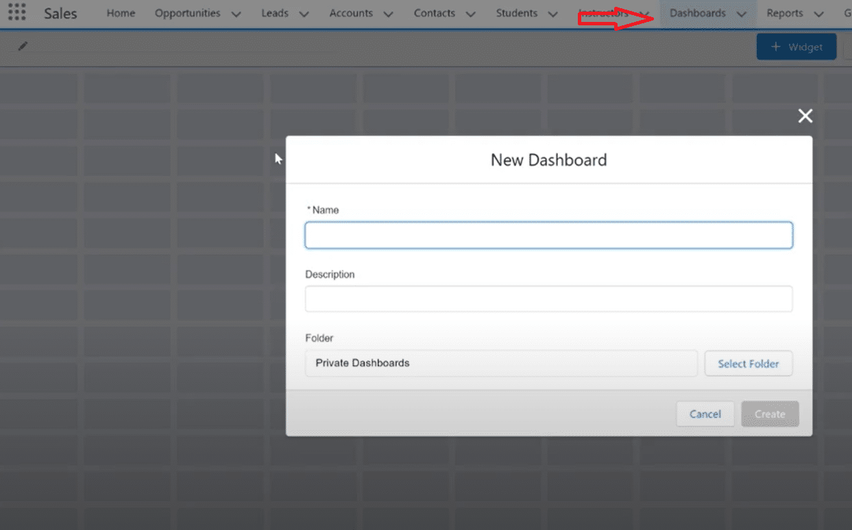
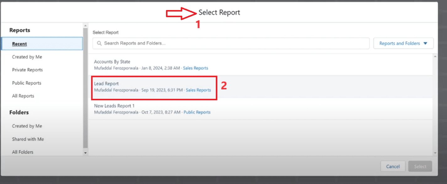
Step 2: Selecting the Right Dataset
- Within the Dashboard, click “New Dashboard” to create a new one.
- Select the appropriate report type from your Salesforce reporting tools. This could range from a simple record count to more complex CRM analytics.
Step 3: Creating a New Gauge Chart
- In the Dashboard Builder, click the “Add Component” button.
- Select “Gauge Chart” from the available chart types.
- Drag the gauge chart component to the desired location on your dashboard.
- This process might involve writing some SAQL or using Einstein Analytics for more advanced customizations.
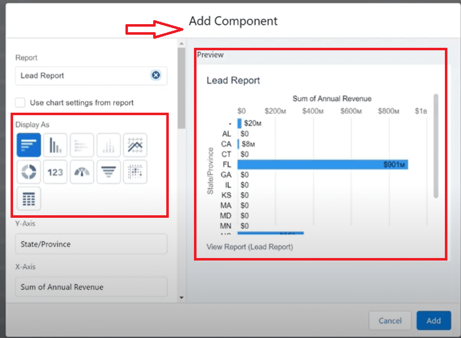
Step 4: Customizing the Chart (Colors, Scales, Thresholds)
- Select the relevant dataset or report from your Salesforce reporting tools as the data source for your gauge chart component. This is critical for ensuring that your chart accurately reflects the desired metric or KPI.
- Clearly specify the metric you aim to visualize with the Dynamic Gauge Chart. Whether it’s a sales target, customer satisfaction score, or any other vital field value, precision in metric selection is key.
- Establish threshold levels on your chart to indicate different performance zones. For example, configure colors such as green for success, yellow for caution, and red for critical. These color-coded zones assist Salesforce admins and reps in quickly assessing performance against targets.
- Adjust the scale of the gauge to match the range of your metric, ensuring it provides a clear and meaningful representation. This step is essential for making your Dynamic Gauge Chart an effective tool for percentages or quantitative assessment.
- Configure the colors of the gauge to align with your organization’s branding or preferred color scheme. This customization enhances the visual appeal and clarity of the chart, making it more engaging and consistent with your Salesforce Lightning dashboard.
Step 5: Saving and Integrating the Chart into the Dashboard
- Click on “Save” to ensure your configurations are saved.
- Click on “Done” to exit the Dashboard Builder.
- Test the chart in both standard mode and dynamic mode to ensure it functions as expected. Utilize dashboard filters for further customization.
For a detailed video walk-through, check out our YouTube Tutorial.
Best Practices for Designing and Utilizing Dynamic Gauge Charts in Salesforce Dashboards
- Define Clear Goals and Thresholds: Clearly define the goals or targets for the metrics you’re visualizing with Dynamic Gauge Charts. Establish well-defined thresholds to provide a clear indication of performance levels.
- Select Appropriate Chart Types: Evaluate whether a Dynamic Gauge Chart is the most suitable option for your specific metric. Consider alternative chart types for scenarios where trends or comparisons are more relevant.
- Prioritize Data Accuracy: Ensure the underlying data for your metrics is accurate and up-to-date. Dynamic Gauge Charts derive their effectiveness from real-time data, and inaccuracies can lead to misleading visualizations.
- Use Consistent Color Coding: Implement a consistent color-coding system to represent different performance levels within the gauge. This enhances visual clarity and allows users to quickly interpret the status of the metric.
- Optimize Gauge Size and Placement: Strategically place the Dynamic Gauge Chart within your dashboard for maximum impact. Adjust the size to ensure it is easily visible and complements the overall dashboard layout.
- Goal-Oriented Design: Focus on the key metrics that matter most. Dynamic Gauge Charts should be designed with specific KPIs in mind.
- Consistent Color Coding: Use a consistent color scheme to represent different performance levels. This is particularly helpful for quick assessments by subscribers and stakeholders.
- Optimal Placement: In a Salesforce dashboard, the placement of your gauge chart component can impact its effectiveness. Place it strategically for maximum visibility.
Expanding Your Salesforce Capabilities
Beyond Dynamic Gauge Charts, Salesforce offers a myriad of tools and features to enhance your data visualization and management. Einstein Analytics and Apex provide advanced capabilities for those looking to delve deeper into custom analytics. CRM analytics and automation tools open up new possibilities for data interpretation and workflow efficiency.
For those who prefer external tools, Salesforce integrates seamlessly with Tableau and Excel, allowing for more comprehensive data analysis. Custom reports and SAQL queries can further refine your data insights, while Lightning dashboards offer a modern, intuitive interface for all your CRM needs.
Tutorial Resources and Record Pages
To assist with the creation and optimization of your Dynamic Gauge Charts, Salesforce offers a range of tutorial resources. These can be particularly helpful for new Salesforce admins or reps. Additionally, customizing record pages in Salesforce Lightning can enhance user experience and data accessibility.
Conclusion
In conclusion, the implementation of Dynamic Gauge Charts within Salesforce dashboards offers a compelling approach to monitoring key metrics. These charts provide real-time insights, allowing users to gauge performance against goals and thresholds effectively.
For a seamless and advanced Salesforce experience, consider incorporating Coefficient into your toolkit. Whether you’re a seasoned Salesforce admin or new to the platform, the journey toward more dynamic, insightful dashboards is just a few clicks away.


