

Log into Salesforce and navigate to the “Dashboards” tab to access Dashboard Builder
Choose an existing dashboard from the list or click “New Dashboard” to create one
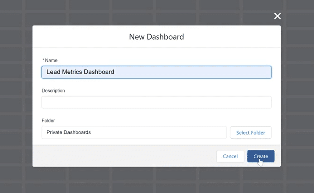
Enter a dashboard name and select a folder, then proceed to the builder interface
Enter a dashboard name and select a folder, then proceed to the builder interface
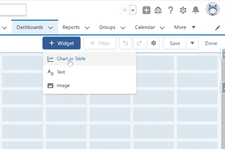
Click the “Widget” button and select “Chart or Table” to add a new component
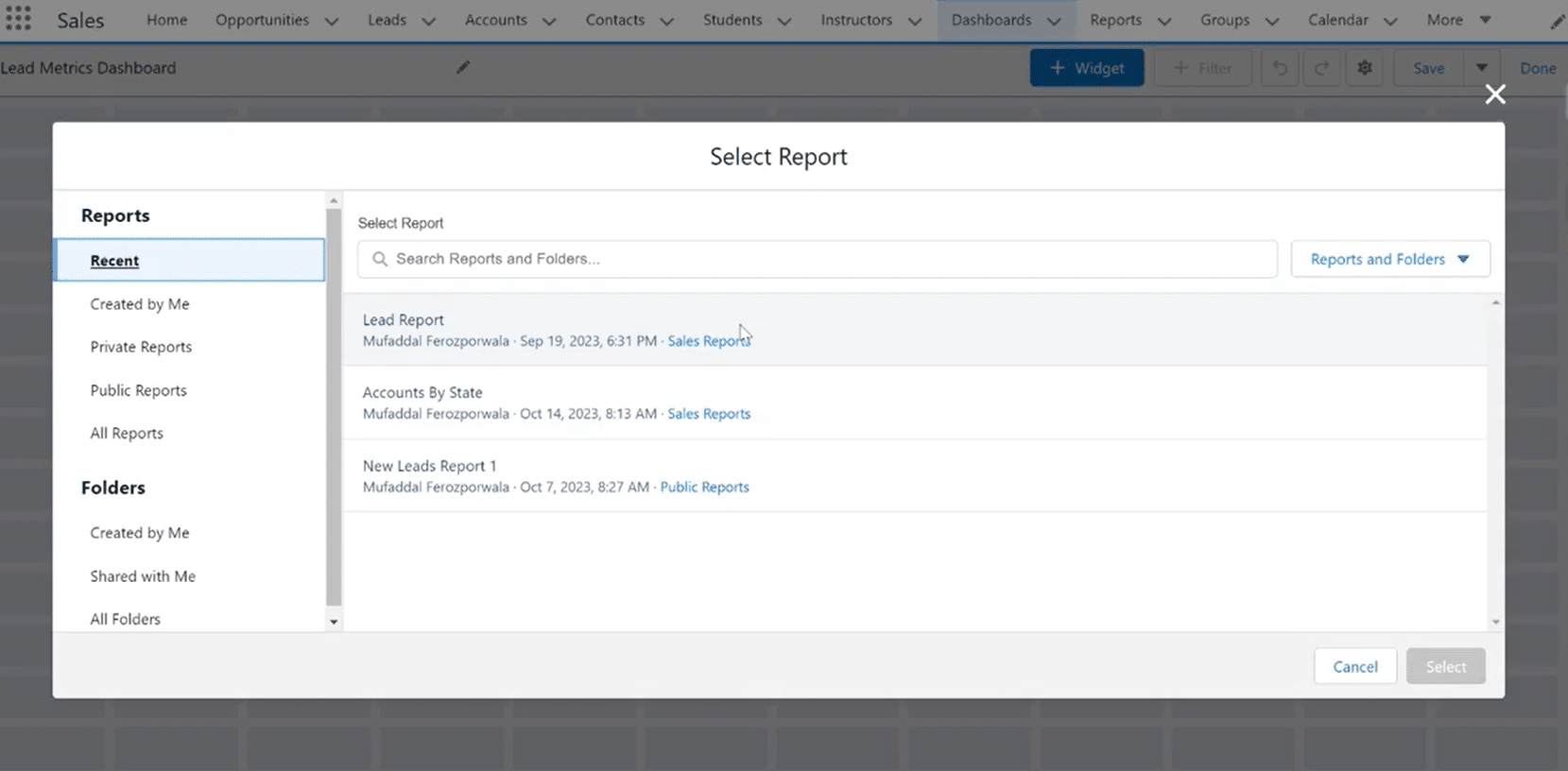
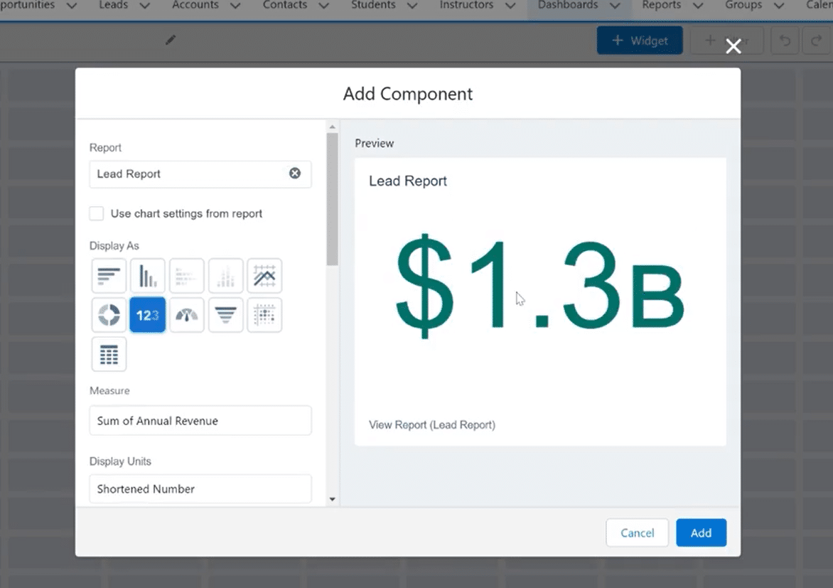
Choose an existing report from the pop-up window to base your dashboard component on
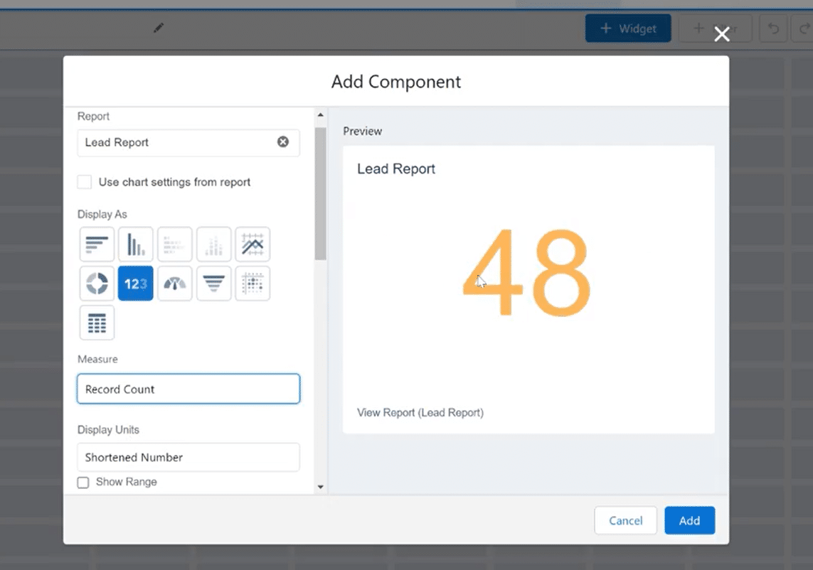
Look for “Metrics Chart” with the 123 icon under Display As options to create a total
Select your desired measure below Display As options (revenue, leads, record count, etc.)
Customize color codes and ranges for indicators if needed, then click “Add”
Save and preview your dashboard to ensure grand totals display correctly with aggregated values
Dashboards are essential for visualizing data and understanding overall performance metrics. In Salesforce, displaying grand totals in dashboards is particularly valuable for making data-driven decisions.
This article will guide you on how to display grand totals in Salesforce. We’ll explore their importance in data analysis and reporting and provide expert tips to enhance your dashboard’s effectiveness, including how Coefficient can complement your Salesforce experience by streamlining data integration and visualization.
Let’s get started!
Understanding Salesforce Dashboard Components
Salesforce dashboards are dynamic visual representations of data that enable users to track, analyze, and share key performance indicators and metrics in real time.
Within the context of dashboards, grand totals become pivotal for aggregated data insights. They act as aggregators, summarizing the values across multiple data points and offering a high-level perspective. Here, Coefficient can play a critical role by providing real-time data synchronization from various sources when you need, ensuring that your grand totals are always up-to-date and accurate.
Whether tracking sales figures, leads, or any other key metric, grand totals in dashboards streamline the interpretation of complex data sets. With Coefficient’s seamless integration between Salesforce and your spreadsheet for technical and non-technical users alike, you can easily import and refresh data from multiple systems directly into your Salesforce dashboards.
Step-by-Step Guide to Displaying Grand Totals in Salesforce
Follow this step-by-step guide to seamlessly integrate grand totals into your Salesforce dashboards for a comprehensive view of key metrics, and see how Coefficient can further simplify and enhance this process.
Step 1: Navigate to the Dashboard Builder
Start by logging into your Salesforce account and navigating to the “Dashboards” tab to access the Dashboard Builder.
Step 2: Choose or Create a Dashboard
If you’re editing an existing dashboard, select it from the list.
To create a new dashboard, click the “New Dashboard” button.
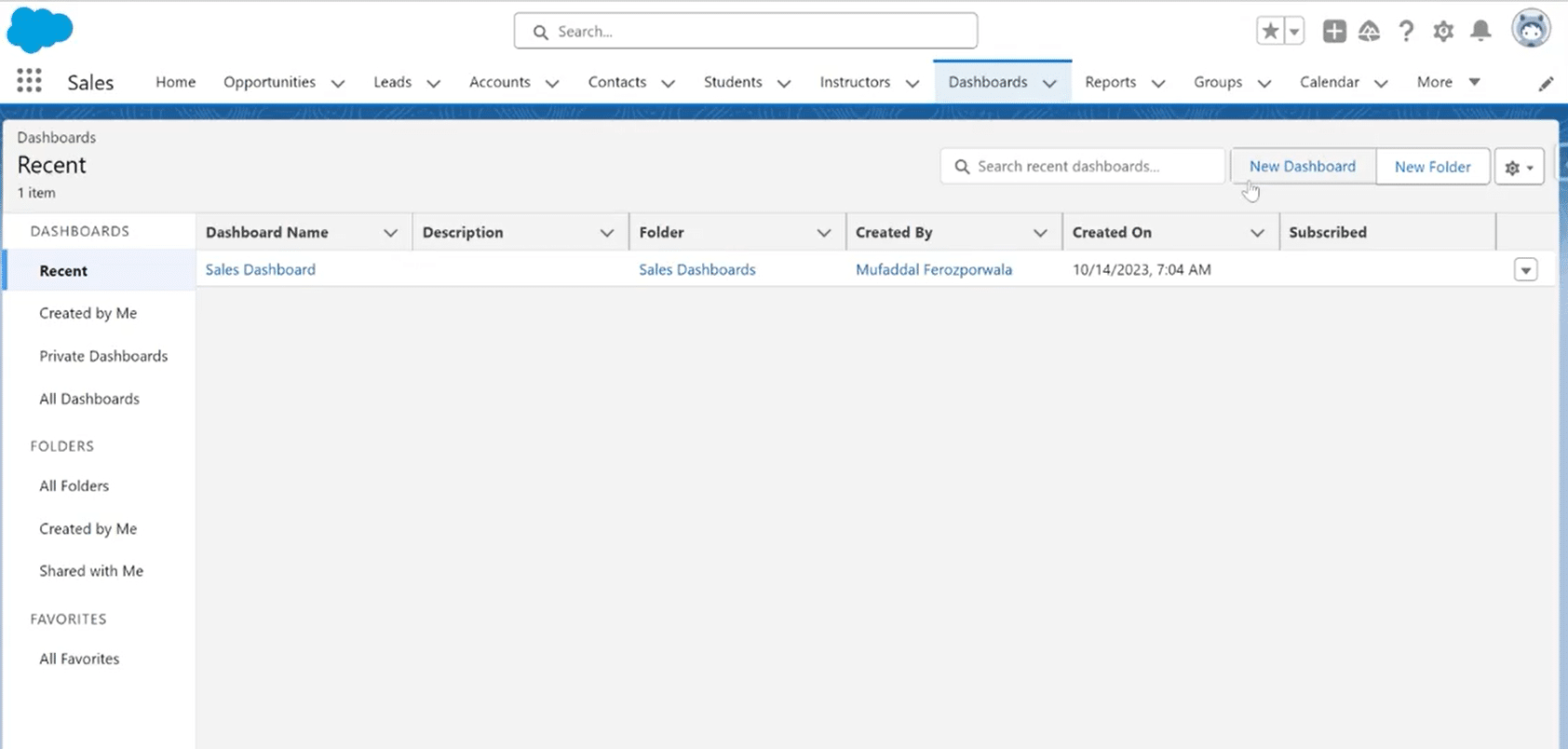
Enter a name and choose a folder for your dashboard.
Step 3: Add a Widget
In the Dashboard Builder, click on the “Widget” button and choose the type of component you want to add to your dashboard. In this case, click on ‘Chart or Table.’
Here, you might consider how Coefficient’s one-click data connectors could enrich your dashboard by bringing in comprehensive and up-to-date data from a variety of sources, not just within Salesforce but from your entire software stack.
In the next step, a pop-up window will appear to choose a report to base your dashboard on. Select from your existing report from which you want to showcase the total.
Step 4: Configure the Component
Once you’ve added a report, it’s time to add a component and configure its settings by selecting the chart type, filters, and grouping criteria.
Look for the ‘Metrics Chart’ with a 123 icon under the Display As options. This will immediately turn your component into a total.
Leverage Coefficient to ensure your data sources are well-integrated and your grand totals reflect real-time data. This is especially useful when dealing with dynamic metrics that require frequent updates.
Step 5: Select a Measure
Right below the Display As options is the Measure option.
Depending on the total you’re looking for, you can adjust the categories to make a total of any value from the report. For example, revenue, number of leads, record count, etc.
Note that you can only choose a measure that’s in numerical format or currency.
Here, you can take advantage of Coefficient’s Salesforce spreadsheet integration for advanced analytics features that can offer deeper insights by applying sophisticated calculations and aggregations beyond Salesforce’s native capabilities, bringing more nuanced understanding to your grand totals. You can manipulate the data and push it back to Salesforce without ever leaving your spreadsheet.

Explore 8 cutting-edge techniques that are revolutionizing how Salesforce admins manage their daily tasks. Contribute more significantly to business outcomes and become a key driver of efficiency and innovation.
See the Techniques
The total can change color codes based on a given range to show indicators. You can select this range during the creation process or edit it afterward.

After you’re done customizing your report’s total, click “Add,” and your dashboard will showcase a total that will be added to your Salesforce dashboard.
Step 6: Save and Preview
Save and preview your dashboard to ensure that grand totals accurately reflect the aggregated values. Adjust settings as needed to fine-tune the display of grand totals or the dashboard’s appearance.
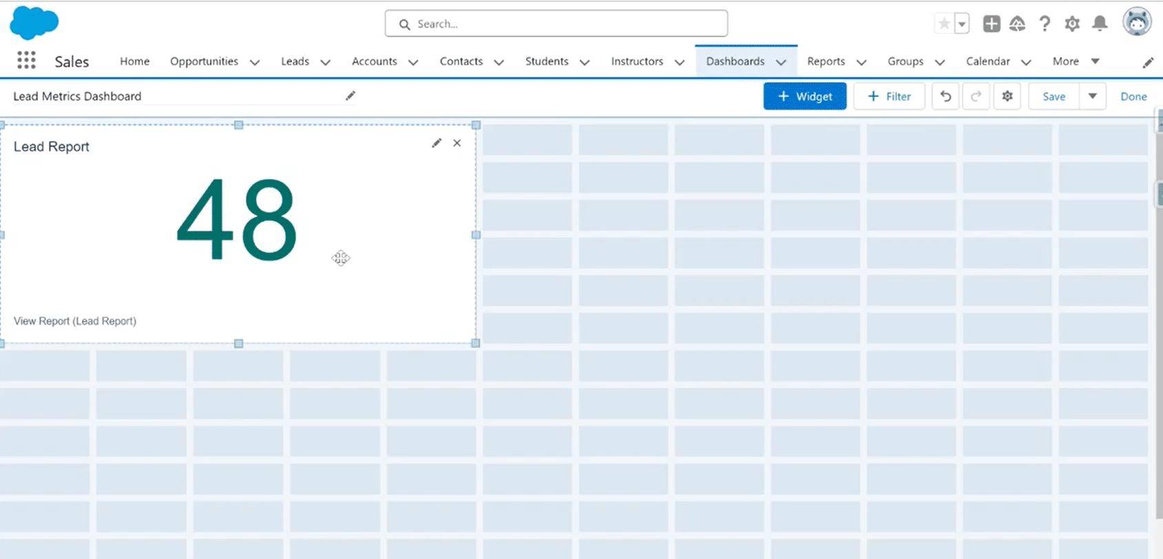
That’s all! Now you can see the total of the chosen values of your Object.
5 Tips on Customizing the Display of Grand Totals and Salesforce Reporting Techniques
Customizing the display of grand totals in Salesforce dashboards goes beyond basic configuration. These tips delve into advanced techniques to tailor the presentation of aggregated data and leverage Salesforce reporting effectively.
Aggregate Based on Business Logic
Evaluate your business requirements and customize grand totals to align with the specific metrics and calculations that matter most to your organization. Use formulas and custom logic to ensure aggregated data reflects your unique business context. Consider taking advantage of Coefficient’s flexibility to integrate data from varied sources, ensuring a holistic view that reflects your unique business context.
Segment Data for Comparative Analysis
Customize dashboards to segment data, allowing for a comparative analysis of grand totals across different categories or segments. This technique is particularly valuable for organizations with diverse teams or operations in multiple regions.
Cross-Object Reporting
Create reports that pull data from various Salesforce objects, allowing for a holistic view of related metrics. For example, combine opportunities, accounts, and contacts to analyze the sales pipeline in one report. With Coefficient, this process is simplified, allowing you to easily combine and analyze live direct directly within your spreadsheet – from not only multiple reports or objects within Salesforce, but also data fed from any other business system you use.
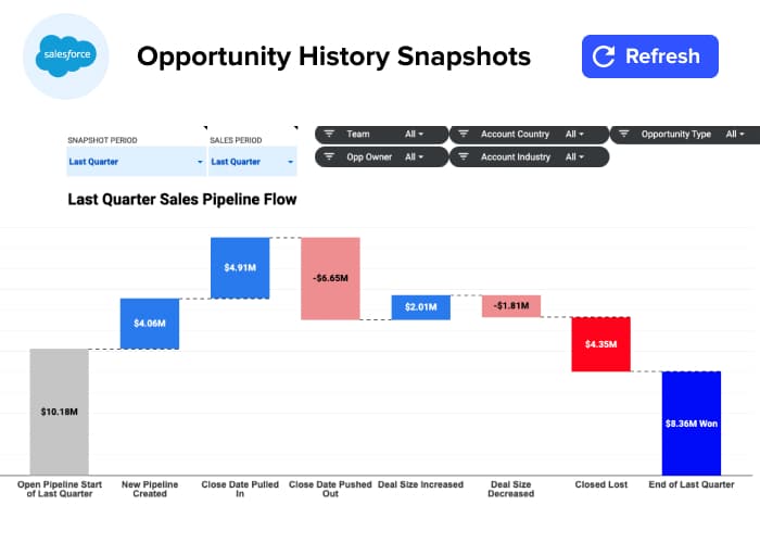
Trend Analysis with Historical Snapshots
Set up historical snapshots in Salesforce to track changes in data over time. This is particularly useful for monitoring trends in metrics such as sales performance, lead conversions, or customer satisfaction. Coefficient can enhance this by offering more comprehensive snapshots and trend analyses across all your data sources, not just Salesforce.
You can grab this free Salesforce Opportunity History dashboard to quickly see Coefficient in action.
Dashboard Filters for Interactive Exploration
Add filters to your dashboards that users can adjust based on their specific criteria. For example, let users filter by region, product category, or date range to customize their view and gain more targeted insights.
Coefficient’s intuitive interface and advanced filtering capabilities allow users to dive deeper into their data, making dashboards even more interactive and user-friendly. Here’s a quick walkthrough.
Final Word
For businesses that use Salesforce, where decisions hinge on data, the ability to effectively showcase grand totals is a strategic advantage. It’s about transforming complexity into clarity, empowering users to glean actionable insights and make informed decisions.
Incorporating Coefficient into your Salesforce dashboards takes this capability to the next level, offering enhanced data analysis, visualization, and management.
Get Started for Free with Coefficient and take the first step to build more insightful Salesforce dashboards!


