
Navigating the dense forest of data in Salesforce can be daunting, especially when you’re looking to pinpoint information within a specific timeframe.
Whether you’re analyzing performance, tracking project timelines, or assessing sales trends, adjusting the date range on your Salesforce charts is a critical skill that can redefine your data analysis efforts. Today, we’re breaking down this process into simple steps to help you seamlessly filter records by dates in your Salesforce reports.
Why Adjust Date Ranges?
Adjusting date ranges allows for a more focused analysis, enabling you to drill down into pertinent data for a specified period.
It’s a crucial practice when working with imported reports from other organizations or when you need to present your analysis based on custom timeframes. Filtering by specific dates helps in eliminating irrelevant data, making your reports more meaningful and easier to digest.
Step-by-step guide: How to Adjust Dates on Salesforce Charts
First and foremost, access your Salesforce dashboard. From here, navigate to the ‘Reports’ section where all your analytical adventures begin.
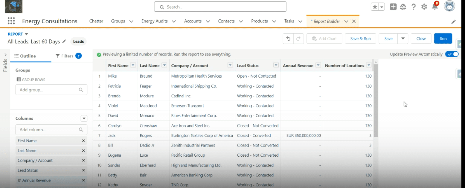
Step 1: Identifying a Report
Select the report you wish to refine. If it’s a report imported from another organization, ensure it’s correctly integrated into your workspace.
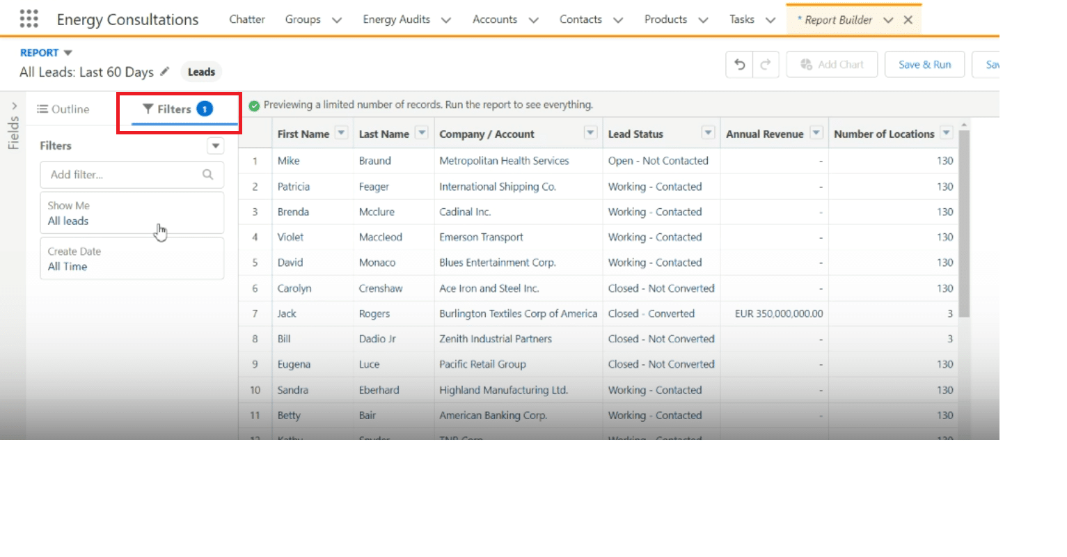
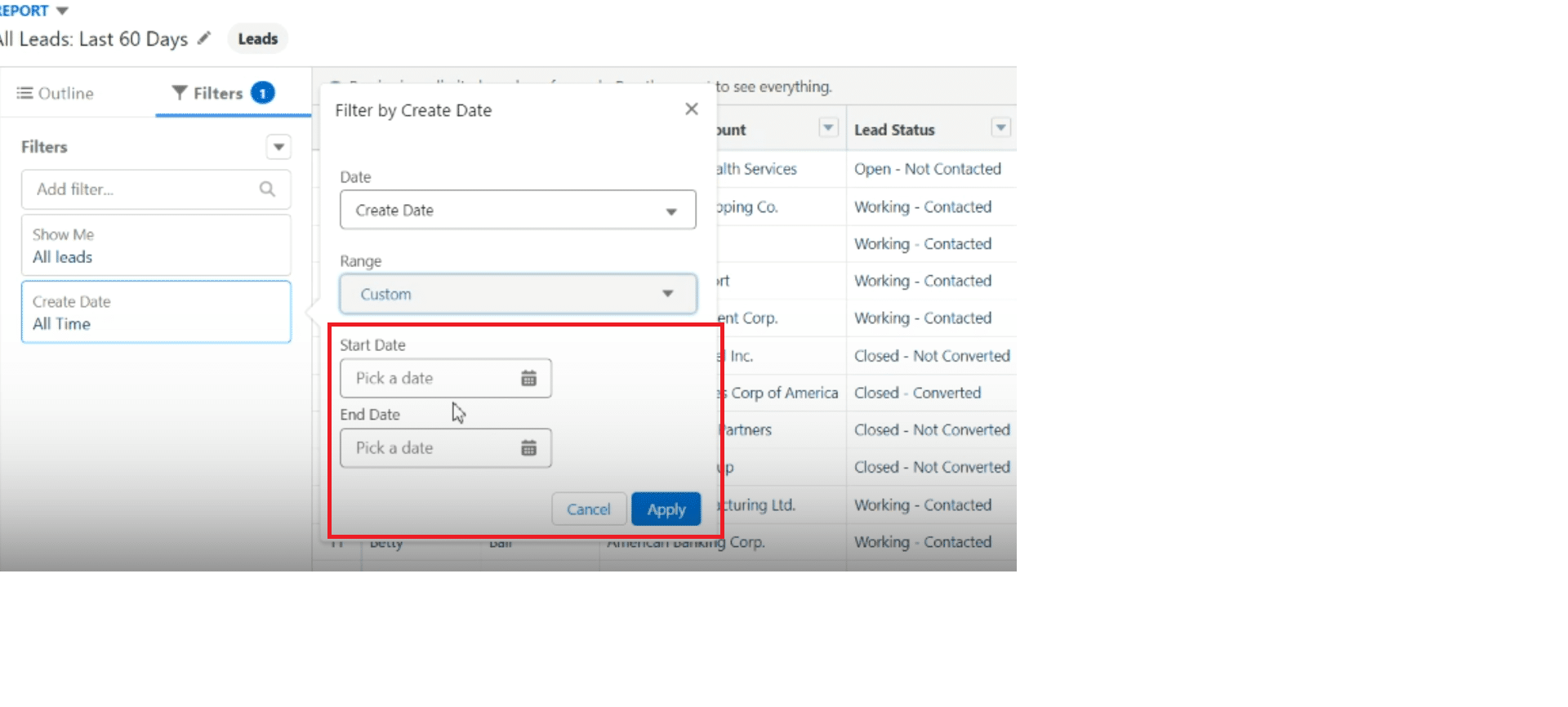
Step 2: Accessing Filters (0:28)
Locate the ‘Filters’ section within your report. Initially, you might find the ‘Created Date’ filter set to ‘All Time’. Click on this to start customizing.
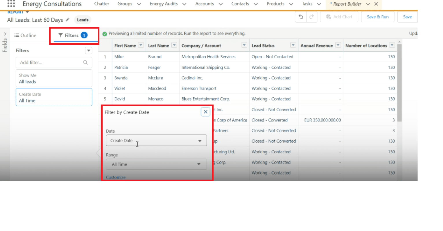
Step 3: Setting a Custom Range
To tailor the date range, select the ‘Custom’ option. Here, you’ll find fields for both ‘Start’ and ‘End’ dates, allowing you to define your specific range, like the ‘Last 30 Days’.
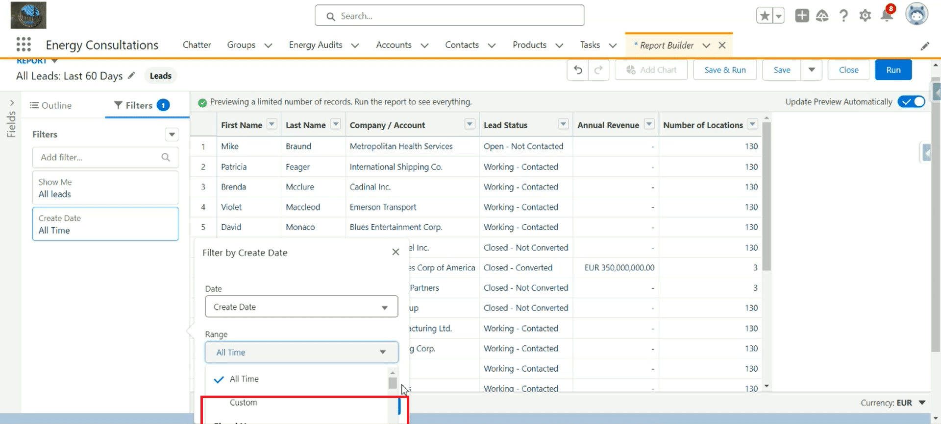
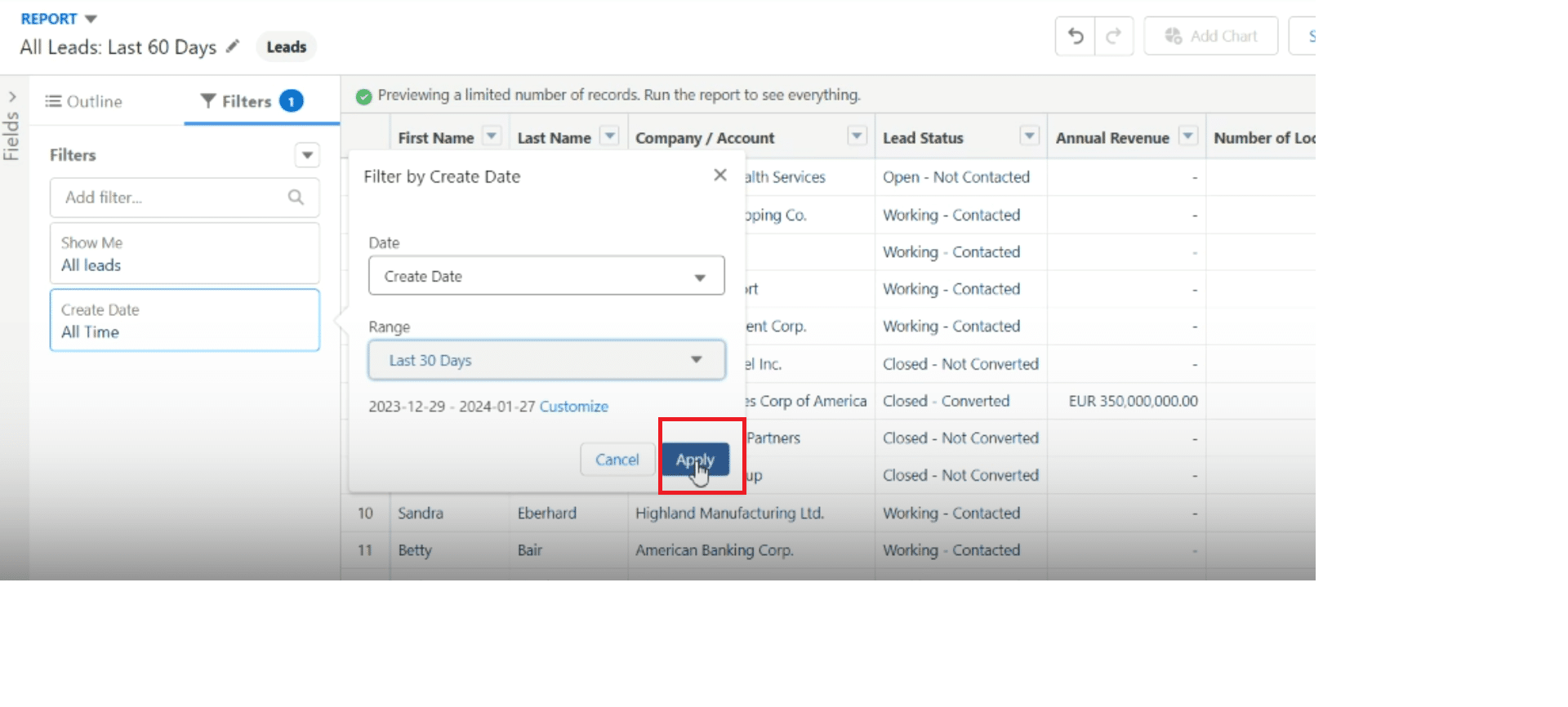
Step 4: Exploring Predefined Options
Salesforce provides a variety of predefined time frames—’This Month,’ ‘Last Month,’ ‘This Week,’ etc.—for quick adjustments. Choose one that suits your analysis needs.
Step 5: Applying the Filter and Viewing Results
After selecting your date range, hit ‘Apply’. If the filter is set correctly, your report will update to reflect records within the chosen timeframe.
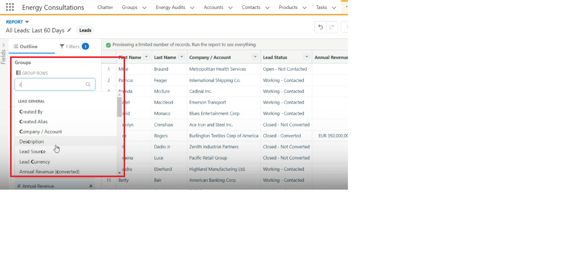
Pro-tip: Grouping by Dates
Explore 8 cutting-edge techniques that are revolutionizing how Salesforce admins manage their daily tasks. Contribute more significantly to business outcomes and become a key driver of efficiency and innovation.
See the Techniques
Enhance your report’s clarity by grouping records based on their creation date. This step helps to visually segment the data for better analysis.
Tips for Advanced Filtering
After setting your date ranges, it’s time to delve deeper into Salesforce’s filtering capabilities to enhance your report’s precision further. Navigating through advanced filtering options allows you to refine your data analysis, offering insights tailored to your specific requirements. Here are some advanced tips to consider:
Explore Field-Specific Filters: Beyond date ranges, Salesforce allows the utilization of filters based on specific fields such as ‘Last Modified,’ ‘Last Activity,’ and more. This enables a multifaceted analysis, providing insights from different angles based on your data’s attributes.
Combine Filters for Complex Queries: Leverage Salesforce’s ability to combine multiple filters to create complex queries. This can be particularly useful when looking to isolate a subset of data for highly targeted analysis, such as all contacts that have been modified in the last 30 days but were created more than a year ago.
Using Logic in Filters: Implement logical operators (AND, OR, NOT) to refine your filters. This advanced technique allows you to include or exclude records based on multiple conditions, offering a high degree of customization in your report.
Conclusion
Mastering date adjustments on Salesforce charts illuminates the path to insightful analytics and informed decision-making. We encourage you to integrate these steps into your workflow for sharper, more meaningful data analysis.
Elevate your Salesforce experience further by exploring Coefficient’s integration solutions. Start now and tap into a world of streamlined data management and analysis.
Ensure your charts reflect the exact timeframe you require, transforming raw data into actionable insights. With these tips, become the Salesforce wizard your team respects and relies upon. Dive into the data, adjust those date ranges, and watch your analytics come alive!


