As organizations navigate the intricacies of decision-making in a data-driven landscape, mastering matrix reports in Salesforce cannot be overstated.
These reports, organized in a matrix or grid format, provide a unique perspective that can be instrumental in unraveling patterns, trends, and relationships within your Salesforce data. By presenting data in a grid structure with both rows and columns, these reports allow for multi-dimensional analysis, unveiling insights that may remain hidden in other reporting formats.
So, in this comprehensive guide, we’ll learn how to create matrix reports in Salesforce. From accessing the Report Builder to customizing and saving your reports, we’ll discuss best practices to ensure your Matrix Reports foster clarity and actionable insights.
Let’s transform your Salesforce data into a visual story that fuels confident decision-making!
What is a Matrix Report Salesforce?
A matrix report in Salesforce is a dynamic reporting format that presents data in a grid, allowing users to analyze and compare information across two different dimensions.
Unlike traditional reports that display data in a tabular format, Matrix Reports leverage rows and columns to organize and summarize data, providing a more comprehensive perspective. This format is handy when dealing with data with multiple categorical variables or viewing summarized data in a cross-tabulated format.
To better understand its use, here are some benefits and applications of using matrix reports:
- Multi-Dimensional Analysis
Matrix reports excel in scenarios where data analysis involves multiple dimensions. Whether examining sales performance across product categories or evaluating marketing campaign success by region, the matrix structure allows for a nuanced analysis.
- Comparative Insights
Matrix Reports facilitate easy comparison of values by organizing data in rows and columns. This is particularly useful when comparing performance metrics across different segments or periods.
- Summarized Data View
Aggregating values within the matrix cells provide a summarized data view. This is advantageous for users who seek a deeper understanding of trends and patterns without delving into smaller details.
- Efficient Decision-Making
The visual and summarized nature of Matrix Reports enhances decision-making efficiency. Business users can quickly interpret data trends, enabling faster and more informed decision-making processes.
Step-by-Step Guide: Creating a Matrix Report Salesforce
Now that you understand Salesforce matrix reports and their uses we’ll dive into the 5 steps on how to create a matrix report in Salesforce.
If video is your preference, here’s a quick video walkthrough of the process.
There are a few Salesforce report limitations you should be aware of:
- Salesforce report limits data to 2,000 rows in view
- No custom reporting is available in some editions
- There may be constraints caused by limited admin access
- There are fewer customization options available within Salesforce
- Salesforce report builders and views commonly experience slow performance and glitches, especially with large datasets
As a solution, many export their data into spreadsheets to get around these limitations. You may have even done so yourself in the past. However, manual data pulls are also exhausting and drain time. Tools like Coefficient offer pre-built spreadsheet connectors for Salesforce and over 35 other commonly used business systems.
With Coefficient:
- You’ll never leave your spreadsheet to take advantage of your bi-directional Salesforce data sync
- You can schedule data refreshes on the cadence you need or update data in real-time with the click of a button
- You can take advantage of around-the-clock support
- You can preview your data before making your data import or export
- You’ll have the flexibility to build whatever you need in your spreadsheet
- You can blend data from over 35 other pre-built connectors for core business systems
Now, let’s dive in through the written process of building your matrix report in Salesforce.
Step 1: Accessing Report Builder in Salesforce
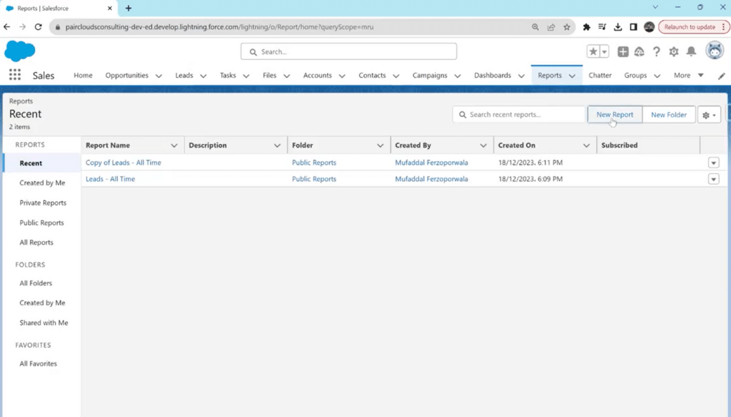
Access your Salesforce account with valid credentials. In the top navigation bar, locate the “Reports” tab and click to access the Reports section.
Click the “New Report” button to initiate the report creation process.
Users, depending on their permissions, might encounter challenges with data accessibility, especially if they need to blend Salesforce data with data from other sources. Coefficient can streamline the process by enabling seamless integration of Salesforce data with data from other business systems, all within Excel or Google Sheets.
Step 2: Selecting the Report Type
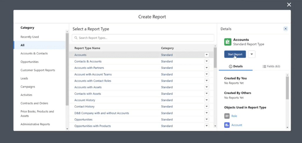
Select the appropriate report type in the new pop-up window based on the data you want to analyze. These types are based on objects that have multiple grouping dimensions.
In the example below, the selected report type is “Accounts.”
You can choose any other type from the standard or custom options and proceed by clicking on “Start Report.”
Step 3: Review Columns and Group Data
From the left sidebar, review all the columns that are part of your report. You can remove any fields you don’t want to see in the matrix report or add any missing ones from the search bar.
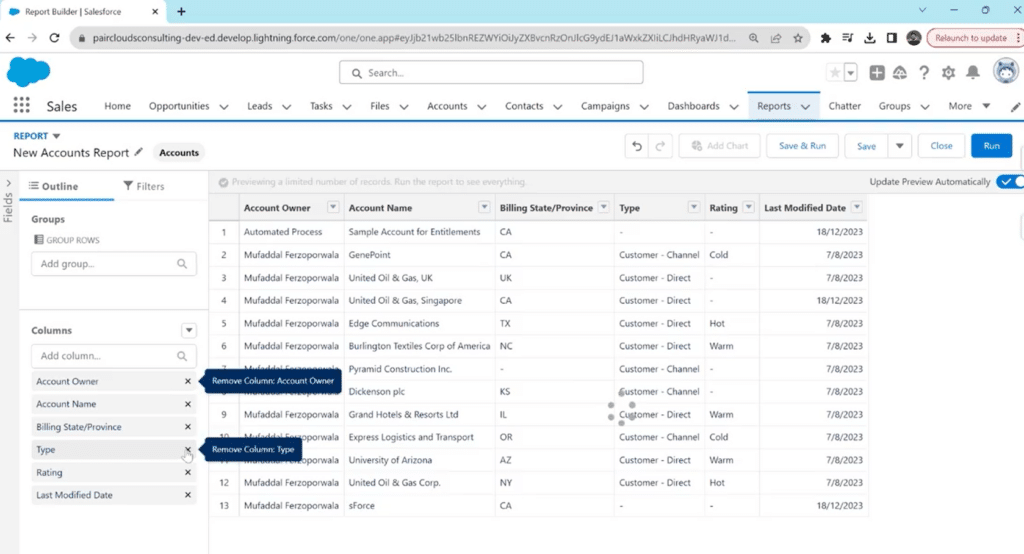
The most crucial part of this step is to Group your rows and columns based on a specific category. It is through grouping both that you can create a matrix report.
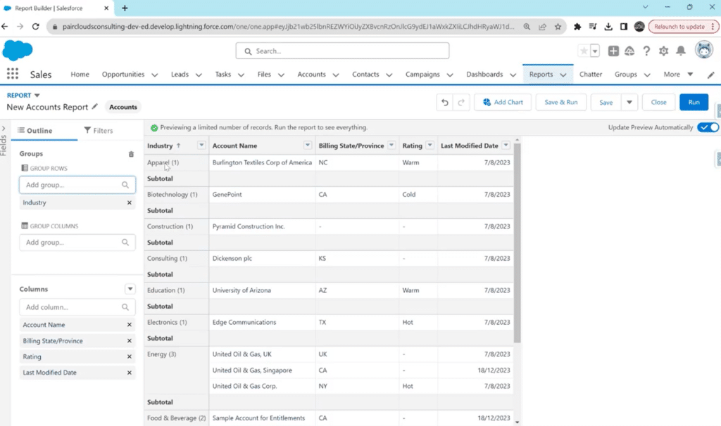
Click on the “Group Rows” search bar in the left sidebar and type your category e.g., Account owner, Account name, Created By, Modified By, etc.
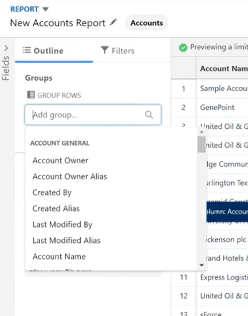
Your report will be grouped by the category selected. Below is an example of rows being grouped by Industries.
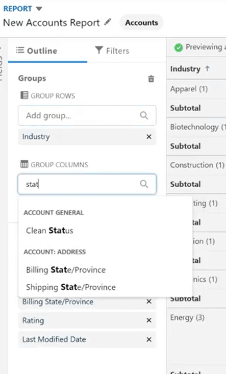
Repeat the same for the “Group Columns” section.
When reviewing columns and grouping data, users may face challenges in incorporating additional data fields or making adjustments to the grouping criteria.
Coefficient can simplify this process by offering intuitive data manipulation features that can be used on your live Salesforce data within Excel or Google Sheets, allowing users to easily modify columns, add new fields, or adjust grouping parameters without leaving their familiar spreadsheet environment.
Step 4: Run the Report
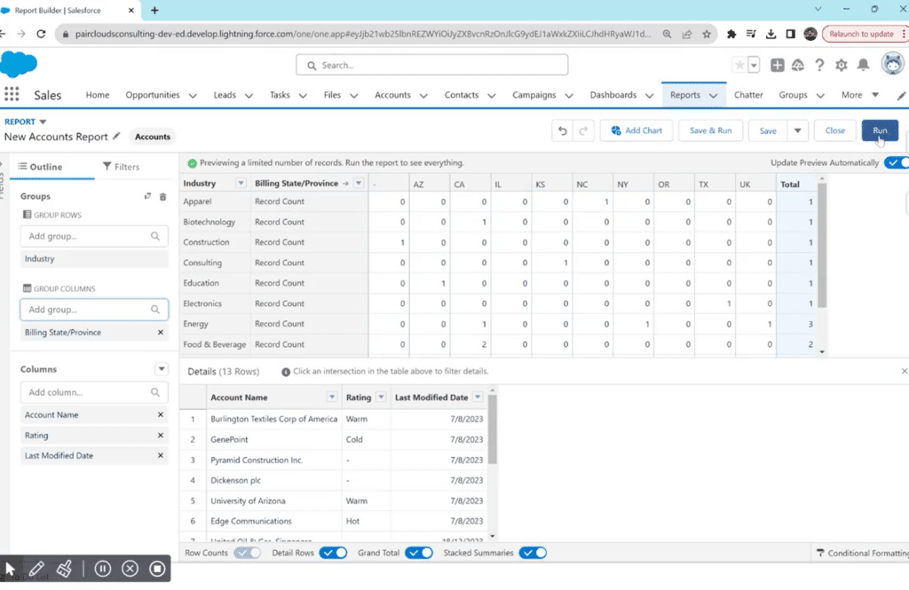
The result of adding both row and column groups is a matrix report.
Click on “Run” to see a more comprehensive view of your matrix report in Salesforce.
Step 5: Previewing and Saving the Report
You can also click the “Save and Run” option to save the matrix report immediately.
However, run and preview it first to ensure that the data is organized and summarized as desired. This step allows for any necessary adjustments.
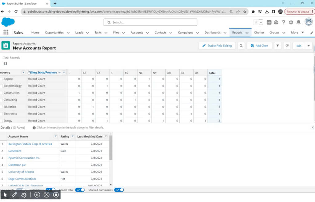
Click on the cells inside your matric report to see more details. For example, by clicking “2” in the Food & Beverage/ CA row, you can see which account names exactly fall in this range. You can also click on these names to see all records related to them and edit them.
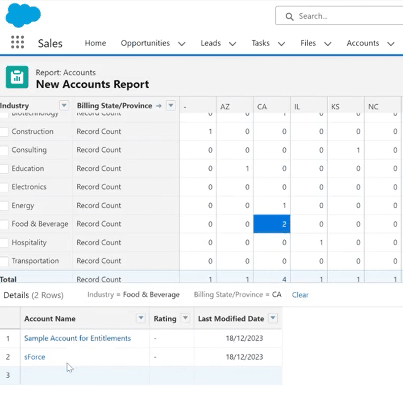
Once satisfied with the preview, save the matrix report by clicking the drop-down arrow icon next to “Edit.” From the drop-down menu, click “Save.”
Choose the folder where you want to store the report for easy access, and you’re done!
4 Best Practices for Matrix Reports in Salesforce
You must do more than drop fields into a grid to learn how to create a matrix report effectively in Salesforce. To maximize your reports’ utility and clarity, adhere to best practices that ensure a streamlined and insightful reporting experience.
Here are the best practices for crafting matrix reports Salesforce:
- Plan Your Matrix Structure
Before diving into the Report Builder, plan how you want to structure the rows and columns of your Matrix Report. Consider the specific dimensions and groupings that will provide the most valuable insights for your analysis.
- Limit the Number of Groupings
While the matrix format allows multiple groupings, avoid overcomplicating your report with excessive rows and columns. Too many groupings can lead to a cluttered and less comprehensible report.
- Use Filters Strategically
Apply filters judiciously to focus on relevant data. Filters help refine the information presented in the matrix, making it more actionable and aligned with your analysis goals.
- Utilize Conditional Formatting
Use conditional formatting options to highlight key data points within the matrix visually. Color-coded cells or charts can draw attention to critical information, enhancing the user’s ability to interpret the report quickly.
Integrating Matrix Reports with Coefficient
With data becoming the center of all progress and businesses, efficient data management is also crucial. The same applies to automating and streamlining creating reports on your Salesforce data.
Coefficient’s 2-way Salesforce spreadsheet connector, rated 5-stars on AppExchange, bridges Salesforce data and your spreadsheet environment, whether you use Google Sheets or Excel, offering a path to enhance data workflows, reporting, automation, and overall collaboration, regardless if your team members have Salesforce access or not.
With Coefficient, you can effortlessly connect to Salesforce, pull live data or pre-built reports into Google Sheets or Excel with a single click, and keep it on a refresh schedule to ensure real-time, up-to-date data powers your reports and dashboards. Plus, trigger Slack and email alerts to notify team members of any changes or important insights gleaned from your Salesforce data.
Final Word
Knowing how to create a matrix report in Salesforce is a valuable skill for you if you’re seeking to analyze data in a structured and visually intuitive format.
By following the step-by-step guide and incorporating best practices, users can harness the power of matrix reports to derive actionable insights from their Salesforce data.
To simplify your process and benefit from a competitive edge that will set your business’ data management apart from competitors, get started for free with Coefficient and revolutionize your Salesforce reports!


