


Free Google Sheets Dashboard Templates for Sales, Finance, Marketing and SaaS
A Google Sheets dashboard template gives your team a ready-made structure for tracking the metrics that matter, without the hours it takes to build charts, formulas, and layouts from scratch. Every Google Sheets dashboard template or google sheets report in this library is pre-built with the KPIs, chart types, and data layout relevant to its use case. Each one works immediately with your own data and can connect to live business systems for automatic refresh and data visualization.
This library covers templates across sales, finance, marketing, and SaaS organized by the workflows and data sources teams reach for most. Browse by function or filter the gallery above by connector or team. You can also choose to try our Microsoft Excel dashboards here and all our dashboard examples here.
Why teams use Google Sheets for dashboards
Google Sheets is the most widely used platform for business dashboards outside of dedicated BI tools. From project management dashboards to revenue dashboards there are several practical reasons that explain that preference.
- It is free and accessible without software installs. Anyone with a Google account can open, edit, and share a dashboard from any browser or device. That zero-friction access means dashboards actually get used rather than living on someone's local drive.
- It supports real-time collaboration. Multiple people can view and edit the same dashboard simultaneously. Comments, version history, and cell-level permissions make it easier to maintain a shared source of truth across teams without emailing file attachments.
- It is formula-native. Calculations that would require custom code in a standalone BI tool like weighted averages, period-over-period growth, conditional flags are built directly into Sheets using functions most business users already know. That makes dashboards easier to audit, modify, and hand off.
- It integrates with the tools teams already use. Google Sheets connects to Google Analytics, Google Ads, and the broader Google Workspace ecosystem natively. With tools like Coefficient, it connects to Salesforce, HubSpot, QuickBooks, NetSuite, Snowflake, and 150+ other business systems, making it a practical hub for cross-functional reporting.
What makes a good Google Sheets dashboard?
Most dashboards fail before anyone looks at the data. They are overcrowded, built for the wrong audience, or designed by the person who collected the data rather than the person who needs to act on it. The ones that actually get used every week share the same qualities.
- One audience. One decision. A dashboard is not a data dump. It is an answer to a specific question that a specific person needs answered on a specific cadence. A sales manager reviewing a pipeline on Monday morning needs something completely different from a CFO preparing for a board meeting on Thursday. If you are designing for both at once, you are designing for neither.
- Five to seven metrics, not fifteen. Every key metric added to a dashboard dilutes the ones already there. When everything is tracked, nothing is prioritised. Before adding any metric, ask: if this number changes tomorrow, what would someone do differently? If the answer is nothing, the metric has no business being on the dashboard.
- The most important number wins the top-left position. That is where a reader's eye lands first. Everything else follows from there. Supporting context below, trend data to the right, filters tucked to the side where they do not compete for attention with the numbers themselves.
- Chart & graph types chosen for comprehension, not aesthetics. Line charts for trends over time. Bar or column charts for comparing categories. A single large number in a formatted cell for KPIs that need no chart at all. Pie charts used sparingly and only when there are three or fewer segments. Mixing chart types without a deliberate logic makes a dashboard harder to read, not richer.
- Clean separation between data and display. Raw data in one tab. Calculations and pivot summaries in a second. The dashboard view in a third. Charts and KPI cards only, no visible formulas, no raw rows. This structure means updating the underlying numbers never requires touching the visual layer. It also means anyone on the team can audit a KPI back to its source without decoding nested formulas buried in chart data ranges.
- It survives a handoff. The real test of a well-built Google Sheets dashboard is whether someone who did not build it can update it six months later without breaking anything. Clear tab names, labelled columns, pivot tables built with clarity, documented assumptions, gantt charts and no hardcoded values embedded in chart series which are not optional extras. They are the difference between a dashboard that outlasts the person who built it and one that gets rebuilt from scratch every quarter.
Google Sheets dashboard templates by use case
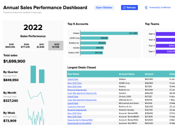
Sales and pipeline dashboard templates
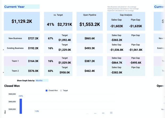
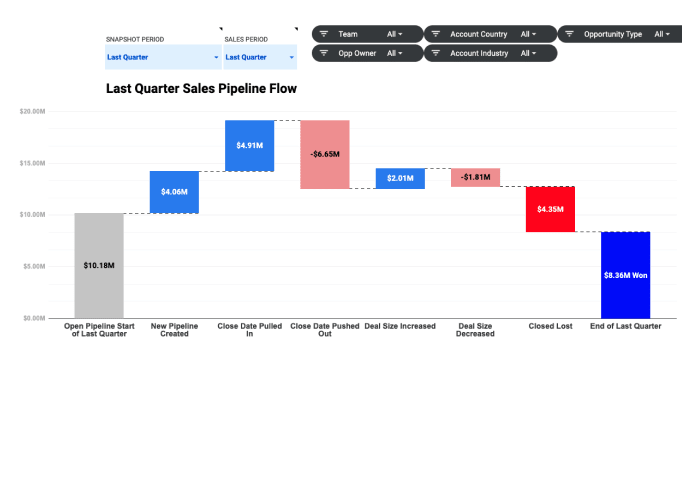
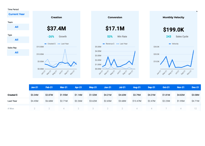
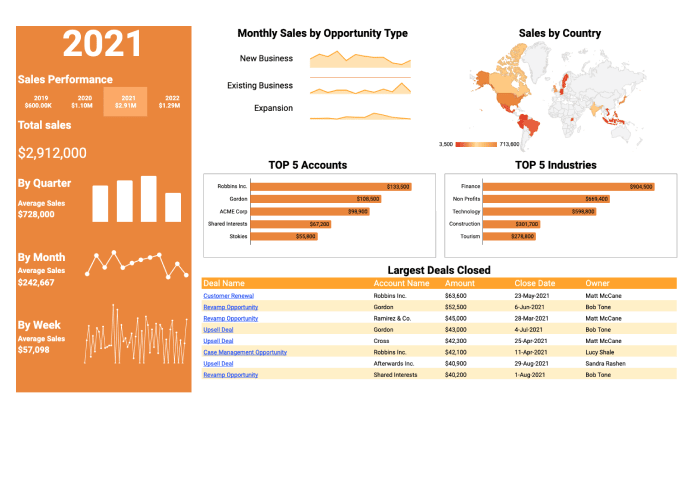
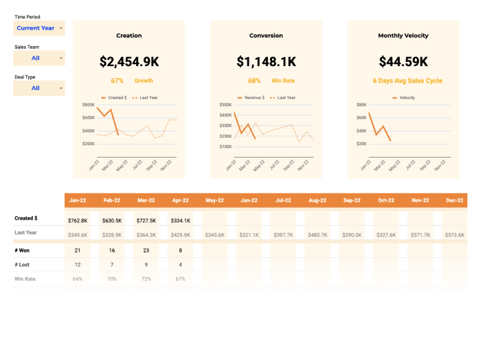
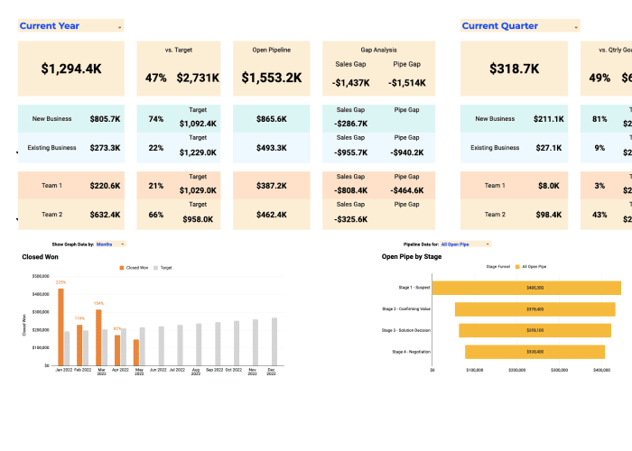
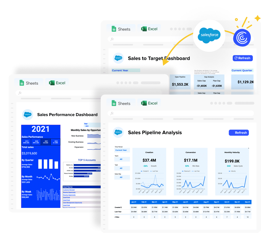
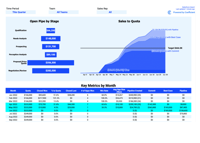
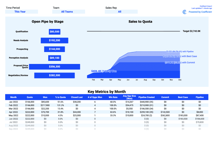
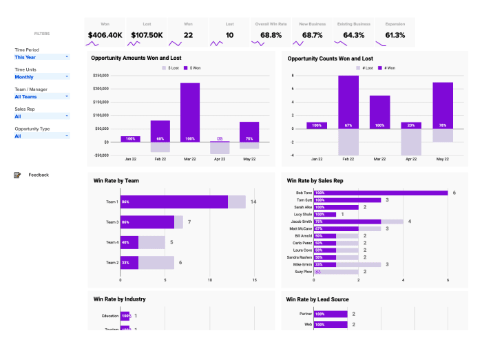
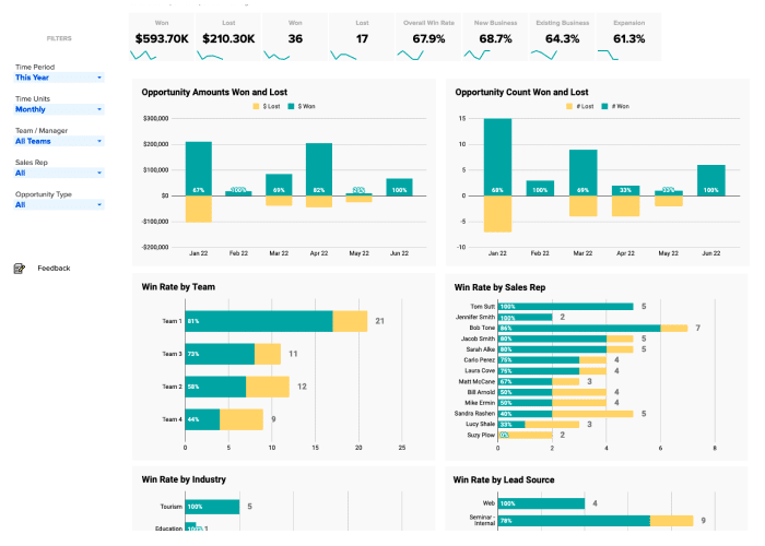
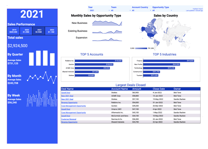
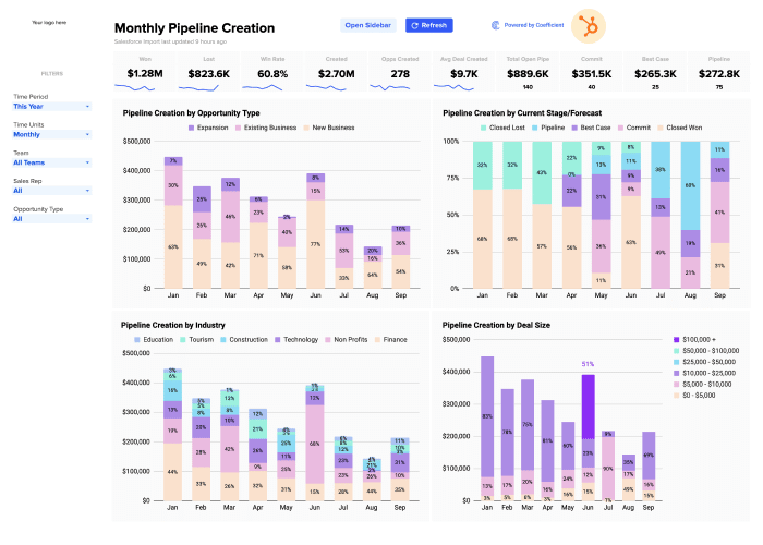
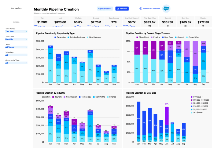
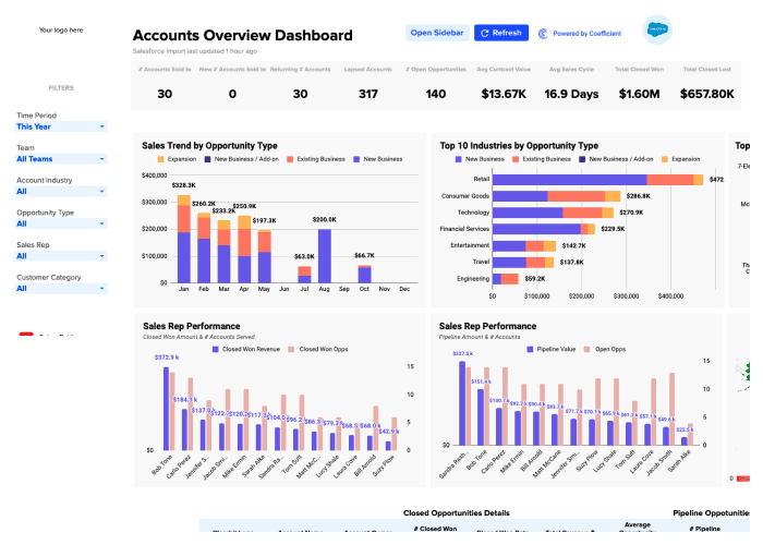
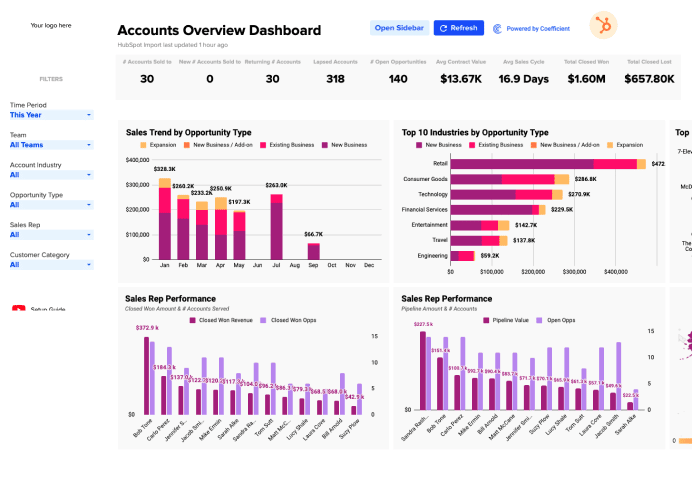
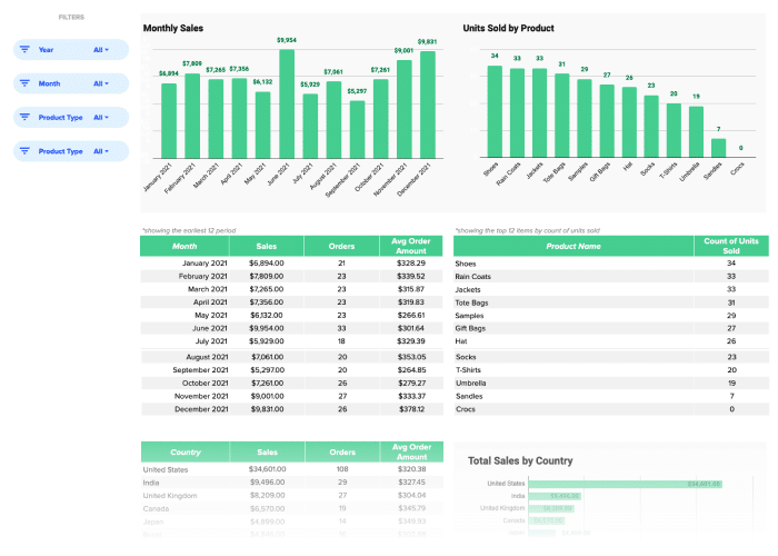
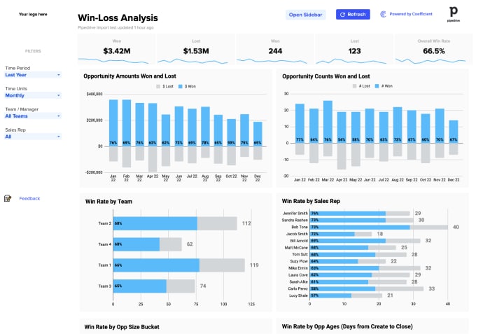
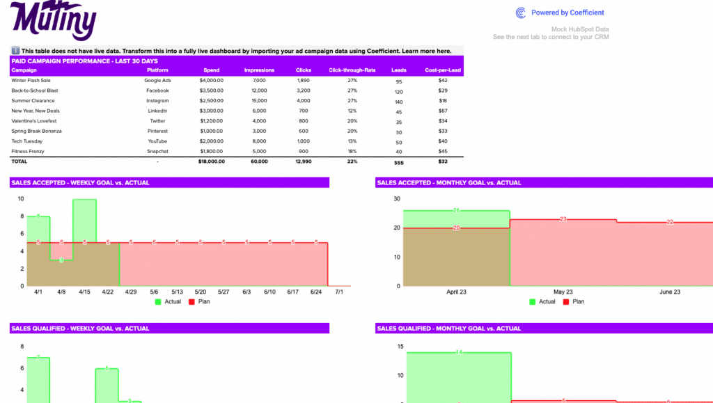
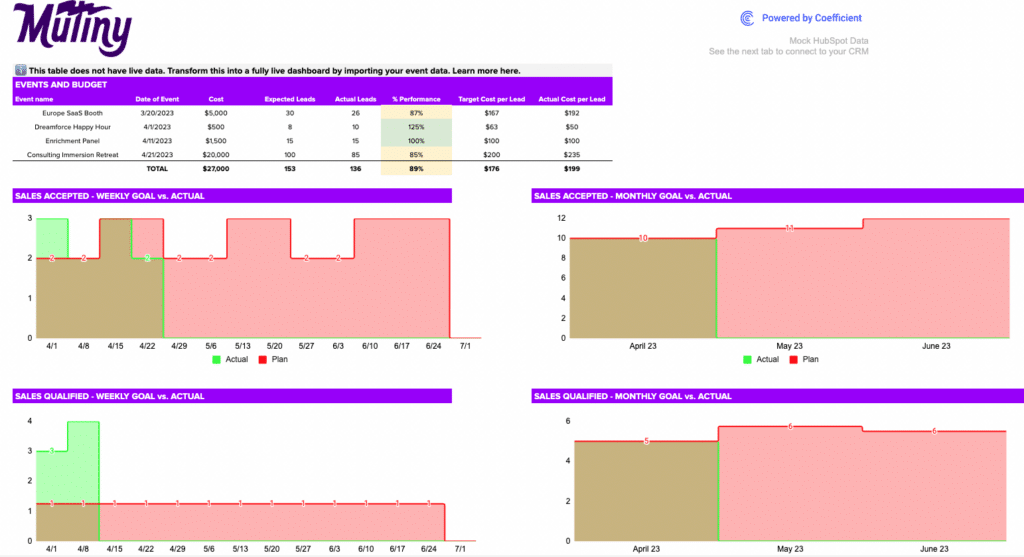
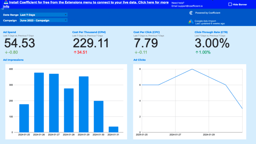
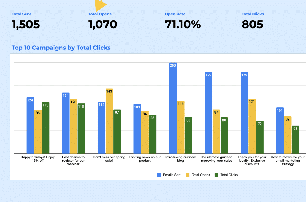
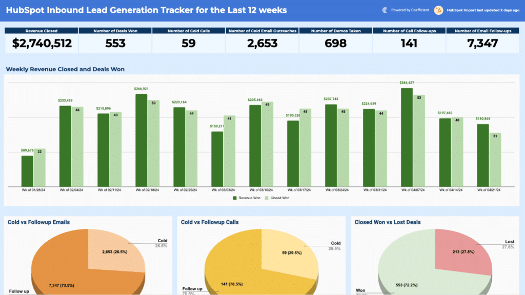
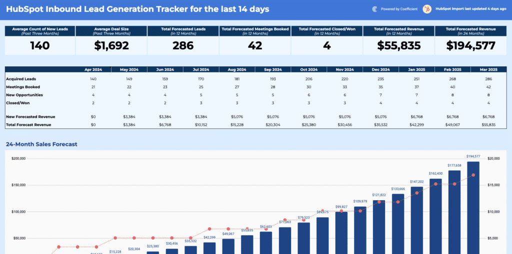
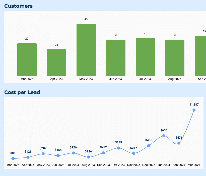
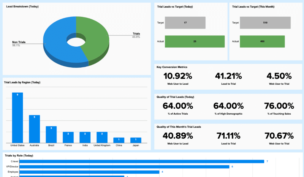
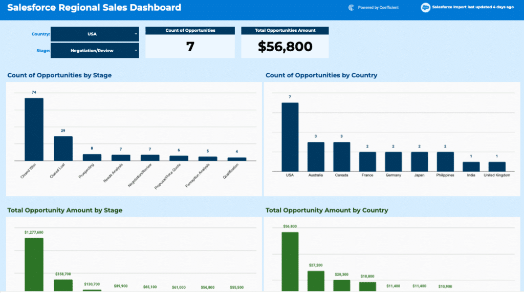
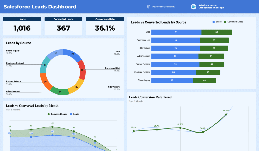
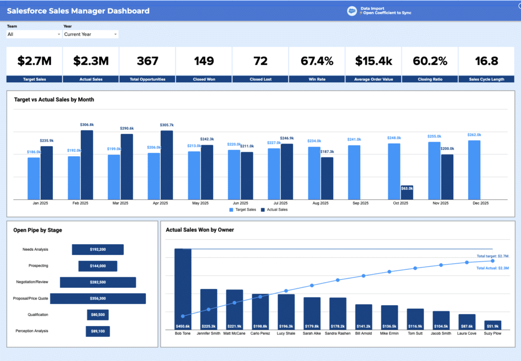
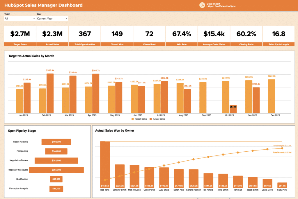
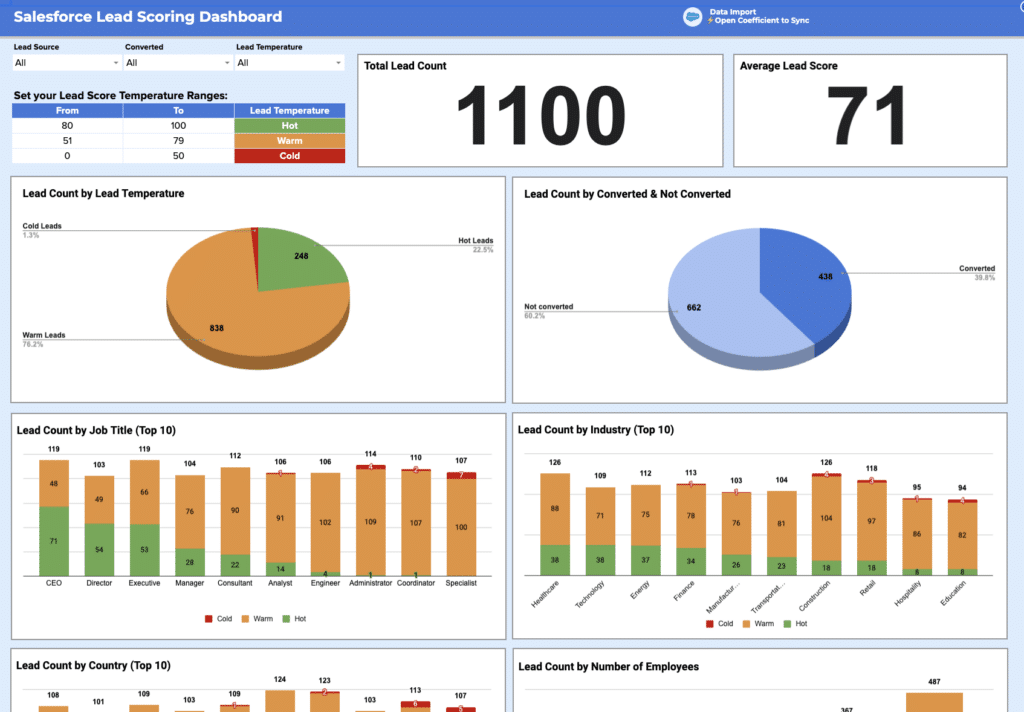
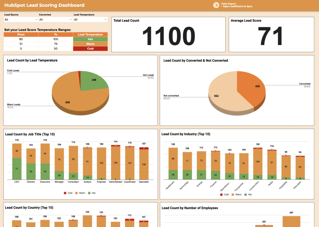
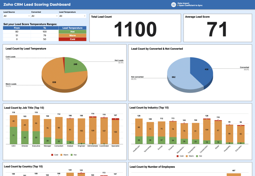
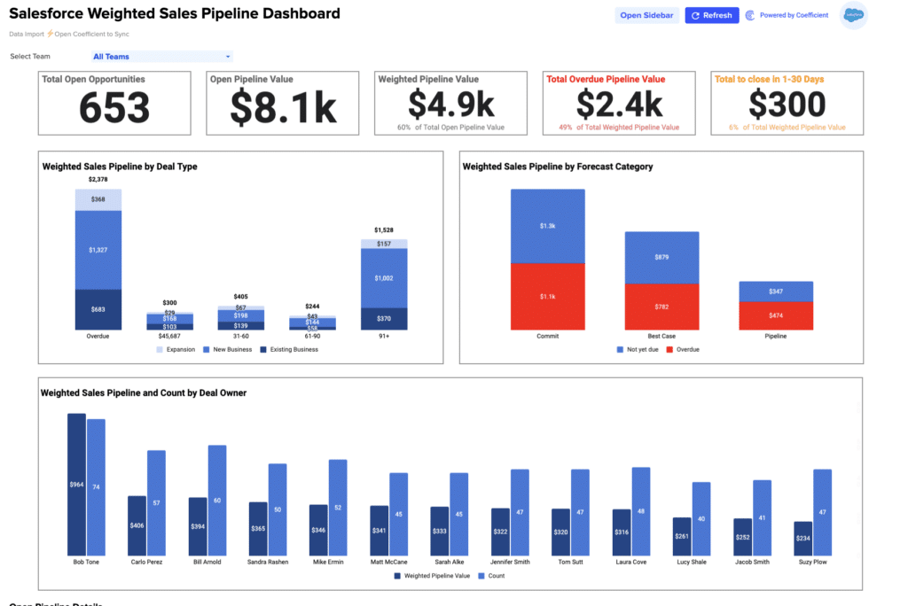
Sales dashboard templates track the metrics revenue team members review weekly: pipeline value by stage, weighted forecast vs. target, win rate, average deal age, and rep-level performance. Key KPIs include total pipeline, deals created, conversion rate by stage, and sales velocity.
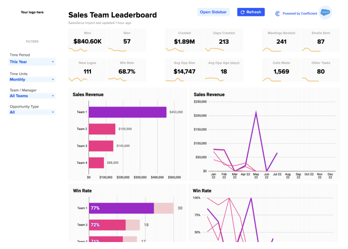
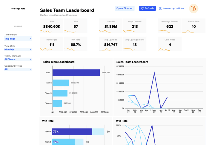
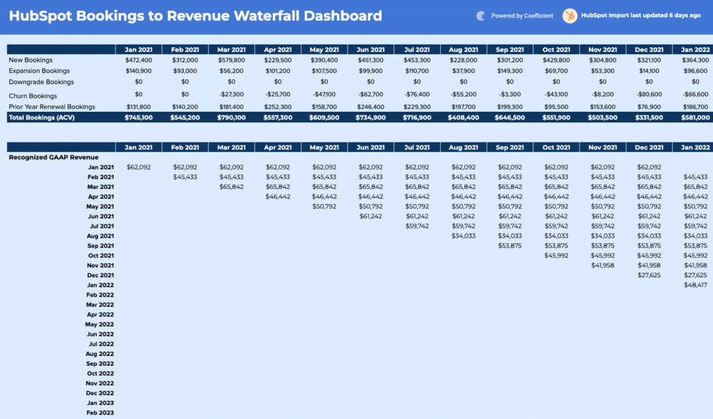
Templates in this library include the Salesforce Pipeline Analysis Template, the HubSpot Sales Pipeline Template, the Salesforce Sales-to-Target Template, and the HubSpot Sales-to-Target Template. These pull live data from Salesforce and HubSpot so the pipeline report reflects current CRM data, not last week's export. Also available: Salesforce Win-Loss Analysis, HubSpot Win-Loss Analysis, Salesforce Sales Team Leaderboard, and HubSpot Sales Team Leaderboard.
Finance and accounting dashboard templates
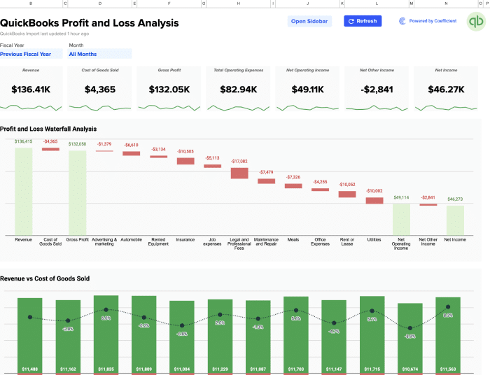
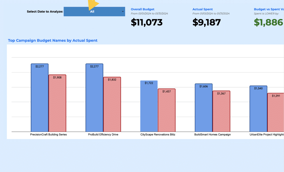
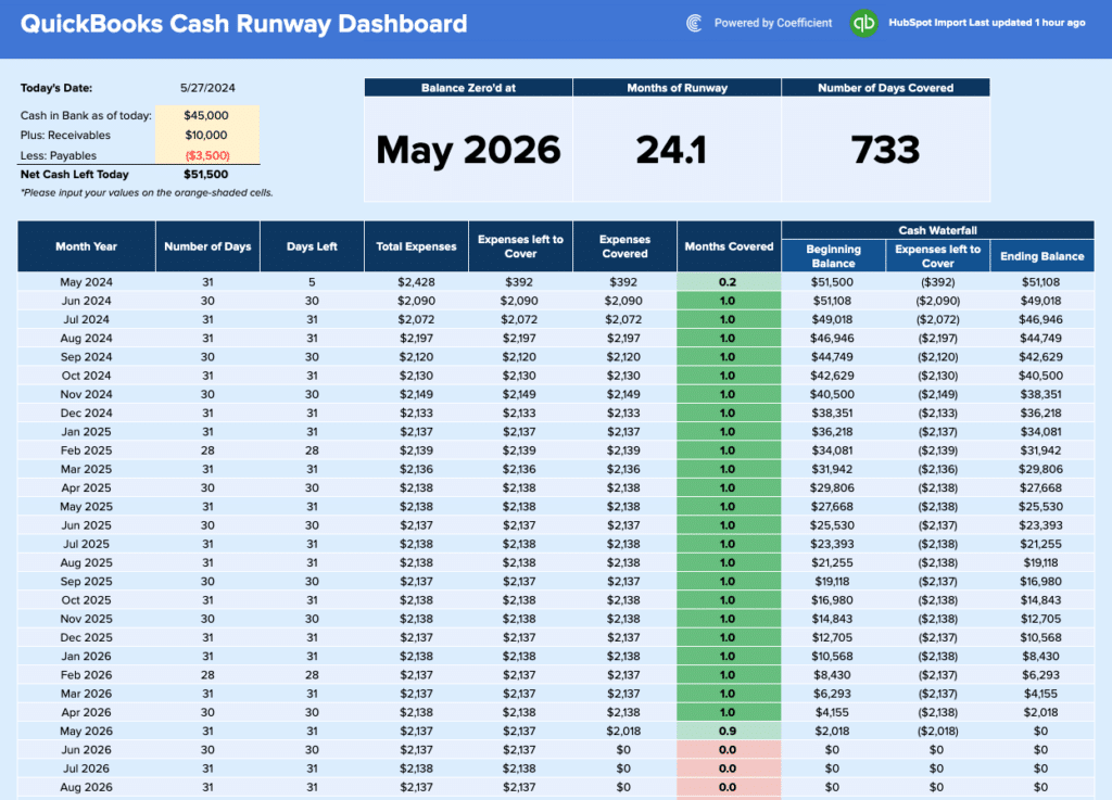
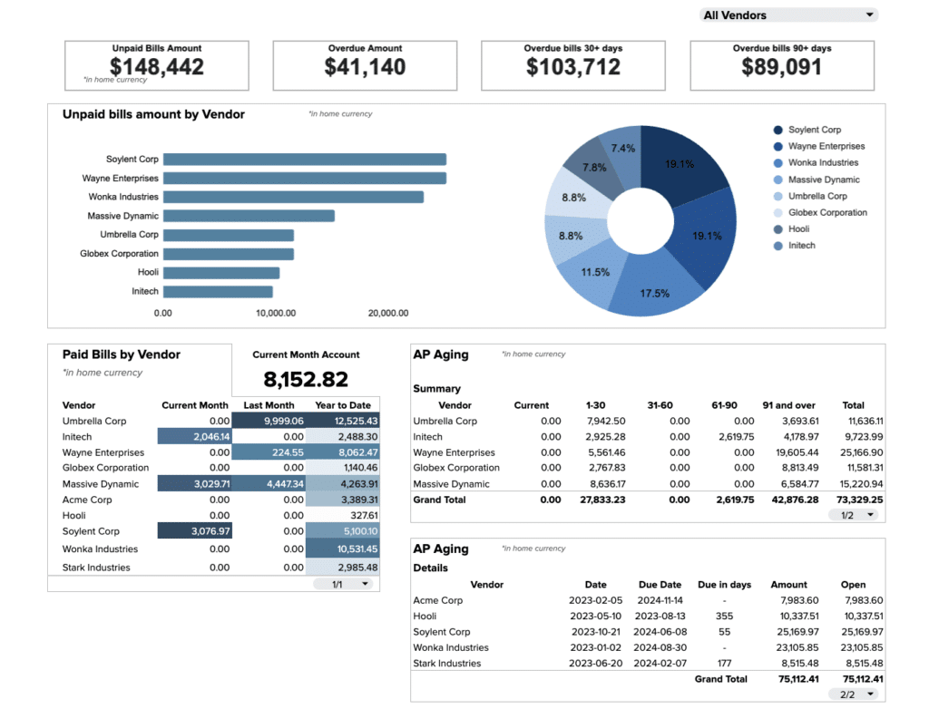
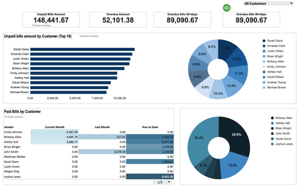
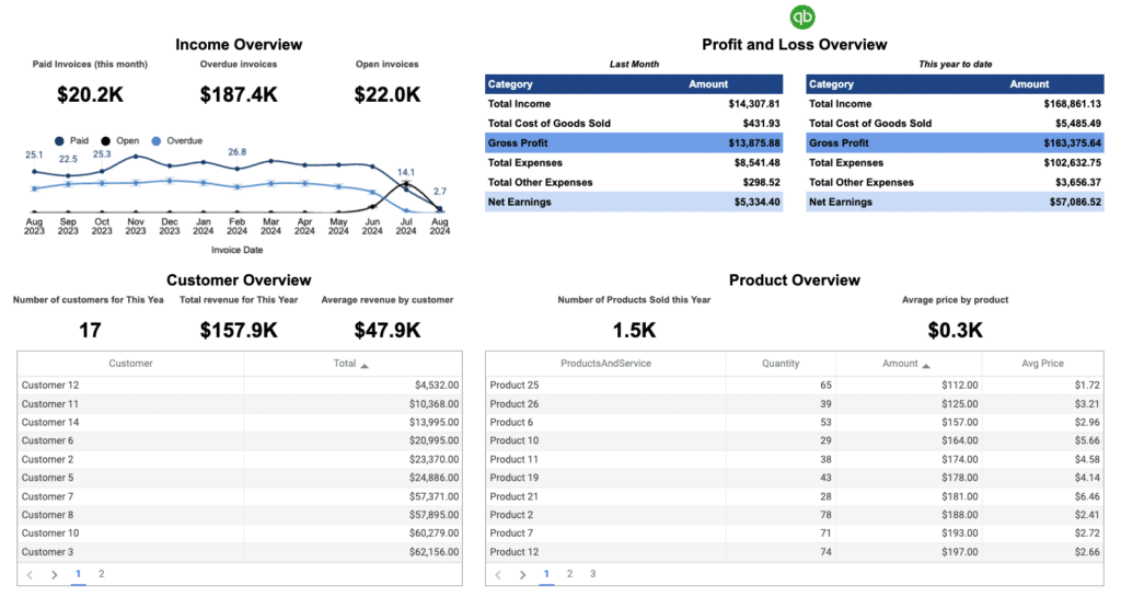
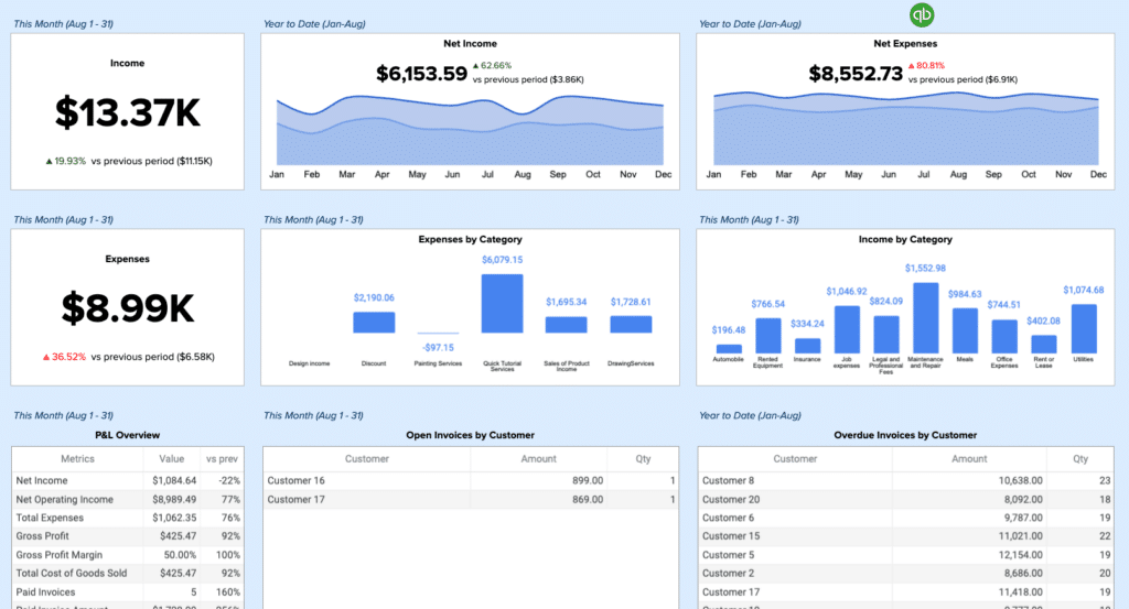
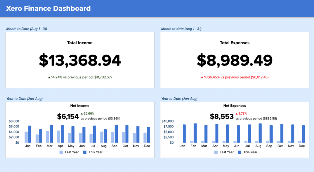
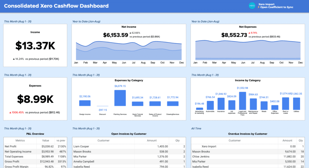
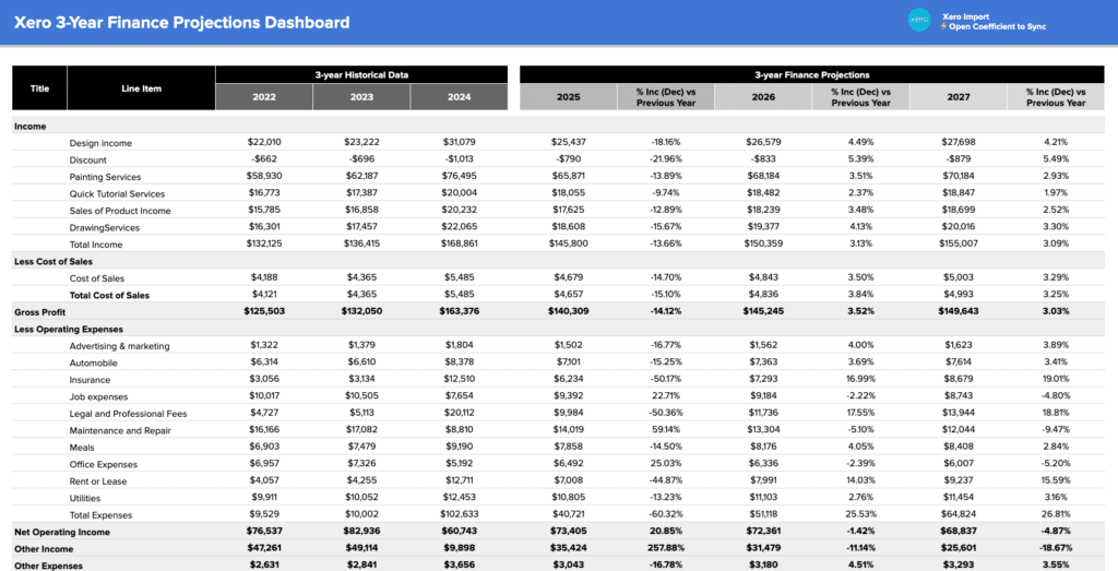
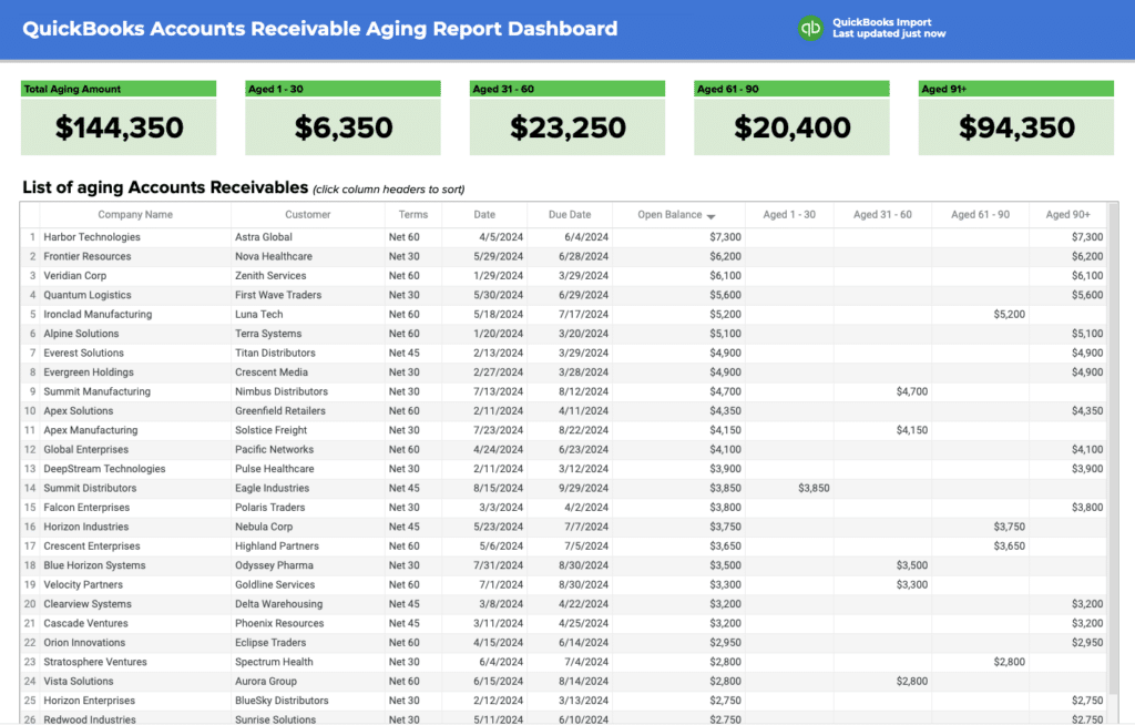
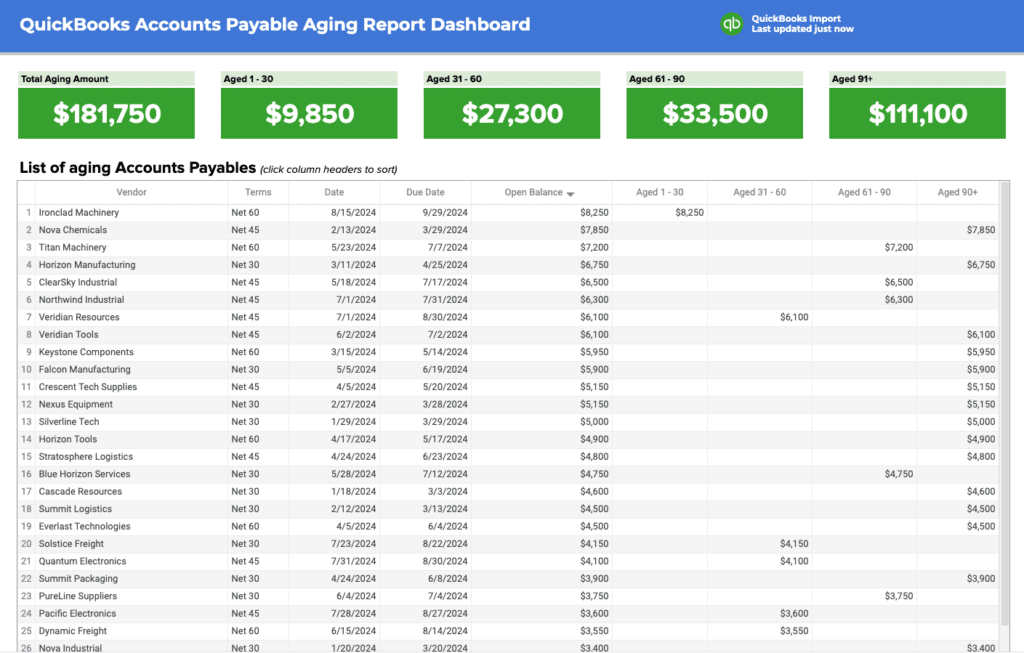
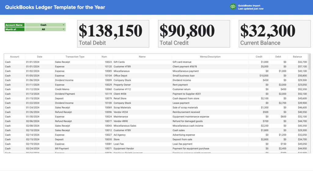
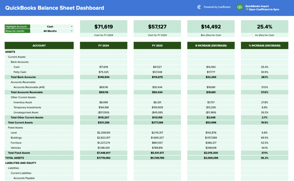
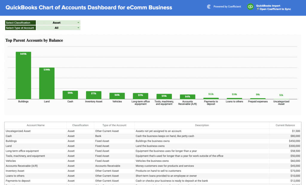
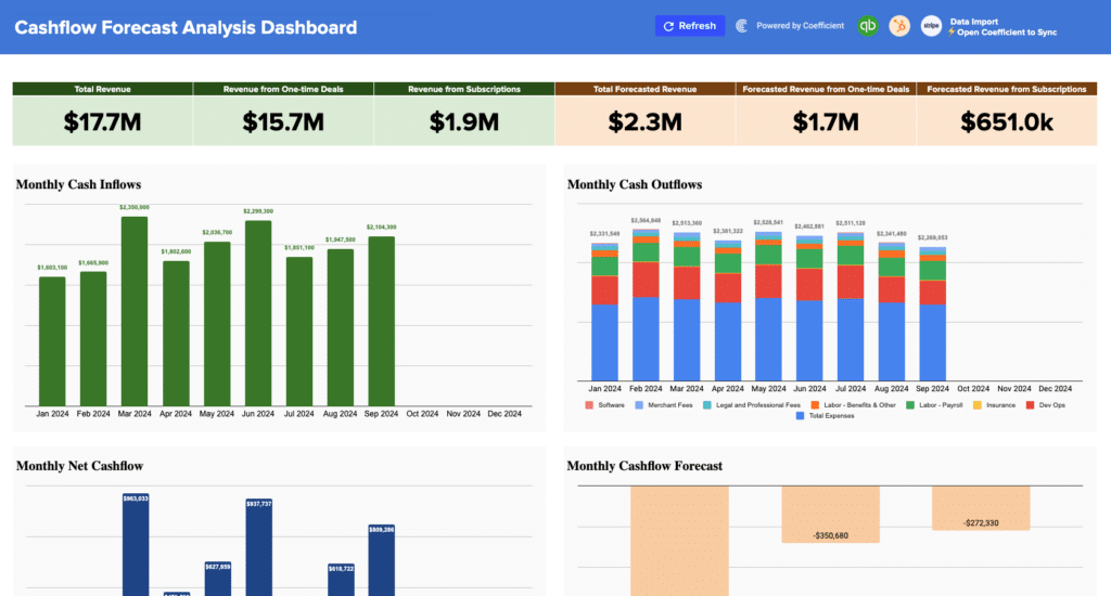
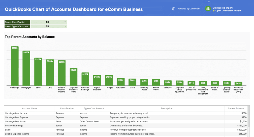
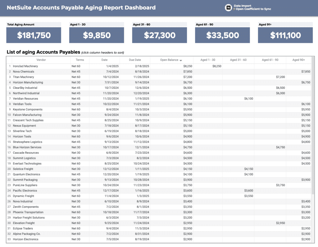
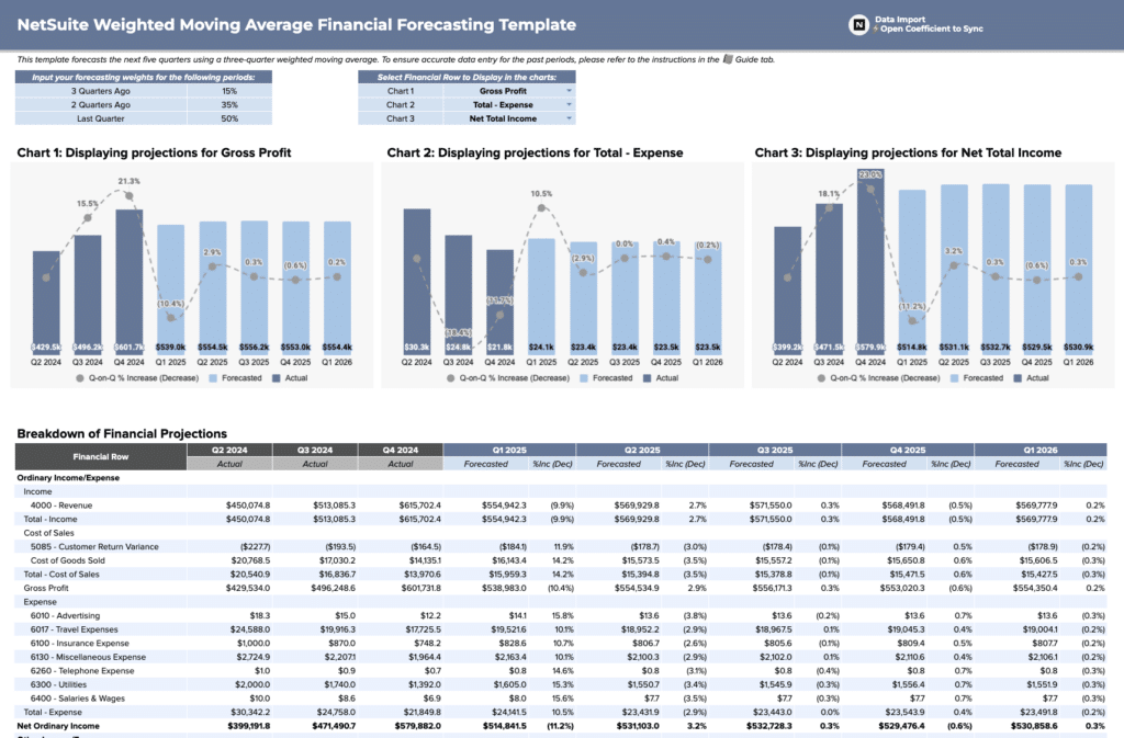
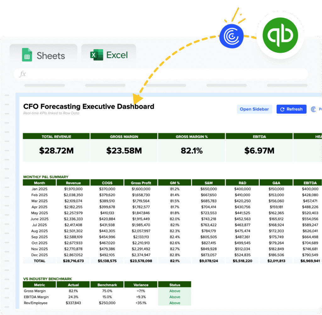
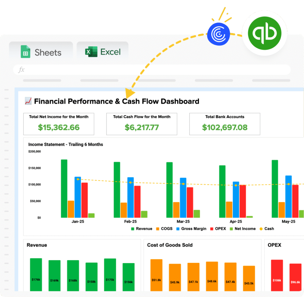
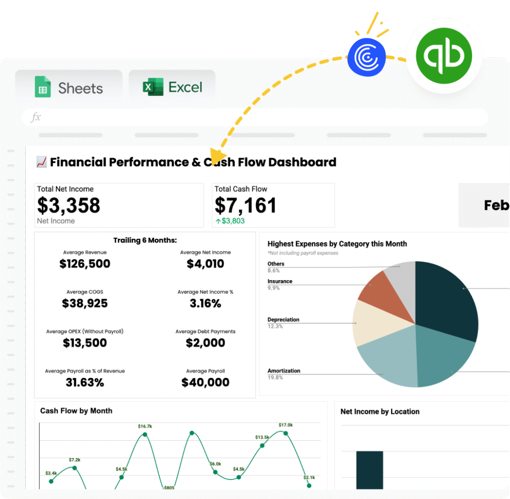
Finance dashboard templates track the documents accounting and FP&A teams produce on a recurring cycle: P&L summary, cash flow, budget vs. actuals, and accounts receivable. Key KPIs include gross margin, net income, cash position, operating expenses, and budget variance by department.
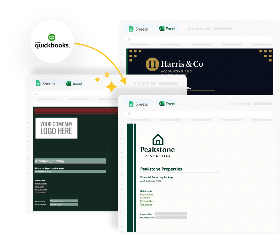
Templates include the QuickBooks Profit and Loss Template which pulls live data from QuickBooks for teams that need financial dashboards to reflect current transaction data without manual exports. Additional finance templates are available through the Finance and Accounting filter in the gallery above.
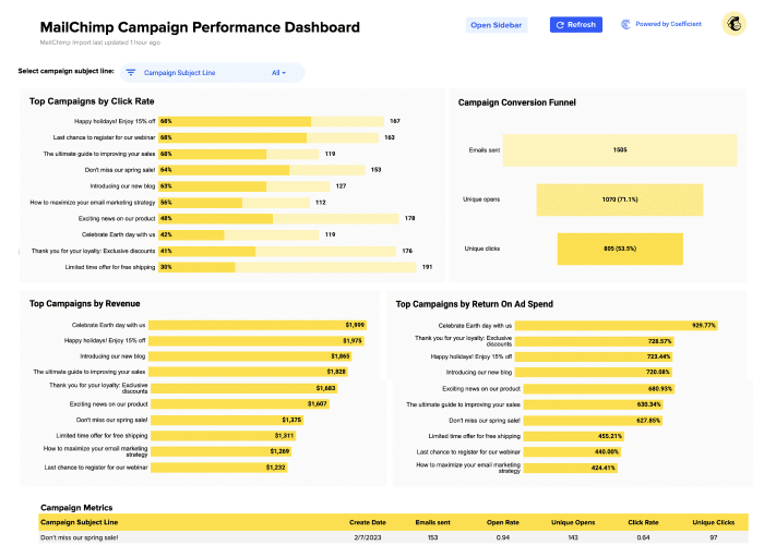
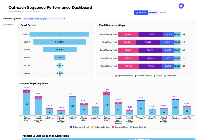
Marketing performance dashboard templates
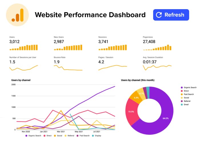
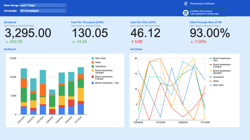
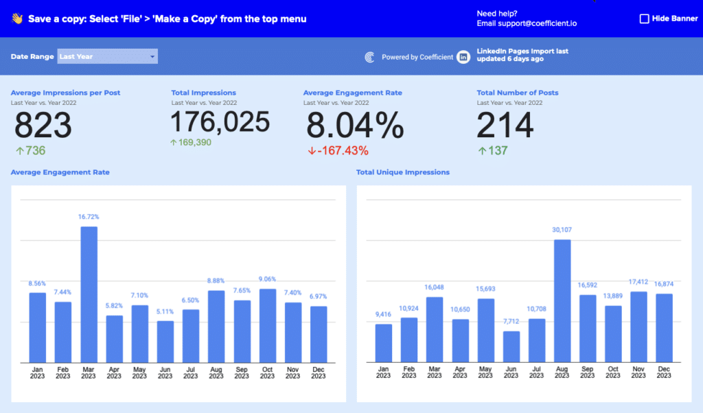
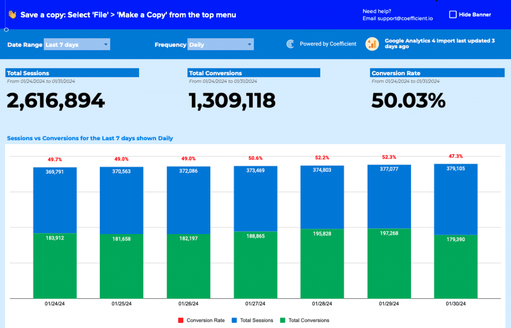
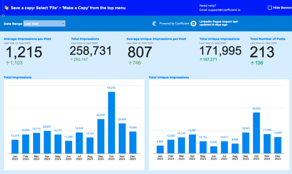
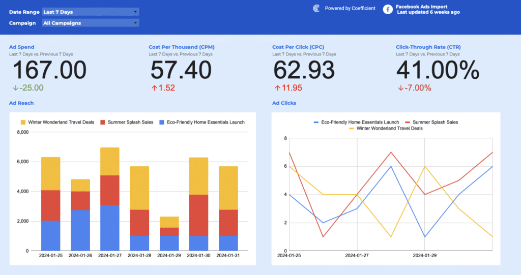
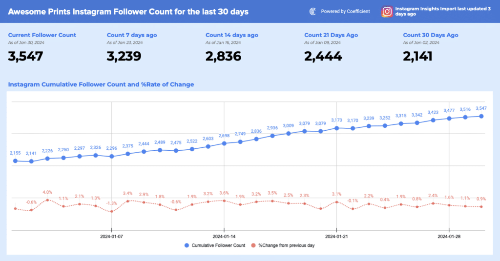
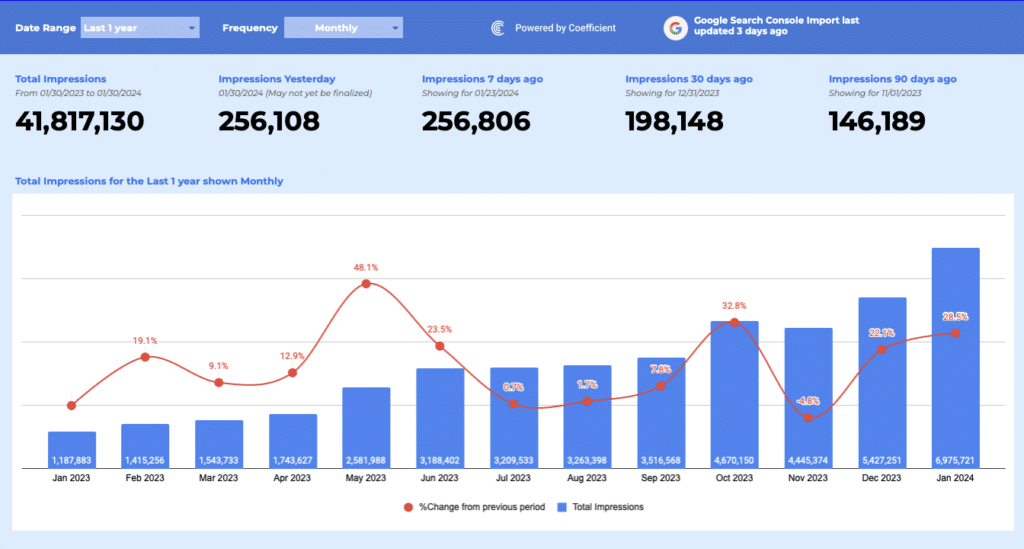
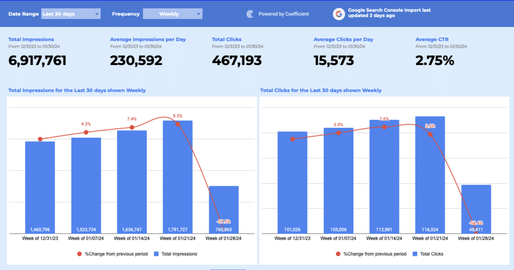
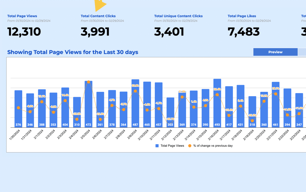
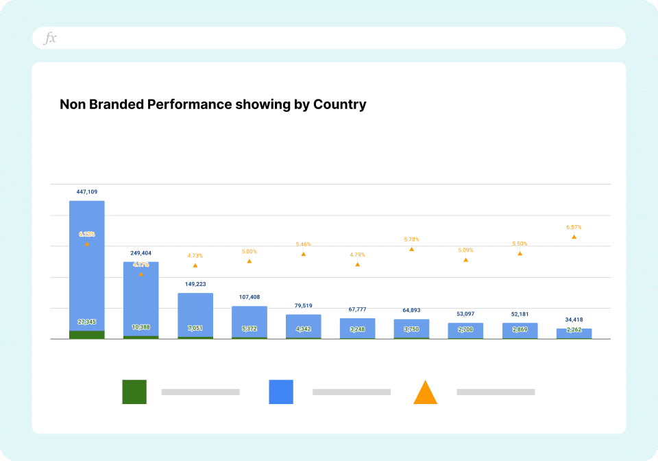
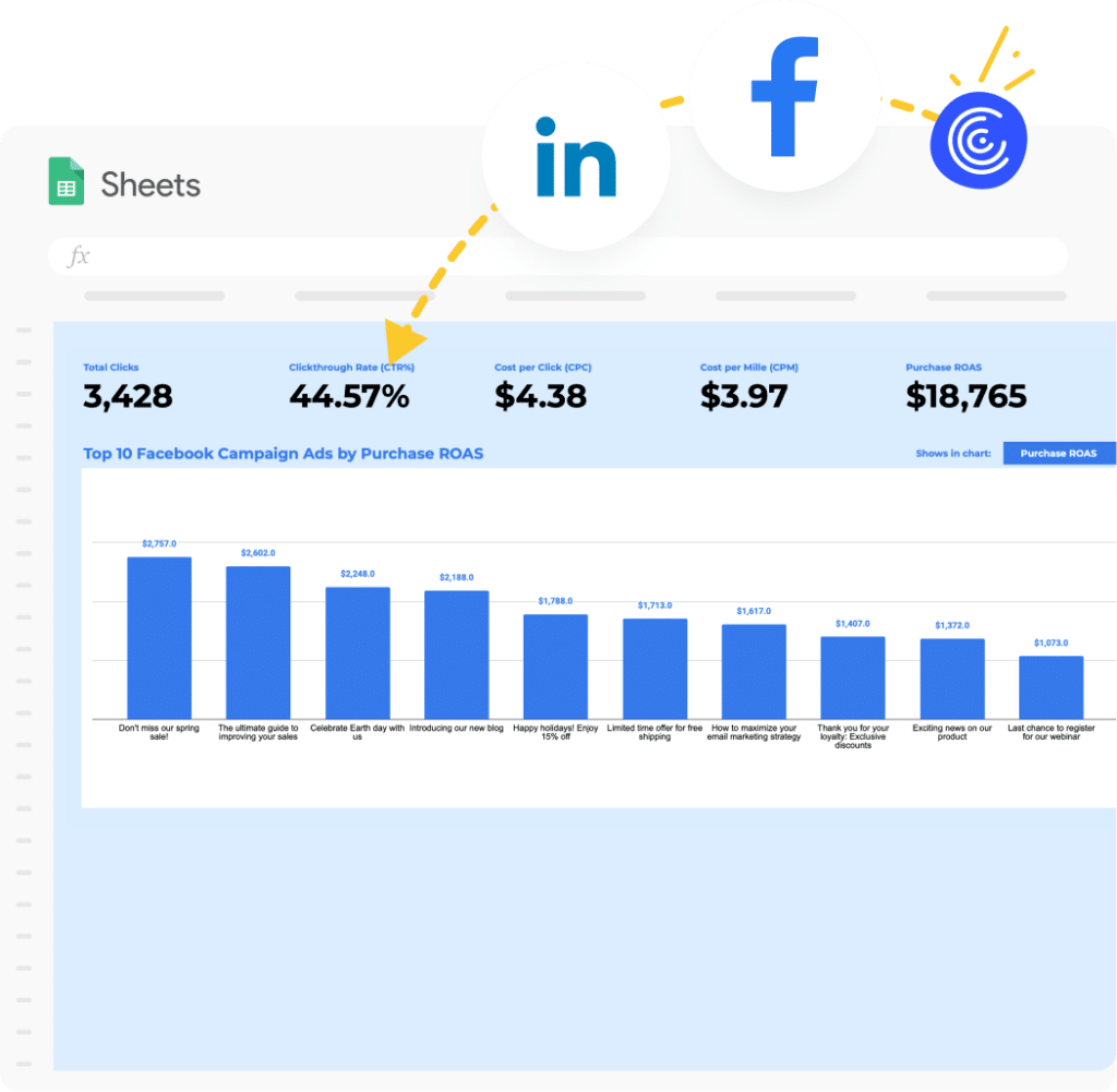
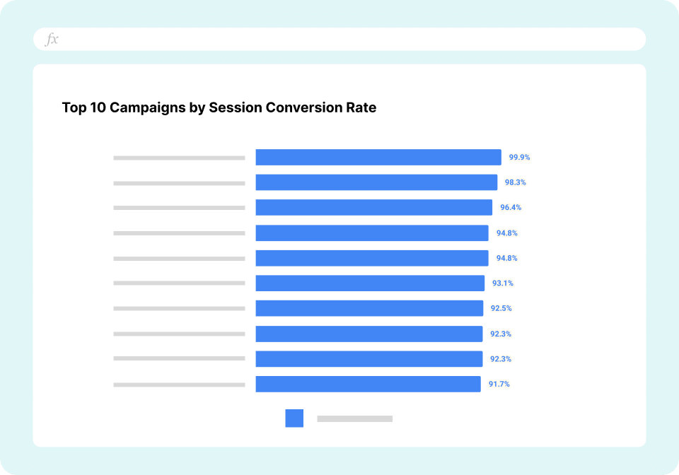
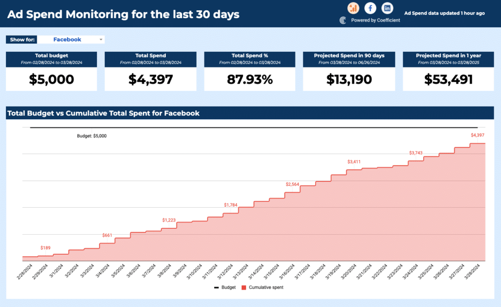
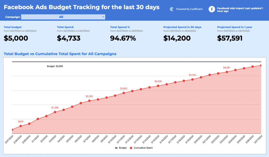
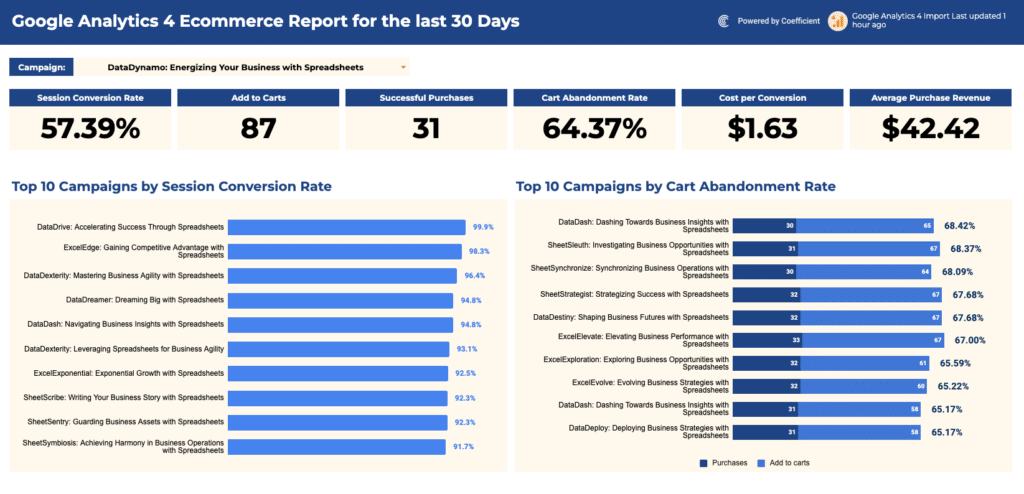
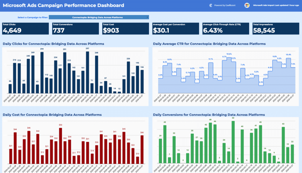
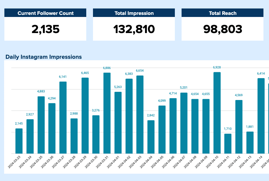
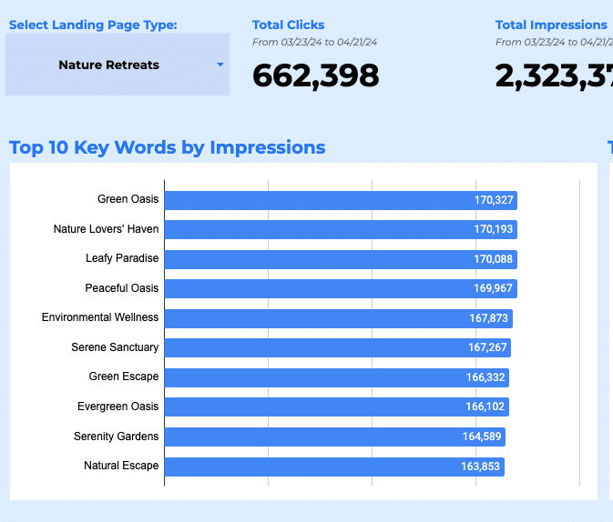
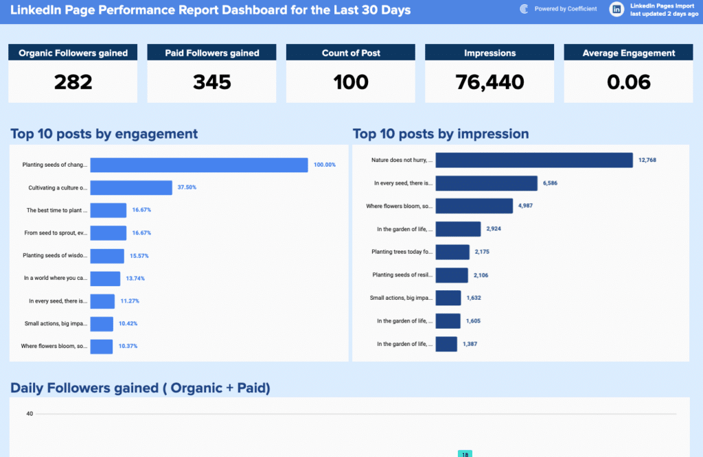
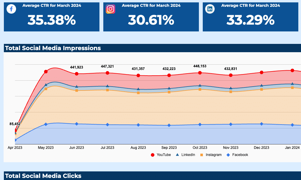
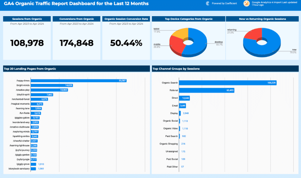
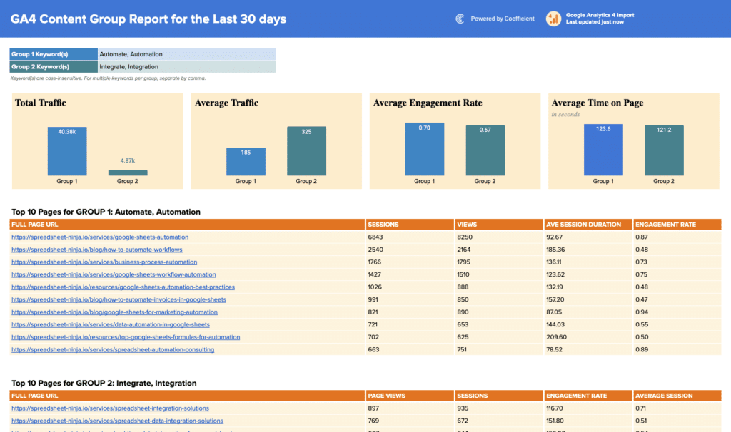
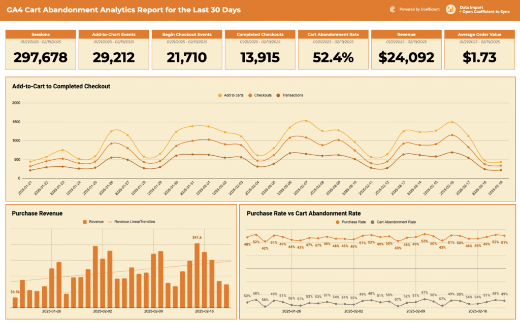
Marketing dashboard templates track social media performance, marketing campaign ROI, channel wise marketing reports and funnel contribution. Key KPIs include sessions, leads by channel, cost per acquisition, MQL volume, email open and click rates, and return on ad spend.
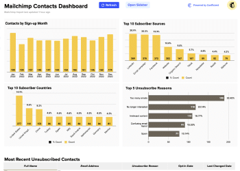
Templates include the Google Analytics Dashboard Template, the Mailchimp Campaign Performance Dashboard, and the Mailchimp Contact Dashboard. Use the Marketing filter in the gallery above to browse all available marketing templates.
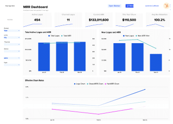
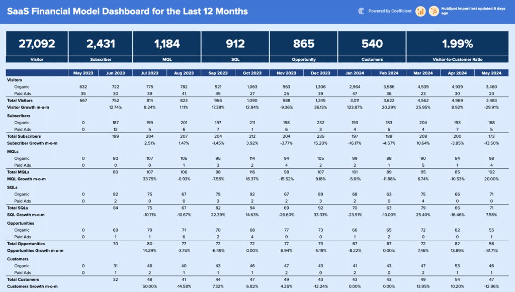
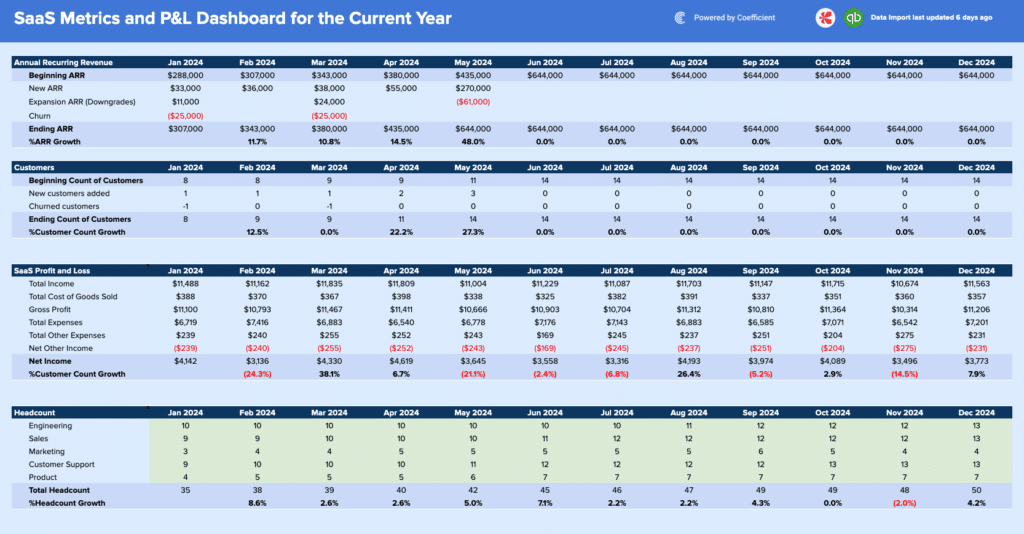
SaaS metrics dashboard templates
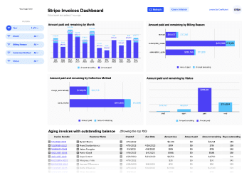
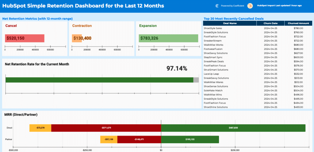
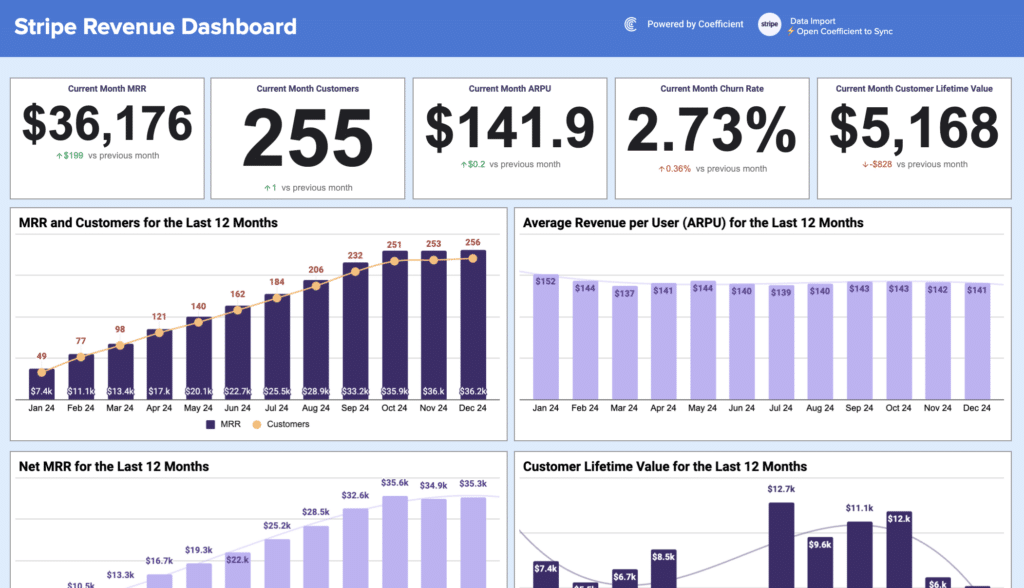
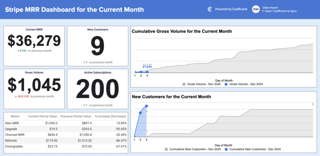
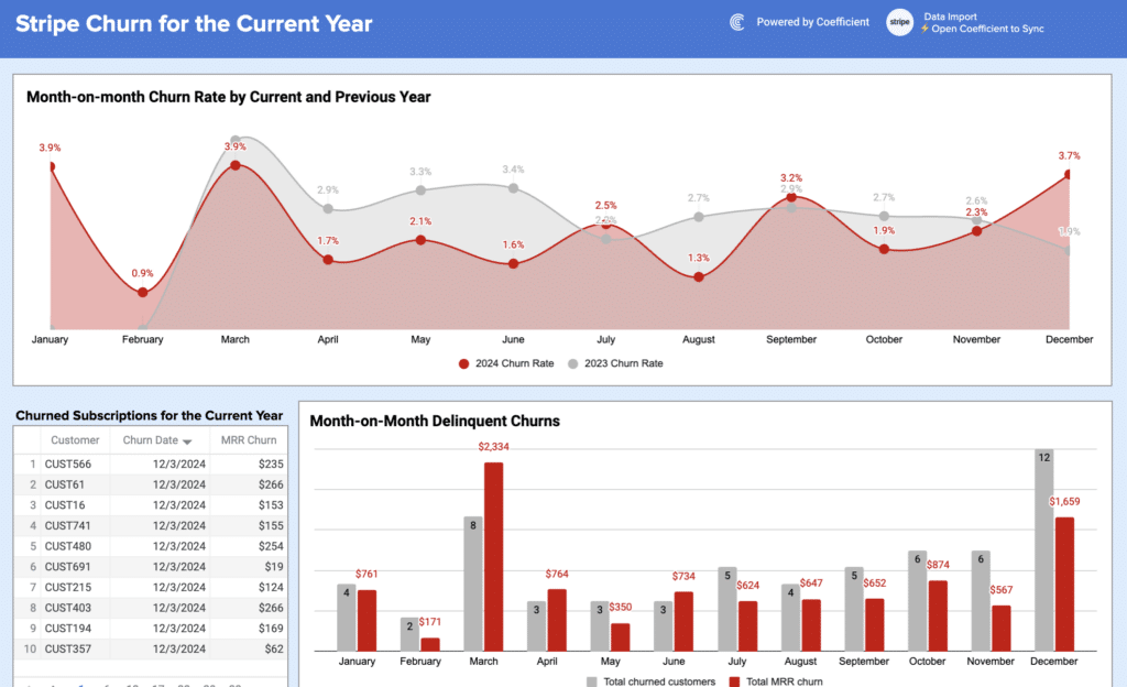
SaaS dashboard templates track subscription health and growth efficiency. Key KPI dashboards include monthly recurring revenue (MRR), annual recurring revenue (ARR), customer churn rate, net revenue retention, and customer lifetime value which will help business make accurate data-driven decisions.
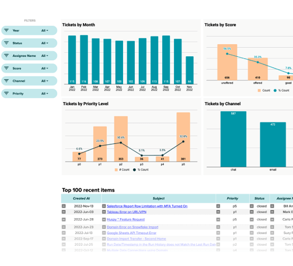
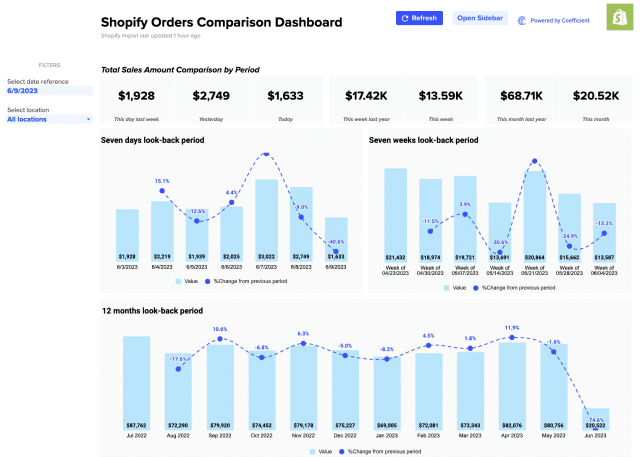
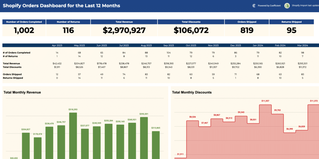
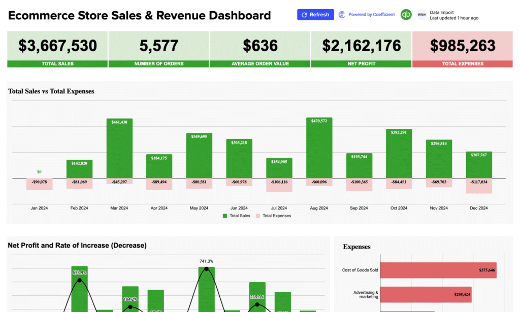
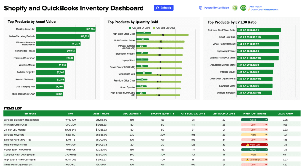
Templates include the HubSpot MRR Dashboard and the Stripe Invoices Dashboard. The Shopify Sales Dashboard and Zendesk Tickets Report Template cover e-commerce and customer support metrics respectively. Use the SaaS filter in the gallery above to see all available templates.
Using these Google Sheets dashboard templates with Static data
Every Google Sheets dashboard template in this library is fully usable as a standalone static dashboard. Open any template, make a copy in Google Drive, and start entering your own data directly. The charts, formulas, and KPI layouts work immediately with whatever data you add to the sheet. You can also find static spreadsheet templates in Coefficient’s static template gallery.
Connecting to Coefficient is an optional but recommended step that’s an all-in-one data connector that does live data pulls from 150+ external systems. If you use Salesforce and want the pipeline dashboard to update automatically when deals move stages, Coefficient handles that connection. If you prefer to manage data manually or paste in CSV exports, the template works identically with the same charts, same formulas, same layout. Coefficient is the automation layer on top of a dashboard that already works out of the box.
Frequently Asked Questions
Do I need a Coefficient account to use these Google Sheets dashboard templates?
No. Every template works as a fully functional static dashboard without any account or connection. Download any template, make a copy in Google Drive, and enter your data directly. All charts and formulas work immediately. Connecting to Coefficient is optional and adds automated data refresh from source systems. The dashboard structure is identical whether used statically or with a live connection.
What types of Google Sheets dashboard templates are in this library?
This library covers sales and pipeline dashboards (Salesforce, HubSpot, Pipedrive), finance and accounting dashboards (QuickBooks), marketing & seo performance dashboards (Google Analytics 4, Meta Ads or Facebook Ads, Google Ads, LinkedIn), e-commerce dashboards (Shopify, Stripe), and SaaS metrics dashboards. Use the filters above the gallery to browse by connector or business function.
Can I customize a Google Sheets dashboard template?
Yes. Every template is fully editable. You can change colors, rename KPI (key performance indicator) labels, add or remove columns, adjust chart types, and restructure tabs to match your team's workflow. If you connect to a live data source through Coefficient, your customisations carry forward and the live data populates the structure you have built.
How do I make a Google Sheets dashboard template update automatically?
Install the Coefficient add-on from the Google Workspace Marketplace, open your template, and connect to your data source like Salesforce, HubSpot, QuickBooks, or any of 150+ supported systems. Set a refresh schedule and the dashboard updates automatically without anyone touching the file.
What is the difference between a Google Sheets dashboard template and a static spreadsheet?
A static spreadsheet is a blank grid you build from scratch. A Google Sheets dashboard template is a pre-built file with the right structure, chart types, and formulas already configured for a specific use case. You replace the sample data with your own and the dashboard works immediately without formula writing, chart formatting, or layout design.
Are these Google Sheets dashboard templates free?
Yes. Every template is free to download and use as a static dashboard. Connecting to live data through Coefficient requires a Coefficient account (free plan available, paid plans from $49/month with no per-user fees).
Ready to get started? Browse the templates in the gallery above or connect your first data source free and have a live Google Sheets dashboard running today.