Build a Live Sales Team Performance Dashboard in
Less Than 30 Minutes
Use this prompt guide to build a live sales team performance dashboard in your spreadsheet.
Get Started Free
Before you start
Get set up in Coefficient for Google Sheets
- You'll need Coefficient AI to follow this guide. Coefficient is the AI assistant inside Google Sheets that turns prompts into live dashboards, reports, and analytics. Install it free to begin.
- Once you're in, click "Import from" on the Coefficient home screen and select your data source(s) to pull your data into the sheet. Not sure what data to import? Open the Coefficient Sheets Assistant — it can help you figure out where to start.
- Iterate on the prompts as you go. Tweak them to fit your team's workflow and make the dashboard your own. See more workflows built for revenue operations teams.
7 steps
Step-by-step prompts to build a live sales team performance dashboard
Import Your Sales Data
Start by bringing your deal and activity data into dedicated tabs. This gives your dashboard a clean foundation to reference for all calculations.
Import your CRM deal/opportunity data into a tab called "Data - Deals" with these columns: Deal ID, Deal Name, Amount, Stage, Close Date, Create Date, Owner, Team, Days Open, Is Closed Won (TRUE/FALSE), Opportunity Type, Forecast Category.
Also import your activity data (calls, emails, tasks, meetings) into separate tabs labeled "Data - Activities", "Data - Calls", "Data - Emails", and "Data - Meetings" with date, rep, type, and count columns.
Keep the imported data ranges intact so they can be referenced by formulas throughout the dashboard.
Build a Settings Tab
Create a centralized configuration table so you can update filters, thresholds, and team rosters in one place without touching the dashboards.
Create a "Settings" tab with the following tables:

1. Company config (A1:B10): Company Domain, Logo URL, Fiscal Year Start Month (e.g., January), "Use Forecast Categories or Stages?" (Yes/No), Weeks End On (e.g., Saturday).

2. Opportunity size buckets: $0, $5K, $10K, $25K, $50K, $100K+.

3. Pipeline stages list with a "Found in data?" validation checkmarks column.

4. Team-to-rep mapping table: rep name, team assignment, and validation columns.

5. Filter dropdown lists: Time Periods (Last Year, This Year, Last Quarter, This Quarter, Last 30 Days, Last 60 Days, Last 90 Days), Time Units (Monthly, Quarterly, Annual), Teams, Rep Names, Opportunity Types.

6. A fiscal quarters lookup table mapping each quarter (2019 Q1 through 2026 Q4) to its start date (e.g., 2025 Q1 = January 1, 2025).

Format the Settings tab so it's easy to scan and update. Use dropdown validation where possible.
Create a Team Dashboard with KPI Scorecards
Build the main team-level view with live filters and metrics that automatically recalculate based on the selected time period and team.
Create a "Team Dashboard" tab with the following structure:

Left Sidebar (Column B):
- Add 4 filter dropdowns with labels: Time Period, Time Units, Team/Manager, Opportunity Type
- Set default values: "Last Year", "Monthly", "All Teams", "All"
- Use data validation to pull filter options from the Settings tab

KPI Scorecard Row (below filters):
- Display 8 key metrics as formatted text with values: Won ($), Won (count), Created ($), Opps Created, Meetings Booked, Emails Sent, New Logos, Win Rate, Avg Opp Size, Avg Opp Age, Calls Made, Other Tasks
- For each KPI, show the metric name in small gray text above the value
- Show the main value in large bold dark navy or black text
- Below each KPI value, add a yellow sparkline (#FAAD14, linewidth 2) showing the trend over the selected time period

Filter Logic:
- In cells S2:S3, calculate the start and end dates for the selected Time Period using a VLOOKUP to the Settings fiscal quarters table
- All KPI formulas should use SUMIFS, AVERAGEIFS, or COUNTIFS to reference the imported deal and activity data tabs
- Filter by date range (S2:S3), selected team, and selected opportunity type
- For Avg Opp Size, calculate AVERAGEIFS on closed won deals only
- For Win Rate, divide Won (count) by total opportunities for the selected filters
- For New Logos, count distinct deal names where "Is Closed Won" = TRUE and close date is in the selected period

Build this as a live dashboard that updates on its own using formulas — do not use pasted values. All calculations must reference the imported data ranges so the metrics refresh automatically when new rows are imported.
Add Hidden Calculation Tables for Charts
Charts need aggregated data broken down by team and time period. Create off-screen helper tables that feed your charts without cluttering the visible dashboard.
In columns T–AH of the Team Dashboard tab, create hidden aggregation tables for each metric. Each table should be 9 rows × 15 columns.

Table Structure (for Monthly view):
- Row 1: SPARKLINE row showing "All Teams" aggregate per month
- Row 2: Chart title label (e.g., "Sales (Closed Won $)")
- Row 3: X-Axis Labels header
- Row 4: Date Start >= (first day of each month, Jan–Dec)
- Row 5: Date End < (first day of next month)
- Row 6: Month labels (e.g., Jan 25, Feb 25, ... Dec 25)
- Rows 7–10: One row per team (Team 1, Team 2, Team 3, Team 4) with SUMIFS or AVERAGEIFS formulas calculating that team's value for that month

Create one aggregation table per metric at these row offsets:
- Row 38: Sales (Closed Won $)
- Row 76: Win Rate (%)
- Row 115: Pipeline Creation ($)
- Row 153: Avg Opp Size ($)
- Row 191: Avg Opp Age (days)
- Row 229: Meetings Booked (count)
- Row 267: Calls Made (count)
- Row 305: Emails Sent (count)
- Row 343: Opps Created (count)
- Row 381: New Logos Won (count)
- Row 419: Other Tasks (count)

All formulas in these tables must reference the imported data tabs and use the date range filters from S2:S3. Use SUMIFS/AVERAGEIFS/COUNTIFS with dynamic date and team filters so the tables recalculate automatically when the Time Period or Team filter changes.
Build Dashboard Charts
Add visual comparisons so team leaders can quickly spot top performers and see trends at a glance.
For each metric in the Team Dashboard, create two side-by-side charts that reference the hidden aggregation tables:

Chart 1 — Horizontal Bar Chart (Team Leaderboard):
- Show each team's total value for the selected period
- Sort bars in descending order (highest value at top)
- Use teal (#3BCEE4) for "All Teams" and light blue for individual teams
- Label each bar with its value
- Set chart title to the metric name (e.g., "Sales Won by Team")
- Use white background with light gray border

Chart 2 — Line Chart (Monthly/Quarterly Trend):
- Show one line per team, tracking the metric value over each month or quarter in the selected period
- Use dark navy (#1B1F8A) for the top-performing team and lighter blues/teals for others
- Include x-axis labels (month or quarter) and y-axis with values
- Set chart title to "[Metric] Trend by Team"
- Use white background with light gray border

Create chart pairs in this order (top to bottom):
1. Sales Team Leaderboard
2. Win Rate
3. New Logos Won
4. Pipeline Creation
5. Opps Created
6. Avg Opp Size
7. Avg Opp Age
8. Meetings Booked
9. Calls Made

Position each pair in a dedicated row section. Charts should auto-update when the Time Period or Team filter changes.
Create an Individuals Dashboard
Build a rep-level view so individual sellers can track their own performance and managers can coach against specific metrics.
Create an "Individuals Dashboard" tab with the same overall structure as the Team Dashboard, with these key differences:

Filters (Column B):
- Keep Time Period and Time Units filters
- Replace "Team/Manager" with two filters: "Team/Manager" (dropdown: All Teams) AND "Sales Rep" (dropdown: All or specific rep name from the Settings rep list)
- Set Time Units default to "Quarterly" instead of Monthly
- Apply the same data validation and VLOOKUP logic for date ranges (S2:S3)

KPI Scorecard:
- Use the same 12 metrics as the Team Dashboard
- All formulas filter to the selected team and individual rep using SUMIFS, AVERAGEIFS, COUNTIFS
- Build this as a live dashboard using formulas so it updates automatically

Hidden Calculation Tables (Columns U–AA):
- Create tables with 4 columns for quarters instead of 12 for months
- Row 4: Date Start >= (Q1: 1/1, Q2: 4/1, Q3: 7/1, Q4: 10/1)
- Row 5: Date End < (Q2: 4/1, Q3: 7/1, Q4: 10/1, Q1 next year: 1/1)
- Row 6: Quarter labels (e.g., 2025 Q1, 2025 Q2, 2025 Q3, 2025 Q4)
- Rows 7–19: One row per individual sales rep (13 reps) with SUMIFS/AVERAGEIFS for that rep × that quarter

Charts:
- Bar charts rank all 13 reps by metric value (highest at top)
- Line charts show 13 individual rep trend lines over quarters
- Use a color palette with dark navy for top rep and progressively lighter blues/teals for others
- Apply the same formatting as Team Dashboard charts (white background, light gray border, labeled bars)

Create chart pairs in the same order as Team Dashboard. All charts auto-update when Time Period or Sales Rep filter changes.
Format and Polish the Dashboards
Clean up the visual presentation so the dashboards look professional and are easy to scan.
Apply the following formatting to both Team Dashboard and Individuals Dashboard tabs:

General:
- Hide gridlines on both tabs
- Auto-fit all visible columns
- Set print area to exclude the hidden calculation tables

Sidebar & Filters (Column B):
- Background: light gray
- Filter labels: bold, dark gray text
- Dropdown cells: white background with border

KPI Display:
- Metric names: small gray text (8–9pt)
- KPI values: large bold text (16–18pt), dark navy or black
- Sparklines: gold/yellow (#FAAD14), linewidth 2

Charts:
- Chart backgrounds: white with light gray border (1–2pt)
- Chart titles: bold, dark navy, 11–12pt
- Axis labels: 9–10pt gray text
- Data label format: bold, dark navy

Header & Branding:
- Add a banner row at the top with "Support & Help" links (e.g., email, Slack channel)
- Add a "my logo here" placeholder in cell B2 that displays a company logo image when a logo URL is provided in the Settings tab
- Dashboard title: "Sales Team Leaderboard" on Team Dashboard, "Individual Rep Performance" on Individuals Dashboard — large bold text (18–20pt), center-aligned, dark navy

Final Check:
- Verify all filters work and dashboards update when selections change
- Check that sparklines and charts refresh with new imported data
- Ensure hidden calculation tables are truly hidden (use Format > Columns > Hide)
- Test the logo URL placeholder in Settings to confirm image displays. Ask me for this brand information if you don't know it.
More dashboards and templates
Hand-picked for revenue operations teams.
Sales Performance Dashboard
Build a live sales performance dashboard with KPIs, charts, and filters in your spreadsheet using Coefficient. Track closed won deals by year, country, and account.
Read the guide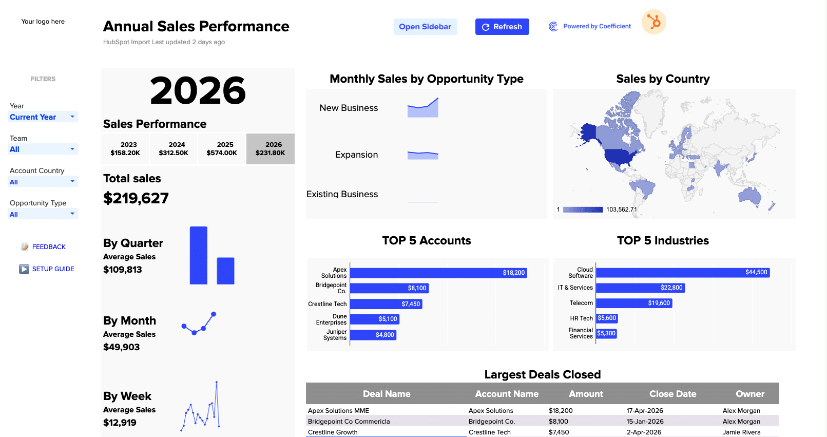
Outbound Sales Metrics
Build a live 12-week outbound sales metrics dashboard in Google Sheets with email, call, prospect, and deal data. Track performance by rep.
Read the guide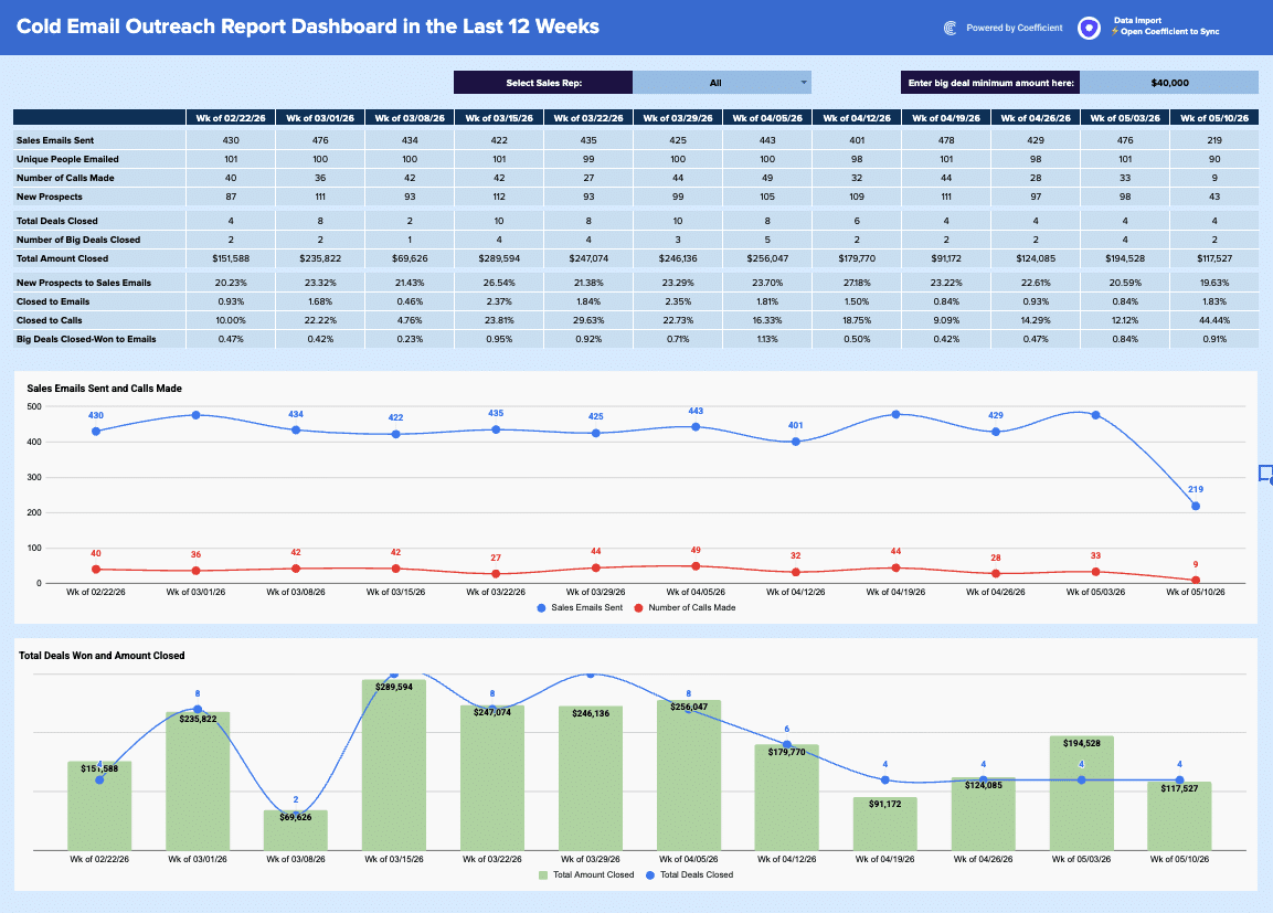
Free Lead Routing Template for HubSpot
Download our free HubSpot Lead Routing template. Track lead assignments, rep response times, and routing workflow performance. Optimize your sales process today.
Launch template
Common questions about the sales team performance dashboard
How do I set up my sales data for the Sales Team Performance Dashboard?
How does the Settings tab help me customize my Sales Team Performance Dashboard?
Can I filter the Sales Team Performance Dashboard by different time periods and team structures?
What's the difference between the Team Dashboard and the Individuals Dashboard in this prompt?
How are the dashboard charts organized and what data do they pull from?
Can I share my Sales Team Performance Dashboard with my team?

Ready to try it in Coefficient?
Connect your data and start building in minutes.