Build a Live Sales Performance Dashboard in
Less Than 30 Minutes
Use this prompt guide to build a live sales performance dashboard in your spreadsheet.
Get Started Free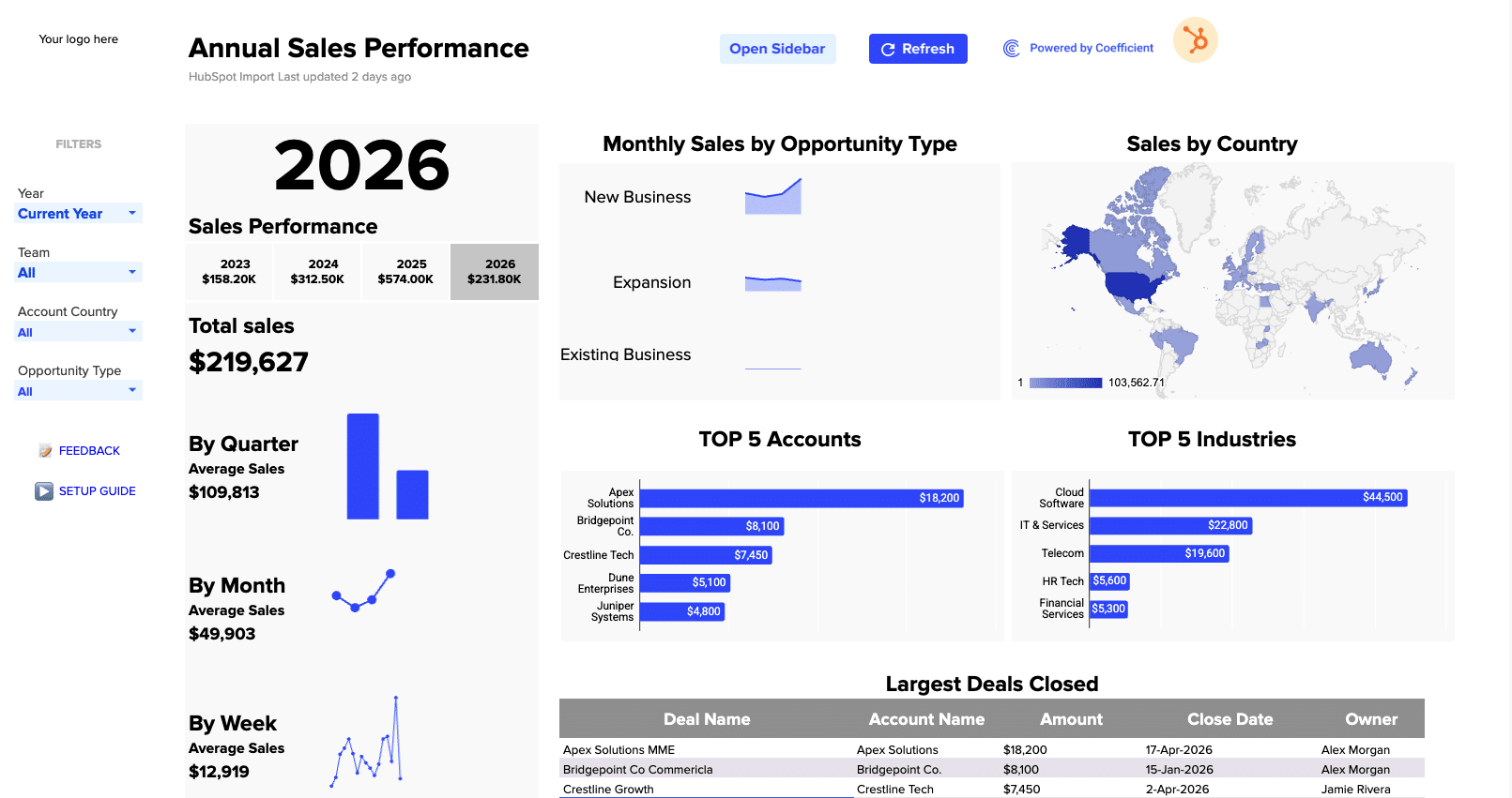
Before you start
Get set up in Coefficient for Google Sheets
- Don't have Coefficient yet? Get started free — the AI Sheets Assistant is only available in Google Sheets.
- Once you're in, click "Import from" on the Coefficient home screen and select your data source(s) to pull your data into the sheet. Not sure what data to import? Open the Coefficient Sheets Assistant — it can help you figure out where to start.
- Iterate on the prompts as you go. Tweak them to fit your team's workflow and make the dashboard your own.
8 steps
Step-by-step prompts
Build KPI Summary Cards by Year
Start with a high-level view of closed won sales performance. You'll display total closed won sales for each year side by side, with the current year visually highlighted.
Create KPI summary cards showing total Closed Won sales for each year (2022–2026) side by side, with the current year highlighted. Pull from the deals data filtered by Close Date Year, and use formulas to ensure the values update when new data is imported.
Add Sales Performance Sparklines
Give viewers a quick visual of how sales are trending. Build three sparkline sections with total sales this year, average sales by quarter, month, and week—each with a mini-chart and the dollar figure below.
Add three sparkline/mini-chart sections showing: (1) Total Sales this year, (2) Average sales by Quarter with a bar chart, (3) Average sales by Month with a line chart, and (4) Average sales by Week with a line chart. Each should show the average dollar figure below the label. Use formulas that reference the imported data so the calculations stay live as new rows come in.
Create Opportunity Type Trend Lines
Help stakeholders see which deal types are driving momentum. Build three sparkline trend lines showing monthly sales trends for New Business, Expansion, and Existing Business deals in the current year.
Create three sparkline trend lines — one each for New Business, Expansion, and Existing Business — showing monthly sales trends for the current year. Use formulas to reference the imported data so trends update automatically as new deals close.
Add Geographic Sales Map
Show where revenue is coming from at a glance. Build a geo map chart displaying total closed won sales by country or region with a blue color gradient.
Create a geo map chart showing total Closed Won sales by Country/Region, using a blue color gradient. Source data from the deals import filtered to the selected year, and use formulas so the map updates when new geographic data arrives.
Build Top 5 Accounts Chart
Highlight your biggest revenue drivers. Create a horizontal bar chart showing the top 5 accounts by total closed won amount for the selected year, with dollar values labeled on each bar.
Create a horizontal bar chart titled 'TOP 5 Accounts' showing the top 5 accounts by total Closed Won amount for the selected year. Display dollar values as labels on each bar. Use formulas to dynamically rank and display the top accounts as data updates.
Build Top 5 Industries Chart
Understand which industry segments are your strongest performers. Create a similar horizontal bar chart for the top 5 industries by closed won amount.
Create a horizontal bar chart titled 'TOP 5 Industries' showing the top 5 industries by total Closed Won amount for the selected year. Display dollar values as labels on each bar. Use formulas to dynamically rank and display the top industries as data updates.
Create Largest Deals Closed Table
Give sales leaders a quick reference for recent big wins. Build a detailed table showing your largest closed deals with key details and a styled header.
Create a table titled 'Largest Deals Closed' showing the top deals sorted by amount descending, with columns: Deal Name (as a hyperlink), Account Name, Amount, Close Date, and Owner. Style with a dark gray header row and alternating row shading. Use formulas to keep the table sorted and updated as new deal data is imported.
Add Interactive Dropdown Filters
Let viewers drill into the data they care about. Add dropdown filters for Year, Team, Account Country, and Opportunity Type so all charts and KPIs respond dynamically.
Add dropdown filter cells for: Year (default: Current Year), Team (default: All), Account Country (default: All), and Opportunity Type (default: All). Ensure all charts, sparklines, KPI cards, and tables respond to these filters by using formulas that reference the dropdown selections.
Ready to try it in Coefficient?
Connect your data and start building in minutes.
