Build a Live Outbound Sales Metrics in
Less Than 30 Minutes
Use this prompt guide to track outbound sales activity and pipeline metrics in your spreadsheet.
Get Started Free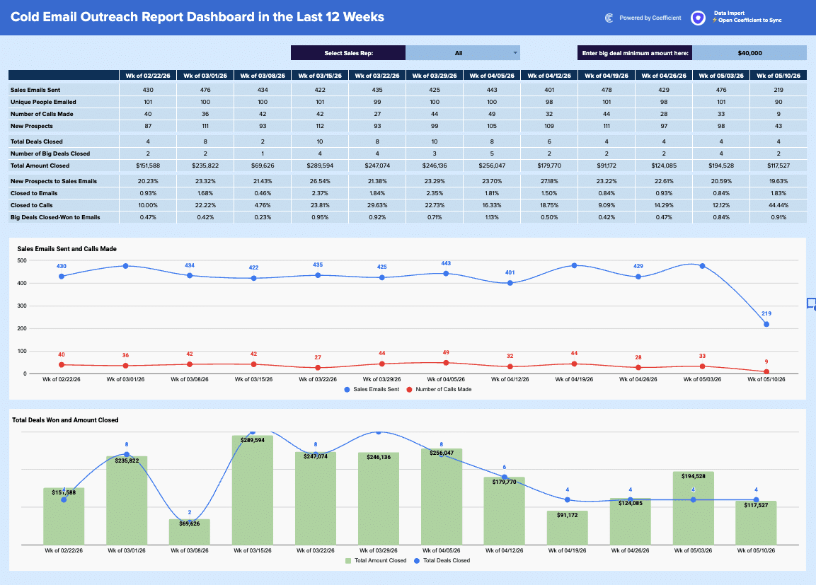
Before you start
Get set up in Coefficient for Google Sheets
- You'll need Coefficient AI to follow this guide. Coefficient is the AI assistant inside Google Sheets that turns prompts into live dashboards, reports, and analytics. Install it free to begin.
- Once you're in, click "Import from" on the Coefficient home screen and select your data source(s) to pull your data into the sheet. Not sure what data to import? Open the Coefficient Sheets Assistant — it can help you figure out where to start.
- Iterate on the prompts as you go. Tweak them to fit your team's workflow and make the dashboard your own. See more workflows built for revenue operations teams.
6 steps
Step-by-step prompts to build a live outbound sales metrics dashboard
Import Sales Activity Data
You need activity data from your CRM synced into separate tabs so you can calculate metrics against it. Coefficient will handle the automatic refresh.
You'll need to import sales activity data from your CRM into Google Sheets using Coefficient.
You'll need 4 separate tabs that sync automatically:
⚡Emails — all sent emails with columns: Delivered At, Subject, Prospect Name, Prospect Email, Sender Name, Week (formatted as "Wk of MM/DD/YY"), Sender (owner name)
⚡Calls — all calls logged with columns: Dialed At, Direction (Inbound/Outbound), Prospect Name, Rep Name, Week, Rep (owner name)
⚡Prospects — all new prospects with columns: Created At, Name, Email, Owner Name, Week, Owner
⚡Opportunities — all opportunities with columns: Created At, Opportunity ID, Name, Close Date, Amount, Stage Name, Is Closed (TRUE/FALSE), Owner Name, Week (based on Close Date), Owner
Please set up these 4 imports so they update automatically.
Build the Weekly Metrics Table
Create a live dashboard table that calculates sales activity and deals by week. Use formulas that reference your imported data so the metrics refresh automatically when new rows sync in.
Create a new tab called '📊 Dashboard'. Add a header row of 12 weekly date columns (covering the last 12 weeks, formatted as 'Wk of MM/DD/YY') starting in column C, row 8. In rows 10–13, use BYCOL/COUNTIFS/COUNTUNIQUEIFS formulas to calculate these metrics per week with a Sales Rep filter in cell H6 (defaulting to 'All'):

Sales Emails Sent (COUNTIFS on ⚡Emails by Week + Rep)
Unique People Emailed (COUNTUNIQUEIFS on ⚡Emails by prospect email, Week + Rep)
Number of Calls Made (COUNTIFS on ⚡Calls by Week + Rep)
New Prospects (COUNTIFS on ⚡Prospects by Week + Rep)

In rows 15–17, add:

Total Deals Closed (COUNTIFS on ⚡Opportunities where Is Closed = TRUE, by Week + Rep)
Number of Big Deals Closed (same but also where Amount >= threshold in cell M6)
Total Amount Closed (SUMIFS on ⚡Opportunities where Is Closed = TRUE, by Week + Rep)

Make all calculations with formulas that reference the imported data ranges so the dashboard refreshes automatically when the data import updates.
Add Conversion Rate Metrics
Calculate key ratios (prospects-to-emails, emails-to-closes, calls-to-closes) so you can spot trends in your sales funnel efficiency week by week.
Below the deals section (rows 19–22), add 4 conversion rate rows using MAP/LAMBDA formulas to calculate ratios across the 12 weekly columns:

New Prospects to Sales Emails = New Prospects ÷ Sales Emails Sent
Closed to Emails = Total Deals Closed ÷ Sales Emails Sent
Closed to Calls = Total Deals Closed ÷ Number of Calls Made
Big Deals Closed-Won to Emails = Number of Big Deals Closed ÷ Sales Emails Sent

Format all four rows as percentages with 2 decimal places. Use IFERROR to handle divide-by-zero.
Add Filters and Sales Rep Dropdown
Let anyone viewing the dashboard filter metrics by individual rep or see the full team view. A big-deal threshold control lets you adjust what counts as a 'big' deal on the fly.
Add two interactive controls to the dashboard header area (row 6):

A label 'Select Sales Rep:' with a data validation dropdown in cell H6 pulling from a list of rep names (from a helper column Q2:Q15 that contains 'All' + each unique rep name from ⚡Emails)

A label 'Enter big deal minimum amount here:' with a manually editable input cell at M6 (default value: $40,000)

All COUNTIFS/SUMIFS formulas in the metrics table should already reference H6 and M6 for filtering.
Add Charts for Visual Trends
Two charts show activity volume and revenue outcome at a glance, making it easy to spot weeks of high effort or big wins.
Add two charts to the 📊 Dashboard tab below the metrics table:

Chart 1 — Line chart titled 'Sales Emails Sent and Calls Made':

X-axis: the 12 week labels (row 8)
Series 1 (blue line): Sales Emails Sent values
Series 2 (red line): Number of Calls Made values
Show data point labels

Chart 2 — Combo chart titled 'Total Deals Won and Amount Closed':

X-axis: the 12 week labels
Series 1 (green bars): Total Amount Closed (formatted as currency)
Series 2 (blue line): Total Deals Closed (shown as a line with markers)
Show data labels on both series
Style the Dashboard
A clean, professional design makes the dashboard easy to read and share with stakeholders.
Format the 📊 Dashboard tab to match a professional dark-header style:

Title 'Cold Email Outreach Report Dashboard in the Last 12 Weeks' in row 3, large bold white text on a dark navy background (#1a237e)
Week column headers (row 8) in bold white text on dark navy
Row label column (B) in bold white text on dark navy
Metric value cells in alternating light grey/white rows
Currency rows formatted as $#,##0; percentage rows as 0.00%
Hide gridlines for a clean dashboard look
Auto-fit all columns
More dashboards and templates
Hand-picked for revenue operations teams.
Regional Sales Report Template
Build a live regional sales report template in Google Sheets with Coefficient. Filter by country/stage, track KPIs, & visualize opportunity.
Read the guide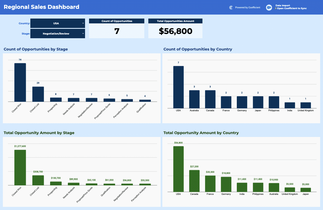
Sales Commission Report
Build a live sales commission report with tiered rates, team filters, and KPI tracking. Track sales, commissions, and performance in your spreadsheet.
Read the guideFree Pipedrive Template for Lead Scoring
Download our free Pipedrive Lead Scoring template to automatically calculate lead quality scores, visualize hot prospects, and increase your sales team's conversion rates.
Launch template
Common questions about the outbound sales metrics dashboard
How do I set up automatic data syncing for my outbound sales metrics across multiple tabs?
How can I calculate conversion rates across 12 weeks of outbound sales activity?
How do I filter my outbound sales dashboard by individual sales rep?
What's the best way to visualize trends in emails sent versus calls made over time?
Can I share my outbound sales metrics dashboard with stakeholders who shouldn't edit the data?
How do I know when my outbound sales metrics hit important thresholds or targets?
Ready to try it in Coefficient?
Connect your data and start building in minutes.
