Navigating the intricacies of the sales process can be daunting for even the most experienced SalesOps professionals. With numerous touchpoints in the sales cycle and the need to align various stakeholders, it’s easy to feel overwhelmed.
Sales pipeline management is the glue that holds these moving parts together, helping to ensure leads and opportunities don’t slip away.
Fortunately, the right sales pipeline management tool not only tackles these challenges but also streamlines the entire sales process. These solutions will help SalesOps professionals monitor sales activities, ensuring a smooth journey from lead generation to closed deals.
This blog will give a complete breakdown of the most popular sales pipeline management solutions out there.
Let’s dive in!
What Are Sales Pipeline Management Tools?
Sales pipeline management tools are software solutions that give Sales leadership full-funnel visibility, allowing them to optimize strategies, accelerate lead management, and more.
Most sales pipeline management software includes these features:
- Task management
- Workflow automation
- Sales analytics
- Reports and dashboards
- Lead scoring
- Customer profile
- Third-party integrations
- Remote data access
Top 5 Paid Sales Pipeline Management Tools
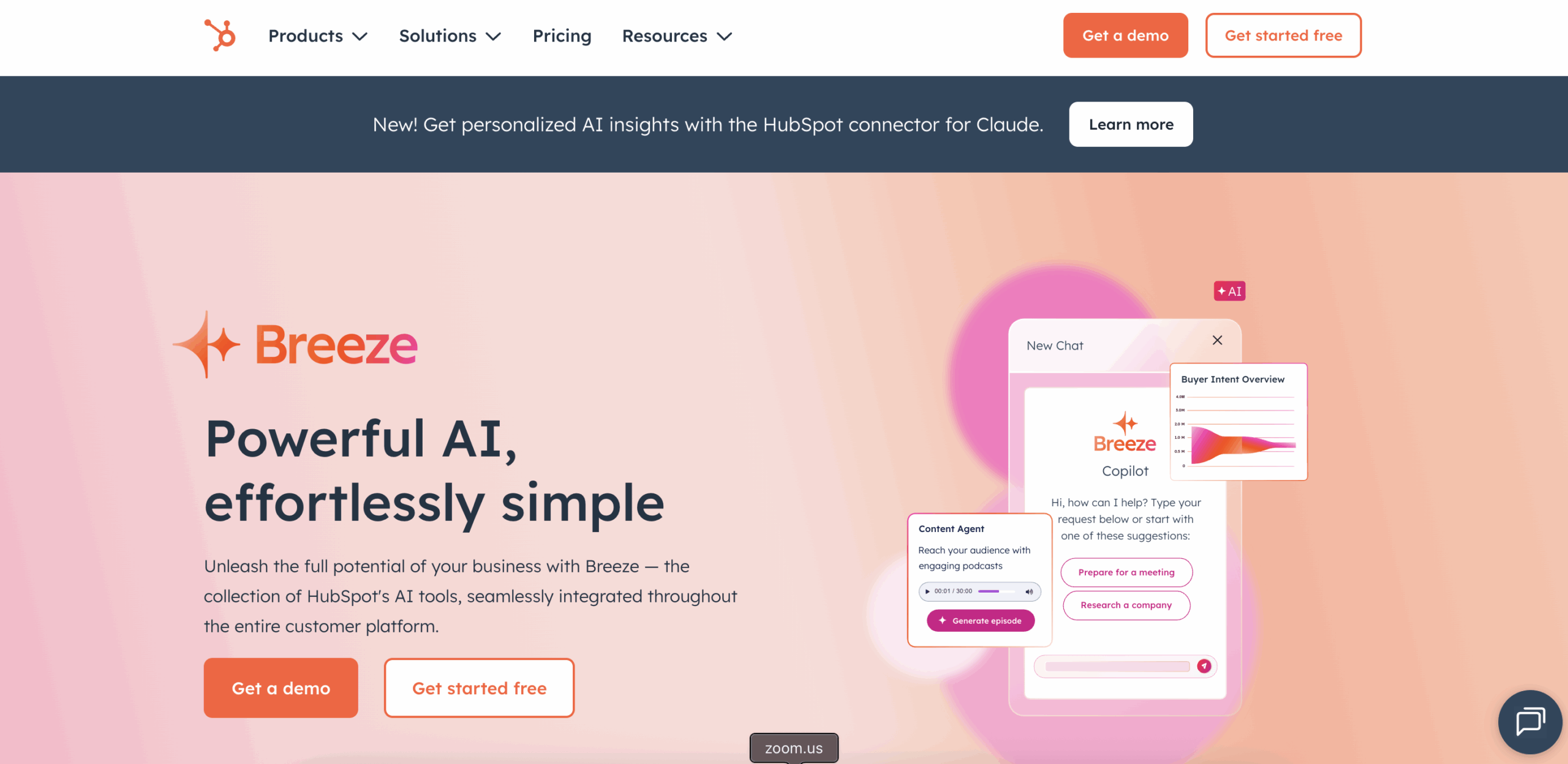
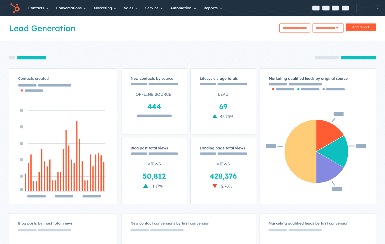
HubSpot CRM
HubSpot is a popular, comprehensive CRM system with features that unify your customer service, marketing, and sales teams. It has everything you need to streamline every stage of your sales pipeline, like the meeting scheduler, website builder, sales tracking, and reporting.
Pros
- Robust functionalities. Experience the convenience of real-time reporting, live chat, meeting scheduler, and email tools without spending a single dime.
- Automation features. Speed up the buyer’s journey through pipeline stages with automated follow-up emails and a chatbot for booking meetings, providing customer support, and more.
- App Marketplace. Create a unified software ecosystem by connecting HubSpot with your existing tools, including landing page builders, ticketing solutions, and email marketing platforms.
- Flexible pricing. HubSpot CRM lets you create your own HubSpot products and add-ons bundle tailored to your specific needs.
Cons
- Minor slowdowns. Users may experience unexpected delays and slowdowns when performing certain tasks, like connecting calls to mobile devices or logging in.
- Steep learning curve. Although HubSpot’s core CRM solution is user-friendly, using it alongside other HubSpot products and integrations can initially be challenging.
G2 Reviews Around HubSpot CRM
“Functionality, ease of use, the education that HubSpot provides for new sales team members.”
– Luke S., Small Business (50 or fewer employees)
“One of the key benefits of HubSpot is its comprehensive suite of tools, which includes marketing automation, customer relationship management, sales, and service modules.”
– Ines O., Small Business (50 or fewer employees)
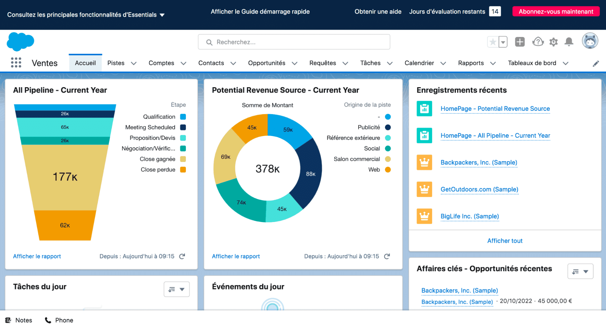
Salesforce CRM
Salesforce is a trusted CRM platform that consolidates all customer-facing activities—from digital marketing to customer service. It’s designed to maximize the productivity of your sales and marketing teams, maximizing revenue while reducing customer churn.
Pros
- Collaboration features. Augment sales enablement with a strong lineup of collaboration tools for your salespeople.
- Extensive customization. Streamline your sales pipeline management by customizing the Salesforce CRM with custom fields, web forms, and more.
- Automation features. Similar to HubSpot, Salesforce comes with automation features for redundant admin work and customer interactions.
- Cross-platform productivity. Use the Salesforce mobile app to access the dashboard, respond to messages, and collaborate with your team on the go.
Cons
- Technical issues. Due to the level of customization that businesses can achieve, Salesforce users may experience problems with certain features like macros, quoting, and other dashboard tools.
- Cumbersome reporting interface. Although powerful, Salesforce CRM’s reporting feature takes some time to learn and use proficiently.
G2 Reviews Around Salesforce CRM
“Creating and sharing dashboards on the performance of a particular service area is easy, helping us monitor the pipeline of opportunities in real-time.”
– Rayaprolu V., Mid-Market (51-1,000 employees)
“Salesforce Sales Cloud gives our internal teams a platform to collaborate and provide the best experience to our customers.”
– Chris T., Enterprise (> 1,000 employees)
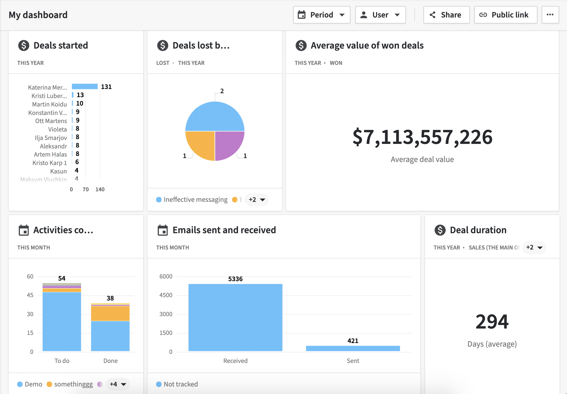
Pipedrive
Pipedrive’s CRM tool is designed to help brands optimize each customer journey stage and maximize revenue. While it’s not as feature-rich as other top-tier CRM software, it allows teams to focus on what matters in customers’ experience.
Pros
- Clean dashboards. Pipedrive’s clutter-free visual interface centers around sales pipeline management, maximizing your sales team’s productivity and ease of use.
- Affordable pricing. Pipedrive’s pricing model offers one of the most affordable subscription plans among paid sales pipeline management solutions.
- Automation features. Use Pipedrive’s workflow automation features to save time on manual tasks, including lead scoring, revenue forecasting, lead nurturing, and so on.
- Paid add-ons. Extend the functionality of the Pipedrive dashboard with add-ons for lead communications, visitor analysis, and campaign management.
Cons
- Limited integrations library. Although Pipedrive has a respectable integrations count of over 400, it pales in comparison to other platforms that support 1,000+ third-party app integrations.
- Feature limitations. Due to Pipedrive’s focus on sales pipeline management, it lacks additional features like extended support hours, live chat for end users, and dashboard branding options.
G2 Reviews Around Pipedrive
“Ultimately, we appreciate Pipedrive for the fact that it delivers great value for the price, at all subscription levels.”
– Joseph V., Small Business (50 or fewer employees)
“One does not need a lot of experience to be able to use Pipedrive and create contacts, leads, deals, or a sales pipeline.”
– Brendan K., Small Business (50 or fewer employees)
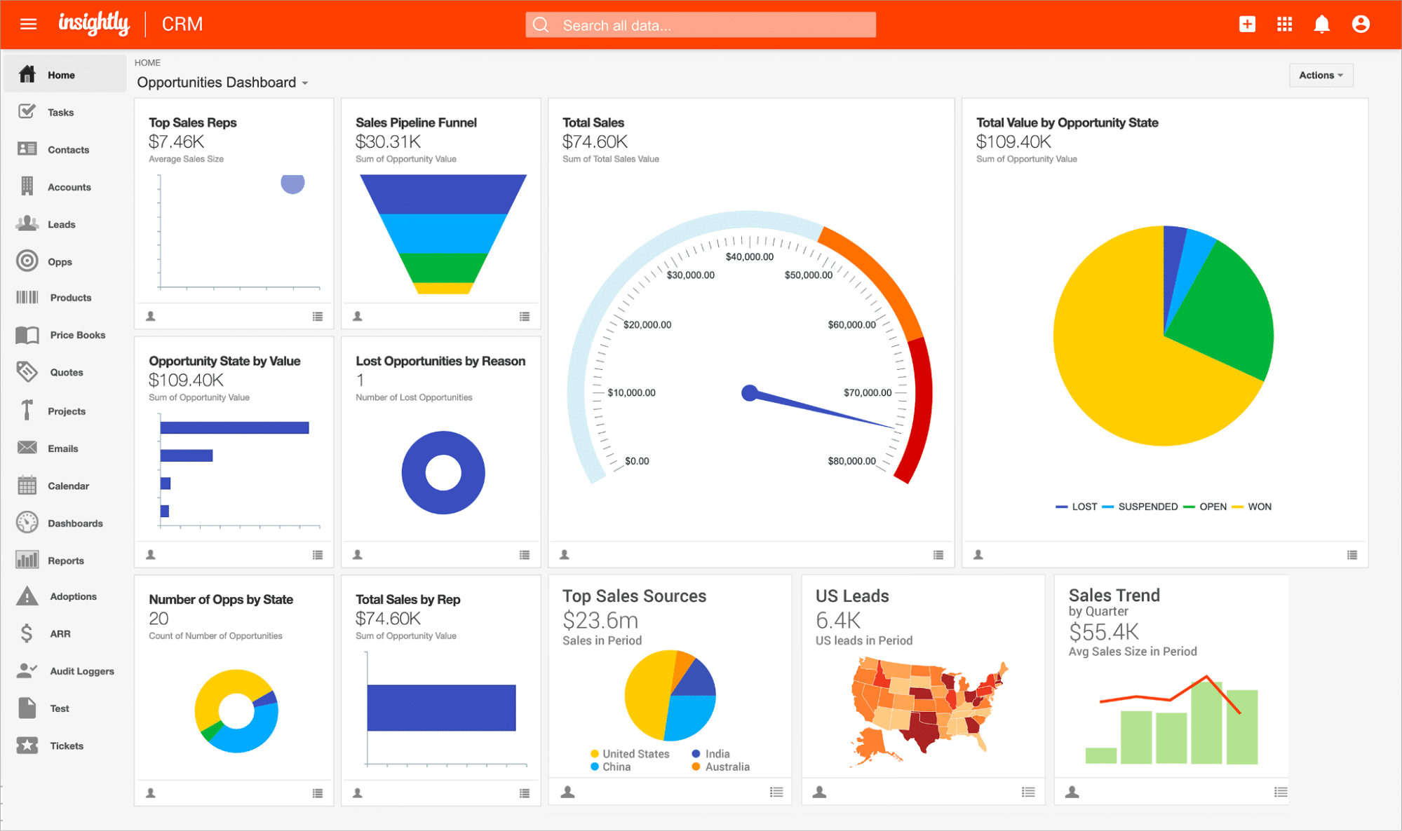
Insightly
Insightly is a scalable CRM platform that simplifies lead tracking, collaboration, and reporting within a modernized cloud dashboard. One of its strongest suits is usability, but the platform doesn’t skimp on sales pipeline management features.
Pros
- Low pricing. Insightly offers cost-effective pricing across all subscription plans even with advanced features like custom validation rules, unlimited file storage, and AppConnect integration.
- Automation features. Take advantage of complete workflow automation for activities like sales emails, follow-ups, task creation, and more.
- User-friendly interface. Insightly CRM is highly praised for its streamlined and easy-to-learn user interface, allowing your internal teams to jump into action in virtually no time.
- Build your Insightly package from scratch. Combine specific Insightly products that match your business needs, be it for CRM, customer service, marketing, or a combination of these areas.
Cons
- Lack of customization options. While the default Insightly dashboard is built with user-friendliness in mind, the limited customization options prevent businesses from optimizing their experience for maximum productivity.
- Automation update issues. Automation workflows may change or stop working completely upon installing software updates to Insightly.
G2 Reviews Around Insightly
“This platform provides a complete solution that caters to our every need, making it a valuable asset for our business.”
– Ajay Y., Mid-Market (51-1,000 employees)
“One thing I love the most about Insightly CRM is how the projects are structured and how easy it is to find the information we need.”
– Esperanca L., Mid-Market (51-1,000 employees)
Zoho CRM
Zoho CRM combines your marketing, sales, and customer support in a single, powerful platform. Its all-in-one approach to sales pipeline management covers everything, including sales enablement, marketing automation, team collaboration, analytics, and process management.
Pros
- Extensive customization. Get granular control over your CRM, including data entry validity, dashboard filters, custom components, and multi-lingual support.
- Automation features. Leverage automation workflows to save time on tasks like lead scoring, relationship building, deal management, and more.
- Omnichannel experience management. Manage customer experiences across all touchpoints, including social media, phone calls, emails, and web portals.
Cons
- Steep learning curve. The more integrations and customizations your business uses, the harder it is to get familiarized with Zoho CRM’s interface.
- Problems with specific integrations. Despite its popularity, users may have difficulty integrating certain third-party software into their Zoho CRM ecosystem.
G2 Reviews Around Zoho CRM
“One of the standout attributes of Zoho CRM is its user-friendly interface, which makes it simple for customers to get around and utilize the platform’s features.”
– Praveen K., Small Business (50 or fewer employees)
“Zoho One is a good CRM and suite of tools for small businesses that are price-conscious. It’s easy to use for people unfamiliar with CRMs.”
– Sharon W., Small Business (50 or fewer employees)
Top 5 Free Sales Pipeline Management Tools
Below are the top five sales pipeline management tools you can use for free.
Monday.com
Monday.com is an all-in-one cloud-based platform that lets you create apps to make your workflows, team collaboration, and project management efficient.
The platform’s Monday Sales CRM product includes features that help streamline your sales pipeline.
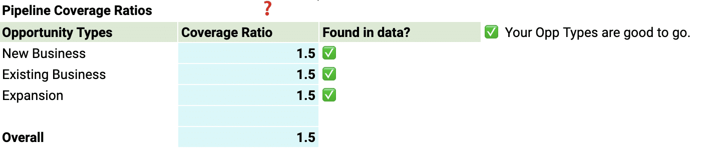
The Sales CRM helps you gather and score leads from multiple sources easily. All the data goes to a Deals board that contains all the pipeline metrics and relevant information you need to manage your pipeline coverage.
Another handy Sales CRM product feature is its automations which reduces your manual and repetitive tasks. For instance, you can configure the CRM to automatically set a deal’s creation date based on when it was added to the board.
Pros
- Unlimited boards. All Monday sales CRM product plans offer unlimited boards, allowing you to organize your clients, projects, and processes efficiently.
- Easy Workflow automations. Setting up and implementing the sales pipeline workflow automations is straightforward and user-friendly.
- 24/7 Customer support. Regardless of the plan you choose, Monday sales CRM provides round-the-clock customer support.
Cons
- Action limitations. The Monday Sales CRM product restricts the number of actions you can perform each month.
- Seat limit caps. All the paid plans for Monday Sales CRM mandate a three-seat minimum.
G2 Reviews Around Monday.com
“Monday does the work of at least 3 or 4 individual products and keeps getting better. There are also many integrations, and they keep updating and adding regularly.” — Keith C., Director of Outreach, Small-Business(50 or fewer emp.)
“The automation proved to be immensely valuable as it enabled us to establish a streamlined system within monday.com for managing all our data and I’m really impressed with the update feature.” — Shinoy R., Digital Marketing Specialist, Enterprise(> 1000 emp.)
Bitrix24
Bitrix24 is a free sales pipeline management solution that simplifies and streamlines managing your sales pipeline. You won’t need to build your sales pipeline management templates from scratch since the tool can automatically create them for you based on your defined sales process stages.
The software’s sales automation features include:
- Automatic lead assignment
- Custom workflows
- Access rights
- Tasks and projects
Pros
- Feature-rich. Bitrix offers a plethora of features, from sales pipeline management and CRM solutions to task and project management.
- Feature-packed free version. Unlimited access to records, leads, contacts, deals, and companies with the free version.
Cons
- Complex Interface. The user interface can be challenging to navigate.
- Steep Learning Curve: Especially for newcomers to sales pipeline management and CRM.
G2 Reviews Around Bitrix24
“How easy it is to create automations in the pipeline and also how easy it is to customize our pipeline, being able to go through different products and comprehend the sales process more easily.” — João V., Small-Business(50 or fewer emp.)
“This is a SAAS system and Bitrix24 will take care of all system maintenance and hosting. The best part of the system is employee management and kanban for task management. CRM embeddings for sales, project management, and many other modules are also available.” — Thomas B., Project Engineer, Mid-Market(51-1000 emp.)
Capsule CRM
Capsule CRM is a customer relationship management platform that helps you track and manage business relationships with your clients and leads. The platform’s sales pipeline management software features allow you to:
- Track sales opportunities via forecasted sales pipeline value based on total opportunity and probability value.
- Manage your open sales opportunities on one page and outline your sales plan using a visual sales planner.
- Create multiple pipelines representing various services, markets, and products. The pipelines give your sales team a more accurate view of your sales process, allowing them to better forecast sales, analyze pipeline easily, tailor your sales cycle to prospects, and close more deals.
Pros
- User-friendly. Capsule CRM is intuitive and easy to use.
- Robust integrations. Seamlessly integrates with Microsoft 365, Google Workspace, Xero, and Mailchimp.
Cons
- Limited security features. Basic security options with restricted user roles and permissions.
- Lacks marketing automation. Users need to rely on third-party integrations like Zapier for certain automated workflows.
G2 Reviews Around Capsule CRM
“Capsule is an excellent CRM that satisfies all of our requirements. It’s simple to locate and extract contact groups for upload/sort purposes. This software has a clean, simple, and intuitive sales pipeline dashboard.”— Eshrak M., Junior Frontend Developer, Small-Business(50 or fewer emp.)
“This software help pulls together all of our Sales and Marketing efforts. Our intranet business loves using this!” — Rebecca H., Digital Marketing Manager, Small-Business(50 or fewer emp.)
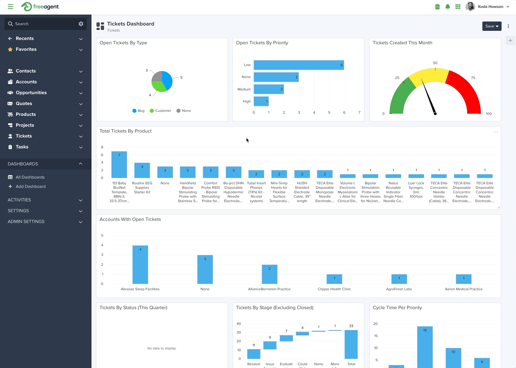
FreeAgent CRM
FreeAgent CRM is a CRM platform with features that help your team streamline organizing and gaining visibility into daily tasks. Its easy-to-use yet powerful sales platform aids your sales team in managing their workflows, allowing them to close more deals.
The platform’s pipeline management solution allows you to do the following:
- Customize your deal structure, processes, and sales stages.
- Forecast and pipe reviews that give you necessary insights. The platform’s built-in reporting engine helps you extract insights to drill down into your reports and see the source data.
- Automatically capture, assign, and follow up leads.
- Automate your task management and capture team interactions with deals and contacts within the Activity Timeline for easy tracking and assessment.
Pros
- Workflow automations. Helps teams work faster and smarter with auto-assign task-based triggers for notifications.
- Comprehensive tracking. Tracks deals, monitors contacts, manages data, and presents projects via automated reporting.
- Automated lead management. Offers automated lead assignments and follow-ups for improved sales plays.
Cons
- Not Ideal for Small Teams. The platform’s features might be overwhelming for smaller companies with fewer than ten employees.
G2 Reviews Around FreeAgent CRM
“There are two things. First: their customer service is bar-none, the best i have ever seen. They have a chat option that allows you to get answers within 5 minutes if not sooner. Second: the system so so robust you can work operations, payments and sales seamlessly together.” — Janie W., Platform Development Consultant, Small-Business(50 or fewer emp.)
“Customizable, easy to use and learn the basics with potential to add a lot more later. They show you how and where you can access and control all aspects of the setup.” — Permveer B., Small-Business(50 or fewer emp.)
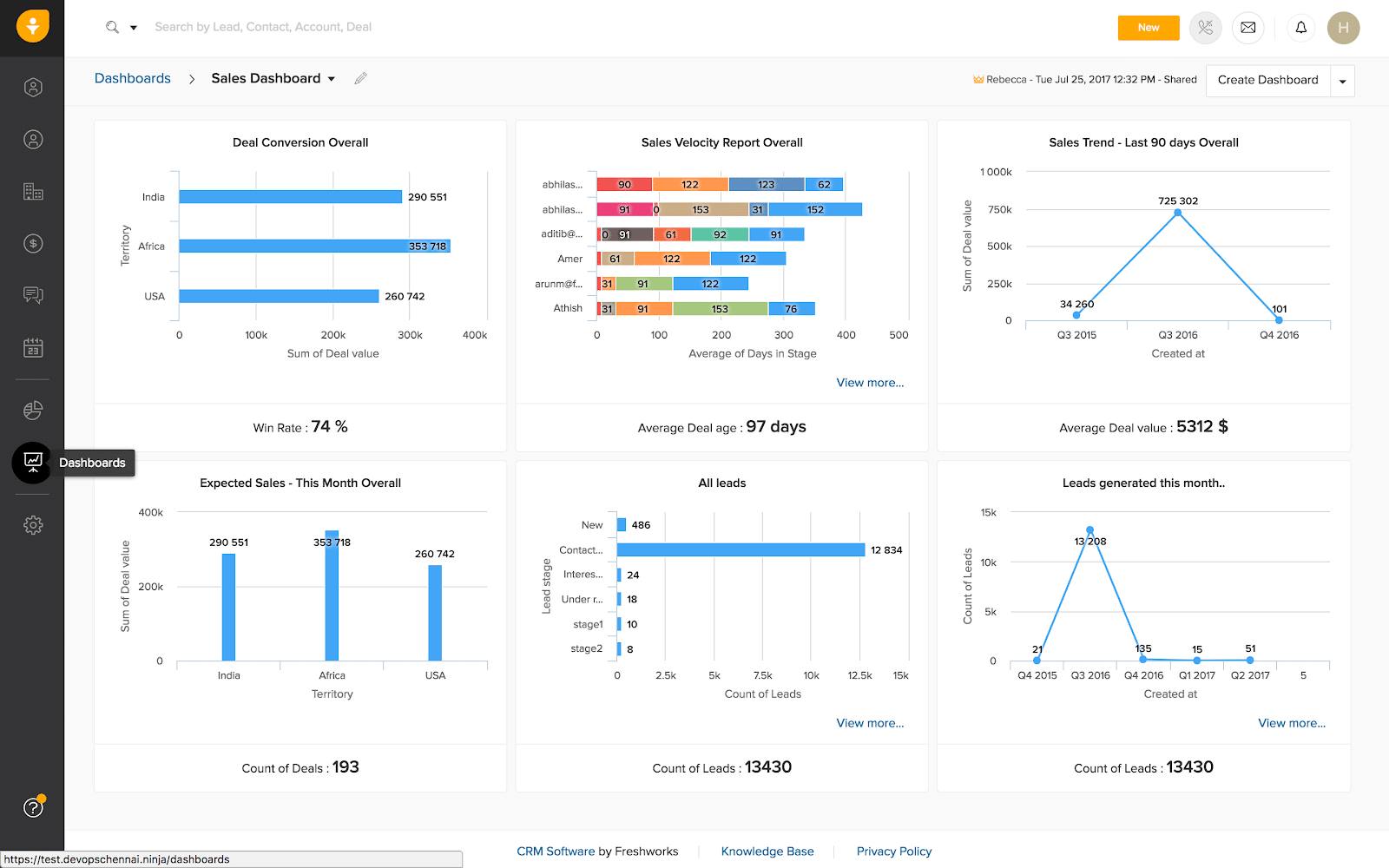
Freshsales CRM
Freshsales CRM is a cloud-based CRM software that is part of Freshworks’ suite of tools that integrate seamlessly. The software is known for its customization options, AI-powered contact and deal scoring functionalities, and built-in phone features.
The Freshsales CRM Sales Intelligence feature allows you to:
- Spot and prioritize your most sales-ready prospects based on scores assigned by Freddy AI.
- Leverage the Freddy AI insights based on historical engagement, activities, and sales data to predict deal closure.
- Use Freddy AI’s smart suggestions to manage calendars, set up tasks, reschedule appointments, and more.
- Use past data to predict revenue and sales performance and target high-intent deals.
Pros
- Multichannel contacting. Free plans include multiple channels to contact leads, such as email, chat, and phone.
- AI-Powered lead scoring. Utilizes artificial intelligence for lead scoring.
- Automation capabilities. Provides numerous automations to streamline sales pipeline and CRM tasks.
- Customizable dashboards. Users can tailor their dashboards and reports to their needs.
Cons
- Limited free plan. The free version does not include reporting features.
G2 Reviews Around Freshsales CRM
“Freshsales has provided us with high-quality items at a reasonable price. We have managed and improved our sales and marketing efforts with Freshsales‘ support.” — Mindi M., Senior Client Coordinator, Marketing and Advertising, Enterprise(> 1000 emp.)
“As a sales rep, this tool is really helpful for me to create, manage and project deals of prospects and see the progress and the sales cycle. The best part is this platform allows or notify us of real-time deal opportunities so we can connect with the client asap.” — Neel R., Manager International Sales, Mid-Market(51-1000 emp.)
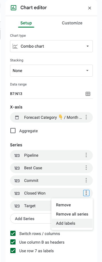
Can Google Sheets be used for Sales Pipeline Management?
Absolutely. Google Sheets offers familiar functionalities that make it a prime choice for sales pipeline management, especially for startups or smaller businesses on a tight budget.
But there’s a catch.
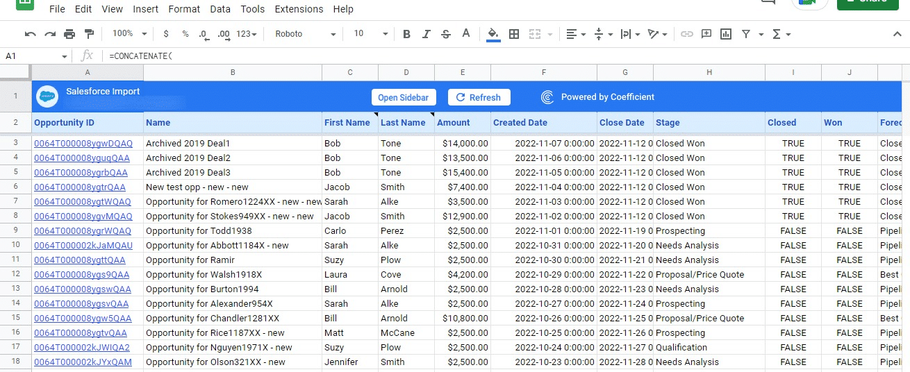
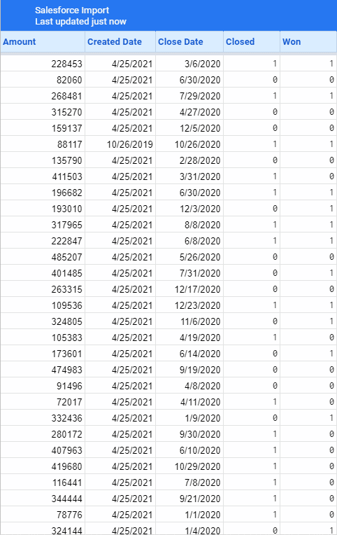
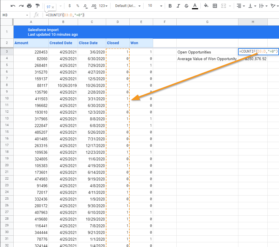
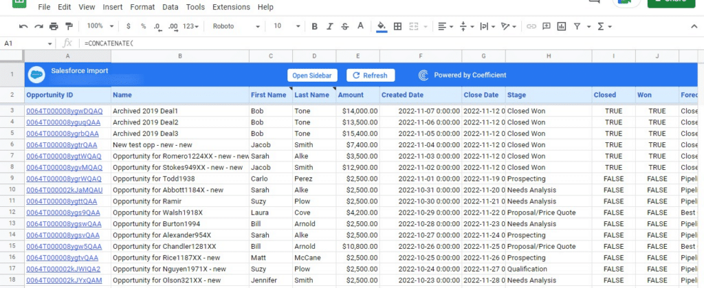
Getting your sales pipeline data into your Google spreadsheet can be a real headache. Sure, you can manually export data from your CRM, but that’s tedious, error-prone, and a massive time sink.
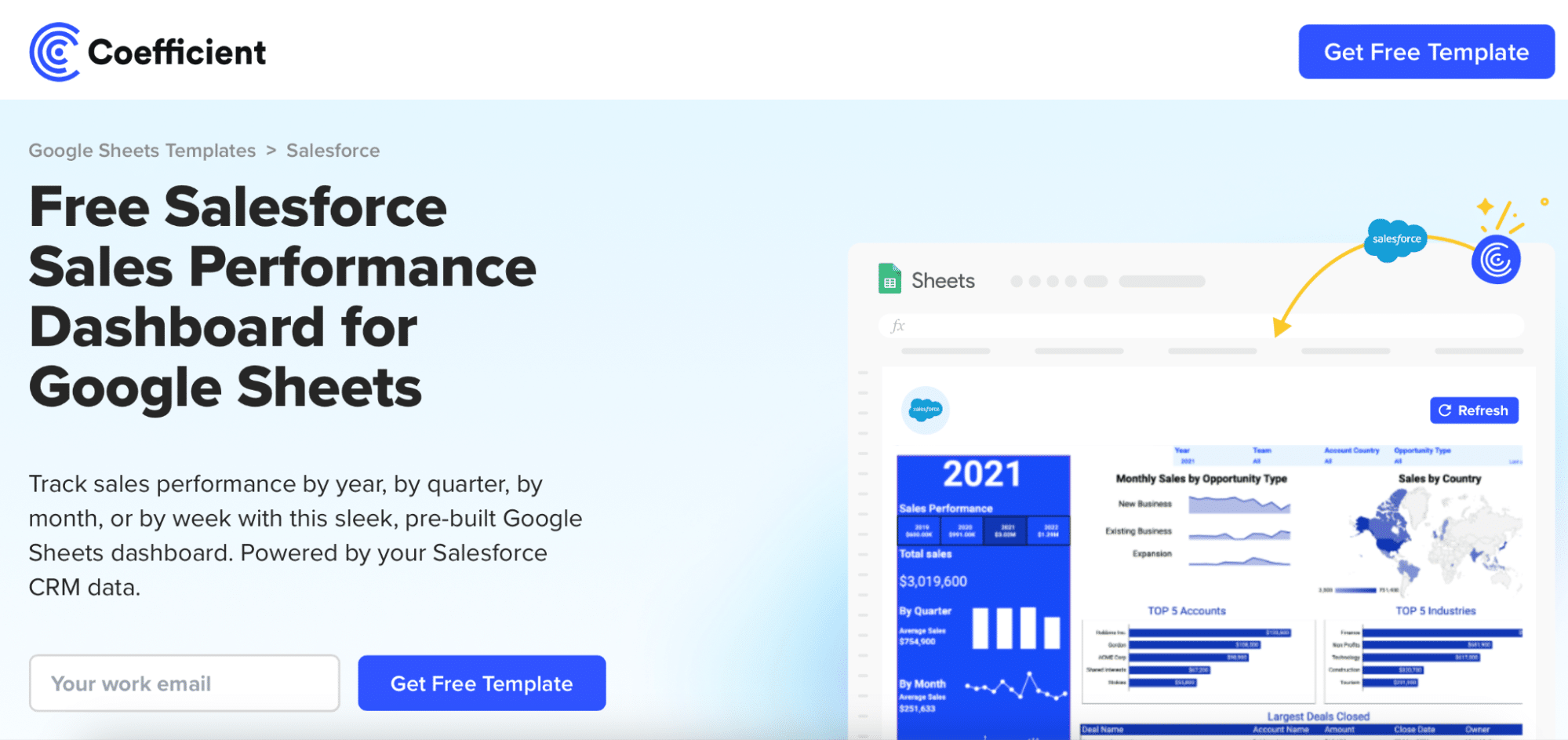
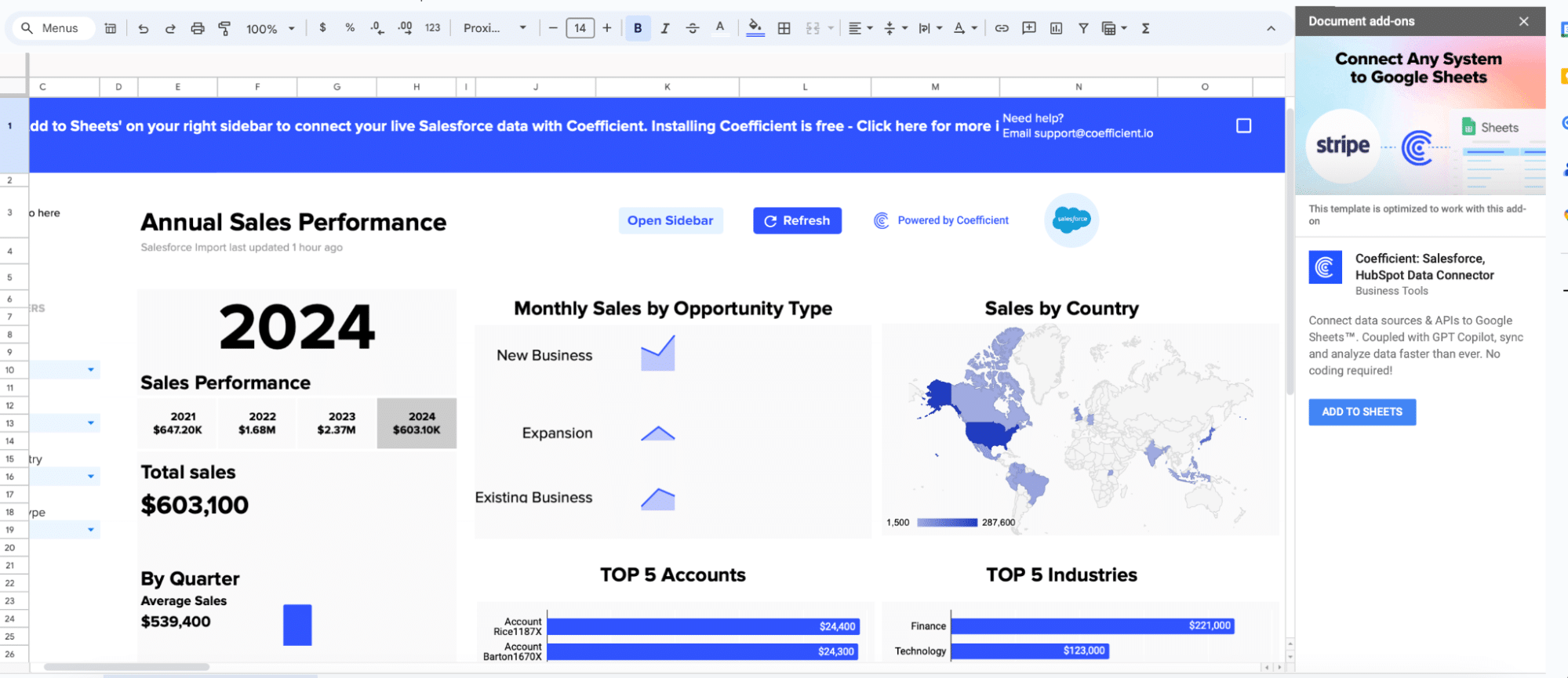
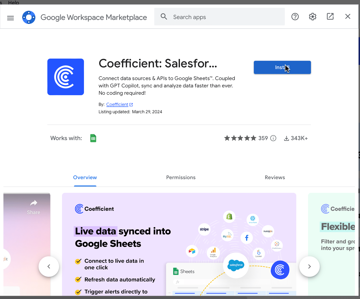
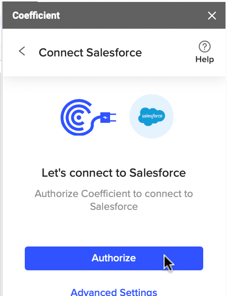
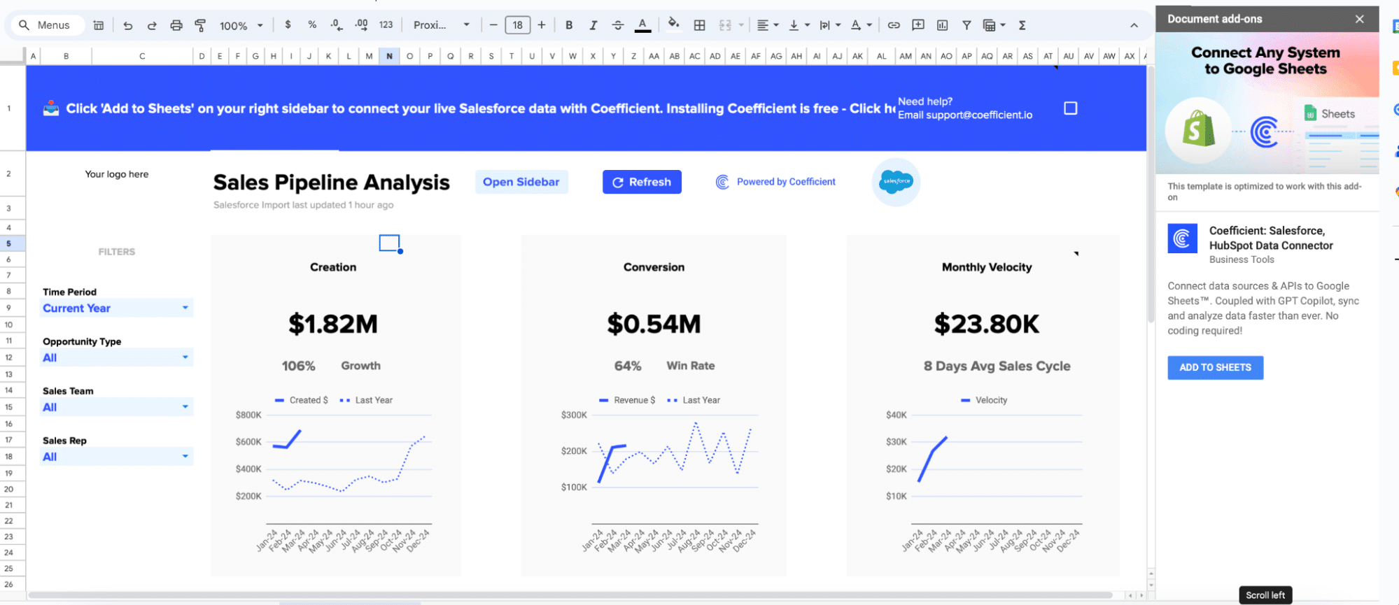
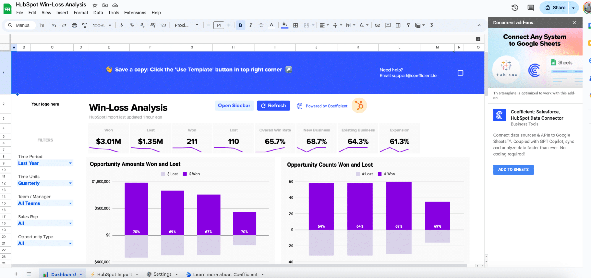
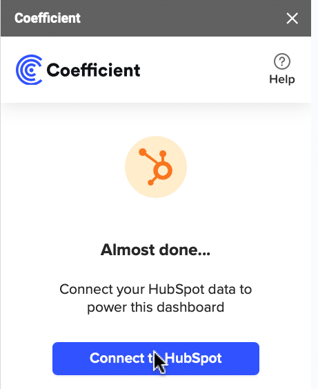
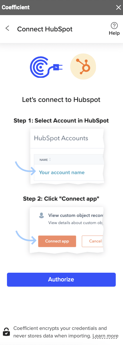
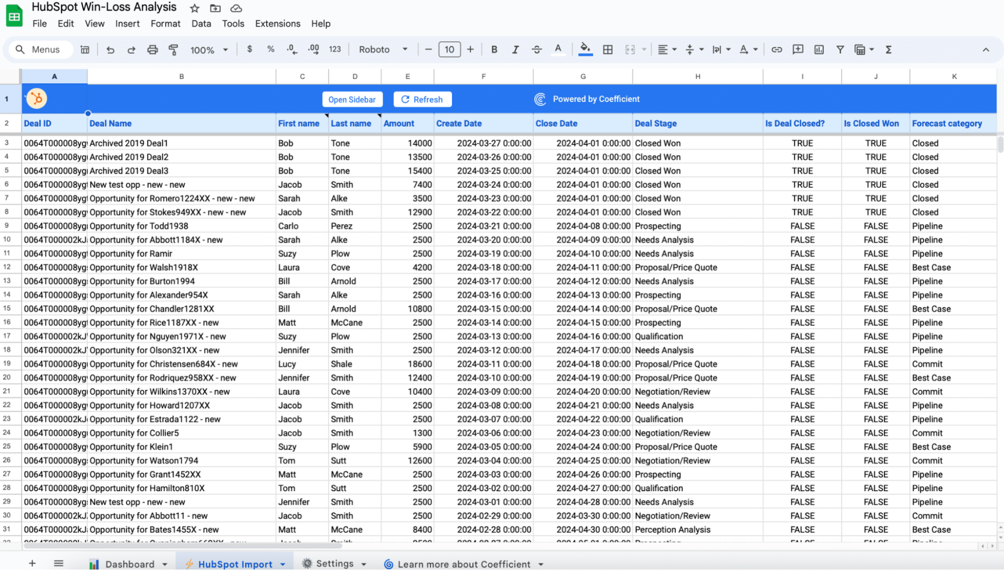
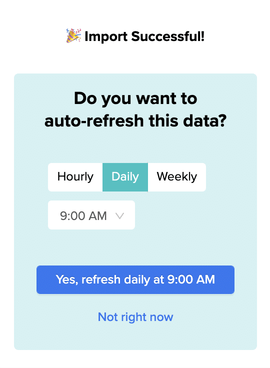
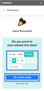
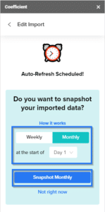
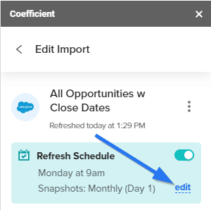
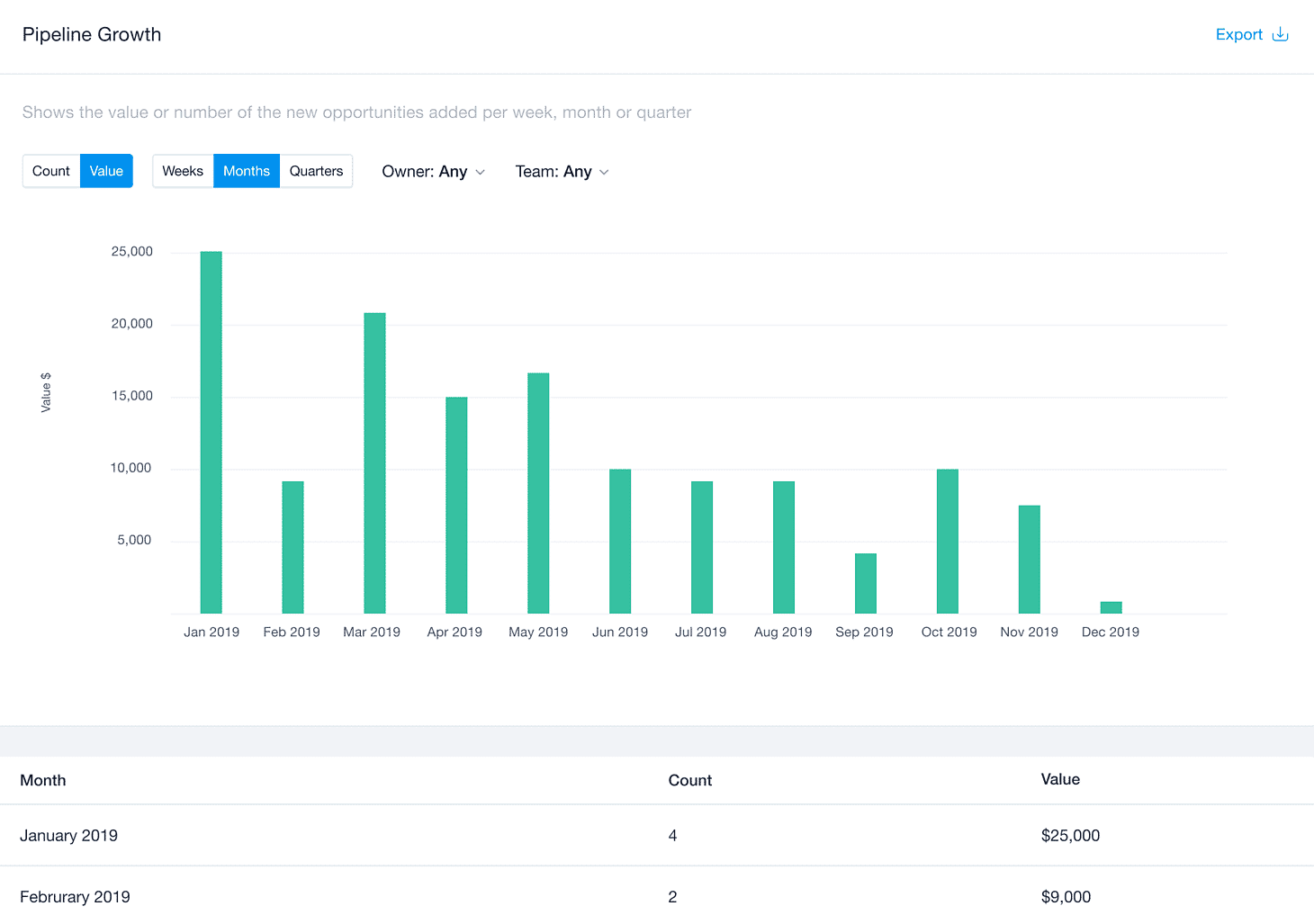
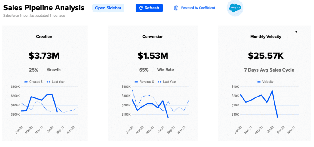
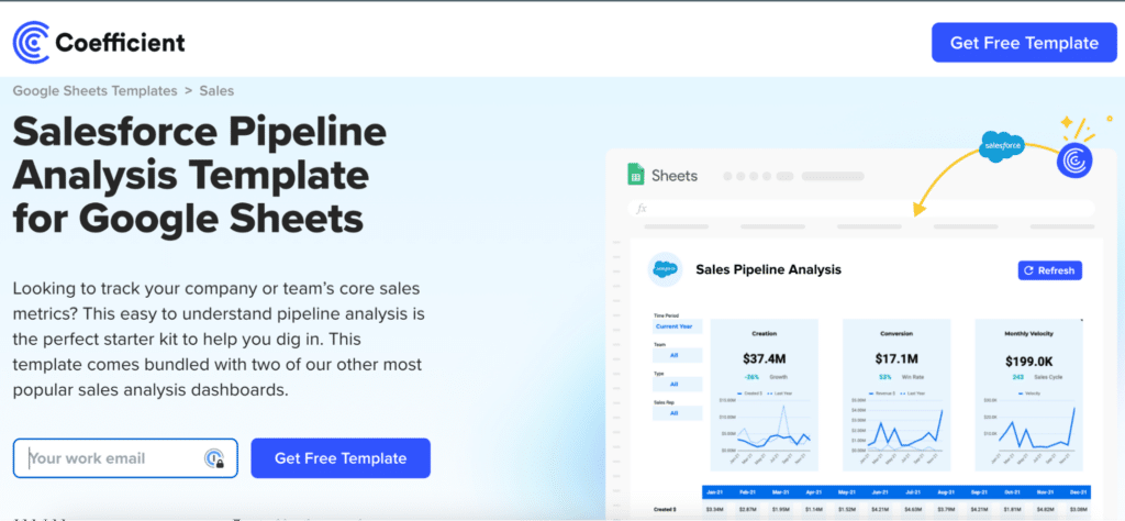
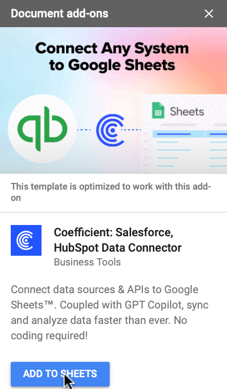
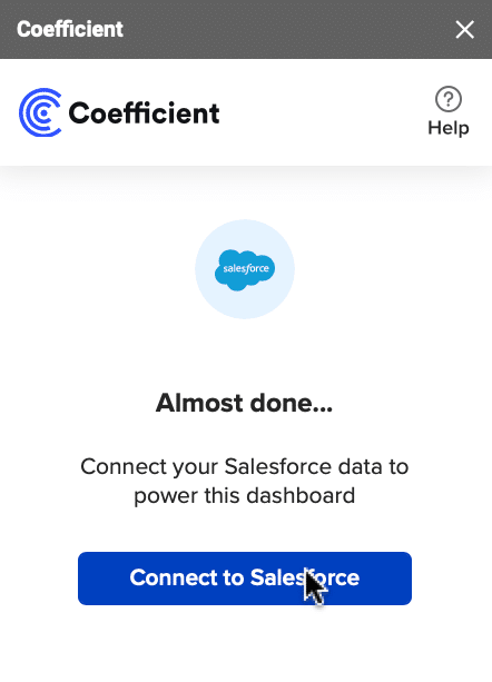
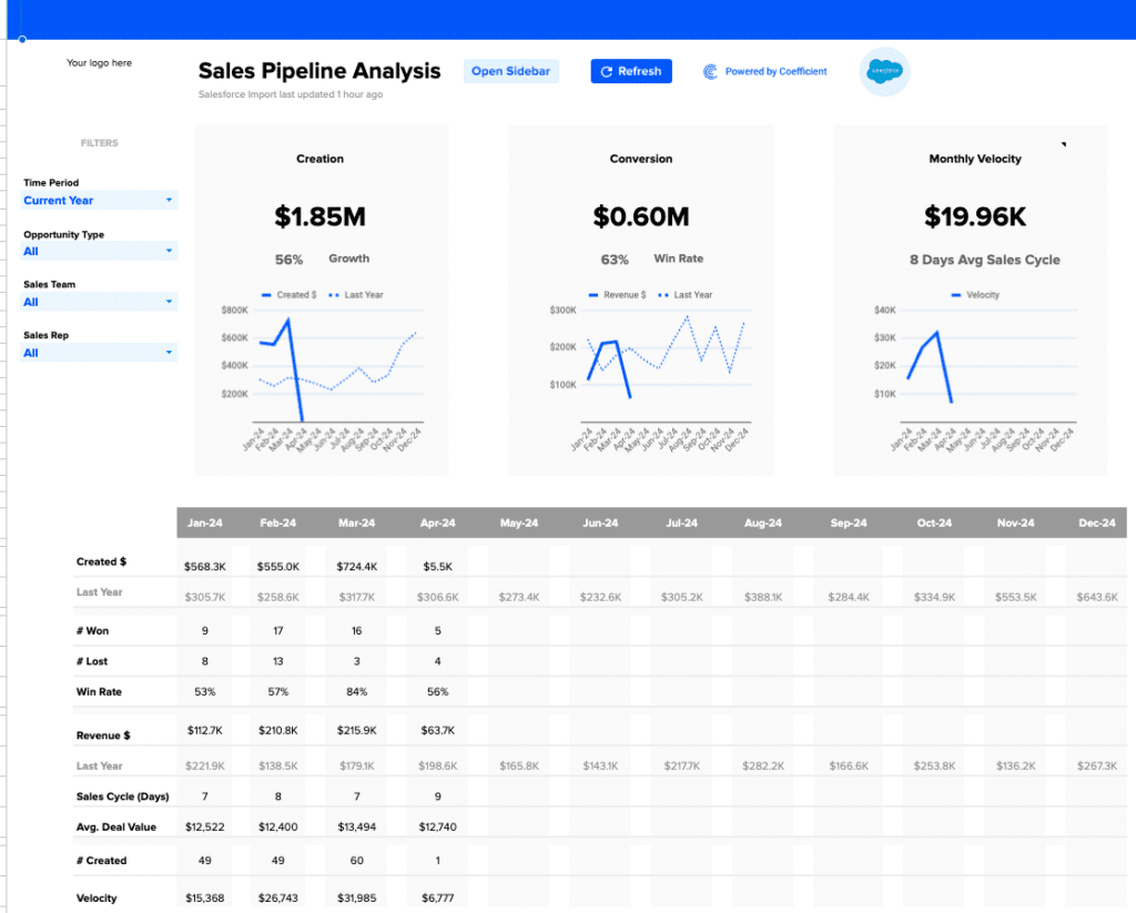
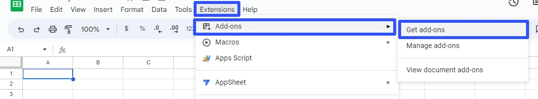
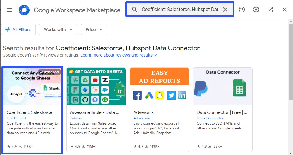
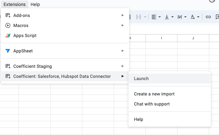
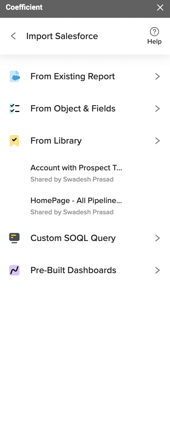
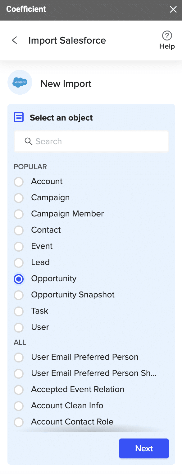
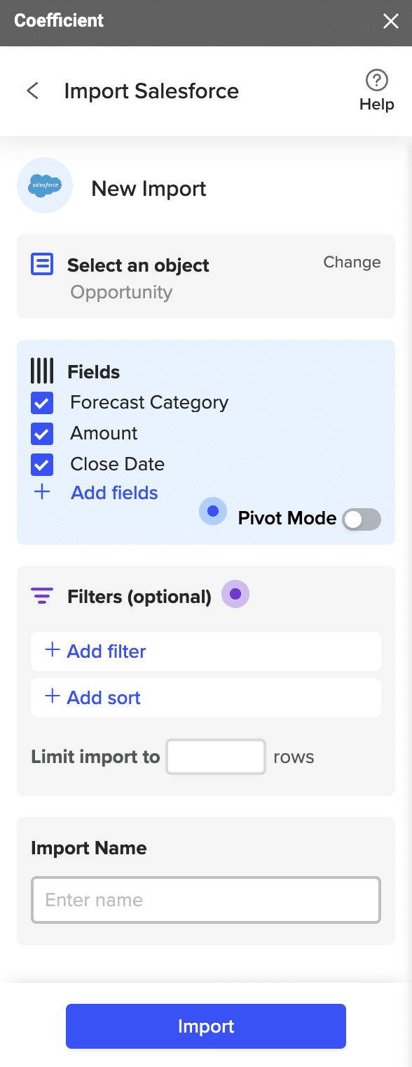
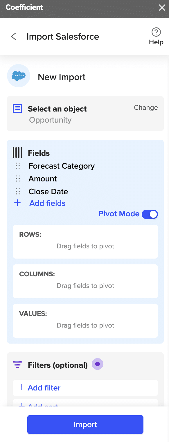
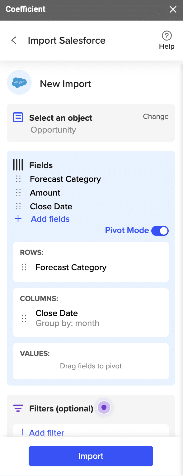
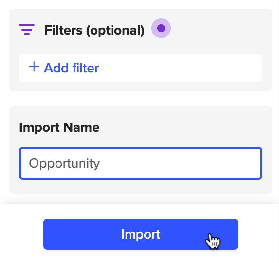
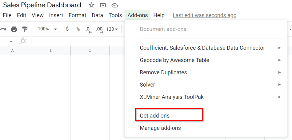
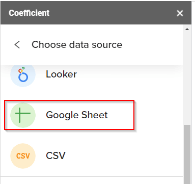
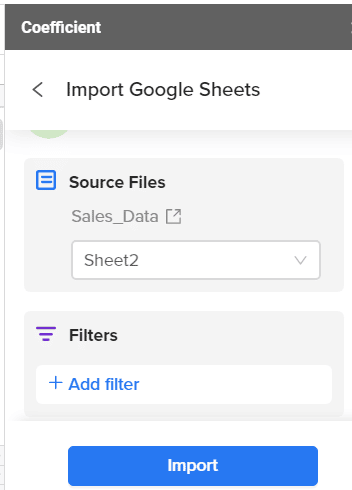
Enter Coefficient, a free Google Sheets add-on that allows you to seamlessly sync live data from your favorite business systems into your spreadsheet.
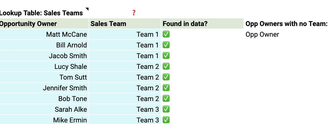
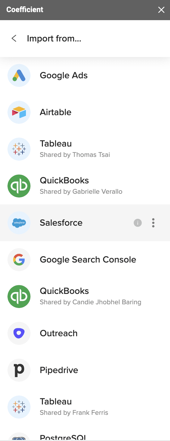
Installing Coefficient to Google Sheets is a breeze. And once set up, you can directly connect to CRMs like Salesforce, HubSpot, Pipedrive, Zoho CRM.
Coefficient also lets you combine data from other data sources like Snowflake, Mailchimp, Tableau, MySQL and more, allowing you to perform more holistic analyses of performance.
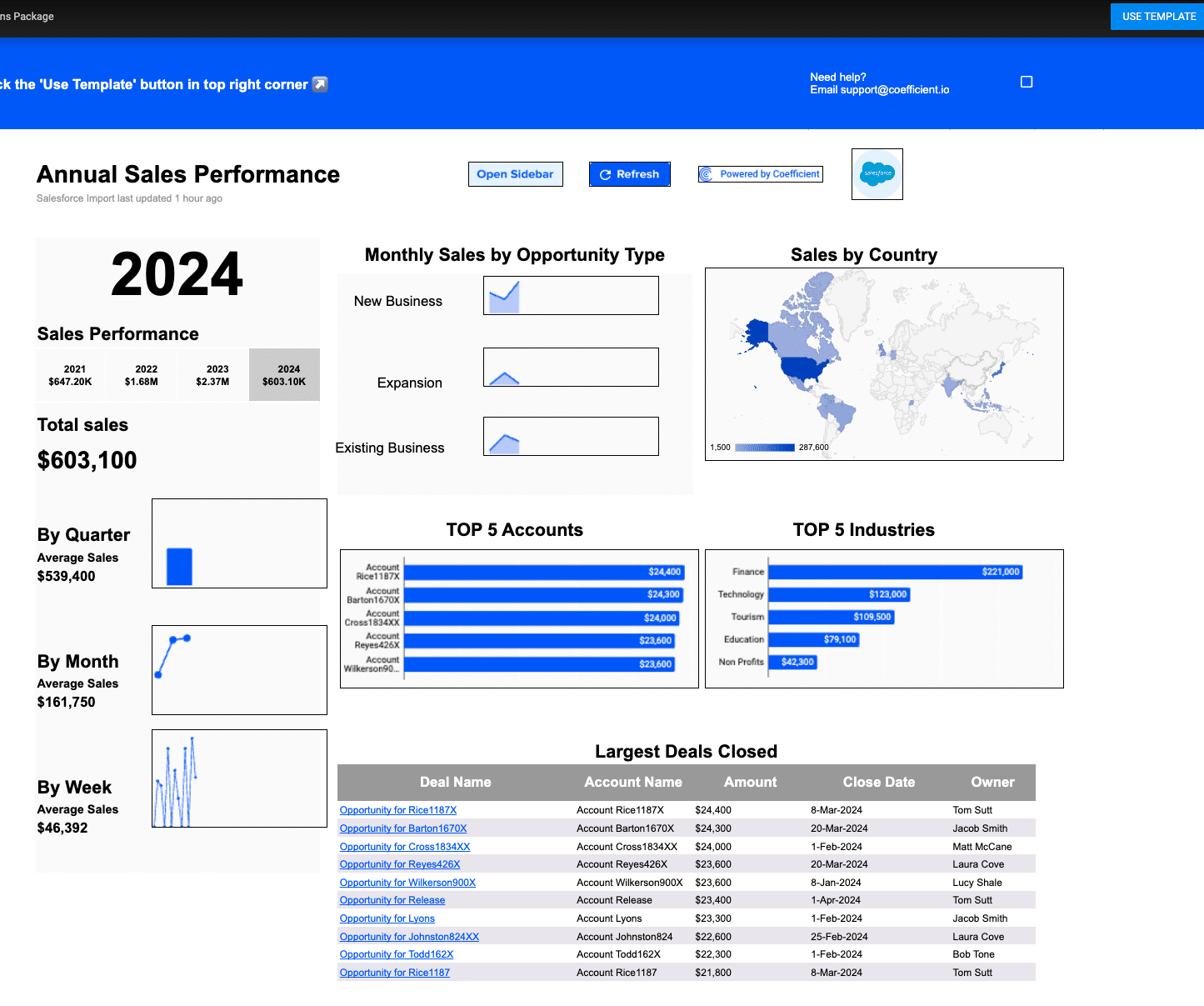
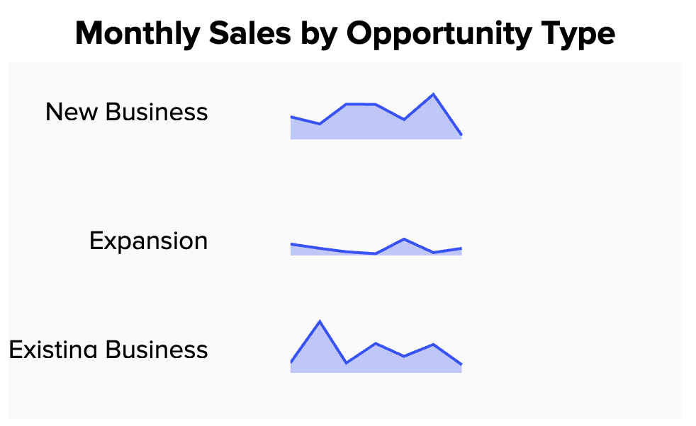
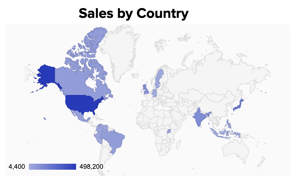
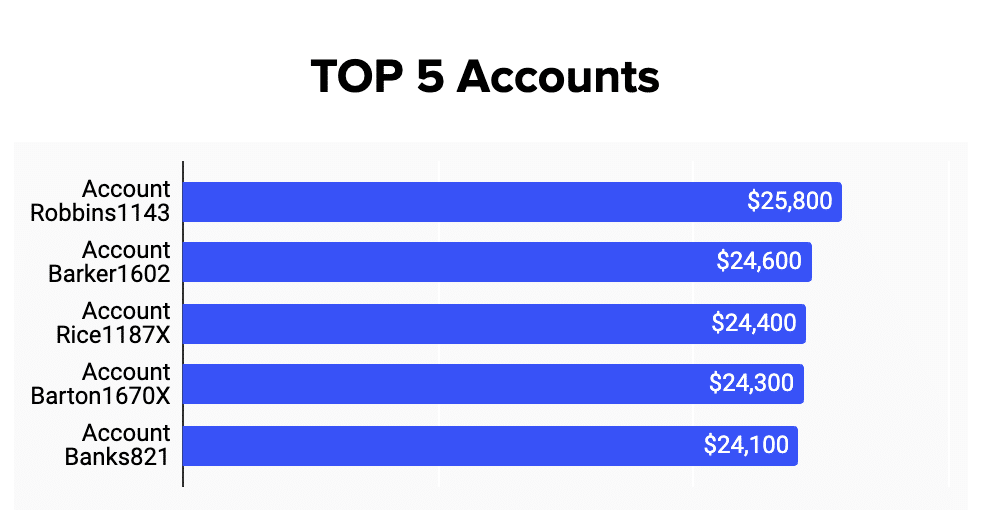
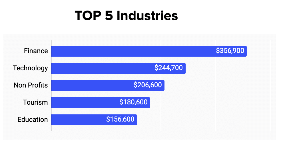
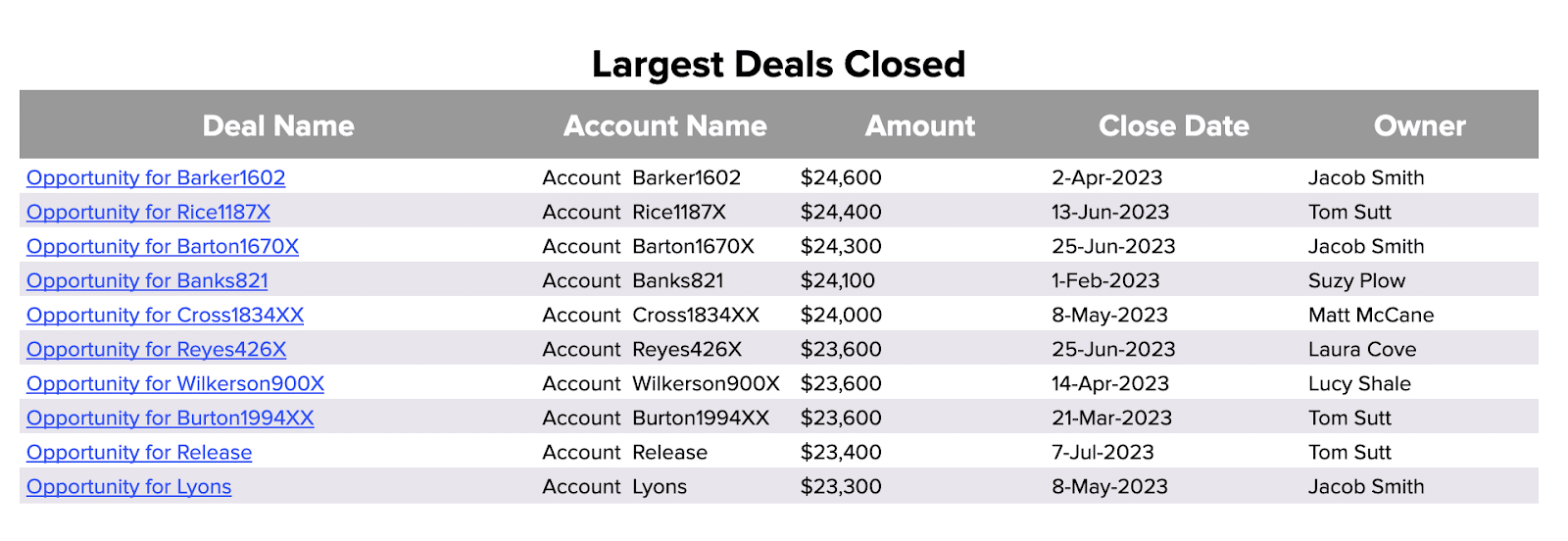
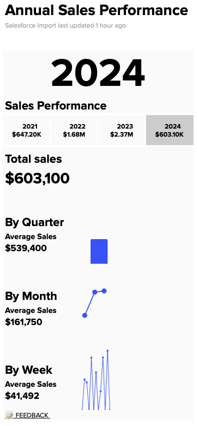
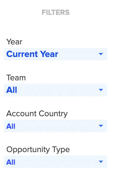
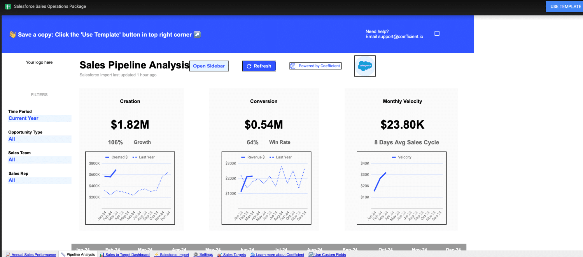
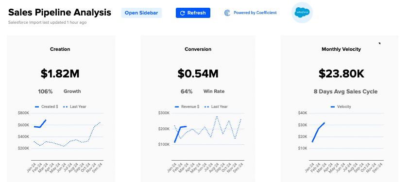
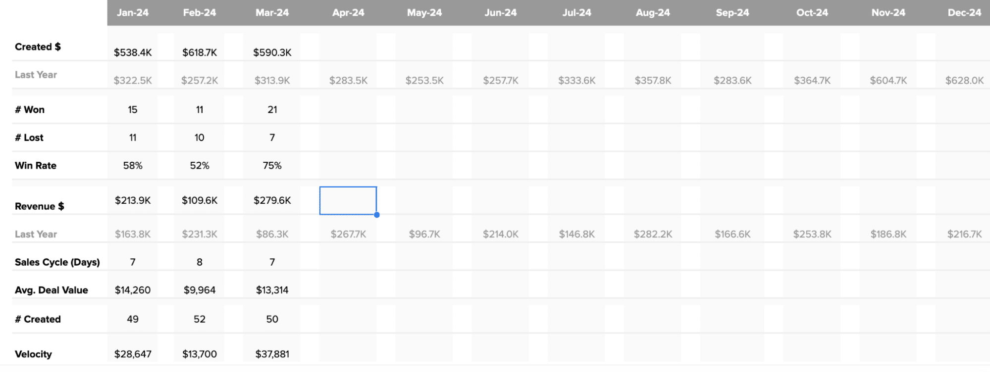
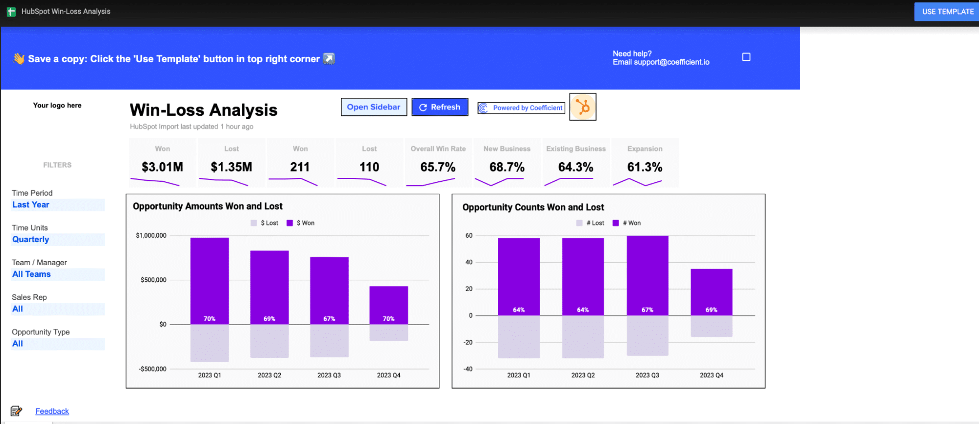
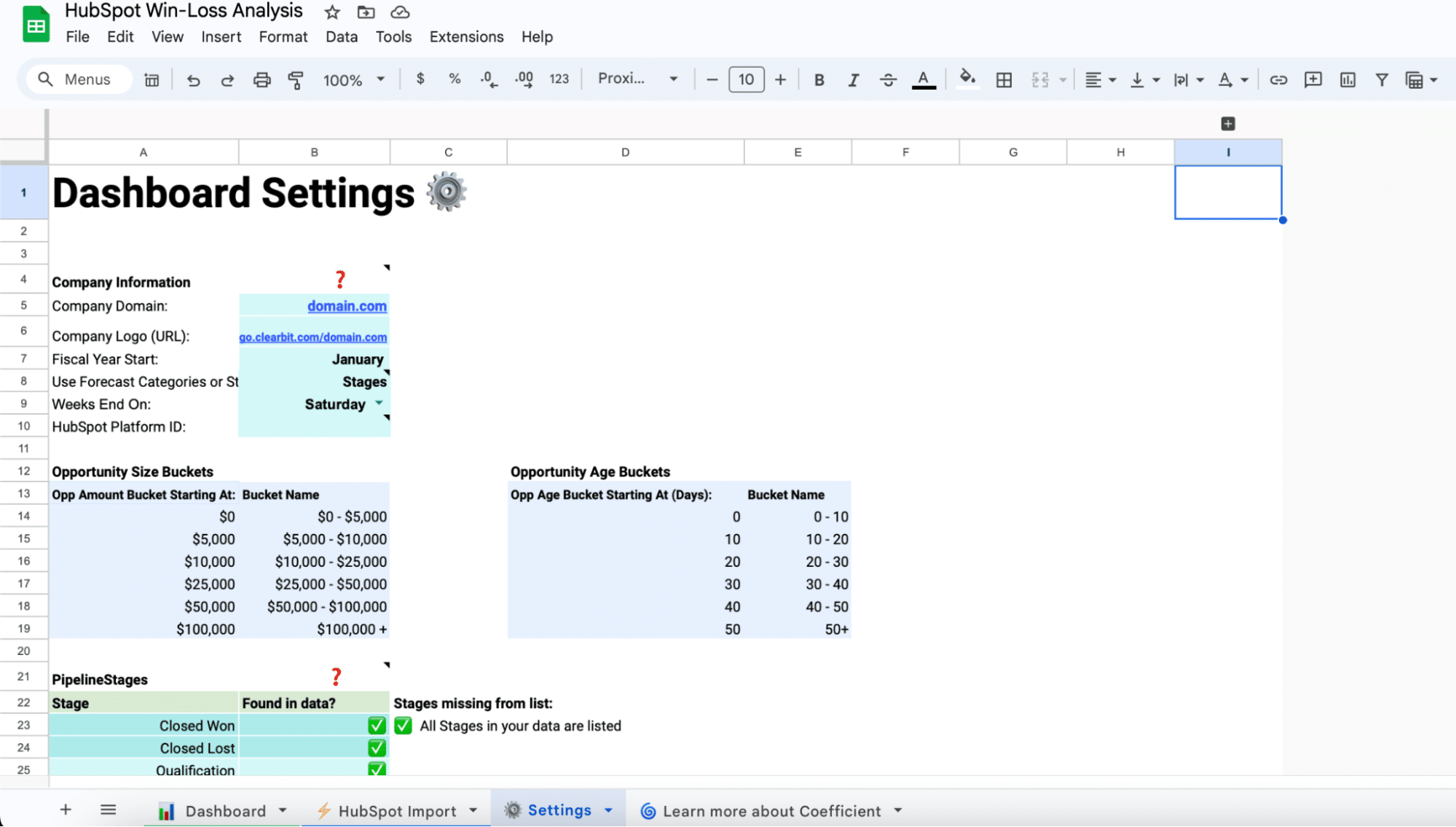
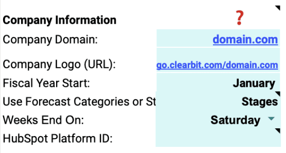
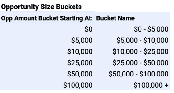
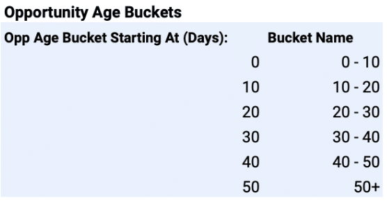
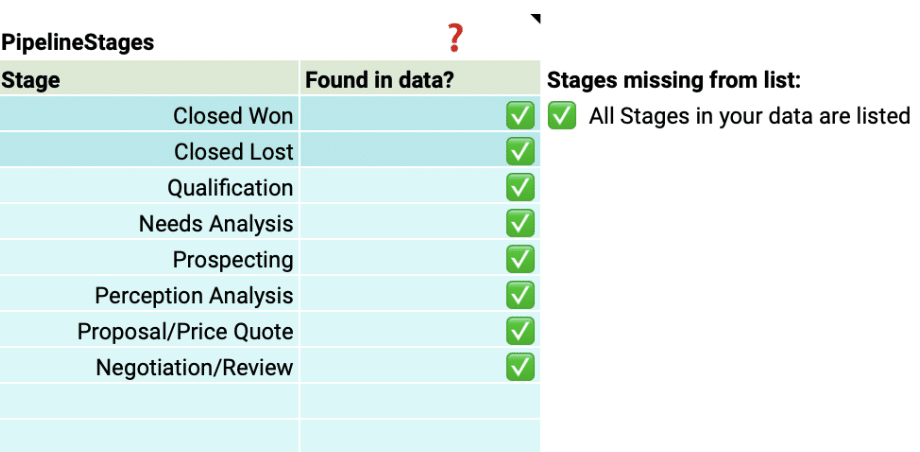
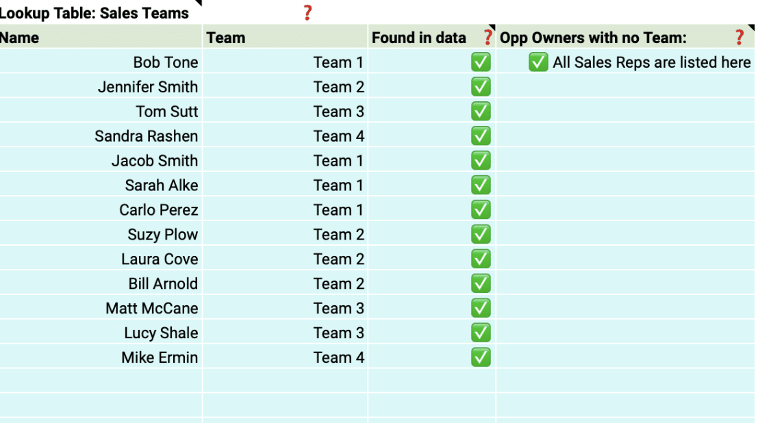
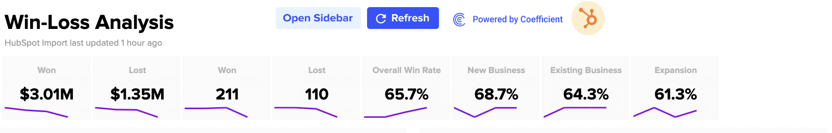
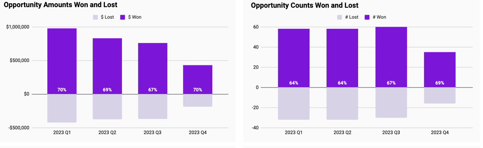
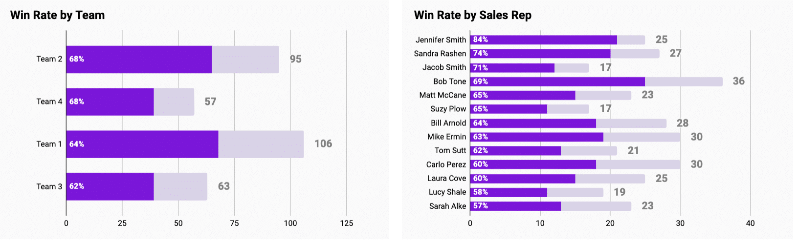
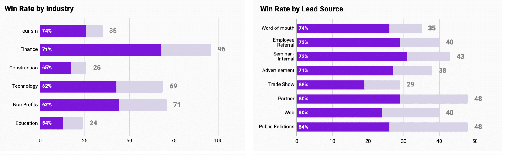
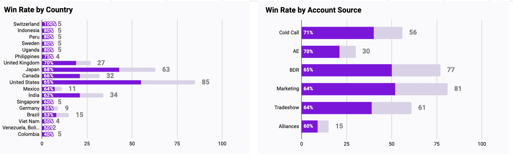
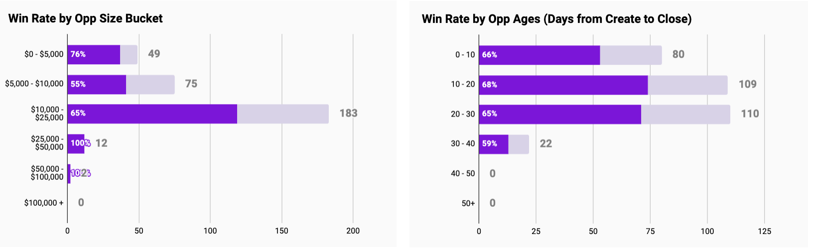
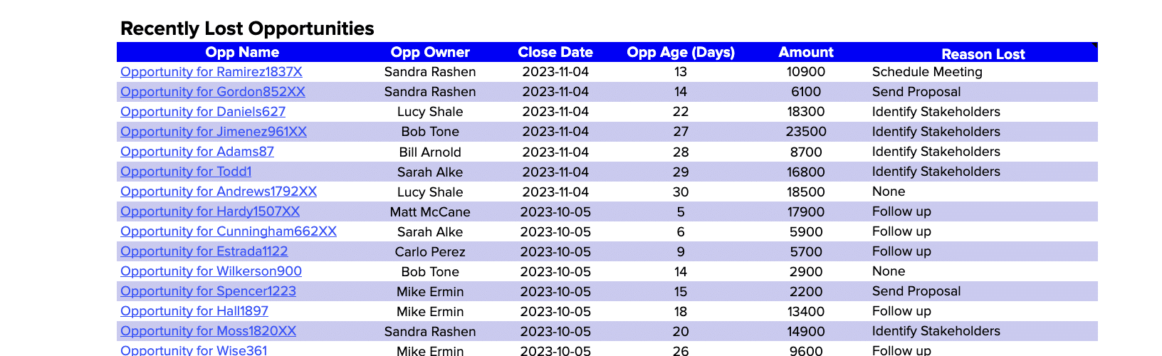
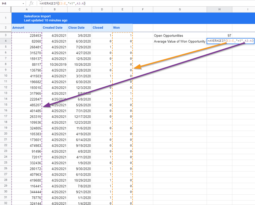
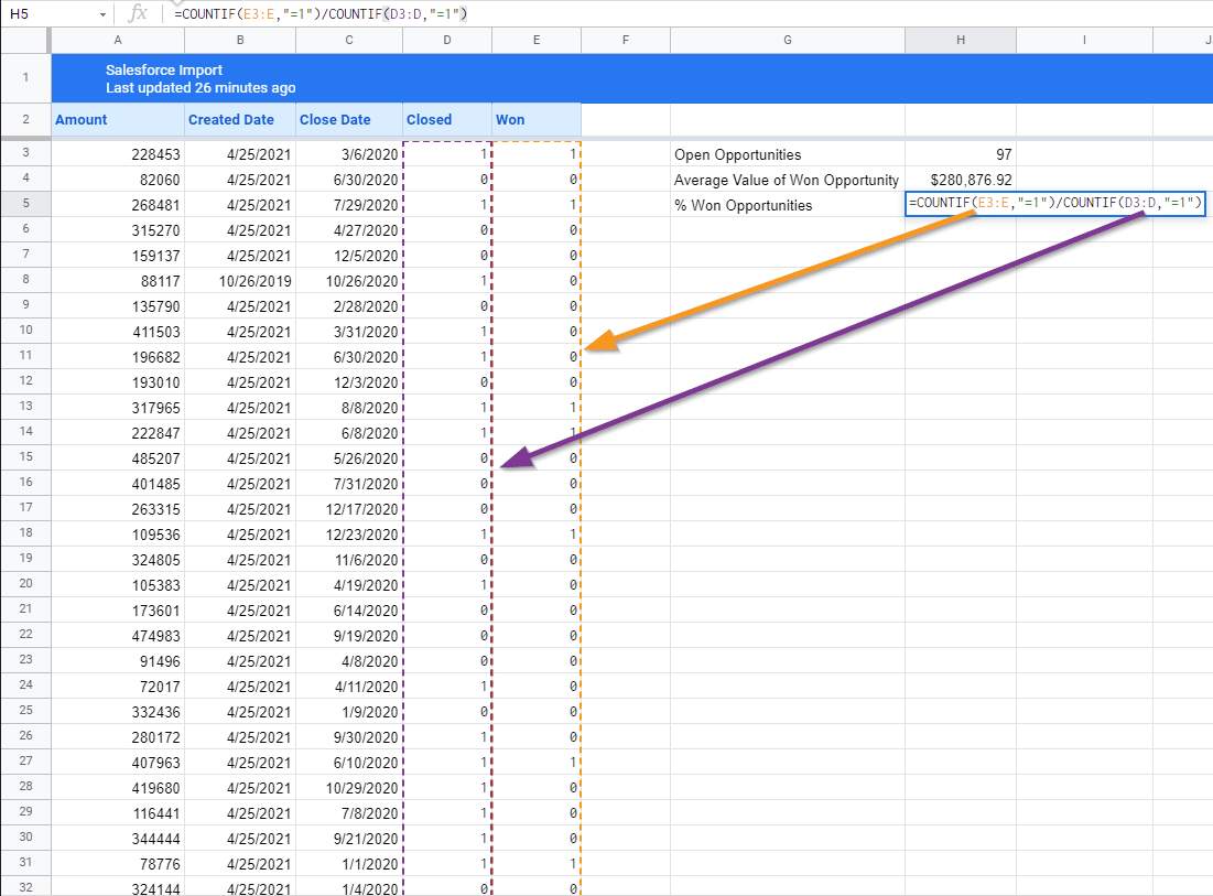
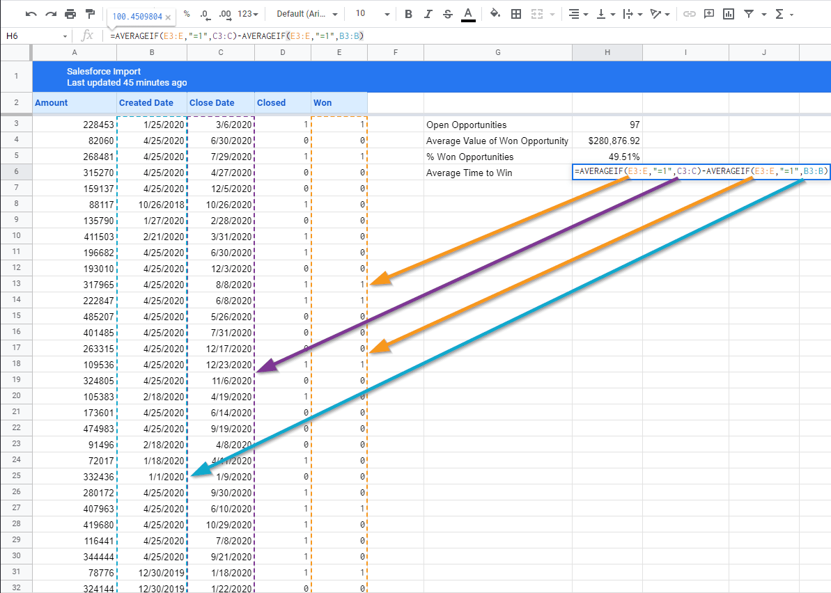
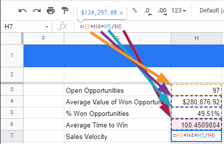
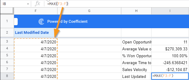
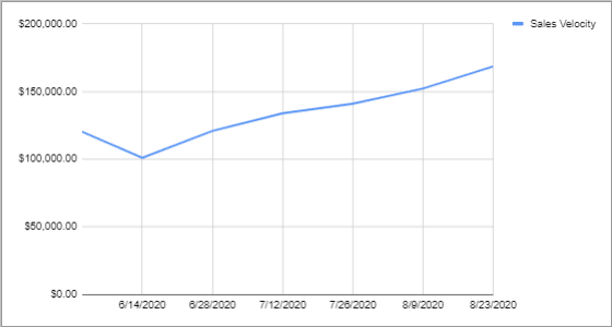
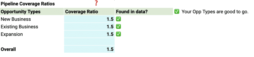
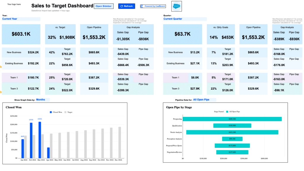
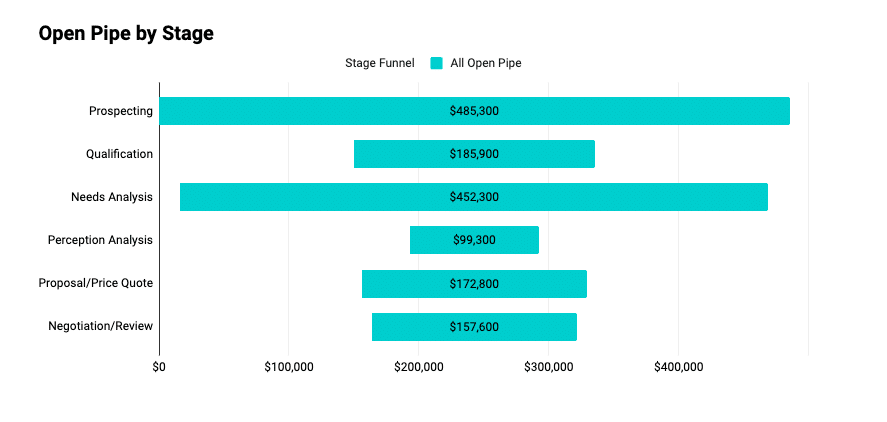
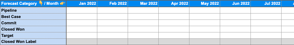
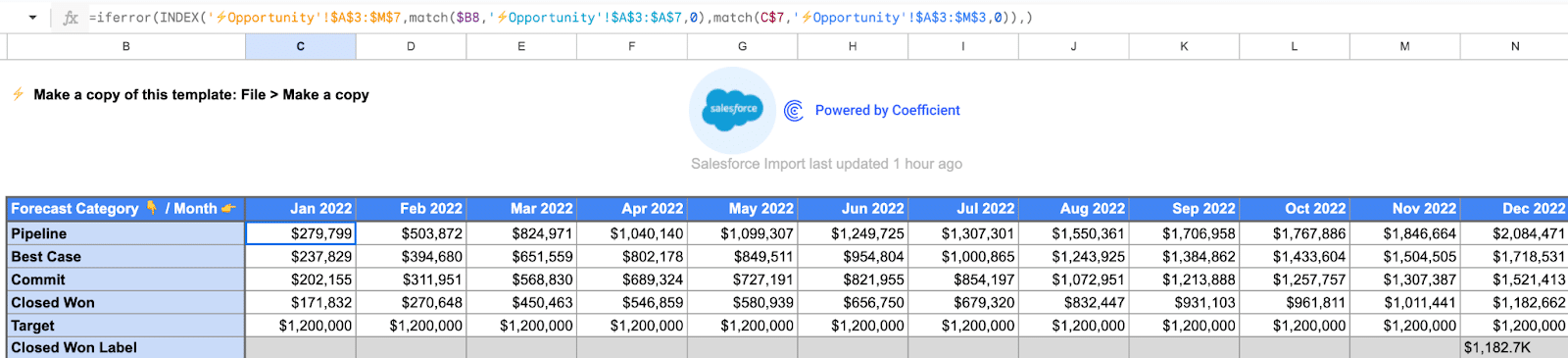
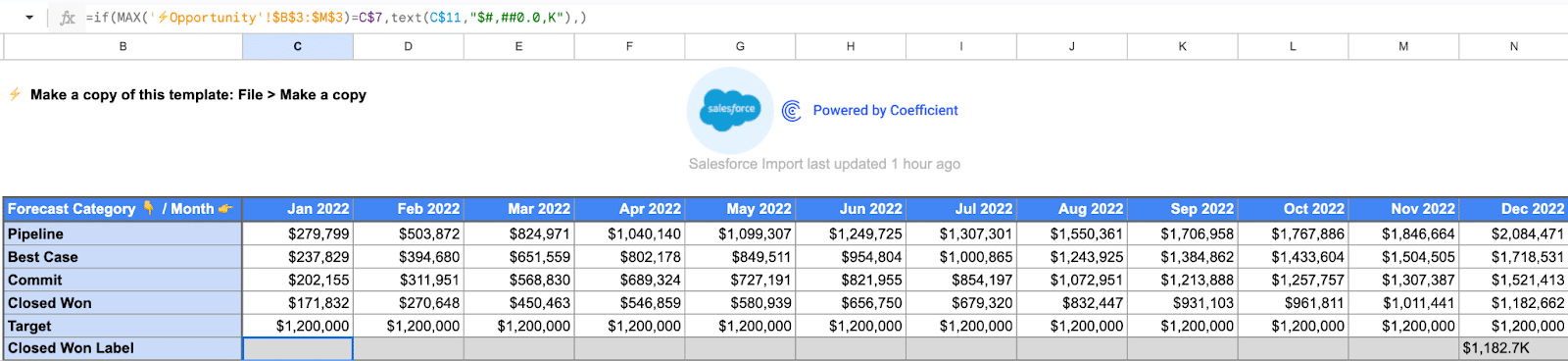
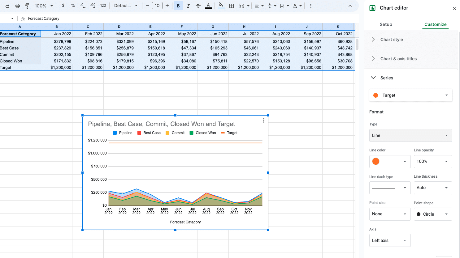
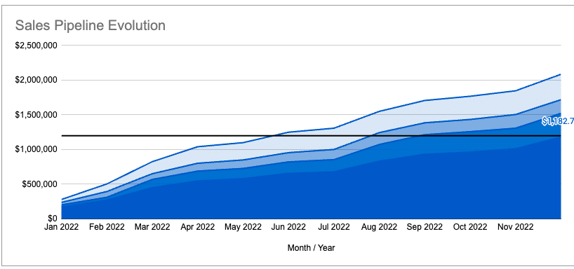
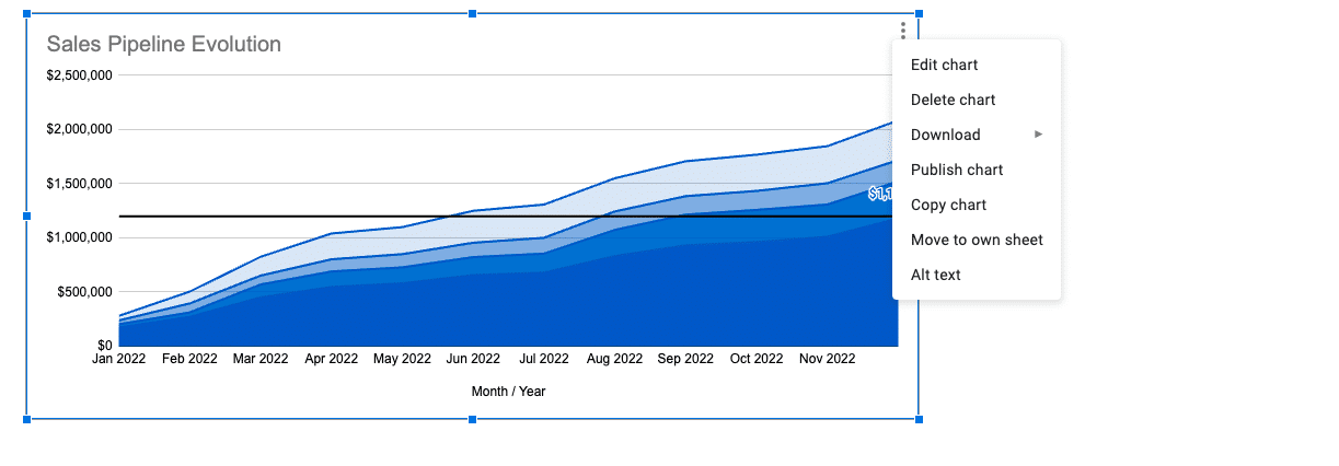
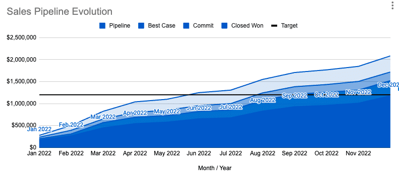
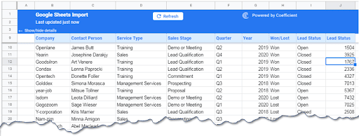
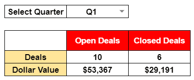
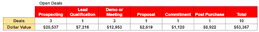
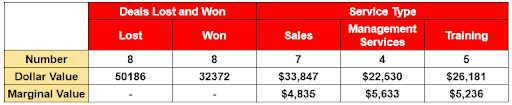
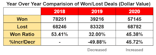
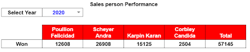
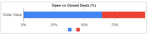
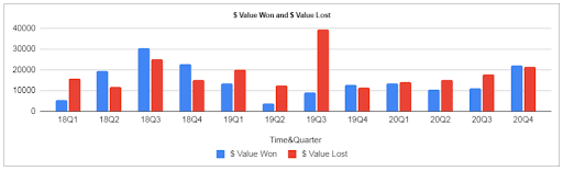
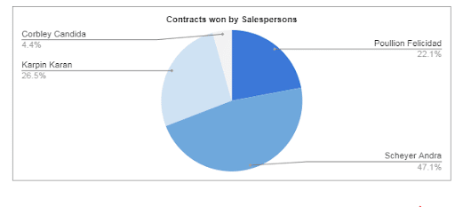
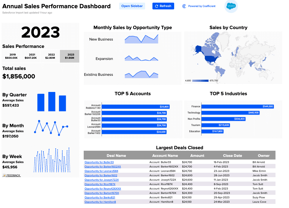
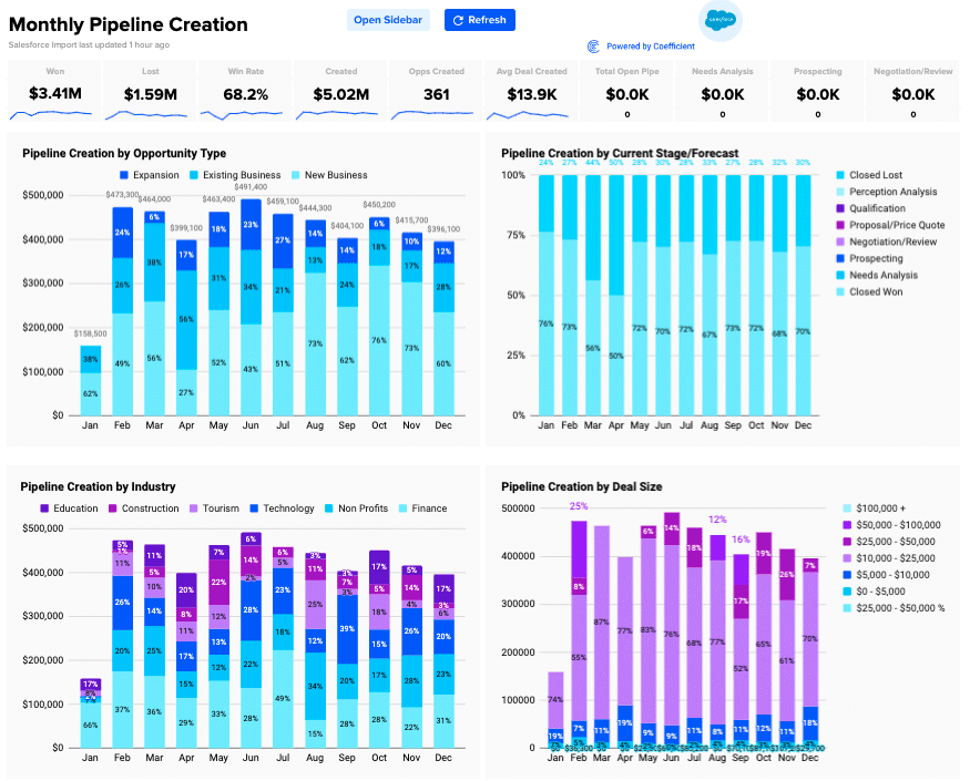
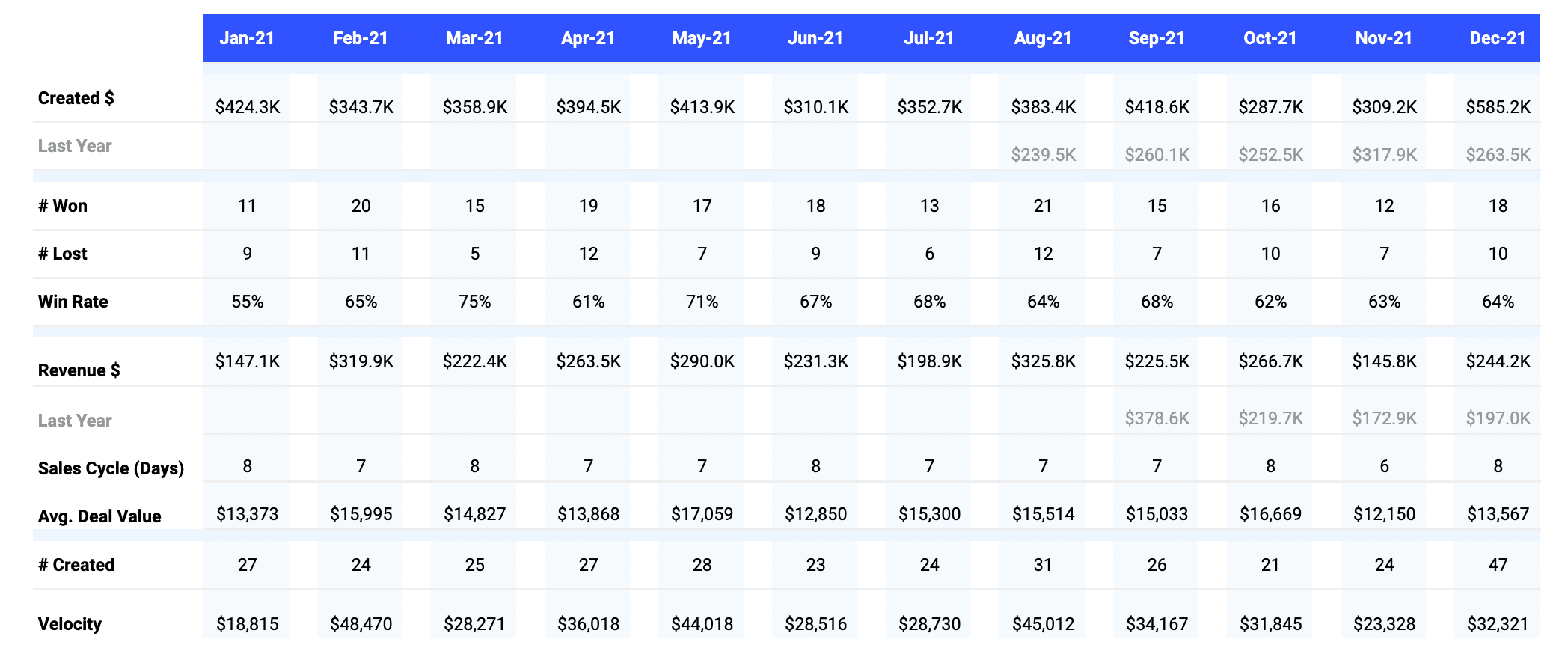
And the best part? Coefficient has an expansive library of free sales reporting templates to help you visualize your data, like in the pipeline analysis dashboard below.
How to Choose the Right Sales Pipeline Management Tool
Consider the following to ensure you choose the right CRM platform for your business:
1. Understand Your Business Needs
Before comparing your options, it’s crucial to have a clear understanding of your business’s needs.
Various CRM solutions prioritize different aspects of sales pipeline management, be it automation, collaboration, or customer service. Ensure your CRM platform fits your needs adequately without bloating costs with unnecessary features.
2. Consider Your Budget
Is the CRM platform you’re considering offering viable or reasonable pricing based on projected returns?
Compare each CRM software’s pricing structure to find a suitable subscription plan you can afford. If you’re cash-strapped, consider CRM platforms with a free offering or a free trial offer.
3. Evaluate the Tool’s Features
Thoroughly evaluate each CRM platform’s features and investigate how they will impact your sales performance.
Ensure your CRM platform of choice has everything you need in terms of sales pipeline management. This will reduce your dependency and, in turn, expenses on supporting apps and add-ons.
4. Check Integration Capabilities
Choose a CRM platform that seamlessly integrates with apps you already use.
It’s possible to achieve cross-functionality between your CRM and third-party apps through connectors like Zapier and IFTTT. However, CRM platforms that natively support third-party software via in-app integrations achieve better efficiency and functionality.
5. Scalability
Your CRM platform should be able to scale as your business grows.
Remember, what you need today CRM-wise will change over time as your processes and teams evolve. As such, it’s beneficial to pick a CRM solution with options to upgrade or extend limitations without paying for a completely new product.
6. Customer Support and Training
Before investing in a new CRM platform, take a look at the available learning and onboarding resources on their website.
Training employees to use a brand-new CRM solution is a major roadblock to productivity. To overcome this, CRM providers may offer online courses, video tutorials, or assisted onboarding services.
How Sales Pipeline Management Tools Help Sales Performance
Sales pipeline management tools help sales performance by providing sales reps with a clear view of the sales pipeline. This includes information such as the status of each lead, the next steps needed to move the lead forward, and the expected close date. This helps sales reps to stay organized and focused and identify any potential bottlenecks in the sales process.
Improve Sales Forecasting
Sales Pipeline Management Tools enhance sales forecasting by providing a clear view of each stage in the sales funnel, allowing for real-time data updates and historical analysis. These tools promote consistency by standardizing forecasting metrics, facilitating scenario analyses, and can integrate with other business software for a comprehensive view of the customer journey. Leadership can then leverage this information to set sales targets based on anticipated revenue.
Enhance Lead Management
Sales Pipeline Management Tools tools categorize leads based on their position in the sales funnel, ensuring that each lead receives the appropriate attention and engagement. This structured approach helps sales teams prioritize high-potential leads, ensuring timely follow-ups and more effective nurturing strategies.
Automate Route Tasks
In the fast-paced world of sales, every second counts. Sales Pipeline Management Tools allow sales reps to focus on building relationships and closing deals by automating routine tasks like lead scoring and assignment, sending follow-up reminders, etc.
Provide Real-Time Insights and Reporting
With Sales Pipeline Management Tools, sales teams have instant access to crucial data. They can monitor key performance indicators, track sales trends, and analyze lead behavior in real-time. This immediate feedback allows for quick adjustments to strategies, ensuring that sales efforts are always aligned with current market dynamics.
Enable Collaboration
Sales is a team sport. Sales Pipeline Management Tools offer teams a central platform where data is used to ensure transparency and accountability. Team members can share insights, update deal statuses, and discuss potential roadblocks. This collaborative environment ensures that everyone is on the same page, leading to a more cohesive and effective sales strategy, ensuring that everyone is aligned toward common goals.
Increase Conversion Rates
By offering insights into each lead’s preferences and interactions, Sales Pipeline Management Tools enable salespeople to tailor their approaches accordingly. Personalized interactions, combined with optimized follow-up timings, enhance engagement. As a result, sales teams can convert leads into customers more efficiently, boosting overall sales performance.
Find the Best Sales Pipeline Management Tool for Your Business
A quality sales pipeline management tool is pivotal for refining your entire sales process. It offers leaders a panoramic view of sales activities, pinpoints and rectifies bottlenecks, and paves the way for smoother operations.
While every tool has its limitations, Coefficient steps in to bridge these gaps. It allows teams to effortlessly merge data from diverse sources, ensuring richer, more comprehensive analyses – all within the familiar confines of a spreadsheet.
Get started for free today and see how it seamlessly integrates with your tools and workflows today.