Do you want to build a live marketing dashboard in Google Sheets to track your KPIs?
We’re here to help.
Creating a live dashboard is a great way to visualize and gain comprehensive insights from your marketing data directly within your spreadsheet.
We’ll share a simple process to build a marketing dashboard in Google Sheets along with the Key Performance Indicators (KPIs) you should include, and how you can keep your data live with Coefficient.
Why create a Google Sheets dashboard?
Google Sheets is relatively easier to use than the more technical data visualization apps. It offers tools and functions that allow you to build a marketing dashboard easily and quickly.
You can perform common spreadsheet calculations for your analysis and reporting. What’s more, most users are familiar with using Google Sheets, which can require less of a learning curve. As such, you’ll get your marketing dashboard up and ready in no time.
A marketing dashboard in Google Sheets helps you, your marketing team, and other key players across your company to derive actionable insights.
You’ll understand your business better and gain crucial information about critical areas in your marketing operations.
You don’t need to build yourself. We got you. Browse through pre-built Google Sheets templates, find your perfect match, and make a copy.
What are KPIs and why are they important?
KPIs are measurable metrics that demonstrate how well your company performs against your key business objectives and priorities.
KPIs allow you to measure your business (or department-specific) goals against your actual and quantifiable data over a certain period.
It’s vital to track and measure your KPIs to help you assess the health and success (or failure) of your sales, marketing, and other business operations and efforts. This allows you to make critical strategy and implementation adjustments to get better results and achieve your goals faster.
KPIs can vary depending on your goals, unique business needs, and what you identify as important to track and measure.
The data dashboard for a marketing manager may have KPIs that are more specific than others to uncover more granular marketing insights.
Essentially, KPIs are important because they help you:
- Measure your progress over time. KPIs, such as your gross margin, number of locations and employees, and revenue, can help you measure your company’s progress toward your business strategy and long-term goals.
You can set targets for each KPI at the start of the year and every quarter and use the weekly KPIs to measure progress toward your set goals.
- Track your company’s health. KPIs serve as health scorecards of your business, allowing you to measure and focus on the critical metrics you want to move to get your desired results and improve your company’s health.
- Tackle opportunities and solve problems. A combination of the right marketing dashboard KPIs can give you quick and easy access to relevant information to uncover opportunities and address problems.
For instance, if you get high landing page traffic but low conversions, assess your landing page design, elements, or other related factors.
This helps you determine potential issues and identify opportunities to improve your landing page traffic-to-conversion ratio.
- Analyze patterns and trends. Measure specific KPIs over time to detect patterns, make data-based predictions, implement the right strategies, and prepare for your forecasted outcomes and trends.
What should a marketing dashboard include?
A marketing dashboard includes the KPIs (specific metrics) to help you measure the progress toward your defined goal within your various marketing channels.
Here are some of the essential KPIs marketing dashboards should have:
- Revenue (monthly). Track your revenue for the month and use it to compare last month’s revenue and monitor your revenue growth rate.
- Conversion funnel. Use a combination of your Customer Relationship Management (CRM) data and web analytics platform to gain valuable insights into how your leads move through your marketing funnel.
For instance, you can pull your Salesforce and Google Analytics data into Google Sheets and use it to track your conversion funnel KPI in your marketing dashboard.
This can help you understand better how your leads convert into opportunities and opportunities into closed or won deals (among others).
- Website performance (last 30 days). Include your website performance in your marketing dashboard to track your average page views, average bounce rate, average time on site, and new sessions within the last 30 days.
- Traffic source (last 30 days). Track your highest website traffic generating online sources within the last 30 days.
- Email list performance. Assess if you’re reaching your email list performance goals by monitoring your click, open, and unsubscribe rates, including other KPIs, such as your list ratings, if you’re using Mailchimp.
- Advertising Return on Investment (ROI). Track and compare your conversion values with the costs to determine your advertising ROI. You can also use this as a more specific metric to help you measure your overall marketing returns.
- Social media followers. Monitor the number of social media followers on your social media platforms, such as Instagram, Facebook, YouTube, and LinkedIn. This can help you identify the social networks you should put more effort into to boost audience engagement.
- Cost-per-conversion (CPC). Track and compare your targets to your cost-per-conversion to help determine your ad’s success in achieving your set goal based on the total cost of running the ad.
Other marketing KPIs you can include in your dashboard are sales growth, leads (Marketing Qualified Leads (MQLs) and Sales Qualified Leads (SQLs)), website lead to MQL, etc.
How do I create a marketing dashboard in Google Sheets?
Before building your marketing dashboard (or any dashboard), determine what you want to see in it and what visualization format types to use.
You might also want to consider the essential design tips below to create a stunning and comprehensive marketing dashboard.
Keep it simple
Don’t get carried away and include overly complex and even distracting visuals. Choose formats and visualizations that best represent your data while ensuring you highlight and display the important numbers.
Use an appropriate color scheme
Choose a color scheme that doesn’t distract or obscure your figures and numbers. Avoid using too many or clashing colors. Instead, select colors that highlight your KPIs and go well together visually.
Tie all your visualizations into one story
Design and display each chart, graph, or map as connected and relevant to the overall visual story you want to convey to target audiences.
Enable data filtering
Ensure your dashboard allows you to filter data based on your key metrics’ variables. With filters, you can view, let’s say, your website traffic source from a specific region and can filter all the dashboard elements that fit the criterion.
Once you’ve decided on the data you want to display and how to visualize them, and understand the general rules of designing your dashboard, it’s time to pull your data into Google Sheets.
An excellent way to do this is to use Coefficient, a no-code solution that lets you connect your data sources to Google Sheets without breaking a sweat.
When you have your dataset on a Google spreadsheet, you can start creating charts, graphs, and other visualizations to build your dashboard.
Steps
Follow these steps to build a live marketing dashboard. Start by migrating your data from your CRM, data warehouse, and other platforms using Coefficient.
Step 1: Import your data to Google Sheets
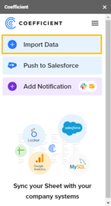
Launch the Coefficient add-on after installing it to Google Sheets.
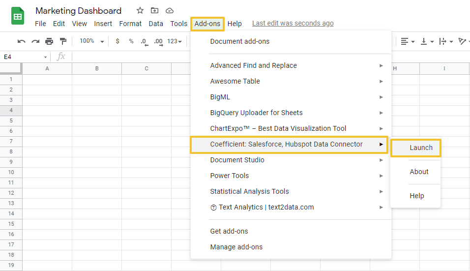
Select Import data on the Coefficient sidebar.
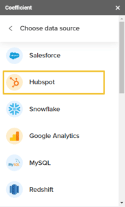
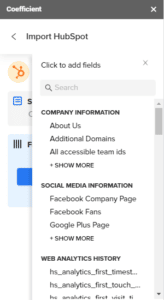
Choose your data source. For this example, we’ll use HubSpot.
After connecting Google Sheets to your HubSpot account, select the objects you want to include in your import.
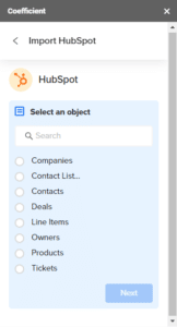
Use filters to customize your imports and only include the data you want.
Click Import when you’re done, and you should be able to see your data populate your Google spreadsheet almost instantly.
You can also pull data from multiple sources and consolidate all of them in one Google spreadsheet.
For example, if your bookings data is on Salesforce and your user data lives in a Business Intelligence (BI) platform, such as Looker, import both datasets into separate spreadsheets within one Google Sheets file. You’ll have consolidated access to all the data you need to create your marketing dashboard.
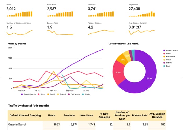
Step 2: Create a chart
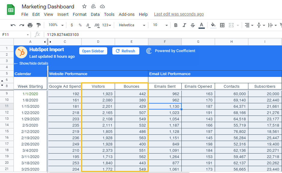
Let’s say you want to track your website performance, email list performance, and number of social media followers, and include all the information in your marketing dashboard.
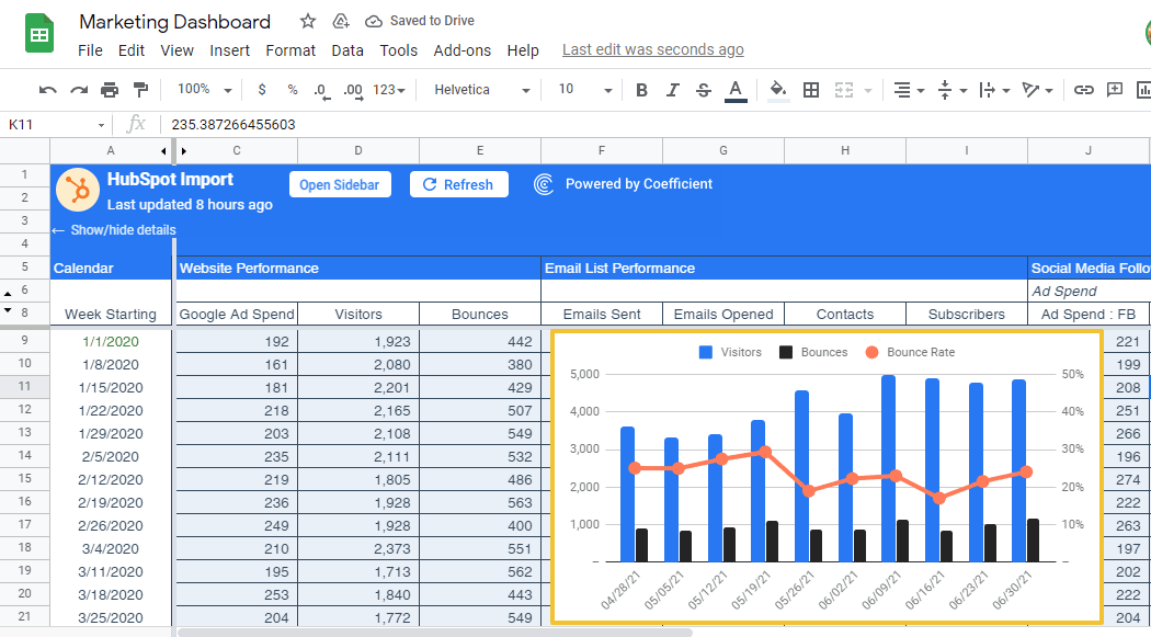
First, we’ll create a chart or graph for the website performance KPI. We’ll use the dataset we imported from HubSpot to Google Sheets using Coefficient.
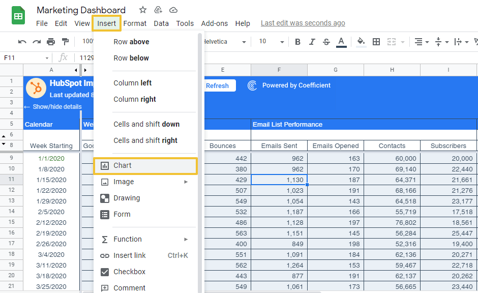
Select the required data range to determine your website performance, your Visitors, and Bounces for the week, including the column names.
Click Insert on the menu and select Chart.
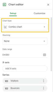
For this example, let’s choose the Combo chart on the Chart editor sidebar.
Step 3: Customize your chart

Stop exporting data manually. Sync data from your business systems into Google Sheets or Excel with Coefficient and set it on a refresh schedule.

Modify the chart stacking, data range, X-axis, and other elements accordingly.
Choose how you want the chart and axis titles, series, legend, horizontal and vertical axes, and gridlines to appear.
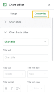
When you’re done, your first chart should look like this.
Step 4: Use a new spreadsheet for your dashboard
Click the three dots at the top right corner of the chart and select Move to own sheet.
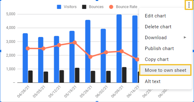
Doing so should place your chart in a separate spreadsheet where you can add the rest of your marketing dashboard visuals and elements.
From here, you can build your email list performance, number of social media followers, and the rest of your charts, maps, graphs, and other dashboard elements following similar steps. Customize, design, and format the dashboard once you have everything you need.
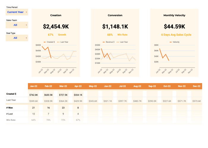
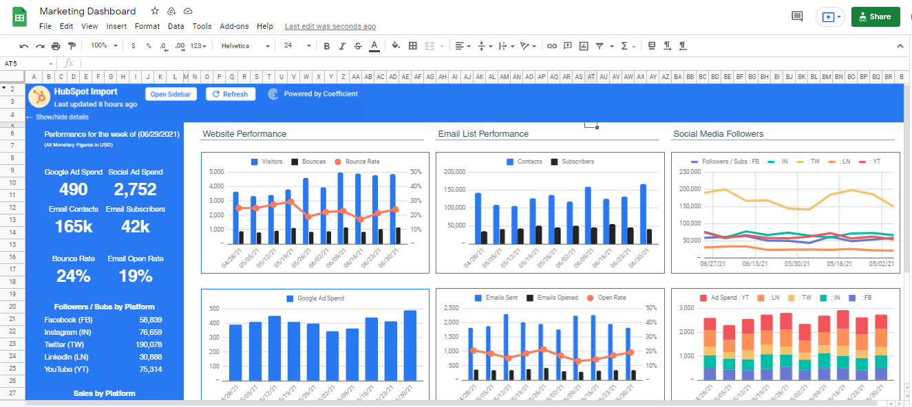
When you’re done, you should have a marketing dashboard that looks something like this.
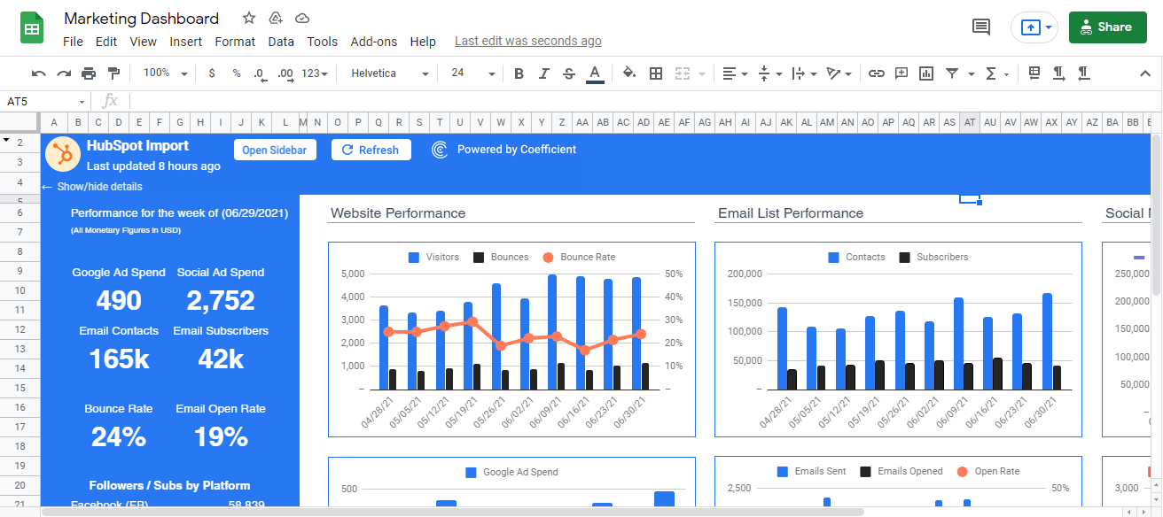
This completed dashboard is something we modeled from one of HubSpot’s coeff-templates.
Here’s an overall view of the marketing dashboard.
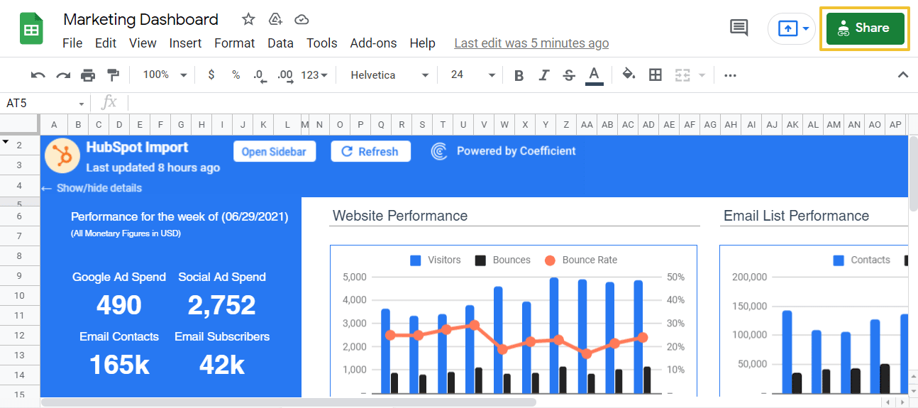
Remember to allow access to the sheet for other authorized users by clicking the Share button and setting the sharing options accordingly.
If you don’t want to build your marketing dashboard from scratch, use ready-to-use marketing dashboard coeff-templates.
Replace the existing template information with your dataset. Customize it as you prefer and include your critical KPIs and numbers, use various visualization formats that best suit your data, and you’ll have your world-class marketing dashboard in no time.
Step 5: Keep your marketing dashboard data live
The best part about using Coefficient is that it keeps all your data live with minimum effort on your part.
The app lets you set up an auto-refresh schedule so you won’t need to keep importing new datasets to Google Sheets every time you update your HubSpot data.
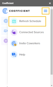
On the Coefficient sidebar, click the menu option and select Refresh Schedule.
Choose whether to auto-refresh your data daily, hourly, or weekly.
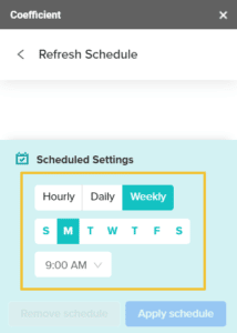
Click Apply schedule and you should be good to go. If you change or add new information to your data source, Coefficient automatically syncs everything with your Google Sheets marketing dashboard data, so you won’t have to do it manually.
This streamlines the process of updating your data, eliminating the tedious way of ensuring you always have accurate and live marketing dashboard data.
Coefficient’s automates critical parts of building your marketing dashboard. This saves you and your marketing team countless hours of time-sucking, laborious data migration, and syncing processes.
The app allows you to work with the latest data, so you always get relevant and up-to-date information and insights from your marketing dashboard.
Coefficient also helps ensure your data is accurate and error-free since the app can automate your data importing and syncing.
Another useful Coefficient feature is the notification option that allows everyone to stay in the loop.
You can set automated alerts through slack messaging or email that trigger when the spreadsheet data changes, new rows are added, and other updates to your marketing dashboard.
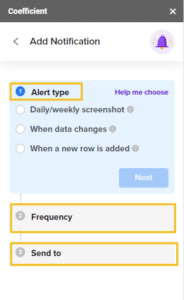
For instance, you can configure automated notifications that send daily screenshots of your marketing dashboard sheet to your marketing operations manager.
Choose the alert type, set the frequency, add the notification recipients, and you’re all set.
In a nutshell, Coefficient takes away the often long and painful process of building a stunning and powerful marketing dashboard while keeping your data live at all times.
Conclusion
Simplify building a world-class, live marketing dashboard by streamlining the process of importing and syncing data from your data sources like Mailchimp to Google Sheets.
By automating your data importing and syncing process, your marketing team saves boatloads of time and effort and ensures you get accurate and error-free data.
You avoid performing the same analysis twice, and you can create a marketing dashboard that’s always relevant and up-to-date to help you gain valuable insights and make better marketing and business decisions.
Try Coefficient for free today!