n today’s competitive business landscape, optimizing sales operations is crucial for driving growth and success. Unlock the power of SalesOps tools to elevate your sales team’s productivity and efficiency.
From lead generation and customer relationship management to automated workflows and insightful analytics, incorporating these top SalesOps tools can make a significant difference in streamlining your sales processes.
Harnessing the right tools can be transformative. Let’s dive into the specifics of the top SaaS SalesOps tools that can revolutionize your sales processes.
The Power of Sales Operations Software: Enhancing Efficiency and Growth
Sales Operations is a critical function within any organization that deals with sales. It encompasses various responsibilities such as optimizing the sales process, managing data, and handling sales tools and technology.
Why Getting Sales Operations Right is Crucial?
Sales operations teams play a pivotal role in the success of a business by regularly engaging in operations planning and process optimizations. By ensuring a smooth and efficient sales process, it enables organizations to make strategic decisions based on accurate data and analysis.
A well-functioning sales operations team improves sales team performance, leading to increased revenue, higher conversion rates and enhanced customer experiences. Sales operation managers and their teams also help with including sales planning, data management, and more to ensure sales goals are hit.
Top SalesOps Tools to Improve Sales Efficiency
Sales operations teams play a pivotal role in bridging strategy and execution within the sales domain. They work behind the scenes, ensuring that sales processes run smoothly, data is interpreted correctly, and resources are allocated efficiently.
The team’s day-to-day responsibilities likely span the following areas:
- CRM Management: More than just centralizing data, SalesOps meticulously manages CRM entries. They ensure every client interaction is logged, organized, and easily accessible for sales reps, maintaining data accuracy and readiness.
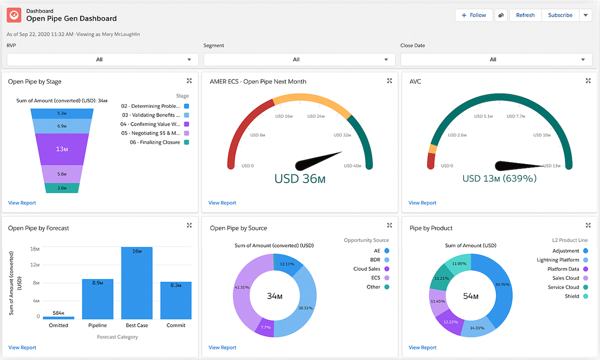
- Sales Data Analytics: Rather than merely analyzing data, SalesOps delves deep into sales trends, activities, rep performances, and lead sources. They transform key metrics into actionable insights, presenting them through intuitive dashboards for the sales team.
- Continual Sales Training: SalesOps acknowledges the ever-changing sales landscape. They orchestrate training sessions addressing current market challenges, ensuring reps are well-equipped and updated on industry evolutions.
- Sales Enablement: By collaborating closely with marketing and product teams, SalesOps develops content, tools, and playbooks tailored for varied sales situations. This ensures reps always have apt resources for every client engagement.
- Pricing and Invoicing: Informed by market feedback and competitor insights, SalesOps refines pricing strategies. They guarantee that quotes are not only competitive but accurate, ensuring timely deliveries and swift invoicing.
- Commission Management: SalesOps designs commission structures in alignment with organizational objectives. They maintain transparency in payouts, promptly resolve discrepancies, and ensure reps remain motivated, feeling their contributions are valued.
- Sales Forecasting: Drawing from historical data, rep insights, and current market trends, SalesOps forecasts potential challenges and opportunities, helping businesses strategize effectively.
- Territory Assignments: SalesOps allocates territories after considering rep expertise, previous performances, and potential leads. This strategy ensures comprehensive coverage and encourages a spirit of healthy competition among reps..
Behind every successful SalesOps team is a tailored tech stack. Let’s delve into specific tools that excel in each category below.
CRM Software Tools
CRM software is a critical part of the SalesOps Stack, acting as the core of the sales process. It centralizes and organizes customer data, interactions, and sales pipelines. With a robust CRM system, sales teams can manage leads, opportunities, and customer relationships, leading to enhanced productivity and better sales performance.
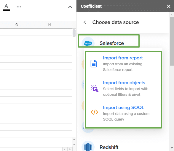
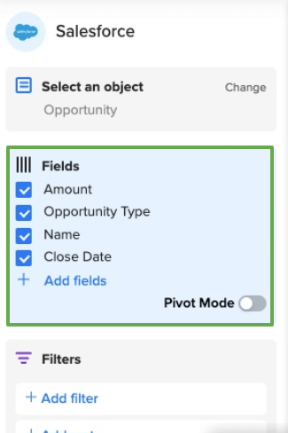
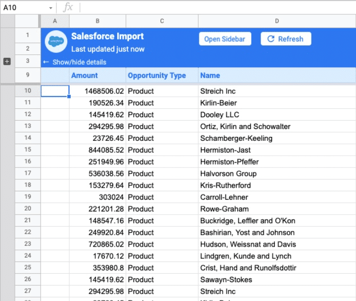
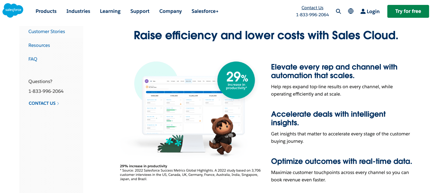
Salesforce
Salesforce is an industry-leading widely-used CRM platform that has earned its reputation as a leader in the industry.
Key Customers
- Uber
- GE Appliances
- RBC Wealth Management, U.S.
- Schneider Electric
Main Features
Salesforce offers a comprehensive set of features that cater to various aspects of sales operations.
- Sales teams can manage leads and maintain relationships throughout the entire sales process with seamless lead management.
- Opportunity tracking enables sales representatives to monitor and manage potential deals, ensuring no opportunity slips through the cracks.
- Real-time sales reporting provides valuable insights into sales performance and pipeline health, facilitating data-driven decision-making.
Cost
Salesforce offers four different price packages for sales suits. It’s $25 for small teams, $75 for any size teams, $150 for deeply customizable CRM, and $300 for ultimate growth.
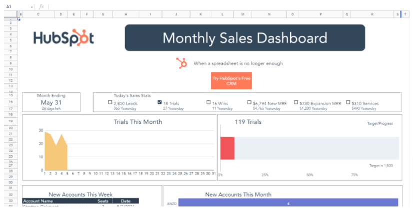
Hubspot
Hubspot is another popular CRM tool known for its interface and extensive marketing automation capabilities.
Key Customers
- Shopify
- Subaru
- DocuSign
- Trello
- SurveyMonkey
- Bonobos
- Yammer
- Codecademy
Main Features
- While renowned for inbound marketing, Hubspot’s CRM module is powerful.
- It is particularly well-suited for small to medium-sized businesses looking to streamline their sales processes.
- With Hubspot CRM, sales teams can manage contacts, track deals, and automate routine tasks.
- The seamless integration of marketing and sales functionalities enhances collaboration and boosts overall efficiency.
Cost
Hubspot offers two powerful marketing software in affordable prices. Their Marketing Hub Professional costs $800 per month, and their Marketing Hub Enterprise costs $3600 per month.
Pipedrive
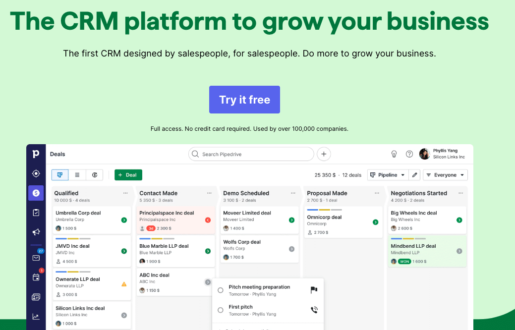
Pipedrive excels in sales pipeline management, making it an ideal choice for sales operations teams focused on deal progression.
Key Customers
- Vimeo
- ReMax
- Fortumo
- Posts
- Prezi
- Teamgate
- Chargebee
- Zoom
Main Features
- It provides a clear and intuitive visual representation of deals, helping sales reps identify opportunities and potential bottlenecks in the sales process.
- Pipedrive’s interface and straightforward design make it easy for sales team members to navigate and adapt.
- With its emphasis on visualizing the sales pipeline, Pipedrive empowers sales reps to prioritize tasks and focus on closing deals.
Cost
Pipedrive has five payment plans. Their most simple Essential plan costs $9.90, and their power Enterprise plan costs $59.90.
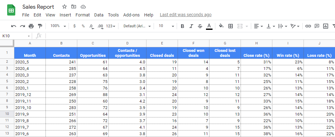
Google Sheets
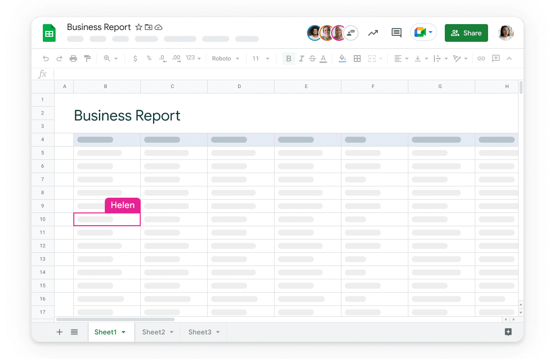
For smaller businesses or those operating on a tight budget, Google Sheets can serve as a viable CRM solution when combined with appropriate sales management templates and add-ons.
Key Customers
- Startups
- Educational Institutions
- Freelancers
- Nonprofit Organizations
- Marketing and Sales Team
Main Features
- While it may lack the sophisticated features of dedicated CRM platforms, Google Sheets offers a customizable and cost-effective way to organize and manage customer data.
- With the use of add-ons and templates, businesses can tailor Google Sheets to their specific needs, making it a flexible option for startups or businesses with simpler sales processes.
Cost
Google Sheets offer three different plans. Basic at $6 per month, Business at $12 per month, and enterprise at $25 per month.
Sales Forecasting Tools
Sales forecasting is a critical part of Sales Operations Software, as it enables businesses to plan, allocate resources, and make accurate revenue projections. By utilizing the right tools, sales operations teams can gain valuable insights and make data-driven predictions to optimize their sales strategies.
Salesforce Sales Cloud
Salesforce Sales Cloud’s forecasting module is a robust tool that empowers businesses to conduct powerful analytics and historical data analysis.
Key Customers
Following
- T-Mobile
- GE Appliances
- Unilever
- Toyota
- MuleSoft
Main Features
- With the ability to track past sales performance, identify trends, and analyze historical data, Sales Cloud enables businesses to make informed predictions about future sales outcomes.
- Their data-driven approach ensures that sales teams can set realistic goals, allocate resources, and plan sales strategies that align with market trends and customer behavior.
Cost
Salesforce offers four different price packages for sales suits. It’s $25 for small teams, $75 for any size teams, $150 for deeply customizable CRM and $300 for ultimate growth.
AnaPlan
AnaPlan is a cloud-based platform designed for collaborative forecasting, budgeting, and planning.
Key Customers
- HP Inc.
- Del Monte Foods
- Toshiba
- Pandora
- United Rentals
- DocuSign
Main Features
- Catering to the needs of larger enterprises with complex sales operations, AnaPlan offers a comprehensive solution that facilitates collaboration among various teams and departments.
- By bringing together cross-functional data and insights, AnaPlan enables businesses to create accurate sales forecasts that align with the company’s overall goals and objectives.
Cost
AnaPlan costs around $30,000-50000. However, it can go up depending on your usage.
Spotio
Spotio is a specialized tool that offers location-based sales intelligence and analytics, making it particularly valuable for field sales teams.
Key Customers
- PrimePay
- Gexa Energy
- Alside
- AT&T Business
- ServiceMaster
Main Features
- By leveraging geospatial data and insights, Spotio empowers field sales representatives to optimize their performance by identifying promising territories, understanding local market dynamics, and prioritizing leads based on geographical proximity.
- The tool’s analytics capabilities help sales teams target high-potential areas, enhancing their efficiency and increasing their chances of success.
Cost
Spotio offers three payment plans; B2B Plan, B2C Plan and an Engagement Bundle
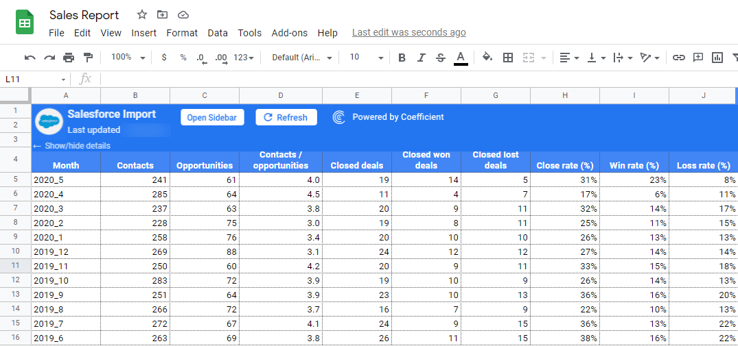
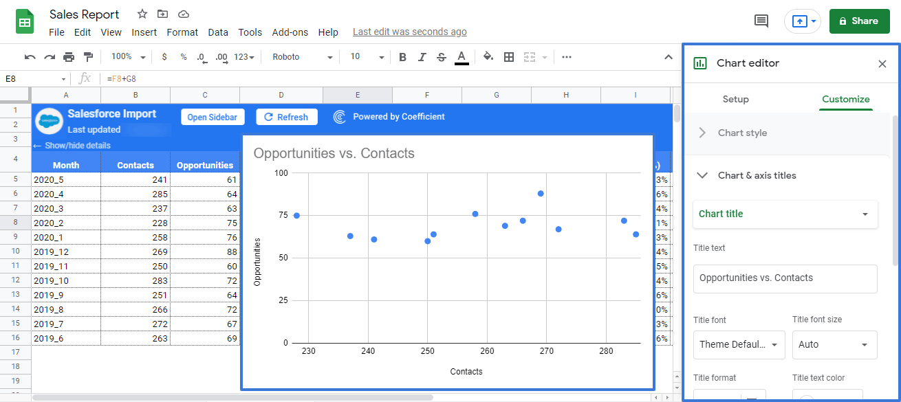
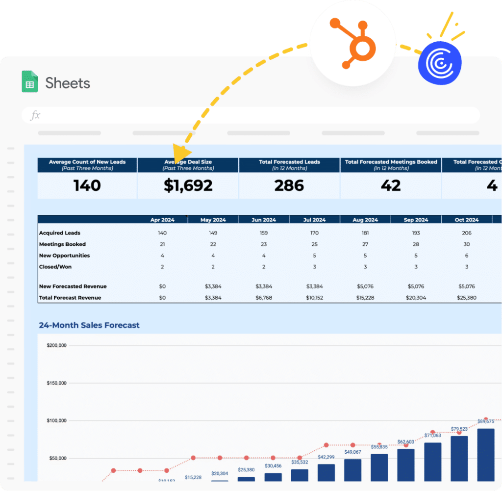
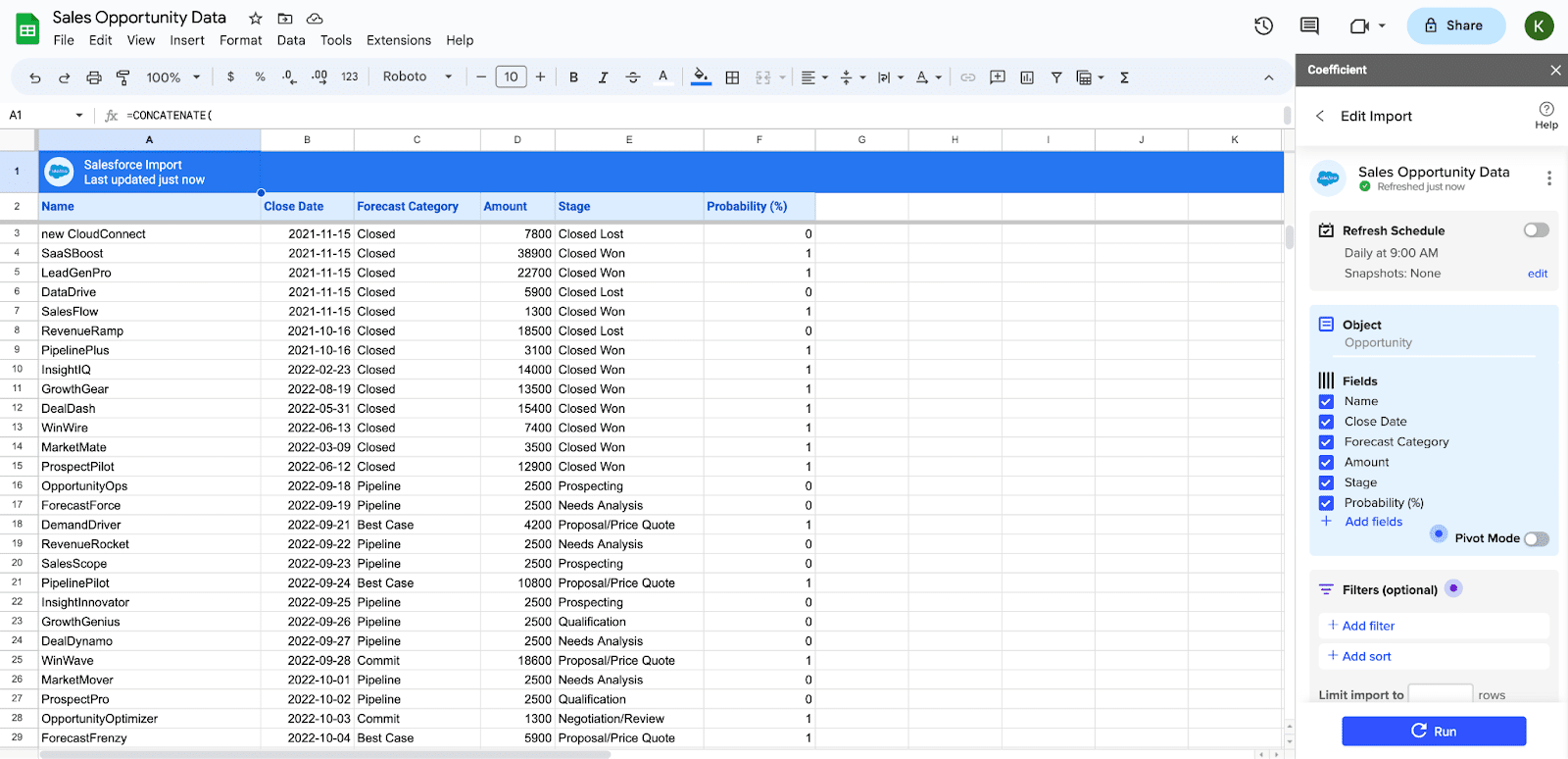
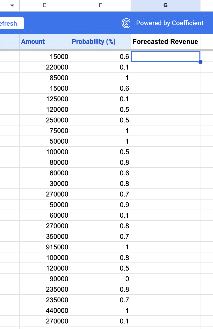
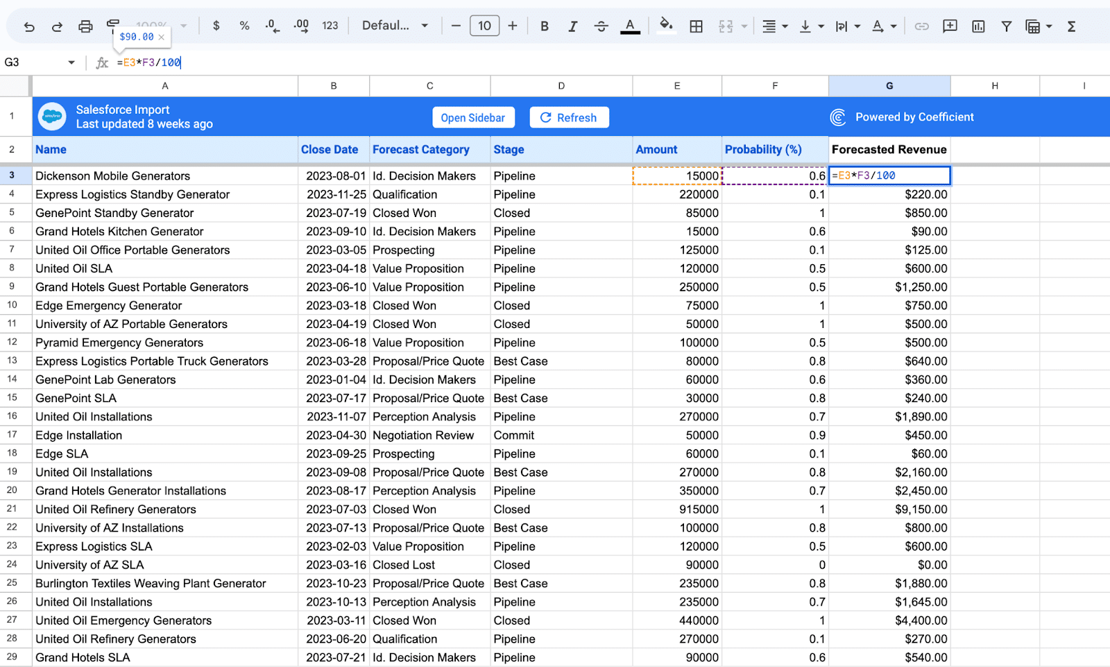
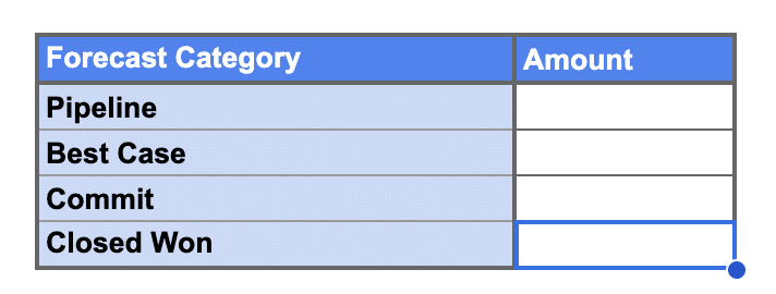
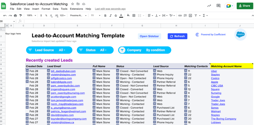
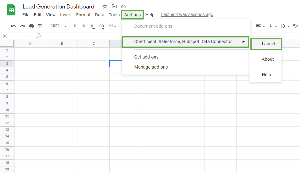
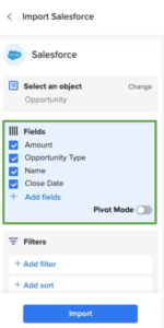
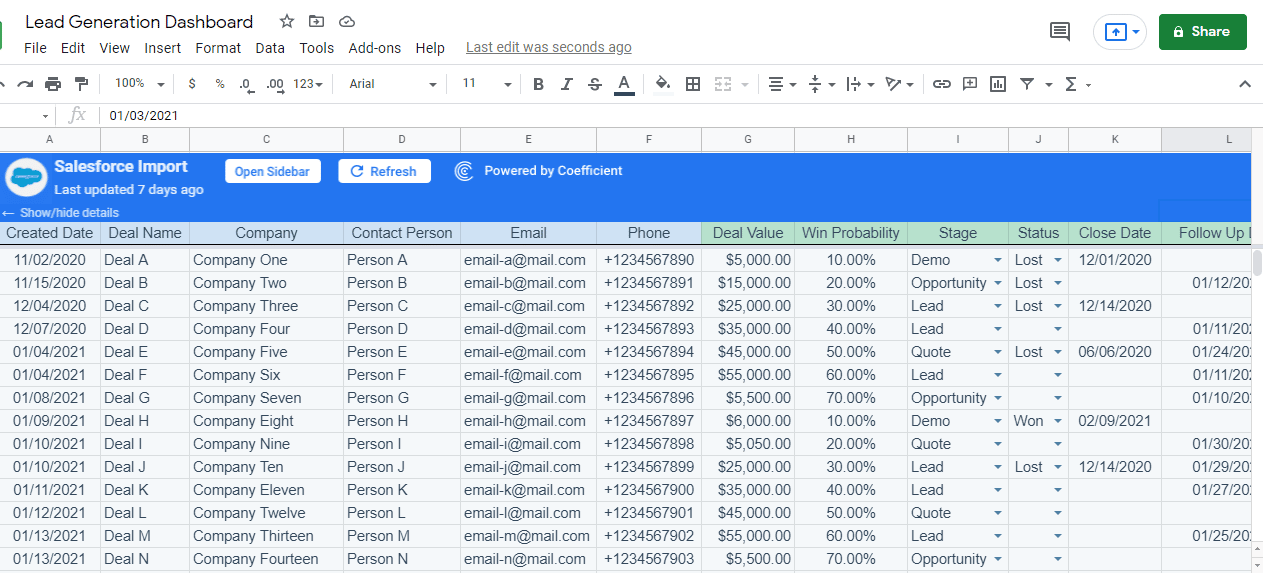
Google Sheets + Coefficient
For businesses seeking a more customizable and cost-effective solution, integrating Google Sheets with Coefficient can be a practical option.
Key Customers
- Financial Analysts
- Marketing Teams
- Sales Teams
- Startups
Main Features
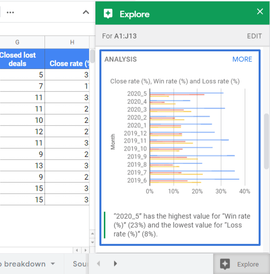
- By combining the flexibility of Google Sheets with the analytical power of Coefficient, businesses can create custom forecasting models tailored to their specific requirements.
- It allows sales operations teams to develop unique sales forecasting methodologies that suit their industry, market, and sales processes.
- Coefficient’s ability to integrate with various data sources enhances the accuracy of the forecasts, ensuring that businesses can make well-informed decisions.
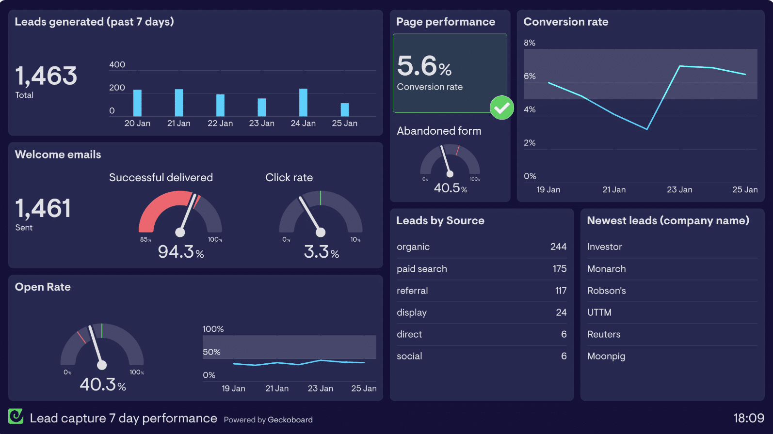
Sales Analytics Tools
Data-driven decision-making is crucial for Sales Operations Software, as it empowers sales teams to make informed choices based on accurate insights and analysis. Sales analytics tools play a central role in this process by providing valuable data insights that drive growth and optimize sales strategies.
Tableau
Tableau is a leading sales analytics tool known for its intuitive data visualization and analytics capabilities.
Key Customers
- Adobe
- Netflix
- Airbnb
- NASA
- Bank of America
Main Features
- It allows sales teams to convert complex data into appealing and easy-to-understand charts, graphs, and dashboards.
- It enables sales professionals to spot trends, patterns, and opportunities.
- With Tableau’s interactive features, users can explore data in-depth, conduct ad-hoc analysis, and gain a deeper understanding of their sales performance.
- This tool enhances decision-making by presenting critical information in an impactful manner.
Cost
Tableau has three pricing options, Tableau Creator costs $70/mo, Tableau Explorer costs $40/mon and Tableau Viewer costs $15/mon.
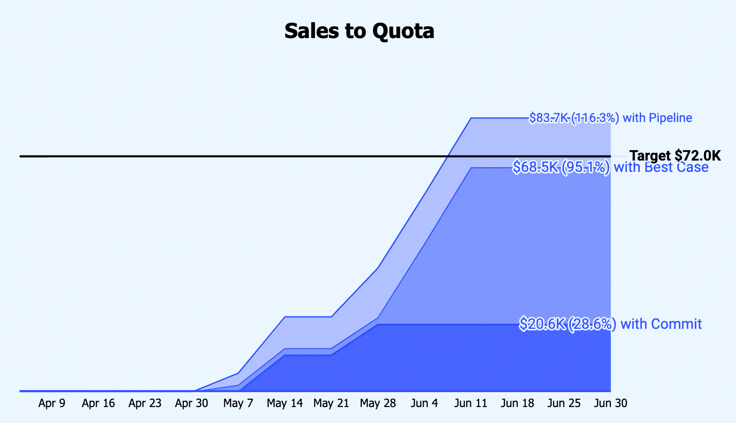
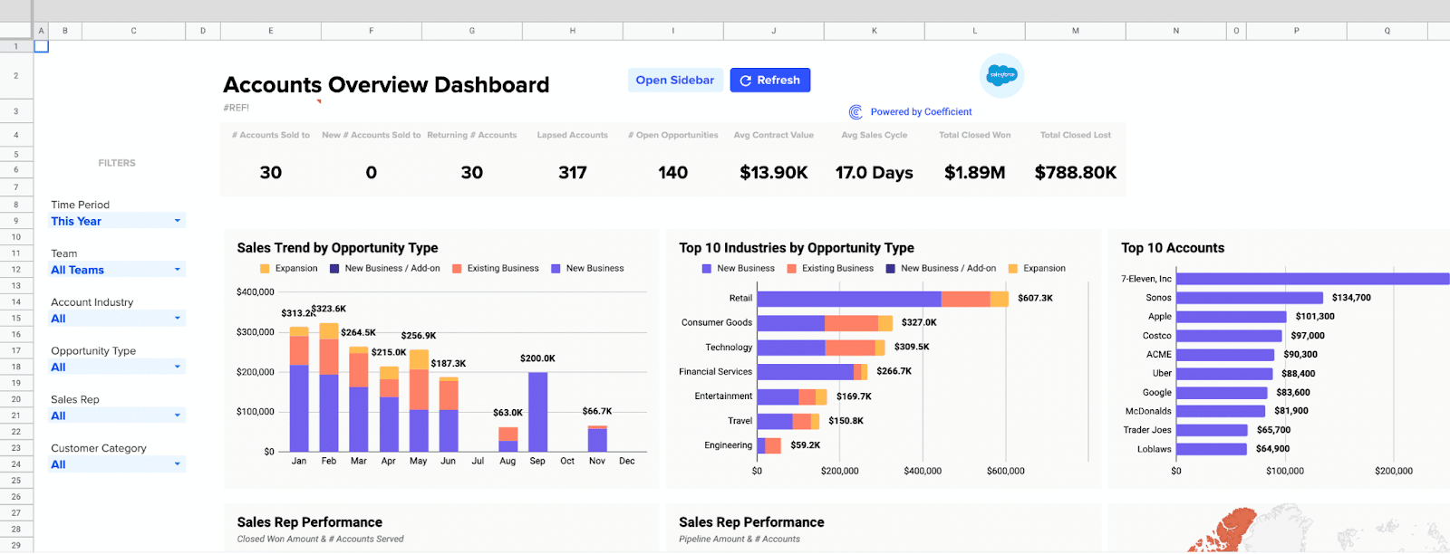
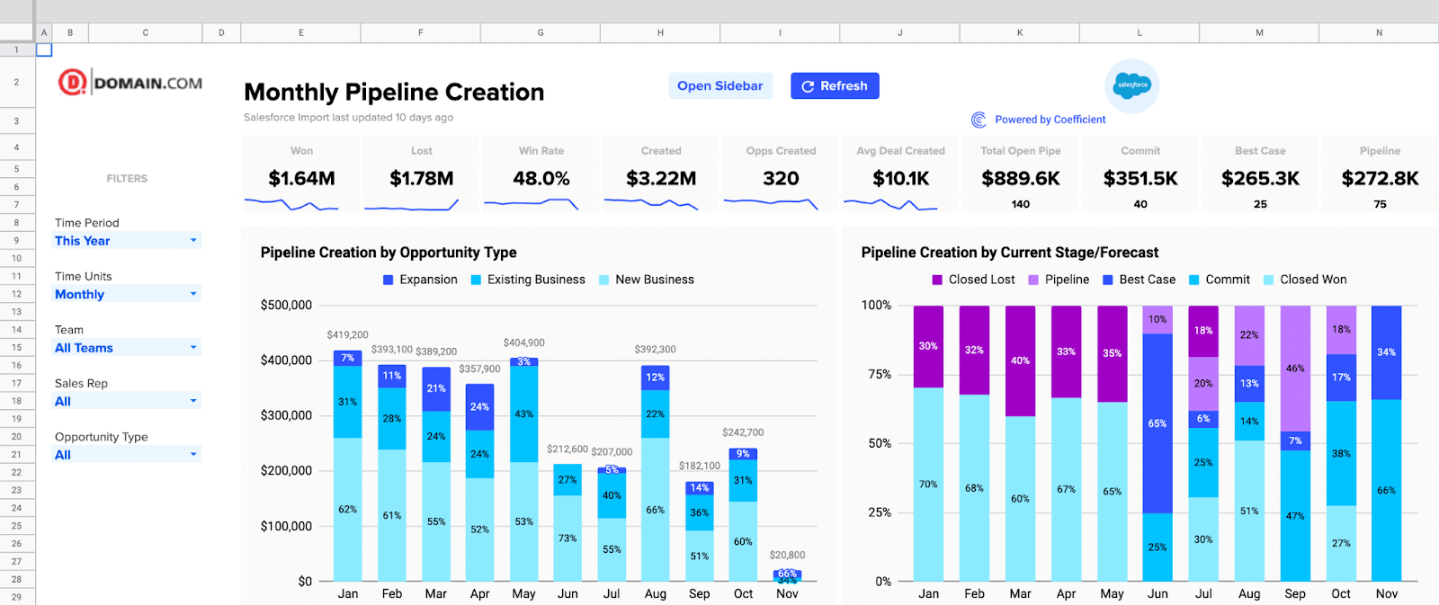
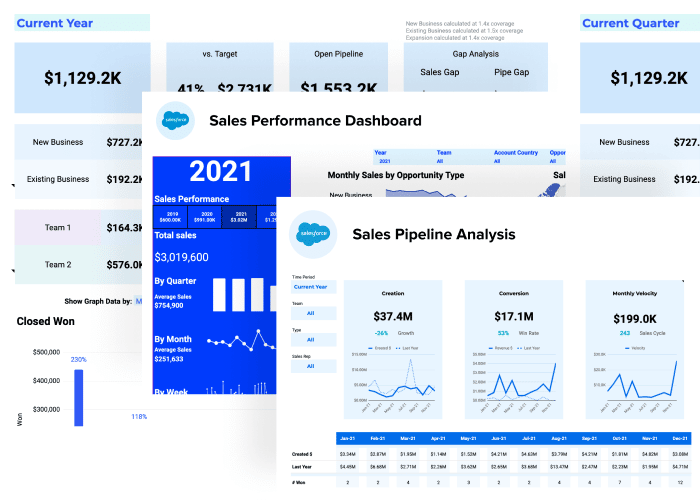
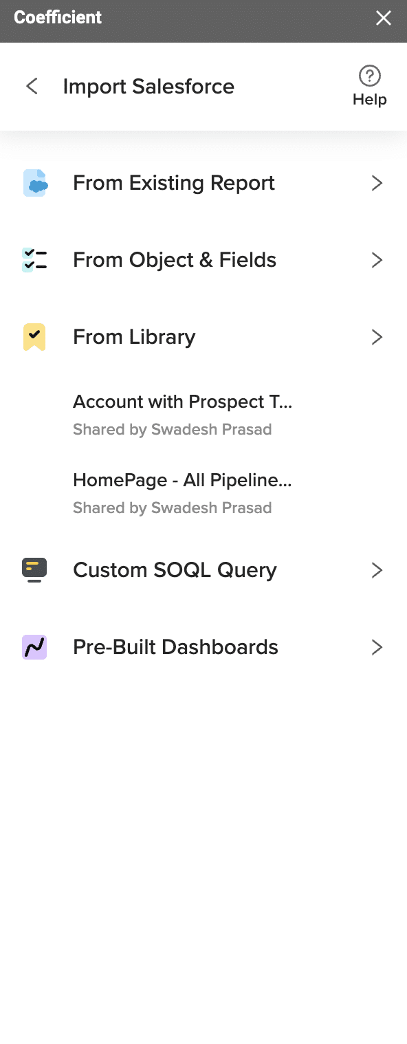
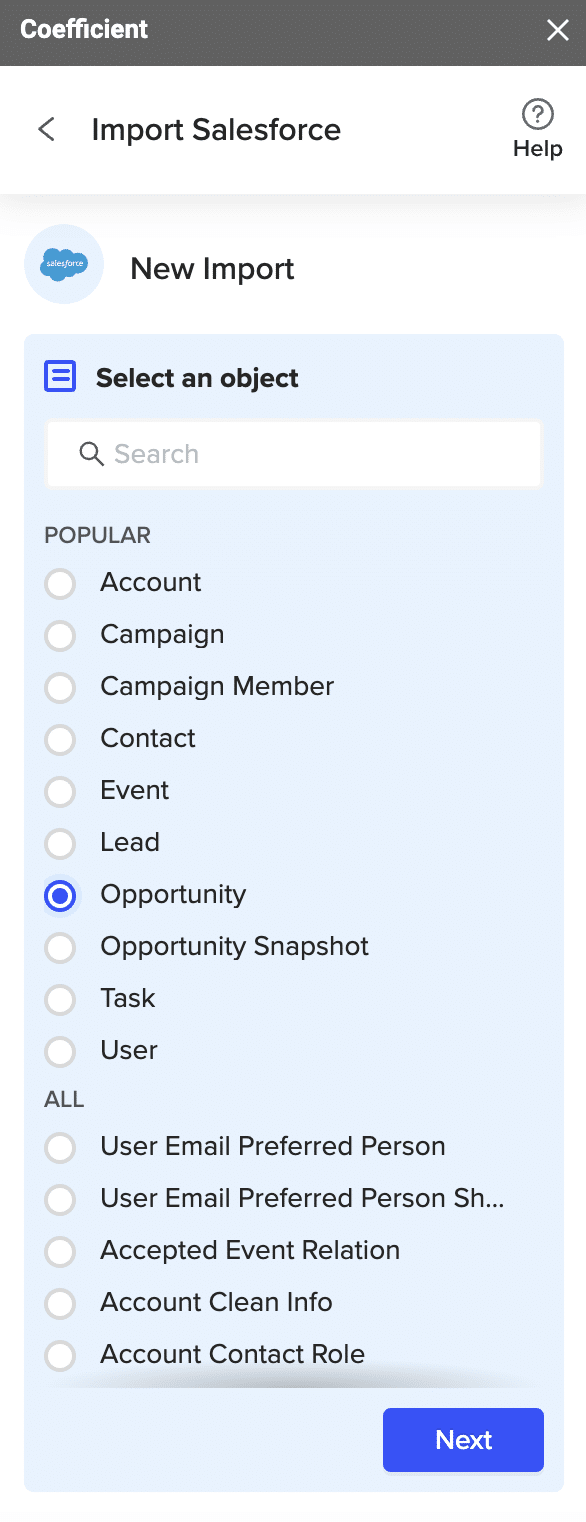
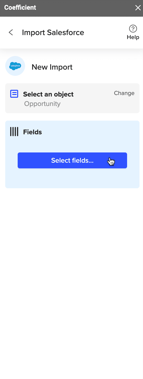
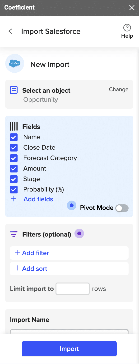
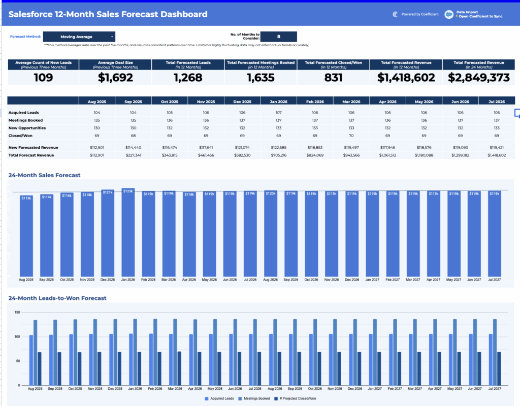
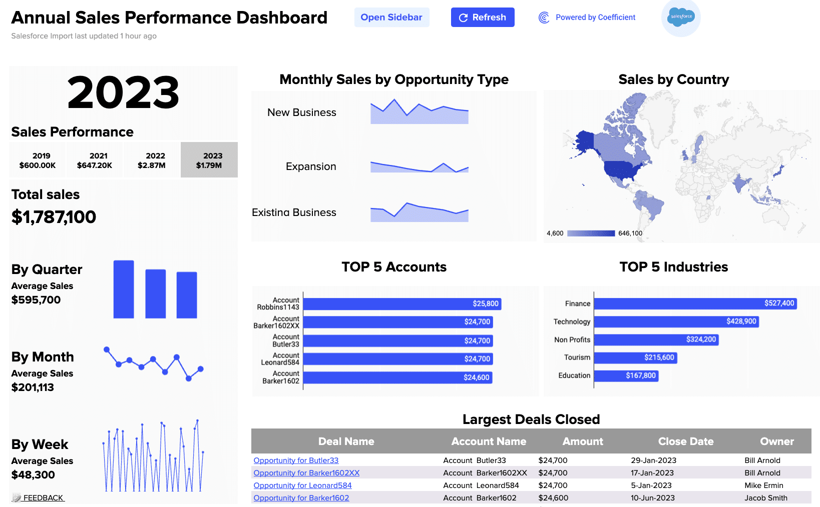
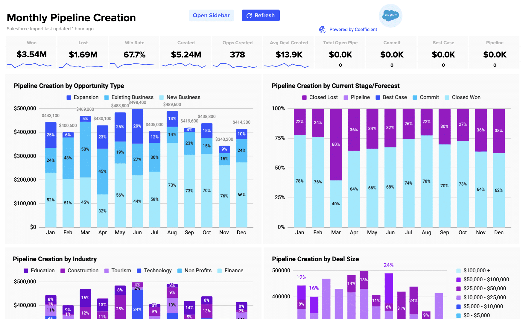
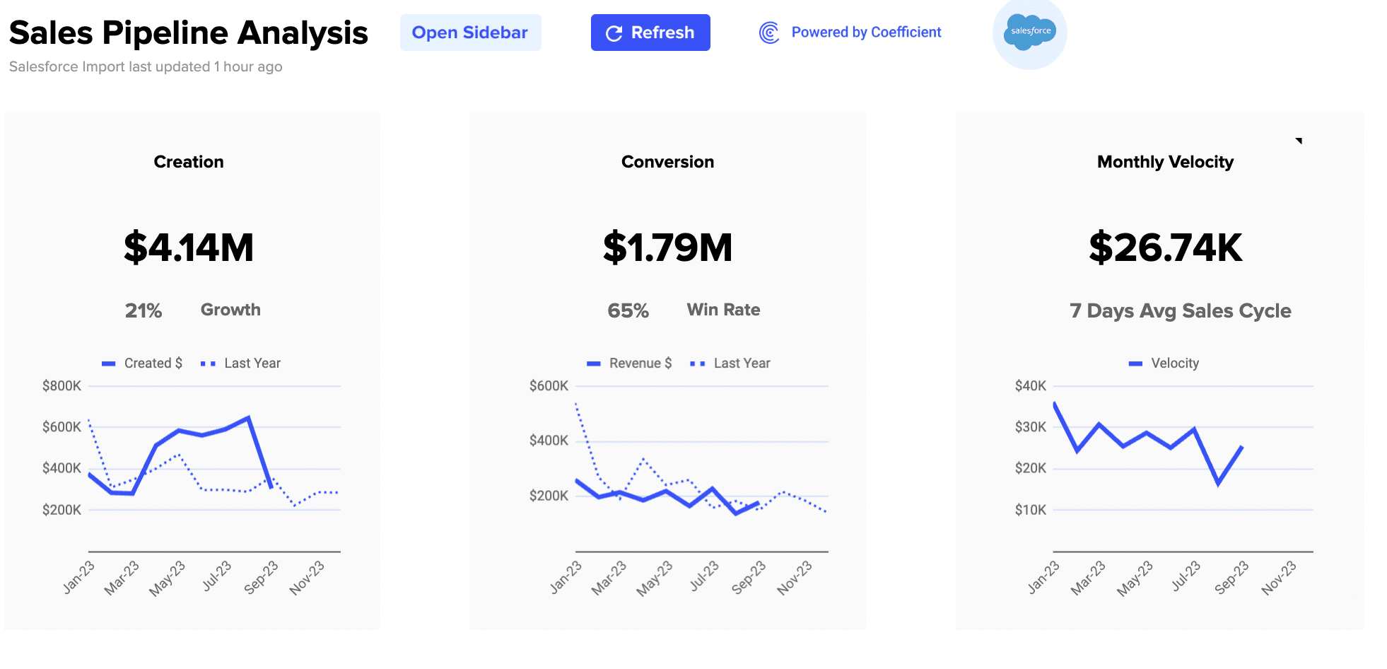
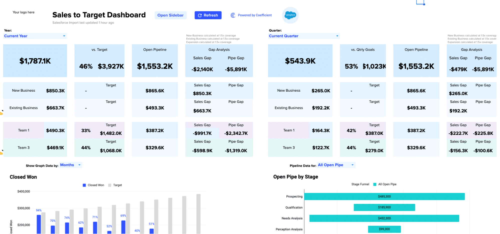
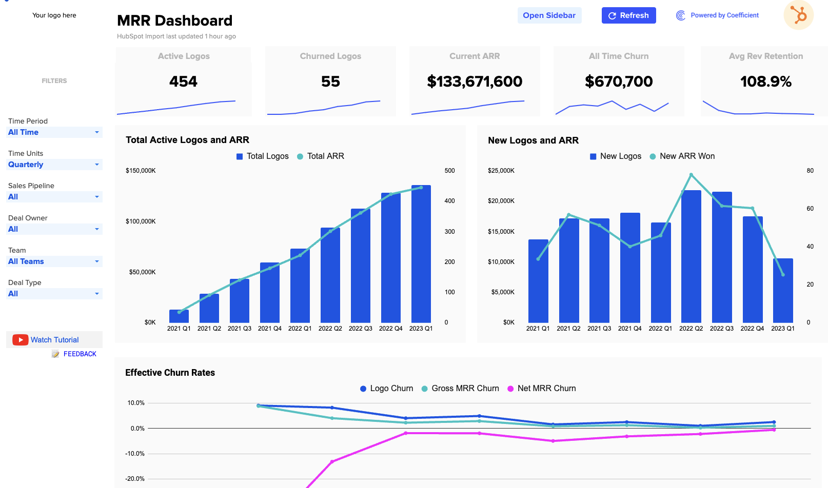
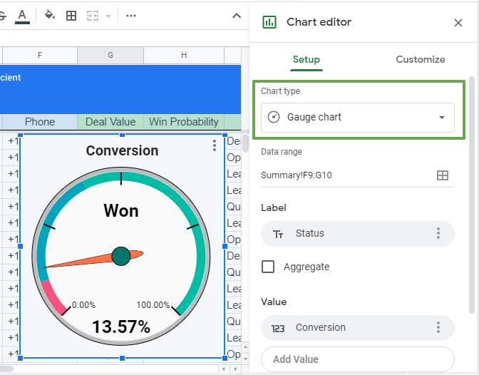
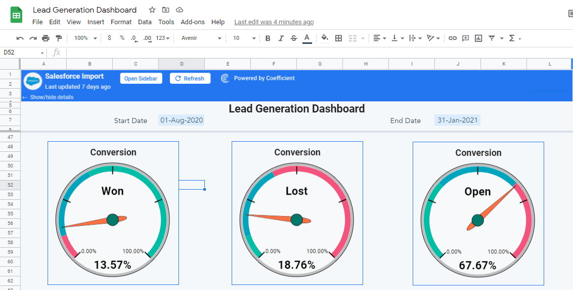
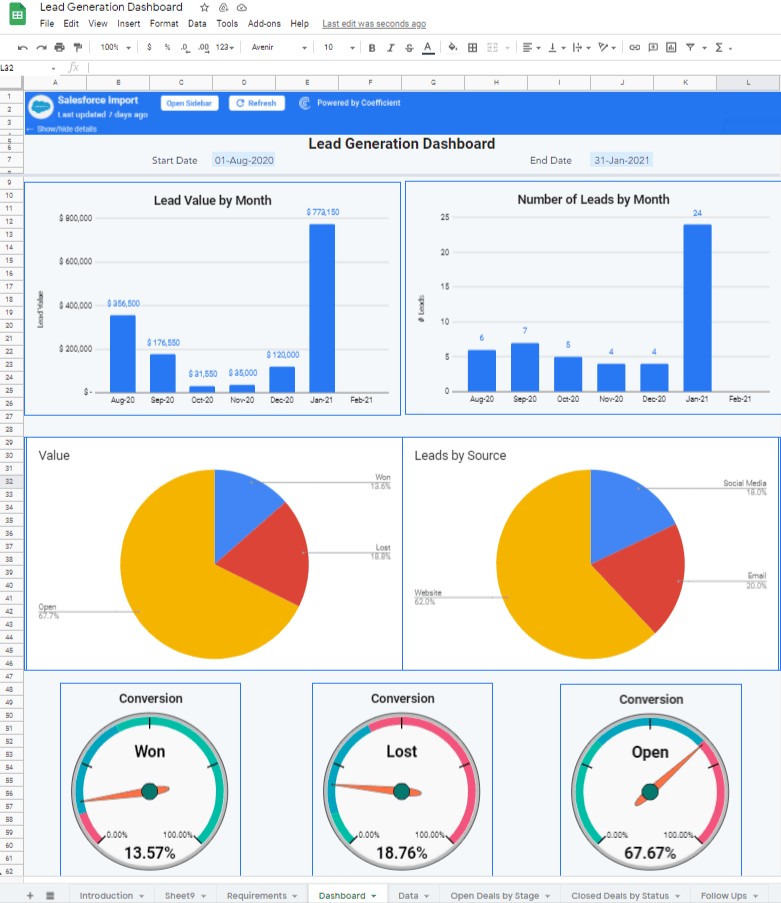
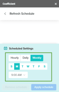
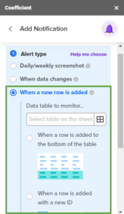
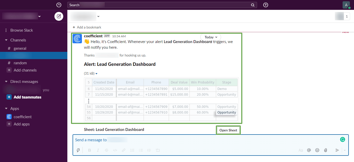
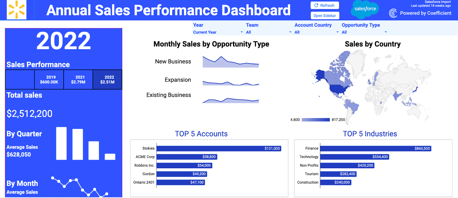
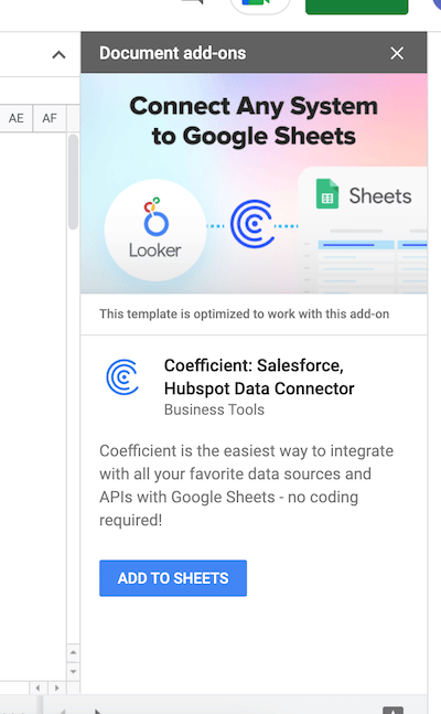
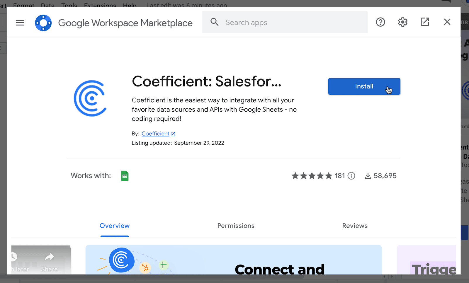
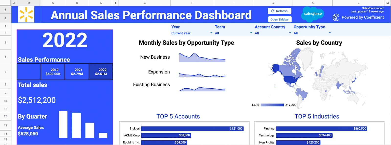
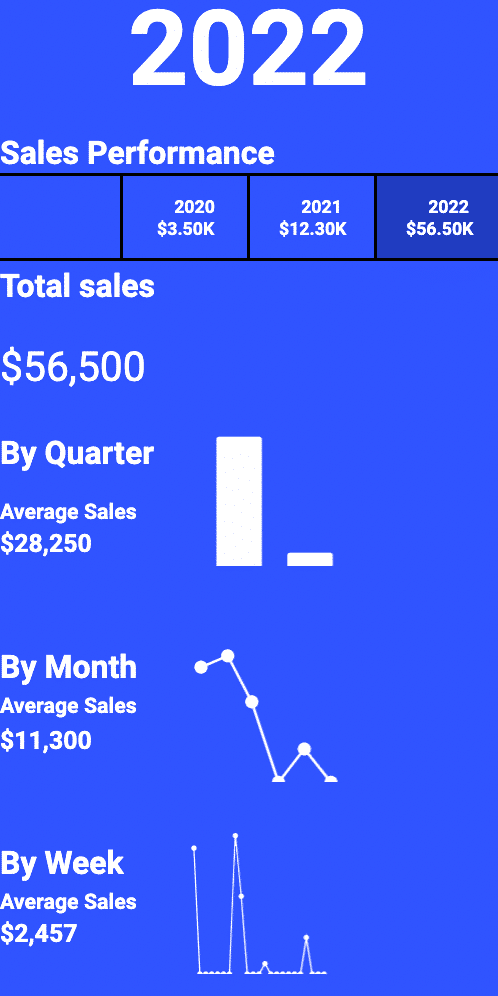
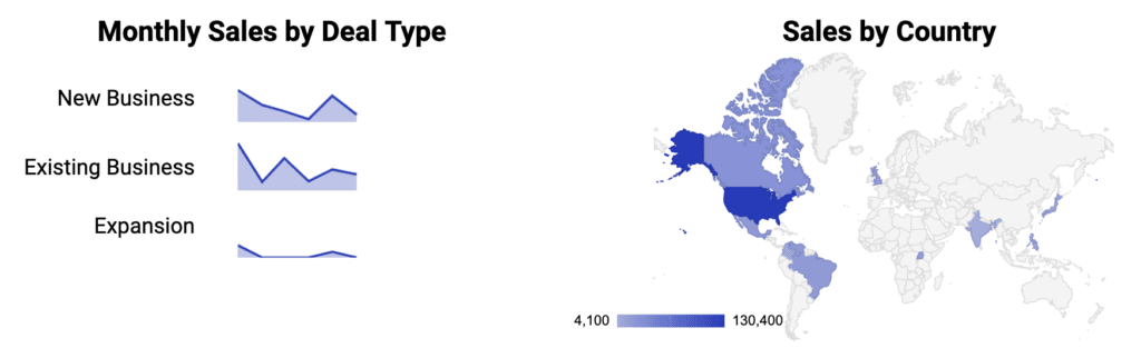
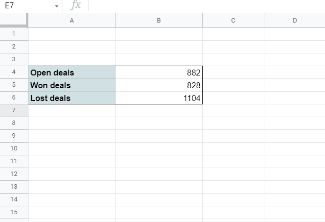
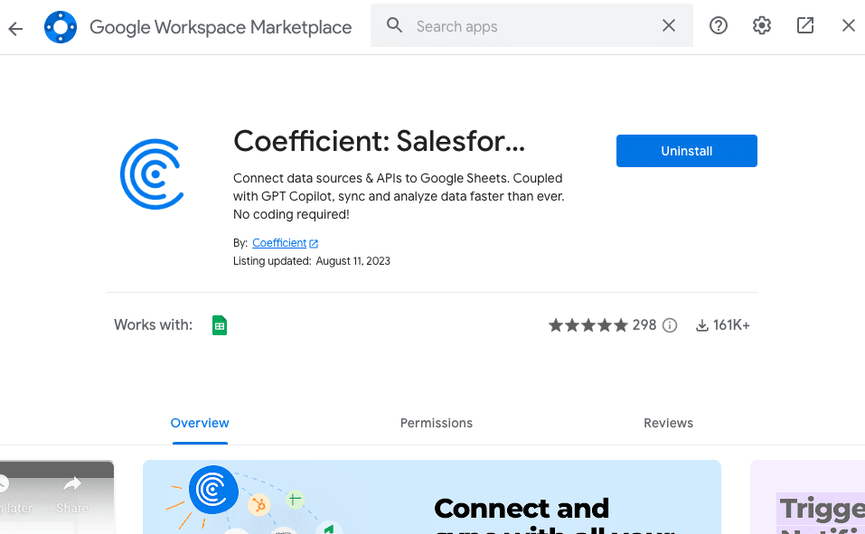
Coefficient
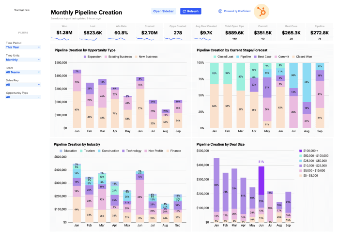
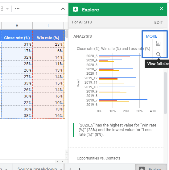
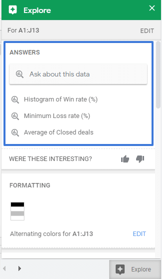
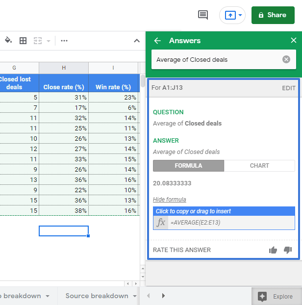
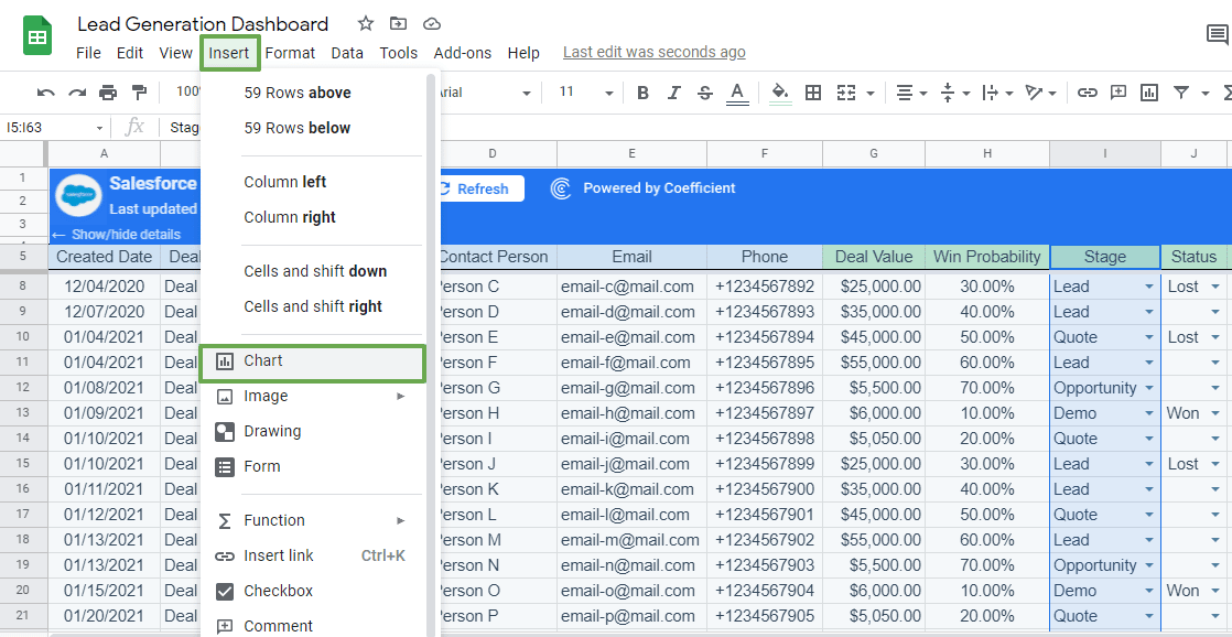
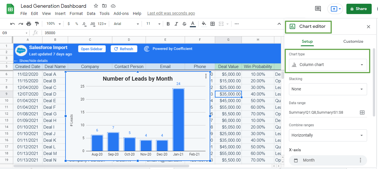
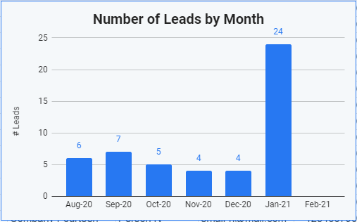
Coefficient is an innovative analytics tool tailored for SalesOps professionals who value the flexibility of spreadsheets but require the capabilities of advanced sales analytics. By seamlessly integrating with various data sources, Coefficient delivers in-depth insights into team’s performance, all within the familiar spreadsheet environment.
This unique approach addresses the common challenges faced in SalesOps, such as fragmented data sources and the need for real-time insights, making it a standout choice among its competitors.
Key Customers
- Atlassian
- Cisco
- VMware
Main Features
- Coefficient’s robust integration capabilities amalgamate data from diverse platforms, offering a holistic view of crucial sales metrics and key performance indicators (KPIs).
- Beyond mere data representation, Coefficient dives deep, enabling SalesOps teams to pinpoint strengths, discern areas of improvement, and unearth golden opportunities.
Cost
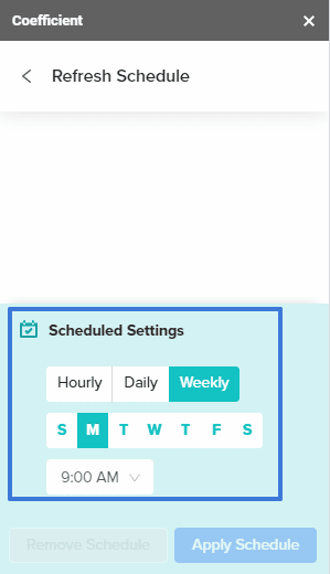
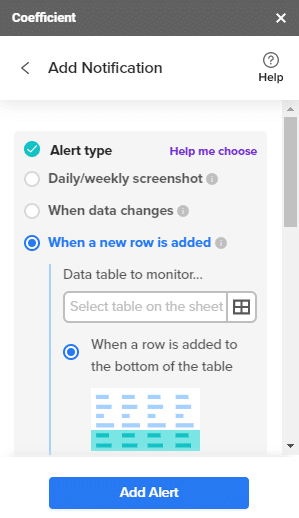
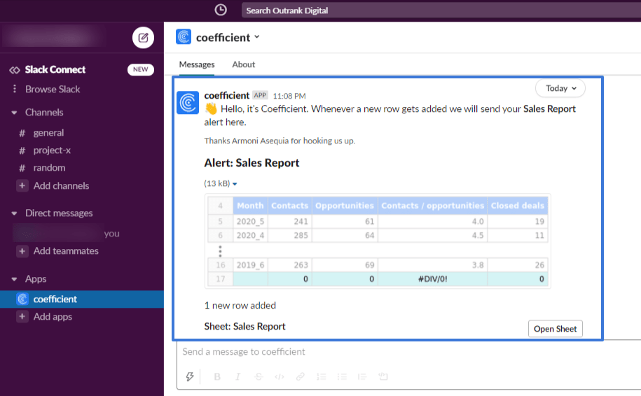
Coefficient provides a variety of pricing packages tailored to diverse requirements. This includes a free plan that enables users to seamlessly import up to 5,000 rows of data into Google Sheets from any supported source, complemented by 10,000 OpenAI API calls through GPT Copilot.
For those seeking more advanced features, the Starter Plan is priced at $49 per month, while the Pro Plan is available at $99 per month. Advanced automations and alerts are exclusive to our paid plans
Looker
Looker is a versatile data platform that allows businesses to explore and share insights across various departments, enhancing collaboration and decision-making.
Key Customers
- Adobe
- Capital one
- Lyft
- Disney
- Nike
Main Features
- Looker’s data exploration and visualization features provide a holistic view of sales performance and customer behavior.
- Sales teams can use Looker to create customized reports, conduct in-depth analyses, and share findings with relevant stakeholders.
- This democratization of data empowers sales reps and managers to access critical information when they need it, facilitating quick and data-driven decision-making.
Cost
Standard users cost $60 per month, and Developer users cost $125 per month.
Power BI
Microsoft Power BI is a business intelligence tool that facilitates data analysis, visualization, and sharing within organizations.
Key Customers
- Walmart
- Apple
- Johnson & Johnson
- FedEx
Main Features
- It integrates with Microsoft products and other data sources, making data access and analysis convenient for sales teams.
- Power BI’s interactive dashboards and reports allow users to gain insights at a glance, empowering them to make real-time decisions.
- With Power BI’s data-sharing capabilities, sales teams can collaborate and ensure everyone is aligned with the same data-driven goals.
Cost
Power BI Pro costs $10 per user per month and Power BI Premium costs $20 per user per month.
Sales Commission Tools
Incentivizing sales representatives is a critical aspect of Sales Operations Software, as it impacts their motivation and performance. Sales commission payout tools streamline the commission calculation process, ensuring accuracy and transparency.
Spiff
Spiff is a commission management tool that simplifies the process of calculating and managing sales commissions.
Key Customers
- 15Five
- Braze
- Clari
- Pendo
- Vitaly
- RadNet
- Veeva Systems
- Weave
Main Features
- With its automation features, Spiff reduces manual errors and eliminates the need for tedious spreadsheet calculations.
- Sales representatives can access real-time commission data, which boosts transparency and motivates them to achieve their sales targets.
- The tool also allows for custom commission structures, accommodating various incentive plans and commission models tailored to individual sales roles.
Cost
Spiff provides custom prices for the use of their software.
Performio
Performio is a versatile commission management platform that caters to businesses with complex commission structures and incentive plans.
Key Customers
- Veeva Systems
- Johnson & Johnson
- Vodafone
- Air France Industries KLM Engineering & Maintenance
- ServiceTitan
- Service Express
- Medtronic
Main Features
- It offers advanced commission modeling capabilities, making it suitable for organizations with diverse sales teams and compensation plans.
- Performio’s robust reporting and analytics features provide insights into commission performance, enabling sales managers to identify top-performing reps and opportunities for improvement.
- The platform’s flexibility allows businesses to adapt their commission structures as needed to align with changing sales strategies.
Everstage
Everstage provides an interface for commission tracking, making it easy for sales teams to access their performance and earnings.
Key Customers
- Chargebee
- Postman
- Nitro
- Hackerrank
- CleverTap
- Popmenu
- Health Gorilla
- MSH
Main Features
- The tool simplifies commission management, ensuring that sales reps can view their earned commissions in real time. With clear visibility into their performance, sales representatives stay motivated and focused on achieving their targets.
- Everstage’s intuitive design allows for seamless onboarding and adoption, streamlining the commission payout process for both sales reps and administrators.
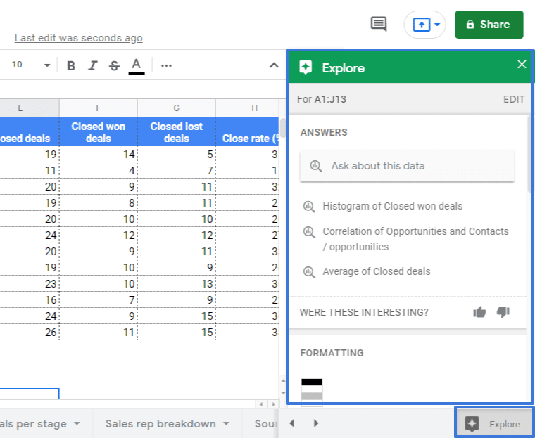
Google Sheets + Coefficient
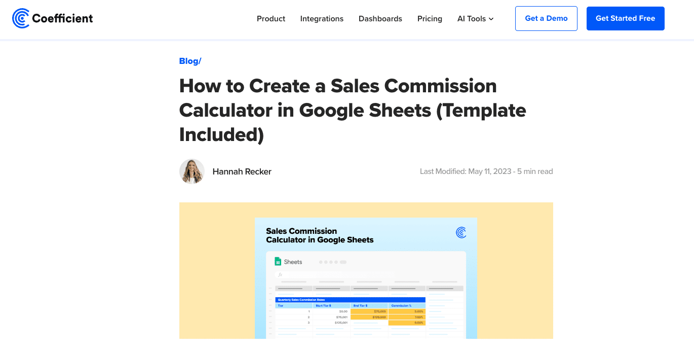
Once again, Coefficient offers smaller businesses or those seeking a cost-effective solution, a simple yet effective commission-tracking tool they can use and share in their spreadsheet.
Key Customers
- Spotify
- Zendesk
- Udemy
- Uber
Main Features
- Google Sheets provides a familiar and customizable platform for businesses to manage commission data.
- When combined with Coefficient, businesses can automate commission calculations and other analyses to gain deeper insights into their commission data.
- It allows sales managers to track performance, analyze trends, and make data-driven decisions while keeping costs down.
Sales Enablement Tools
Sales enablement tools are important SalesOps tools that play a pivotal role in providing sales representatives with valuable assets and training to enhance their efficiency and effectiveness in closing deals.
Showpad
Showpad offers a comprehensive and centralized platform for content management and sales training.
Key Customers
- GE Healthcare
- Honeywell
- Merck
- Coca-Cola European Partners
- BakerCorp
- Croustico by Vandemoortele
- Thales Avionics
Main Features
- It allows sales reps to access the latest and most relevant sales materials, such as product brochures, presentations, case studies, and videos.
- With Showpad, sales teams can organize, share, and track the usage of content.
- This ensures that sales reps are equipped with up-to-date and compelling content to engage prospects and close deals more.
- Additionally, Showpad’s sales training capabilities facilitate continuous learning and skill development among sales teams, enabling them to stay at the forefront of their game.
Cost
Showpad offers customised pricing.
Uniqode

Uniqode’s digital business card offers field sales professionals and organizations a powerful solution that transforms traditional networking into a trackable, efficient, and eco-friendly process.
Key Customers
- Pepsi
- Hilton
- Toyota
- Nestle
Main Features
- Create and bulk-generate up to 2,000 personalized digital business cards in under 5 minutes, eliminating lengthy procurement processes.
- Track engagement metrics including views, saved contacts, and unique recipients to measure networking ROI and optimize sales strategies.
- Enable two-way contact sharing that automatically captures prospect information directly through your digital business card.
- Share cards through multiple channels, including Apple or Google Wallet, social media, email, and messaging platforms, without requiring additional apps.
- Enterprise-grade security with GDPR, HIPAA, and SOC 2 Type 2 compliance protects data for all parties involved.
Cost
Uniqode provides flexible pricing options designed to meet various business needs. Their solution has a free tier that allows you to create one digital business card with basic customization options and limited analytics.
If you need additional features like multiple cards per user, advanced customizations, or premium designs, you would need to upgrade to their Team plan at $6 per user per month (billed annually) or their Business+ plan for larger organizations.
Mindtickle
Mindtickle is a sales readiness platform designed to enable continuous training and coaching for sales teams.
Key Customers
- Medallia
- Infoblox
- TurnKey Vacation Rentals
- Societe Generale
- Unisys
- MongoDB
- Andela
Main Features
- Mindtickle fosters skill development by providing interactive and engaging training content. Sales reps can access bite-sized learning modules, quizzes, and simulations that help them master sales techniques and product knowledge.
- Mindtickle’s coaching features enable managers to provide personalized feedback and coaching to their sales reps, further enhancing their capabilities and performance.
- Mindtickle ensures that sales teams are always prepared and equipped to handle various customer interactions.
Salesloft
Salesloft is a sales engagement platform that streamlines sales communication and outreach.
Key Customers
- IBM
- Shopify
- 3M
- ServiceNow
- Okta
Main Features
- It empowers sales reps with tools for personalized and effective communication with prospects.
- Salesloft offers features like email templates, cadence planning, and real-time engagement tracking.
- These capabilities help sales reps manage their outreach efforts and engage prospects at the right time with relevant content.
- By automating repetitive tasks, Salesloft increases sales productivity and enables sales teams to focus on building meaningful relationships with prospects.
Cost
Salesloft has three plans, essential, Advanced, and Premier. The prices for these three plans are customized.
Seismic
Seismic is a content automation and personalization platform designed to help sales reps deliver targeted content to prospects.
Key Customers
- Adobe
- Atlassian
- Capital One
- Cisco
- IBM
- Microsoft
Main Features
- It enables sales teams to access a vast library of content and customize it to match specific prospect needs.
- With Seismic, sales reps can create personalized presentations, proposals, and other collateral, increasing the effectiveness of their interactions with prospects.
- The tool ensures that sales reps deliver the right message to the right audience, leading to more meaningful conversations and improved sales outcomes.
CPQ & Invoicing Tools
Configure, Price, Quote (CPQ) tools and invoicing solutions are essential for Sales Operations Software, as they streamline the quoting and billing process, reducing manual errors and accelerating deal closures.
Pandadoc
Pandadoc is a versatile CPQ tool that simplifies document creation, including quotes, proposals, and contracts.
Key Customers
- Autodesk
- Benstalk
- Catalyst Group
- Chili Piper
- HubSpot
- Insperity
- Lumosity
- Marketo
Main Features
- With Pandadoc, sales teams can generate professional-looking documents, ensuring a polished and consistent presentation to prospects.
- The tool’s e-signature capabilities facilitate faster deal closure by enabling seamless and secure electronic signatures.
- Pandadoc streamlines the entire document approval process, allowing sales reps to focus on building customer relationships and closing deals.
Dealhub
Dealhub offers a comprehensive CPQ platform with built-in contract management and revenue recognition features.
Key Customers
- Standard Chartered Bank
- JP Morgan Chase & Co.
- Deutsche Bank
- Dassault Systemes SA
- Veeva Systems
- ThoughtSpot
Main Features
- The platform enables sales reps to create accurate and customizable quotes that align with specific customer requirements.
- Dealhub’s contract management capabilities ensure that sales teams can track contract statuses, making it easier to manage renewals and upsells.
- Additionally, the revenue recognition functionality ensures that sales reps and finance teams can forecast and report revenue figures.
Salesforce CPQ
Salesforce CPQ is an integrated solution within the Salesforce ecosystem, offering seamless CPQ functionality for sales teams.
Key Customers
- ExxonMobil
- Apple
- Johnson & Johnson
- Siemens
- FedEx
- Bank of America
- GE Healthcare
- Qualcomm
- United Airlines
- Spotify
Main Features
- As part of the world’s leading CRM platform, Salesforce CPQ enables sales reps to configure products, set pricing rules, and generate quotes within the CRM interface.
- This integration ensures that sales teams have access to real-time customer data, enhancing the accuracy and efficiency of the quoting process.
- Salesforce CPQ streamlines the end-to-end sales process, from lead generation to deal closure, within a single platform.
NetSuite
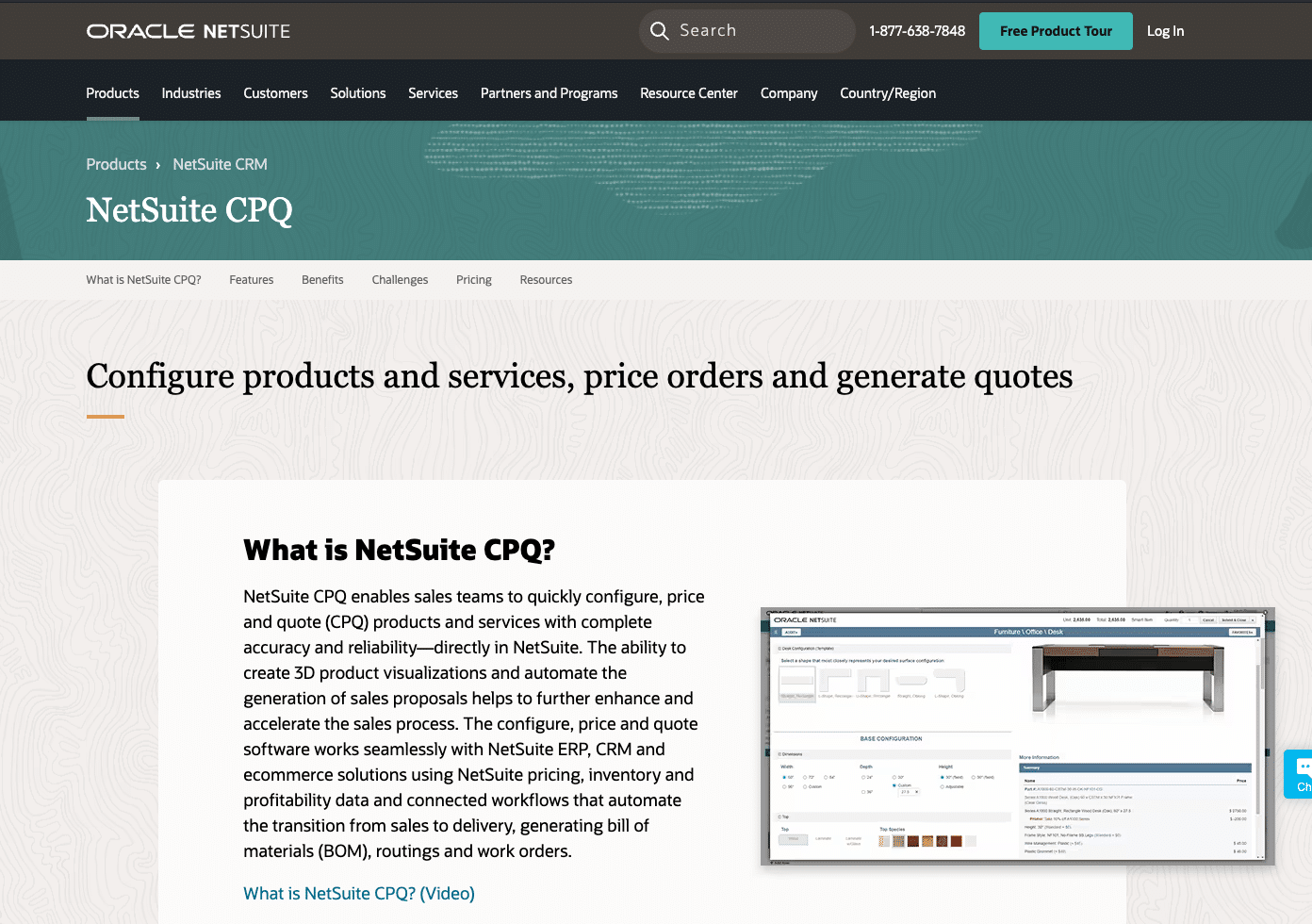
NetSuite provides a robust suite of business management tools, including CPQ and invoicing features, suitable for larger enterprises.
Key Customers
- GoPro
- Osmose
- Polygon
- Qdoba Restaurant Corporation
- Crowe Horwath LLP
- Flexport
- Medtronic
Main Features
- NetSuite’s CPQ functionality allows sales teams to configure complex product offerings, manage pricing and discounts, and generate accurate quotes for customers.
- The integrated invoicing capabilities streamline the billing process, ensuring timely and accurate invoicing to customers.
- With NetSuite, larger enterprises can manage their sales operations and financial processes within one unified platform.
Sales Training Tools
Continual sales training is critical for Sales Operations Software, ensuring that sales teams are equipped with the necessary skills and knowledge to excel in their roles. Sales training tools play a pivotal role in providing interactive and engaging learning experiences for sales representatives.
Lessonly
Lessonly by Seismic is a comprehensive learning management system that simplifies training content creation and delivery.
Key Customers
- Trunk Club
- Ibotta
- U.S. Cellular
- Zendesk
- BrightView
- Flexport
- Bread Finance
- Instacart
- Filtration Group
- Nissan
Main Features
- With Lessonly, sales teams can create and distribute training materials, such as videos, presentations, quizzes, and simulations.
- The platform’s interface and intuitive features make it easy for both trainers and trainees to navigate and engage with the training content.
- Lessonly’s tracking and reporting capabilities enable sales managers to monitor individual progress and assess the effectiveness of the training program, leading to continuous improvement.
Brainshark
Brainshark enables the creation of interactive sales training content, ensuring that sales reps stay engaged and well-informed.
Key Customers
- ADP
- Cisco
- Dell Technologies
- GE Healthcare
- Hewlett Packard Enterprise
- Humana
- IBM
Main Features
- With Brainshark, trainers can develop dynamic and multimedia-rich content, including video presentations, role-playing scenarios, and knowledge assessments.
- Its interactive approach to training increases trainee participation and knowledge retention, making the learning process more effective.
- Brainshark’s analytics and reporting features provide valuable insights into training effectiveness and help identify areas for improvement.
EdApp
EdApp provides a mobile learning platform with gamification elements, making training sessions enjoyable and effective.
Key Customers
- Amgen
- British American Tobacco (BAT)
- Università Di Bologna
- LifeBridge Health
- Prudential
- SAP
- The Home Depot
- Wipro
- Xerox
Main Features
- The platform’s gamified approach encourages friendly competition among sales reps, motivating them to actively participate in training activities.
- EdApp’s mobile accessibility ensures that sales reps can access training materials anytime and anywhere, allowing for flexible and convenient learning.
- EdApp’s microlearning approach breaks down training content into bite-sized modules, facilitating quick and focused learning for busy sales professionals.
Spekit
Spekit offers in-app training and knowledge reinforcement, helping sales reps access the information they need in real-time.
Key Customers
- Atlassian
- CoBank
- DigitalOcean
- HubSpot
- Mariner Wealth Advisors
- Sendlane
- Southwest Airlines
- Zscaler
Main Features
- Spekit integrates with existing tools and platforms, providing context-sensitive training and support within sales applications.
- When sales reps encounter new scenarios or need guidance, Spekit’s in-app training pops up with relevant information, ensuring quick problem-solving and informed decision-making.
- This just-in-time learning approach enhances the sales team’s productivity and confidence.
Sales Territory Mapping Tools
Sales territory mapping tools play a crucial role in Sales Operations Software by helping businesses optimize their sales coverage and ensure that resources are allocated across different regions. These tools provide valuable insights and functionalities that assist sales teams in managing their territories and maximizing sales opportunities.
Salesforce Maps
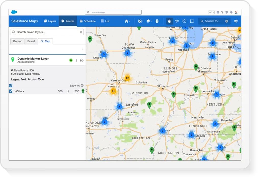
Salesforce Maps is a powerful tool that integrates with Salesforce CRM to provide visual territory planning and route optimization for sales reps.
Key Customers
- Stanley Black & Decker
- CEAT
- Esri
- Viega
- AmerisourceBergen
- DHL
- Graco
- Legrand
- Nestlé
Main Features
- With Salesforce Maps, sales teams can visualize their territories on interactive maps, allowing them to identify potential gaps in coverage and make data-driven decisions on territory assignments.
- The tool also offers route optimization features, enabling sales reps to plan their visits and minimize travel time.
- By integrating with Salesforce CRM, Salesforce Maps ensures that sales reps have access to real-time customer data while in the field, enhancing their ability to engage with prospects and close deals.
Badger
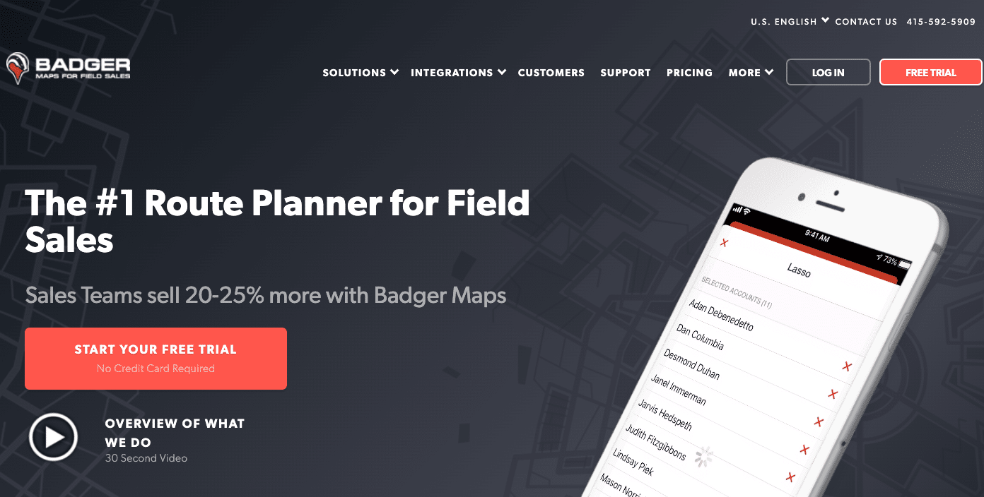
Badger offers field sales automation, including territory management, lead generation, and route planning.
Key Customers
- Bosch
- Ecolab
- FedEx
- Hitachi
- Honeywell
- John Deere
- L’Oréal
Main Features
- With Badger, sales teams can define and manage their territories, ensuring that each territory receives the appropriate attention and resources.
- The lead generation features help sales reps identify potential customers within their territories, enabling them to focus on high-potential prospects.
- Badger’s route planning capabilities optimize sales reps’ travel routes, saving time and reducing travel expenses.
- Its streamlining of field operations enhances the overall efficiency of the sales team.
EasyTerritory
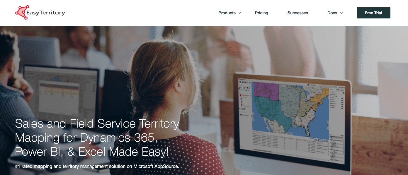
EasyTerritory provides location-based intelligence to optimize sales territories and streamline field operations.
Key Customers
- Avnet
- Cisco
- DHL
- Enel
- GE Healthcare
- Honeywell
- Johnson Controls
Main Features
- The tool utilizes geographic data and insights to help sales teams identify market opportunities and allocate resources.
- EasyTerritory offers advanced mapping and data visualization capabilities, enabling sales reps and managers to analyze sales performance by region, identify trends, and adjust territory boundaries as needed.
- With EasyTerritory, sales teams can make informed decisions on territory planning and resource allocation, resulting in improved sales productivity and revenue growth.
Xactly
Xactly offers sales performance management solutions, including territory planning and quota allocation features.
Key Customers
- Western Union Company
- Louis Vuitton
- Australia Post
- Aflac
- Boeing
- HP
- Ecolab
Main Features
- The tool enables businesses to define and align territories based on various criteria, such as geography, customer segments, or product lines.
- Xactly’s territory planning capabilities ensure equitable distribution of sales opportunities among the sales team, leading to fair and achievable quotas for each territory.
- By optimizing territory assignments and quotas, Xactly empowers sales reps to focus their efforts on the right prospects and opportunities, driving higher sales performance and revenue.
Bonus solution: Clean Email
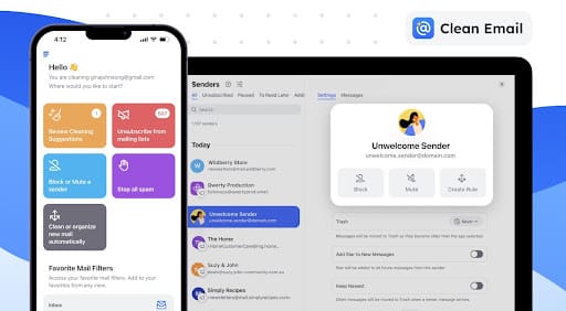
Clean Email is an essential productivity tool that helps sales teams manage their overflowing inboxes, ensuring they stay organized and focused. Designed for handling high volumes of emails, it automates the sorting, archiving, and removal of unwanted messages, freeing up time for more critical tasks.
Key Customers
- Small to medium-sized businesses
- Sales teams in all industries
- Productivity-focused professionals
Main Features
- Unsubscriber: Quickly unsubscribe from unwanted newsletters and promotional emails, reducing inbox noise.
- Auto Clean: Automate repetitive email tasks like archiving, labeling, and moving emails based on user-defined rules.
- Screener: Pre-approve or block new senders, ensuring your inbox remains clutter-free with only relevant messages.
- Smart Folders: Automatically categorize emails into categories like finance-related emails, automated messages, or social media notifications for faster navigation.
- Cleaning Suggestions: Receive personalized recommendations to clean up unnecessary or cluttered emails.
Cost
Clean Email offers flexible pricing plans to cater to different needs:
- Basic: $9.99/month or $29.99/year (1 email account)
- Family: $19.99/month or $49.99/year (up to 5 accounts)
- Team: $29.99/month or $99.99/year (up to 10 accounts)
How to Choose a Sales Operations Software?
Selecting the right Sales Operations Software is a critical decision that can impact the efficiency and effectiveness of your sales processes.
Integrations
Ensure the software integrates with your existing tech stack, including CRM and marketing automation tools, to avoid data silos and improve overall efficiency.
Budget
Consider the software cost and its value for your sales operations. Evaluate the pricing model and potential ROI, while ensuring it fits within your budget constraints.
Ease of Use
Opt for an interface with intuitive features to enable faster adoption and implementation across your sales team.
Free Trial (Don’t Purchase Without a Trial)
Select tools offering free trials to assess suitability for your business needs. Involve key stakeholders, test features, and evaluate data integration during the trial to make an informed decision.
Elevate Performance with Sales Operations Tools
Sales operations software is pivotal for driving growth and refining business performance. Harnessing the right tools not only boosts sales efficiency but also provides crucial data-driven insights.
As you assess your organization’s unique requirements, it’s important to understand the categories of Sales Operations Tools and how your team can leverage them properly.
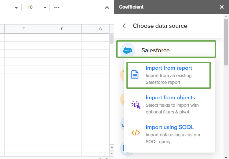
Coefficient empowers SalesOps professionals to unify diverse data sources for comprehensive sales insights. Try it for free today to see how it can streamline your analyses!