


Table of Contents
![]()
- 1. 10 B2B Sales Dashboards for RevOps Teams in 2025
- 2. How to build a lead generation dashboard in Google Sheets
- 3. Sales Performance Dashboard: Free Spreadsheet Template
- 4. How to Build a Sales Dashboard in Google Sheets
- 5. Sales KPIs Dashboard: 4 Free Google Sheets Templates
- 6. Free Sales Templates: SalesOps Dashboards for Google Sheets
- 7. 5 Sales Tracking Spreadsheet Templates for Reporting
- 8. Opportunity History Template: Track Sales Forecast Changes


If you want to build a lead generation dashboard in Google Sheets, then you’ve come to the right place.
A lead generation dashboard helps you evaluate the value and performance of your marketing campaigns by letting you track your numbers and get a top-level of your Key Performance Indicators (KPIs).
In this guide, we’ll show you how to create a lead generation dashboard in Google Sheets and demonstrate how easy it is to update your Salesforce lead data using Coefficient.
What is a lead generation dashboard?
A lead generation dashboard gives you a big picture view of your conversion rates and digital marketing channels.
Lead generation reports deliver actionable insights that help marketing and sales teams explore the lead generation data further to optimize marketing strategies and, in turn, improve results.
A comprehensive lead generation dashboard should provide good visibility into the lifecycle of your leads’ lifecycle and should help address these questions:
- Are your lead generation efforts driving enough Marketing Qualified Leads (MQLs) for your sales team?
- Which marketing campaigns generate the most leads?
- Which campaigns bring in the most qualified leads?
- Where do your leads come from?
- Are there potential leaks in your lead funnel?
- Are your critical lead generation KPI trends moving up or down over time?
With a lead generation dashboard, you can continuously monitor the performance of your lead lifecycle and easily share critical data across your teams and company.
It gives you the data you need to make the right adjustments to your strategies and even helps make your salesforce sales funnel analysis better (among others).
Steps to building your dashboard
The first important thing to do is to identify KPIs you and your team find most relevant.
Some of the essential lead generation KPIs to track include the following.
- The number of leads. A lead can depend on what your company considers or qualifies as leads. For instance, if a lead is someone who starts a free trial, then your total number of leads would include the number of people who signed up for a free trial of your product.
- Leads by source. Tracking this KPI can help you determine which marketing campaigns and channels, such as Search Engine Optimization (SEO), digital ads, and social media platforms, generate new leads for your business.
- Current leads by stage. This is a critical lead lifecycle over time metric that lets you see the most recent details of your leads to help you identify trends and optimize your lead generation efforts.
- Total lead value. This (approximate) number provides a good estimation of your leads’ overall worth for the business.
- Conversion rate. The percentage of leads who perform a specific action is your conversion rate. These actions can include subscribing to your email newsletter on your landing page, downloading an ebook, making a purchase, or clicking a link in your email.
Essentially, your conversion rate is the percentage of leads who act on your conversion goals. You can uncover this insight by looking into your open, won, and lost deals.
Once you have determined the critical lead generation KPI metrics you want to track and get insights from, start building your dashboard by following these steps.
Step 1: Pull your dataset from your data source
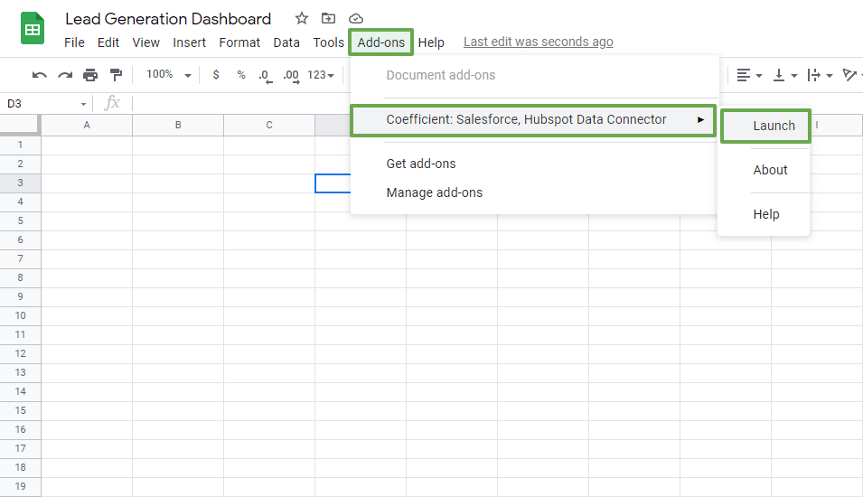
To get your data from Salesforce into your spreadsheet, install the Coefficient: Salesforce, HubSpot Data Connector app, and launch it from the Google Sheets Add-ons menu tab.
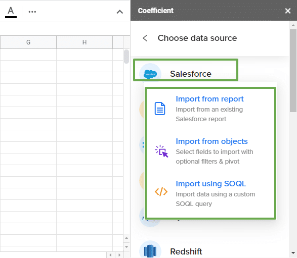
On the Coefficient sidebar, select Import data > Salesforce, then choose whether to import from reports, objects, or use a custom SQL query.
Customize your imports easily by choosing only the data you need. For instance, if you’re pulling data from a Salesforce report, you can edit your import by filtering the fields you want to include.
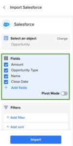
You can also go back to this and add more data from your report later. It’s a seamless way to get your Salesforce data in a spreadsheet without exporting it.
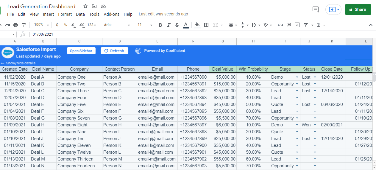
When you’re done, click the Import button, and your Salesforce data should populate your Google spreadsheet almost immediately. It should look something like the sample data below.
Step 2: Create your lead generation KPI graph or chart
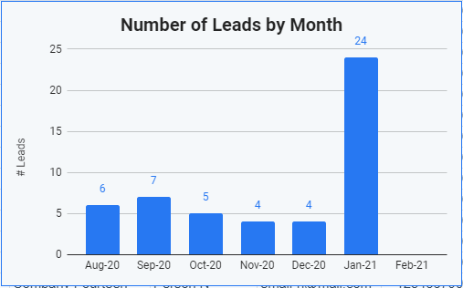
Let’s say you want to include the number of leads per month from August 1, 2020, to January 31, 2021, in your lead generation dashboard.
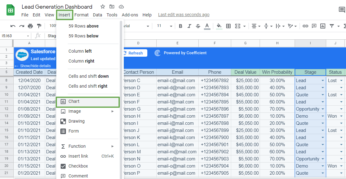
On your table containing your dataset, select the required data range, including the column labels. Click Insert on the Google Sheets menu, then Chart.
On the Chart editor sidebar under the Setup tab, select the chart type. For this example, we’ll use a column chart.
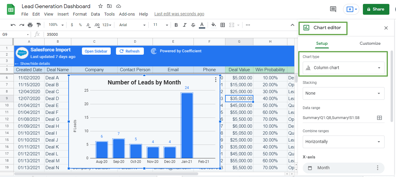
Configure the chart how you want by choosing stacking options, editing the data range, combining ranges, and changing the X-axis label (among other things).
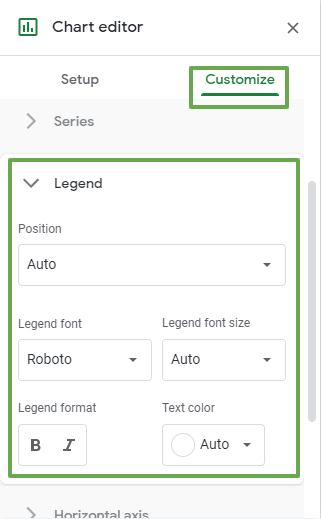
Customize your chart’s design, colors, and other elements by clicking the Customize tab in the Chart editor and modifying your visualization accordingly.
The chart customizable chart elements include the chart and axis titles, Series data, Gridlines and ticks, Legend, and other options.
When you’re done, you should have a chart showing your number of leads per month.
Step 3: Build your dashboard
Now that you have your first chart, click the three dots on the upper right-hand corner and select Move to own sheet.
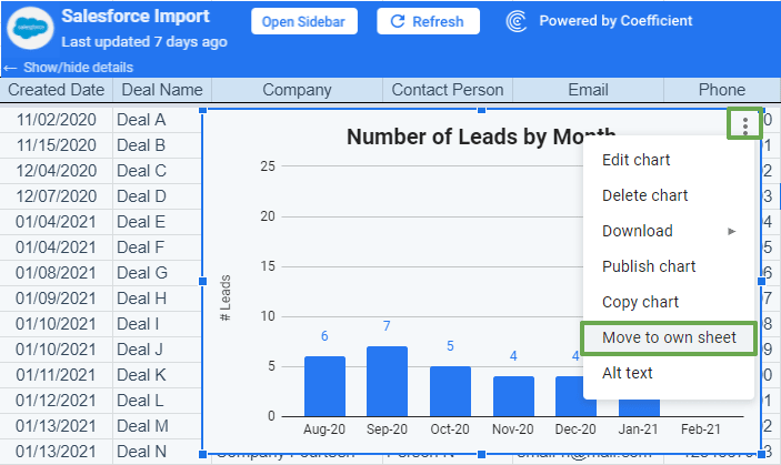
Doing so places your chart on a separate sheet within the same file. Add the rest of your graphs and charts to your lead generation dashboard.
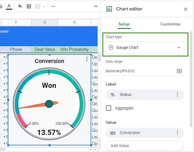
Let’s walk through another example. This time, let’s create visualizations that track and show your conversion rates based on your Won, Lost, and Open deals.
Follow the same steps we did previously by selecting your data range (or ranges) and clicking Chart from the Insert menu option.
Let’s choose a different chart style this time — a gauge chart to show the won leads or deals.
Create the other gauge charts that show your lost and open deals and customize their design and elements accordingly.
When you’re done, you should have charts you can display on your lead generation dashboard that look like this.
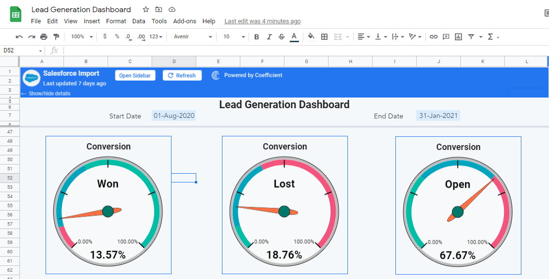
Move the charts to the sheet containing the first chart you created and build the rest of your visualizations.
Create other KPI metrics visualizations you want to track. They can be as granular as possible, such as a graph that shows your lead to opportunity conversion rate, depending on what you and your team consider essential.
Take a look at your completed lead generation dashboard.
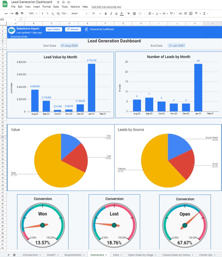
Choose a color scheme that best presents your data and includes elements that highlight your critical figures. This allows all your viewers, teams, and other stakeholders to quickly get a good sense of your lead generation insights.
Organize your charts and graphs in a way that makes sense for your target audience and helps you tell a complete visual story of your lead generation efforts and their progress.
Step 4: Keep your lead generation dashboard data live
What happens when you add new information to the Salesforce data linked to your Google Sheets lead generation dashboard?
Will you need to import new data to your lead generation report every single time to keep your dashboard up-to-date?
Not with Coefficient.
The app allows you to update your Salesforce data automatically through an auto-refresh schedule.
You won’t need to repeat your imports but streamline your dashboard building instead, making Coefficient one of the top ten Google Sheets add-ons for data analysis and reporting.
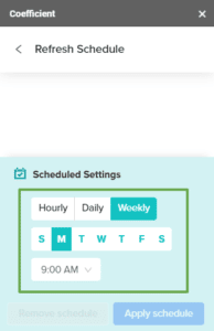
You can set the auto-refresh schedule for your Salesforce data on Google Sheets before importing your dataset. Or you can click the menu button on the Coefficient sidebar and select Refresh Schedule.
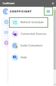
Set an hourly, daily, or weekly auto-refresh schedule, and Coefficient will automatically sync changes or new data additions to your linked Salesforce datasets. This saves you and your teams from often lengthy and time-consuming aspects of keeping your lead generation dashboard data live and always relevant.
You can also update your Google Sheets data instantly by clicking the Refresh button.

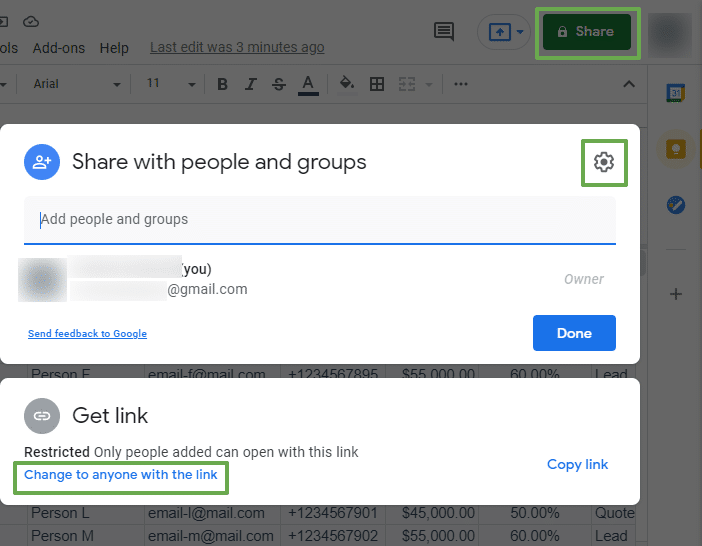
Remember to set the spreadsheet sharing option accordingly to allow other users to view or edit your Google Sheets lead generation dashboard.
Click the Share button on the top right corner of the Google Sheets interface and configure your preferred sharing settings.
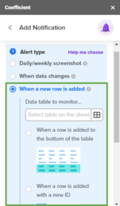
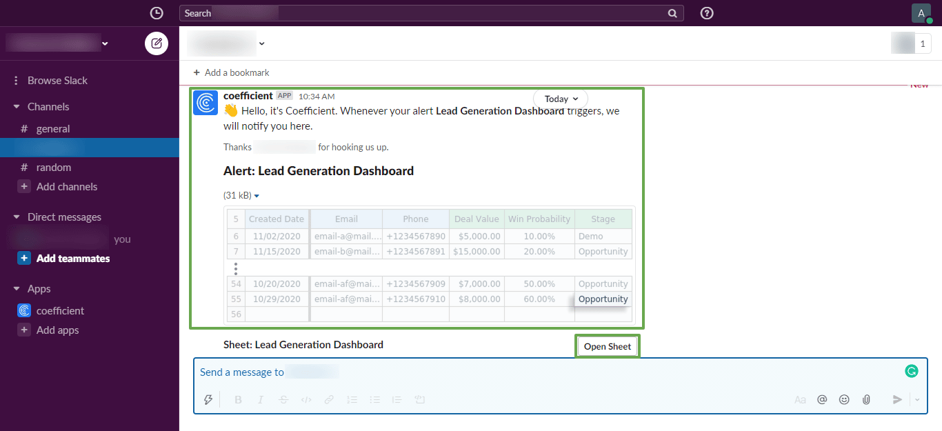
Coefficient also helps you keep everyone in the loop by letting you set alerts that automatically send notifications to specific recipients.
You can configure these alerts to trigger according to your scheduled notification frequency, or when new rows or data are added to your linked Google Sheets dataset.
For example, you can set alerts that send daily screenshots of your opportunities to Slack or your lead generation KPI dashboard to your management team.
Recipients get an alert in Slack and they can click the link within the notification to open the sheet so they can check the changes or updates on your dashboard in more detail.
You can also send automated notification emails containing weekly screenshots of your open leads to marketing and sales team members.
With the power of Coefficient combined with native spreadsheets functions and features, you’ll learn how to build a marketing dashboard in Google Sheets that is easy to put together and update with minimal effort.
The easier it is to build your lead generation dashboard, the faster you and your teams can track your critical KPIs, gain actionable insights, identify potential gaps in your marketing strategies, and implement appropriate adjustments. This helps you optimize your lead generation efforts and drive better results efficiently.
Creating a lead generation dashboard is not rocket science
An effective lead generation dashboard helps you articulate the value of your marketing efforts while simplifying tracking and deriving insights from your crucial KPIs.
As such, building a comprehensive lead generation dashboard begins with migrating your data from Mailchimp, Salesforce, or other business system into Google Sheets.
Coefficient makes this uber easy by letting you import data quickly with a few clicks and automatically keeps your data updated at all times.
With Coefficient, creating your lead generation reports and dashboard is efficient, seamless, and almost effortless. This helps you extract valuable insights easily, improve your strategies, and make data-driven business decisions.
Try Coefficient for free today!