Build a Live Regional Sales Report Template in
Less Than 30 Minutes
Use this prompt guide to build a regional sales dashboard in your spreadsheet.
Get Started Free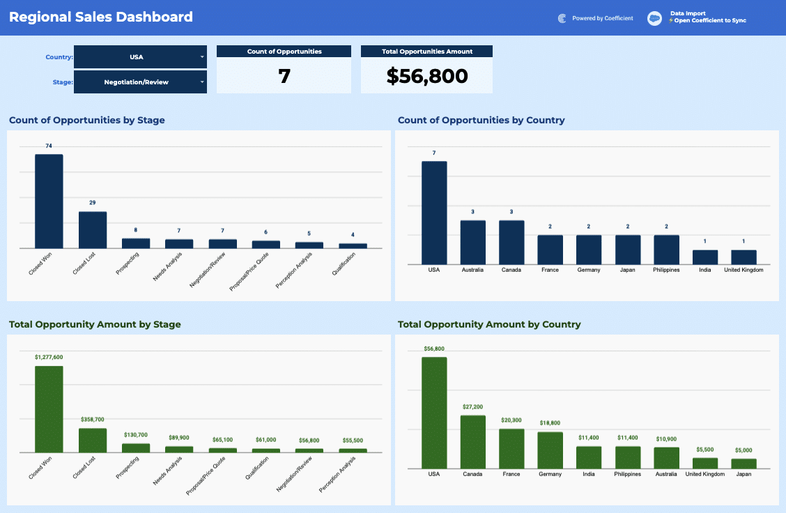
Before you start
Get set up in Coefficient for Google Sheets
- You'll need Coefficient AI to follow this guide. Coefficient is the AI assistant inside Google Sheets that turns prompts into live dashboards, reports, and analytics. Install it free to begin.
- Once you're in, click "Import from" on the Coefficient home screen and select your data source(s) to pull your data into the sheet. Not sure what data to import? Open the Coefficient Sheets Assistant — it can help you figure out where to start.
- Iterate on the prompts as you go. Tweak them to fit your team's workflow and make the dashboard your own. See more workflows built for revenue operations teams.
5 steps
Step-by-step prompts to build a live regional sales report template
Import Sales Opportunities Data
Start by pulling your opportunity data into a dedicated tab. This is your single source of truth that the entire dashboard will reference.
Import your Opportunities object into a tab called '⚡ Opportunities'.
You'll need these fields: Opportunity ID, Name, Created Date, Stage, Closed (boolean), Won (boolean), Amount, and Billing Country.
Import all records with no filter. This data will power a regional sales dashboard.
Build Filter Controls and KPI Cards
Add interactive filters so you can slice the dashboard by country and stage. Then create live KPI cards that recalculate as filters change.
On a new tab called '📊 Regional Sales Dashboard', create two filter labels and values: 'Country:' in B6 with the selected country in C6, and 'Stage:' in B10 with the selected stage in C10. Default both to the first value from the Opportunities tab. Then create two KPI summary cards: 'Count of Opportunities' (G6:G7) and 'Total Opportunities Amount' (J6:J7). Use COUNTIFS and SUMIFS formulas to calculate each metric, filtering by the selected Country and Stage. If either filter is set to 'All', count and sum across all values. Make these calculations live with formulas that reference the imported data.
Build Summary Aggregation Tables
Create four summary tables that automatically break down your opportunities by different dimensions. These tables will feed your visualizations.
Using QUERY formulas referencing the '⚡ Opportunities' tab, create four summary tables on the dashboard tab: (1) Count of opportunities by Stage filtered by the selected Country — place in W1:X10; (2) Count of opportunities by Country filtered by the selected Stage — place in Z1:AA11; (3) Total Amount by Stage filtered by the selected Country — place in AC1:AD10; (4) Total Amount by Country filtered by the selected Stage — place in AF1:AG11. Each table should sort descending by the metric and include a title row above the headers. Use formulas that stay live as new data is imported.
Add Visualizations
Charts make trends visible at a glance. Add two bar charts that show your opportunities broken down by stage and country.
Create two bar charts on the '📊 Regional Sales Dashboard' tab. The first chart should show 'Count of Opportunities by Stage' using the data in W1:X10, with Stage on the Y-axis and Count on the X-axis. The second chart should show 'Count of Opportunities by Country' using the data in Z1:AA11, with Country on the Y-axis and Count on the X-axis. Place both charts side by side below the KPI cards, starting around row 13.
Format for a Polished Look
Clean formatting makes the dashboard easy to read and signals professionalism. Style headers, KPIs, and the overall layout.
Format the '📊 Regional Sales Dashboard' tab to look like a clean sales dashboard. Add a title 'Regional Sales Dashboard' in B3 with bold large font. Style the KPI card headers in bold with a dark blue background (#3053FF) and white text. Format the Amount KPI as currency ($#,##0). Add a light blue background (#EBF3FB) to the full dashboard area. Auto-fit all columns and hide gridlines.
More dashboards and templates
Hand-picked for revenue operations teams.
Outbound Sales Metrics
Build a live 12-week outbound sales metrics dashboard in Google Sheets with email, call, prospect, and deal data. Track performance by rep.
Read the guide
Sales Commission Report
Build a live sales commission report with tiered rates, team filters, and KPI tracking. Track sales, commissions, and performance in your spreadsheet.
Read the guideFree HubSpot Template for Lead Scoring
Download our free HubSpot Lead Scoring template to instantly identify your hottest prospects. Pre-built dashboards show lead quality, conversion trends, and segment performance at a glance.
Launch template
Common questions about the regional sales report template
How do I import my sales opportunities data into the Regional Sales Report template?
Can I filter the Regional Sales Dashboard by country and stage at the same time?
How does the Regional Sales Dashboard calculate win rates and pipeline totals by stage?
What's the best way to share the Regional Sales Dashboard with my team?
How often does the data in the Regional Sales Dashboard update?
Can I add more fields from my CRM to the Regional Sales Dashboard template?
Ready to try it in Coefficient?
Connect your data and start building in minutes.
