Build a Live Sales Commission Report in
Less Than 30 Minutes
Use this prompt guide to build a live sales commission dashboard in your spreadsheet.
Get Started FreeBefore you start
Get set up in Coefficient for Google Sheets
- You'll need Coefficient AI to follow this guide. Coefficient is the AI assistant inside Google Sheets that turns prompts into live dashboards, reports, and analytics. Install it free to begin.
- Once you're in, click "Import from" on the Coefficient home screen and select your data source(s) to pull your data into the sheet. Not sure what data to import? Open the Coefficient Sheets Assistant — it can help you figure out where to start.
- Iterate on the prompts as you go. Tweak them to fit your team's workflow and make the dashboard your own. See more workflows built for revenue operations teams.
9 steps
Step-by-step prompts to build a live sales commission report
Import and Calculate Commission Fields
Start by bringing in your opportunity data with calculated columns for date rollups, team lookups, and commission tiers so your dashboard has the raw ingredients it needs.
I have opportunity data with columns: Opportunity ID, Name, Created Date, Close Date, Amount, Owner (Full Name), and Stage. Add calculated columns for: Close Month (number), Close Year, Month Year (date), Team (lookup from a settings tab mapping owner → team), Commission Rate (tiered: 0.7% for <$2K, up to 9.7% for >$25K), and Commission (Amount × Commission Rate). Use formulas so these fields update automatically when new rows arrive.
Build a Settings Tab
Create reference tables for owner-to-team mapping and commission rate tiers so your dashboard can look up and apply the right rates dynamically.
Create a Settings tab with two tables: (1) an owner-to-team mapping table with columns: Opportunity Owner, Sales Team, Found in data? — with 20 reps split across Team 1–4; and (2) a commission rate tier table with From, To, and Commission Rate columns (5 tiers from $0 to $9,999,999).
Add Filter Controls
Set up dropdown filters at the top of your dashboard so users can slice the data by team and year without building multiple sheets.
Add a filter panel with two dropdowns: 'Teams' (options: All, Team 1, Team 2, Team 3, Team 4) and 'Year' (options: Current Year, 2024, 2025, 2026). Place them in the top-left of the dashboard.
Create KPI Summary Cards
Build a summary section that shows high-level metrics (total sales, deals won, commissions) filtered by the selected team and year, with year-over-year comparison.
Create a summary table with 3 KPIs filtered by the selected Team and Year: Total Actual Sales, Total Opportunities Won, and Total Actual Commissions — each showing the chosen year value vs. last year value side by side. Use formulas that reference the imported data and filters so the KPIs update when the dropdowns change.
Build Sales by Owner Summary
Create a second-level summary that breaks down total sales and commissions by rep, respecting the team and year filters.
Create a table summarizing Total Sales and Total Commission by Owner, filtered by the selected Team and Year dropdowns. Include abbreviated label columns (e.g. $13.3M, $1.2M) for use in charts. Use formulas so the table recalculates when filters change.
Build Monthly Trend Summary
Build a rolling 12-month view so you can spot seasonal patterns and trend directions in sales and commissions.
Create a monthly summary table for the last 12 months showing Month Year, Total Sales, and Total Commission. Include abbreviated label columns formatted as $XM or $Xk for chart axis labels. Use formulas so the table updates as new monthly data arrives.
Add Charts
Visualize the trends and comparisons across owners and months so patterns jump out at a glance.
Create three charts on the dashboard:

A horizontal bar chart titled 'Total Sales by Owner' using the sales-by-owner table, sorted descending by sales, showing abbreviated dollar labels.
A combo bar chart titled 'Total Commission by Owner' showing % of Sales (as a bar) and Commission $ (as a second bar) side by side per owner.
A column chart titled 'Total Sales and Commission for the Last 12 Months' using the monthly summary table, with Sales and Commission as two series, x-axis as Month Year.
Add Recent Deals Table
Include a transaction-level view at the bottom so users can drill into the most recent closed deals and validate commission calculations.
At the bottom of the dashboard, add a table titled 'Most Recent Opportunities Won' showing the top 100 most recent closed-won deals, filtered by the selected Team and Year, with columns: Opportunity Name, Close Date, Owner, Team, Amount, Commission Rate, Commission. Use formulas to apply the filters automatically.
Style the Dashboard
Apply consistent branding and visual hierarchy so the dashboard is easy to scan and looks polished.
Style the dashboard with a dark navy blue (#0A2463) header bar with white bold title text 'Sales Commission Dashboard'. Use white KPI cards with large bold dollar values. Use dark navy (#0A2463) and light blue (#3BCEE4) as the primary chart colors.
More dashboards and templates
Hand-picked for revenue operations teams.
Outbound Sales Metrics
Build a live 12-week outbound sales metrics dashboard in Google Sheets with email, call, prospect, and deal data. Track performance by rep.
Read the guide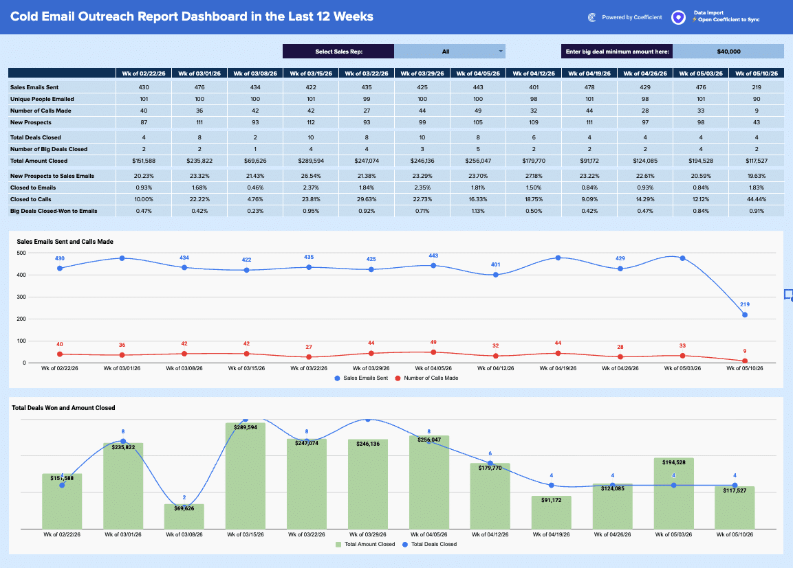
Regional Sales Report Template
Build a live regional sales report template in Google Sheets with Coefficient. Filter by country/stage, track KPIs, & visualize opportunity.
Read the guide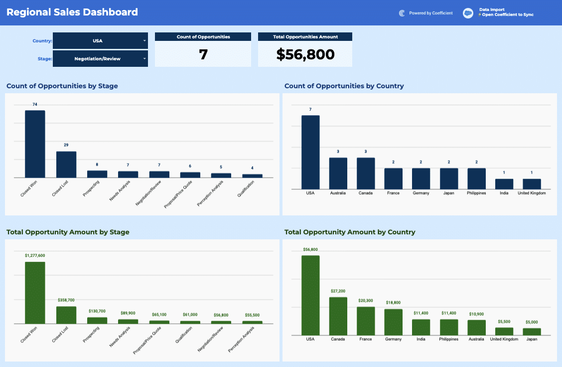
SaaS Trial Dashboard
Unlock the power of data with Coefficient's SaaS Trial Dashboard template. Analyze trial segments, monitor engagement, and optimize your trial experience!
Launch template
Common questions about the sales commission report
How do I set up the owner-to-team mapping in the Settings tab?
How does the Sales Commission Report automatically update when new deals close?
Can I filter the commission report by multiple teams and years at once?
How can I share the commission dashboard with sales managers without giving them edit access?
What's included in the 'Most Recent Opportunities Won' table at the bottom of the dashboard?
How are the three charts on the dashboard connected to the filter controls?
Ready to try it in Coefficient?
Connect your data and start building in minutes.
