Histograms vs Bar Graphs: Key Differences & Use Cases
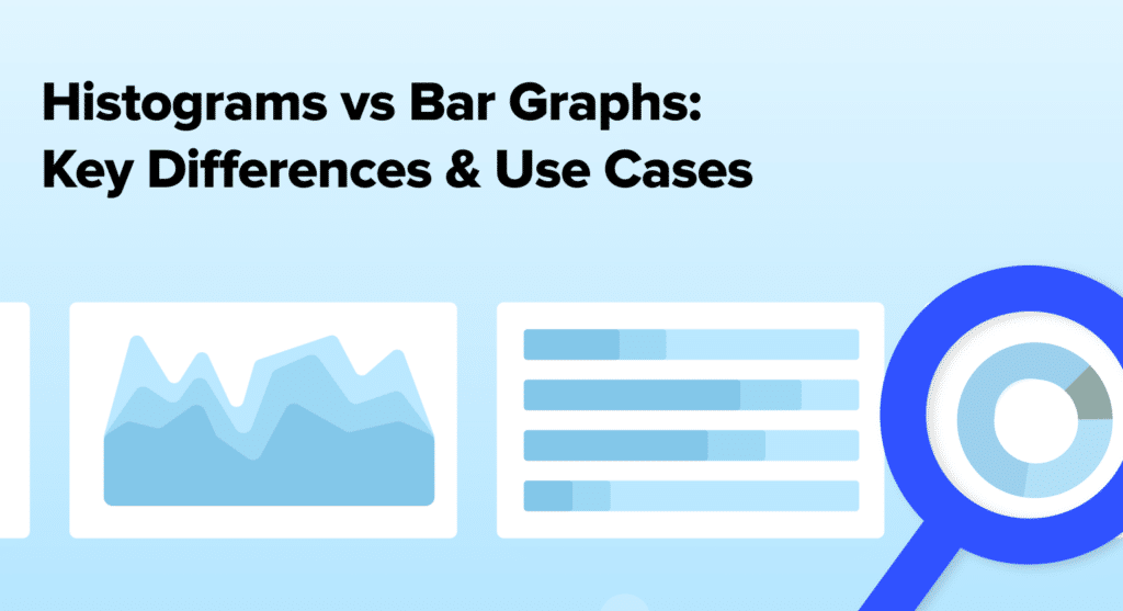
When analyzing data, choosing the right visualization tool is crucial. Two popular options are histograms and bar graphs. But what’s the difference between them, and when should you...
When analyzing data, choosing the right visualization tool is crucial. Two popular options are histograms and bar graphs. But what’s the difference between them, and when should you...

Data visualization best practices help transform complex data into easily digestible, actionable insights. By following these guidelines, you can create compelling visuals that engage your audience, communicate key...
SQL (Structured Query Language) functions are a powerful tool for data analysis, enabling professionals to extract, manipulate, and analyze large datasets efficiently. As businesses increasingly rely on data-driven...
SaaS data analytics has become an indispensable tool for companies looking to drive growth, enhance customer satisfaction, and guide product development. By leveraging the vast amount of data...

AI analytics is revolutionizing the way businesses approach data analysis and decision-making. By harnessing the power of artificial intelligence, companies can process and analyze vast amounts of information...

ChatGPT for sales is the ultimate tool to boost your team’s performance and streamline processes. By integrating ChatGPT into your sales workflow, you can create personalized customer experiences,...

ChatGPT for finance is transforming the way financial teams handle data, make decisions, and drive results. By integrating this powerful AI tool into your finance workflows, you can...

ChatGPT for marketing is transforming how businesses create content, engage customers, and optimize their marketing efforts. In this guide, we’ll explore how ChatGPT can help you save time,...
Paymo is a leading project management software that enables businesses to manage their clients, projects, invoicing, and time tracking. By connecting Paymo to Excel using Coefficient, you can...

Paymo is a powerful project management software that helps businesses manage their clients, projects, invoicing, and time tracking. By connecting Paymo to Google Sheets using Coefficient, you can...
Trello is a popular project management tool that helps teams organize tasks, collaborate on projects, and streamline workflows. By connecting Trello to Google Sheets using Coefficient, you can...

Trello is a versatile project management tool that helps teams organize tasks, collaborate on projects, and optimize workflows. By connecting Trello to Microsoft Excel using Coefficient, you can...