Legends are key in Tableau – they show what colors, shapes, and sizes in your charts mean. This makes your data easy to understand at a glance.
Here’s how to add and manage legends in Tableau, making your visuals clearer.
Step-by-Step Tutorial on How to Show Legend in Tableau
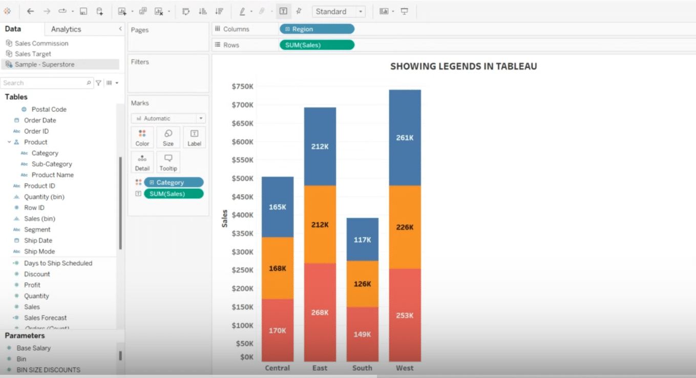
Step 1. Open Your Tableau Workbook
Start by opening your Tableau desktop and loading the dataset you wish to visualize.
Pro-tip: Upgrade your charts with live data from all your business tools with Coefficient’s one-click data connectors for Excel and Google Sheets.
Step 2. Add a Color Legend
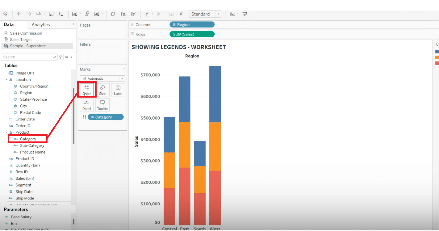
Next, drag a field to the ‘Color’ mark on your ‘Marks’ card to automatically generate a color legend associated with your data points.
Step 3. Tweak Your Legend
Customize your legend by clicking on the dropdown arrow next to the legend in the workspace.
Here, you can edit the legend title, adjust font size, and change colors as needed.
Stop exporting data manually. Sync data from your business systems into Google Sheets or Excel with Coefficient and set it on a refresh schedule.
Get Started
Step 4. Make Your Legend Float
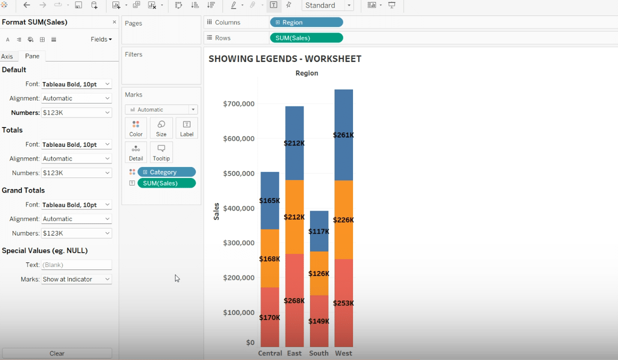
For better control over the dashboard layout, you might prefer your legend to float.
Right-click the legend and select “Floating” to freely move and position it anywhere on the dashboard.
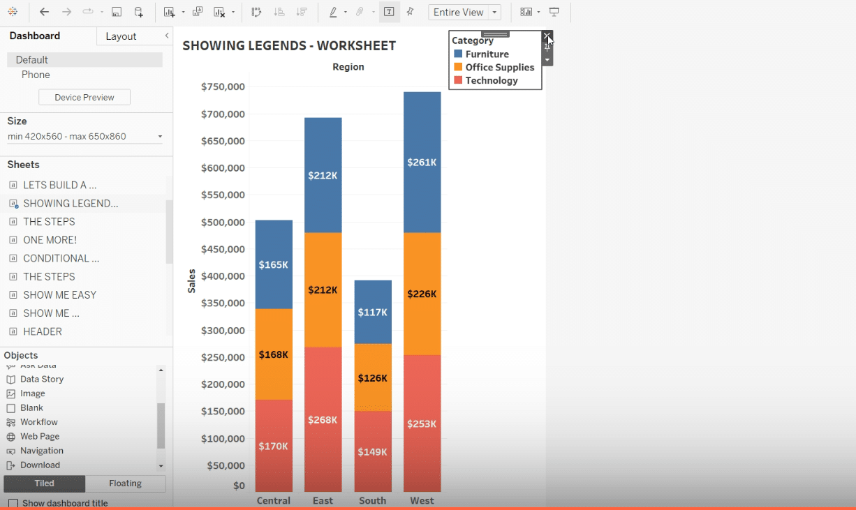
Step 5. Fix Hidden Legends
If your legend isn’t showing, it might have been accidentally hidden.
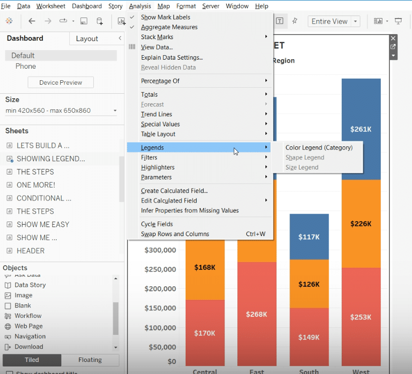
Right-click the field on the Marks card associated with the missing legend and select “Show Legend.”
Tips and Tricks for Better Legends in Tableau
Troubleshooting Common Legend Issues
- Simplify Complex Legends: If your legend is too busy, try using filters to show fewer categories or group similar items.
- Avoid Legend Clutter: Keep legends from covering your charts by using the floating feature for a clearer layout.
- Keep Legends Looking the Same: Make sure legends look similar across all dashboards for a consistent look and feel.
Best Practices for Legends
- Keep It Clear: Make sure legends are easy to read and understand.
- Place Smartly: Keep legends near their charts to reduce eye movement.
- Personalize: Use Tableau’s options to make your legends fit your dashboard’s style.
- Go for Floating: Floating legends are useful for tight spaces, offering layout flexibility.
- Interactive Legends: Set up legends so people can click on them to filter and explore data in new ways.
Conclusion
Now you know how to use legends in Tableau smarter, making your data visuals easier to read. Remember, getting good takes practice. Coefficient has tools to make it easier. Start improving your data skills with Coefficient today, by visiting Coefficient.
