Tableau’s Waterfall charts are indispensable for illustrating progress in projects, sales performance analyses, or the intricacies of inventory changes with clarity and depth.
This guide is curated with the intent to demystify the process of creating Tableau Waterfall Charts, ensuring that both novice and experienced data enthusiasts can harness the full potential of this visualization tool.
Prefer video? Watch the tutorial below!
Understanding Waterfall Charts
At its core, a waterfall chart bridges the gap between a straightforward bar chart and the complex narratives embedded within our data. It excels at visualizing the cumulative effect of sequential positive or negative values, offering a clear view of how each component contributes to the final outcome. This unique quality makes it an indispensable tool for a wide array of analytical scenarios.
Waterfall Charts: 3 Use Cases
- Visualizing Financial Statements: Traditionally rooted in financial analysis, waterfall charts are adept at breaking down the nuanced components that contribute to a company’s net income. From revenues to expenses and ultimately profit, each element is distinctly visualized, fostering a deeper understanding of financial health.
- Inventory Analysis Visualization: In the realm of inventory management, understanding the fluctuating levels of stock is crucial. Waterfall charts adeptly track inventory adjustments, purchases, and sales over time, offering a timeline view that highlights trends and anomalies, facilitating informed decision-making.
- Project Progress Tracking: Managing projects effectively requires a keen eye on progress against outlined goals. Waterfall charts come into play by mapping out the series of advancements or setbacks within a project’s lifecycle, offering a visual chronicle that assures stakeholders of directional progress or alerts them to areas needing attention.
Step-by-Step Tutorial: Creating a Tableau Waterfall Chart
Step 1. Preparing Your Data
Before we dive into the visualization, let’s ensure our dataset is primed for a waterfall chart, making it the foundation of our creation process.
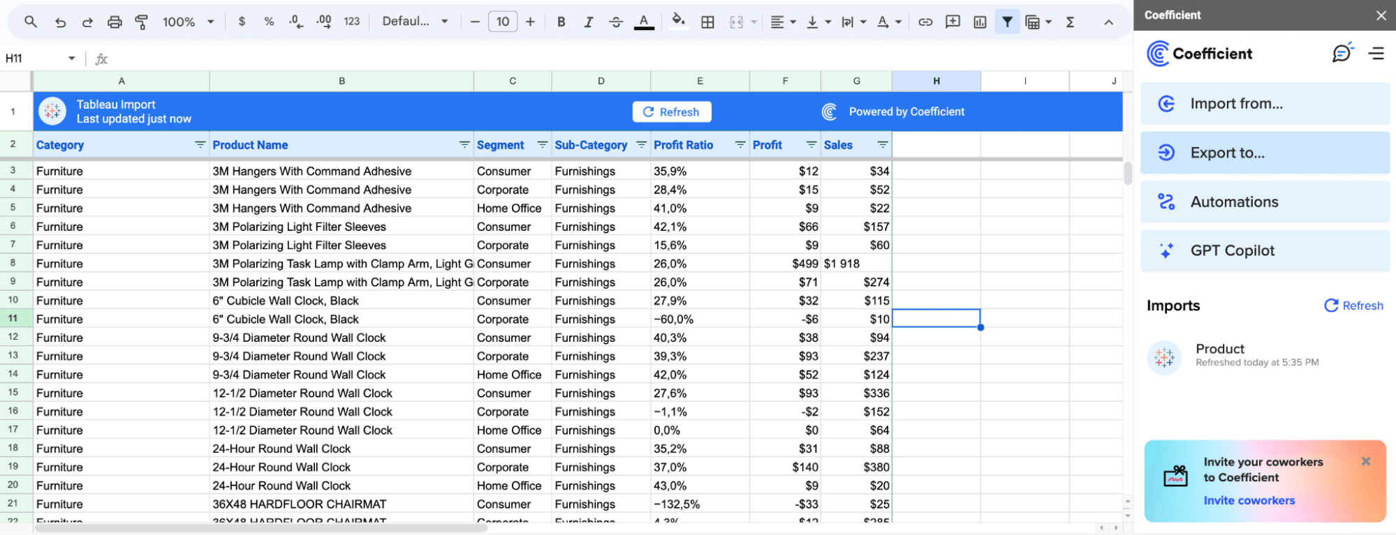
Here’s where Coefficient comes into play. By seamlessly connecting your data sources directly to Tableau, Coefficient ensures that your base for the waterfall chart is up-to-date, reflecting the real-world complexities of finance, inventory, and project management with minimal manual intervention.
After preparing your data, launch Tableau and connect to your data source.
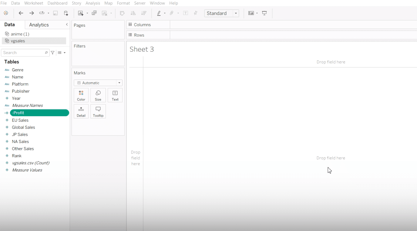
Here, we’re working with a simple yet effective dataset tailored for video game sales, perfect for demonstrating the nuances of creating a waterfall chart.
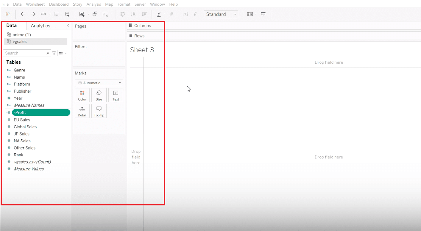
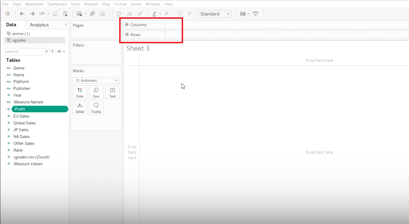
Step 2. Setting Up Your Data
Properly arrange your dataset with categorical fields in the columns and numerical values in the rows.
Step 3. Constructing the Waterfall Chart
Transform your dataset into a visually compelling waterfall chart, highlighting financial growth, inventory changes, or project progression.
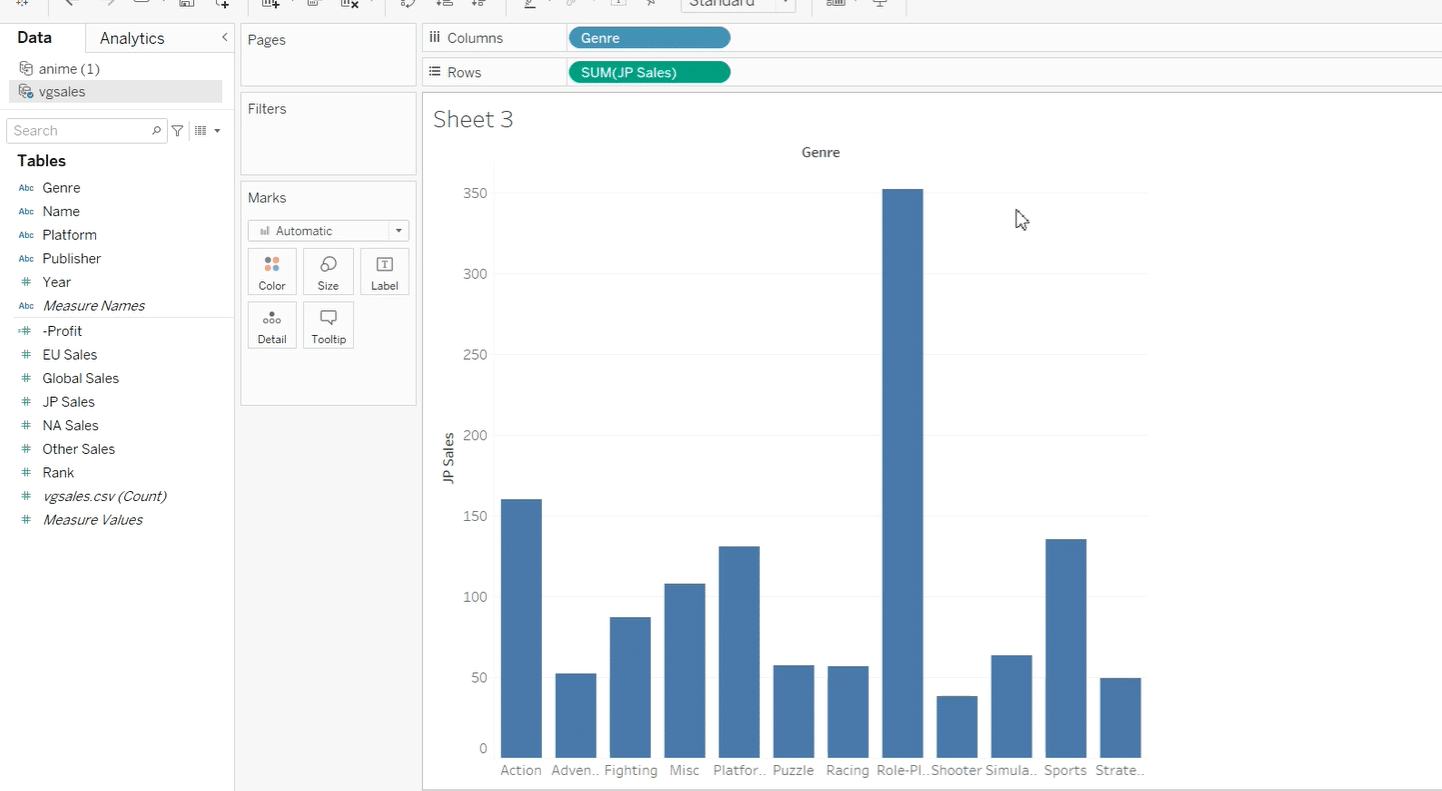
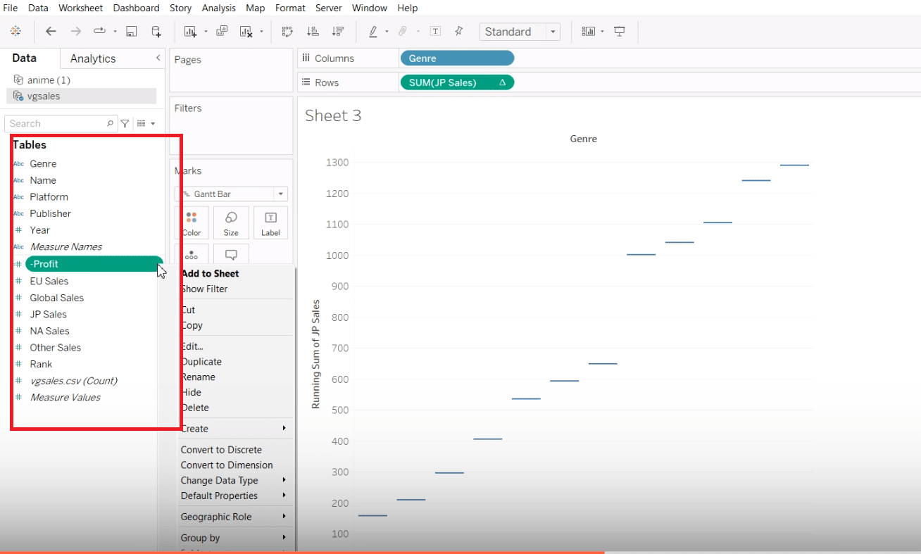
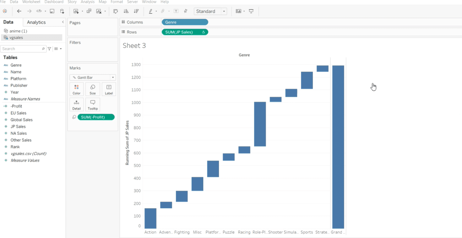
Starting with a basic bar chart, we pivot towards creating a waterfall chart by utilizing the Gantt bar and integrating a running total to showcase cumulative effects.
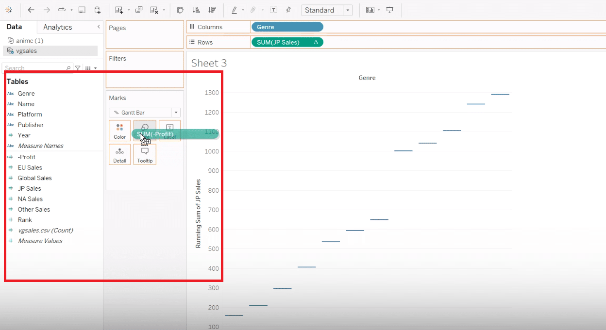
Enhance your chart by adding a calculated field named “Profit”, distinguishing between the positive and negative changes effectively through this customized metric.
With the “Profit” field added to size, observe the evolving waterfall effect, visually separating positive and negative contributions to your dataset.
Step 4. Enhancing Your Waterfall Chart
Customizing and refining your chart not only increases utility but also adds an aesthetic appeal, making your data story compelling and insightful.
Dive into color customization and grand totals, utilizing Tableau’s rich set of features to personalize your waterfall chart, making it intuitive and insightful for your audience.
Advanced Techniques and Tips for Tableau Waterfall Charts
Mastering the creation of Tableau Waterfall charts not only involves understanding their basic structure but also leveraging advanced techniques to enhance clarity, performance, and interpretability of your visualizations. Here are some tips to elevate your charts:
Adding Reference Lines for Total Values
Reference lines in Tableau offer a simple yet powerful means to provide context to your waterfall charts. By adding a line that represents the total cumulative value, you enable viewers to quickly grasp the final outcome or goal.

Stop exporting data manually. Sync data from your business systems into Google Sheets or Excel with Coefficient and set it on a refresh schedule.
Get Started
To add a reference line, simply right-click on the axis where you want the line to appear, select “Add Reference Line”, and then choose the appropriate aggregation (e.g., sum) that represents the total value. This visual cue significantly bolsters the interpretability of your chart.
Handling Negative Values
One of the unique challenges of a waterfall chart is accurately representing both increases and decreases in value. Tableau allows for a dynamic approach to this by using color to differentiate positive from negative changes.
Explore the Color shelf of your calculated field or the specific measure to customize colors based on the condition (positive or negative). This not only adds visual appeal but also improves readability, making the transitions between gains and losses immediately evident.
Optimizing Performance and Visual Clarity
As your datasets grow in complexity and volume, maintaining optimal performance and clarity in your visualization becomes paramount. To enhance performance, consider filtering out unnecessary data points or aggregating data at a higher level before visualization.
Simplifying the chart design – such as minimizing the use of heavy custom calculations, reducing the number of fields in view, and decluttering the chart by removing unnecessary labels or gridlines – can significantly improve both performance and visual clarity, ensuring a smooth and insightful user experience.
Common Challenges and Solutions
Even for the most experienced data analysts, creating waterfall charts in Tableau can present certain challenges. Being prepared with strategies to overcome these hurdles can make the process more efficient and the result more compelling.
Troubleshooting Alignment and Calculation Issues
Alignment and calculation errors are common challenges that can distort the intended narrative of your waterfall chart. These issues often stem from incorrect setup of calculated fields or misconfiguration of the axis.
To troubleshoot, double-check your calculated fields for accuracy and ensure they align with your data’s logic. If you encounter alignment issues, revisit the settings for your Gantt bars, ensuring that your start and end points are correctly defined and that the axis is properly scaled.
Strategies for Effectively Handling Large Datasets
Working with large datasets can make your waterfall chart cumbersome and less informative.
To mitigate this, consider segmenting your data into more manageable chunks or utilizing Tableau’s data blending and aggregation features to summarize the data before visualization.
Another effective strategy is leveraging Tableau’s hierarchy functionality, which allows users to drill down from a high-level overview to more detailed views of the data, ensuring a clean, organized, and insightful visualization even with large volumes of data.
Conclusion
Remember, the key to mastering Tableau lies in practice and experimentation. So, connect your datasets, leverage these steps, and start weaving your data stories today!
Intrigued by the potential of integrating Tableau with your data analysis tools for enhanced insights? Explore more about Coefficient’s powerful integration capabilities to elevate your data storytelling to new heights. Start your journey with Coefficient here.


