Tableau Stacked Bar Chart helps users convey complex data hierarchies in a digestible format.
This blog will focus on the stacked bar chart, a handy feature in Tableau that helps compare different parts of your data in one glance. By the end, you’ll know why stacked bar charts are useful and how to create one in Tableau, even if you’re just starting out or are already a pro.
Prefer video? Watch the tutorial below!
Understanding Stacked Bar Charts
Stacked bar charts layer data in a way that lets you see the big picture and the detail underneath – all at once. It’s like seeing both the forest and the trees, showing you how different pieces come together to form a complete story.
These charts shine when you need to compare how segments stack up across various categories. They’re also great for digging deep into data, letting you spot both broad trends and fine details. With Tableau, working with these charts becomes a breeze, no matter your expertise level. It’s a user-friendly way to dive into complex data and come out with clear insights.
Prerequisites for Creating a Stacked Bar Chart in Tableau
Before jumping into Tableau, ensuring your data is comprehensive, up-to-date, and easily accessible is crucial.
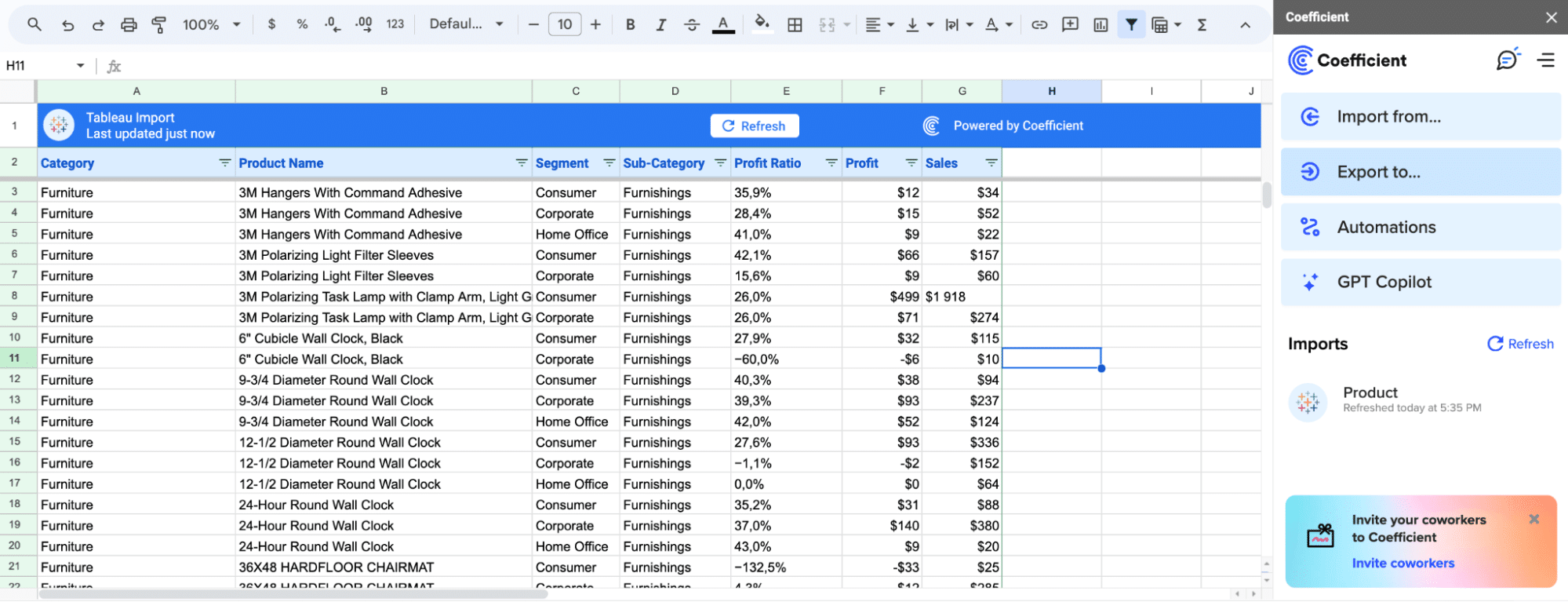
Coefficient makes this easier than ever by importing live data from your business systems directly into Excel or Google Sheets, which can then be utilized in Tableau. This ensures that all your Tableau stacked bar charts are using the most recent data.
Step-by-Step Tutorial on Creating a Stacked Bar Chart in Tableau
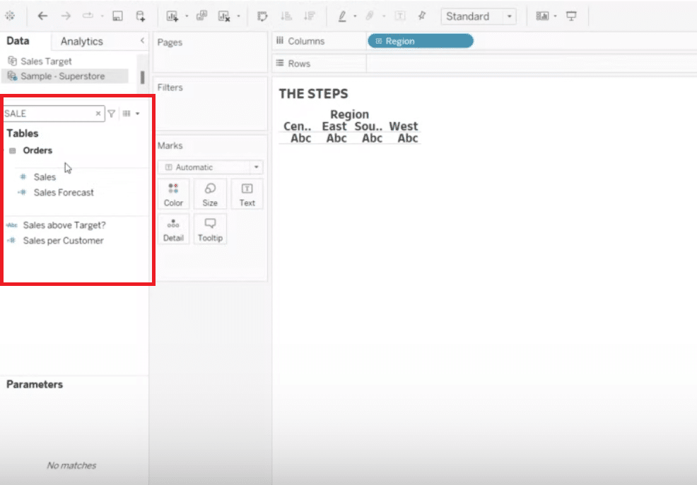
Step 1. Selecting Dimensions and Measures for the Stacked Bar Chart
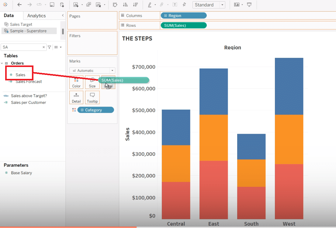
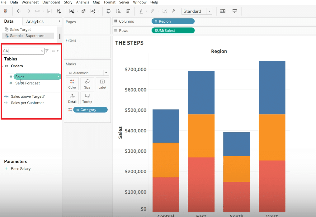
Navigate to your data and select ‘Region’ as a dimension.
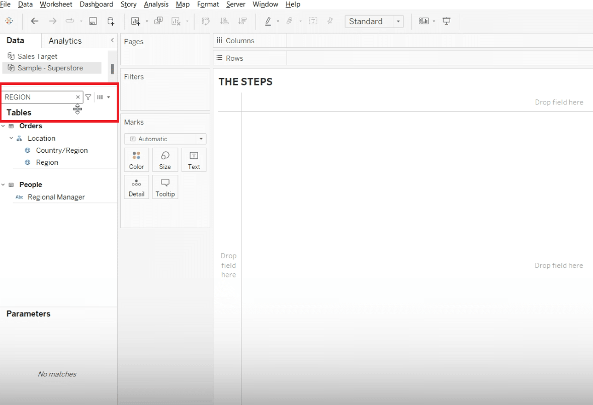
Drag ‘Region’ into the columns shelf.
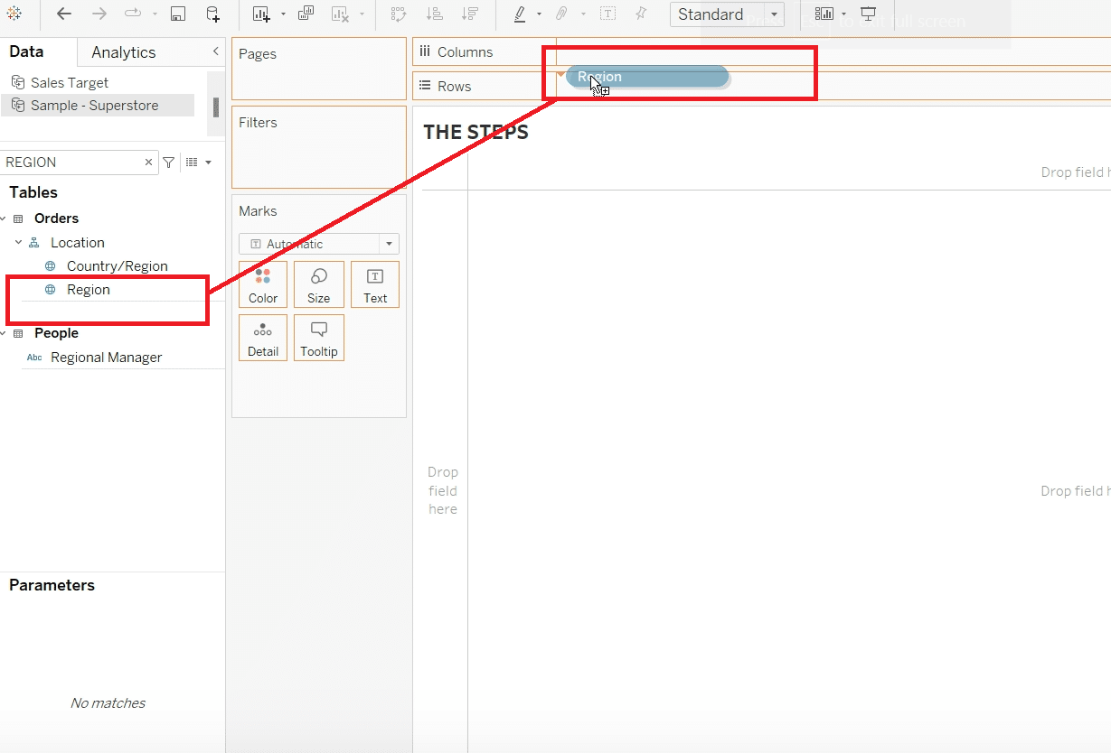
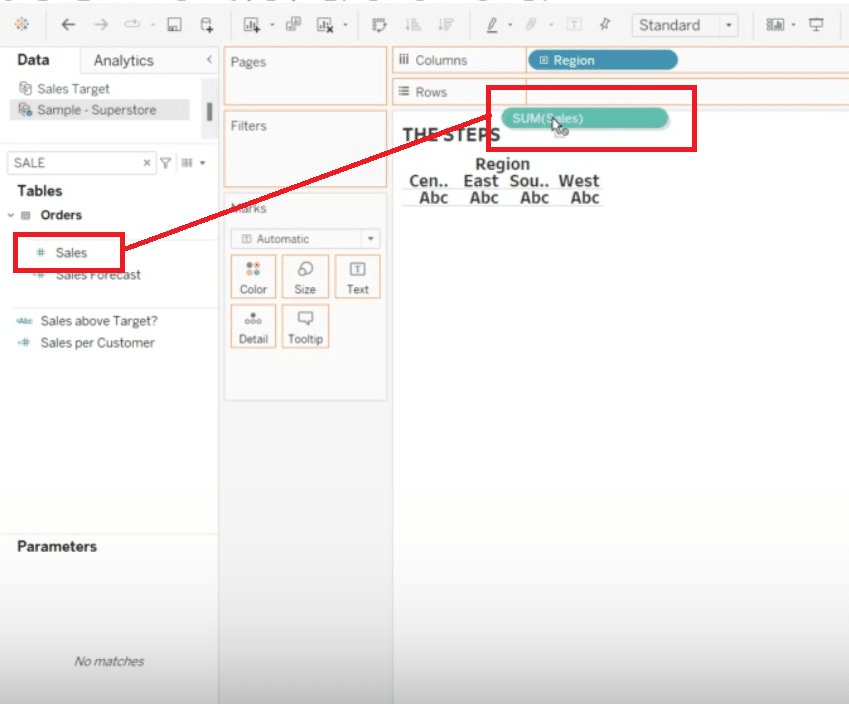
Follow that by selecting ‘Sales’ as a measure.
This time, drag ‘Sales’ onto the rows shelf, as you’ll want to visualize the sales data vertically.
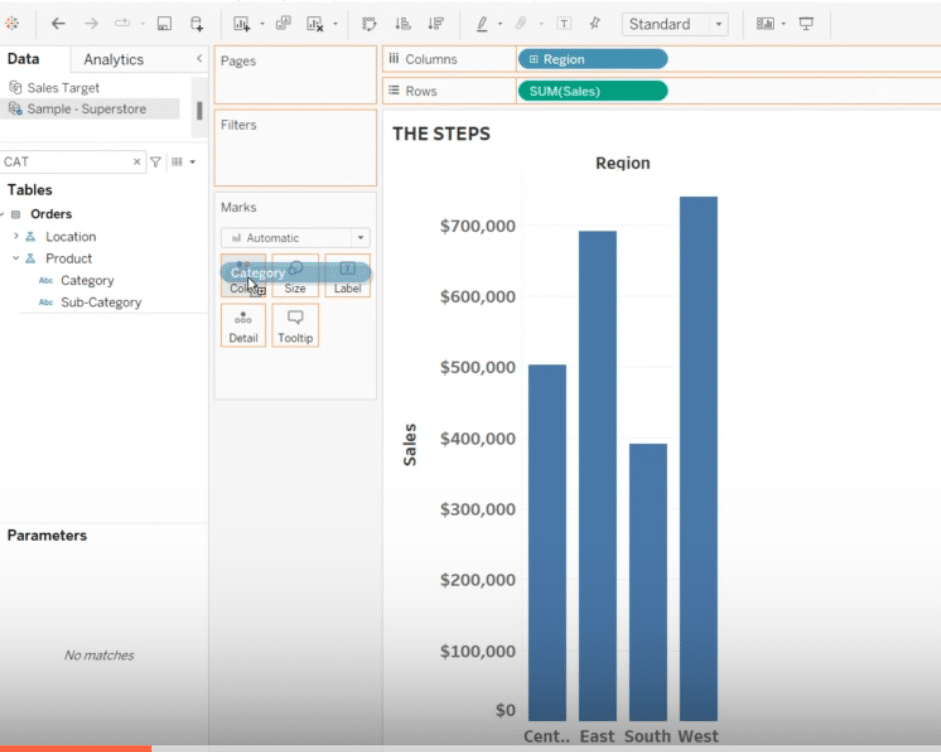
Step 2. Adding Categories to Color for a Visual Differentiation
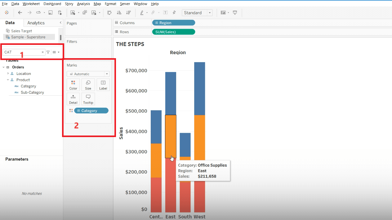
Use the search function in Tableau to find ‘Categories.’
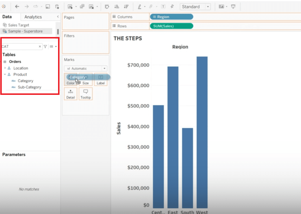
Once found, drag ‘Category’ into the color mark to differentiate data visually based on categories.
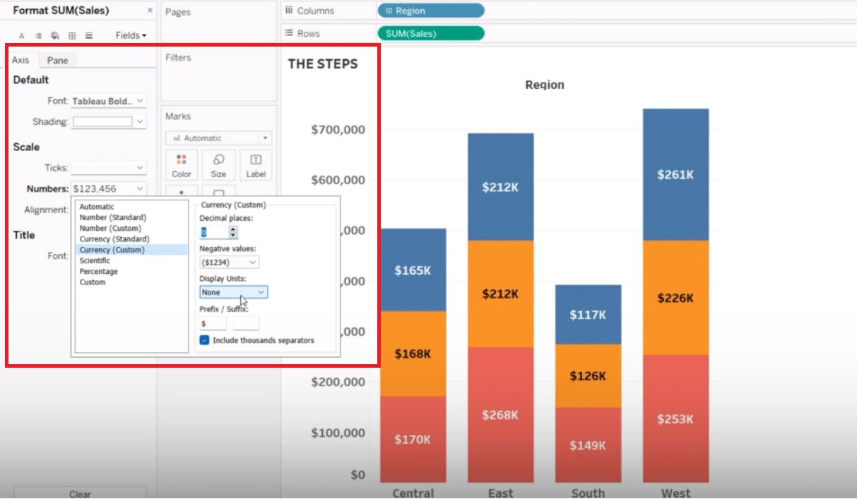
Step 3. Making the Data Clearer with Labels and Custom Currency Formatting
To make individual data points easier to identify, drag ‘Sales’ onto the label mark.
Customize the currency format to align with your data’s scale, in this case, thousands of dollars.

Stop exporting data manually. Sync data from your business systems into Google Sheets or Excel with Coefficient and set it on a refresh schedule.
Get Started
Step 4. Finalizing Your Stacked Bar Chart
Adjust the title, axis labels, and dashboard layout to present your data in a clean, understandable format.
This includes hiding unnecessary titles or labels and adjusting the size or position of your chart on the dashboard.
Best Practices and Tips for Optimizing Your Stacked Bar Chart
Optimizing your Tableau stacked bar charts involves thoughtful customization to enhance readability and effectively communicate your data story.
Mastering elements like “Tableau chart customization” ensures that your charts are not just created but crafted, with every decision from color selection to label placement enhancing the viewer’s understanding and engagement.
Make Your Charts Pop with These Simple Tricks:
- Color is Key: Don’t be afraid to get creative with your color choices! Tableau has a ton of awesome color palettes to choose from. Just make sure your colors contrast enough to make your data segments stand out.
- Label Like a Pro: Clear, well-placed labels are a must for any chart. Play around with different label sizes and positions until you find the sweet spot. And if you’ve got a lot of info to include, Tableau’s tooltips are your best friend!
- Keep it Simple: Less is often more when it comes to data viz. Focus on highlighting the key takeaways and avoid cluttering up your chart with too much info. Your viewers will thank you!
Troubleshooting Common Issues
While Tableau is a powerful tool for data visualization, users may occasionally run into issues like data misalignment, confusing labels, or challenges in data segmentation.
Addressing these common hurdles ensures your stacked bar chart is both accurate and insightful.
- Data Disaster: There’s nothing worse than realizing your data is all out of whack. If your chart looks funky, double-check your data sources and make sure everything is formatted correctly. Tableau’s data prep tools can be a lifesaver here!
- Label Confusion: If your labels are making your chart hard to read, it’s time for a label makeover. Play with different label placements, shorten long text, and use tooltips to add extra context. Tableau gives you a ton of options to make your labels work for you.
- Segment Overload: Too many data segments can make your chart feel like a hot mess. If you’re running into this issue, try simplifying your categories or using filters to show only the most important data. Tableau’s filters let you zoom in on the details without losing the big picture.
Conclusion
Mastering Tableau stacked bar charts is just the beginning. Embrace the journey to explore deeper data visualization techniques that Tableau offers, enhancing your ability to tell compelling data stories.
For those looking to push the boundaries of what Tableau can do, Coefficient is here to augment and streamline your data analysis processes. Unlock new insights and make informed decisions with ease.
Ready to elevate your data visualization game? Get started with Coefficient today and transform your data into narratives that drive action


