
Conditional formatting in Tableau allows you to dynamically alter the appearance of your charts based on underlying data values, making it easier to highlight key insights through changes in color, text size, and other visual styles.
Whether you’re a beginner or looking to refine your skills, our step-by-step tutorial will walk you through the basics of setting up your data, creating highlight tables, optimizing chart displays, and much more.
Prefer video? Watch the tutorial below!
Step-by-Step Tutorial for Conditional Formatting in Tableau
Step 1. Getting Started with Your Data
Begin by importing your dataset into Tableau. Navigate to the top right and select “show me,” then hover over “highlight table” to start with a basic visualization.
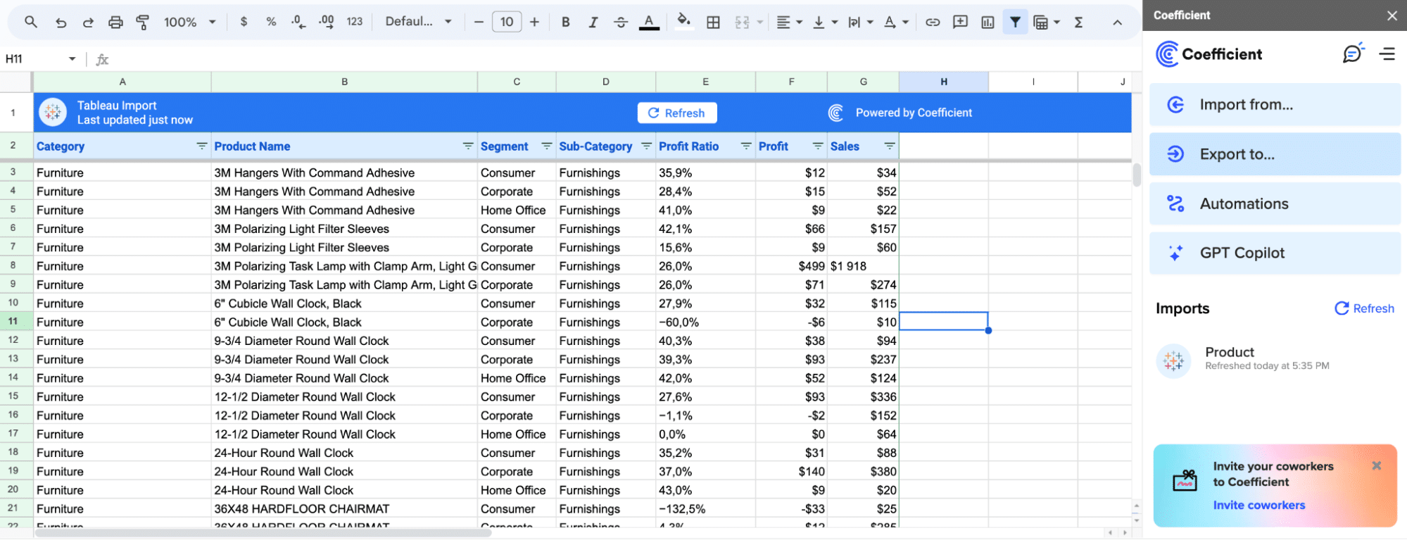
Pro-tip: Traditional data importation can be tedious, especially when handling multiple sources.
Here’s where Coefficient shines, allowing you to easily connect Tableau directly to where your data resides—be it CRM or sales databases—from the comfort of your spreadsheet.
Step 2. Creating a Simple Highlight Table
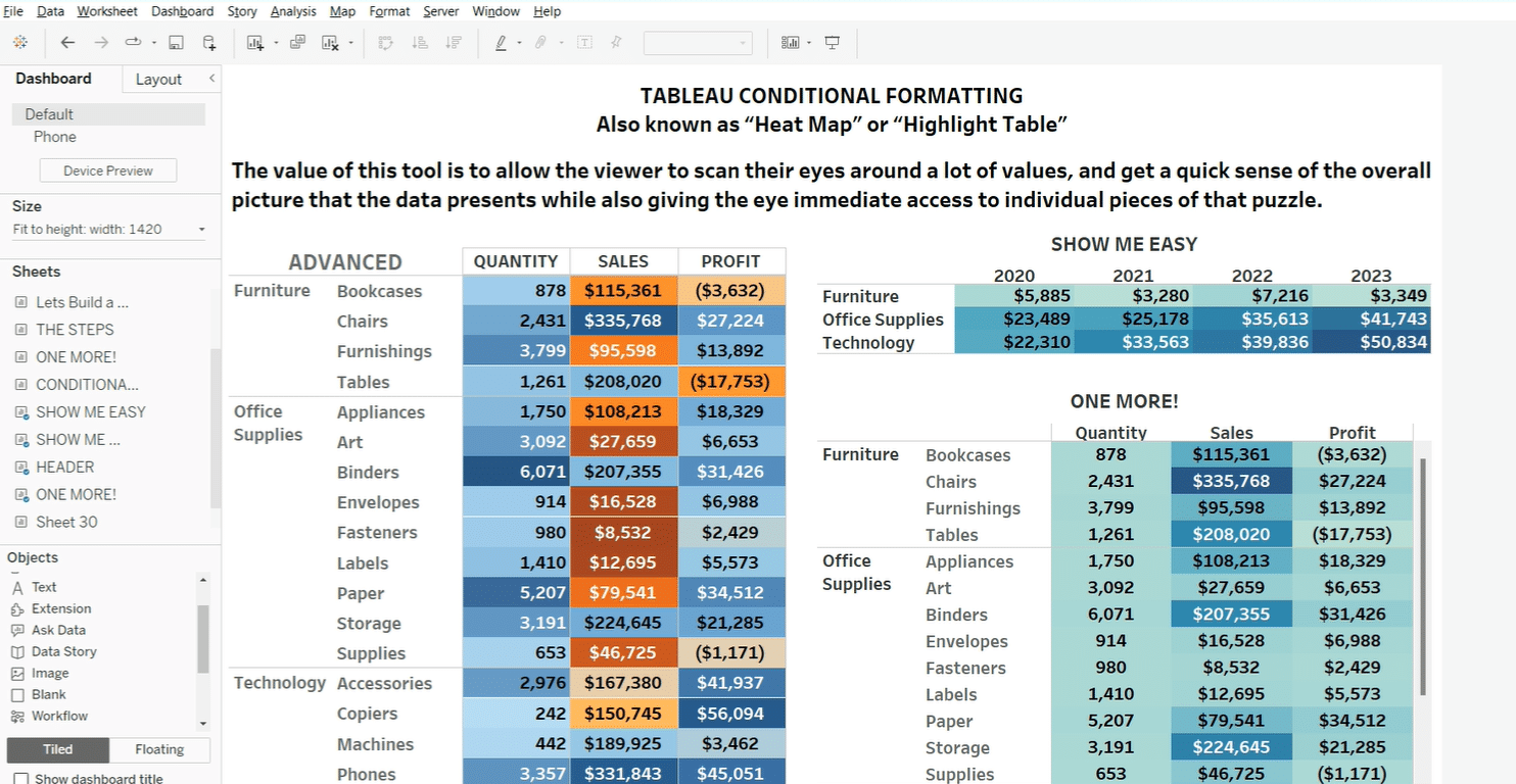
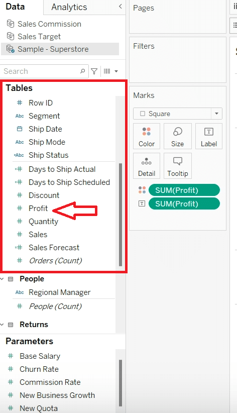
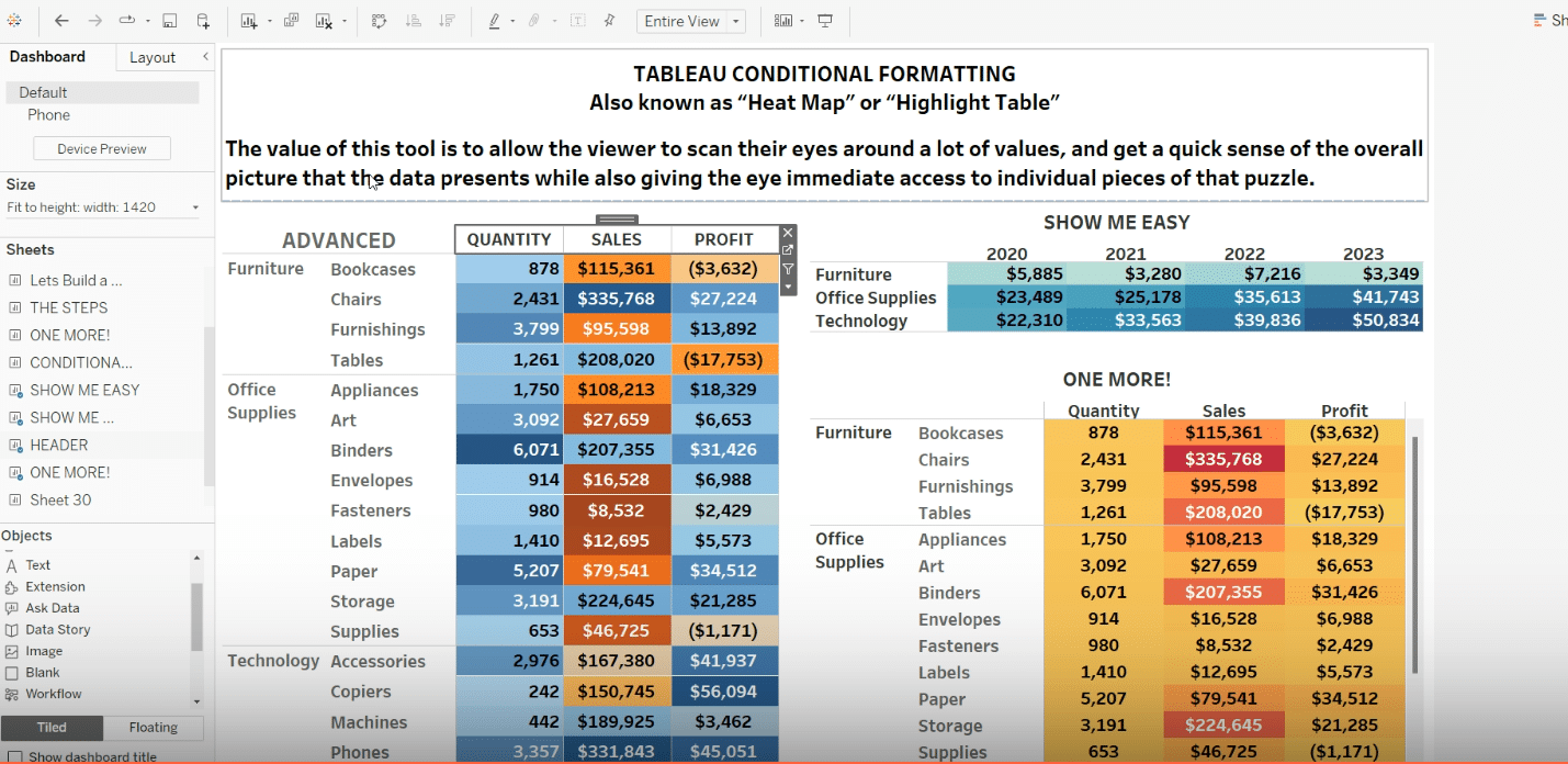
Use a dimension (for example, ‘Category’) and a measure (‘Profit’) to create your first highlight table, providing a foundational understanding for conditional formatting
Step 3. Adding and Configuring Columns
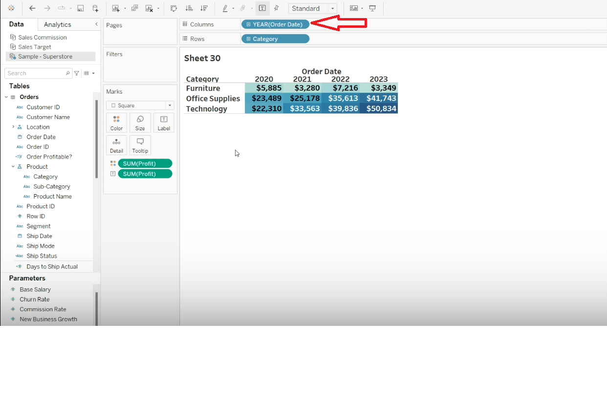
Add the ‘Order Date’ to columns for better data over time visualization. Right-click, hold, and drag ‘Order Date’ into columns, selecting ‘Year’ for a summarized view.
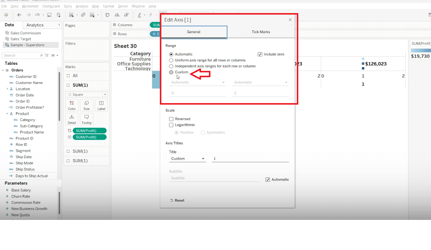
Step 4. Advanced Setting: Custom Axes Adjustments
Adjust axes from automatic to custom, setting the end from 2 to 1, for more detailed visualization options.
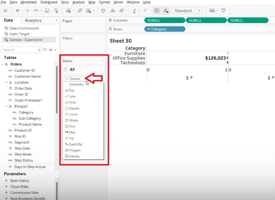
Step 5. Changing Marks from Square to Bar
Change marks from square to bar and maximize the size to eliminate gaps between bars, improving readability.

Stop exporting data manually. Sync data from your business systems into Google Sheets or Excel with Coefficient and set it on a refresh schedule.
Get Started
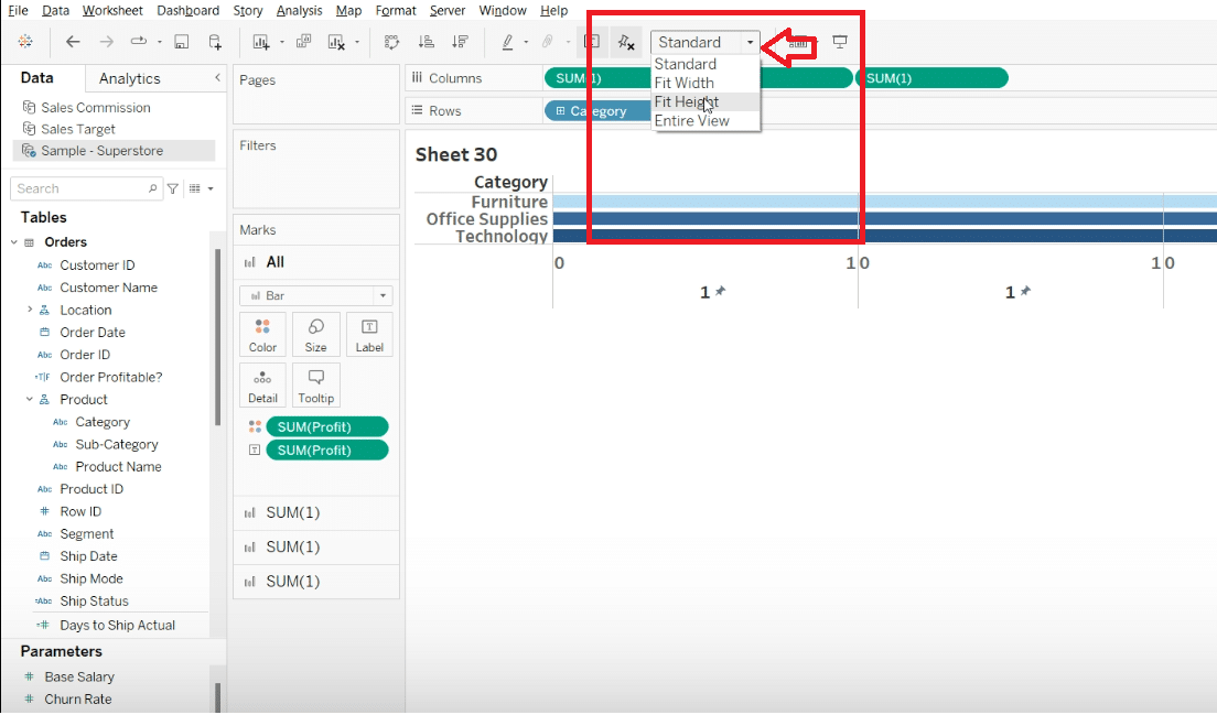
Step 6. Optimizing Chart Display and Adding Measures
Adjust the width and hide headers for a neat display. Add different measures to marks cards for a detailed analysis.
Step 7. Adjusting Color and Alignment
Experiment with conditional colors and alignment to make your data more visually appealing and understandable.
Step 8. Creating Headers with Measure Names (3:11) Customize your visualization by adding measure names to text for identifiable headers, making your dashboard more structured.
Advanced Tips for Conditional Formatting
After mastering the basic conditional formatting techniques in Tableau, you can further refine your visualizations with the following advanced tips:
- Customizing Color Palettes: Tableau offers a variety of built-in color palettes, but sometimes your visualization might require a unique touch. Explore how to customize color palettes to match your organization’s branding or to improve readability and impact of your data visualizations.
- Highlighting Rows/Columns and Customizing Text Formatting: Beyond just changing colors based on values, you can highlight entire rows or columns based on certain criteria. Additionally, adjusting the text formatting, including font type, size, or color based on conditions, can make your key data stand out even more.
To implement these advanced tips, follow the guidelines described below:
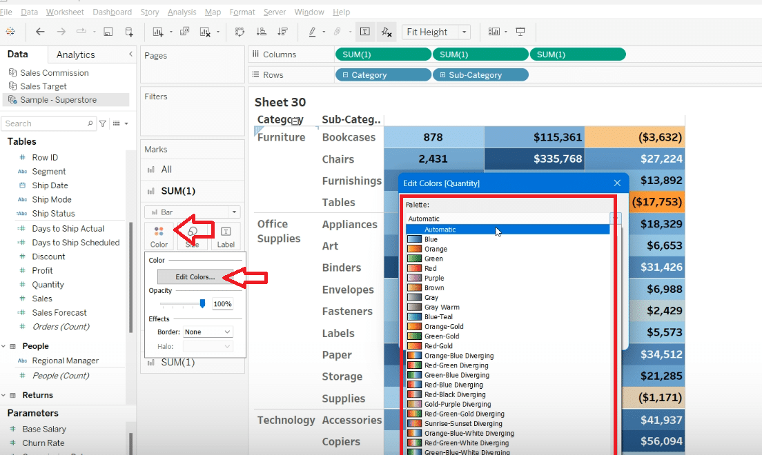
- Customizing Color Palettes:
- Within the Tableau workbook, navigate to the ‘Color’ shelf.
- Select ‘Edit Colors…’ and explore the range of built-in palettes or create your own by choosing ‘Custom’ and specifying the colors you wish to include.
- Apply your custom palette to the relevant measures or dimensions to see your data visualized with your unique color scheme.
- Highlighting Rows/Columns:
- Use calculated fields to create conditions for highlighting. For instance, if you want to highlight sales above a certain threshold, create a calculated field that returns true when the condition is met.
- Apply conditional formatting by dragging this calculated field to ‘Color’ on the Marks card, customizing the colors to emphasize rows/columns that meet your criteria.
- Customizing Text Formatting:
- After applying conditions to highlight your data, further customize your visualization by adjusting text formatting.
- On the Marks card, select ‘Label’ and then click on the ‘…’ button to enter the label menu. Here, you can format your text based on your preferences and conditions.
How Coefficient Can Complement Your Tableau Experience
Integrating Tableau with Coefficient can streamline your data analysis process even further. Coefficient is a data connector software that allows for seamless import of business system data into Tableau.
This integration enables more dynamic and timely insights, enhancing your visual reports. Ready to elevate your data visualizations? Get Started with Coefficient.


