If you’re looking to learn how to create a graph in Tableau, you’re in the right place.
Tableau lets you choose from many different kinds of graphs.The key is to pick the graph type that best shows what your data means.
In our guide, we’ll focus on scatter plots, which are fantastic for seeing the relationship between two pieces of data.
Understanding Graph Types in Tableau
Tableau offers a wide array of graph types tailored to showcase different data relationships and patterns:
- Bar Charts: Ideal for comparing numeric values across categories, showing differences in size at a glance.
- Line Charts: Best used for illustrating trends over time, allowing you to track increase, decrease, or consistency in data points.
- Scatter Plots: Useful for identifying relationships between two variables, indicating correlation patterns.
- Pie Charts: Perfect for displaying proportions, showing how each category contributes to the whole.
- Histograms: Utilized to represent the distribution of a dataset, highlighting the frequency of data points within specific ranges.
- Heat Maps: Show the magnitude of a phenomenon as color in two dimensions, excellent for spotting high and low densities of data points.
- Area Charts: Similar to line charts but filled beneath the line, emphasizing volume or quantity over time.
- Box-and-Whisker Plots: Provide a five-number summary of a dataset, useful for identifying outliers and understanding a dataset’s distribution.
- Bubble Charts: An extension of scatter plots, where the size of the bubble represents a third variable’s magnitude, adding an additional layer of comparison.
- Tree Maps: Display hierarchies through nested rectangles, allowing for a quick comparison of proportions and part-to-whole relationships within a hierarchy.
- Dual-Axis Charts: Combine two charts sharing an axis for comparison, useful when comparing different but related datasets on the same visuals.
In this example, we’ll walk through how to create a scatter plot in Tableau.
Preparing Your Data for Graph Creation
Before you start making a graph, you need your data to be ready. This means connecting Tableau to your data.
Coefficient ensures your Tableau visualizations are built on the most current and coherent datasets. It
automatically imports live and most recent data from your CRM, ERP, and other business systems directly into your spreadsheet.
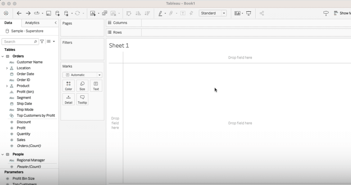
Step-by-Step Tutorial: Creating a Basic Scatter Plot Graph in Tableau
Creating a scatter plot in Tableau allows you to visualize the relationship between two continuous variables, enhanced with customization options for color, text, size, and shapes. Follow along with the video for a detailed walkthrough.
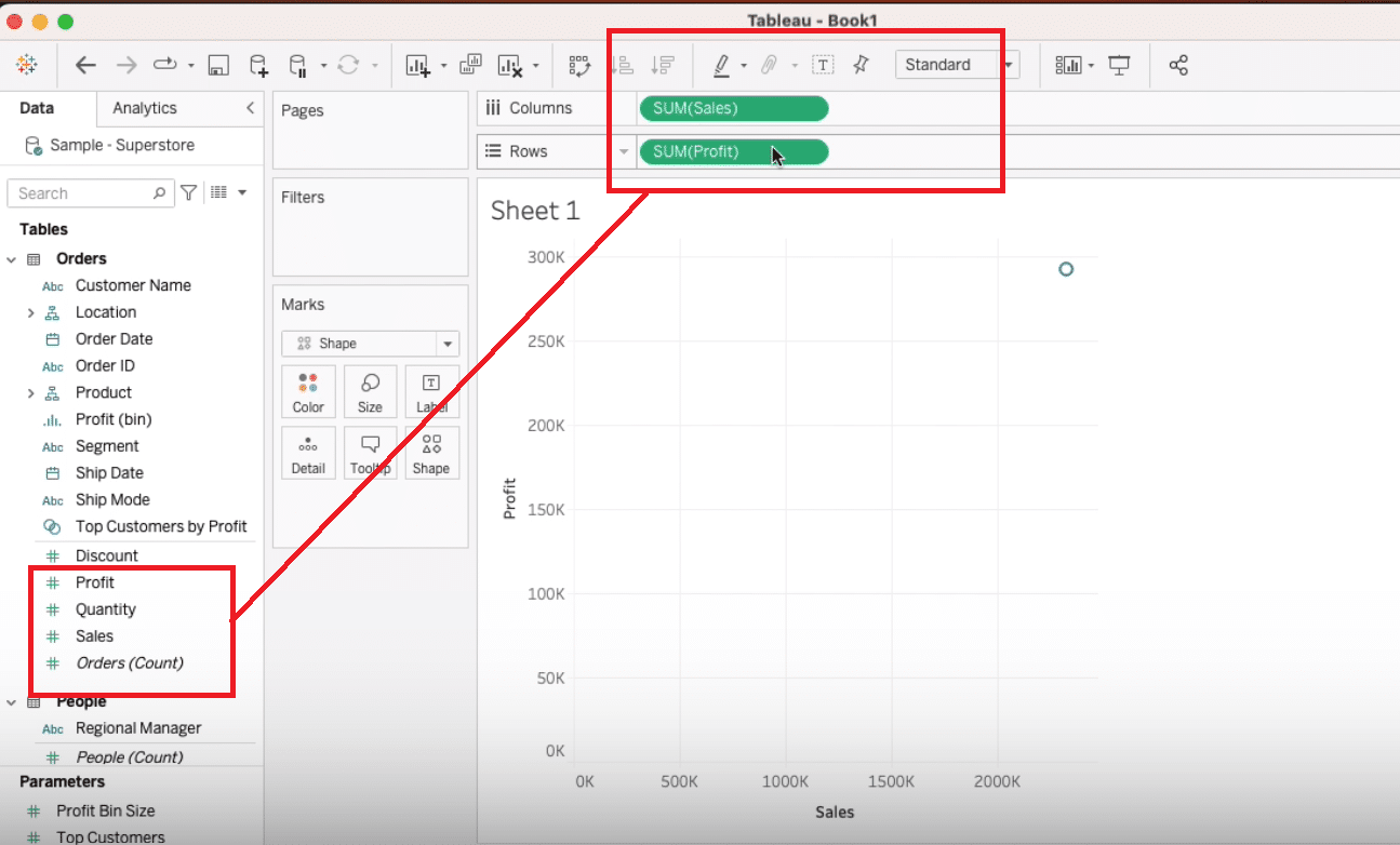
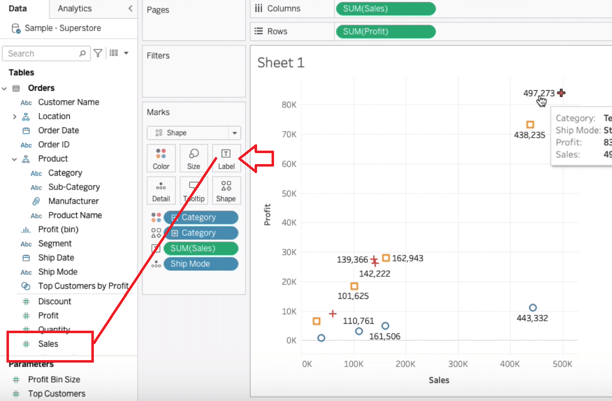
Navigate to the workspace, and select the ‘Shape’ chart option.
Drag and drop two continuous values: Sales and Profit into the workspace.
To visualize categories by color, drag the ‘Category’ field to the color option.
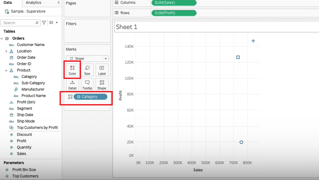
Enhance your scatter plot by adding the ‘Ship Mode’ to the detail box to see the data at a more granular level.

Drag ‘Sales’ to the label field for displaying sales figures on the scatter plot.

Stop exporting data manually. Sync data from your business systems into Google Sheets or Excel with Coefficient and set it on a refresh schedule.
Get Started
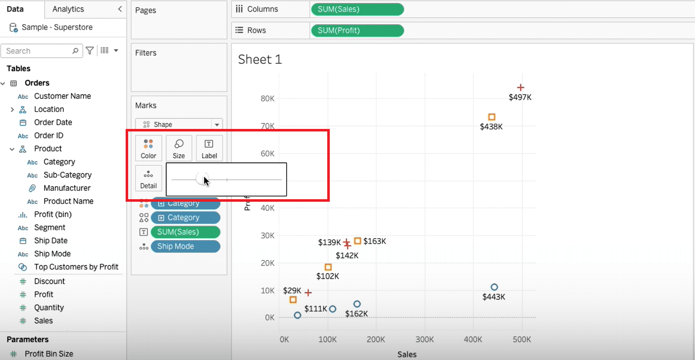
Customize label formatting by selecting format options to adjust the display of the sales values.
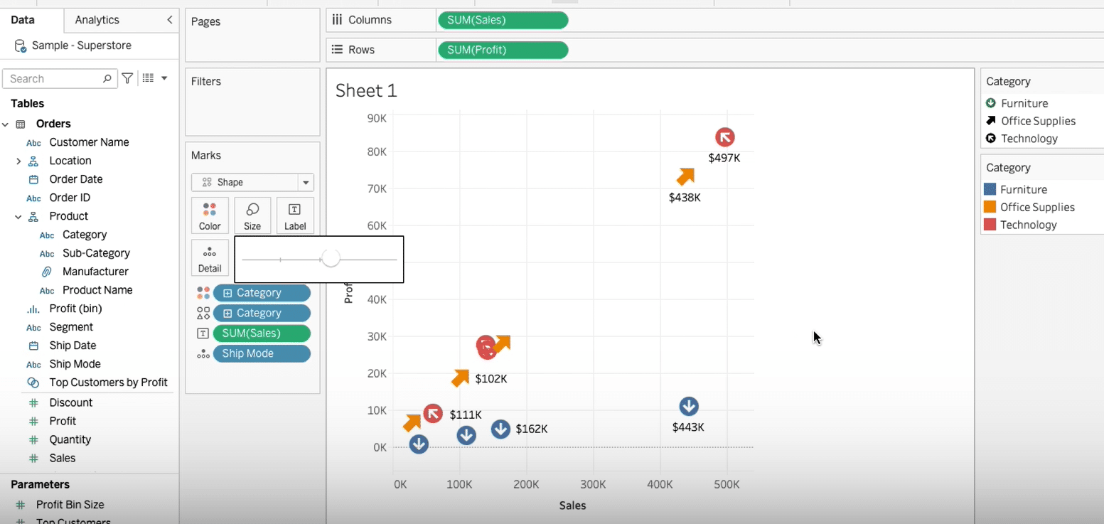
Increase or decrease the size of the marks for better visualization. Then, explore more shapes for differentiating data points.
Assign custom arrow shapes to emphasize direction or trends within the scatter plot.
Customizing Graphs for Deeper Insights
- Filters: Adding filters lets you zero in on specific parts of your data, like data from a particular time or place.
- Calculated Fields: You can go deeper into your analysis with calculated fields, which let you create new data points from your existing data. This is especially helpful for discovering new insights hidden in your raw data.
- Dashboard Actions: Making your graphs interactive with dashboard actions can make exploring data more engaging. Viewers can click around to uncover insights specific to their interests.
Formatting and Styling Tips
The look of your graph is just as important as the data behind it.
- Color Schemes: Use colors wisely to make important data stand out without making the graph too busy.
- Font Adjustments: Make sure your labels and titles are easy to read by choosing the right sizes and styles for your text.
- Layout Containers: Tableau’s layout tools help you arrange your graphs so they tell a story together, making your whole dashboard more cohesive and engaging.
Overcoming Common Graph Creation Challenges
While Tableau streamlines graph creation, users may occasionally encounter hurdles. Here’s how to navigate some of the more frequent challenges:
- Data Connection Issues: Ensure your data source is correctly configured and accessible. Check for any server or authentication problems. By using Coefficient, you can easily pull in data from all your business systems into your spreadsheet prior to uploading your data to Tableau.
- Unexpected Graph Outputs: This often results from incorrect field selections or aggregations. Verify your chosen measures and dimensions are appropriate for the graph type.
- Performance Lag: Large datasets can slow down Tableau. Consider filtering your data or using Tableau’s data extract feature for a smoother experience.
- Difficulty in Tailoring Visuals: Familiarize yourself with Tableau’s robust formatting options. If a desired look seems unachievable, exploring the Tableau community forums for tips or alternative approaches can be valuable.
- Trouble Interpreting Data: If the graph isn’t providing clear insights, it might be worth revisiting the chosen graph type or the way data is organized and presented. Sometimes, a different graph type or a more granular look at the data can reveal the needed insights.
- Inconsistent Data Formats: Before graph creation, ensure all data is uniformly formatted. Mixed data types or formats can cause errors or misinterpretations in visualizations. Coefficient is great for this because it makes sure your data is consistent before you start graphing in Tableau, cutting down on surprises.
Conclusion and Call to Action
Learning to create informative graphs in Tableau helps you unlock the power of your data, turning complex information into easy-to-understand visuals. This guide covered making a basic scatter plot, customizing it, and resolving common issues.
To take your Tableau graphs to the next level, see how Coefficient can streamline your data processes, making your insights richer and more current.


