Today, we’re diving into the world of Gantt charts, an excellent tool for visualizing timelines and schedules for any project management endeavor.
This guide will walk you through the process of creating your Gantt chart in Tableau, transforming complex project information into an easy-to-understand visual format.
Why Use Gantt Charts for Your Project Management?
Gantt charts are crucial for planning and scheduling projects, allowing you to visualize task durations, dependencies, and progress. They serve as a valuable asset for enhancing team communication and efficiency, ensuring everyone’s on the same page and deadlines are met promptly.
Step-by-Step Tutorial: Creating a Gantt Chart in Tableau
Step 1. Preparing Your Data
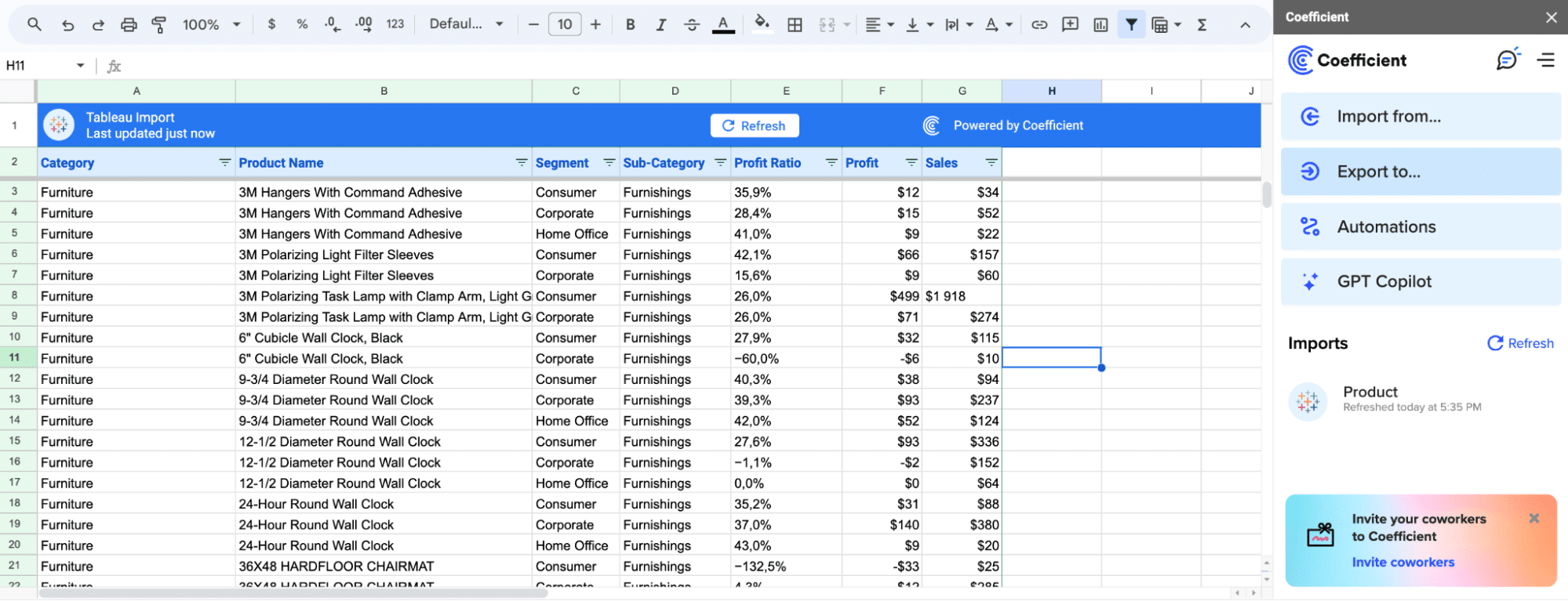
First up, ensuring your dataset is ready. Here’s where Coefficient comes into play.
By seamlessly integrating data sources such as Jira directly with your spreadsheet—and then into Tableau—Coefficient ensures that your data is not only comprehensive but also current.
This direct connection to your project management tools means that the foundation of your Gantt chart is built on the most accurate and timely data available.
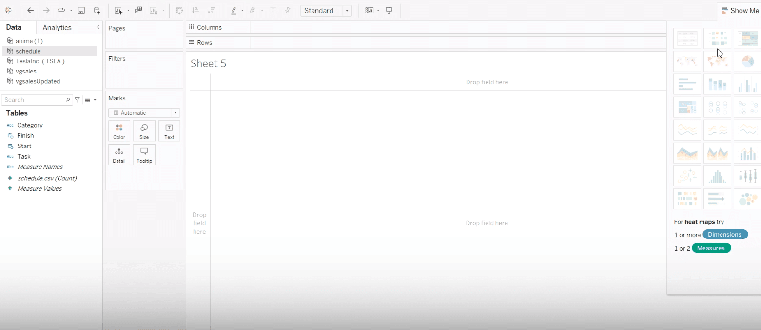
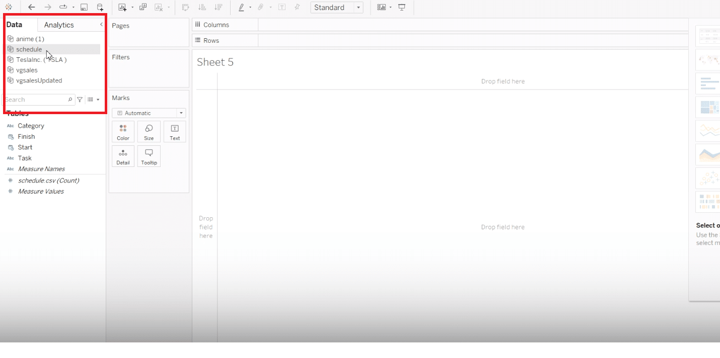
After preparing your data, launch Tableau and connect to your data source.
Open Tableau Desktop. From the main interface, begin by connecting to your data source, setting the stage for your visualization journey.
Here, we have a simple dataset, perfect for demonstrating the Gantt chart creation. It covers daily activities with a start and end time, serving as an example of how to organize your data.
Note: Ensuring your dataset is ready is crucial. Coefficient allows you to import live data seamlessly, ensuring up-to-date information is always at your fingertips. This helps in creating a more accurate and dynamic Gantt chart in Tableau.
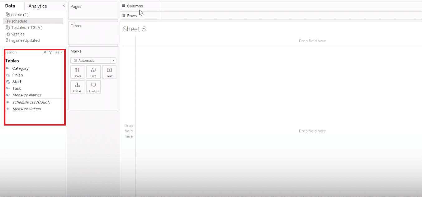
Step 2. Starting with Tableau
With your data prepared, it’s time to start molding it into a Gantt chart.
Make sure your dataset includes fields for start and end dates, as well as task names. This ensures that Tableau can accurately represent your activities over time.
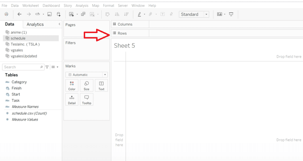
Step 3. Building the Gantt Chart
It’s time to construct your Gantt chart, transforming your dataset into a visual timeline.
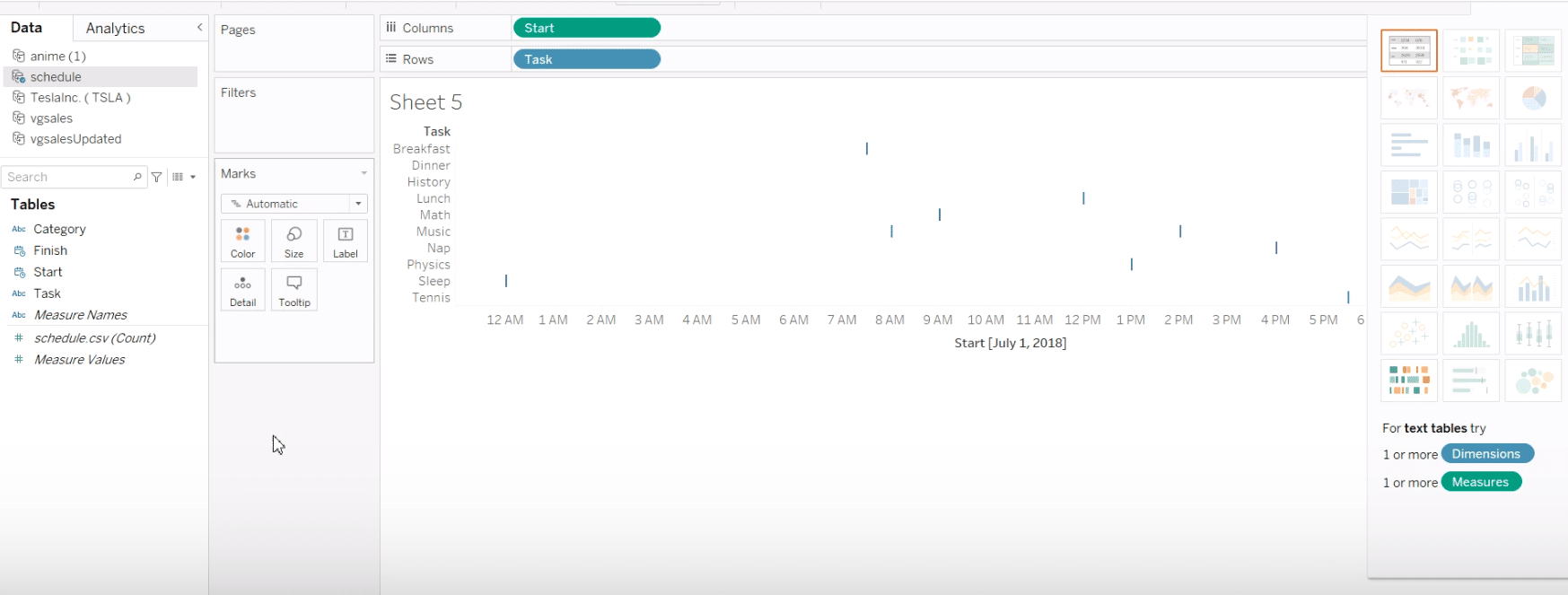
Add your data fields into the appropriate columns or rows within Tableau. This step begins to shape your raw data into a coherent visualization.
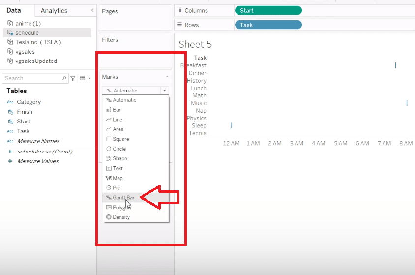
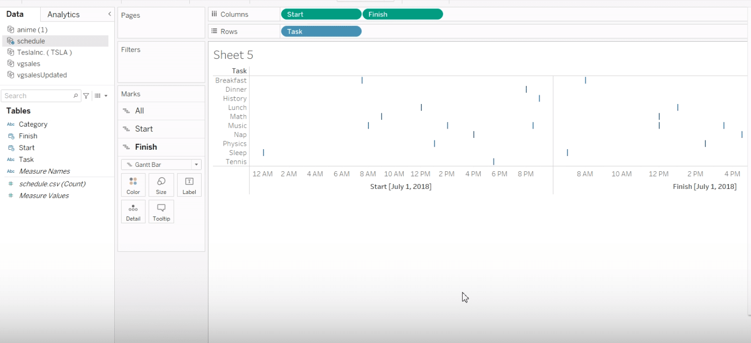
Use the ‘Show Me’ tab to select the Gantt chart type. This feature guides you on the necessary data structure for your chart.
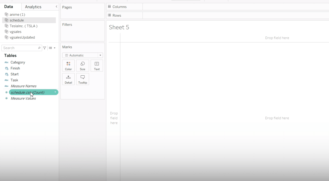
By default, Tableau may display your data as a tabular view or a bar chart, but don’t worry—this is just the starting point.
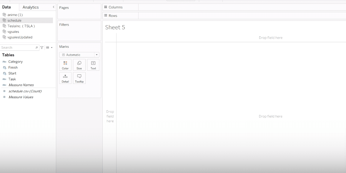
Position the start date in the columns section, a pivotal step in visualizing the timeline of your tasks.
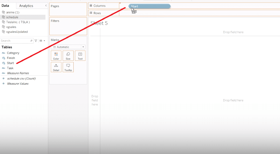
Transform the visual representation by changing the mark type to ‘Gantt Bar’. Here’s where your Gantt chart begins to take shape.
Step 4. Customizing Your Gantt Chart
Enhance your Gantt chart’s utility and aesthetics through customization.
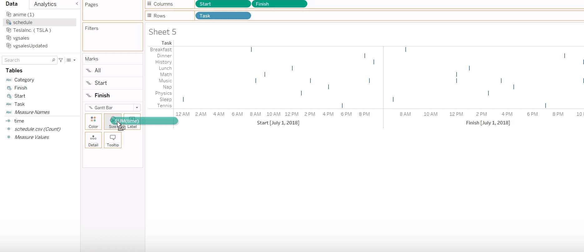
Integrate the finish date alongside the start date in the columns, meticulously arranging them to reflect your project timeline accurately.
Ensure the start and finish dates are correctly positioned. This is crucial for accurately representing the duration of each task.
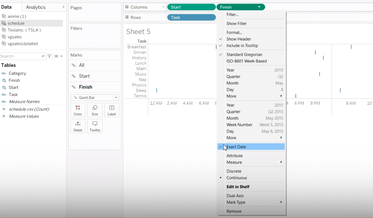
Adjust the size of each bar to represent the task duration visually, providing immediate insights into each activity’s time allocation.

Stop exporting data manually. Sync data from your business systems into Google Sheets or Excel with Coefficient and set it on a refresh schedule.
Get Started
Prefer video? Watch the tutorial here!
Advanced Tips and Tricks
Explore the deeper capabilities of Tableau to add a refined touch to your Gantt chart.
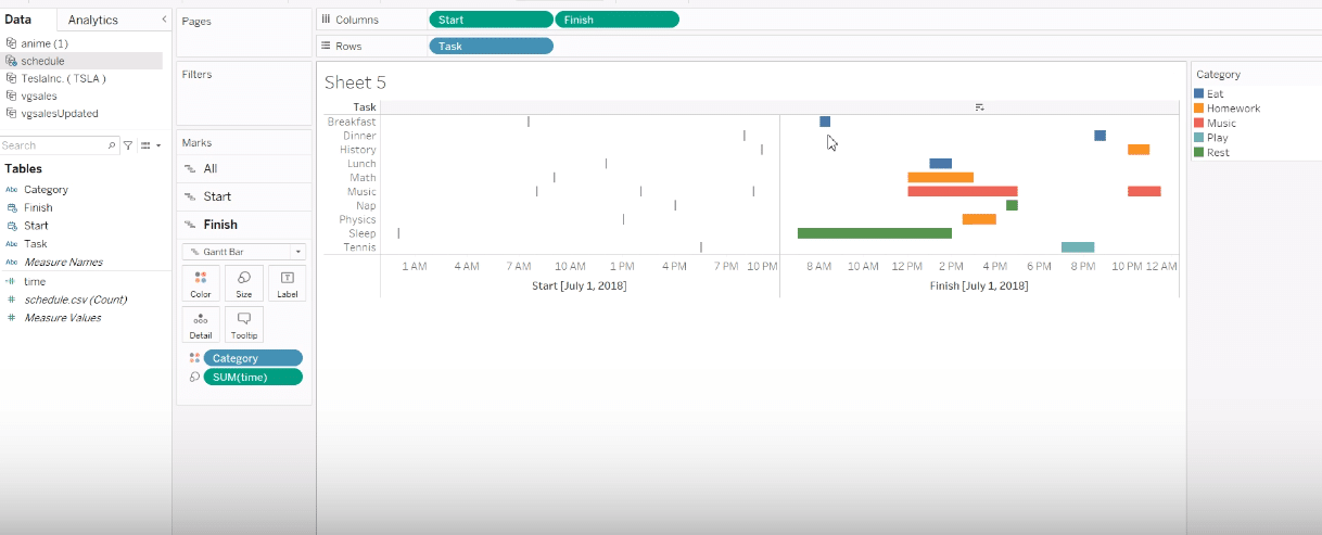
Utilize a calculated field to dynamically represent the duration between start and finish times, adding depth to your analysis of time allocation per task.
Apply color categorization to differentiate tasks or categories visually, facilitating a more intuitive understanding of your project structure.
Common Challenges and Solutions
Developing a Gantt chart in Tableau is a rewarding process, but it can be accompanied by specific challenges. Here, we address some of the common issues and provide practical solutions:
Incomplete or Incorrect Data
Solutions:
- Before starting your Gantt chart, thoroughly check your dataset for completeness and accuracy. Coefficient streamlines the data import process from your business systems, ensuring your dataset is complete and accurate.
- Ensure that all tasks have a start and end date. Data cleansing tools within Tableau, or external tools if necessary, can help ensure your data is ready for visualization.
Difficulty in Understanding Tableau’s Interface
Solution: Familiarize yourself with Tableau’s interface by exploring free tutorials and resources available on the Tableau website.
Complex Task Dependencies Not Clearly Visualized
Solutions:
- Utilize Tableau’s calculated fields to create new metrics that reflect task dependencies or overlap.
- Consider adding annotations or using color coding to highlight dependencies directly within the Gantt chart.
Performance Issues With Large Datasets
Solutions:
- Use Tableau’s data extract feature instead of live connections to improve performance.
- Aggregate data to a higher level if individual task-level detail is not necessary.
- Optimize your data model by removing unnecessary fields or rows that are not relevant to the Gantt chart.
Customization Limitations
Solutions:
- Leverage calculated fields to create custom measures or dimensions that can add additional insight or visual variance to your Gantt chart.
- Explore Tableau’s dashboard functionality to integrate your Gantt chart with other visualizations, allowing for a more comprehensive analysis.
Difficulty in Sharing and Collaboration
Solutions:
- Use Tableau Online or Tableau Server to share your dashboards and visualizations with stakeholders.
- Take advantage of Tableau’s commenting and collaboration features to gather feedback and iterate on your Gantt chart.
- Use Coefficient’s integration with Slack or email to share updates directly from your Gantt chart, enhancing team collaboration.
Conclusion
Gantt charts in Tableau offer a dynamic approach to managing projects with visual timelines. They provide insights into your project’s scope, helping you to plan, track, and execute efficiently.
Ready to transform your project management with powerful data visualizations? Start your journey with Coefficient today – Get Started with Coefficient.


