
In Tableau, histograms empower users to effortlessly transform numerical data into compelling visual narratives, highlighting underlying patterns, trends, and outliers within datasets.
This blog aims to demystify the process of crafting histograms in Tableau from the ground up, providing a step-by-step guide that equips readers with the knowledge to leverage this powerful tool in their data analysis endeavors.
Prefer video? Watch the tutorial below!
Understanding Histograms in Tableau
Histograms depict the distribution of continuous data, allowing analysts to discern the shape, spread, and central tendencies that characterize their data. These visual constructs group data into ‘bins’ or ‘buckets’, each representing a range of values, thereby transforming raw data into a digestible form that facilitates comparison and analysis.
The strategic use of histograms in data analysis not only enhances decision-making processes but also unveils patterns that might remain obscured in traditional tabular presentations.
Preparation: Setting Up Your Tableau Environment
For those new to Tableau, setting up the environment is the initial step towards harnessing its full potential. Begin by downloading and installing Tableau Desktop, following the official guidelines to ensure a smooth setup process. Familiarize yourself with the Tableau interface and connect to your data source, be it a simple spreadsheet or a complex database.
When it comes to histograms, the type of data you choose is pivotal. Histograms are best suited for continuous, numerical data where the goal is to explore the distribution of a single variable. Ensure your dataset contains at least one measure (a numeric field) that you wish to analyze, as this will form the backbone of your histogram.
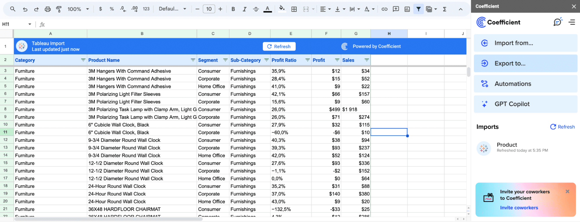
Pro-tip: Coefficient can significantly streamline your data preparation process. By using Coefficient’s seamless one-click data connectors for Google Sheets and Excel, you ensure your Tableau environment is fed with the most up-to-date and relevant data.
Step-by-Step Guide: Creating a Histogram in Tableau
Step 1: Initiating the Histogram with Bins
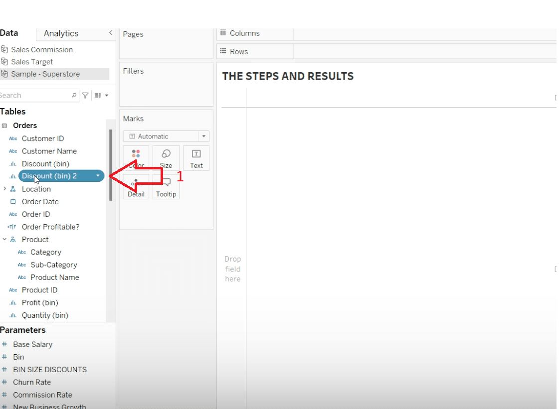
To begin creating your histogram, focus on the specific aspect of your data that you want to analyze. In this case, we’re examining discounts. The first crucial step is to create bins, which will categorize your data into manageable segments.
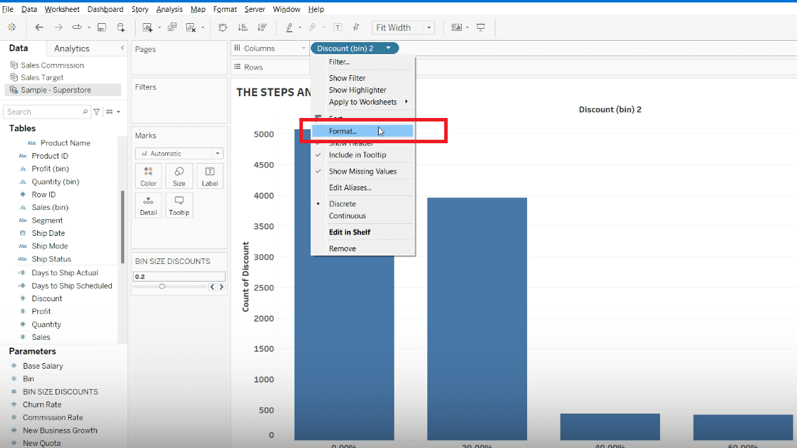
Navigate to your data pane, right-click on the ‘Discounts’ measure or whichever measure you’re analyzing, and select ‘Create’ > ‘Bins’.
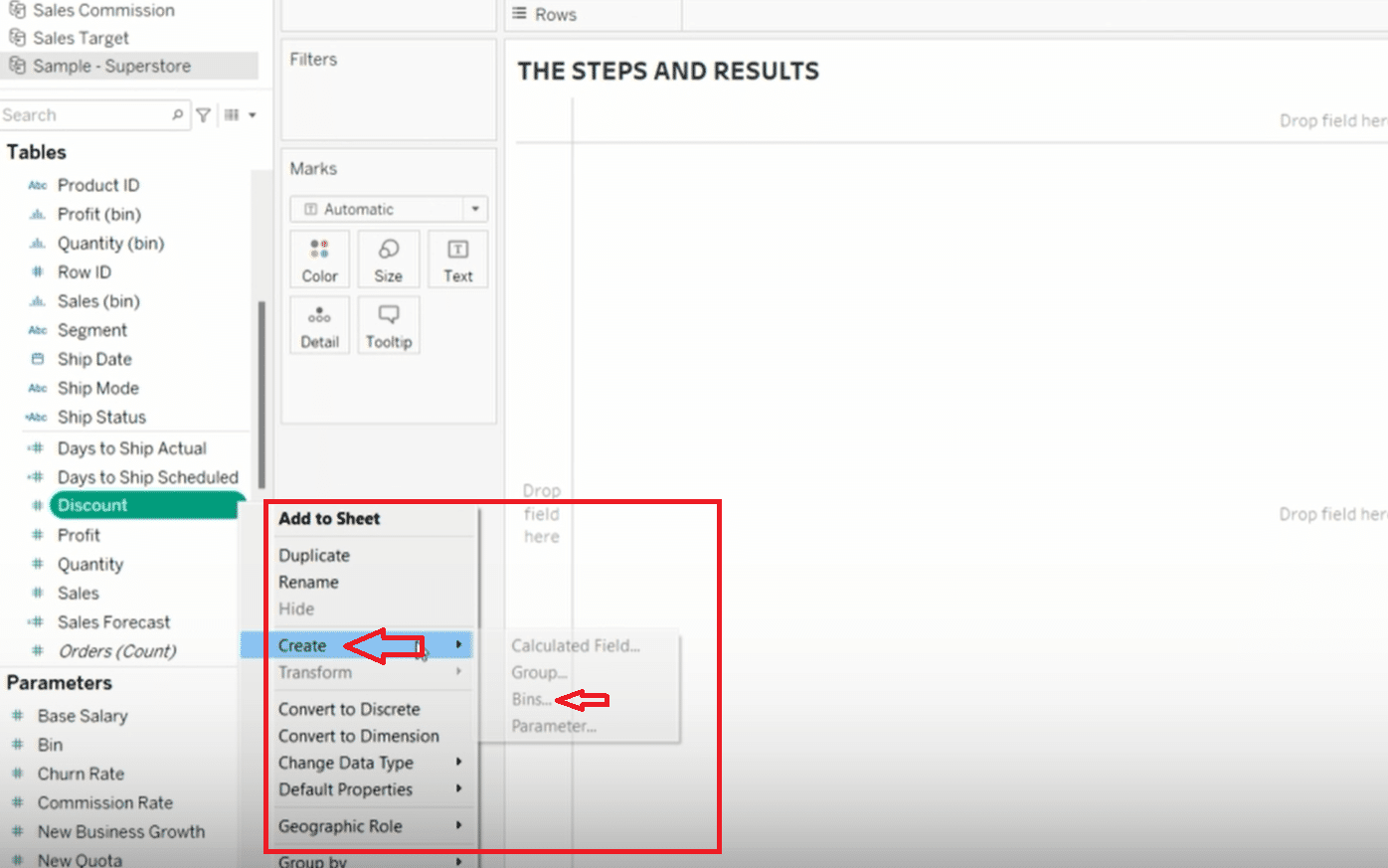
When the ‘Create Bins’ dialog box appears, you’ll have the opportunity to name your bins. Consider a clear, descriptive name like ‘Discount Bin Size’.
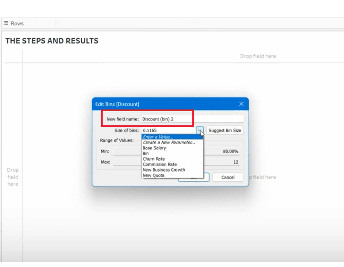
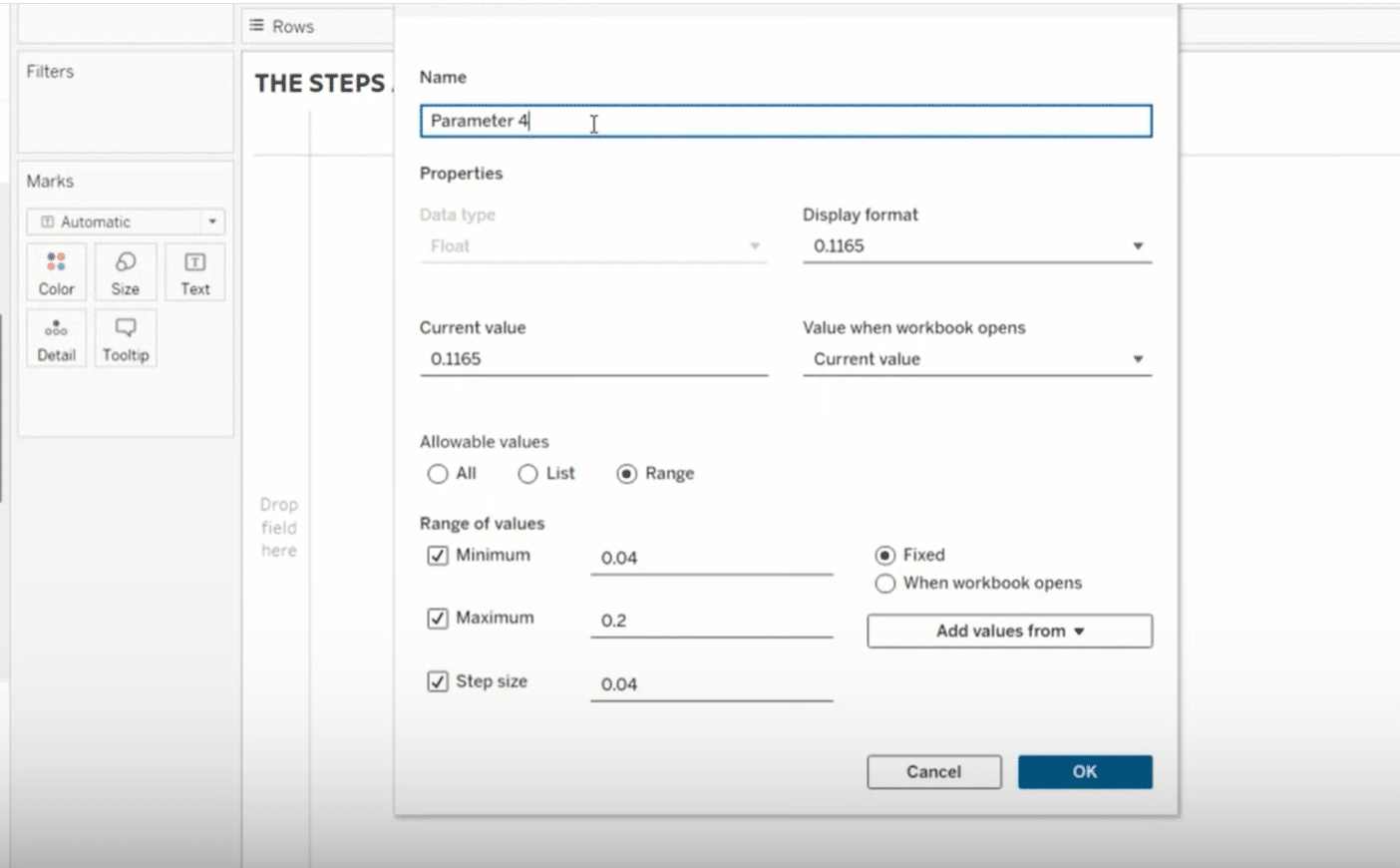
The unique aspect here is setting the bin size to be controlled by a parameter. This allows for dynamic adjustments. Set the bin size to start at 1%, indicating that each bin will represent a range of 1%. This setup offers the flexibility to change the bin size as needed, providing various perspectives on the data distribution.
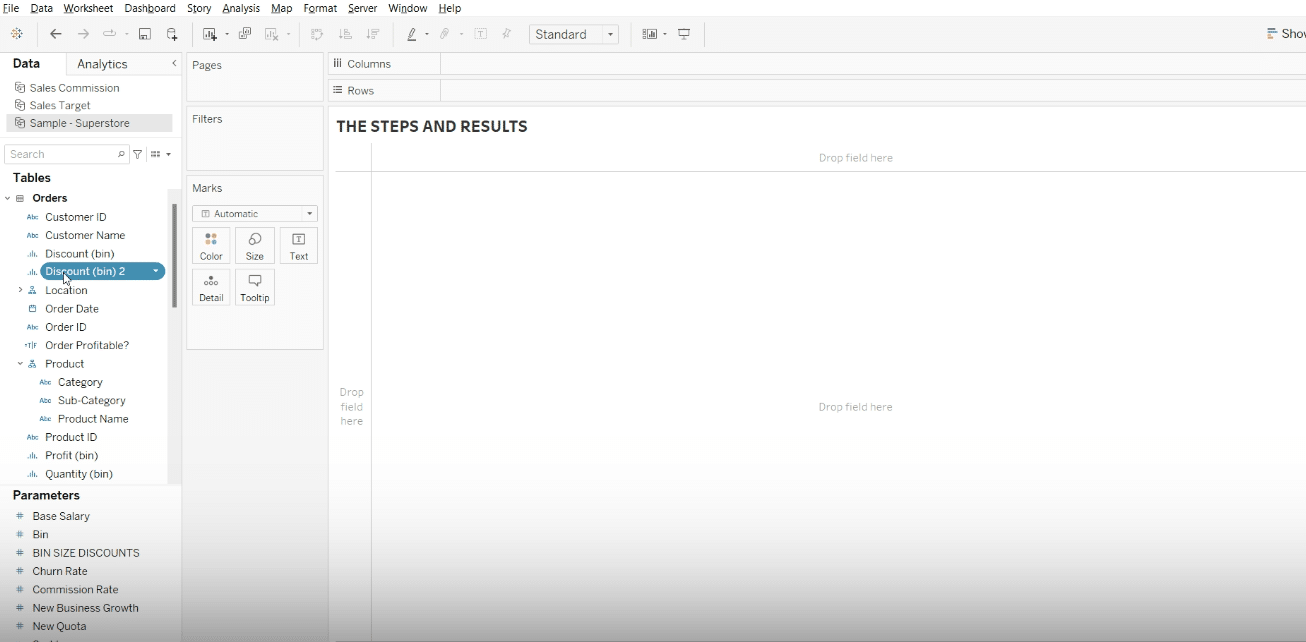
Step 2: Visualizing the Histogram with Dynamic Bins
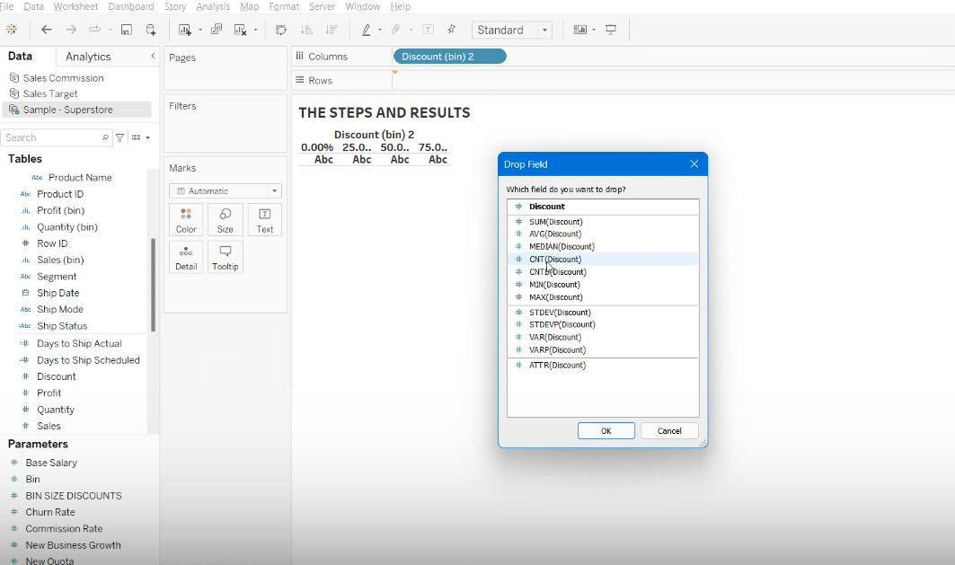
Once your bins are set up, you’ll move to visualizing the histogram. This involves placing your newly created bin field onto the Columns shelf and your measure onto the Rows shelf, configuring it to show the count of records within each bin.
Click, hold, and drag your ‘Discount Bin Size’ field to the Columns shelf.
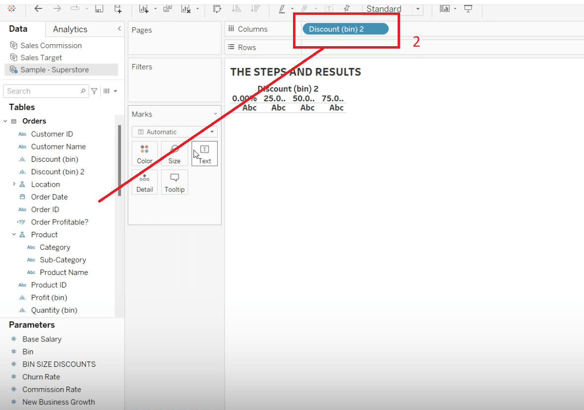
Then, take the original ‘Discounts’ measure, drag it to the Rows shelf, and adjust it to display the ‘Count’ of records. This manipulation will create the basic structure of your histogram.
Introduce the parameter control by right-clicking on the parameter you created for the bin size and selecting ‘Show Parameter Control’. This will allow users to interactively adjust the bin sizes directly from the dashboard, altering the histogram’s appearance and granularity.

Stop exporting data manually. Sync data from your business systems into Google Sheets or Excel with Coefficient and set it on a refresh schedule.
Get Started
Step 3: Enhancing Clarity and Insight
For clarity and deeper insights, it’s beneficial to format your histogram and add labels that convey more information about each bin’s contents.
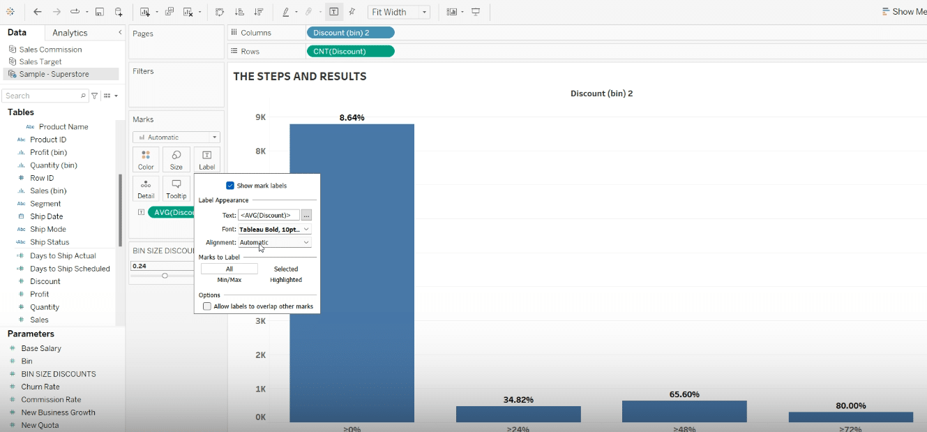
To make the bin ranges clearer, consider formatting the bin labels to show the minimum value represented by each bin.
Note: Coefficient’s Automatic Refreshes to ensure your histograms dynamically adapt to new data. This real-time update functionality is crucial for monitoring changes in your data’s distribution, enabling more responsive decision-making in fast-paced business environments.
Remove decimal places for simplicity and add a ‘greater than or equal to’ symbol to the beginning of each bin label to clearly delineate the range each bin covers.
Enhance understanding of what’s inside each bin by adding average discount labels.
This can be done by dragging the ‘Discounts’ measure onto the ‘Label’ mark and setting it to display the average. This will show what the typical value is within each bin, providing insight into the distribution within the bins, not just the count.
Advanced Tips for Enhancing Your Tableau Histogram
For those looking to get more from their Tableau histograms, consider these tips:
- Adjust Bin Size: Changing the bin size can greatly affect how your data looks and what it emphasizes. Play around with different sizes to see which presents your data best.
- Use Colors and Labels: Apply colors to make differences in data stand out more clearly, and use labels to make it easy for viewers to understand what they’re looking at.
- Analyze Distribution Patterns: Take a closer look at the shape of your histogram. Identifying patterns like skewness (where data leans more towards one side) or a bimodal distribution (where there are two peaks) can provide deeper insights into your data.
Best Practices for Histograms in Tableau
Creating histograms that are both informative and easy to understand involves a few key considerations:
- Do:
- Make sure your data is clean and organized before you start.
- Select a bin size that suits the data you’re presenting and the level of detail you need.
- Use colors and labels to make your histogram clearer, but avoid making it too busy or cluttered.
- Don’t:
- Overcomplicate your histogram with too many bins, which can confuse rather than clarify.
- Overlook unusual data points—they could lead to interesting discoveries.
Conclusion
Becoming proficient in creating histograms with Tableau is a valuable skill for digging into your data and uncovering useful information. The real key to success is regular practice and a willingness to experiment with different techniques.
To take your data work even further, consider how integrating Tableau with your other tools could streamline your processes. Coefficient offers a straightforward way to connect Tableau data with your reports and management systems. Check out Coefficient to explore how easy integration can enhance your data workflows.


