
Overview: Weekly Sales Report
If you want to integrate more data-based decisions and strategies into your sales process, start exporting data from your Salesforce or HubSpot account to build a weekly sales report in Google Sheets.
Depending on the insight you’re looking for, a week can be a significant enough time period to measure meaningful trends and outcomes in sales. It helps you assess your team’s sales performance and correct issues promptly before they escalate (among others).
While generating sales reports every week can seem time-consuming and tedious, using Google Sheets and a Salesforce (or another CRM) connector can streamline this process.
In this guide, we’ll cover what a weekly sales report is, why it’s important, and how you can build one using Google Sheets.
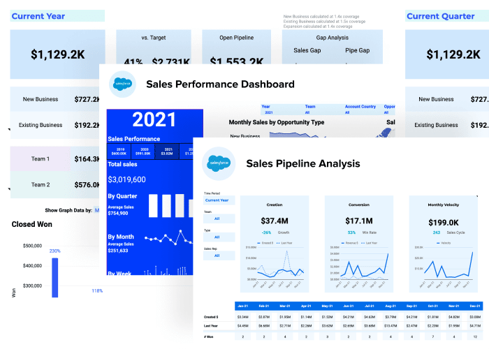
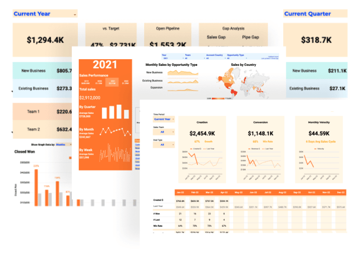
Rather cut to the chase? Upgrade your toolset instantly with free starter dashboard packages for Salesforce and Hubspot. Plug your live data in in just a few clicks to power core charts, metrics, and filters you need to monitor performance and grow your sales.
What is a weekly sales report?
Weekly sales reports are compilations of predetermined data taken from your CRM, such as HubSpot, Salesforce, and other similar apps.
The data is analyzed to assess your sales team’s performance and can be used to help managers and teams make suitable data-driven adjustments to increase sales.
Essentially, a weekly sales report shows how your sales team is performing so you can improve your sales cycles, strategies, and business development initiatives.
Your weekly sales activity reports don’t need to include all your sales metrics to give you meaningful information and insights.
Instead, focus on critical data points, such as what you want to measure and why to avoid the stress and confusion of handling overwhelming large data dumps.
You can easily compile weekly or monthly reporting information from your Customer Relationship Management (CRM) software and other platforms where your sales data is collected and stored.
A weekly sales report can give your sales teams and reps a roadmap that should highlight the most critical data they need to boost performance and outcomes through constant analysis and visibility.
Crucial factors in building weekly sales reports
It’s vital to outline and understand the following factors when creating your weekly sales report.
- Data points you want to measure. Determine which Key Performance Indicators (KPIs) you want to be more visible. Try to keep it simple and focus on the most critical data points to avoid overloading your sales reps with reporting that could affect their sales performance.
- Target audience. Identify who benefits from getting your weekly sales report information to determine the data to include in the report and the best format to use. For instance, some sales teams use a weekly sales report to communicate sales performance to company leaders, while others use it as an internal tool, particularly for reps, to monitor and improve their performance.
- Context. Provide context and background information with your numbers, so it tells the full story. If your focus is selling to a specific city or location celebrating a special holiday week, you could include context detailing the spike (or dip) in sales for that week.
Identify and understand these factors to help you determine what data to focus on in your weekly sales reports to harness and provide meaningful information.
Essential weekly sales report KPIs
Some of the essential KPIs in a weekly sales report can include the following.
Weekly sales calls
Sales reps should report their weekly sales calls outcomes, including the number of calls made, connections, voicemails left, and prospects who didn’t answer.
Total deal creation
This monitors the total deals created over the week with sales reps detailing the daily deals created, including the weekly sales report’s totals for the week and month (to date).
Total pipeline generated
This measures your team’s pipeline creation rate based on the meetings held by each sales rep each week and for the month to date.
Lead response time
This tracks how long it takes for your leads to respond after your reps contact them. This can help you understand cycle time fluctuations that can affect your sales strategy.
Capacity work rate
On the assumption that you have several sales teams working to reach monthly quotas, the capacity work rate monitors the number of unique potential clients each sales rep interacts with within a 30-day sales period.
Closed-won deals
This tracks your number of weekly wins, from the number of closed deals to the dollar amount your sales team brings in each week.
Monitoring this information weekly allows your team to identify and celebrate wins, keep the momentum going, and learn valuable insights about sales tactics that work and don’t work.
Steps in creating a weekly sales report in Google Sheets
While there are various sales report types depending on the kind of data you want to extract and your intended audience, let’s start simple and focus on a specific metric: weekly sales revenue.
Step 1: Create or open your spreadsheet file
To get started you’ll need to import your data from Salesforce. This can be accomplished in a few ways but we will cover the two most common:
- You can go directly to SFDC and create a report that contains the records and objects that you need and export this to a CSV. Then import that CSV into Google Sheets. This sounds a lot easier and faster than it is.
- Or you can import your data directly from your Salesforce account to Google Sheets seamlessly, using Coefficient.
In this tutorial, we will show you how to do this using Coefficient.
Coefficient lets you automate data transport from Salesforce and other data warehouses and platforms quickly and easily, streamlining your weekly sales report creation process.

Stop exporting data manually. Sync data from your business systems into Google Sheets or Excel with Coefficient and set it on a refresh schedule.

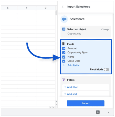
After installing Coefficient, launch the tool by accessing it on the Google Sheets Add-ons tab on the spreadsheet app’s Menu.
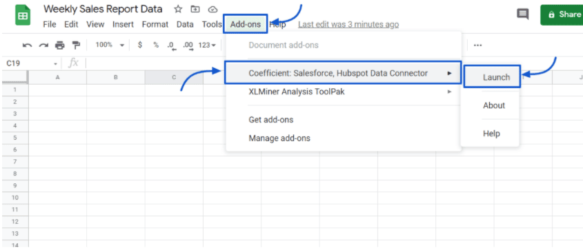
On the Coefficient popup window, select Import data, then choose Salesforce as your data source.
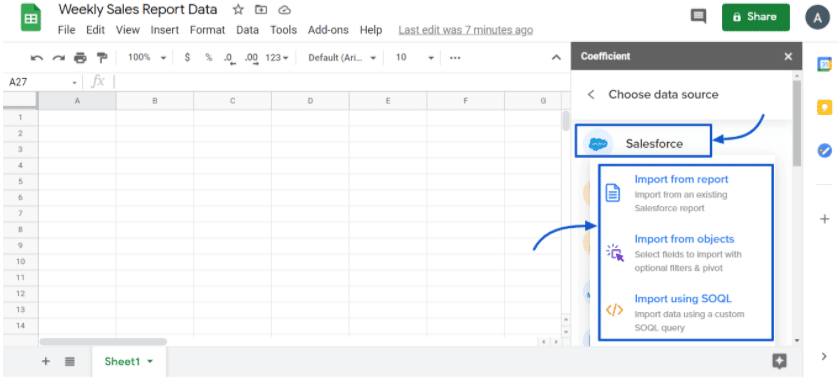
Authorizing Coefficient to connect to Salesforce, and you should see your imported data on Google Sheets within seconds.
You can choose which data fields to include, so you only work with the information you need easily.
You also won’t need to build new data imports if your Salesforce data changes after syncing it with Google sheets.
Coefficient automatically updates information from data sources on a schedule you can set, saving you from manually inputting data.
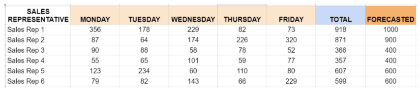
As you can see in the example below, let’s say your data contains the weekly revenue numbers for six members of your SaaS sales team, including the total amount and forecasted revenue for the week.
Step 2: Insert a chart
Select all the data, including the titles, sales reps, figures, and days, and navigate to the menu’s Insert tab.
Choose Chart, then select Column chart under the chart editor. Your chart should look like the example below.
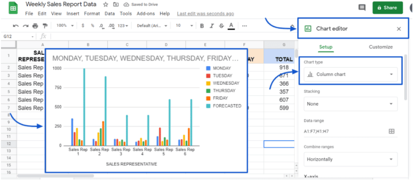
You can rename the title and add your preferred formatting options for the chart’s colors, texts, and other options.
Step 3: Add a trendline for the forecasted revenue
Include a trendline for your forecasted revenue data so you can see it as an intersecting data line in the chart.
Select the forecasted data column (light blue color) and in the Chart Editor under the Series tab, click the box on the left side of Trendline.
You can add data labels and choose your preferred format, such as Exponential, Polynomial, Logarithmic, Power Series, or Moving Average. The example below uses a Linear trendline.
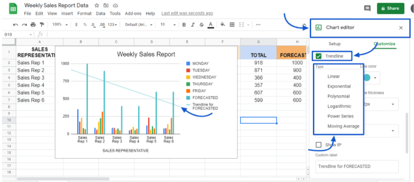
Your final weekly sales report chart should look something like this.
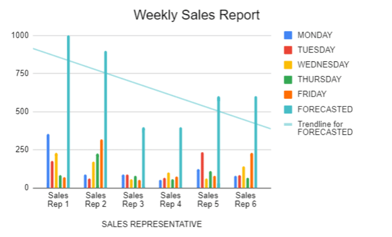
The chart should give you a good visualization of the revenue your sales reps earned for the week, allowing you to see if they are hitting targets or not. It can also help prompt you and your team to make appropriate changes for improvement.
Conclusion
Creating weekly sales reports in Google Sheets gives your sales team access to crucial information about their performance, revenue, and other sales-related insights. This allows them to sell your products and services better, which then improves your bottom line.
Managers can use weekly sales report data and apply it to many aspects of their sales process, from formalizing one-to-one coaching sessions with each team member to making the proper sales process adjustments. You can also create a weekly sales report template so you can create more sales reports in the future easily.
It can also be a comprehensive way to present weekly sales data to management.
Generating weekly sales reports is no longer a long and painful process with the right solution, such as Google Sheets and Coefficient. This can supercharge your weekly sales report creation process, allowing you to bolster your team’s performance.
Try Coefficient for free today!


