Build a Live Win-Loss Analysis Dashboard in
Less Than 30 Minutes
Use this prompt guide to build a live win-loss analysis dashboard in your spreadsheet.
Get Started Free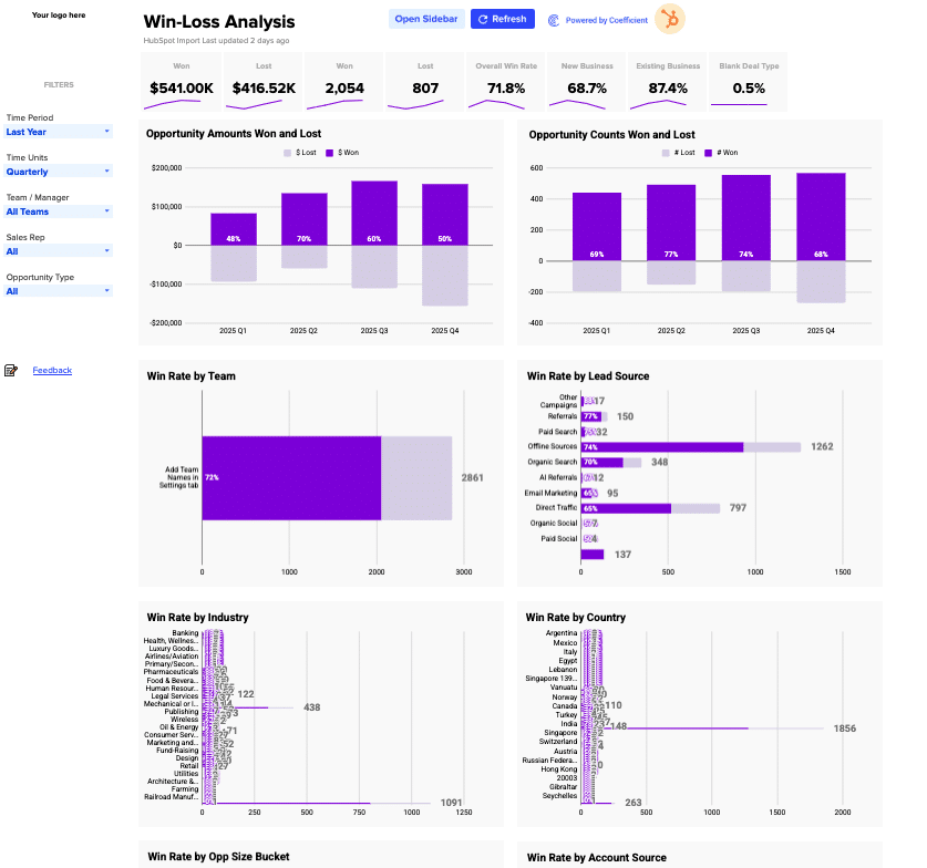
Before you start
Get set up in Coefficient for Google Sheets
- Don't have Coefficient yet? Get started free — the AI Sheets Assistant is only available in Google Sheets.
- Once you're in, click "Import from" on the Coefficient home screen and select your data source(s) to pull your data into the sheet. Not sure what data to import? Open the Coefficient Sheets Assistant — it can help you figure out where to start.
- Iterate on the prompts as you go. Tweak them to fit your team's workflow and make the dashboard your own.
9 steps
Step-by-step prompts
Import and Prep Your Deal Data
Start by bringing your deal data into a dedicated tab. This gives the Sheets Assistant a single source of truth to reference throughout the dashboard.
Import my CRM deals data into a tab called '⚡ Data Import'. Include these fields: Deal ID, Deal Name, First Name, Last Name, Amount, Create Date, Close Date, Deal Stage, Is Deal Closed?, Is Closed Won, Forecast Category, Forecast Probability, Deal Owner Email, Billing Type, Deal Type, Associated Company Name, Industry, State/Region, Country/Region, Original Source Type, Latest Source, Next Step, Team, Opp Age (days), Opp Owner, Sales Team, Opp Type, Opp URL, Close Date Year/Quarter/Month/Week, Stage/Forecast, Opp Name (Hyperlinked), Opp Size Bucket, Opp Age Bucket.
Build a Settings Tab with Configuration Tables
A settings tab centralizes filter options, bucket definitions, and company metadata. This keeps your dashboard flexible and easy to update without touching formulas.
Create a '⚙️ Settings' tab with the following configuration tables:

Company settings: Company Domain, Company Logo URL, Fiscal Year Start (January), Use Stages or Forecast Categories, Weeks End On (Saturday)
Opp Size Buckets: $0–$5K, $5K–$10K, $10K–$25K, $25K–$50K, $50K–$100K, $100K+
Opp Age Buckets: 0–10, 10–20, 20–30, 30–40, 40–50, 50+ days
Pipeline Stages list with a 'Found in data?' validation check
Sales Rep → Team lookup table
Dashboard filter dropdown lists: Time Period options, Time Units (Daily/Weekly/Monthly/Quarterly/Yearly), Currency options, Opp Types, Deal Stages, Country list, Industry list, Team names, Sales Rep names, Forecast categories
Fiscal year and fiscal quarter start date reference tables
Build a Live KPI Scorecard
Create a row of key metrics at the top of your dashboard using formulas that pull from your imported data. These should respond instantly to filter selections.
In the Dashboard tab, create a KPI scorecard row with 8 live metrics using formulas that pull from the data import tab and respect the selected Time Period, Team, and Sales Rep filters:

$ Won (sum of Amount where Is Closed Won = TRUE), formatted as $000K or $0.0M
$ Lost (sum of Amount where Is Deal Closed = TRUE and Is Closed Won = FALSE)
# Won (count of closed won deals)
# Lost (count of closed lost deals)
Overall Win Rate (# Won / (# Won + # Lost))
New Business Win Rate (COUNTIFS on Opp Type = 'New Business')
Existing Business Win Rate
Blank/Expansion Deal Type Win Rate

Add a SPARKLINE below each metric showing the trend over time periods. Use formulas that reference the data ranges so all metrics update automatically when new rows arrive.
Add a Filter Panel (Left Sidebar)
Filters let users slice the dashboard by time, team, and rep. Use data validation dropdowns so the entire dashboard responds to each selection.
Add a filter panel on the left side of the Dashboard with these dropdown filters using data validation:

Time Period (Last Year, This Year, Last Quarter, This Quarter, Last Month, This Month, Last 12 Weeks, All Time)
Time Units (Daily, Weekly, Monthly, Quarterly, Yearly)
Team / Manager (All Teams, plus each team name from Settings)
Sales Rep (All, plus each rep name from Settings)
Opportunity Type (All, New Business, Existing Business, Expansion)

All charts and KPIs should dynamically filter based on these selections.
Build Opportunity Amount and Count Charts
Side-by-side combo charts show won vs. lost dollars and deal counts at a glance. Back these with live formulas so they refresh as filter selections change.
Create two combo/bar charts side by side using live formulas that update based on filter selections:

'Opportunity Amounts Won and Lost' — grouped bar chart by time period showing $ Won (purple) and $ Lost (light purple/negative), with win rate % labels on each bar
'Opportunity Counts Won and Lost' — same structure but using # Won and # Lost counts

Data should come from a pivot table in the off-screen area of the Dashboard tab that uses the selected Time Period and Time Units filters. Use formulas (not pasted values) so the charts refresh automatically when the data import updates.
Build Win Rate Charts by Dimension (8 Charts)
Horizontal bar charts breaking down win rate by team, rep, industry, source, and other dimensions help identify which segments perform best. Use live formulas throughout.
Create 8 horizontal bar charts using live formulas showing Win Rate + deal count for each dimension. Each chart should show won deals (purple bar) and lost deals (light bar) side by side, with win rate % labeled on the bar:

Win Rate by Team
Win Rate by Sales Rep
Win Rate by Industry
Win Rate by Lead Source
Win Rate by Country
Win Rate by Account Source
Win Rate by Opp Size Bucket ($0–$5K, $5K–$10K, etc.)
Win Rate by Opp Age Bucket (0–10 days, 10–20 days, etc.)

Each chart's data should come from a COUNTIFS-based pivot in an off-screen staging area, filtered by the active filter selections. Build all formulas to reference the imported data ranges so the charts stay live as new rows come in.
Create a Recently Lost Opportunities Table
A live table at the bottom shows the 20 most recent lost deals, helping reps and managers spot patterns and follow up on losses.
At the bottom of the Dashboard, create a 'Recently Lost Opportunities' table using an ARRAYFORMULA that pulls the 20 most recently closed-lost deals from the data import tab. Show these columns: Opp Name (hyperlinked to the Opp URL), Opp Owner, Close Date, Opp Age (Days), Amount. Sort by Close Date descending. Apply alternating row colors (purple header, light purple/white alternating rows). Use formulas so the table refreshes automatically as new data arrives.
Build Off-Screen Staging Pivot Tables
Staging tables (hidden columns) perform the heavy lifting of counting and summing. This keeps charts clean and responsive without slowing down your sheet.
In columns T onward (off-screen), build the following pivot/staging tables using live formulas that feed the charts:

Quarterly/period timeline series for: Closed Won $ Amount, Closed Lost $ Amount, Closed Won Count, Closed Lost Count — broken out by sales rep
Win Rate by Sales Rep (false/true counts + % calculation)
Win Rate by Team, Industry, Lead Source, Country, Account Source
Win Rate by Opp Size Bucket and Opp Age Bucket

All tables should respect the Time Period, Team, and Sales Rep filter cells using COUNTIFS/SUMIFS with IF() wrappers for 'All' selections. Use formulas that reference the imported data ranges so everything updates live.
Add Dashboard Header and Branding
A clear header with logo, title, and last-updated timestamp makes the dashboard feel polished and trustworthy.
Add a dashboard header with:

A logo placeholder (top left) that shows a company logo image when a URL is entered in Settings
Title 'Win-Loss Analysis'
A 'Last updated X minutes ago' subtitle pulling from the data import tab's last sync timestamp
A collapsible help banner at the top
A 'Feedback' link in the bottom-left of the filter panel. Ask me for this brand information if you don't know it.
Ready to try it in Coefficient?
Connect your data and start building in minutes.
