Build a Live Website Traffic Report in
Less Than 30 Minutes
Use this prompt guide to build a live GA4 analytics dashboard in your spreadsheet.
Get Started Free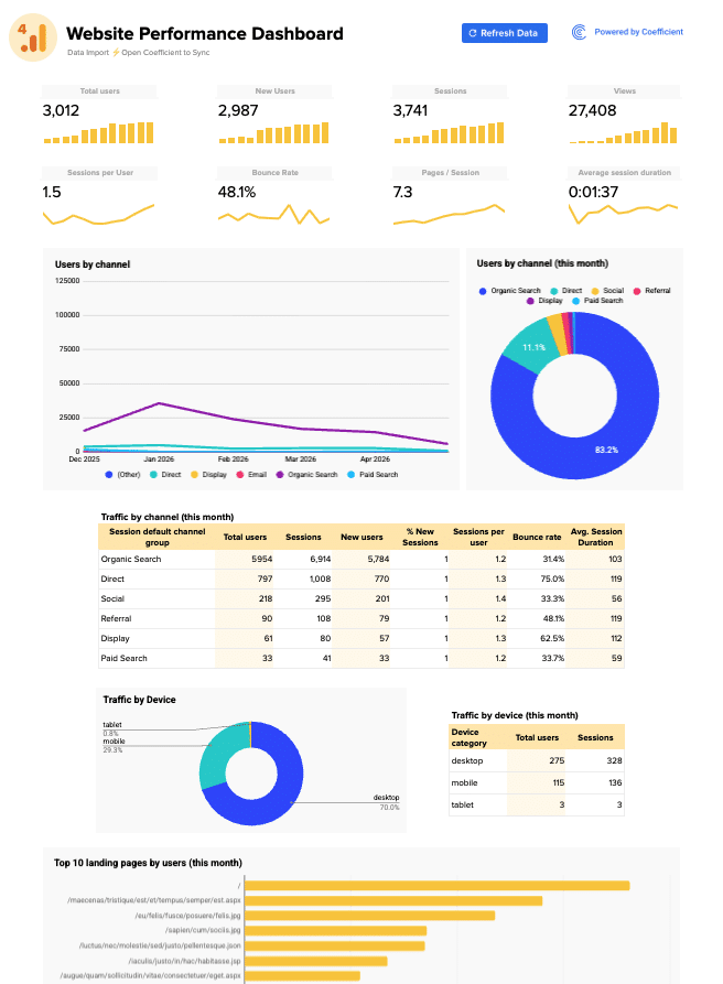
Before you start
Get set up in Coefficient for Google Sheets
- Don't have Coefficient yet? Get started free — the AI Sheets Assistant is only available in Google Sheets.
- Once you're in, click "Import from" on the Coefficient home screen and select your data source(s) to pull your data into the sheet. Not sure what data to import? Open the Coefficient Sheets Assistant — it can help you figure out where to start.
- Iterate on the prompts as you go. Tweak them to fit your team's workflow and make the dashboard your own.
8 steps
Step-by-step prompts
Import Analytics Data into Separate Tabs
Start by pulling your website traffic data from your analytics platform into organized tabs. This gives you a clean data foundation for the dashboard.
Import your analytics data into Google Sheets.
You'll need 4 separate tabs of data:
Overall Data — monthly totals for: total users, new users, sessions, views, sessions per user, bounce rate, pages/session, and average session duration — for the last 12 months. Channel Data — the same metrics broken down by 'Session default channel group' (e.g. Direct, Organic Search, Referral, Paid Other, Unassigned, Paid Social) by month — for the last 6 months. Device Data — the same metrics broken down by device category (desktop, mobile, tablet) by month — for the last 13 months. Landing Page Data — total users, sessions, new users, sessions per user, bounce rate, average session duration, and % new sessions by landing page URL — for the current month, top 50 pages. Name each tab ⚡ Overall Data, ⚡ Channel Data, ⚡ Device Data, and ⚡ Landing Page Data.
Create KPI Scorecard Row
KPI tiles give you the headline numbers at a glance. Sparklines below show whether each metric is trending up or down.
On a new tab called '📊 Dashboard', create a KPI scorecard section at the top with 8 metrics pulled from the '⚡ Overall Data' tab: Total Users, New Users, Sessions, Views, Sessions per User, Bounce Rate, Pages/Session, and Average Session Duration. Each KPI should show the most recent month's value using formulas like INDEX/MATCH. The first 4 KPIs (Total Users, New Users, Sessions, Views) should have a yellow column sparkline below them showing the trend over time. The bottom 4 (Sessions per User, Bounce Rate, Pages/Session, Avg Session Duration) should have a yellow line sparkline below them.
Add Channel Performance Charts
Charts make traffic patterns visible at a glance. These two visualizations show which channels drive users and how that mix changes month to month.
Add two charts side by side on the dashboard below the KPI tiles, both using the '⚡ Channel Data' tab:

A line chart titled 'Users by channel' showing Total Users over time (Year Month on X-axis), with one line per channel group. Use a multi-color palette.
A pie/donut chart titled 'Users by channel (this month)' showing the share of Total Users by channel for the most recent month only, with percentage labels on each slice.
Build Live Channel Traffic Table
Tables let you dig into the details behind the charts. Use formulas to reference the imported data so this table refreshes automatically when new traffic comes in.
Below the channel charts, add a table titled 'Traffic by channel (this month)' sourced from the '⚡ Channel Data' tab, filtered to the most recent month. Columns should be: Session default channel group, Total users, Sessions, New users, % New Sessions, Sessions per user, Bounce rate, Avg. Session Duration. Build this table with formulas that reference the imported data so it updates automatically. Format the header row with a yellow/gold background and bold text.
Add Device Breakdown Section
Device performance tells you if your site works well on mobile or desktop. This section breaks traffic down by device type.
Add a device section below the channel table. Include:

A donut chart titled 'Traffic by Device' using the '⚡ Device Data' tab, showing the share of Total Users by device category for the most recent month.
A small table titled 'Traffic by device (this month)' next to it, showing Device category, Total users, and Sessions for the most recent month, sourced from '⚡ Device Data'. Use formulas so both the chart and table update when the data import refreshes.
Create Top Landing Pages Bar Chart
Landing pages are where users actually land. A ranked bar chart shows which pages are pulling traffic most effectively.
Add a horizontal bar chart titled 'Top 10 landing pages by users (this month)' using the '⚡ Landing Page Data' tab. Show the top 10 landing pages ranked by Total Users, with the landing page URL on the Y-axis and Total Users on the X-axis. Use a gold/yellow bar color.
Build Live Top Landing Pages Table
The full table shows all 50 pages at once, sortable and searchable. Use formulas so row-level metrics recalculate automatically as your data updates.
Below the bar chart, add a table titled 'Top 50 landing pages' sourced from the '⚡ Landing Page Data' tab. Columns: Landing page, Total users, Sessions, New users, % New Sessions, Sessions per user, Bounce rate, Avg. Session Duration. Sort by Total Users descending. Add row numbers in the first column. Build this table with formulas (not pasted values) so it refreshes automatically when the data import updates. Format the header row with a yellow/gold background and bold text. Show all 50 rows.
Style the Dashboard for Impact
Polish the dashboard layout so it looks polished and professional. Clean styling makes insights easier to spot.
Style the '📊 Dashboard' tab to look like a professional analytics dashboard:

Hide gridlines
Add a title at the top: 'GA4 Website Performance Dashboard' in large bold text with a GA4 logo icon
Add a subtitle showing when the data was last refreshed (pulled dynamically from the ⚡ Overall Data tab header)
Use a white background with light gray section borders
KPI tile labels in small gray text, values in large bold black text
Section headers (e.g. 'Users by channel', 'Traffic by channel (this month)') in bold with a subtle border box around each section. Ask me for this brand information if you don't know it.
Ready to try it in Coefficient?
Connect your data and start building in minutes.
