Summary
Xactly Corporation founded in 2005, has earned its place as one of the longest-standing players in incentive compensation management. The platform powers commissions for large enterprises managing complex, global sales organizations.
But longevity doesn’t always translate to modern user experience or cost efficiency.
In 2026’s market, where newer platforms offer intuitive interfaces and faster implementations, the key question isn’t whether Xactly works for enterprises. It’s whether mid-market teams need enterprise-grade complexity and whether professional service dependencies justify the total cost of ownership.
This guide breaks down Xactly’s actual pricing, reveals hidden implementation costs, and helps you decide if enterprise software justifies the investment for your team size.
What is Xactly?
Xactly is enterprise sales compensation software designed for large organizations managing complex, global incentive programs. The platform automates commission calculations, quota management, and sales performance analytics for companies with hundreds to thousands of commissioned employees.
Key Features
The platform provides six core capabilities:
Flexible compensation plan design. Create commission structures using reusable elements like quotas, rules, and rate tables. Configure tiered rates, accelerators, SPIFFs, draws, and team-based incentives.
Automated commission calculations. Process monthly, quarterly, or annual commissions for thousands of reps. The system handles complex calculations including multi-level splits, overrides, and clawbacks.
Reporting and analytics (Xactly Analytics). Access 100+ out-of-the-box reports and customizable dashboards to track sales performance, compensation costs, and plan effectiveness across regions and teams.
Rep and manager dashboards. Provide sales teams with visibility into earnings, quota attainment, and performance metrics through web interfaces and mobile apps.
CRM, ERP, and HCM integrations. Connect to Salesforce, Microsoft Dynamics, NetSuite, Workday, and other enterprise systems to pull deal data and employee information automatically.
Plan document workflow management. Configure, track, and manage compensation processes including plan approvals, quota assignments, and payout workflows.
Who Uses Xactly?
Xactly targets large enterprises (1,000+ employees) and mid-market companies (200-1,000 employees) managing 100-2,000+ commissioned employees. The platform works best for organizations with dedicated compensation teams who can manage complex system configuration.
Common users include pharmaceutical companies with multi-tiered comp structures, technology enterprises with global sales organizations, financial services firms requiring compliance audit trails, and manufacturing companies managing channel partner incentives.
According to the company’s data, customers include publicly traded companies and Fortune 500 organizations. The platform maintains a 4.3/5 rating on G2 and earned recognition as G2’s #1 enterprise compensation management solution.
One TrustRadius reviewer noted: “For small sales teams of 300 or less, it may not be cost effective. Xactly Incent is also better for auditing purposes.”
Xactly Pricing Overview
Xactly operates on two distinct pricing models depending on team size: Xactly SimplyComp for small teams (up to 25 reps) and Xactly Incent for larger organizations (50+ reps).
According to published information and industry reports, Xactly SimplyComp starts at $40 per user per month ($480/user/year). Xactly Incent pricing starts at $60 per user per month ($720/user/year) with enterprise custom quotes for larger deployments.
What Real Buyers Pay
Based on industry reports and user feedback, here’s what organizations typically spend:
10-25 reps (SimplyComp): $4,800-$12,000 annually
50-100 reps (Incent): $36,000-$72,000 annually
100-300 reps (Incent): $72,000-$216,000 annually
300-1,000+ reps (Enterprise Incent): $216,000-$720,000+ annually
These represent base subscription costs. Professional services implementation, Technical Account Manager (TAM) fees, and add-on modules come separately.
One TrustRadius user noted cost concerns: “Business calls out as it High cost to company Xactly should have some discounts for companies using the tool.”
👉 For teams with fewer than 100 reps or annual RevOps budgets under $40K:
The pricing breakdown below may not justify ROI for your team size. Skip to spreadsheet-based alternatives that solve the same problem at $500-$3K/year.
The Pricing Model
Xactly charges per user with annual contracts. Unlike newer competitors, Xactly typically requires professional services for implementation and ongoing configuration changes.
One GetApp reviewer described the dependency: “Xactly Incent is supposedly the better version and upgrade from Xactly Express. In order to make it work with your organization, you will need to pay an implementation fee. Xactly then flys in trainers to configure your commission plan with their software. Once they leave, if anything breaks, you’ll have to contact Xactly support. From our experience, we realize that their software is like a big black box.”
Final pricing depends on:
- Number of users (admins, managers, reps with system access)
- Professional services implementation scope
- Technical Account Manager (TAM) support tier
- Add-on modules (Analytics, Forecasting, Sales Planning, AlignStar)
- Integration complexity (number of CRM/ERP systems)
- Contract length (annual vs multi-year)
Xactly Pricing Plans Breakdown
Based on user feedback and published information, three main tiers emerge: SimplyComp for very small teams, Incent for mid-market, and Enterprise Incent for large organizations.
Xactly SimplyComp (Up to 25 Reps)
Pricing & What’s Included
SimplyComp contracts cost $40 per user per month ($480/user/year) with annual subscriptions. This is Xactly’s DIY product designed for teams with up to 25 sales reps.
What’s Included:
- Spreadsheet-style commission plan templates
- Automated monthly commission calculations
- Salesforce integration
- Rep dashboards for earnings visibility
- Basic reporting
- Self-service plan configuration
- Email and in-app support
- 30-day free trial available
Limitations:
SimplyComp caps at 25 users maximum. Teams exceeding 25 reps must upgrade to Xactly Incent, which involves significantly higher costs and required professional services.
The DIY model means limited customer support compared to Incent. Configuration changes require admin users to manage themselves without dedicated account management.
Estimated Annual Cost
| Cost Component | Amount |
|---|---|
| Subscription (10 reps) | $4,800/year |
| Subscription (25 reps) | $12,000/year |
| Implementation | Self-service (included) |
| Total annual investment | $4,800-$12,000 |
Best Suited For
SimplyComp works for very small sales teams (5-25 reps) with straightforward commission structures.
Good fits include startups transitioning from spreadsheets, small B2B companies with simple tiered commissions, and organizations wanting basic automation without complex multi-tier structures.
The sweet spot: Teams where one admin can manage commission planning without dedicated RevOps or compensation analyst resources.
Xactly Incent (50-300 Reps)
Pricing & What’s Included
Mid-market Incent contracts typically cost $36,000-$216,000 per year for teams with 50-300 sales reps. At $60/user/month, 100 reps would cost $72,000 annually before professional services.
One Software Advice reviewer noted: “Professional services are expensive and some of the resources are inexperienced.”
What’s Included:
- Flexible compensation plan design (quotas, rules, rate tables)
- Automated commission processing
- 100+ out-of-the-box reports
- Customizable dashboards
- Rep and manager visibility dashboards
- Incentive statements with deal-level detail
- CRM, ERP, HCM integrations (Salesforce, Dynamics, NetSuite, Workday)
- Plan document and workflow management
- Standard support (ticket-based system)
- Mobile app for iOS (limited functionality)
Limitations:
User interface receives consistent criticism for being “clunky” and “not intuitive.” One Capterra reviewer stated: “The user interface seems clunky at times. I do not like the frame-within-a-frame design that is used in some of the objects.”
Self-service configuration is limited. Most organizations rely on Xactly’s professional services team or third-party implementation partners for plan changes and troubleshooting.
Additional Costs to Expect
Beyond base subscriptions, budget for substantial professional services:
Implementation fees: $30,000-$100,000+
Xactly requires professional services for initial implementation. One GetApp reviewer noted: “The upfront implementation fee was more than justified with the support rep dedicated to our organization.”
Implementation typically takes 3-6 months for mid-market teams. A TrustRadius reviewer noted: “Xactly Incent seemed to offer the most with the best cost, but the implementation was poor in my opinion.”
Technical Account Manager (TAM): $20,000-$60,000 annually
Most Incent customers purchase TAM support for ongoing configuration assistance. One TrustRadius user explained the value: “The price you pay for a TAM is much cheaper than trying to pay a full time employee to handle all of” the compensation management work.
Add-on modules: – Xactly Analytics (advanced reporting): Additional fee – Xactly Connect (data integration platform): Additional fee – Custom integrations: $10,000-$40,000 per integration
Estimated First-Year Cost
| Cost Component | Amount |
|---|---|
| Subscription (100 reps) | $72,000 |
| Implementation | $30,000-$100,000 |
| TAM support (annual) | $20,000-$60,000 |
| Add-on modules (if needed) | $15,000-$40,000 |
| Total first-year investment | $137,000-$272,000 |
Best Suited For
This tier works for mid-market to large organizations with 50-300 reps who have dedicated compensation analysts or RevOps teams.
Good fits include pharmaceutical companies with complex tier structures, technology companies with global sales teams, and organizations where commission accuracy and audit trails justify dedicated software and professional services costs.
The critical factor: Teams must have internal resources who can work with Xactly’s TAM to manage ongoing configuration. One-person finance teams struggle without this capacity.
Enterprise Xactly Incent (300+ Reps)
Custom Pricing Structure
Enterprise contracts typically range $216,000-$1,000,000+ annually for organizations with 300-2,000+ commissioned employees across multiple business units and geographies.
One Gartner reviewer shared: “We’ve been using Xactly for over 4 years now and it has completely transformed how we manage incentive compensation. The platform is flexible, powerful and has many additional addons our team can tack on for internal and external uses.”
What Drives Custom Pricing:
- Total user count (often 500-2,000+ users)
- Geographic distribution (multi-currency, multi-entity)
- Number of business units with different comp structures
- Add-on products (Analytics, Forecasting, Sales Planning, AlignStar)
- Premium TAM support with faster SLAs
- Professional services scope and complexity
- Multi-year contract terms
Enterprise Features:
All Incent features plus:
- Xactly Analytics (advanced BI and reporting)
- Xactly Forecasting (sales forecasting and pipeline analytics)
- Xactly Sales Planning (quota planning, territory management)
- Xactly AlignStar (territory optimization and capacity planning)
- Dedicated Technical Account Manager
- Priority support with faster response times
- Custom integration development
- Advanced security and compliance features
- Multi-year contract volume discounts
Additional Costs to Expect
Enterprise implementations involve higher setup investment:
Implementation fees: $100,000-$500,000+
Large enterprises with multi-region structures, complex plan hierarchies, and multiple system integrations require extensive professional services. Implementation can take 6-12 months for global rollouts.
Annual TAM and support: $60,000-$150,000+
Enterprise TAMs provide dedicated account management, quarterly business reviews, and priority access to product and engineering teams.
Custom development and integrations: $50,000-$200,000+
Connecting to proprietary systems, building custom workflows, or developing specialized reporting often requires additional development work.
Estimated First-Year Cost
| Cost Component | Amount |
|---|---|
| Subscription (500 reps) | $360,000+ |
| Add-on products | $100,000-$300,000 |
| Implementation | $100,000-$500,000 |
| TAM support (annual) | $60,000-$150,000 |
| Custom development | $50,000-$200,000 |
| Total first-year investment | $670,000-$1,510,000+ |
When to Consider Enterprise
Enterprise pricing makes sense when you manage 300+ commissioned employees across multiple regions, business units, or complex compensation plan types.
Compliance drives many enterprise purchases. Pharmaceutical companies, publicly traded organizations, and regulated industries requiring SOC 2 compliance and detailed audit trails need enterprise infrastructure.
Xactly’s full platform (Incent + Analytics + Forecasting + Planning) becomes valuable when quota planning, territory optimization, and sales forecasting currently consume significant resources outside commission software.
Xactly Customer Reviews & User Feedback
Overall Rating
Xactly Incent maintains a 4.3/5 rating on G2 and earned recognition as G2’s #1 enterprise compensation management platform. The platform holds 85% user satisfaction based on SelectHub’s aggregate analysis across multiple review platforms.
However, satisfaction varies significantly based on organization size and internal resources. Enterprise teams with dedicated compensation analysts report higher satisfaction than mid-market teams without TAM support.
What Users Love
Accuracy for large-scale organizations
Users consistently praise Xactly’s ability to handle complex calculations at enterprise scale.
One Software Advice reviewer stated: “We created a team that works exclusively on compensation and we all use Xactly to do that. It has allowed for better accuracy, audit controls, more consistent standardized processes and analysis of compensation.”
Another Software Advice user noted time savings: “Prior to going full force with Xactly, it would take us 3 weeks to get revenue and commissions calculated. It can all be done in 1 day now.”
Comprehensive integration capabilities
Enterprise users appreciate connections to major business systems.
A GetApp reviewer mentioned: “Integration from CIQ to NetSuite allows us to perform many SOX compliance controls.”
Strong customer support (for TAM customers)
Organizations purchasing TAM support report positive experiences.
One GetApp reviewer shared: “From my perspective the best aspect of Xactly is the excellent customer support that comes with a license.”
A Software Advice user added: “The teams that help us set up Xactly and maintain it are very helpful. We are especially happy with [their] help and staying on top of any issues we might have.”
Robust reporting and analytics
The Analytics module receives praise for depth.
One Capterra reviewer noted: “Analytics is very good which gives clear picture of overall performance.”
Common Dissatisfaction
Steep learning curve and complexity
Multiple users report difficulty with initial configuration.
A Capterra reviewer stated: “I would say overall experience with Xactly Incent is average… It’s definitely better than calculating credits, quotas, attainments and commission manually offline, but it’s very challenging to configurate and maintain the plans in the system for mid-large size companies.”
One Gartner user noted: “There was a strong learning curve at the start.”
Dependency on professional services
The “black box” reputation creates frustration for teams wanting self-service.
A GetApp reviewer explained: “Once they leave, if anything breaks, you’ll have to contact Xactly support. From our experience, we realize that their software is like a big black box. If anything goes wrong you keep have to run to them.”
Another Software Advice user complained: “Professional services are expensive and some of the resources are inexperienced.”
Clunky user interface
UI design receives consistent criticism.
One Capterra reviewer noted: “The user interface seems clunky at times. I do not like the frame-within-a-frame design that is used in some of the objects.”
A GetApp user stated bluntly: “Xactly is a very clunky old tool for managing sales commissions. It is not intuitive.”
Poor rep-facing experience
Sales reps often don’t use the dashboard.
One Capterra reviewer shared: “My feedback from our sales team we have is they don’t even look at it. We direct them towards our analytics dashboards. 99% virtually all pods are turned off or hidden to avoid Incent from confusing the sales rep.”
A Gartner user noted: “Xactly doesn’t simplify the comp review for a sales person. Can be very difficult to know what you’re getting paid for.”
Cumbersome ticketing system
Support process frustrates users without TAM.
One GetApp reviewer complained: “You must submit a ticket, then wait for an email response which you cant directly respond to, but must open the software portal to do so, then your response goes back into a queue, and you wait for the next response.”
High costs for smaller teams
Multiple users question ROI for mid-sized organizations.
A TrustRadius reviewer stated: “For small sales teams of 300 or less, it may not be cost effective.”
Another noted: “Too expensive” after 1.5 years of use.
Is Xactly Right for Your Team?
After reviewing pricing, features, and user feedback, here’s how to assess fit:
| Xactly Works Best For | Xactly May Be Overkill If |
|---|---|
| 300+ sales reps with complex enterprise structures | Fewer than 100 reps ($72K-$272K/year exceeds mid-market ROI) |
| Dedicated compensation teams (analysts who can work with TAM) | Solo finance/ops person (requires ongoing professional services) |
| Multi-entity global operations (different countries, currencies, business units) | Single-region operations (complexity exceeds needs) |
| Publicly traded or regulated (SOC 2, audit trails required) | Limited compliance requirements (audit trails can be managed in spreadsheets) |
| Enterprise-wide platform (need Forecasting, Planning, Analytics modules) | Just need commission tracking (don’t need full revenue operations platform) |
| Budget exceeds $150K/year (can afford implementation + TAM) | Budget under $50K/year (base software + services exceeds budget) |
For teams in the second category, spreadsheet-based workflow automation offers a different path that provides commission tracking without enterprise complexity or professional services dependency.
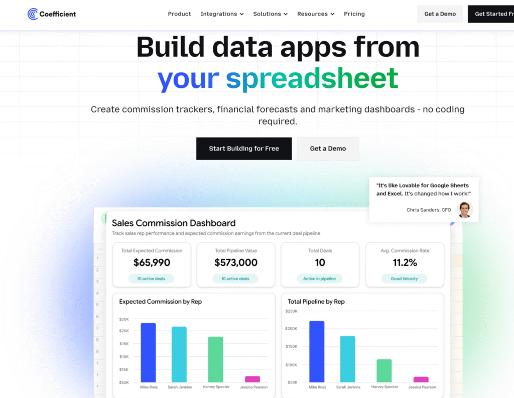
Alternative for Spreadsheet-Savvy SMBs: Coefficient
If Xactly feels too expensive or complex for your needs, spreadsheet-based workflow automation provides a different approach to solving commission tracking.
This works best for teams already comfortable with Excel or Google Sheets who want to automate data connections rather than implement enterprise software.
The Spreadsheet-Native Approach
Instead of learning enterprise commission platforms, spreadsheet automation tools connect your existing Excel or Google Sheets directly to Salesforce, HubSpot, and other business systems.
You build commission formulas using the functions you already know. Data refreshes automatically from your CRM. No implementation team. No TAM dependency. No “black box” system.
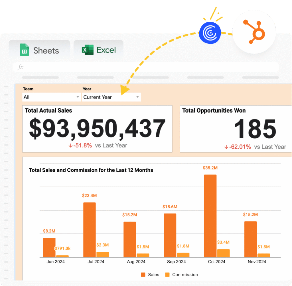
Coefficient is one such workflow automation tool designed for this use case. Finance teams and sales operations professionals use it to automate commission tracking without leaving spreadsheets.
Here’s a simple walkthrough video of the same,
How It Works
1. Connect your CRM. Link Google Sheets or Excel to Salesforce, HubSpot, QuickBooks, or 100+ other data sources. Takes 60 seconds with OAuth authentication.
2. Build commission calculations in spreadsheets. Use familiar formulas like SUMIF, VLOOKUP, IF statements to calculate commissions based on live CRM data. Or copy pre-built templates for common structures.
3. Schedule automatic refreshes. Set data to refresh hourly, daily, or weekly. Commission numbers update automatically as deals close in your CRM without manual exports.
4. Share view-only dashboards. Reps check their earnings in shared Google Sheets with view-only access. Finance maintains a single source of truth without building separate rep portals.
Best For
This spreadsheet automation approach works best for:
Organizations with fewer than 100 reps. Where $72,000-$272,000 annual spend (plus professional services) doesn’t align with team size.
Teams without dedicated compensation analysts. Solo finance professionals who can’t dedicate capacity to working with TAM for ongoing configuration.
Companies wanting to avoid professional services dependency. Prefer self-service over relying on third-party implementation partners for changes.
Budget-conscious organizations. Where $588-$1,188/year fits RevOps budgets better than $72,000+/year plus services.
What You Trade Off
To provide balanced guidance, spreadsheet automation doesn’t replicate everything enterprise software offers:
No built-in workflow management. Plan approvals, quota assignments, and payout workflows require manual processes or separate tools.
No enterprise analytics module. Advanced BI and forecasting capabilities like Xactly Analytics require separate tools.
No multi-year audit trail infrastructure. Historical data management happens in spreadsheet versioning rather than database systems.
Excel knowledge required. You build commission logic with formulas rather than visual plan builders.
For teams prioritizing cost efficiency and avoiding professional services dependency, these trade-offs feel minor. For enterprises needing full revenue operations platforms with forecasting and planning, dedicated software justifies the premium.
Cost Comparison
| Scenario | Xactly | Coefficient |
|---|---|---|
| Starting price | $40/user/month (SimplyComp, max 25) | $588/year |
| Mid-tier (50-100 reps) | $36K-$72K + $30K-$100K implementation | $1,188/year (Pro) |
| Enterprise (300+ reps) | $216K+ + $100K-$500K implementation | $2,940/year (Enterprise) |
| Professional services | Required for Incent ($30K-$100K+) | $0 (self-service) |
| TAM support | $20K-$60K annually | N/A (not needed) |
| Total first-year (100 reps) | $137K-$272K | $1,188 |
The bottom line: Both solve commission tracking. Xactly offers enterprise-grade software with comprehensive revenue operations capabilities and required professional services. Spreadsheet automation tools like Coefficient solve commission tracking through workflow automation at dramatically lower cost and zero professional services dependency.
Your choice depends on team size, budget, internal resources, and whether you need enterprise capabilities (forecasting, planning, analytics) or just commission automation.
Conclusion
Xactly is powerful, enterprise-grade sales compensation software purpose-built for large organizations managing complex, global incentive programs. However, for many mid-market teams with fewer than 75 sales reps, Xactly often exceeds actual needs and budgets.
The key question isn’t “Is Xactly good for enterprises?” The real question is: “Does your team need enterprise software with required professional services, or can workflow automation solve the same problem through a simpler approach?”
For spreadsheet-comfortable teams with tighter budgets and fewer than 100 reps, tools like Coefficient automate commission tracking at $588-$1,188/year by connecting spreadsheets to CRMs. Same outcome (automated commission calculations), different path (self-service Excel formulas instead of enterprise implementation), dramatic cost savings.Ready to explore spreadsheet-based commission tracking? Try Coefficient’s free Salesforce Commission Tracking Template or HubSpot Commission Tracking Template. Connect your CRM in 60 seconds and see if the spreadsheet approach fits your workflow.