Are your sales operations reporting an absolute nightmare?
If you answered “Yes,” then you are not alone.
Many companies struggle with building meaningful sales ops reports due to the moving parts involved and the sheer amount of data needed.
If you don’t have a solid grasp of your sales workflow and how your tech stack works, putting together your sales reports can be overwhelming.
The good news is there are simple ways to build sales ops reports and dashboards using tools, such as Salesforce and spreadsheets. That’s what we’ll cover in this guide.
Sales ops reporting: Table of contents
- Create a sales funnel analysis in Salesforce and Google Sheets
- Perform sales forecasting using exponential smoothing
- Build weekly sales activity report
- Track your lead to opportunity conversion rate
- Make a sales pipeline dashboard
- Use Coefficient to streamline your sales operations reporting
Go-live today with a brand new set of sales operations reports. Grab our free Hubspot or Salesforce operations report templates and sync your data in a few clicks. Don’t use either? No worries. Make a copy and customize for your needs.
Create a sales funnel analysis in Salesforce and Google Sheets
Conducting a sales funnel analysis allows you to assess and filter through your data to determine the effectiveness of your sales processes.
The process begins at the topmost part of your sales funnel, so you’ll be tracking conversion data through the funnel until your prospects arrive at the handoff stage.
You can use Salesforce and Google Sheets to translate this information into a sales funnel analysis report.
Salesforce
Build a Salesforce Dot Com (SFDC) sales funnel analysis using the Reports and Dashboards feature in Lightning Experience.
Open the report or dashboard you want to analyze and select your preferred data display view by changing the component properties.
Once you have your report open, click Edit, the settings icon, then choose Funnel from the display options.
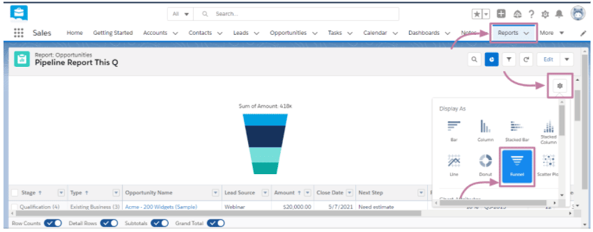
Here’s an expanded view of your sales funnel analysis report from the SFDC dashboard.
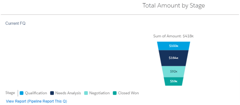
Creating this SFDC report gives you a good visualization overview of your sales funnel. Salesforce also allows you to build your calculation to narrow down your sales funnel view. But this process can take a bit of experimenting and deeper SFDC knowledge.
Google Sheets
A simpler way to create your sales funnel analysis report is via Google Sheets using the Chart Editor feature.
The process involves quick and easy steps:
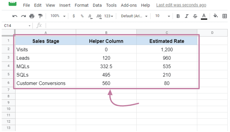
- Open your spreadsheet file that contains the sales funnel stages with their estimated rates
- Create a helper column
- Insert this formula: =(max($C$2:$C$7)-C2)/2
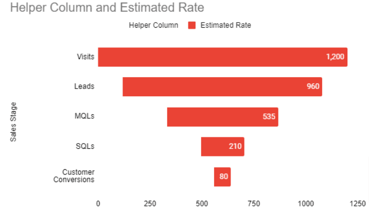
Then, using the Chart Editor tool, create and format a visual representation of your sales funnel analysis report.
With a few adjustments, you should have a sales funnel analysis that looks like this.
While there are many ways to perform a sales funnel analysis in Google Sheets, using the formula mentioned and the Chart Editor feature is one of the easiest ways to create one.
Learn more about conducting a sales funnel analysis from our post on How to Make Your SFDC Funnel Analysis 10x Better.
Perform sales forecasting using exponential smoothing
Sales forecasting allows you to predict your future revenue through experience, intuition, and data.
Unlike experience and intuition, there are actionable steps to performing sales forecasting using your data.
A straightforward way of doing sales forecasting is to use Google Sheets. It lets you handle and analyze your data with ease.
The program also provides in-app forecasting tools, formulas, and integrations to help you create reliable sales forecasting analysis reports using the exponential smoothing technique.
You can use several methods to perform sales forecasting on Google Sheets, such as moving averages, linear regression, and exponential smoothing.
However, exponential smoothing is more commonly used because it uses easier calculations and is more flexible.
The exponential smoothing forecasting technique analyzes data from specific periods, generating data free from “noise” and making patterns and trends more visible.
When using exponential smoothing, the smoothing constant in your formula should be between .1 and 1.
To do a sales forecast in Google Sheets easily, download and install Add-ons with an exponential smoothing function.
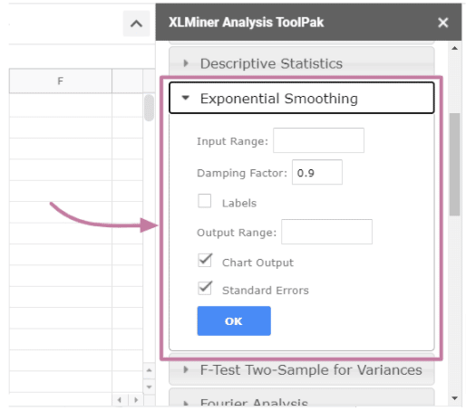
With the Add-on, you can open your spreadsheet data file, run the app, input and configure the required information, and you’ll get the calculated figures of your sales forecast data.
You can then create a visualization using the Google Sheets Chart Editor feature. Your sales forecast chart using the exponential smoothing technique should look something like this.
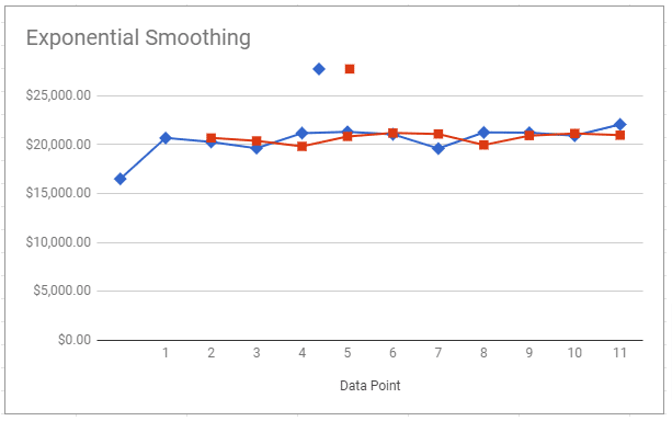
Using the exponential smoothing technique to perform your sales forecast is quick and easy, allowing you to extract pertinent data efficiently.
Understand sales forecasting better by reading our guide on How to Do a Sales Forecast with Exponential Smoothing in Google Sheets.
Build weekly sales activity report
Weekly sales reports consist of compilations of your given sales data from various sources that you can analyze to determine your sales performance every workweek.
These reports provide valuable data and insights for your sales managers and teams so they can make appropriate process and operations adjustments to improve sales strategies and cycles (among others).
Before creating your weekly sales activity report, ensure you know who your target audiences are and the context and background information to paint a full picture of your data.
Also, identify the Key Performance Indicators (KPIs) you want to highlight in your weekly sales report template, such as your weekly sales calls, lead response time, total pipeline generated, and closed-won deals.
To start off with creating your weekly sales report, open the file with your sales team’s weekly revenue data on Google Sheets.
You can also import your sales data from other software, such as Salesforce, or use robust apps for quick and easy importing.
Insert a chart using the Chart Editor and format and configure it to show how you want your weekly sales to display.
You can customize the colors, legend, x- and y-axis, and add a trendline to highlight your data’s pattern.
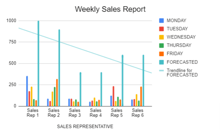
A visualization of your weekly sales report gives you a clearer picture of your sales team’s weekly performance.
This helps you uncover gaps or areas of opportunity that you can address to improve your company’s sales performance.
If you want to know more, read our post on How to Build a Weekly Sales Report in Google Sheets.
Track your lead to opportunity conversion rate
To understand why you need to monitor your lead to opportunity conversion rates, first you’ll need to learn what these terms are, and why they are important.
Leads and opportunities can mean differently depending on the company, but generally, leads are sales prospects at the top of the funnel that are not yet qualified and converted to opportunities.
An opportunity, on the other hand, is a converted lead that went through the qualification process and met the criteria to enter your pipeline.
In Salesforce, an opportunity means the lead has gone through the Unqualified, New, Working, Nurturing, and Converted stages.
To get your lead to opportunity conversion rate, calculate the percentage of leads that convert to opportunities using this formula:
Lead converted to opportunities / Total number of leads = Lead to Opportunity Conversion Rate (%)
Tracking your lead to opportunity conversion rate will boost your revenue. It helps you optimize your lead qualification process to avoid needless resource spending, identify effective lead nurturing strategies, and uncover best practices based on high-performing team members.
Knowing the number of leads that convert to opportunities also helps your teams manage customers better since they can balance their efforts between your existing and new clients.
Additionally, this can help you identify leaks in your funnel since low lead to opportunity conversions is a telltale sign of gaps or issues in your sales pipeline.

Stop exporting data manually. Sync data from your business systems into Google Sheets or Excel with Coefficient and set it on a refresh schedule.
Get Started
Use Google Sheets to track your lead to opportunity conversion rate
It’s easier to do this on Google Sheets mainly because in Salesforce, Leads and Opportunities are separate objects and SFDC cross-object reporting can be difficult.
A common way to do lead to opportunity conversion rate tracking is to import your Leads (or campaign data) and your Opportunities from your Salesforce account into Google Sheets.
Then, use the VLOOKUP function across your imported data using an ID, such as Salesforce Lead ID or Salesforce Opportunity ID.
Google Sheets VLOOKUP works by looking up and retrieving matching data from another table on the same or different sheet.
Let’s say you have two tables containing your lead and opportunity data. After importing your Salesforce data, you can use your Lead ID as a unique identifier.
Use the VLOOKUP function to pull the number of leads converted to opportunities from both tables (or sheets) and determine your lead to opportunity conversion rate.
This is one of the most effective and efficient ways to use Google Sheets to analyze your data to track lead to opportunity conversion rates.
Click here to get more in-depth information from our post on How to Track Lead to Opportunity Conversion Rate in Google Sheets.
Make a sales pipeline dashboard
A sales pipeline dashboard or report allows you to track your sales performance and assess whether your sales team is hitting its targets.
Having quick access to your sales pipeline reports is critical to closely monitor your conversion rates, sales trends, and strategies that help your teams win new and more clients.
While this isn’t always easy to accomplish, an effective method is to create a spreadsheet-based sales pipeline dashboard in Google Sheets for convenient sales progress tracking.
But why Google Sheets?
It’s free, generally easy-to-use, and allows for team collaboration since users with access can contribute data directly to the spreadsheet. You can also import and export data seamlessly with the help of robust Add-ons and apps.
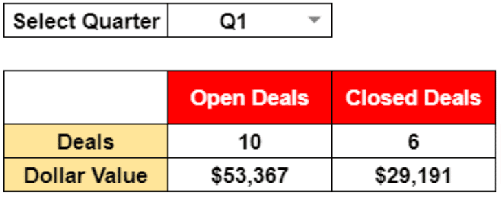
Start by importing your sales pipeline data from the data source into your spreadsheet. Then, ensure you lay out all the data and perform the calculations critical to your sales pipeline.
This includes:
- Open and closed deals and their dollar values
- Open deals stage-wise details
- Deals won and lost, including segment-wise details of the deals
- Year over year sales analysis
- Sales rep or team member performance
- Graphs
For instance, to calculate the number of closed or open deals and their respective dollar values, use the SUMIF(), SUMIFS(), COUNTIF(), and COUNTIFS() formulas.
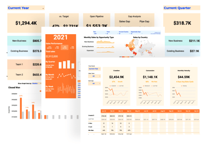
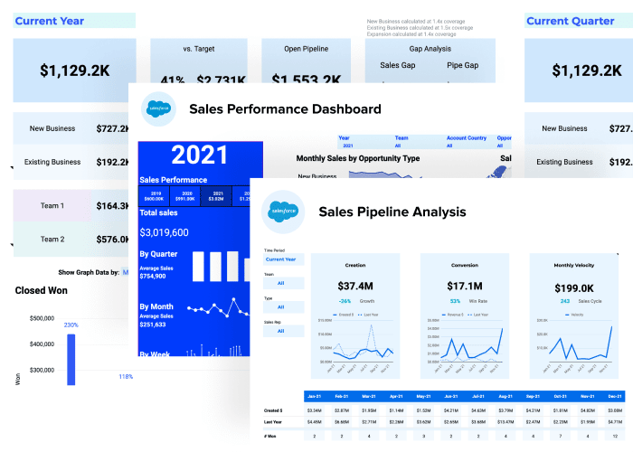
Below is an example of how your final output can look like (depending on your dataset).
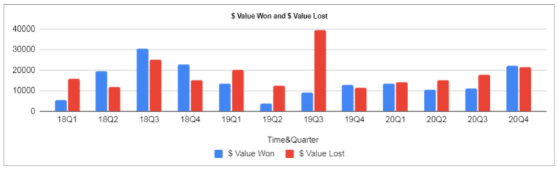
To create graphs, use Google Sheets Chart Editor to build essential visualizations for your sales pipeline dashboard.
For example, you can make a bar graph of your won and lost projects for each quarter within a three-year period.
Comprehensive sales pipeline dashboards help you and your sales teams pinpoint gaps and weak areas in your sales cycles, processes, and operations. This allows you to implement the right adjustments promptly to improve your sales performance and boost your revenue.
Check out our post on How to Create a Sales Pipeline Dashboard in Google Sheets to learn more about building this type of report.
Use Coefficient to streamline your sales operations reporting
We know that importing and exporting data from one software to another can be time-consuming and tedious.
What’s more, manual data importing and exporting leave plenty of room for human errors, which cause inaccuracies in your datasets. This can slow down your information flow, making your sales operations reporting inefficient and ineffective.
Use Coefficient to automate your data import and export processes.
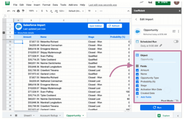
Our software allows you to pull data from a SaaS system, file, or another database instantly. Then sorts and filters the information before syncing to your spreadsheet.
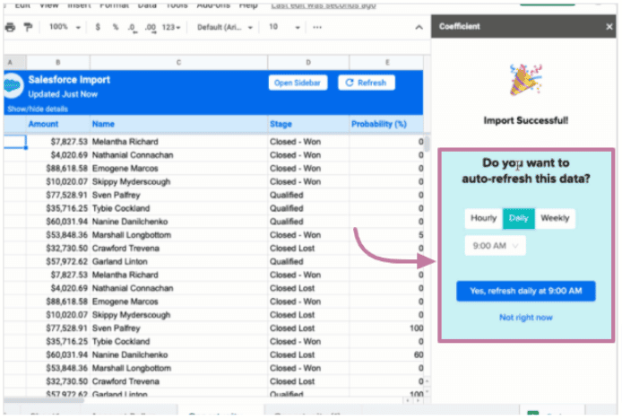
You can avoid manual data importing since Coefficient lets you schedule automatic data updates. This means any changes to your Salesforce data, for instance, automatically syncs with your spreadsheet file.
Use Coefficient’s filter and limits features to specify the data fields you want to include. This way, you only import the data you need to work with and eliminate extra steps to hide or remove columns on your spreadsheet file.
Keep your data accurate and always up-to-date without manually importing from your data sources every time the information changes by using Coefficient’s auto-refresh option.
You can also configure Slack to send email alerts to your team each time your data updates or set a custom notification schedule. Here’s a video walkthrough of how to trigger Slack notifications for Closed-Won Opps from Google Sheets.
Video Walkthrough: How to Trigger Slack Notifications for Closed-Won Opportunities from Google Sheets
With Coefficient, you can import (and export) data seamlessly and gain faster time to insights, supercharging your sales operations reporting.
Simplify your sales operations reporting processes
Creating and running sales operations reports can be overwhelming, but leveraging the power of Google Sheets and Coefficient can simplify and streamline this process.
As long as you use the right tools and implement the right methods and strategies to manage, sift through, and analyze your data, building your sales ops reports can be very straightforward.
With robust sales dashboards and reports, you get valuable and actionable insights that you need to make better business decisions.
Try Coefficient for free today!