


Creating professional graphs in Google Sheets can be time-consuming and complex, especially when you need to present data clearly. Our free template gives you ready-made, customizable graphs that help you visualize your data effectively.
What are Google Sheets Graphs?
A Google Sheets Graph is a visual presentation of data using various chart types like bar charts, line graphs, pie charts, and scatter plots. These reports transform raw numbers into clear visual patterns, making it easier to spot trends, compare values, and share findings with others.
The right graph can make complex data sets understandable at a glance, whether you’re tracking sales performance, analyzing website traffic, or monitoring project progress.
Benefits of Using Our Google Sheets Graphs Gallery
- Pre-built Chart Formats: Start with professionally designed graphs – no need to configure settings from scratch
- Custom Styling Options: Adjust colors, fonts, and layouts to match your brand or preferences
- Multiple Chart Types: Access various graph styles in one template, from basic bar charts to advanced scatter plots
- Simple Data Input: Clear layout with designated cells for your data entries
- Built-in Formulas: Automatic calculations and data processing ready to use

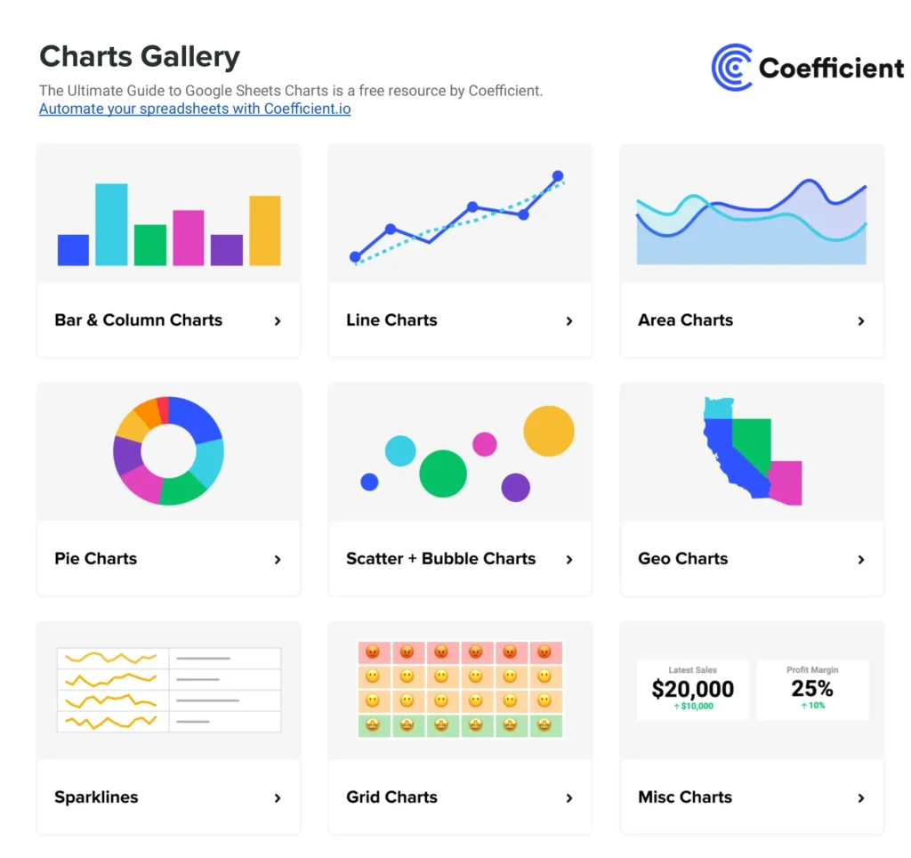
Gallery Features
- Bar graphs with customizable axes and labels
- Line charts for tracking trends
- Pie charts for showing proportions
- Scatter plots for correlation analysis
- Area charts for cumulative totals
- Column graphs for comparison
- Combination charts for multiple data types

Creating Effective Graphs in Google Sheets
How to Make a Basic Google Sheets Graph
- Open the template
- Input your data in the highlighted cells
- Select your preferred chart type
- Customize colors and labels as needed
- Copy or download your completed graph
Tips for Better Data Visualization
- Keep designs simple and clean
- Use consistent colors for related data
- Label axes clearly
- Include a descriptive title
- Add data labels when necessary
Common Graph Types and Their Uses
Bar Charts Best for comparing categories or showing changes over time. Use when you need to compare values across different groups.
Line Graphs Perfect for displaying trends and patterns over time. Ideal for showing continuous data like monthly sales or temperature changes.
Pie Charts Use these to show parts of a whole. Most effective when displaying percentages that add up to 100%.Scatter Plots Excellent for showing relationships between two variables. Use when examining correlations in your data.