Salesforce Reports allow organizations to drive more revenue with data-based decision-making.
You can use Salesforce Reports & Dashboards to chart the productivity of your company, understand how employees are utilizing sales tactics, and adjust selling strategies to hit quotas.
In this article, we’ll review everything you need to know about joined reports in Salesforce, including what they are, how to use them, and common use cases.
Salesforce report blockers holding you back?Sync live Salesforce data into Google Sheets, build any report you need, and share with your stakeholders for free (no extra Salesforce license needed).
Salesforce Report Types
Before we dive into joined reports, let’s review the different report types in Salesforce CRM. There are primarily four report types which we’ve outlined below.
Tabular Reports
Tabular Reports, often called Tables, are a basic list of data. There are no groupings, and this is an ideal option when it comes to exporting data for manipulation in Google Sheets.
Tabular reports are often used as a starting point for data to be cleansed and uploaded via other tools such as Data Loader. However, the Data Loader is often limited and prone to error, which is why many users leverage a dedicated Google Sheets Salesforce connector instead.
Tabular report formats are also ideal for “top ten” lists of Accounts (or other object records). Some examples of these reports would include Accounts at High Risk, Highest Grossing Opportunities, or Contracts Up for Renewals.
Summary Reports
Summary Reports are one of the most popular report types, based on their flexibility and visualization capabilities, such as charts and graphs. In a Summary Report, data is grouped by a common field, such as Account Name, or Opportunity Owner. The visualizations available for summary reports include, but are not limited to, funnels, pie graphs, and bar graphs.
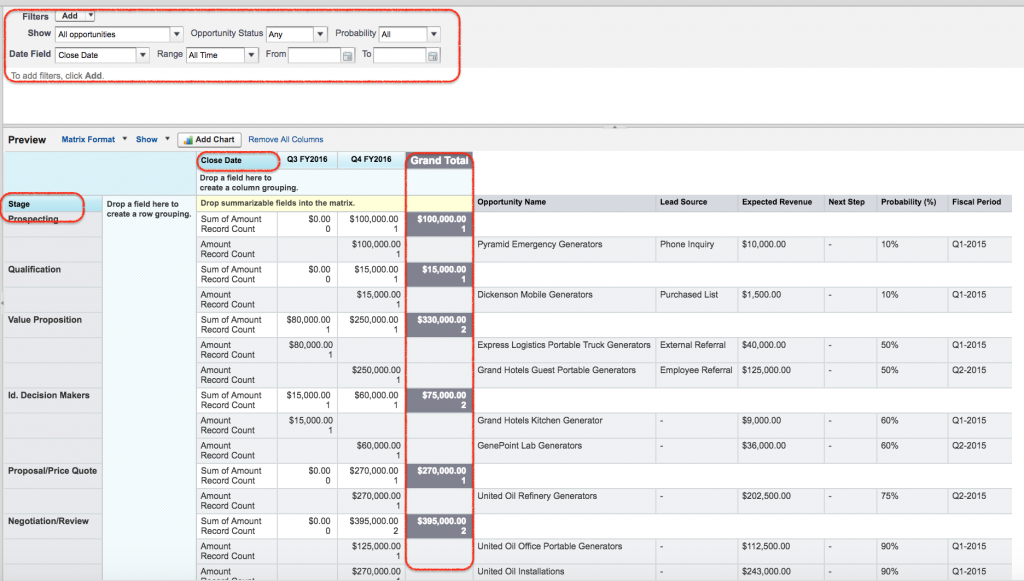
Matrix Reports
Matrix Reports are more complex than tabular or summary reports and are best used for financial or complicated numerical data. You can group both by rows and columns and see it in more of a “matrix” pattern.
Examples of matrix reports include Closed Opportunities per Sales Rep, per month, or year over year data for the past five years on the value of top accounts. And now, we get to the main event: Salesforce Joined Reports!
Joined Reports
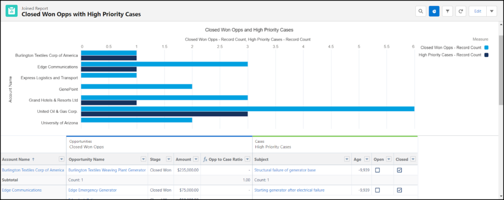
A joined report is a Salesforce report that allows you to show data that share a relationship with one or more objects.
Joined reports are often used when objects are not in parent-child relationships, such as Accounts and Opportunities.
Here’s an example. A joined report might show relationships between Opportunities and Cases, since they share a relationship with Accounts.
This differs from the Tabular, Summary, and Matrix report type in that it’s a unified display of different reports.
Examples of Joined Reports in Salesforce
There are many examples of joined reports functionality that you can take advantage of to build out your analytics, such as:
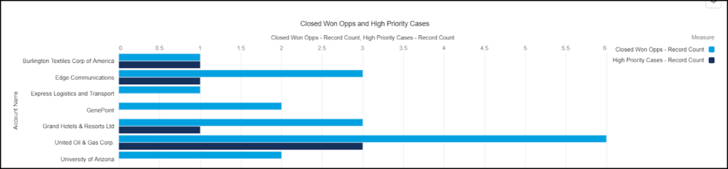
Opportunities with High Priority Cases Ratios (seen in tutorial below)
Support Reps Scorecard
Pipeline Predictor by Sales Rep Success
Any custom object + Accounts
Top Accounts with Open Cases
As long as a relationship exists with a common object, you can build a joined report in Salesforce.
Step-by-Step Walkthrough: Joined Reports in Salesforce
Let’s say you want to see a connection between Closed Won Opportunities and how many high priority Cases there are for that Account. This will help you gauge if there is a correlation between deal size and customer issues.
To do this, we must create a joined report that shows a ratio between Closed Won Opportunities and High Priority Cases.
Here’s a step-by-step guide on how to set the joined report up:
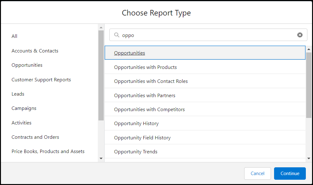
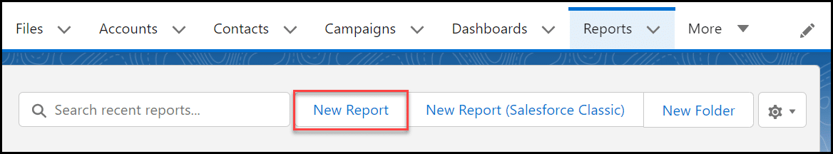
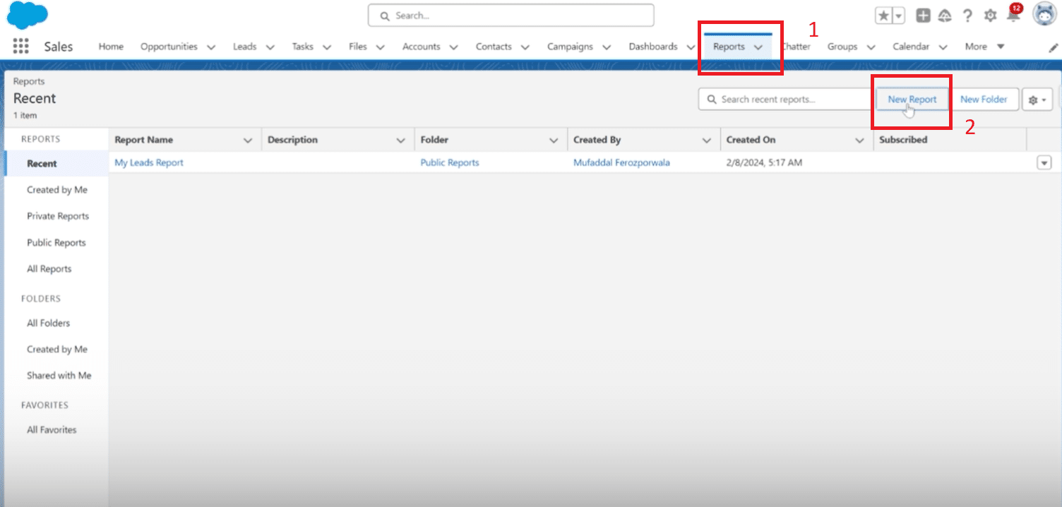
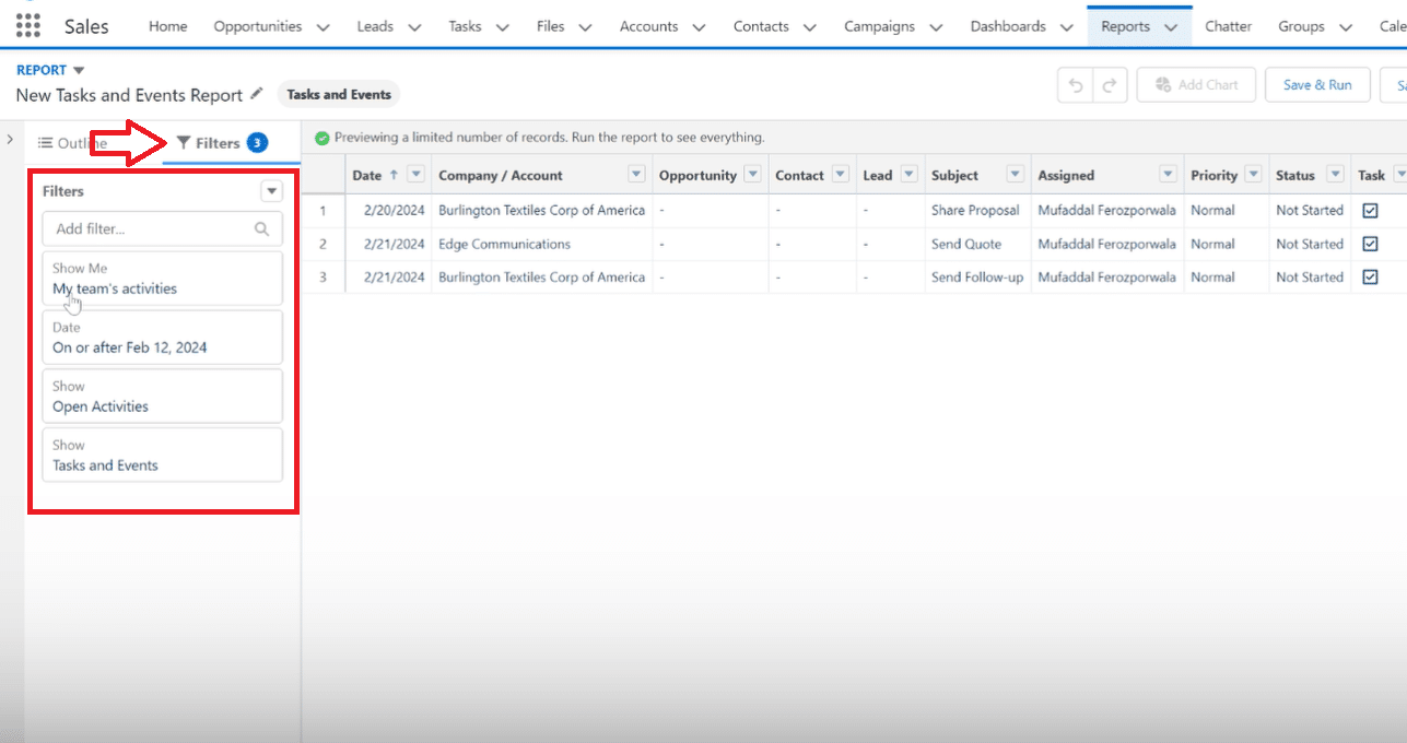
Navigate to the Reports tab and select New Report.
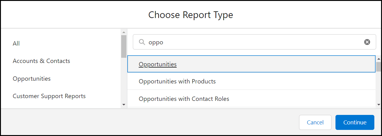
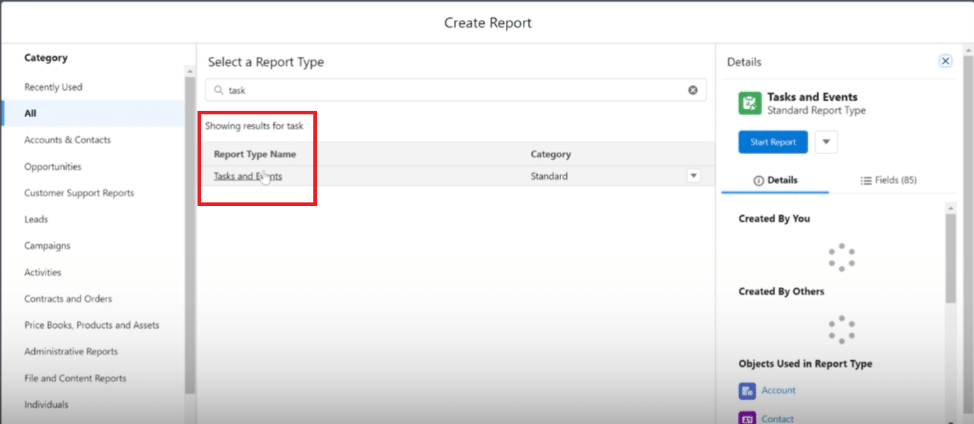
Choose your primary report type. In this example, we chose Opportunities. Select Continue.
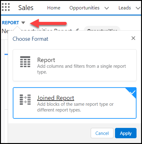
After the report is generated, choose the drop down beside Report and choose Joined Report. Select Apply.
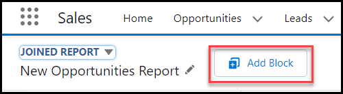
5. Select Add Block in order to add your second report type.
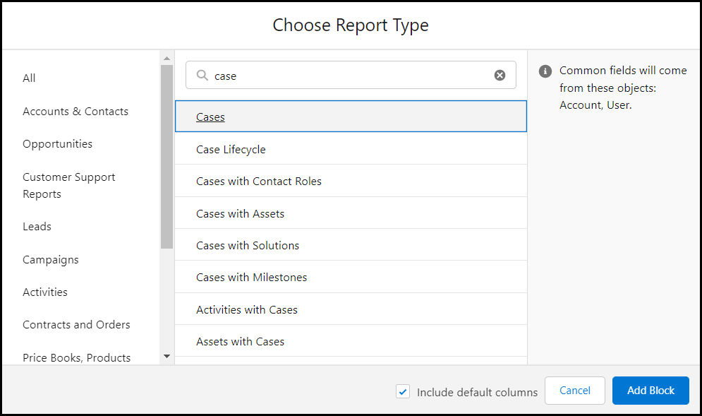
6. Choose your second report type. In our example, we chose Cases. Select Add Block.
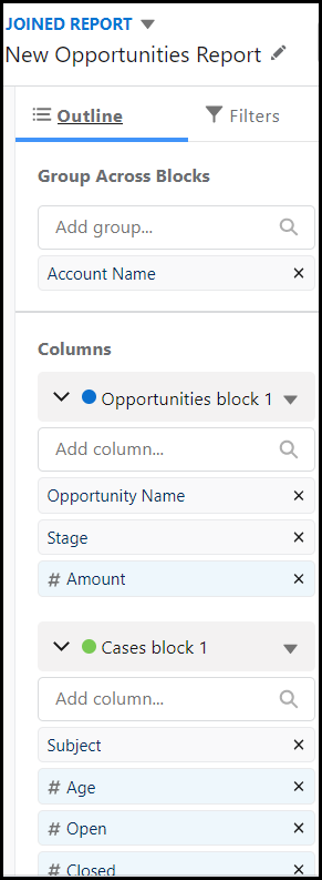
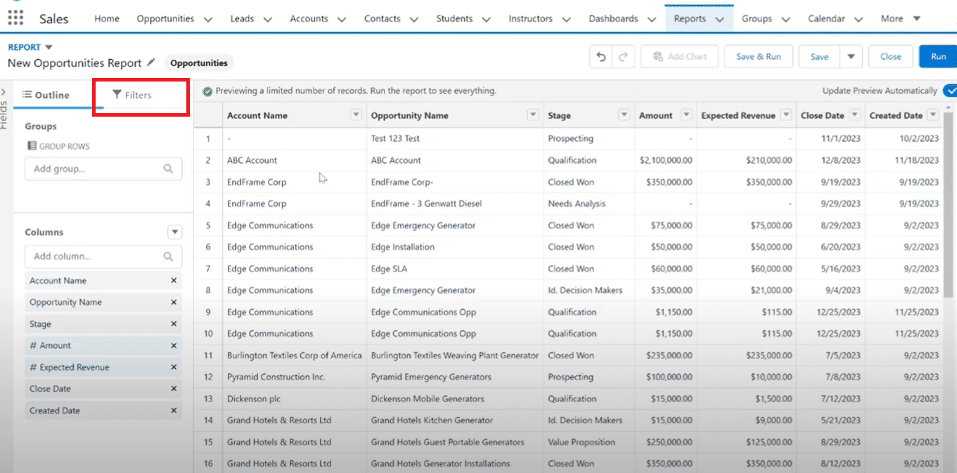
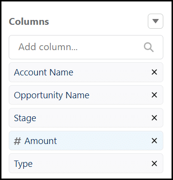
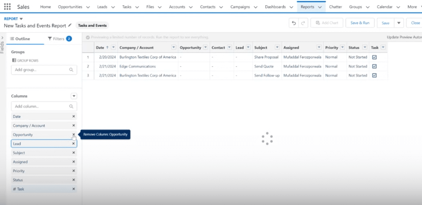
7. Adjust your columns by ensuring the Outline tab is selected. Add columns under the appropriate block based on your objects.
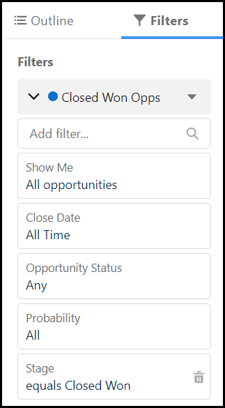
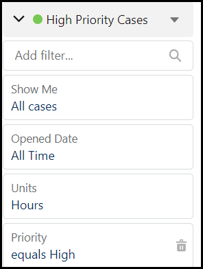
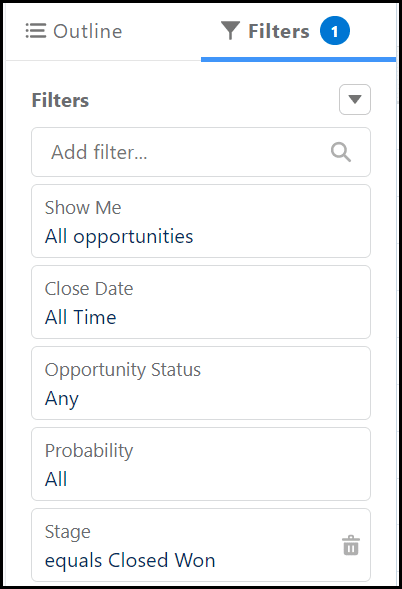
8. Select the Filters tab to reduce the results in the report and focus the data. We added a report filter for Stage under the Opportunities block and a filter for case priority under the Case block.
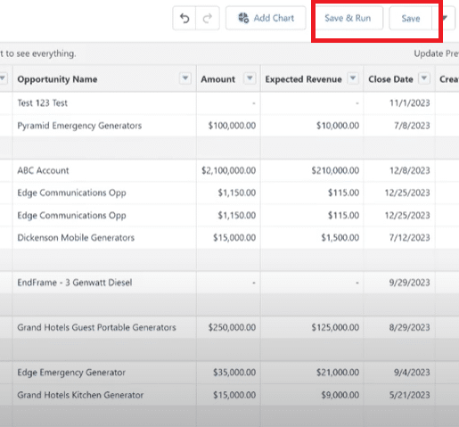
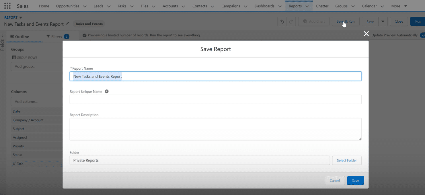
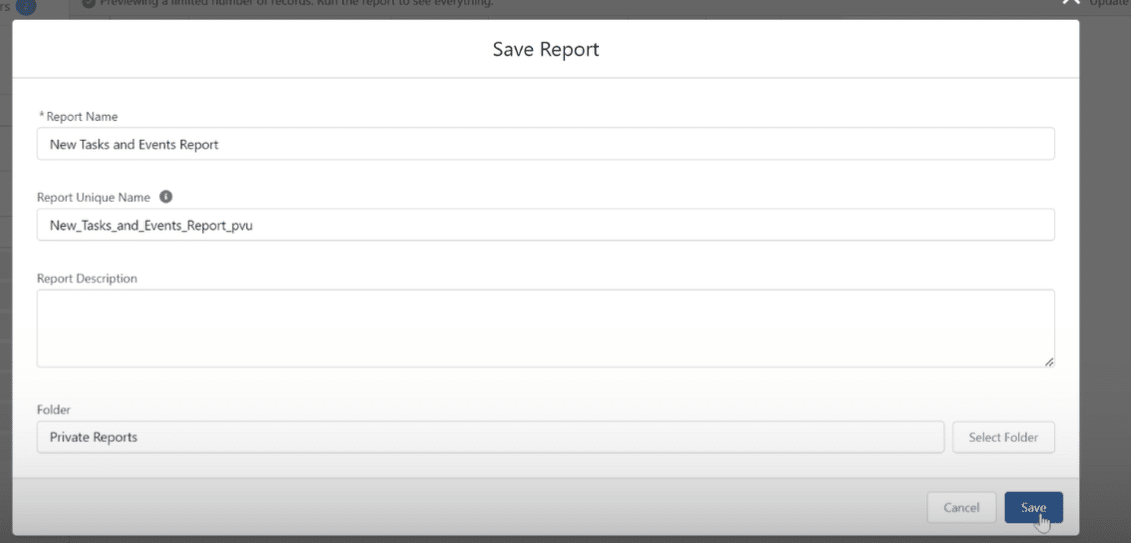
Don’t forget to Save & Run.
Congrats – You’ve built a Joined Report in Salesforce! But don’t stop there – you can still make additions to your joined report to make it more robust.
Add a Formula to a Salesforce Joined Report
Adding a formula to a joined report in Salesforce can help make the data more useful for analysis.
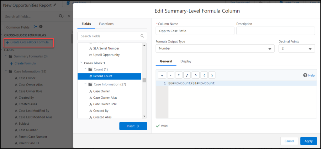
Let’s continue with the example above and build a formula that divides the number of opportunities by the number of high priority cases.
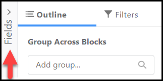
9. Select the Fields expandable menu (vertical, beside Outline).
10. Select Create Cross-Block Formula. Build your formula by selecting and inserting fields into the formula box.
In our example, we want to create a ratio between Opportunities and Cases, so we’ll select the Record Count option from each block. You can validate your formula, and once Valid, can select Apply.
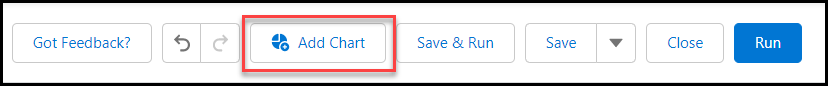
Add a Chart to a Joined Report
Adding a chart to a joined report is a great way to visualize the intersection of your Salesforce data.
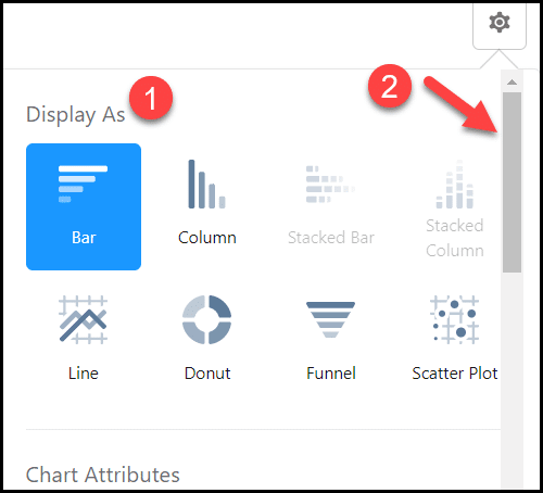
11. Select Add Chart at the top of your report.
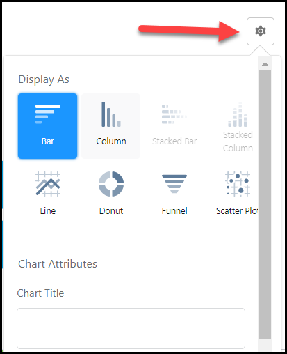
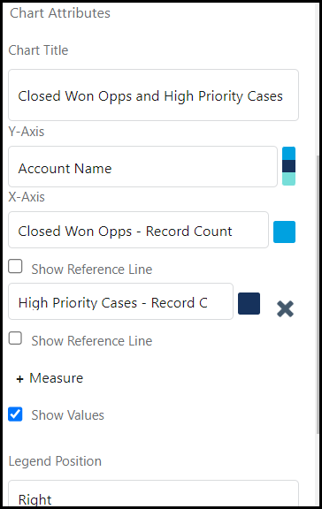
12. Select the wheel in the chart widget to edit Chart Attributes.
13. Adjust the attributes to fit the image you need to display.
And there you have it! A chart that now complements your Salesforce Joined Report!
Check out Salesforce Emily’s walkthrough on joined reports for a full video tutorial on how to create joined reports:
Video Walkthrough: How to Create a Joined Report in Salesforce
What Permissions Do I Need for a Joined Report?
The two permissions needed in order to create a joined report in Salesforce are:
Create and Customize Reports
Report Builder
These permissions are usually included in System Administrator profiles, but can also be given to super users and assigned via permission sets.
Limitations for Joined Reports in Salesforce
Here are some limitations you should consider before you leverage joined reports in Salesforce. Joined reports cannot do the following:
Add bucket fields
Add cross filters
Apply conditional formatting
Contain five report blocks or less
Utilize report types such as Account History or Lead History
subscribe to joined reports
Certain limitations on dashboard filtering
Joined Reports: Build Multifaceted Data Stories in Salesforce
To summarize, joined reports are a great tool for combining different types of data into a collective visualization to understand a bigger picture of what’s going on in your org.
However, reality is, you will run into reports that can’t be built in Salesforce from time to time, for whatever reason. That’s when the flexibility of spreadsheets come in handy. Tools like Coefficient allow you to sync Salesforce data to your spreadsheet to automate data imports, exports, reports, and notifications without ever leaving your sheet.
Bonus? You can easily blend your Salesforce data with data from your BI tool, DB, payment platform, and other SaaS systems with this one, simple Google Sheets add-on.
Salesforce reporting is a pivotal tool for extracting valuable insights from your data. Among these, “Stage Reports” are essential for effective sales pipeline management, offering dynamic views of opportunities through different stages.
This guide provides a clear, step-by-step process to create a Stage Report in Salesforce, equipping sales professionals and administrators with actionable data insights.
Understanding Stage Reports
A Stage Report in Salesforce refers to a visual representation that tracks the progress of a specific process or project through various stages. It provides a snapshot of where each opportunity, deal, or project stands in its lifecycle.
Importance in Sales: In sales, Stage Reports are pivotal for monitoring the sales pipeline. Each stage represents a key phase in the sales process, from initial contact to closing a deal. Sales teams use these reports to identify bottlenecks, prioritize leads, and forecast revenue.
Importance in Project Management: In project management, Stage Reports are instrumental in tracking the evolution of tasks and milestones. Projects often pass through distinct phases, and these reports provide a visual overview of progress. Project managers utilize them to assess timelines, identify potential delays, and allocate resources appropriately.
Preparing to Build Your Report
While preparing to build your stage report, you need some data and necessary permissions to prepare the report on Salesforce. Here are the required prerequisites to prepare your stage report
1. Ensure Necessary Salesforce Permissions
Permissions Check: Confirm that you have the necessary permissions to create and run reports in Salesforce. Check your user profile settings or consult your Salesforce administrator to grant the required access.
Data Access Permissions: Ensure that your Salesforce profile allows access to the specific objects and fields needed for the report. Adjust field-level security and object permissions as necessary.
2. Overview of Data Needed for a Stage Report
Identify Relevant Objects: Determine which Salesforce objects are essential for your Stage Report. In sales, this often involves Opportunities; in project management, it might be Tasks or Projects.
Select Key Fields: Identify the key fields that represent different stages in your process. For sales, these could include Stage, Amount, Close Date, etc. In project management, it might be Task Status, Start Date, Due Date, etc.
Data Quality Check: Ensure that the data in the selected fields is accurate and up-to-date. Clean up any discrepancies or outdated information to ensure the reliability of your report.
Consider Filters: Think about any specific criteria or filters you want to apply to your report. This could include time frames, specific team members, or other relevant parameters based on your reporting needs.
Step-by-Step Guide: Creating a Stage Report in Salesforce
Creating a stage report is crucial for effective collaboration and tracking the progress of a specific process or project through various stages. Follow this detailed walkthrough to seamlessly create a stage report for your project on Salesforce.
Step 1: Access the Report Module in Salesforce
Log in to your Salesforce account and navigate to the “App Launcher.”
Select the “Reports” app to access the Salesforce Report Module.
Step 2: Select the Right Report Type
Click on the “Create Report” button and choose the appropriate report type.
For a Stage Report, select the report type that aligns with your data structure, such as “Opportunities” or “Projects.”
Step 3: Customizing Report Criteria
Define the criteria for your Stage Report. Specify parameters such as date ranges, opportunity owners, or project statuses to tailor the report to your specific needs.
Step 4: Adding and Organizing Fields
Add relevant fields to your report to capture key information.
Organize these fields to present data logically.
For a Stage Report, consider including fields like “Opportunity Name,” “Close Date,” or “Project Stage.”
Step 5: Applying Filters for Accurate Data
Refine your Stage Report by applying filters.
Filters ensure that only relevant data is included in your report.
For instance, filter opportunities or projects based on specific criteria such as “Closed-Won” or “In Progress.”
Step 6: Saving and Naming Your Report
Once satisfied with your Stage Report settings, click on “Save” and provide a meaningful name for your report.
Choose an appropriate folder for organization and future access.
Enhancing Your Report
To make your Stage Report in Salesforce more insightful and visually impactful, consider the following customization options:
Customization Options: Select relevant fields, group data, and apply strategic filters.
Adding Graphs and Charts: Integrate visual elements for a comprehensive overview.
Dashboard Integration: Incorporate your report into a Salesforce dashboard for a holistic view.
Dynamic Filters: Implement interactive filters for on-the-fly analysis.
Conclusion
Customize your Salesforce Stage Report to align with your organization’s unique needs. Leverage visual elements, strategic data grouping, and Salesforce’s reporting capabilities to maximize utility.
For an advanced data management experience, explore Coefficient. Enhance your Salesforce reporting with Get started with Coefficient and unlock the potential of sophisticated data analysis and management.
Salesforce reports are one of the most impactful features of the CRM platform. They allow your team to organize, analyze, and visualize sales data to make key decisions about your operations and org.
Salesforce offers four different types of reports, each with their own benefits, from tabular reports, to summary reports, to matrix reports, to joined reports.
The most popular Salesforce reports are summary reports.
Summary reports help slice and dice data in a myriad of ways for both custom and standard objects. They allow for groupings, display results as sums or as parts, and any user with the appropriate permissions can build them.
Summary Reports provide incisive results for a diverse array of Salesforce users. They’re in the toolkit for anyone, from a Salesforce Admin building complex company reports, to a Sales Manager who wants to identify high performing reps.
Read on to learn how to build a summary report in Salesforce, based on step-by-step walkthroughs and best-practices.
Salesforce report blockers holding you back?Sync live Salesforce data into Google Sheets, build any report you need, and share with your stakeholders for free (no extra Salesforce license needed).
Benefits of Salesforce Summary Reports
Summary reports are widely leveraged by Salesforce users, due to their power and versatility. Here are some of the benefits of summary reports:
Analyze data grouped in rows
Consume three levels of data in one view
Combine charts, summary fields, and bucket fields
Add easy-to-understand visuals in dashboards
Access subtotals to get more granular results
How can you use summary reports in your org? Next, we’ll review a few common examples in Salesforce.
10 Examples of Summary Reports in Salesforce
You can create a summary report for just about anything in Salesforce. Some of the common use cases include, but are not limited to:
Top Performing Sales Reps by Region
Most Valuable Accounts per Opportunity Amount
Opportunity Pipeline this Quarter
Customer Support Rep Response Time
Customer Satisfaction by Support Rep
Neglected Leads to Focus On this Week
Hot Leads that Need Attention
Contracts Up for Renewal Ranked by Amount
Tasks Due Today by Team Members
Custom Object Records of Your Choice
If the data can be segmented, it can usually be inserted into a summary report in Salesforce.
And as long as reporting is enabled for custom objects, they will mesh seamlessly with summary reports.
Now let’s learn how to build a summary report in Salesforce.
How to Build a Summary Report in Salesforce
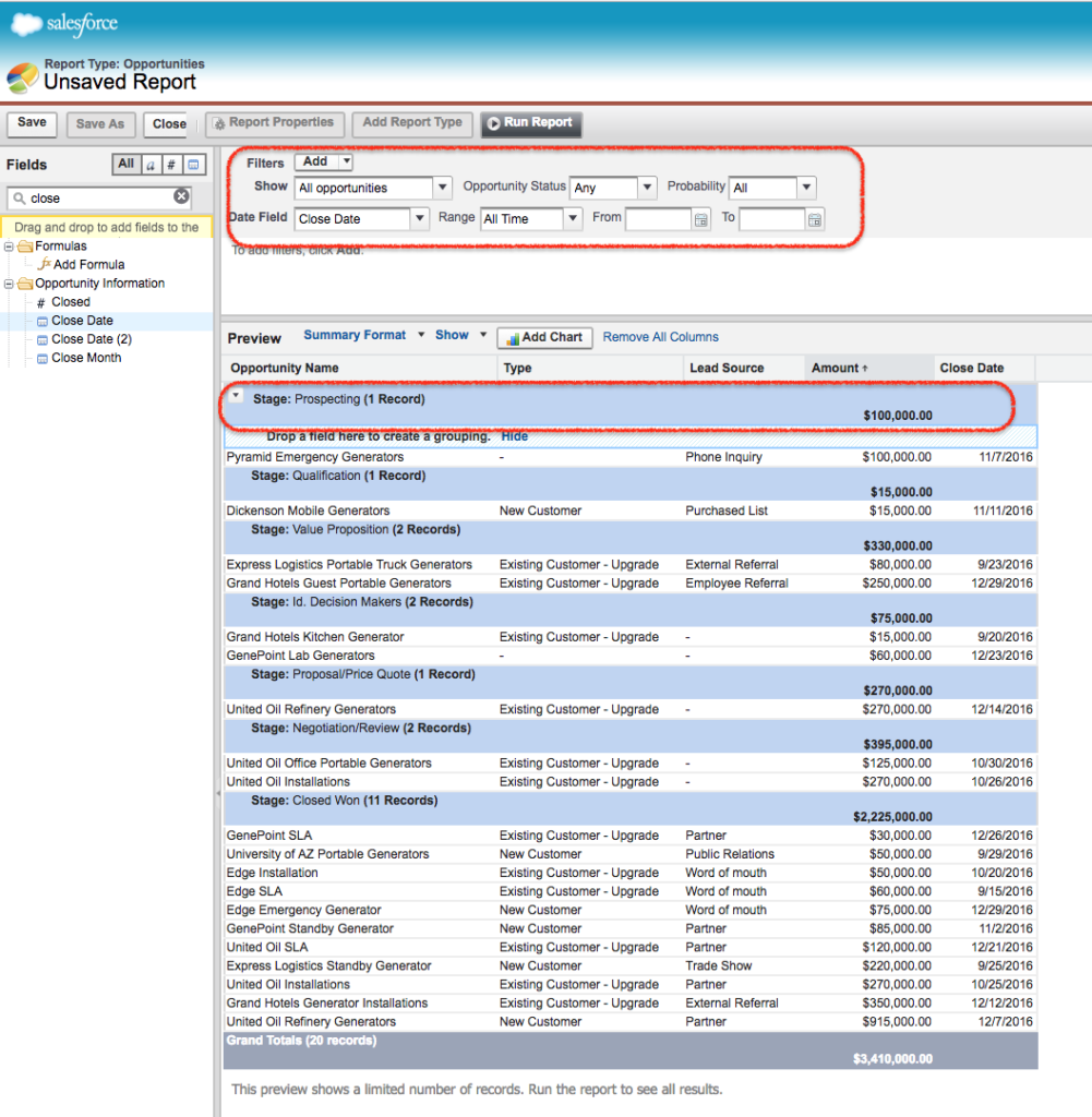
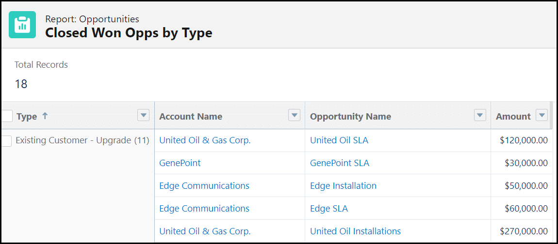
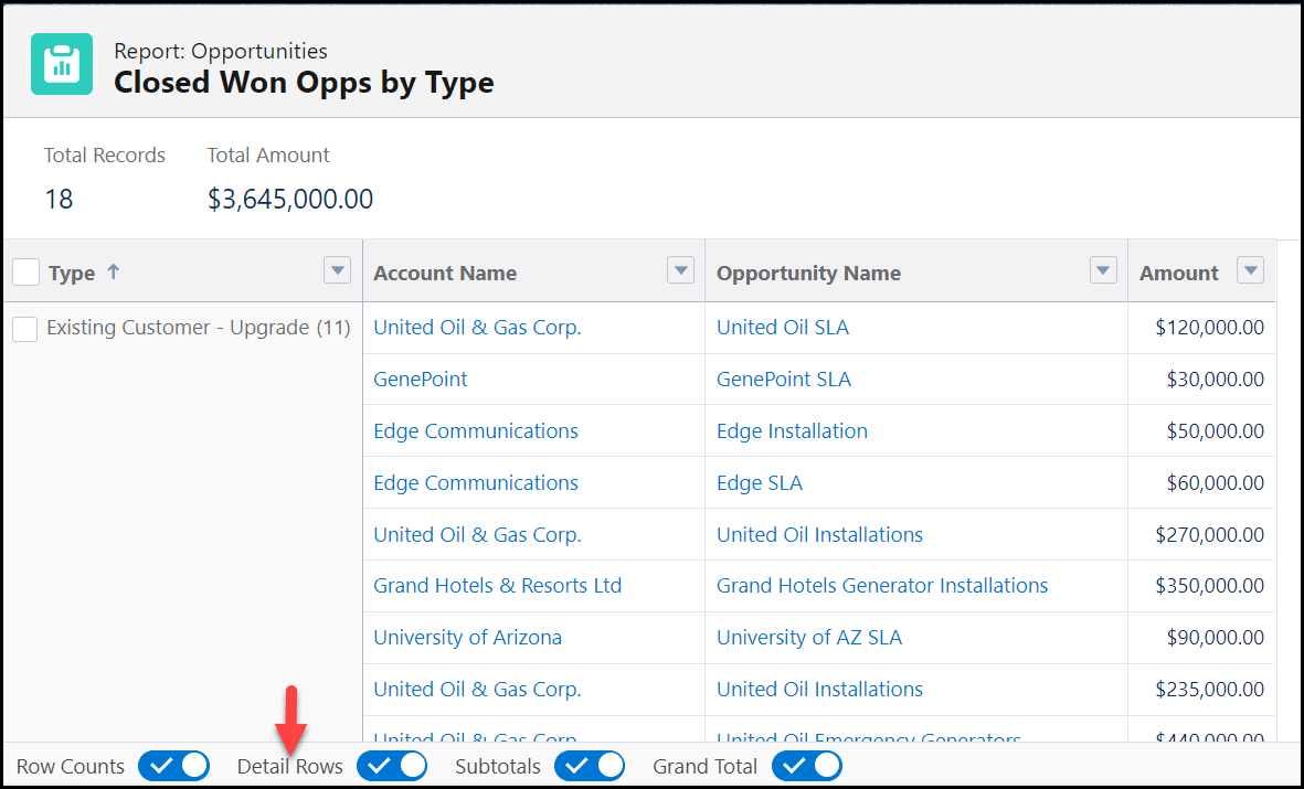
Building a summary report in Salesforce is actually quite easy. In our example, let’s view Closed Won Opportunities sorted by Type.
This will give us a better look at our revenue sources so we can focus on those in the coming quarters. Here’s how to build the report.
Navigate to the Reports tab and select New Report.
Select the object for the basis of your report. For this example, we want to view Opportunities. Select Continue once your object (or objects) have been selected.
Select the Filters tab, and begin to make adjustments. For our report, we changed Close Date to All Time and added a filter for Stage since we only want to see Closed Won.
Next, select the Outline tab. Clean up the Columns by selecting the “X” beside fields you do not wish to see in this report, and search for and add any fields you would like to see.
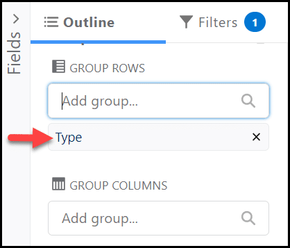
White still on the Outline tab, add a field to the Group Rows section. This is what helps segment the report. For our report, we added the Type field.
Next, change the name of your report by selecting the pencil and select Save & Run to see the results. Once a folder is selected, your report will appear.
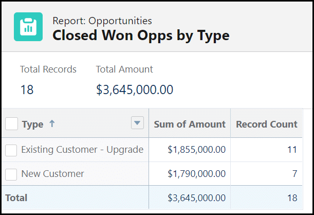
Congrats! You now have a Summary Report in Salesforce! Use this time to make adjustments. Let’s remove the Stage field from the report since a filter focuses only on one stage.
But don’t stop there! You can make enhancements to your summary report that make it even more informative.
Enhancement Options
You can enhance your summary report to view your data in different ways, depending on what you need to accomplish. Here are some different ways to toggle your reports and improve your insights.
Turn Off Detail Rows
In some cases, you’ll just want to see raw numbers, without the details of record names or all the fields in one long report. There’s a simple solution for this — you simply need to turn off the Detail Rows.
You can see in this report that Detail Rows have been enabled, indicated by the white checkmark and blue background.
To turn that off, simply select the check. You can now see a more condensed version of your report.
This is not a permanent change and can be done quickly and easily to see a breakdown of your report without having to scroll.
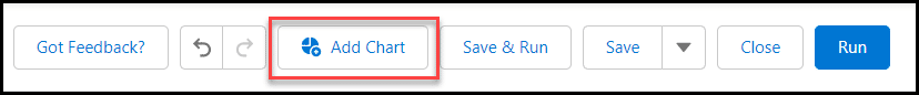
Add a Chart to Your Summary Report
A colorful visualization can supplement your summary report, and it does not take long to add. Plus, if you plan on using your summary report in a dashboard, a chart is essential.
Select Add Chart from within your report.
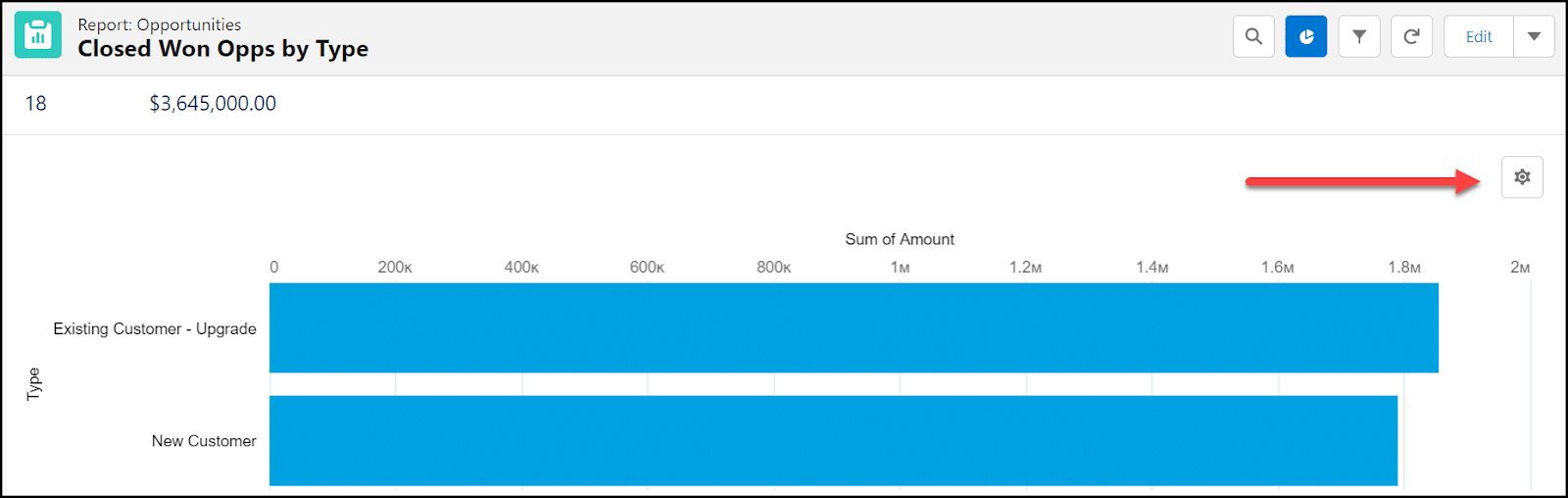
A chart will automatically appear, but you can make changes by selecting the wheel from within the chart.
Select your Display As (1) to indicate the type of visual you want, then scroll down (2) within the Chart Properties box to make additional changes.
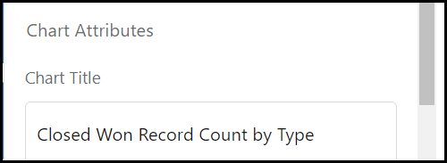
Under Chart Attributes, enter a name for Chart Title. Continue to scroll through Chart Properties.
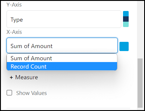
Adjust X-Axis and Y-Axis if needed. Select the field under each Axis to see other options. In this example, we changed the X-Axis from “Sum of Amount” to “Record Count”. You can also choose to change colors, indicate measurement lines, or show values on the chart graphic.
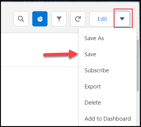
Once you’re done making adjustments, select the drop down beside Edit on the report and select Save.
Now you have a chart that’s a hefty addition to your report and dashboard. This makes the data easier to digest and less overwhelming for those that find rows of results difficult to comprehend.
How to Access Summary Reports
The last thing you want to do is create a report and never use it again. There are numerous ways to access your reports once you’ve built them.
Subscribe to your reports to have them emailed to your inbox.
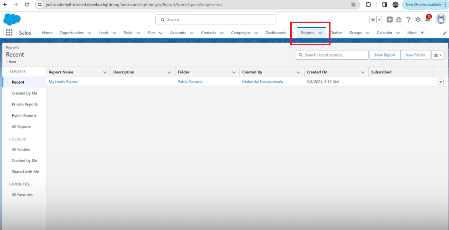
Find your report on the Reports tab on your home page.
Access a dashboard that has all of your reports lined up for easy visibility.
Nest a report on your Home screen.
There are also tips to keep in mind when it comes to making the most of your Salesforce Summary Reports.
3 Pro Tips
In our work with hundreds of sales teams, we’ve learned a thing or two about summary reports and how to best use them. Here are three ways to make your Salesforce summary reports more efficient:
Don’t be afraid to play around with your report and save a version or two. You may discover you like it displayed differently depending on your audience.
Keep your chart simple! Use the appropriate display for the type of information you have in your report.
Use one report for multiple dashboard widgets. You can display the same data in multiple graphs, and reduce clutter by not having the same report saved numerous times.
Now that you know how to create a Salesforce Summary Report, you can keep an eye on important data and trends within your org!
Import Summary Reports into Spreadsheets for Expanded Analysis
Although Salesforce summary reports offer key insights, importing them into Google Sheets enables you to engage in expanded analysis and visualizations and share with stakeholders that don’t have access to an expensive Salesforce license.
With Coefficient, you can connect Google Sheets to Salesforce in a single click and import Salesforce data from existing reports, objects & fields, and custom SOQL queries.
Here’s how to import a summary report into Google Sheets with Coefficient:
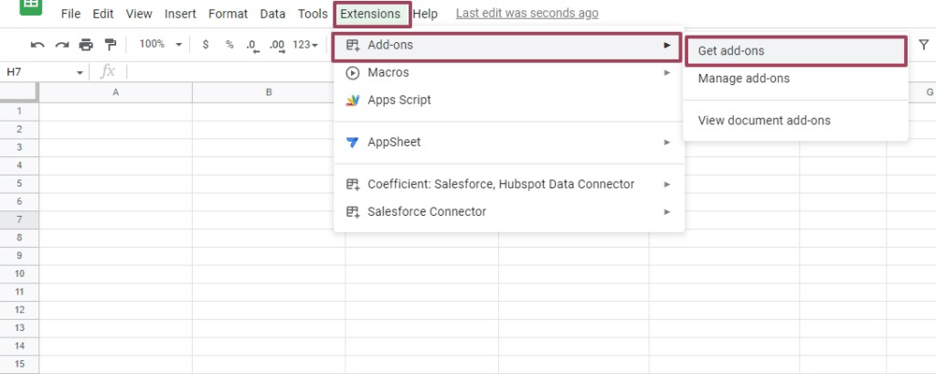
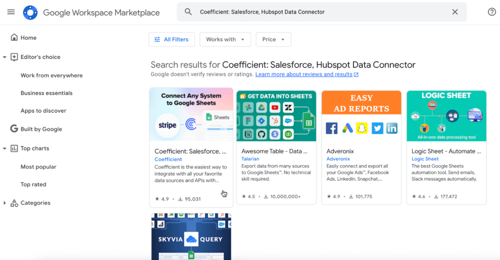
Click Extensions from the Google Sheets menu. Select Add-ons and choose Get add-ons. This will bring you to the Google Workspace Marketplace.
Search for “Coefficient”. Click the Coefficient app.
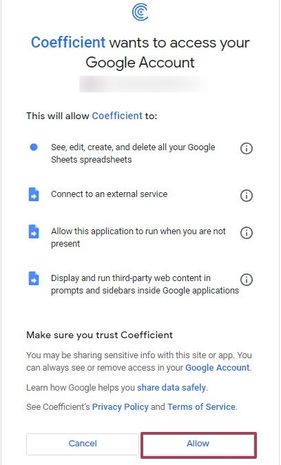
Approve the prompts to install.
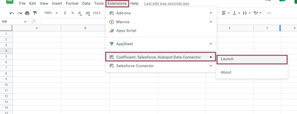
Once installation is finished, return to Extensions on the Google Sheets menu. You will see Coefficient available as an add-on.
Launch the app. Coefficient will run on the sidebar of your Google Sheet.
Step 2: Select Import From… on the Coefficient sidebar
Choose Salesforce as your data source.
Enter your Salesforce credentials and press authorize. You will enter the “Import Salesforce” tab.
Here, you can choose to import data from a Salesforce report, Object & Fields, custom SOQL queries, or saved library imports.
Choose “From Existing Report” to import your summary report.
Choose your summary report and then click “Import”.
Your summary report will populate in your spreadsheet.
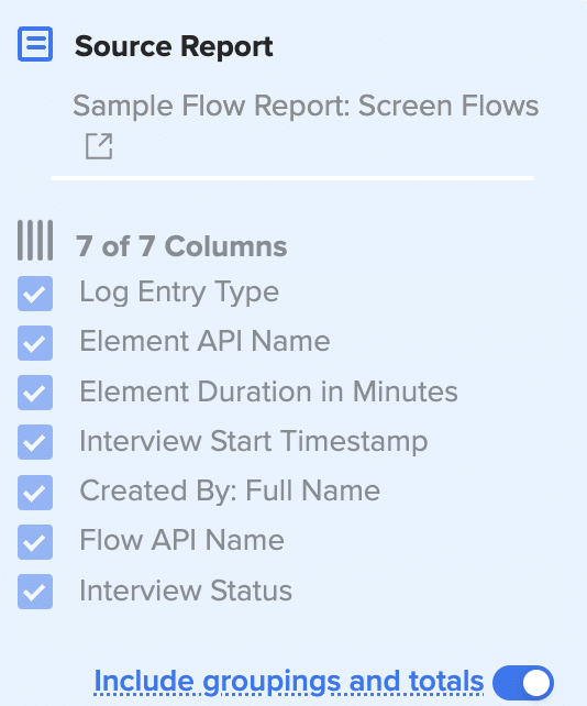
Navigate to the Coefficient sidebar to modify your source report in your spreadsheet.
Choose the columns you want to include. Also, turn on “include grouping and totals” to import the raw data behind the summary.
Coefficient automatically refreshes data to keep your Salesforce data up-to-date in your Google spreadsheet. You can configure your data to auto-refresh hourly, weekly, or monthly.
Coefficient also enables you to refresh data instantly by clicking the Refresh button at the top of your imported dataset.
Summary Report Versatility
Summary reports are the most popular report type in Salesforce, and for good reason. They enable you to analyze data grouped in rows, add easy-to-understand visuals in dashboards, and combine charts, summary fields, and bucket fields.
And if you want to make your Salesforce data analysis even more flexible, import your Salesforce reports into Google Sheets and leverage the built-in power of spreadsheets to generate new insights.
Get started with Coefficient for free to pull your Salesforce data into Sheets and conduct advanced visualization and reporting in your preferred spreadsheet platform.
Are you struggling with the limitations of Salesforce reports? You’re not alone. Many teams find these restrictions frustrating, but there are powerful alternatives and solutions that can transform your approach to managing and reporting on your Salesforce data.
Understanding Salesforce Report Limitations
Salesforce, while powerful, comes with its set of challenges that can restrict your ability to fully leverage the data within your CRM. By understanding these limitations, organizations can better strategize on how to complement Salesforce’s capabilities with tools like Coefficient, which are designed to simplify data manipulation and enhance reporting flexibility.
Salesforce Report Limitations You Might Encounter
Row and Data Export Limits: Salesforce reports are restricted to displaying up to 2,000 rows in the browser interface, with the option to export up to 100,000 rows depending on your organization’s permissions and settings. This limitation can be a major hindrance when trying to perform comprehensive data analyses directly within Salesforce.
Custom Reporting Limits: Not all Salesforce editions support custom reporting. For example, the Essentials and Starter editions, tailored for smaller businesses, lack advanced features like custom reporting. This limitation can prevent businesses from tailoring reports to meet specific informational needs, which is crucial for strategic decision-making.
Complexity and User Access: Customizing reports in Salesforce can be complex, requiring a certain level of expertise. Additionally, Salesforce often restricts modification rights to users with administrative access. This can create bottlenecks in organizations where only a few individuals have the necessary permissions to alter report setups, leading to delays and dependencies.
Interface and Usability Challenges: Salesforce is not the most user-friendly platform, especially when it comes to configuring and managing reports. Users often need a deep understanding of the platform to navigate and use its reporting tools effectively, which can lead to inefficiencies and a steep learning curve for new users.
Performance Issues: Especially in its Lightning version, Salesforce can perform slowly, complicating the process of adding filters or making report adjustments. This can significantly impact the user experience, making it frustrating to work with large amounts of data or complex report configurations.
Strategies to Overcome Report Limitations
Expanding data visibility beyond these standard limitations is crucial for businesses looking to derive deeper insights and make informed decisions.
This section explores how overcoming these barriers (by leveraging advanced data connectivity tools like Coefficient) can transform the accessibility and usability of business data, allowing for more dynamic and extensive data interaction directly within familiar spreadsheet environments.
We’ll not only dive into the possibilities, but also how org’s like Miro have been getting deeper, faster insights from their Salesforce data for years with Coefficient.
First things first, what is Coefficient?
Coefficient, a 5-star rated app on AppExchange used by over 550,000 professionals, offers a seamless solution to bypass these report limitations by integrating your spreadsheet – whether you use Google Sheets or Excel – directly with Salesforce and enhancing your spreadsheet capabilities.
Coefficient offers:
Direct Integration with Salesforce: Import your Salesforce data and reports directly into Excel or Google Sheets. This bypasses the typical row and customization limits, allowing you to work with your data more freely.
Real-Time Data Updates: Coefficient updates your spreadsheets in real time, ensuring you always have the latest data at your fingertips. This is crucial for making timely decisions based on the most current data.
Ease of Use: With Coefficient, you don’t need deep technical skills to manage complex datasets. Its user-friendly interface makes it accessible to all team members, enhancing productivity across your organization.
Salesforce Formula Imports: With functions like =salesforce_lookup and =salesforce_report_search, you can pull live CRM data instantly. Filter, sort, and return exactly what you need—whether that’s passing a list of emails to a rep, surfacing top deals in a meeting, or checking the stage of a specific opportunity.
AI Workflows & Analysis: Coefficient’s AI Sheets Assistant allows you to instantly build live, customized reports in Google Sheets. Just ask in plain language, and it will pull, filter, and format your Salesforce data so you can answer questions, update dashboards, and share insights in seconds.
Row limitations are null and void – this help article can walk you through the process.
Any custom report is possible with the flexibility of your spreadsheet.
Any stakeholder can access and explore your data regardless if they have a Salesforce license.
Your stakeholders are generally comfortable in spreadsheets and therefore won’t run into many, if any, issues while exploring their data. Especially, if they take advantage of Coefficient’s AI functionality that can build your formulas, charts, pivots, and SOQL.
Your spreadsheet will perform much faster than your Salesforce reports because you’ll only need to select and pull in the exact data you need for your report. Even with large datasets, you can use Cloud Datasets for the speediest performance in your spreadsheet.
Want to see some of the limitations solved in action?
Now, let’s dive into some practical use cases with an org we all know and love, Miro.
How Miro Overcomes Salesforce Report Limitations
Miro’s ops and GTM teams use Coefficient to draw data directly from Snowflake and Salesforce into Google Sheets, effectively bypassing the row, customization, and accessibility limitations of Salesforce reports. This integration provided them with the flexibility to handle large datasets and complex reporting needs without relying on IT or data teams.
In a nutshell, Coefficient enables real-time data access and manipulation, allowing the Miro team to keep up with the fast-paced changes in their business environment, thus ensuring their data analyses were current and actionable.
Enhancing Report Customization
Automated Lead and Forecasting Models: At Miro, Coefficient facilitated the creation of automated lead routing and comprehensive forecasting models directly within Google Sheets. This not only streamlined their workflow but also provided deep insights into lead management and business forecasting that were not readily available through Salesforce.
Custom Applications Within Spreadsheets: Coefficient empowered Miro’s team to build custom applications within spreadsheets and allowed them to tailor projects quickly to the complexity required, making the tool extremely adaptable to varying needs.
Streamlining Access and Collaboration
Autonomous Operation: Coefficient’s ease of use allowed Miro’s RevOps team to operate autonomously with their Salesforce and Snowflake data, without needing constant support from other departments. This independence is crucial for teams needing to iterate fast and test methodologies efficiently.
Seamless Integration and Collaboration: Coefficient’s integration capabilities made it easier for teams at Miro to collaborate on data-driven projects without the typical delays associated with data processing and analysis.
Overcoming Technical Limitations
From Ad-Hoc Analyses to Structured Reporting: Coefficient transformed Miro’s approach from performing time-consuming ad-hoc analyses to establishing a robust, automated reporting structure. This shift significantly reduced the time spent on data management while increasing the accuracy and relevancy of the reports produced.
Conclusion
Salesforce report limitations shouldn’t hold back your team’s potential. Embrace a tool like Coefficient and discover a new level of flexibility and power in your data management and reporting practices. Seamlessly integrate Salesforce data into your preferred spreadsheet environment, bypassing traditional barriers and unlocking capabilities that transform raw data into actionable knowledge.
Customizing Reports – Building different views or drill-downs for stakeholders in sales, finance, or marketing. When multiple users across teams or departments need reports with slight variations, cloning reports ensure that the fundamental structure remains intact.
Visualization Limitations – Analyzing relationships between objects that Salesforce won’t let you join in a single view
Version Control and Experimentation – Experimenting with new metrics to test new formulas, grouping, or visualization changes without altering the original.
Cloning is a quick fix. But trust us, it won’t solve the real problem:
Salesforce CRM is for sales, not reporting. Many Salesforce users agree on this point.
Want better custom report types? Salesforce’ll tell you to buy Tableau. You might even have it already.
But even Tableau won’t give you what you actually need: the freedom to slice data instantly, create custom views on the fly, and answer stakeholder questions in minutes, not days.
How are Salesforce Experts aka Trailblazers Cloning or Duplicating Reports?
They actually don’t. No more cloning. No more exports. They’re building any view they need, keeping it up-to-date without lifting a finger, and sharing it with any stakeholder (yes, they don’t need to have a Salesforce license).
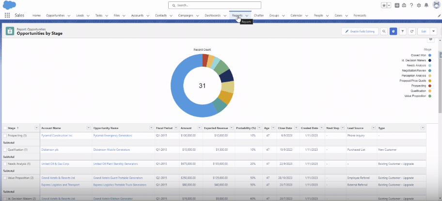
Step-by-Step Guide to Cloning a Report in Salesforce in 30 seconds
Step 1. Log in to Salesforce & Navigate to Reports
Access your Salesforce account with valid credentials. Locate the “Reports” tab in the top navigation bar from your Salesforce dashboard.
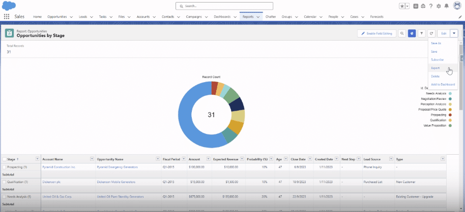
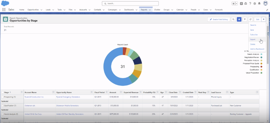
Step 2. Select the Report to Clone and Copy it.
Once your reports have loaded, identify and open the report you want to clone from the list. Click the drop-down arrow icon beside the ‘Edit’ button within the report view.
From the drop-down menu, select ‘Save As,’ and it will proceed to make a copy of the current report.
Step 3. Change Report Name and Choose Folder
Provide a new name for the cloned report. This helps distinguish between the original and cloned versions.
Select the folder where you want to store the cloned report. This could be the same folder as the original, a different one to make edits.
Step 4. Click Save
Click ‘Save’ to create the cloned report.
That’s all! You’ve successfully cloned a report in Salesforce.
How Trailblazers are Building Powerful and Flexible Salesforce Reports without Cloning?Use Coefficient
RevOps teams waste hours cloning reports for different stakeholders and views. Each clone means more maintenance, more errors, and less time for actual analysis.
For example, companies like Miro with data-driven revops teams solved for efficient and flexible salesforce reporting by simply using Salesforce, Spreadsheets with Coefficient. You can read more about it here.
Now, let’s get into why trailblazers prefer salesforce reporting from Coefficient + Spreadsheets.
1. Build master Salesforce dataset to use everywhere
Your team needs different views of the same data – whether it’s pipeline by rep, region, or account, or tailored analysis for marketing and finance.
In Salesforce, each view means another clone. With Coefficient, you can:
Create one master dataset that pulls every record, field, and object you need
Automate refresh schedules that keep your data fresh without manual exports
Update Salesforce records directly from your spreadsheet to maintain data integrity
2. Create Custom Salesforce Report views in minutes
“Can you add this field?” “Could we filter by that?” Sound familiar?
Instead of cloning reports for every request, use your spreadsheet skills to:
Create any view you need with pivot tables and familiar formulas – no Salesforce admin required
Slice and filter data instantly by rep, region, product, or any other dimension
Build complex calculations and custom metrics without touching Salesforce settings
All from the same dataset, all staying fresh automatically. Same source data, different views. Simple.
3. Flexibility – Share reports with teams without Salesforce license
Not everyone has (or needs) a Salesforce license. But they do need data. Right now, that means either expensive licenses or endless CSV exports – and both options mean more work for you.
With Coefficient, you can:
Share live dashboards that update automatically when Salesforce changes
Let leaders explore data on their terms – without coming to you for every drill-down
Keep stakeholders updated with automated Slack alerts for pipeline changes, forecast updates, and key metrics
Better Visualization and ability to track changes over time
Salesforce only shows you data as it exists right now. Want to compare this quarter’s pipeline to last? You’ll need to create (and maintain) separate reports for each time period.
Compare pipeline metrics across any time period without creating new reports
Track how deals progress through stages to identify bottlenecks and optimize your sales process
Show leadership exactly how forecasts, quotas, and territories perform over time
(Bonus) And for those new Salesforce report requests? Don’t create reports from scratch
You know what’s worse than cloning reports? Building new ones from scratch
That’s why we’ve built a library of free Salesforce reports and dashboards for your most common reporting needs. Each template is ready in minutes – just connect Salesforce and watch your data populate automatically.
Salesforce Sales Performance Dashboard
Give your sales leaders the complete picture – pipeline by rep, territory performance, and conversion metrics in one view.
Cloning reports work in a pinch. But you deserve better.
Try Coefficient free and see why thousands of teams trust us to streamline their reporting workflow and make us a top-rated app on appexchange. Your stakeholders (and your sanity) will thank you.
If you’re still focused on cloning reports on Salesforce, these prerequisites ensure a smooth and successful cloning process, allowing users to duplicate reports effectively.
Here are the key things you must know before getting started:
Basics of Salesforce Reports for Beginners
Salesforce reports are powerful tools that enable users to analyze and visualize data within the Salesforce platform. They allow you to organize and present data meaningfully, helping in better decision-making. These reports are based on objects like Leads, Contacts, Opportunities, and more.
Types of Salesforce Reports:
Tabular Reports: Present data in rows and columns.
Summary Reports: Group data for a summarized view.
Matrix Reports: Display data in a matrix format.
Joined Reports: Combine blocks of data from different report types.
Folders in Salesforce
Reports in Salesforce are organized and saved into folders (not individually). Before cloning, familiarize yourself with the folder structure and decide where the cloned report will be stored. Ensure that users have appropriate access rights to the chosen folder.
User Permissions
Before attempting to clone a report in Salesforce, verify that you or the users attempting to perform the cloning process have the necessary permissions.
Read Access to the Report:
You need the “Read” access permission for the report they intend to clone. This lets you view and extract the necessary information from the original report. If you’re the owner of the report, you’ll have this access by default.
Create Access to the Destination Folder:
You should have the “Create” access permission for the folder where they intend to store the cloned report. Without this permission, you or any other users on your team won’t be able to save the cloned report.
Salesforce Cloned Report Customization – Best Practises
Edit Report Columns
Customize the columns displayed in the report to focus on the relevant data points. Add or remove columns based on the reporting needs.
Adjust Groupings and Summaries
If the original report had specific groupings or summaries, modify them to suit the requirements of the cloned report. This ensures that the structure aligns with the intended analysis.
Apply New Report Formats
Experiment with different report formats to present data in a way that enhances understanding. Choose the format that best conveys the information, whether it’s a tabular report, summary report, or matrix report.
Update Report Charts and Graphs
If the original report included charts or graphs, update them based on the modified data in the cloned report. This step enhances the visual representation of data.
For an even more streamlined experience, consider how Coefficient can further enhance this customization process by allowing you to merge Salesforce data with other data sources directly in your spreadsheet.
Permission Issues
If users encounter permission-related issues, ensure they have access rights to read the original report and create a report in the designated folder.
Filter Mismatch
If the cloned report is not capturing the expected data, review and adjust the filters to ensure they align with the desired dataset.
Frequently asked questions
Can you clone a report in Salesforce?
Yes! Salesforce makes it simple to clone reports. Just find the report you want to copy, look for the Clone button in the top-right corner, give your new report a name, and you’re done.
But here’s the better way: Coefficient lets you import your Salesforce data once and create unlimited views without cluttering your report folder. Every view stays fresh automatically, and you can add calculations or combine data from other sources – all without touching Salesforce.
How to make a duplicate report in Salesforce?
Open the report you want to copy in Salesforce
Click the Clone button in the top right corner
Type a new name for your report
Select the folder where you want to save it
Click Save
But here’s another approach: With Coefficient, select your Salesforce report in the sidebar, import it to your spreadsheet, and save different versions as new sheets.
Each version updates in real-time when your Salesforce data changes, and you can add extra calculations or combine it with other data sources.
What is a clone report?
A clone report is an exact copy of an existing report, including all its fields, filters, groupings, and formatting settings.
While cloning works for one-off needs, teams that frequently need different views of their data use Coefficient to eliminate manual exports and keep their data fresh automatically.
Whether you’re tracking sales trends, monitoring customer interactions, or evaluating team performance, the ability to pull detailed reports from Salesforce is indispensable.
This guide offers a straightforward path to mastering report generation in Salesforce, empowering you to unlock actionable insights and make informed decisions that drive business success.
Understanding Salesforce Reports
Salesforce reports are essential tools for analyzing and interpreting customer data. They offer diverse chart types, including line graphs, pie charts, and bar charts, providing an in-depth look at trends and KPIs.
The ability to customize these reports allows businesses to focus on metrics critical to their specific goals. A standout feature is the real-time data provision, giving decision-makers up-to-the-minute insights for a competitive edge.
Step-by-Step Guide: Pulling a Report in Salesforce
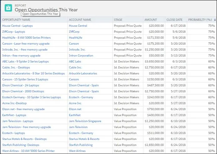
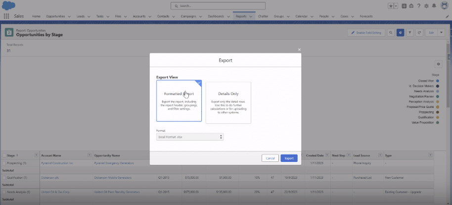
Start by accessing the Reports section in Salesforce to view available reports.
Select the ‘Opportunities by Stage’ report to proceed.
Choose the ‘Exports’ option
Select ‘Formatted Report’. Then, choose Excel (.xlsx) format for export.
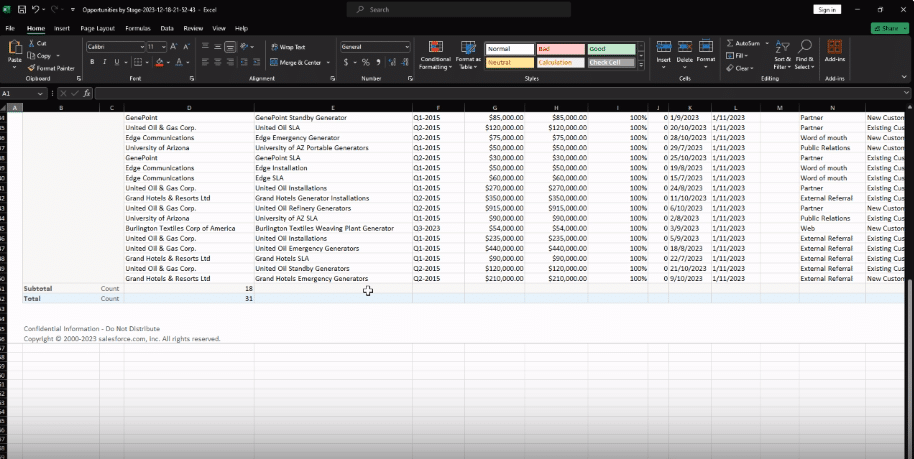
Once exported, the report will be available in your downloads folder as an Excel file, ready for analysis.
Tips for Effective Salesforce Reporting
Start with a Strategic Plan: Align your reporting with your organizational goals to ensure relevancy and focus.
Understand Report Types: Get to know the various report formats available in Salesforce, such as Tabular, Summary, Matrix, and Joined reports, and choose the one that best suits your needs.
Optimize Report Filters: Use filters effectively to hone in on specific criteria, ensuring your reports provide targeted, useful insights.
Customize Report Formats: Tailor the visual presentation of your reports (graphs, charts, dashboards) to match your audience’s preferences and enhance understanding.
Utilize Dashboard Components: Make use of dashboard tools in Salesforce to combine multiple reports into a robust, comprehensive view.
Display Relevant Data: Avoid clutter and confusion by focusing on data that is pertinent to your business needs, steering clear of unnecessary information overload.
Use Cases: Types of Salesforce Reporting
Tabular Report: Ideal for evaluating individual performances within a sales team.
Summary Report: Provides an overview of quarterly revenue across different product categories.
Matrix Report: Useful for analyzing sales performance by product region and category.
Joined Report: Combines data from various Salesforce objects, perfect for assessing marketing campaign effectiveness.
Troubleshooting Common Issues
Salesforce reporting helps businesses generate vital insights to make informed decisions. However, there are some common issues that users may experience.
Here are some solutions to problems to unlock a smooth experience.
Data Quality Issues. Data completeness and accuracy issues can be solved by conducting frequent data audits and incorporating validation protocols to establish data integrity.
Complex Report Structures. Using folders, subfolders, and cross filters helps to reasonably organize reports to prevent complex report structures.
Performance Optimization. Report performance can be enhanced by utilizing indexed fields reducing the use of formula fields, filters, and aggregations.
Security Challenges. Use field-level security to prevent access to sensitive data. Constantly review and update security settings.
Conclusion
Before you consider pulling a Salesforce report, it is crucial to have a plan and ensure it aligns with your business’s overall objectives. Also, get familiar with the report types, report filters, dashboard components, and troubleshooting tips to solve common issues.
Sharing reports in Salesforce is crucial for driving team collaboration and informed decision-making. This guide will walk you through the essential steps to share reports in Salesforce, ensuring your team can effectively utilize and benefit from shared data insights.
Step-by-Step Guide to Sharing a Report in Salesforce Internally
TLDR
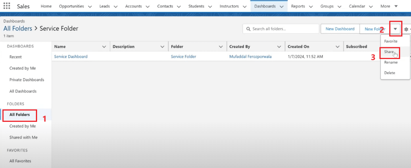
Step 1:
Navigate to the Reports tab in your Salesforce dashboard
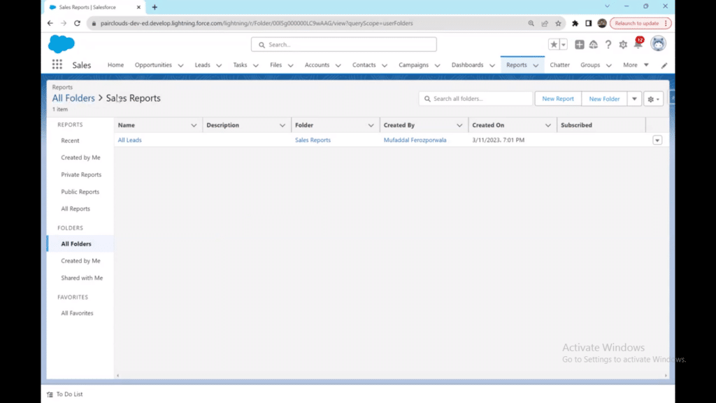
Step 2:
Locate the folder containing the report you want to share
Step 3:
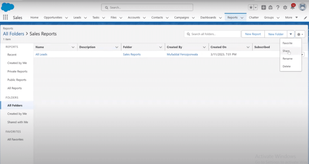
Click the dropdown arrow next to “New Folder” and select “Share”
Step 4:
Select the target folder you want to share
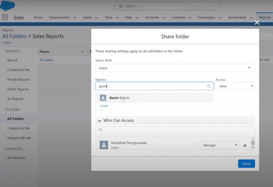
Step 5:
Enter the names of individuals you wish to share with
Step 6:
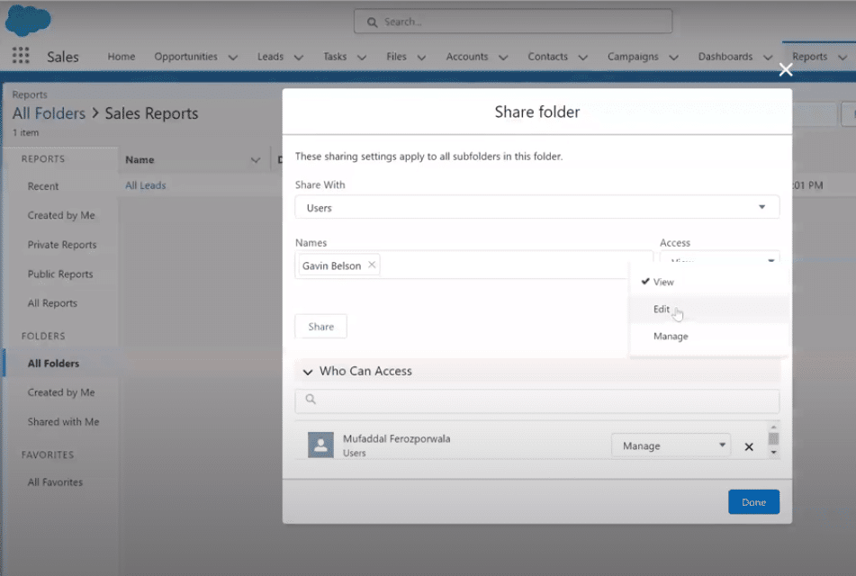
Define access levels: choose view, edit, or manage permissions
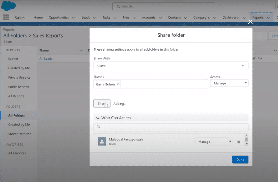
Step 7:
Click “Share” and then “Done” to finalize the process
Knowing how to share a report in Salesforce is a game-changer for effective collaboration and informed decision-making. Whether you’re diving into the Classic interface or exploring the Lightning Experience, this step-by-step guide will illuminate the process.
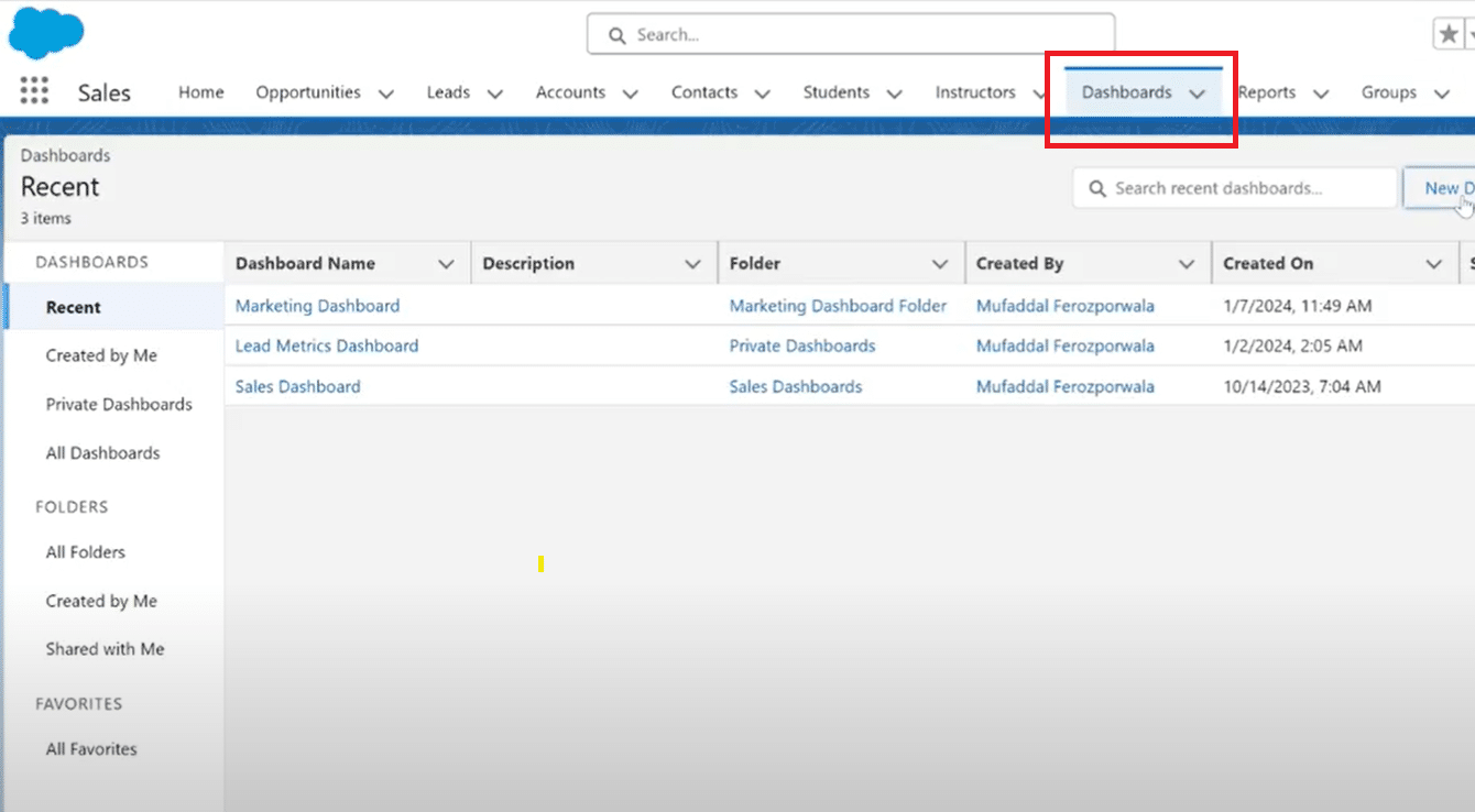
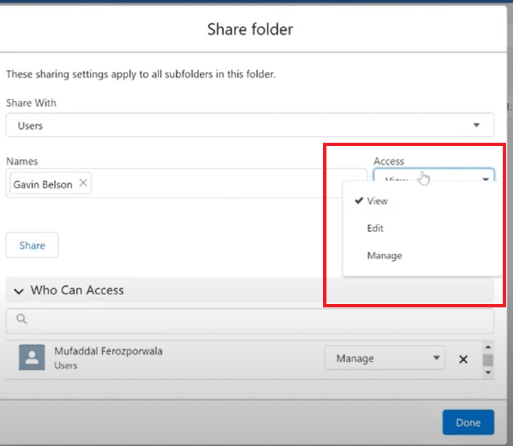
Log in to Salesforce: Head to the reports tab on the top right of the dashboard.
Navigate to the Desired Folder: Identify the folder containing the report you want to share.
Access Sharing Options: Click on the dropdown arrow next to the “New Folder” button on the top right and select “Share.”
Select the Target Folder: Locate and click on the folder you want to share.
Specify Recipients: Enter the names of individuals you wish to share the folder with.
Define Access Levels: Choose between view, edit, or manage access levels according to the recipient’s role.
Share and Completion: Confirm your choices by clicking the “Share” button. Once shared, click “Done” to finalize the process.
For a detailed video walk-through, check out our YouTube Tutorial.
Scenario Specifics
Public Reports: To make a report public in Salesforce, ensure the report is saved in a public folder, and then follow the sharing steps.
Private Reports: For private reports, select the appropriate folder and customize access levels based on team roles.
Lightning Experience: Navigating through Salesforce report sharing in Lightning follows the same intuitive process, providing a seamless experience.
Share Salesforce Reports Externally With Non-Licensed Team Members
If you’re struggling to share reports with your team or clients, you’ve probably tried CSVs, manual screenshots, or even manual data entry.
Coefficient offers a 2-way sync between Salesforce and your spreadsheet. You’ll have the ability to sync live Salesforce data or reports with your spreadsheet and share with anyone who needs access – whether they have a Salesforce license or not.
TLDR
Step 1:
Install Coefficient from coefficient.io or from Excel or Google Sheets Plugin Marketplace
Step 2:
Connect Coefficient to your Salesforce account and import report data
Step 3:
Set up live data sync to keep reports automatically updated
Step 4:
Use native Excel or Google Sheets sharing features to share with anyone
Step 5:
Recipients can view, edit, and collaborate without needing Salesforce licenses
Step 6:
Maintain data security through spreadsheet permission settings
In the one-minute tutorial below, learn how to share Salesforce reports with your native Google Sheets or Excel share and permissions settings. Now others can view, edit, and collaborate seamlessly. Of course, keep the data security measures we mentioned above in mind.
How Coefficient + Spreadsheets excels in External Salesforce Report Sharing
Using Coefficient with Excel or Google Sheets transforms how you share Salesforce reports externally, offering significant advantages over traditional methods.
Cost Efficiency: Eliminate the need for additional Salesforce licenses when sharing with clients, contractors, or external stakeholders. Recipients access live data through familiar spreadsheet interfaces they already use daily.
Leadership-Friendly Access: Executives and senior stakeholders can quickly review key metrics and performance data without navigating complex Salesforce interfaces. The familiar spreadsheet format enables faster decision-making and strategic discussions.
Real-Time Collaboration: Unlike static CSV exports or screenshots, Coefficient maintains live data connections. Your external partners always see current information while being able to add comments, create charts, and perform their own analysis.
Enhanced Usability: Spreadsheets provide intuitive filtering, sorting, and visualization tools that many users find more accessible than Salesforce’s native interface. This reduces training time and increases adoption among external collaborators.
Flexible Permissions: Leverage spreadsheet sharing controls to grant view-only access, editing rights, or collaborative permissions without compromising your Salesforce security. You maintain full control over who sees what data.
Seamless Integration: External teams can easily incorporate your Salesforce data into their own workflows, reports, and presentations without complex data imports or manual copying.
Best Practices for Sharing Reports
When it comes to sharing a report in Salesforce, implementing best practices is crucial for seamless collaboration while maintaining data security.
Precision in Permissions: Tailor access levels diligently. Assign view, edit, or manage permissions based on user roles to prevent unauthorized alterations.
Regular Audits: Conduct routine checks on shared reports and folders. Remove access for users who no longer require it, ensuring data integrity.
Consider Public vs. Private: Understand the nuances of how to make a report public in Salesforce. Reserve public visibility for non-sensitive data and keep confidential reports in private folders.
Educate Users: Clearly communicate sharing protocols to users. Avoid common mistakes by ensuring everyone comprehends the implications of their access.
Mindful Dashboard Sharing: Similar to reports, when sharing a dashboard in Salesforce, be cautious of the data it contains. Apply access controls to maintain confidentiality.
Sharing Dashboards in Salesforce
Effective report sharing drives better decisions across your organization. While Salesforce handles internal sharing well, external collaboration remains challenging. Coefficient solves this by creating live, collaborative spreadsheets that sync automatically with Salesforce—no additional licenses required. Try Coefficient for free and transform how you share data.
Creating truly dynamic Salesforce dashboards goes beyond changing viewer roles. Build dashboards that combine live Salesforce data with external sources for complete business intelligence. 1:
Step 1: Install Coefficient in Google Sheets or Excel
Creating truly dynamic Salesforce dashboards goes beyond changing viewer roles. Build dashboards that combine live Salesforce data with external sources for complete business intelligence. 2:
Step 2: Connect to Salesforce and import your CRM data (opportunities, leads, accounts)
Creating truly dynamic Salesforce dashboards goes beyond changing viewer roles. Build dashboards that combine live Salesforce data with external sources for complete business intelligence. 3:
Creating truly dynamic Salesforce dashboards goes beyond changing viewer roles. Build dashboards that combine live Salesforce data with external sources for complete business intelligence. 4:
Step 4: Create dynamic calculations combining all data sources
Creating truly dynamic Salesforce dashboards goes beyond changing viewer roles. Build dashboards that combine live Salesforce data with external sources for complete business intelligence. 5:
Step 5: Set up auto-refresh schedules and real-time alerts
Creating truly dynamic Salesforce dashboards goes beyond changing viewer roles. Build dashboards that combine live Salesforce data with external sources for complete business intelligence. 6:
Step 6: Share dashboards with unlimited users – no Salesforce licenses required
Far beyond the static confines of traditional dashboards, a Salesforce dynamic dashboard allows you or your team to take the role and view your data as you demand.
This step-by-step guide will unravel how to craft a Salesforce Dynamic Dashboard.
Whether you’re a Salesforce novice or an experienced user, this guide will walk you through the entire process with the same clarity.
As a bonus, As a bonus, we’ll introduce how Coefficient’s 2-way sync between Salesforce and your spreadsheet can revolutionize your dashboard experience, allowing you to extend visibility and interaction beyond Salesforce, without the extra cost on licenses.
So, let’s start!
What is a Salesforce Dynamic Dashboard?
Salesforce dynamic dashboard creation allows users to take on a role of their choice when looking at their insights and data. It empowers users to make data-driven decisions by offering flexibility, interactivity, and the ability to showcase key performance indicators dynamically.
There are many features of a Salesforce dashboard that make it a great part of the platform:
Real-Time Data Updates – Dynamic Dashboards pull real-time data from Salesforce, ensuring that the visualizations and metrics are always current.
Interactivity – Users can directly interact with the data on the dashboard, such as clicking on charts or applying filters, to tailor the view based on their needs.
Customization – Dynamic Dashboards are highly customizable, allowing users to choose from various components and settings to create a personalized and visually appealing dashboard.
Collaboration – Dashboards can be shared with team members or stakeholders, promoting collaborative decision-making by providing a unified view of essential metrics.
However, the biggest issue with collaborating on your dashboard is that it’s static, and the person seeing it can only have one role to look at the insights at a time.
Limitations of Native Salesforce Dynamic Dashboards
While Salesforce dynamic dashboards offer valuable functionality, they come with several constraints that can limit their effectiveness:
Data Source Restrictions: Native SF dashboards can only display data that exists within Salesforce. You cannot combine Salesforce data with external sources like marketing platforms, financial systems, or custom databases without complex integrations.
Licensing Costs: Every user who needs dashboard access requires a Salesforce license, which can become expensive for organizations wanting to share insights with broader teams.
Limited Customization: Dashboard components are restricted to Salesforce’s predefined chart types and layouts. Advanced visualizations or custom calculations require workarounds or aren’t possible.
Role-Based Limitations: While you can switch viewing roles, the underlying data security model still applies. Users can only see data they have permissions for, regardless of the selected role.
Refresh Constraints: Dashboard refreshes are subject to Salesforce’s processing limitations and may not update as frequently as needed for real-time decision making.
Sharing Restrictions: Native sharing is limited to Salesforce users only. External stakeholders, clients, or unlicensed team members cannot access dashboards without expensive guest licenses.
But you can overcome these limitations, so let’s explore better approaches!
Preparing for Salesforce Dynamic Dashboard Creation
Before diving into the creation process, laying the groundwork for a successful dynamic dashboard is essential. It is also important to note that you don’t actually ‘create’ a dynamic dashboard. Instead, you transform your default dashboard into a dynamic one.
Here are key steps to consider:
User Permissions
Ensure you and your team have the necessary user permissions in Salesforce to view and modify dashboards. Verify that your Salesforce profile includes the required dashboard-related permissions to avoid access issues during creation.
Data Sources
Identify and review the data sources that will feed into your dynamic dashboard. Confirm that the relevant Salesforce reports and datasets are available and up-to-date. Assess the data quality to avoid discrepancies in your visualizations.
Salesforce Dynamic Dashboard Feature
Familiarize yourself with the Salesforce Dynamic Dashboard feature. Understand its capabilities, components, and customization options. This foundational knowledge will empower you to make informed decisions during the dashboard creation.
Clear Objectives and Metrics
Define the objectives of your dynamic dashboard clearly. Identify the key metrics and data points that align with your organizational goals. This clarity will guide your team and yourself to understand when to switch roles and the difference in insights.
Third-party Integrations
Consider integrating third-party apps like Coefficient meant to make your data management in Salesforce dynamic. Coefficient offers a two-way connection between Salesforce and your spreadsheet (Google Sheets or Excel). This connection allows you to bypass any report limitations in Salesforce, share reports with unlicensed users via your native spreadsheet share settings, push data alerts to Slack and email, and more.
Building Dynamic Salesforce Dashboards with Coefficient
Skip the limitations of native Salesforce dashboards. Create truly dynamic dashboards that combine live Salesforce data with external systems, all within familiar spreadsheet environments that your entire team can access.
Step 1: Connect Salesforce to Your Spreadsheet
Open Coefficient in Google Sheets or Excel. Click “Import from…” and select Salesforce as your data source.
Authorize the connection to your Salesforce org. You’ll gain access to all your reports, objects, and custom fields instantly.
Step 2: Import Your Core Salesforce Data
Choose your import method based on your needs:
From Existing Reports: Import any saved Salesforce report directly. Perfect for established pipeline, forecasting, or performance reports.
From Objects & Fields: Build custom reports by selecting specific Salesforce objects (Opportunities, Leads, Accounts) and the exact fields you need.
Custom SOQL Queries: Write advanced queries to join multiple objects or create complex aggregations.
Your live Salesforce data flows into the spreadsheet with full field mapping and filtering options.
Step 3: Integrate External Data Sources
Here’s where true dynamic dashboards shine. Add complementary data sources alongside your Salesforce data:
Marketing data from Google Analytics, Facebook Ads, or HubSpot
Financial data from QuickBooks, NetSuite, or custom databases
Product usage data from analytics platforms or internal APIs
Market data from external research sources
Each data source imports into separate sheets, ready for analysis and dashboard creation.
Step 4: Create Dynamic Calculations and Analysis
Combine your multi-source data using spreadsheet formulas:
=VLOOKUP(A2,MarketingData!A:D,3,FALSE)
Calculate metrics impossible in native Salesforce:
Customer Acquisition Cost vs Lifetime Value across systems
Marketing attribution impact on deal velocity
Product usage correlation with renewal probability
Use Coefficient’s formula functions for real-time lookups:
Configure automatic refreshes to keep your dashboard current:
Scheduled Refreshes: Set hourly, daily, or weekly updates for all connected data sources simultaneously.
Snapshots: Automatically capture historical data at regular intervals to track trends over time.
Alerts: Push notifications to Slack or email when key metrics change or thresholds are hit.
Step 6: Share Universally
Your dynamic dashboard lives in Google Sheets or Excel – no Salesforce licenses required for viewers. Share with:
Executive teams for strategic insights
Marketing teams for campaign performance
External stakeholders and board members
Client-facing teams for account reviews
Why this approach works: You’ve created a true command center that combines all your business data, updates automatically, and reaches everyone who needs it – not just Salesforce users.
Ready to dive in?
Connect your live Salesforce data to Sheets in 3 minutes.
5 Steps on How to Create a Dynamic Dashboard in Salesforce
Follow these step-by-step instructions for a seamless dashboard creation experience:
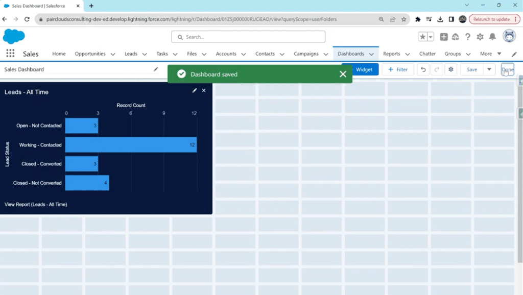
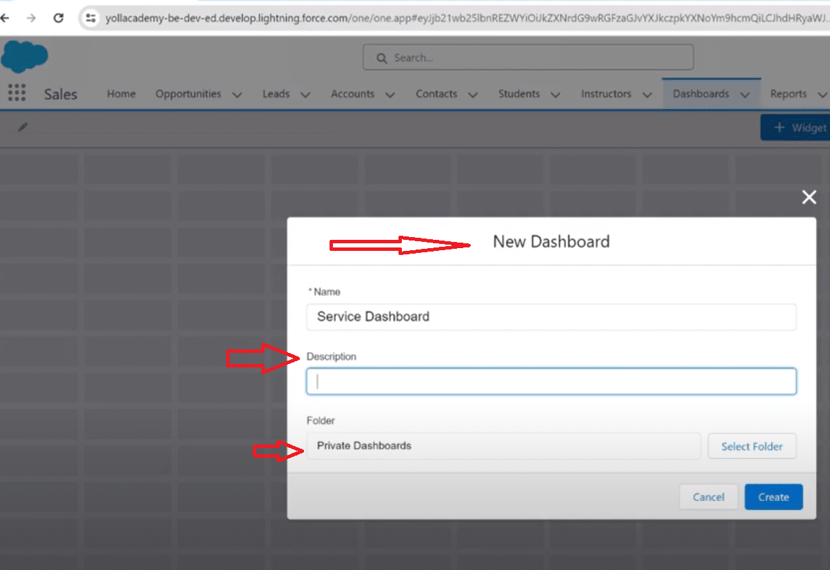
Step 1: Navigate to the Dashboards
Log in to your Salesforce account with valid credentials.
In the top navigation bar, locate the “Dashboards” tab and click to access the Dashboards section.
Once it loads, select the dashboard you wish to transform from the list of present dashboards.
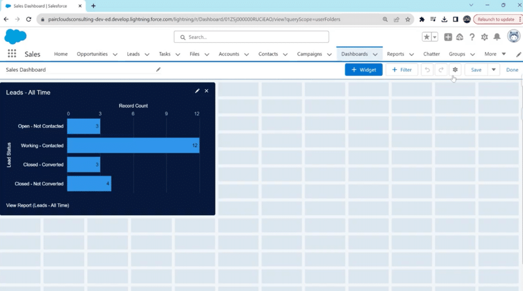
Step 2: Edit and Navigate to Dashboard Settings
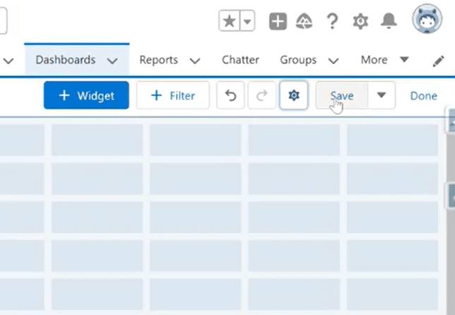
When your selected dashboard loads, navigate to the top right corner and select “Edit.”
On the editing page, navigate and click on the Gear Icon to open dashboard settings.
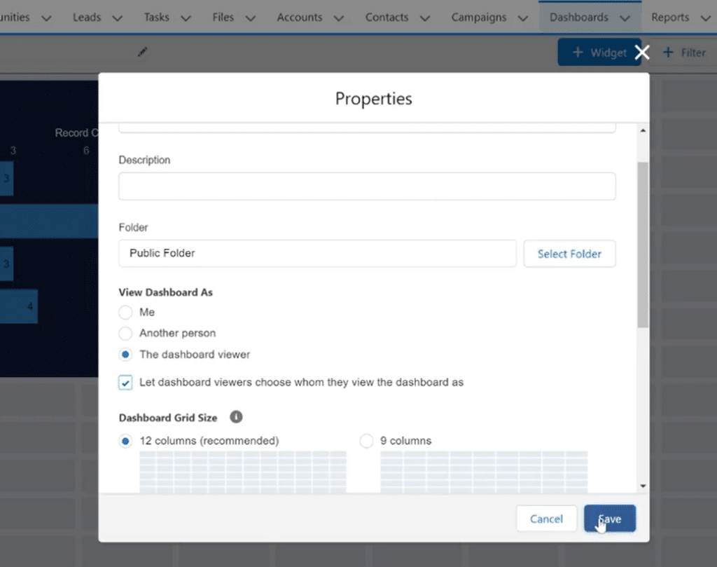
Step 3: Change ‘View Dashboard As’ Settings
Once you select the Gear Icon, a pop-up window will appear for ‘Properties.’
Scroll down to the “View Dashboard As” section.
Here, you can see the default option selected is ‘Me.’
This means you or any other team member can only view the dashboard as themselves based on the roles assigned to their accounts. This can become inconvenient for a team constantly collaborating and needing to view data insights from a different role, e.g., the owner, the editor, the accounts analyst, etc.
To make your dashboard dynamic, Choose “The Dashboard Viewer” and opt for the checkbox “Let the dashboard viewers choose whom they view the dashboard as.”
This option will allow everyone on your team, including you, to choose the role you want when viewing this dashboard’s data insights. Salesforce will let you change these roles indefinitely and switch between them for different dashboard views.
Click on ‘Save’ to close and save changes to Properties.
Step 4: Save All Changes
After exiting the pop-up window, Click ‘Save’ again on the top right corner of the main dashboard editing bar.
Following that, Click on ‘Done’ to save all changes made and exit the session.
Step 5: Preview and Test Your Dynamic Dashboard
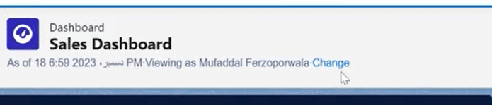
Once you’re done, Salesforce will revert to the home panel of Dashboards. The changes you made will be shown later. Make sure you Reload before reviewing changes.
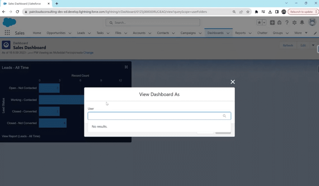
After the page reloads, you can see the option ‘Change’ below the dashboard name ribbon.
Now, anytime you or one of your team users log in, they can change how they view the dashboard. Simply click ‘Change’ and select the user from the drop-down menu in the pop-up window, and Salesforce will adjust the dashboard accordingly.
That’s all! Your Salesforce Dashboard has been turned into a dynamic one that will streamline and improve collaboration and data analysis, reporting, and editing.
Integrate Coefficient and Salesforce to Enhance Dynamic Data Management
Elevate your Salesforce dynamic dashboards by seamlessly integrating Salesforce with your spreadsheet using Coefficient, the indispensable companion that transforms data management into a streamlined and collaborative experience.
Let’s delve into the features that make Coefficient’s Salesforce integration with Google Sheets and Excel a game-changer:
Always-Live Salesforce Data: With Coefficient, stay in the loop in real-time as your Salesforce data evolves. Sync the Salesforce data or reports you need into Google Sheets or Excel and keep your data import on a refresh schedule.
Share Reports Seamlessly: No need to add expensive Salesforce licenses when your team is only viewing reports. Instead, sync your Salesforce reports into your spreadsheet and share your reports with your native spreadsheet share settings.
Push Back Data When You Need: Coefficient’s Salesforce spreadsheet connector offers a 2-way sync. Export your data to Salesforce in just a few clicks without ever leaving your spreadsheet.
Slack & Email Monitoring: With Coefficient, stay in the loop in real-time as your Salesforce data evolves. Trigger Slack and email alerts when cells change values or meet predefined conditions. This means instant notifications for chosen recipients, ensuring that crucial data changes are promptly communicated to the right stakeholders.
Team Notifications: Promote seamless collaboration within your team by automatically delivering notifications via Slack and email. Coefficient allows you to set up real-time, daily, or weekly digests of changes, enabling your team to monitor critical reports and KPIs effortlessly. This shared awareness ensures everyone is on the same page, facilitating informed decision-making.
Instant Row Alerts: Act fast on new opportunities or critical changes in your Salesforce data. Coefficient allows you to set up automatic Slack and email alerts that notify your team when a new row is added to a spreadsheet. This instant notification ensures that your team is informed and ready to take action on the latest data entries.
By integrating Coefficient with Salesforce, you will streamline data management and foster a collaborative environment where real-time insights and actionable alerts empower your team to make informed decisions.
4 Tips for Optimizing Dashboard Performance in Salesforce
Generally, dynamic dashboards are more than just viewing roles and insight directions. There are also some other ways you can optimize and improve your dashboards for better productivity, organizing, and collaboration:
Identify Your Key Metrics
Before diving into the dashboard creation process, pinpoint the key metrics that matter most to your organization. Whether it’s sales revenue, lead conversion rates, customer satisfaction scores, or other vital indicators, these metrics form the foundation of your dashboard.
Building around these essential elements ensures your dashboard is tailored to deliver meaningful insights.
Choose the Right Dashboard Components
Salesforce provides many dashboard components—charts, tables, gauges, and more. Carefully select components that best represent your data and make it easily digestible for your team. The right components enhance data visibility and comprehension.
Use Filters to Focus on Specific Data
Harness the power of filters to hone in on specific data within your dashboard. Whether filtering sales data by region or product line, customization ensures your dashboard remains targeted and relevant to distinct teams or individuals within your organization.
Customize Your Dashboard for Different User Groups
Recognize that not all users within your organization require access to the same data. Tailor your dashboard to cater to the unique needs of various user groups. By providing customized views, you empower each team to access the data most pertinent to their responsibilities.
Advanced Features and Tips
As you create a dynamic dashboard in Salesforce, consider elevating your dashboard creation with these advanced features and best practices.
Dynamic Dashboards in Lightning Experience
Explore the enhanced capabilities of dynamic dashboards in Salesforce Lightning Experience. Lightning Experience introduces interactive features, such as drill-downs and dynamic filters, providing users with a more immersive and intuitive dashboard experience.
Cross-Filtering Across Components
Enhance the interactivity of your dynamic dashboard by implementing cross-filtering across components. This feature lets users click on a data point in one chart or table, automatically filtering related components to display pertinent information.
Scheduled Refresh for Data Accuracy
Maintain the accuracy of your dynamic dashboard by configuring scheduled data refreshes. Salesforce allows you to set intervals for automatic updates, ensuring that your dashboard reflects the latest data from your Salesforce reports.
By incorporating these advanced features and best practices, you not only enhance the sophistication of your Salesforce Dynamic Dashboard but also create a robust and user-friendly environment for insightful data exploration.
Salesforce dashboards are more than individual tools; they’re a gateway to team collaboration and data-driven decisions.
This guide walks Salesforce admins and report builders like you through sharing your Salesforce dashboards, ensuring every team member stays informed and aligned.
There are often there are stakeholders that need visibility that may not have a Salesforce license. So, we’ll introduce Coefficient as an option to share Salesforce reports with your native Google Sheets or Excel share and permissions settings for anyone you require to view, edit, and collaborate seamlessly.
Teams like Miro have used Coefficient for years to give visibility and analytical capabilities to cross-functional stakeholders who don’t have Salesforce, Snowflake, or Looker licenses.
Understanding Salesforce Dashboard Sharing
Dashboard sharing in Salesforce is vital for teamwork, offering benefits like unified data views, quick decision-making, and streamlined communication.
But how do you share a dashboard effectively? Let’s dive in.
Pre-Requisites for Sharing Dashboards
You require some Salesforce permissions and roles to activate the user-sharing dashboard. Here are the essential prerequisites for sharing dashboards on Salesforce:
User Permissions and Roles: Ensure your Salesforce setup has the necessary user permissions and roles for sharing. Key permissions include “View Dashboards in Public Folders” and “Create and Customize Dashboards.”
Roles and Hierarchies: In Salesforce, there’s a system that uses roles to control who can see what. Every user has a role. When you share a dashboard, think about the roles of the users you’re sharing it with. You can set up the dashboard so that different roles see different parts of the information. This way, the right people see what they need based on where they are in the organization.
Dashboard Visibility Settings: Salesforce dashboards have settings to decide who can see them. There are three main settings to know.
Private dashboards are only for the person who made them. If you want to share, the creator has to allow access to others.
Public read-only lets others view but not change the dashboard. It’s good when you want to show information without letting anyone make changes.
Public read/write lets others both view and make changes. This is handy for teamwork when many people need to add or change things on the dashboard.
To bypass these prerequisites within Salesforce, you can sync your Salesforce reports into Google Sheets or Excel with Coefficient, set them on a refresh schedule, and lean on your native spreadsheet share settings to share your report amongst your team.
How to Share a Salesforce Dashboard with Non-License Stakeholders
In this quick video, you’ll see how simple it is to leverage Coefficient from the AppExchange to share the reports you build with any stakeholder, whether they have a Salesforce License or not.
Benefits of Leveraging Coefficient
Besides the incredible cost-savings, the benefits of leveraging Coefficient to share your Salesforce reports are pretty massive.
Universal Access Without Buying Extra Licenses: With Coefficient, you can share live Salesforce data in Google Sheets or Excel, giving non-licensed stakeholders instant access to reports without a Salesforce login. This eliminates the need for costly “view-only” licenses for executives, board members, and cross-functional teams.
Always-Current Data: Reports auto-refresh on a set schedule or whenever you need them, ensuring everyone always sees the most up-to-date Salesforce data without manual exports. This removes version control headaches and eliminates the confusion of wondering which spreadsheet is the latest.
Customizable Views for Each Audience: You can filter, combine, and format reports in the spreadsheet so each stakeholder sees only the data that matters to them. Salesforce data can also be blended with any other data source leveraging Coefficient, including finance, marketing, and operations data in the same sheet, creating a richer, more complete view.
Better Collaboration: Stakeholders can leave comments, add context, and model scenarios directly in the spreadsheet without altering the original Salesforce report. This makes it easier for cross-functional teams to analyze data collaboratively in a tool they already know and use.
Time Savings for RevOps & Sales Ops: With Coefficient, there’s no need for repeated exporting or reformatting—reports are pulled once and kept automatically updated. This reduces manual work for ops teams, allowing them to focus more on strategy and less on administrative tasks.
Step-by-Step Guide to Sharing a Salesforce Dashboard Natively
Sharing your Salesforce dashboard is crucial for effective collaboration and ensuring that key insights are accessible to the right stakeholders. Follow this detailed walkthrough to seamlessly share your dashboard with the necessary users within Salesforce.
Step 1: Open Your Salesforce Dashboard
Navigate to the Salesforce homepage and log in to your account.
Once logged in, locate and open the dashboard you want to share.
Click on the dashboard name to enter the dashboard view.
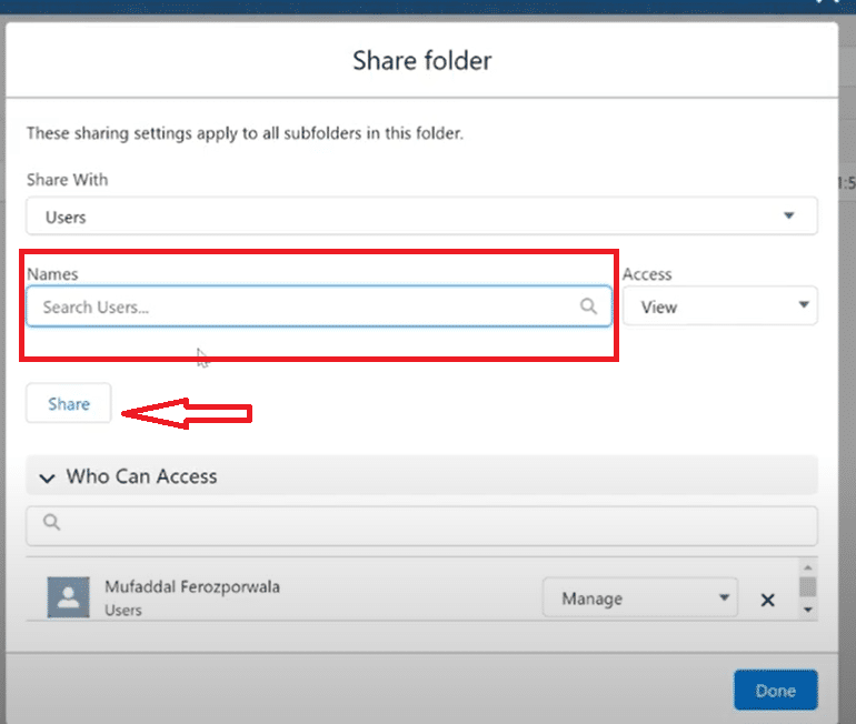
Step 2: Click on the “Share” Button
In the upper-right corner of the dashboard, you’ll find the “Share” button.
Click on it to access the sharing settings for the dashboard.
Step 3: Choose Sharing Settings
A new window will appear, allowing you to define the sharing settings.
Select “Share Dashboard” and choose the type of access you want to grant: Public Link, Specific Users, or Groups.
Adjust the settings according to your collaboration needs.
Step 4: Add Specific Users or Groups
If you selected “Specific Users” or “Groups,” you can now add the Salesforce users or groups you want to share the dashboard with.
Start typing their names, and Salesforce will provide suggestions.
Click on the correct suggestion to add them.
Don’t see your stakeholder on the list? Coefficient facilitates seamless sharing with external stakeholders who don’t have Salesforce licenses.
Step 5: Define Access Levels
For each user or group added, define their access level—Read-Only or Read/Write.
This controls whether they can only view the dashboard or also make changes.
Click “Add More” if you need to include additional users or groups.
Step 6: Save Changes
Once you’ve added all the users or groups and defined their access levels, click “Done” to apply the sharing settings.
Your dashboard is now shared with the selected users or groups based on the specified access levels.
Troubleshooting Common Issues when Sharing Dashboards Natively
Here are the common problems you might encounter while sharing your dashboard on Salesforce and the best solution to troubleshoot them:
Access Denied Issues
Issue: Users might encounter “Access Denied” messages when trying to view a shared dashboard.
Solution: Confirm that the dashboard’s sharing settings are configured correctly. Check the user’s profile and ensure they have the necessary permissions to access and view dashboards. Alternatively, sync your Salesforce reports into your spreadsheet for free with Coefficient. You can now share with anyone, even those without Salesforce licenses.
Missing User or Group in Sharing Settings
Issue: Shared users or groups might not be able to view the dashboard.
Solution: Revisit the dashboard’s sharing settings and verify that all intended users or groups are added. Ensure correct spelling and user/group selection. Save changes if modifications are needed.
Incorrect Access Levels
Issue: Users may have unintended access levels (Read-Only vs. Read/Write).
Solution: Double-check the access levels assigned to each user or group in the sharing settings. Adjust as needed, and remind users to refresh their browsers to apply the changes.
Public Link Issues
Issue: Users may experience difficulties accessing the dashboard through a public link.
Solution: Confirm that the public link is generated and accessible. If issues persist, regenerate the link and share it again. Ensure that the sharing settings allow for public link access.
Changes Not Reflecting
Issue: Shared users may not see the latest changes made to the dashboard.
Solution: Instruct users to refresh their browsers to ensure they are viewing the most recent version of the shared dashboard. Additionally, verify that the dashboard’s running user has the necessary data access for shared users to see updates.
Sharing with Large User Groups
Issue: Sharing with a large user group might be inefficient or lead to performance issues.
Solution: Consider sharing with smaller user groups or using public links for broader access. Evaluate the impact on performance and adjust sharing methods accordingly.
Advanced Tips and Tricks
Over the years of experience on the Salesforce platform, here are some of the advanced tips and tricks we’ve learnt to make operation easier and faster:
Dynamic Dashboard Filters
Tip: Leverage dynamic dashboard filters to allow shared users to interactively filter data based on their preferences.
How-to: In the dashboard editor, add a filter component and choose dynamic options. Shared users can then adjust filters without altering the dashboard’s underlying structure. Alternatively, you can simplify this filtering process in your spreadsheet with Filter Views that are much more easily setup and manipulated. Here’s a quick video of the process.
Nested Folders for Hierarchical Access
Tip: Organize dashboards into nested folders to create a hierarchical structure for sharing.
How-to: Create folders within folders to represent different departments, teams, or projects. Share at the folder level to grant access to all contained dashboards at once.
Utilize Permission Sets for Granular Control
Tip: Use Salesforce permission sets to provide granular control over dashboard access.
How-to: Assign permission sets to users based on their roles or responsibilities. This allows for more nuanced control beyond profile-based access.
Conclusion
Sharing Salesforce dashboards effectively enhances team collaboration and data-driven decision-making.
As you implement these steps and tips, consider simplifying your Salesforce report sharing experience with Coefficient.
Ready to transform your Salesforce capabilities? Get started with Coefficient today and unlock a new realm of efficiency and insight for your organization.
Don’t let important tasks slip through the cracks again. Setting up reminders on your Salesforce dashboard is easier than you think and can significantly boost your productivity.
This guide walks you through the process, from report creation to dashboard customization, ensuring you never miss key tasks again. Let’s dive right in.
Step-by-step guide: How to Show Reminders in a Salesforce Dashboard
Step 1: Navigate to the Reports Tab Begin by logging into Salesforce and heading over to the Reports tab. It’s crucial to create a report for any data you wish to feature on your dashboard.
Step 2: Create a New Report Select “New Report” and choose “Tasks and Events” as your report type, a standard category within Salesforce. Hit the “Start Report” button to proceed.
Step 3: Filter Your Tasks Under “Filters”, decide which tasks you’d like to display on the dashboard. Opt for all tasks to get a broad overview or narrow it down based on your preference.
You’re aiming to be reminded of tasks due in the near future, so filtering by due date is essential. Set it to show tasks due in the next seven days.
Step 4: Customize Report Fields
Decide which fields or columns are necessary for your reminders. Remove any columns you find unnecessary, keeping only the ones that provide value. Ensure the due date column is visible, as it will indicate when each task is due.
Step 5: Save and Run the Report
Name your report, something identifiable like “New Tasks and Events Report”, and save it. Now, you’re ready to incorporate this report into the dashboard.
Step 6: Create a New Dashboard
Navigate to the Dashboards section and opt to create a new one. Name it appropriately, for instance, “Task Reminder Dashboard”, to easily distinguish its function.
Step 7: Add Your Report as a Reminder Component
Select the Widget, Chart, or Table options to add your newly created report to the dashboard. Choose the report from the list, ensuring it’s set to display tasks by due date in ascending order, to spotlight the most imminent tasks.
Step 8: Customize and Save Your Dashboard
Edit your component title to “Task Reminder”, select a theme, and make any other necessary customizations. Finally, click “Add”, adjust the size as desired, and hit “Save”. You’ve now established a dashboard that will remind you of upcoming tasks.
Best Practices for Managing Reminders in Salesforce
To maximize the efficiency of your Task Reminder Dashboard, consider these best practices:
Regular Update and Review: Make it a habit to review your dashboard daily. Regular interaction ensures you’re always ahead of your tasks and deadlines.
Customize According to Your Workflow:Tailor the fields and filters in your reports based on your specific needs. Not every team or individual will prioritize the same data, so adjust as necessary.
Optimize for Visibility:Place your Task Reminder Dashboard prominently within your Salesforce setup. You’re more likely to act on your tasks if they’re constantly in view.
Utilize Salesforce Notifications: Besides dashboard reminders, leverage Salesforce’s notification system to get alerts on upcoming due dates directly via email or through the Salesforce mobile app.
Train Your Team: If you’re managing a team, ensure every member is familiar with the process and the importance of the dashboard. Collective diligence amplifies productivity.
Automation Where Possible:Look into automating repetitive tasks or reminders through Salesforce’s built-in automation tools. This can save time and reduce the likelihood of human error.
Feedback and Iteration:Solicit feedback from your team or reflect on your usage to identify areas for improvement. Salesforce dashboards and reports are versatile tools that can evolve with your needs.
By implementing these strategies, you’re not just setting up a reminder system; you’re crafting a workflow that bridges proactive task management with efficiency.
Conclusion
With these steps and best practices in mind, your Task Reminder Dashboard will become a cornerstone of your daily routine, ensuring that no task goes unnoticed or deadline missed. For businesses seeking to further streamline their Salesforce experience, consider Coefficient.
This highly acclaimed tool on AppExchange provides seamless integration with Google Sheets and Excel, enabling sophisticated data management and enhancing team efficiency. Discover how Coefficient can transform your Salesforce strategy today by visiting Coefficient. Elevate your productivity to new heights—where efficiency meets innovation.