Salesforce (SFDC) funnel analysis helps you uncover problematic and inefficient parts of your sales process. The best sales leaders take a surgical approach to understanding how deals move through the funnel and how they can optimize this process. Two primary indicators are volume (how much) and velocity (how fast). This inspection can help figure out how to increase win rates, shorten the sales cycle, and better forecast the pipeline needed.
Sadly, reporting on this is easier said than done. It is challenging for sales teams to get funnel data from Salesforce, and oftentimes native Salesforce reporting falls short. Some sales teams and managers even turn to manually piecing together funnel reports from various datasets, which is time-consuming and can cause inaccuracies.
The good news is there are tried-and-true ways to make your SFDC funnel analysis 10x better — that’s what this guide is about.
But before we begin, let’s talk about the basics.
What is a sales funnel analysis?
A sales funnel analysis is the process of examining and sifting through collected data to assess your sales effectiveness in moving prospects through each stage of your funnel.
If you’re a marketing leader, the process will start at the very top of the funnel and you’d look at conversions through the funnel until they reach a “sales” handoff. This includes analyzing your impressions, click-through rates, conversion rates, etc. For sales teams, the funnel will typically start with a marketing qualified lead (MQL) and work its way through the sales stages until a deal is closed.
A sales funnel analysis helps you learn where you can acquire leads and the stage (or stages) in the funnel where they drop off and don’t convert. We often hear from sales leaders an important data trail they like to follow is what happens to deals that fall out of the funnel. This can help potentially save deals and identify the areas for improvement.
How is a sales funnel analysis done in Salesforce?
You can use the Reports and Dashboards features in Lightning Experience to create a sales funnel analysis in Salesforce.
From the navigation menu, go to the Dashboards or Reports pages where you can easily find, open, and create new dashboards and reports within their homepages.
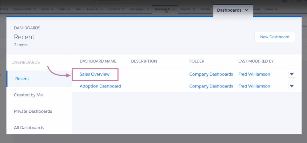
Open a specific dashboard or report, such as your Sales Overview, and change component properties by choosing how you want to display the data.
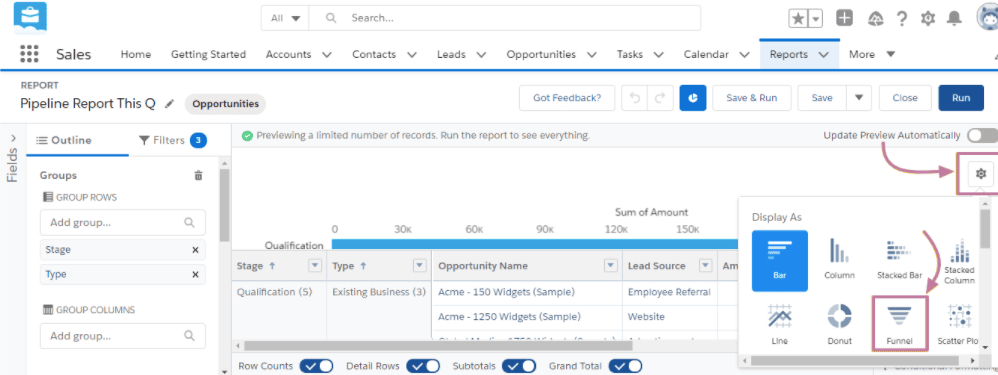
Click View Report to get a more detailed look at your data. Then, click Edit, go to settings, and select Funnel.
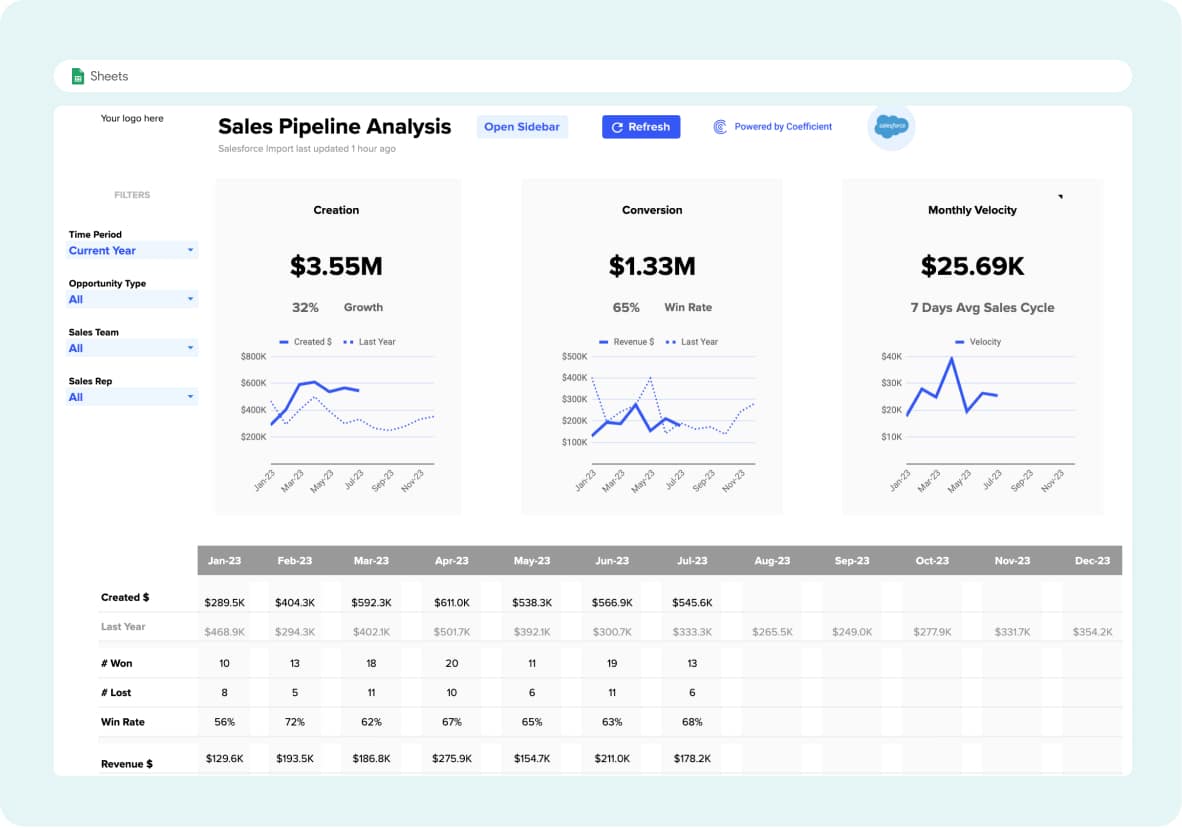
Here is an example of how your sales overview funnel will look on your Salesforce dashboard.
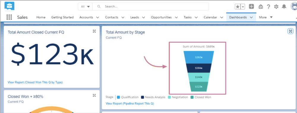
With this, you quickly get a high-level visualization of your funnel. You can also build some calculations or get a more granular funnel view, often there is a lot to be desired working within Salesforce.
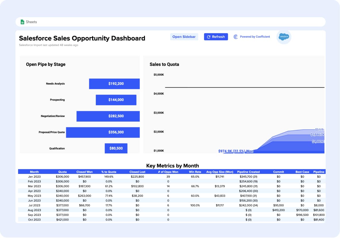
You can skip the how to if you’d like. Grab one of our free, pre-built Salesforce dashboards and power it with your live data in just a few clicks..
Why it’s 10x better to do a Sales funnel analysis in spreadsheets
Effective sales funnel analysis involves sorting through truckloads of data from multiple sources, which is why managing and laying out your sales funnel in a spreadsheet is essential.
Doing so gives you a visual way of understanding the steps in your sales process, allowing you to identify where your potential opportunities lie.
Another advantage of using spreadsheets is they offer reliable and straightforward features that let you gather and organize your sales data with ease.
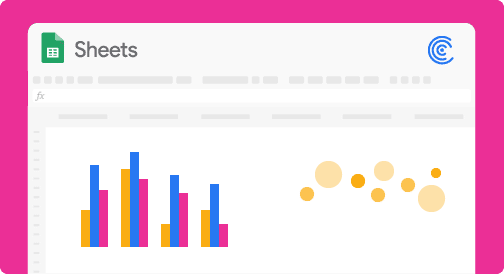
Spreadsheets are familiar, flexible, and powerful – giving business people the sort of ability that programmers have. A lot of companies use Google Sheets to build funnels because they can manipulate the data easily. And since Sheets has a direct connection to Google Slides, these funnels are often powering Exec slide decks for weekly reviews.
There are a couple of areas that tend to present challenges when operationalizing this reporting: getting data from multiple places and keeping the data up to date. That’s where Coefficient comes in, allowing teams to automate reporting from multiple systems without leaving the spreadsheet. Companies are seeing significant gains from using Coefficient to power their sales funnels.
How to do a Sales funnel Analysis in Google Sheets
SaaS companies can conduct sales funnel analysis in several ways using Google Sheets. However, in this guide, we’ll focus on creating an embedded chart builder.
Step 1: If you prefer automation, rather than manually importing your data to power your report, Coefficient is your go-to.
With Coefficient, you can automatically sync data from your Salesforce reports and fields and power your sales dashboard without ever leaving your spreadsheet.
You can install Coefficient in the Google Marketplace.
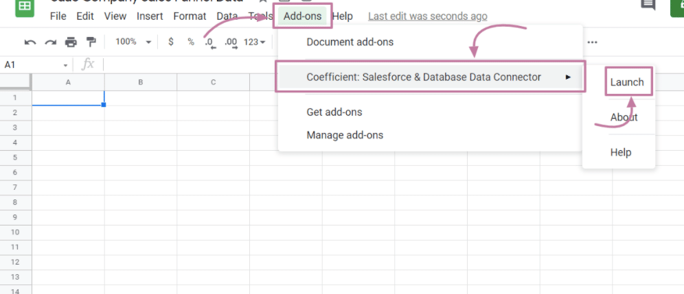
After installing Coefficient, open Google Sheets and click Add-ons. You should see “Coefficient: Salesforce & Database Data Connector” from the dropdown, then click Launch.
Using the Coefficient UI, click Import Data and select Salesforce.
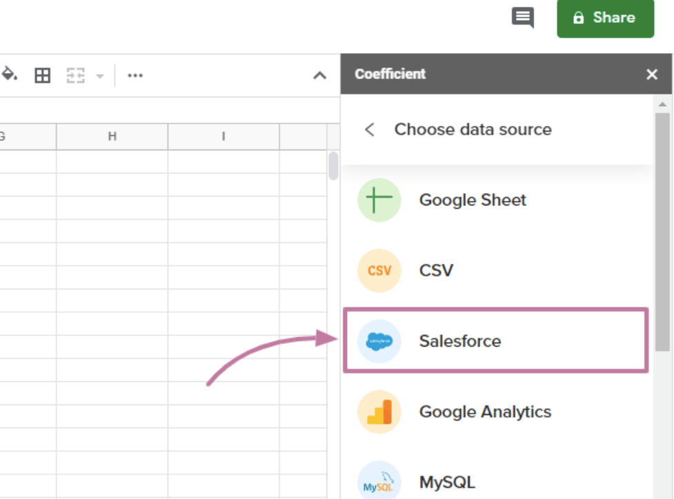
Once Salesforce is connected, you can choose which reports you’d like to pull data from so your spreadsheets update automatically when changes are made in Salesforce.
This streamlines your process and rids you of the grueling task of manually typing Salesforce data into your spreadsheets.
Step 2: Open the spreadsheet with the dataset and create a helper column
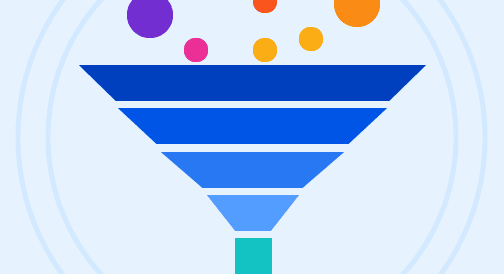
Let’s start by creating a simplified version of a SaaS funnel with a dataset that consists of Visits, Leads, Marketing Qualified Leads (MQL), Sales Qualified Leads (SQL), Opportunities, and Customer Conversions.

Stop exporting data manually. Sync data from your business systems into Google Sheets or Excel with Coefficient and set it on a refresh schedule.

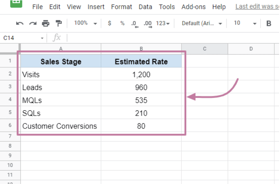
Insert a Helper Column (which contains the transparent bars’ values) between the Sales Stage (column A) and the Estimated Rate (column B) columns. In the example above, the B1:B6 values should now sit in the C1:C6 cell range.
In B2, insert this formula: =(max($C$2:$C$7)-C2)/2. The data should now look like this:
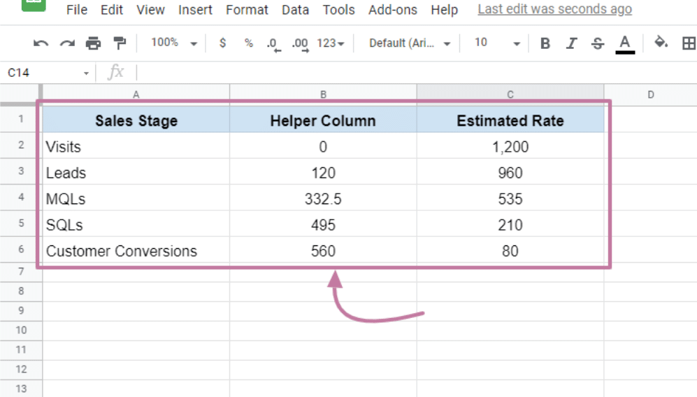
The formula determines your data’s maximum value (1,200) and calculates the difference between it and the current value. It then divides the result by two to center the bar (which we will see later).
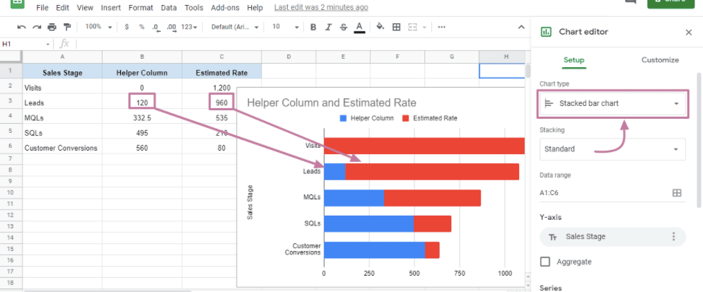
Step 3: Add a chart
Select and highlight your data range, click Insert from the Menu bar, then select Chart. Choose the Stacked Bar Chart option.
The bar graph’s blue portion shows the Helper column value, and the red part plots the value of your Deal value.
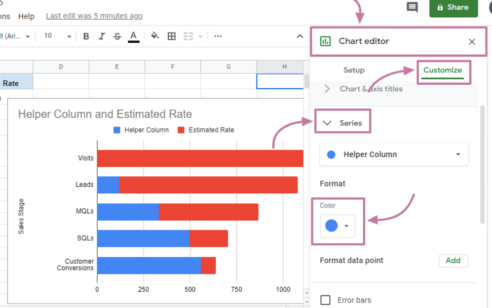
Step 4: Remove the helper column bars’ color
Set the Helper Column bars’ color to None to hide them from view, giving your funnel chart a “floating bars” appearance.
To do this, click any of the blue bars in the chart and under the Chart Editor, select Customize>Series>Color.
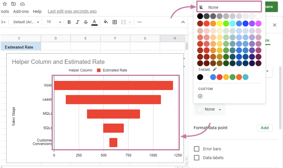
Set to None, and your chart should look like this:
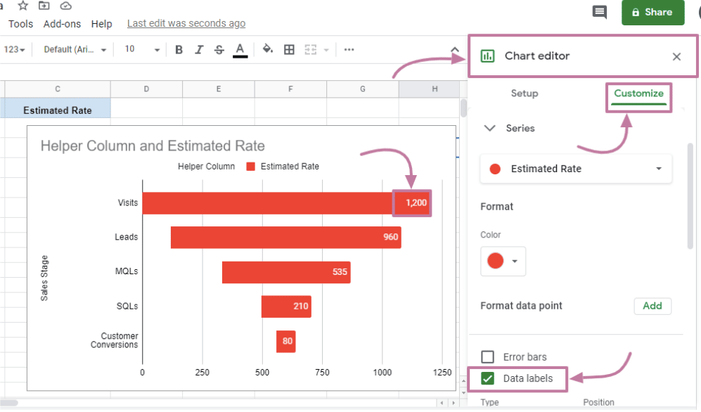
Step 5: Add your data labels
Your chart now looks like a funnel, but you don’t quickly see your data’s true meaning without labels.
Add data labels and remove the x-axis to refine further your sales funnel analysis. Under the Chart Editor, click Customize>Series, and select the box on the left side of Data labels.
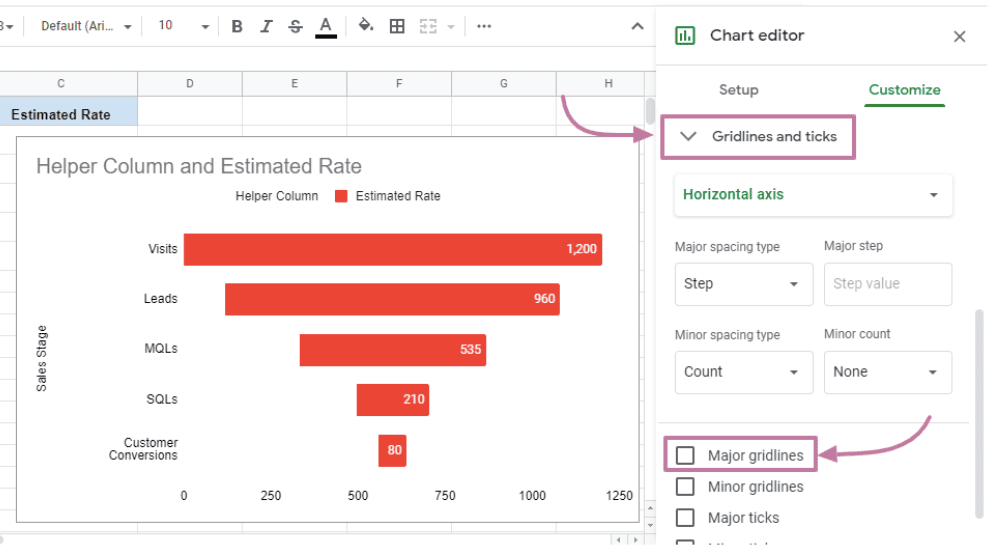
Remove the gridlines under Gridlines and Ticks and uncheck the box on the left side of Major gridlines.
This streamlines your process and rids you of the grueling task of manually typing Salesforce data into your spreadsheets.
Conclusion
It takes a lot of time, money and effort to get potential buyers into the funnel. It’s more important than ever to dive deep into the sales funnel to maximize these efforts. A sales funnel analysis will give you the tools and visibility you need to make sure that your process is optimized for conversions. You may even realize there are some great training opportunities for your sales reps that come out of it!
Try Coefficient for free today!