Quick Answer
Salesforce doesn’t have native webhook functionality, but you can achieve similar real-time data synchronization through three main approaches: outbound messages (SOAP-based), custom Apex REST endpoints, or third-party webhook apps.
The most practical solution for most businesses is using outbound messages combined with middleware or tools like Coefficient for Salesforce or any other system . This guide covers both traditional setup methods and modern no-code alternatives that eliminate the complexity of custom development while providing enterprise-grade reliability.
Prerequisites and Requirements
Before you begin setting up Salesforce webhook integrations, ensure you have:
Salesforce Account Requirements:
- Active Salesforce account with sufficient permissions to create and edit integrations
- API access enabled (ensure your edition supports API access and your user profile has API permissions)
- Administrative access to Setup menu for creating outbound messages and flows
Technical Knowledge:
- Working understanding of Salesforce object model and workflow automation
- Basic familiarity with webhooks, APIs, and HTTP protocols
- For custom endpoints: Apex development skills (optional for advanced integrations)
External Endpoint Setup:
- Secure external endpoint configured to receive webhook calls (HTTPS required)
- Ability to handle SOAP XML format for outbound messages or JSON for custom solutions
API Limits to Consider:
| License / Edition | Daily API Request Limit | Concurrent Requests (over 20s) | Other Limits |
| Developer/Trial | 15,000 | 5 | 10 min timeout per call |
| Enterprise (15 licenses) | 115,000 (100,000 + 1,000/license) | 25 | |
| Performance/Unlimited | Higher (varies by contract) | 25 | |
| Bulk API batch | 15,000 batch submissions/day | N/A | 10,000 records or 10MB/file per batch |
| Streaming API | 200,000 events/day (Enterprise) | N/A | 50 PushTopics/org (Enterprise) |
| Apex Callouts | 100 callouts per execution context | N/A | Timeout: up to 120sec/callout |
Important: Exceeding daily API limits will cause all integrations—including webhooks—to stop working until limits reset.
Step-by-Step Salesforce Webhook Setup
Method 1: Using Outbound Messages (Recommended for Beginners)
Step 1: Create the Outbound Message
Navigate to Setup in your Salesforce org. In the Quick Find box, search for “Outbound Messages” and select it from the results.
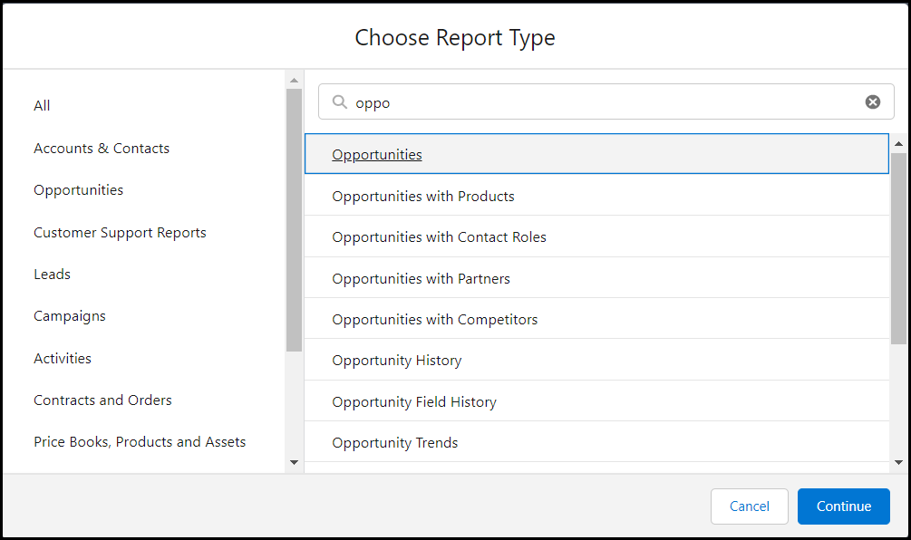
Click “New Outbound Message” and choose your target object (e.g., Account, Contact, Lead). This determines what data will be sent when the webhook triggers.
Configure your outbound message settings:
- Name: Give your webhook a descriptive name
- Endpoint URL: Enter your external system’s webhook URL (must be HTTPS)
- User to send as: Select the Salesforce user context for the message
- Fields to send: Choose which object fields to include in the webhook payload
Save your configuration. Salesforce will generate WSDL documentation for your endpoint to handle the incoming SOAP messages.
Step 2: Create a Workflow Rule or Flow
For workflow rules, navigate to Setup > Process Automation > Workflow Rules. Create a new rule targeting the same object as your outbound message.
Set your evaluation criteria (e.g., “when a record is created or edited”) and define entry conditions that determine when the webhook should fire.
Add a workflow action of type “Outbound Message” and select the message you created in Step 1.
Alternatively, use Flow Builder for more advanced logic:
- Create a Record-Triggered Flow
- Set the trigger to “After Save”
- Add an Action element and select your outbound message
- Configure any additional logic or conditions
Step 3: Test Your Integration
Activate your workflow rule or flow. Create or modify a record that meets your criteria to trigger the webhook.
Monitor the webhook delivery in Setup > Environments > Monitoring > Outbound Messages. This shows delivery status and retry attempts.
Verify that your external endpoint receives the SOAP message correctly. If messages fail, check your endpoint’s SSL certificate and response handling.
Method 2: Custom Apex REST Endpoints (Advanced)
Step 1: Create a Salesforce Site
In Setup, navigate to Sites and Domains > Sites. Create a new site with a descriptive label.
Note the domain name and path, as these form your webhook URL. Configure site settings and permissions carefully to maintain security.
Step 2: Build the Apex REST Class
Create an Apex class with the @RestResource annotation:
Step 3: Configure Site Permissions
Set appropriate permissions for your site to access the Apex class while maintaining security. Enable the specific Apex class in your site’s settings.
Test your endpoint using the URL format: https://yoursite.force.com/services/apexrest/webhook/myintegration
Common Integration Issues
No Native Webhook Support & Integration Complexity
Issue Explanation: Unlike platforms with point-and-click webhook setup, Salesforce has no direct, out-of-the-box webhook listener functionality. To handle inbound webhook calls, users must either build custom Apex REST endpoints, utilize middleware/microservices, or adopt third-party AppExchange products. This requirement increases integration complexity and the necessary skill set—especially for declarative (code-free) Salesforce users.
Solution: Consider using pre-built solutions like Coefficient for spreadsheet integrations or AppExchange apps that provide webhook functionality without custom development.
API Limits Causing Intermittent Failures
Issue Explanation: Every Salesforce org is subject to strict daily API call and concurrency limits. Integrations that regularly push or pull data at scale may rapidly exhaust these quotas. Once limits are hit, ALL API-driven integrations—including webhooks, connected apps, ETLs, or even user automations—will start failing until limits reset.
Solution: Monitor API usage in Setup > System Overview > API Usage. Consider upgrading your Salesforce edition or optimizing integration frequency to stay within limits.
Field Mapping and Data Compatibility Mismatches
Issue Explanation: Webhooks often require field mapping between external payloads and Salesforce object schema. Issues arise if Salesforce objects have required fields not populated by the webhook, data types are mismatched, or picklist values are restricted.
Solution: Carefully map all required fields before deployment. Use validation rules and exception handling to manage data type mismatches gracefully.
Workflow Timing and Data Consistency Problems
Issue Explanation: Complex real-time integrations can suffer from timing issues or loss of context. When webhooks trigger screen flows or update records during concurrent Salesforce operations, variables may be lost, or UI interruptions can prevent agents from completing critical tasks.
Solution: Use platform events combined with flows to preserve context and reduce UI interference. Consider queueing mechanisms for high-volume scenarios.
No-code Webhook Workflows for Google Sheets or Excel
Building custom webhook integrations between Salesforce and spreadsheets traditionally requires weeks of development work and ongoing maintenance. Coefficient transforms this process into a 5-minute setup that anyone can handle.
Instead of wrestling with complex API documentation, custom code, and security configurations, Coefficient provides a direct bridge between your Salesforce data and spreadsheets. Whether you’re using Excel or Google Sheets, you get enterprise-grade reliability without the enterprise-level complexity.
How Coefficient’s Webhooks Work:
Webhooks let you trigger live data pulls into Coefficient from any system you use, which means your external systems can now tell Coefficient exactly when to refresh a data import. Whether data changes in Salesforce, your spreadsheet can react in real-time.
Instead of waiting for a scheduled sync or refreshing manually, you can keep dashboards and reports up to date the moment your source data changes.
Step-by-Step Setup:
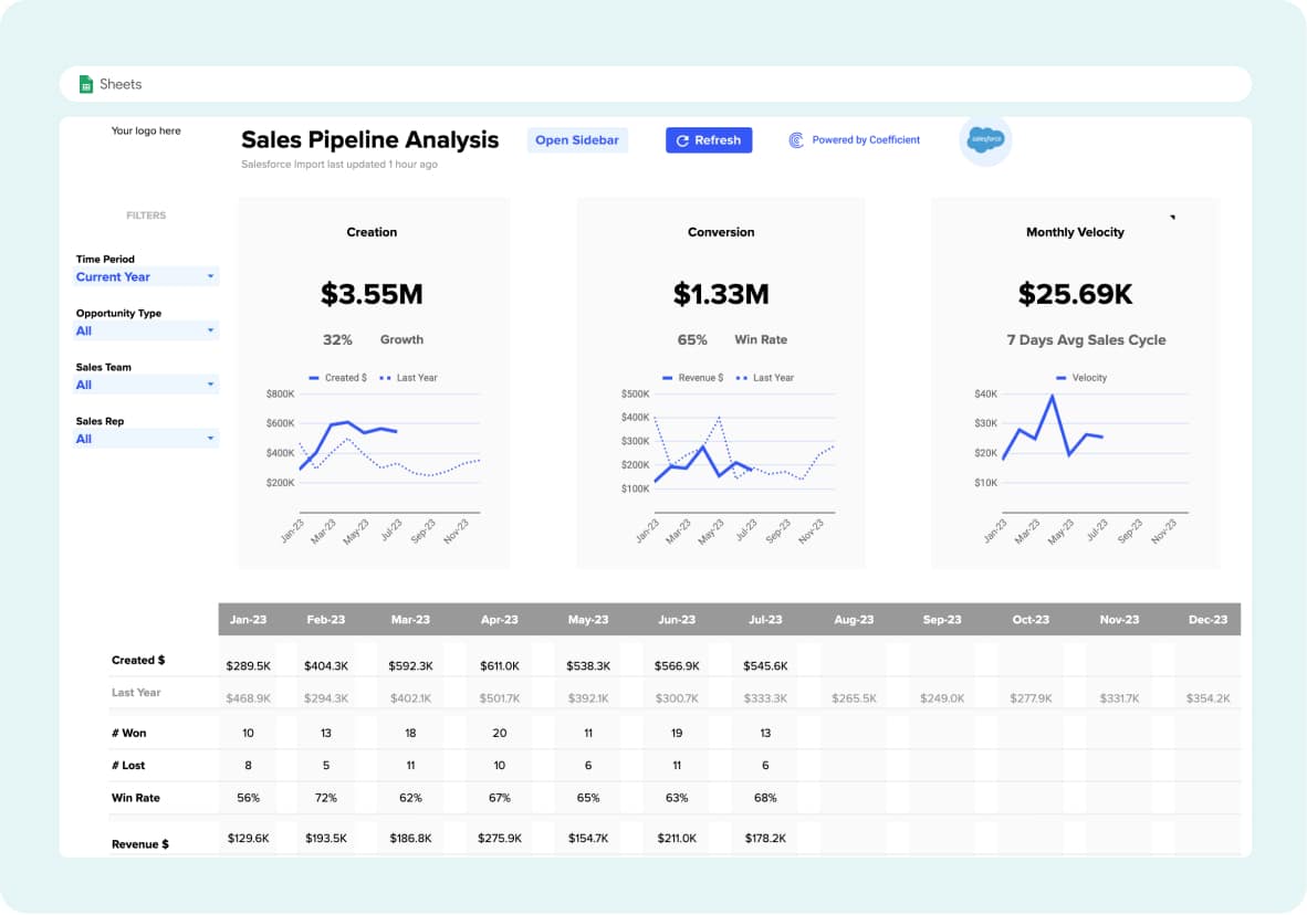
- Import Data: Begin by importing data from Salesforce into your spreadsheet using the Coefficient sidebar
- Access Import Settings: Locate your Salesforce import in the “Imports” section
- Open the Menu: Click the three-dot menu icon next to the import’s name
- Select Edit: Choose “Edit” from the dropdown menu
- Find Webhook URL: In the edit screen, click the three-dot menu again and select “Webhook URL”
- Choose Your Refresh Scope:
- Refresh this import only: For single-import triggers
- Refresh all imports in sheet: For comprehensive spreadsheet updates
- Implement the Webhook: Paste the copied URL into your Salesforce outbound message or flow configuration
When specified events occur in Salesforce, your spreadsheet automatically refreshes with the latest data—no manual intervention required.
Custom Connector Webhooks vs. Coefficient Comparison
| Aspect | Custom Development | Coefficient |
| Setup Time | 2-4 weeks | 5 minutes |
| Development Cost | $5,000-$15,000 | $29-$299/month |
| Maintenance | Ongoing dev resources | Fully managed |
| Security | Must implement yourself | Enterprise-grade built-in |
| Monitoring | Build your own | 24/7 automated monitoring |
| Scaling | Handle infrastructure yourself | Auto-scaling included |
| Updates | Maintain API changes | Automatic updates |
Take Control of Your Data Flow
Setting up Salesforce webhooks doesn’t have to drain your development budget or delay critical business processes. While traditional approaches require extensive technical expertise and ongoing maintenance, modern solutions like Coefficient eliminate these barriers entirely.
Ready to transform hours of manual data updates into automated, real-time synchronization? Get started with Coefficient today and experience the power of effortless Salesforce-to-spreadsheet integration.
Your team will spend less time wrestling with data transfers and more time making the strategic decisions that drive business growth.
FAQs
Does Salesforce have a webhook?
Salesforce doesn’t have native webhook support out-of-the-box. Instead, it offers outbound messages (SOAP-based) and requires custom Apex development for modern REST webhooks. However, you can achieve webhook-like functionality through outbound messages or third-party AppExchange solutions like Coefficient for seamless integrations.
What are webhooks used for?
Webhooks enable real-time data synchronization between systems by automatically sending data when specific events occur. In Salesforce contexts, they’re commonly used for updating external databases when records change, triggering email campaigns, syncing CRM data with marketing tools, and maintaining real-time dashboards and reports.
What is the difference between API and webhooks?
APIs require your system to actively request data (pull-based), while webhooks automatically send data when events occur (push-based). An API requires requests from the client (pulling data), while a webhook sends data automatically when an event occurs (pushing data). Webhooks are more efficient for real-time updates since they eliminate the need for constant polling.
Does Salesforce have an API?
Yes, Salesforce provides extensive API access including REST API, SOAP API, Bulk API, and Streaming API. These APIs allow you to create, read, update, and delete Salesforce data programmatically. API access varies by Salesforce edition, with developer and trial accounts receiving 15,000 daily API calls and enterprise accounts receiving significantly more based on user licenses.