Free, pre-built Salesforce Pipeline Analysis Dashboard
Get started in seconds with a dashboard that helps you better understand core sales operations metrics. Compare monthly results for pipeline creation, win rates, average deal age, average deal size, and sales velocity. Easily filter your data by sales team, time period, or opportunity type.
This Pipeline Analysis Dashboard will help you:
- Automatically populate this dashboard with live data from your Salesforce Org
- Measure and track key indicators, such as Pipeline Creation, Sales Conversions, and Sales Velocity
- Slice and dice your sales results by team, opportunity type, and other filters
- Instantly gain insights into your top-performing teams, regions, industries, and accounts
How to import crucial data for your sales pipeline report using Coefficient
Coefficient.io is a dedicated add-on for Google Sheets that makes importing data a breeze.
You can import data from a variety of sources for analysis which includes simple spreadsheets or CSV files as well as databases present online and offline.
Here are some data sources:
- Salesforce
- HubSpot
- Google Analytics
- MySQL
- Redshift
- PostgreSQL
- Snowflake
- Looker
- Google Sheet
- CSV
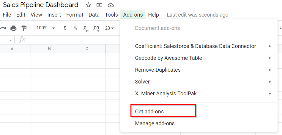
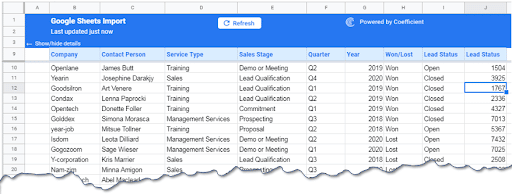
Installing the add-on is easy. Go to Add-ons on the menu bar in Google Sheets, search for “Coefficient: Salesforce & Database Data connector.”
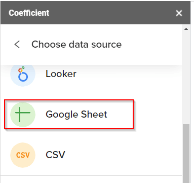
The add-on comes with a dedicated dialogue box to select the source of data. For this example, we will choose Google Sheet as the data source.
For this case study, we used a file named Sales_Data. Connect the analysis sheet to the data source by importing Sales_Data.
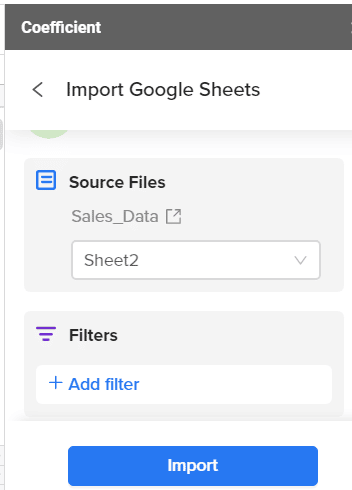
Our data is present in Sheet1 of Sales_Data, we will import the data and apply filters if required. For this analysis, we have not applied any filters.
This is how the analysis sheet looks once data is imported.
We are now ready to build our sales pipeline report.
Preparing the sales pipeline report
Let’s start by answering the fundamental questions related to a Sales Pipeline:
1. Open and closed deals and their dollar values
- What is the number of deals that are open or closed?
- What is the dollar value attached to these deals?
We used the formulas SUMIF(), SUMIFS(), COUNTIF(), and COUNTIFS() to find the number of open or closed deals and to know their respective dollar values. The final output is this table below:
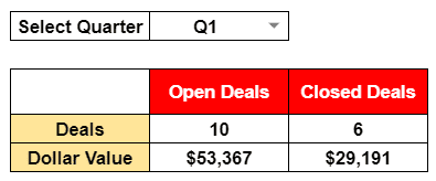
We applied a drop-down to get an individual quarter or select all of the quarters. The number of open and closed deals and their dollar values are displayed in the table.
As you can see from the table above, we have 10 deals open for the current quarter and that will yield $53367. For the current quarter, we have earned $29191.
Thus we can see that 35.35% of the income has already been realized.
2. Open deals by Stage
The second obvious detail that everyone might be interested in is the breakdown of every deal by the stage they are in the pipeline.
The image below shows a detailed report of open deals data in one quarter. Again, we used conditional sum formulas for this report.
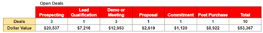
The table above was produced using the formulas SUMIFS() and COUNTIFS() with conditionals added through the IF() function.
After selecting a calendar quarter, the data was displayed in the table showing the breakdown of the deals and their dollar values.
3. Deals won and lost by segment
The table below shows the details of the deals that the company had won and lost for the selected period and the breakdown of deals by segment and their dollar values.
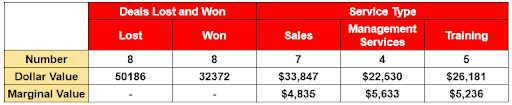
From the table, we can see that there is a 50:50 ratio in deals won and lost. You can also notice that the biggest share of deals belongs to Sales (sales of goods) followed by Training that is provided to clients.
In the second row, the dollar values of the deals are shown. Using the dollar value for each service type, we would know the marginal value each deal can bring to the company.
For example, acquiring one client that needs “sales service” will add 33847/7 = $4835 to the company whereas Management Services will give $5632 and $5232. Thus, the management service is the service type that adds the most value to the company.
A similar analysis could be done for deals won and lost against any service type to find out which service type needs improvement.
4. Year over year analysis of sales
In the following table, we analyzed the total deals won and lost for every year and compared them.
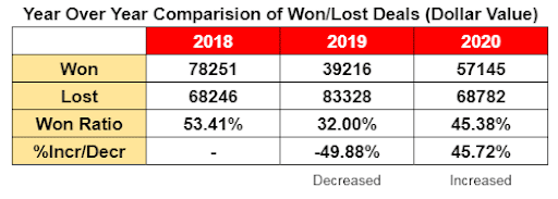
The data above shows the won/lost ratio. This ratio took a dip in the year 2019 and then increased again in 2020. The last row shows that the win ratio in 2019 decreased by almost 50%, and it increased again by 46% in 2020. Still, the ratios reported in these two years are lower than the base year of 2018.
5. Salesperson performance
No target can be achieved without team effort; hence it is really important to see the contribution of each individual in the team. The following table presents the performance of each salesperson in terms of dollar value-added.
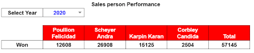
The table shows the sales figures for the four salespeople working in the company. The most successful salesperson is Scheyer Andra who brought the business worth $26,908 of sales, followed by Karpin Karan with $15,125.
Graphs
Graphs always add value to reports by presenting key facts in visual form.
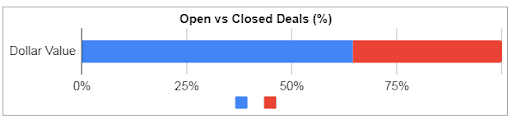
The following graphs show the open or active deals versus the delivered or closed deals. A total of 64% are still open. This implies that services still need to be delivered. This number also represents outstanding payments.
The following graph is the visual presentation of won and lost projects in every quarter of three calendar years.
It also shows the variation in business volume over the years as the bars in the graph rise and fall in every quarter.
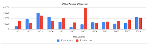
From the visual inspection, there is almost a 50:50 ratio in projects won and lost by the company.
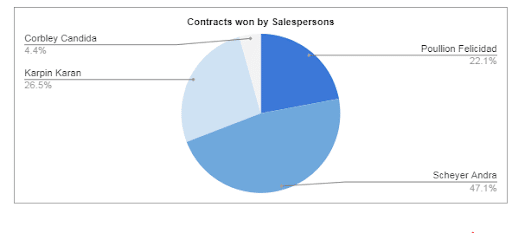
The graph above presents the data from the last table in a visual form showing that major sales come from Scheyer Andra and Karpin Karan.
Syncing and updating the data
Once the report is produced, it will need to be updated to keep the report fresh. This is generally done manually by importing and exporting data, but you can get the data in real-time without importing or exporting using Coefficient. Our add-on makes that easy by providing an option to automatically schedule updates.
You just need to set when the Sales Pipeline Dashboard has to be updated and as the pipeline data is updated, the dashboard will be, too.
Try our pre-built sales pipeline dashboard – launch in a single click in Google Sheets
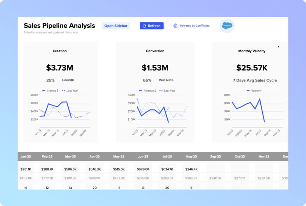
If you want to bypass the manual work of building a sales pipeline dashboard, you can launch our free Sales Pipeline Analysis template (Salesforce / HubSpot) in a single click. Our Sales Pipeline Analysis template offers pre-built dashboards that visualize your sales pipeline in Google Sheets.
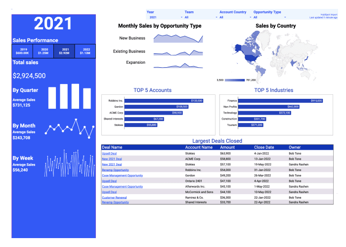
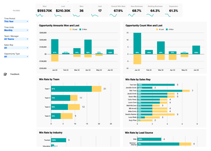
Now you can measure individual, team, and company-wide sales performance for all dashboards and reports. Simply toggle the drop down menu to your preference.
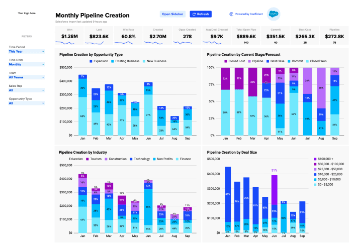
With the Sales Pipeline Analysis template, you can track pipeline creation with live data from your Salesforce or HubSpot CRM. Track the flow of SQLs in your pipeline, how lead generation initiatives are performing, pipeline health, and sales forecasting KPIs, without having to build dashboards from scratch.
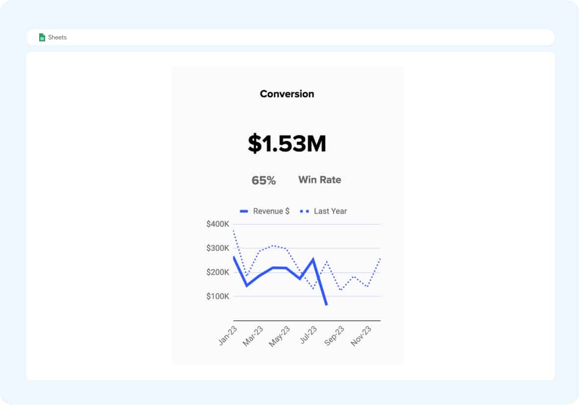
Visualize monthly conversions, measure win rate, and compare revenue year-over-year with our pre-designed dashboards. Understand how individual reps and teams are performing, what they’re contributing to total revenue, and also isolate trends that might call for an adjustment of sales tactics.
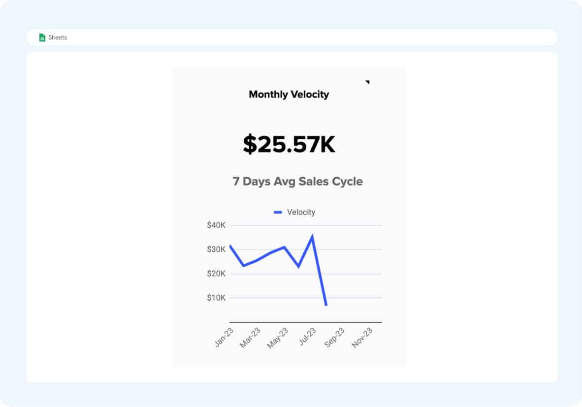
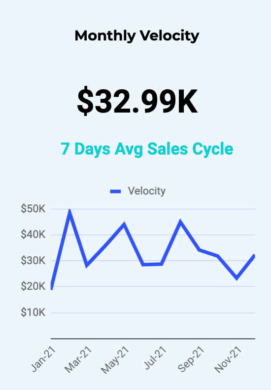
Check out our monthly velocity dashboard to see how much revenue is passing through your pipeline on a monthly basis. This allows you to understand how fast your sales reps are converting leads. It’s a key indicator of pipeline health, and incorporates many fundamental sales KPIs — SQLs, average deal value, and sales cycle length.
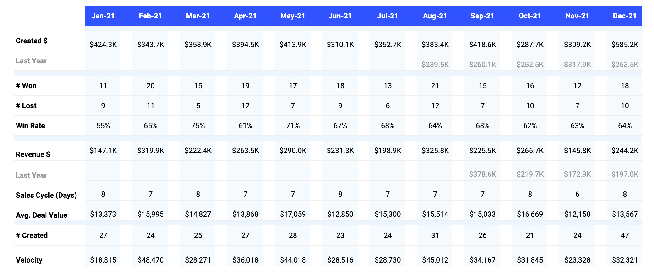
The template also maintains a monthly report for many of the key sales pipeline metrics: pipe created, closed won, closed lost, win rate, revenue, cycle length, average deal value, and more. This gives you a bird’s eye view of how your reps, teams, and company are performing in all facets of the sales pipeline.
Our one-click Sales Pipeline Analysis template (Salesforce / HubSpot) is a great free option for sales professionals who do not have the time to build and maintain dashboards.
How to Analyze Sales Pipeline Creation Metrics?
Examining pipeline creation metrics gives sales teams a comprehensive view of how leads are progressing through the sales funnel. This level of insight allows leaders to identify stages where potential clients disengage, which phases are more time-consuming, and where the highest conversions occur.
Though specifics can vary across different companies, here’s a foundational guide to set you on the right path
- Identify Key Metrics: Start by identifying the key metrics that reflect the health and performance of your sales pipeline. These might include pipeline value, sales pipeline velocity, conversion rate per stage, and sales rep pipeline performance.
- Gather Data: Use your CRM tool to collect data on these metrics. This should include historical data for trend analysis, as well as real-time data for immediate insights.
- Bring Your Data to Life: Use data visualization tools to create charts and graphs that represent your data. This will make it easier to understand and interpret the data.
- Analyze Trends: Look for trends in your data. Are there certain stages in the sales pipeline where leads tend to get stuck? Are there particular sales reps who are outperforming or underperforming?
- Identify Bottlenecks: Use your data to identify bottlenecks in your sales pipeline. These are areas where leads are getting stuck and not moving forward to the next stage.
- Implement Changes: Based on your analysis, implement changes to improve your sales pipeline. This might involve training for underperforming sales reps, changes to your sales process to eliminate bottlenecks, or adjustments to your sales strategy to better align with customer behavior.
- Monitor Performance: After implementing changes, continue to monitor your key metrics to assess the impact of your changes. This will help you understand whether your changes are having the desired effect, and allow you to make further adjustments as needed.
- Repeat the Process: Sales pipeline analyses are an ongoing process where you continually collect and analyze data, implement changes, and monitor performance. This will allow you to continually optimize your sales process and improve your sales results.
You can use the Coefficient Pipeline Analysis Template to streamline this entire process. Each template comes with the ability to refresh data so you can ensure you are analyzing the latest set of data. And since Sales is a team sport, Coefficient allows you to push updates to colleagues for increased visibility.
How Do You Calculate Sales Opportunities Created Per Month?
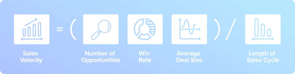
Sales velocity is the rate at which opportunities progress through your sales pipeline to generate revenue. It’s calculated by using the following formula:
Sales Velocity = (Number of Opportunities x Win Rate x average deal size) / Length of Sales Cycle
- Number of Opportunities: The total count of potential deals in your pipeline.
- Win Rate: The percentage of opportunities that successfully convert into sales.
- Average Deal Size: The average monetary value of each deal in your pipeline.
- Length of Sales Cycle: The average duration it takes to close a deal, from the initial interaction with a potential customer to the final sale.
What is the Best Way to Visualize Sales Pipeline?
Visualizing a sales pipeline is essential for understanding sales performance and effectively communicating results to stakeholders. Clear visualizations translate intricate data into accessible insights, allowing stakeholders to quickly grasp and act on them.
Most sales pipelines are visualized as funnel diagrams, Sankey diagrams, bar charts, or pie charts based on your needs. Funnel and Sankey diagrams highlight lead progression and bottlenecks, while bar and pie charts display lead counts and distributions, respectively.
Ensure your visuals have consistent colors and concise labels for clarity. Regular updates keep them relevant and reflective of the latest data. For deeper insights, segment data by team or individual sales reps to identify performance trends. Sharing these visuals promotes a unified understanding of sales goals and progress.
Note: While CRMs like Salesforce offer analytics capabilities, spreadsheets are typically more flexible and allow you to combine different data sets together for a complete view, for example, pipeline gap analysis.