Table of Contents
![]()
- 1. 10 Best CRM Reporting Tools for 2026
- 2. Sales Velocity Tracking: How to Calculate and Track Overtime in Google Sheets
- 3. Average Deal Size: How to Measure + Optimize Forecasting (With Template)
- 4. How You Can Measure and Optimize Pipeline Velocity
- 5. How You Can Measure and Optimize Win Rate Today (2024 Guide)
- 6. Quota Attainment: How to Measure in 2026 (With Template)
- 7. Top 10 Sales Metrics to Track in 2025
- 8. How to Analyze Sales Rep Performance in Google Sheets
- 9. 5 Sales Revenue Metrics to Measure Success in 2024 (With Templates)


When looking at growing your sales, a couple of metrics jump out as obvious things that should be looked at: How many sales opportunities we’re generating, the size of those opportunities, how many opportunities we’re successfully closing, and how long it takes to close a deal.
All 4 of these metrics are pretty important on their own, but how do you measure them all in such a way that you can compare them directly? After all, any one of these metrics can be improved at the cost of the other, so how do we really show long-term progress?
Enter “Sales Velocity”, your dollar-per-day measure of performance, to help you optimize your sales lifecycle and strategy, and understand whether you’re really improving, or if you’re just sacrificing one metric for another!
What is sales velocity
At its core, Sales Velocity is a Dollar-per-Day measure of your sales lifecycle, and by dollar-per-day, I mean the final value is an estimate of the amount of money your business is bringing in based on:
- The number of open opportunities
- The average value of a won opportunity
- The % of opportunities that are typically won
- The average time to win
The basic formula for this looks something like

Now it’s worth keeping in mind a couple of things:
First, the formula assumes that an opportunity is “Qualified”, meaning that it’s an opportunity that has been vetted and determined that it is a viable business opportunity. Depending on how your company evaluates its business opportunities, this could be either any opportunity in Salesforce (if qualification happens before an opportunity is created) or from opportunities beyond a certain stage (if opportunities are qualified at a certain stage in the pipeline).
Second, outliers in your sales lifecycle like big spenders, or companies with smaller purses, could skew your results. You may want to break these out into different categories so that one or two renewals for big clients don’t skew your data.
Third, the better your data, the more accurate your result. So if your org has a bunch of old, qualified opportunities that are hanging out which no one intends to pursue, you’ll want to decide how to handle them. If they’re stale, sales managers may have problems closing them, resulting in a lower win performance. If they’re left open and ignored, you may expect a higher or lower $ per day. You can also just close them, but you may lose out on a client who just needs some more warming up.
Fourth, changes in sales strategy can have significant impacts on the metric. For example, correcting a loose qualification process may drastically change the number of “open opportunities”, and the launch of a new, killer product that begets reaching out mid-contract may drastically change the sales lifecycle, and thus the Sales Velocity. For that reason, it’s important to understand important business events and filter our events in your data which may distract from any progress or shortfalls, at least until your business reaches a “new normal”.
Data needed to calculate sales velocity
So to build this report, we need a couple of things from Salesforce:
- The number of Open Opportunities – This one is pretty straightforward. We just need all Opportunities where IsClosed is False. We’ll just count those and then we’re done. Just make sure to filter out any open, but stale opportunities
- Average Value of a Won Opportunity – This one is also pretty straightforward. We just gather all open opportunities and average out the Amount field across all of them. Just bear in mind that you may want to segment out your customers by size in order to ensure that big (or small) purchasers don’t throw off your results.
- % of Opportunities that are Won – We want to be careful with this one as well. Changes in how opportunities are qualified could skew the percentage up or down.
- Average time to win is fairly easy to get. For each won opportunity, we just want to see the number of days between the close date and then creation date. Note: If you have a stage specifically for qualifying an opportunity, you may need a trigger or flow to record a date for when the opportunity is considered “qualified”, and use that date instead of the created date.
For our company, we’re going to look at the 3 months of data at a time, but we’ll review the data every month by utilizing reporting snapshots
Building your sales velocity tracker
First, let’s build our report. You can either do that via a SOQL Lookup, an Existing Report, or by selecting objects and fields to import. If you’re unsure how to proceed, you can review the documentation here for an example on how to set up a report: https://coefficient.io/salesforce-data-in-a-spreadsheet-without-exporting
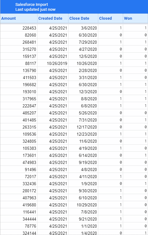
I’ve already created a report for this in Salesforce for use in some dashboards, so let’s pull it down and see what we’ve got:
Now before you close that import window though, remember to do two things. Set the refresh interval and the Snapshot interval:
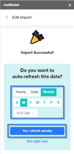
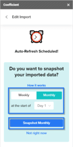
Daily or Weekly should be fine for the refresh interval, and we’ll snapshot our data on the first of every month (you can select any day)
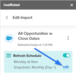
If you make a mistake, or you need to go back and add snapshotting to an existing report, you can always open the Coefficient add-on on your workbook and click the edit button in the Refresh Schedule section
This will give us a snapshot of our data every month so we can see how our sales velocity changes.
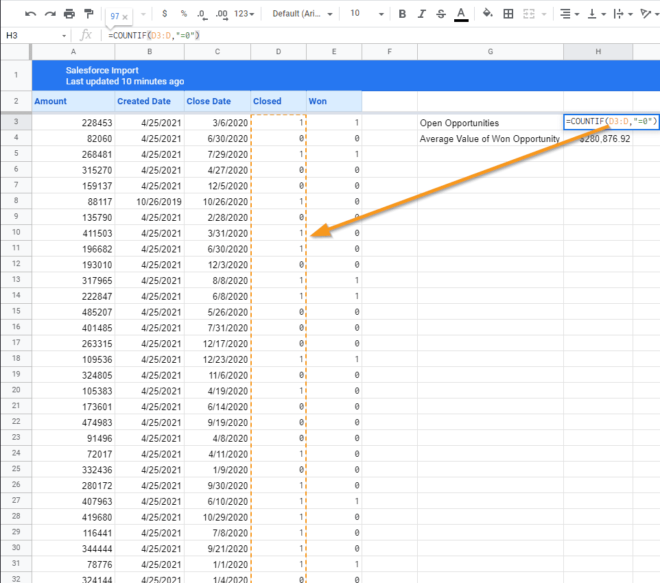
To start with our current data, let’s look at our current sheet. The first thing we needed was the number of open Opportunities. Easy enough.
=COUNTIF(D3:D,“=0”)
Coefficient is kind enough to not overwrite content next to the import on refresh, so we can just drop this code in an adjacent cell, such that this counts all open opportunities. Since Booleans get brought over as 1 or 0, we can just exclude anything where Closed is equal to 0. That means this count will also refresh when the data is refreshed from Salesforce! Note as well that we’re using D3:D. This starts at the 3rd cell in the D column and runs through the rest of the valid cells in the D column. This makes it so that if the number of cells in the D column happens to change (eg. at a refresh we pull in a large number of new opportunities), we will still capture all of them in our calculation!
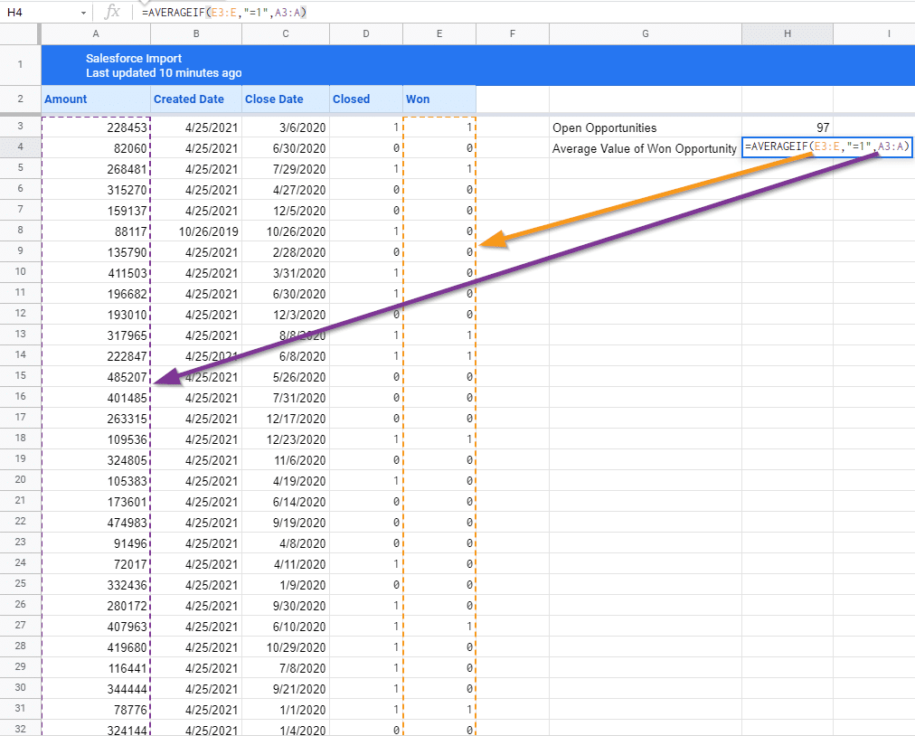
Next, we need Average Value of a Won Opportunity. To do that, we can use a formula like this:
=AVERAGEIF(E3:E,“=1”,A3:A)
AVERAGEIF allows you to take an average of cells, but only those which meet certain criteria. In this case, we’re only averaging those which are for won opportunities. We do specify the range of cells under the Won column (using the same trick as last time), adding criteria requiring the cell to equal 1, and then specifying the purple range, which is the amount column for our imported opportunities.
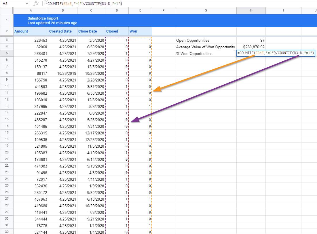
For the percentage of won opportunities, we need something a little different. Just kidding. It’s more COUNTIFs. You could technically do this by reusing the Open Opportunities value, but then you have to worry about parenthesis, and it just doesn’t look as clean (plus you would have dependent calculations which aren’t so ideal.
=COUNTIF(E3:E,“=1”)/COUNTIF(D3:D,“=1”)
Essentially we’re just counting the number of won opportunities and dividing that by the number of closed opportunities. Make sure to reformat the field to a percentage to pretty things up!
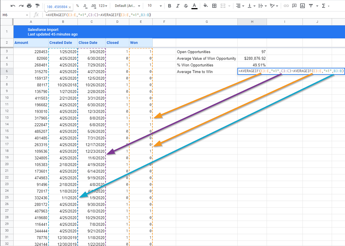
The last metric we need for our sales velocity calculation is Average Time to Win. Now a useful field here would be a Time to Close field which we can use to get the time an opportunity spent in-process. Unfortunately, we don’t have one here, so we’re going to abuse how dates are stored, and get the average start date, the average close date, and subtract the two to get the same answer without having to create the new column in the spreadsheet or in the source report. Be on the lookout for neat little tricks like this which you can use to make your spreadsheets require less maintenance!
=AVERAGEIF(E3:E,“=1”,C3:C)-AVERAGEIF(E3:E,“=1”,B3:B)
Since Dates are stored as numbers and then just presented in a date format, we can just average the start date and subtract it from the average close date. We use AVERAGEIF to handle this in both cases, and just make sure we filter it down to only include Won opportunities. AVERAGEIF works here because of the quality that dates are stored as numbers and that
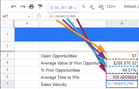
We’re in the home stretch! Now we just need to calculate our Sales Velocity, using the formula from above:
Or in our Google Sheet, written as:
=H3*H4*H5/H6
Now that that’s done, we’ve got our Sales Velocity! Let’s add just one more thing. Since Coefficient now supports automatic snapshotting of our data, those formulas we added will actually carry through to the next snapshot… and the next one… and the next one, until we change or delete them! So we can create a line graph showing the change of the data over time, and we can update it with minimal effort.
To automate the X-axis, we can add the Last Modified Date to our report and pull it into our Coefficient Report pull. We’ll just use the Max function against our last modified Dates to get our X-Axis Value:
=MAX(F3:F)
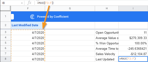
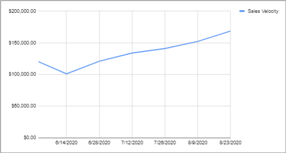
Now the next time the report refreshes, the Last modified dates, and so will the Last Updated Date. The Snapshots will also ensure that the Last Update date reflects the last updated date for the data in the snapshot. So now we can begin building our next Dashboard with a line graph showing the progression of our new Sales Velocity!
Let’s add a tab to collect our data:
First, we’re going to pull in the snapshot dates. Once for the import sheet, and one for each of the snapshots. When we get a new snapshot, we’ll just add a column right before the import sheet and link the cell to it.
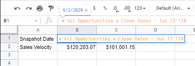
And again for the Sales Velocity Fields. Feel free to do the same thing for any of the other metrics we generated if they’re useful in your reports!
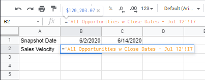
And after a couple of snapshots, you can generate a meaningful Sales Velocity graph for your teams!
Conclusion
Sales Velocity is a great metric to show how your team is pursuing impactful opportunities and pushing for greater efficiency. As with all data points, however, you often need several different metrics to truly understand how your business is moving and to focus on the right things. These metrics should cover the business as a whole, the impacts of important decisions, and individual performance to help each team member to find their own efficiencies.
Try Coefficient for free today!