Sales pipelines are critical for processing and understanding sales data. Pipeline Management tools record, track, and visualize how prospects move through every stage of the sales cycle, from first touch to conversion. And this sales pipeline data has to tell a unified story to extract valuable insights which is generally achieved through charts, graphs and other visualizations.
In order to tell that story, a pipeline needs to thread together the right mixture of sales KPIs. Easier said than done, right? But don’t worry — we’ve got you covered. Our work with hundreds of sales teams across the world has given us unique insight into the best sales pipeline metrics.
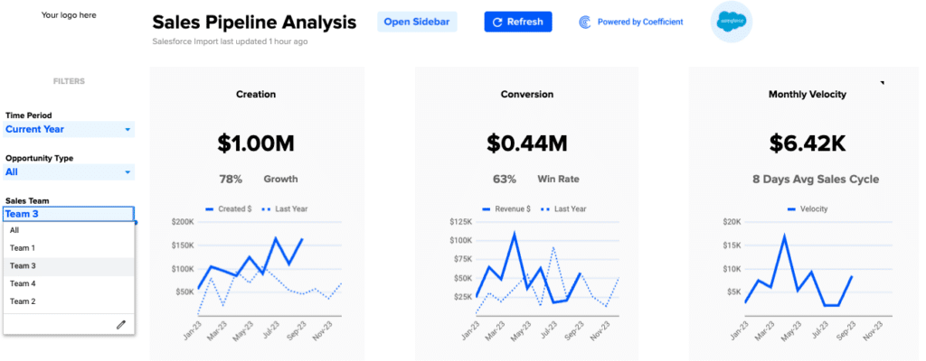
But you also need to visualize the data. Typically, sales teams turn to cumbersome CRMs to build visualizations. We made this part much simpler, too. We’ve designed a free, pre-built sales pipeline template in Google Sheets that’s powered by your real-time CRM data. Now you can visualize the story your KPIs tell in a few clicks.
Read on to learn what the top sales pipeline KPIs are and how you can visualize them in a couple of clicks with our Sales Pipeline Analysis template (based on your Salesforce or HubSpot CRM data).
SQLs per Month
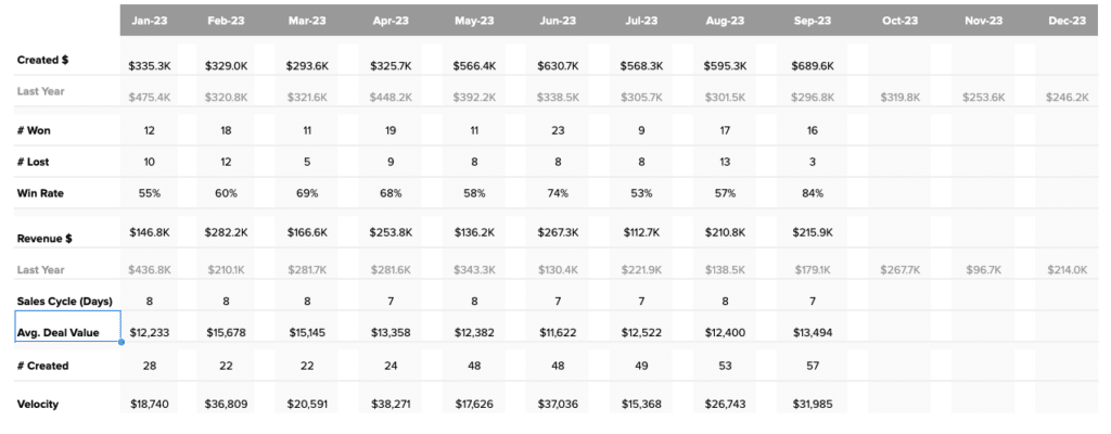
Pipeline creation is one of the most critical components of any sales pipeline. That’s why, in our experience, many sales teams treat Sales Qualified Leads (SQLs) per month as a must-have KPI. A steady flow of new SQLs sustains your pipeline coverage and ensures your sales team has a healthy volume of prospects to convert in the coming weeks.
SQLs per month is a key indicator of how your lead generation initiatives are performing. This KPI is also critical for sales forecasting. And now, with connected spreadsheets such as Coefficient, you can import KPIs from your CRM into Google Sheets and build more flexible sales forecasting models.
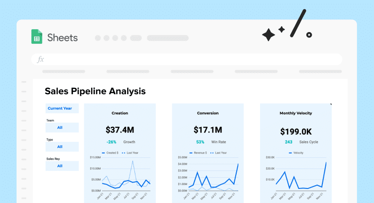
Our Sales Pipeline Analysis template (Salesforce / HubSpot) visualizes SQLs by month with a pre-built dashboard in Google Sheets.
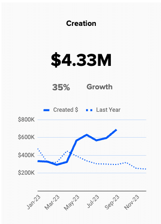
Compare pipeline creation year-over-year, analyze growth, and ensure you’re hitting projected targets. And since we’ve designed this dashboard for you, you don’t have to spend time creating or maintaining it.
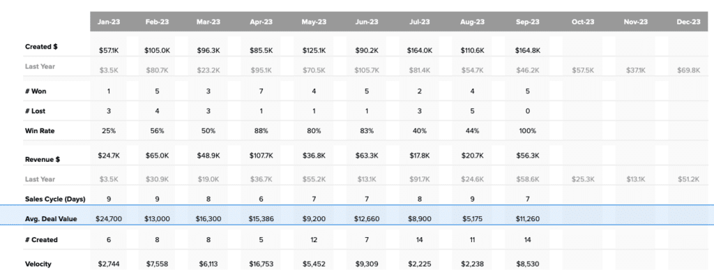
Average Deal Value per Team
Average deal value per team is a key KPI that demonstrates if your sales units are on track to hit revenue goals. That’s why the sales teams that we work with often leverage this KPI in their sales forecasting models.
The KPI enables you to isolate underperforming units and assess if the gap is due to specific individuals or the group as a whole. This allows you to initiate targeted course corrections and calculate more accurate revenue projections.
Our Sales Pipeline Analysis template (Salesforce / HubSpot) calculates average deal value automatically.
To calculate average deal value by team, simply select the team you want to analyze from the drop down menu.
The template generates the average deal value for Team 3 by month.
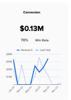
Win Rate by Sales Rep
Many of the sales teams we work with track win rate by sales rep. This KPI allows you to understand how individual reps are performing, what they’re contributing to total revenue, and where they need instruction or assistance.
For instance, if a rep is bringing in a high volume of qualified leads, but loses them later in the sales cycle, he or she will need to make targeted improvements to those friction points. That’s why the sales teams we support like this KPI — it allows them to drill down into specific reps and sales cycle issues.
The Sales Pipeline Analysis template (Salesforce / HubSpot) automatically generates win rate by sales rep. The template, by default, shows you the win rate for the entire sales team:

Stop exporting data manually. Sync data from your business systems into Google Sheets or Excel with Coefficient and set it on a refresh schedule.
Get Started

To view the win rate for a specific sales rep, simply choose his or her name from the drop down.
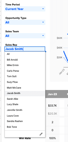
The dashboard will then display the win rate for Jacob Smith — in this case, 70%.
Average Sales Cycle Length
Our sales team partners monitor average sales cycle length quite closely. This measures the time from first touch to conversion, averaged across all closed deals. It gives you a holistic view of the sales cycle.
Average sales cycle length is a good indicator of how your sales strategies and tactics are faring in the aggregate. This KPI is also important for sales forecasting. For instance, you can combine it with lead volume to predict sales figures.
The Sales Pipeline Analysis template (Salesforce / HubSpot) computes the average sales cycle length.


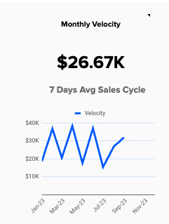
Monthly Sales Pipeline Velocity
Nearly all of our sales partners maintain a sales pipeline velocity KPI. Typically, this KPI is calculated per month. It shows how much revenue is passing through your pipeline on a monthly basis.
In other words, the KPI measures how fast your sales reps are converting leads. Sales pipeline velocity combines many of the KPIs we’ve already discussed: SQLs, average deal value, and sales cycle length. The KPI is a key indicator of pipeline health.
Our Sales Pipeline Analysis template (Salesforce / HubSpot) comes with a monthly sales velocity dashboard. You can segment the dashboard by team, opportunity type, or sales rep.
Try Our Free, Pre-Built Sales Pipeline Template
Our work with hundreds of sales teams has given us a unique view into the most impactful sales pipeline KPIs. But knowing the KPIs is only the first step. That’s why we created our pre-built Sales Pipeline Analysis template (Salesforce / HubSpot) for Google Sheets.
Now you can instantly launch an out-of-the-box sales pipeline and visualize all of these KPIs in pre-designed dashboards. It’s simple — and free — to get started. Click one of the buttons below to copy the template for your own use.