


Table of Contents
![]()
- 1. Best 7 FP&A Software Tools in 2026 [w/ Feature Comparison Table]
- 2. Best 7 Financial Planning Tools in 2026 [w/ Feature Comparison Table]
- 3. Top 8 Demand Planning Tools in 2025 [w/ Feature Comparison]
- 4. 6 Best Financial Reporting Tools in 2026: Compared for Finance Teams
- 5. BI Tools for Finance Teams in 2026: A Buyer’s Guide That Doesn’t Waste Your Time


Most finance teams already know what they need from a BI tool. The numbers have to be right. The report has to be ready before the Monday meeting, not during it. And leadership has to trust what they’re looking at without someone from finance pre-explaining every figure on the page.
What they don’t need is a tool that solves one part of that problem and creates a new one. A BI platform that requires a data engineer to configure. A planning tool that can’t connect to the CRM. A dashboard builder that produces impressive-looking output from numbers nobody can trace to a source.
The BI market in 2026 is wide. The number of tools that actually fit a finance team’s constraints, meaning auditability, multi-system connectivity, spreadsheet-native workflows and leadership-ready output, is much narrower. This guide covers that narrower set: what the landscape looks like, how to figure out where your bottleneck is, and which tools are worth evaluating based on that.
Why Finance Teams Have a Different BI Problem
BI tools are built for data teams. Finance teams use them anyway, because no one built something better for their specific constraints. That gap is where most of the friction lives.
Three things make finance’s BI problem distinct from every other department’s.
Auditability is non-negotiable. A number in a board deck, an investor report or a budget variance analysis has to trace back to a source. Not approximately, exactly. A hallucinated metric or a stale CSV export is not a minor inconvenience in finance. It is a material error. This single requirement rules out any AI tool that generates plausible-looking output without source traceability, and it is why finance teams move more slowly than other departments when adopting new analytics tools. The trust bar is higher because the consequences of getting it wrong are higher.
The data lives in at least three systems. A finance team pulling a P&L is typically touching an ERP, a data warehouse, a CRM for revenue data and sometimes a payroll or HRIS system for headcount costs. A BI tool that connects to one of those systems deeply but not the others does not solve the consolidation problem. It moves it. The finance team still spends hours pulling, formatting and stitching data across tabs before any analysis starts.
Finance teams live in spreadsheets, and that is not going to change. Spreadsheet-based models carry formulas, version history, audit logic and institutional knowledge that took years to build. The best BI tools for finance meet teams in Excel or Google Sheets. The ones that force finance teams to abandon their models for a new interface add adoption friction without solving the underlying data problem.
How Modern Finance Teams Are Building Their BI Stack
Most finance teams in 2026 are not starting from a clean slate. They are working on top of an ERP they have had for years, a spreadsheet model refined across multiple planning cycles and a reporting process that runs on a combination of exports, copy-paste and muscle memory. The BI tools that work for them add to that foundation rather than requiring them to replace it.
The stack that finance teams are building toward moves through three layers. Understanding which layer is your current bottleneck is the fastest way to figure out which type of tool you actually need.
The modeling layer
FP&A and planning platforms like Anaplan, Workday Adaptive and Datarails sit at the base of the modern finance stack. These tools handle budgeting, forecasting, scenario modeling and variance analysis. They are Excel-native or Excel-adjacent, which is why finance teams adopt them without the resistance that comes with fully new interfaces. If your bottleneck is the planning process itself, building budget versions, running what-if scenarios or getting stakeholder approvals, this is the layer to invest in first. Coefficient connects live ERP and CRM data directly into the spreadsheet models this layer runs on, so inputs are always current without a manual pull before every planning cycle.
The visualization layer
Traditional BI platforms like Power BI and Tableau sit at the visualization layer. They are strong for dashboards and data exploration when a dedicated analytics team exists to build and maintain them. In practice, this layer is less common in finance teams under 200 people, not because the need is absent, but because the setup cost requires data engineering resources most mid-market finance teams do not have. Connecting sources, building data models, maintaining refresh pipelines and managing per-viewer licensing adds up fast. Coefficient lets finance teams publish AI-built web dashboards from their existing spreadsheet data, without a data engineer or a BI tool license for every viewer. See dashboard examples for finance use cases.
The reporting layer
Financial reporting software like Workiva and Cube is built for the close process, board reporting and disclosure management. These tools focus on audit trails, version control and the structured output finance teams send to leadership, auditors and investors. Most relevant for public companies or multi-entity organizations with complex consolidation requirements. Coefficient brings live data from NetSuite, QuickBooks, Snowflake and Salesforce into the spreadsheet reports this layer produces, removing the CSV export and copy-paste step that slows every close cycle.
Five Questions Finance Teams Should Ask Before Picking a BI Tool
Most BI tool evaluations go wrong because teams evaluate the tool before diagnosing the problem. These five questions narrow the field before any demo gets scheduled.
1. Is your primary bottleneck data connectivity or financial modeling?
These are different problems that require different tools. If your team spends hours every week pulling data from NetSuite, Salesforce and Snowflake into spreadsheets before any analysis starts, the bottleneck is connectivity. If your team has the data but struggles to model it, plan from it and produce variance commentary, the bottleneck is the modeling layer. Buying an FP&A platform when you have a connectivity problem does not fix the weekly data pull. Buying a data connector when your models are the issue does not fix your budget process. Identify which one is actually slowing you down before you evaluate anything.
2. Does the output need to be auditable?
If the answer is yes, and for most finance teams it is, every number in the output needs a traceable source. This rules out AI tools that generate dashboards or commentary from statistical inference rather than direct data queries. A metric that looks right is not the same as a metric that is right and can be proven to be right. Before evaluating any AI-powered tool, ask: can I see exactly where this number came from? If the answer is a chat log or a language model’s reasoning, that is not an audit trail.
3. How many systems does your data actually live in?
If your finance data lives in one system, most BI tools work. If it lives in three or more, which is the reality for most finance teams at companies over 50 people, you need a connector layer that handles consolidation before visualization. A BI platform with a single strong ERP connector and a weak CRM integration still leaves you stitching data manually. Map your actual data sources before evaluating connector depth.
4. Who consumes the output, and how often?
Internal operational reports that the finance team reviews daily have different requirements than monthly board decks going to investors. Self-serve dashboards for a CFO who wants to check metrics on demand are different from formal disclosure documents that need sign-off. The tools that serve each use case well are not always the same tools. Be specific about who is consuming what and at what frequency before deciding on a platform.
5. What is the total cost per viewer?
A tool priced at $75 per user per month for 20 finance and exec viewers is $1,500 per month before any implementation cost. Power BI Pro runs $14 per user per month. The Copilot add-on adds $30 per user per month. Tableau Creator starts at $75 per user per month. Looker‘s platform fee starts around $5,000 per month before user costs. Per-seat pricing changes the math considerably when the goal is sharing dashboards with leadership teams who will consume reports but never build one. Tools that offer free viewer access shift the economics for orgs distributing dashboards broadly.
The Tools
The tools below are organized by layer. The right one depends on which layer is your current bottleneck, not which tool has the most features or the highest analyst ranking.
FP&A and Planning Platforms
Anaplan
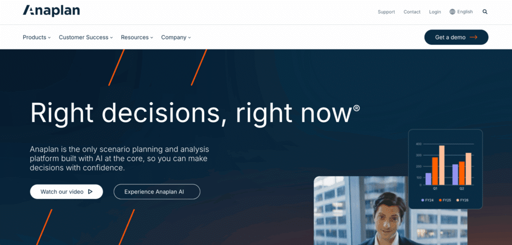
Anaplan is the enterprise standard for connected planning. It handles driver-based modeling, rolling forecasts, what-if scenarios and multi-entity consolidation at scale. Finance teams at large organizations use it to replace disconnected spreadsheet planning with a governed, collaborative model. The trade-off is implementation cost and time: Anaplan deployments typically require professional services, take months to configure and assume IT infrastructure that smaller finance teams may not have. Pricing is enterprise-oriented and quote-based. Best for large enterprises with complex planning requirements and dedicated FP&A resources. Anaplan pricing.
Workday Adaptive Planning
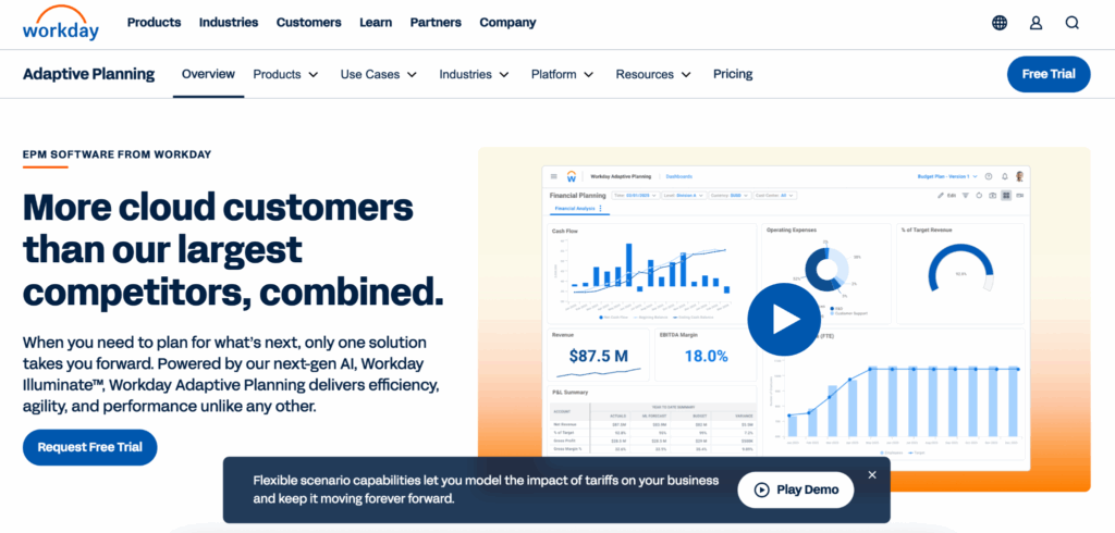
Workday Adaptive is strong for organizations already on the Workday HCM suite, where the integration between workforce data and financial planning is a direct advantage. It offers driver-based budgeting, forecasting and reporting with Excel-native input options. Implementation is faster than Anaplan for mid-market teams but still requires dedicated configuration time. Pricing is quote-based. Best for mid-to-large organizations already invested in the Workday ecosystem. Workday Adaptive overview.
Datarails
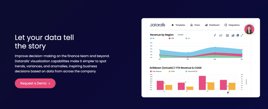
Datarails sits closest to the Excel-native end of the FP&A spectrum. It connects to ERPs and accounting systems, consolidates financial data and lets finance teams keep building in Excel rather than migrating to a new interface. Version control, audit trails and workflow approvals run underneath without requiring teams to abandon their existing models. Starting around $1,500 per month. Best for mid-market finance teams that want FP&A structure and consolidation without giving up the Excel environment where their models already live. Datarails pricing.
Traditional BI Platforms
Microsoft Power BI

Power BI is the default choice for organizations already running on Microsoft 365, where integration with Excel, Teams and Azure is a direct advantage. The Pro license runs $14 per user per month. Every viewer who accesses a shared report needs a seat. The Copilot add-on costs $30 per user per month on top of that. For enterprise-scale deployment, Microsoft Fabric starts at around $8,000 per month for the F64 tier. Power BI is capable for data-heavy organizations with analysts to build and maintain the data models underneath. For finance teams without that support, the setup friction is real. Best for Microsoft-heavy organizations with data engineering resources and a need for governed analytics at scale. Power BI pricing.
Tableau
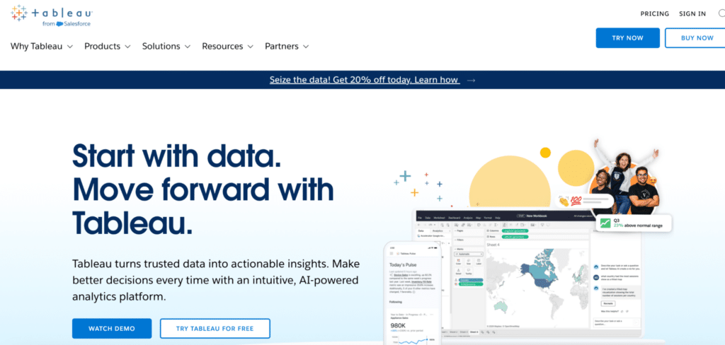
Tableau remains one of the strongest platforms for data exploration and interactive visualization. Creator licenses start at $75 per user per month. Explorer licenses run $42 per user per month and Viewer licenses $15 per user per month, all annual. The platform’s depth is also its constraint for finance teams: getting clean, connected data into Tableau requires upstream data preparation that most finance teams cannot own independently. Tableau is best used when a data or analytics team builds and maintains the pipelines and models, and finance teams consume the output. Best for organizations with a dedicated analytics team and data infrastructure that Tableau can connect to cleanly. Tableau pricing.
Financial Reporting Software
Workiva
Workiva is built for the structured reporting requirements of public companies: SEC filings, board presentations, ESG disclosures and internal control documentation. It links data and text in real time, reducing the version management burden that comes with manual document updates. Pricing is enterprise-oriented and quote-based. Workiva is the right tool for the disclosure management workflow, not for operational reporting or ad-hoc analysis. Best for public companies or late-stage private companies with formal disclosure and audit requirements. Workiva overview.
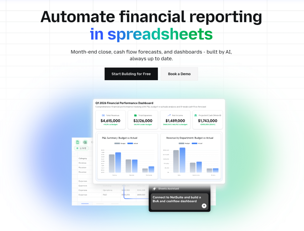
Cube
Cube is a finance-specific platform built to work natively in Excel and Google Sheets while adding FP&A structure underneath, including automated variance analysis, AI-assisted commentary and governed data consolidation from ERPs and CRMs. Starting around $30,000 per year, it is a meaningful commitment for mid-market teams. The value proposition is specific: finance teams that want enterprise-grade planning and reporting without abandoning the spreadsheet workflows they already trust. Best for growth-stage companies where the CFO wants to add rigor to the planning process without a full platform migration. Cube pricing.
Coefficient: One Tool Across All Three Layers
Most finance teams have a gap between their data systems and their reporting output. They have an ERP, a CRM and a data warehouse. They have an Excel or Google Sheets model refined across multiple cycles. And they have a reporting process that involves exporting data from each system, pasting it into the right tabs, reformatting and then building whatever leadership asked for this week. That manual data-pull step is where hours disappear every reporting cycle. Coefficient is built to close that gap.
Coefficient connects directly to 150+ data sources, including NetSuite, QuickBooks, Sage Intacct, Snowflake, Salesforce, HubSpot, Stripe and more, and brings live data into Google Sheets or Excel on a scheduled refresh. The P&L, trial balance, AR aging, general ledger and budget actuals land in the tabs where the team already works. No CSV exports. No copy-paste. No numbers that are already three days stale when the model is done.
This is where finance teams in 2026 are seeing the clearest productivity gains: not by replacing their modeling tools or their ERP, but by cutting out the connective tissue work that sits between those systems and the spreadsheet where analysis actually happens.
On the modeling layer
When the inputs to a financial model refresh automatically, the model is live. A budget vs. actuals report that previously required a 40-minute manual pull from NetSuite before every planning meeting now updates on the schedule the finance team sets, hourly, daily or weekly. Two-way sync means corrections and journal entry adjustments push back to the source system directly from the spreadsheet, without a separate login or a manual re-entry step.
On the visualization layer
When leadership asks for a dashboard, the finance team describes what they need in plain English. Coefficient’s AI builds it, charts, metrics, layout, and writes the SQL query behind every number. The Explain button shows exactly which tabs and columns each figure comes from. No hallucinated metrics in front of a CFO or a board. The output is a live URL that viewers access for free, with no per-seat licensing. Server-side refresh means the dashboard is current every morning without anyone touching it.
On the reporting layer
Scheduled data pulls replace the manual export step at the start of every close cycle. Snapshot functionality captures point-in-time data for period comparisons without overwriting the current view. Alert triggers fire when a key metric, such as a cash balance, AR aging threshold or revenue variance, crosses a defined threshold, so the finance team knows before leadership asks.
The honest limitation: Coefficient is not an FP&A planning platform. It does not replace Anaplan or Datarails for complex scenario modeling and workflow approvals. It is the data connectivity and AI reporting layer that makes the tools finance teams already use perform the way they were supposed to, and it adds the live dashboard capability that most finance teams currently produce manually. Not a standalone BI platform. Requires Google Sheets or Excel.
Free plan available. Paid plans from $49 per month. No per-user fees.
“Coefficient automated everything. Instead of manually exporting or importing into Google Sheets every day, and making sure none of the formulas broke, I can just sit back and watch the data update automatically.” Christian Budnik, FP&A Analyst, Solv
“I never worry about reports being up-to-date and accurate anymore. At this point, after setting it up, Coefficient does most of the heavy lifting.” Brian Chalif, Head of BizOps, Mutiny
Comparison Table
| Tool | Category | Best For | Spreadsheet Native | Starts At |
|---|---|---|---|---|
| Coefficient | Data connectivity, AI dashboards | Finance teams in Sheets or Excel needing live multi-source data and shareable dashboards | Yes (Google Sheets, Excel) | Free plan. Paid from $49/month. No per-user fees. |
| Anaplan | FP&A planning | Enterprise connected planning at scale | Excel input available | Contact for pricing |
| Workday Adaptive | FP&A planning | Workday HCM customers needing integrated planning | Excel input available | Contact for pricing |
| Datarails | FP&A planning | Mid-market teams keeping Excel models | Yes (Excel) | Contact for pricing |
| Power BI | Traditional BI | Microsoft-heavy orgs with analytics resources | Excel integration | $14/user/month (Pro) |
| Tableau | Traditional BI | Orgs with data teams needing strong visualization | Limited | $75/user/month (Creator) |
| Workiva | Financial reporting | Public companies, SEC disclosure, audit management | Excel-linked | Contact for pricing |
| Cube | Financial reporting and FP&A | Growth-stage teams wanting planning rigor in Sheets or Excel | Yes (Excel, Google Sheets) | From $30,000/year |
When to Use More Than One Tool
Many finance teams end up running two tools in parallel, and that is not a failure of planning. It reflects the fact that the finance BI problem has two genuinely different parts.
The modeling and planning layer, tools like Anaplan, Datarails and Cube, needs version control, workflow approvals, scenario management and governance. The reporting and connectivity layer, where Coefficient sits, needs live data, flexible queries and shareable output that non-technical viewers can access without a license.
A finance team using Datarails for their budget planning process and Coefficient for their weekly reporting and dashboard distribution is using both tools for what they were designed to do. The two layers complement each other. Where it gets wasteful is buying an FP&A platform expecting it to also solve the data connectivity problem, or buying a BI platform expecting it to also handle planning and modeling. The categories are distinct and the tools reflect that.
The clearest signal that you need both: your team has a planning tool but still spends three to four hours per week pulling data from source systems into spreadsheets before any reporting starts. That is the connectivity gap. A data connector layer closes it without touching the planning workflow.
Finance BI in 2026 is a stack decision, not a single purchase. The stack that works best is one that respects where finance teams actually work, connects to the systems where their data lives and produces output that leadership trusts. The tools that check all three of those boxes are fewer than the market would suggest. Start with the bottleneck, not the feature list.
If the bottleneck is manual data pulls and stale reports, Coefficient is free to start and takes minutes to connect to your first data source.