Table of Contents
![]()
- 1. How to Build NetSuite Financial Statements
- 2. How to Setup NetSuite Budget vs Actual Reporting
- 3. How to set up NetSuite financial consolidation
- 4. How to Do Multi-Entity Financial Consolidation from Multiple NetSuite Instances
- 5. How to Customize NetSuite Reports: Simple Guide for 2025
- 6. How to Create a NetSuite KPI Dashboard
- 7. How to Pull NetSuite Custom Reports into Excel
- 8. How to Pull NetSuite Custom Reports into Google Sheets


NetSuite dashboards promise real-time visibility into your most critical business metrics. Yet many finance teams struggle with native dashboard limitations—rigid layouts, time-consuming setup, and frustrating formatting constraints that make executive reporting feel more like a chore than strategic advantage.
Smart organizations are discovering there are two distinct approaches to NetSuite KPI dashboards. The native route offers tight integration but demands technical expertise and delivers limited flexibility. The Excel alternative provides professional presentation and cross-system integration that transforms raw NetSuite data into compelling executive insights.
This guide reveals both methods and shows you how to build dashboards that executives actually use.
Two ways to create NetSuite KPI dashboards
Native NetSuite dashboards
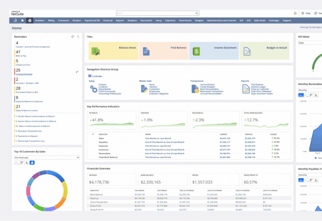
NetSuite’s native dashboard capabilities center around SuiteAnalytics Workbooks and Dashboard Portlets—two interconnected systems designed to bring your transactional data into visual format.
SuiteAnalytics Workbooks serve as your foundation for dashboard creation.
The 2025.2 release includes AI-powered contextual insights that automatically surface:
- Trends and anomalies in real-time
- Outliers that need immediate attention
- Planning data alongside transactional information
- Comprehensive views combining budgets, forecasts, and actuals
The workbook creation process requires technical precision. Navigate to Analytics > Workbooks and define your root records—typically transactions, customers, or items. Configure relationships between datasets, apply filters, and select appropriate visualizations.
NetSuite offers multiple chart types:
- Pivot tables for data summarization
- Tabular displays for detailed views
- Standard visualizations for most reporting requirements
Dashboard Portlets transform your workbooks into dashboard elements.
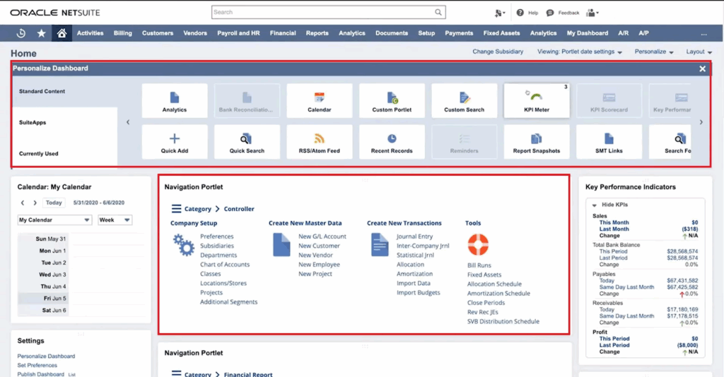
Access Home > Personalize > Add Portlets and select Analytics Portlet to display workbook visualizations. Configure:
- Portlet size and positioning
- Titles and refresh intervals
- KPI Meters showing up to three key metrics
- Trend Graphs with comparison periods and threshold alerts
The reality check: Native dashboards impose significant constraints.
The grid-based layout system restricts pixel-perfect positioning. Professional presentation becomes challenging. Cross-system integration remains problematic—connecting Salesforce opportunities with NetSuite financials requires complex SuiteScript development.
Chart customization options pale compared to dedicated visualization tools. Setup complexity often necessitates consultant involvement, particularly for advanced features like multi-entity consolidation or custom calculated fields.
The learning curve can overwhelm small finance teams already stretched thin by month-end responsibilities.
Coefficient – Excel-based KPI dashboards powered by live data

Coefficient’s NetSuite Financial Forecasting Template
Excel-based dashboards transform NetSuite data into professional, flexible reporting solutions that executive teams actually want to review. Coefficient bridges the gap between NetSuite’s powerful data engine and Excel’s superior presentation capabilities.
Live data integration forms the cornerstone of modern Excel dashboards. Coefficient connects directly to your NetSuite instance through secure OAuth authentication, importing:
- Saved searches with custom criteria
- Standard reports and financial statements
- Custom datasets for specialized analysis
- Real-time refresh capabilities with hourly updates
Excel’s formatting advantages become immediately apparent when creating executive dashboards:
- Conditional formatting highlights performance against targets
- Sparklines provide trend visualization in compact spaces
- Advanced charting options unavailable in native NetSuite
- Professional templates with consistent branding that command attention
Cross-system data integration distinguishes Excel solutions from native approaches. Combine NetSuite financial data with:
- Salesforce pipeline metrics
- HubSpot marketing performance
- External market data and benchmarks
- Power Query and Power Pivot for complex data relationships
Automation capabilities eliminate the manual maintenance that plagues traditional Excel reporting:
- Scheduled refreshes keep data current automatically
- Automated email distribution ensures stakeholders receive updates
- VBA or Office Scripts trigger complex workflows
- Alert systems activate based on performance thresholds
The collaborative advantages of modern Excel enable finance teams to maintain sophisticated dashboards without dedicated IT resources:
- SharePoint integration for team access
- Simultaneous editing capabilities
- Teams connectivity for instant communication
- Version control with audit trails for compliance
Common KPI dashboard challenges
Traditional NetSuite reporting creates predictable pain points that impact finance team productivity and decision-making quality.
- Manual data compilation consumes excessive time. Finance professionals spend 20-30 hours monthly gathering data from multiple NetSuite saved searches, exporting to CSV, and rebuilding Excel reports. This reactive approach means dashboards reflect historical performance rather than enabling proactive management decisions.
- Static reports create visibility gaps. NetSuite’s standard reports generate point-in-time snapshots that become outdated immediately. By the time monthly board packages are complete, the information is already stale and potentially misleading for strategic decisions.
- Limited visualization options frustrate executive communication. NetSuite’s basic chart types and formatting constraints make it challenging to create compelling presentations. Finance teams resort to manual chart creation in PowerPoint, introducing errors and version control problems.
- Time-intensive monthly preparation cycles divert resources from analysis to report building. Finance professionals become report factories rather than business partners, missing opportunities to provide strategic insights that drive growth and profitability.
Build KPI dashboards that actually get used
The best dashboards become essential tools for daily decision-making rather than monthly reporting obligations. Successful implementations prioritize executive usability over technical sophistication.
Live data eliminates the credibility gap that plagues static reports. When executives trust that dashboards reflect current performance, they engage more frequently and make better-informed decisions. Automated refreshes ensure consistency without manual intervention.
Professional formatting commands attention and respect. Well-designed dashboards with consistent branding, clear labeling, and intuitive navigation become meeting centerpieces rather than afterthoughts. Executive teams reference them during strategic discussions and use them to communicate performance across organizations.
Transform your reporting today
Manual NetSuite reporting wastes time and frustrates executives. Live data dashboards solve both problems instantly.
Excel-based solutions deliver professional formatting with cross-system integration that native NetSuite simply cannot match. Your finance team gains hours for strategic analysis while executives get dashboards they actually want to use.
Ready to transform your NetSuite data into compelling executive dashboards? Get started with Coefficient and discover how live data integration makes professional KPI dashboards achievable without IT complexity or consultant dependency.