

Open your spreadsheet with raw data and navigate to Data > Pivot Table from the Google Sheets menu
Choose whether to insert the pivot table in the existing sheet or create a new sheet
In the Pivot Table Editor, select “Rows” and add your data fields (e.g., Location)
Go to “Values” section, click “Add” and select the fields you want to analyze (e.g., Location count, Sales)
Use the pivot table’s moveable columns, rows, and data fields to isolate, group, and summarize your data in real-time
With huge amounts of data, it can be challenging to come up with clear-cut conclusions or summarize information from a simple spreadsheet table view.
That’s why pivot tables and charts are important.
Pivot tables in Google Sheets are a game-changer for efficient data analysis. They are versatile, flexible, and essentially faster to use for exploring your data than spreadsheet formulas.
This guide takes a comprehensive look into pivot tables in Google Sheets, why you should use them, and a few tips on creating your first pivot table.
What are Pivot Tables & Charts and does Google Sheets have them?
From a 30,000 foot perspective, a pivot table is a summary of data selections you already entered into or saved in Google sheets. These data selections serve as the data sources that you can condense into aggregated forms to extract the data you want to find.
For example, by using pivot tables, you can have a clear view of the amount of revenue you generated from a specific product over a certain period in a certain store location.
Pivot tables are composed of columns, rows, pages, and data fields that can be moved around, helping you isolate, group, expand, and sum your data in real-time.
Essentially, pivot tables summarize large sets of data, giving you a bird’s eye view of specific data sets, helping you organize and understand your raw information better.
To explain this further, think of your standard spreadsheets. These typically have “flat data” represented by vertical (rows) and horizontal (columns) axes.
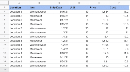
To get your desired insights, you will need to add data on another level. Using the table above as an example, you begin with every sale as its own row, with each column offering different data about the sale.
Shifting (or pivoting) the table’s axes lets you add another dimension to your data. Depending on the information you want to derive, using pivot tables can make your data look like this:
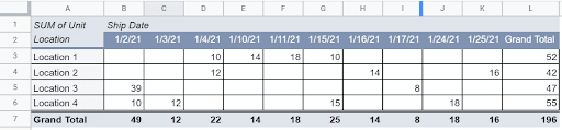
Instead of looking at your information based on individual sales, you get aggregated data of the number of Units you sold in each Location for every Ship Date.
While you can use formulas to derive many insights from your data, a pivot table helps you extract your desired information much faster and easier, and it reduces the chances of human errors and data inaccuracies.
Additionally, pivot tables allow you to generate new reports using the same dataset in a few clicks without starting from scratch.
The Benefits of Pivot Tables
Pivot tables help you manage, sort, and analyze your data more efficiently, along with these other advantages.
Quick and easy to use
Pivot tables are user-friendly and don’t require much effort or a steep learning curve to use. As long as you have your raw data in your spreadsheet ready, you can easily create your pivot tables in just a few clicks.
You won’t need to use formulas and extract data manually based on the specific insights you want to derive. This saves you a lot of time and effort, allowing you to focus on other more important data tasks.
Create data instantly
A pivot table allows you to create data instantly, whether you use spreadsheet formulas or program equations directly into the pivot table.
This allows you to compare various data in seconds and derive the information you need with as little effort as possible.
Generate accurate reports quickly
Traditional ways of generating reports through spreadsheets can eat up a chunk of your time and energy, making pivot tables a more efficient method of creating your data presentations.
Pivot tables let you create various reports using the same raw data in one file, without copying and pasting the information into new sheets.
Using pivot tables also reduces the chances of human errors in your data, allowing you to generate accurate reports.
Summarize large data sets easily
Pivot tables in Google Sheets streamline the process of summarizing large quantities of data in seconds. These can aggregate your data into simple and easily comprehensible formats without needing to input any spreadsheet formulas.
Pivot tables make it easy to label, sort, and organize your columns and rows based on your preference and how you want to present the information. This makes segmenting large volumes of data for data analytics more efficient.
Speed up your decision-making process
Managers and business leaders need to make quick critical decisions to keep up with fast-paced operations and meet client demands.
Pivot tables streamline your decision-making process by saving you a lot of time and energy in deriving crucial insights and make the right decisions that drive your operations’ actions, direction, and movement quickly.
Help identify data patterns
Forecasting is a critical aspect in every form of a management process, whether in a business or any organization.
However, you need the right data to determine patterns and make reliable predictions to propel your business to succeed.
Pivot tables help you identify patterns by allowing you to create customized tables from large data sets. This lets you manipulate your data to uncover recurring patterns and trends with ease, helping you make more precise data forecasting.
How to Make a Pivot Table in Google Sheets
Below are some quick and easy steps to create a pivot table in Google Sheets using a simple dataset. Also, see our how-to video above for a full step-by-step walkthrough on how to create pivot tables.
Step 1: Open your data set
Open the spreadsheet file where you will get your raw data from and click anywhere inside the table.
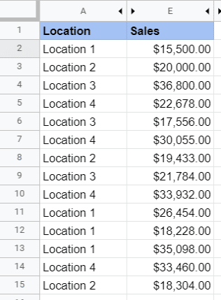
For this example, let’s assume your data consists of different entries of your sales for several store locations.
Step 2: Go to Menu and find Data
Navigate to the Google Sheets Menu, select Data and click Pivot Table.
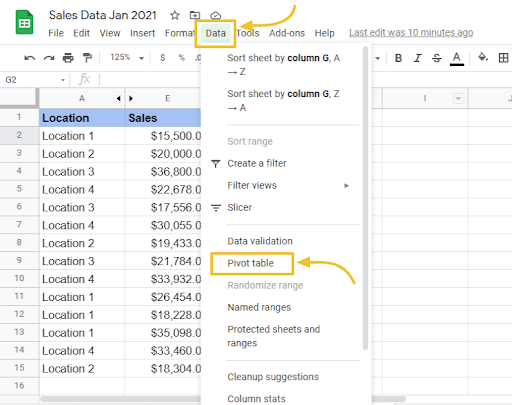
Then, select whether you want to insert the pivot table within the existing sheet or a new sheet.
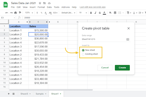
Creating a new Sheet will name the newly created tab Pivot Table 1 (or Pivot Table 2, Pivot Table 3, and so on as you add more).
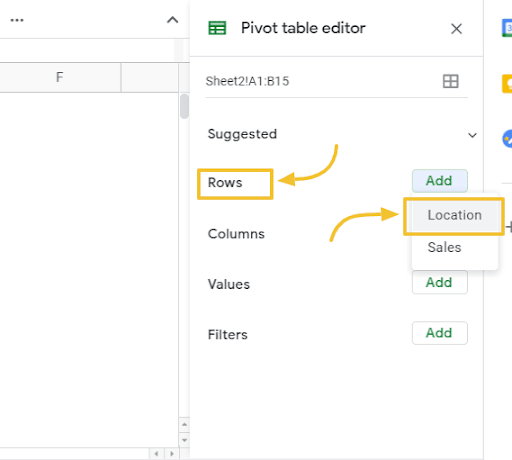
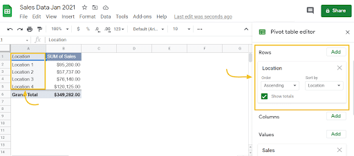
Step 3: Add your desired row and value data
Under the Pivot table editor, select Rows and add the data. In this case, click Location.
Next, go to Values, click Add, then Location.
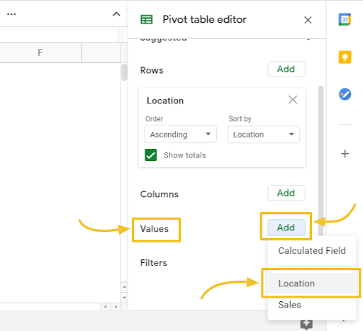
Click Add under Values again and select Sales. This is what your pivot table should look like after going through all the steps.
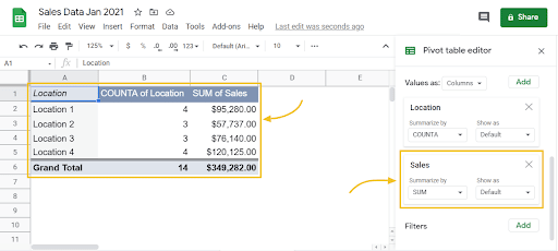
Voila! You just created your first pivot table in a few quick and easy steps.
To help you understand pivot tables further, let’s take a look at some of their fundamental components and functions.
Rows
Click Add under the Rows category within the Pivot table editor and you’ll see a list of your table’s column headings.
Select one and the pivot table will include the unique data from your chosen column into your pivot table appearing as row headings.
The fields in the Rows category appear as a unique list on the left side of the pivot table.
As you can see from the previous example of the source data sheet, pivot tables take all your fourteen rows of Location information and summarize it into four rows of data.
Columns
Add Columns and you’ll see the Values data displayed aggregated information for every column.
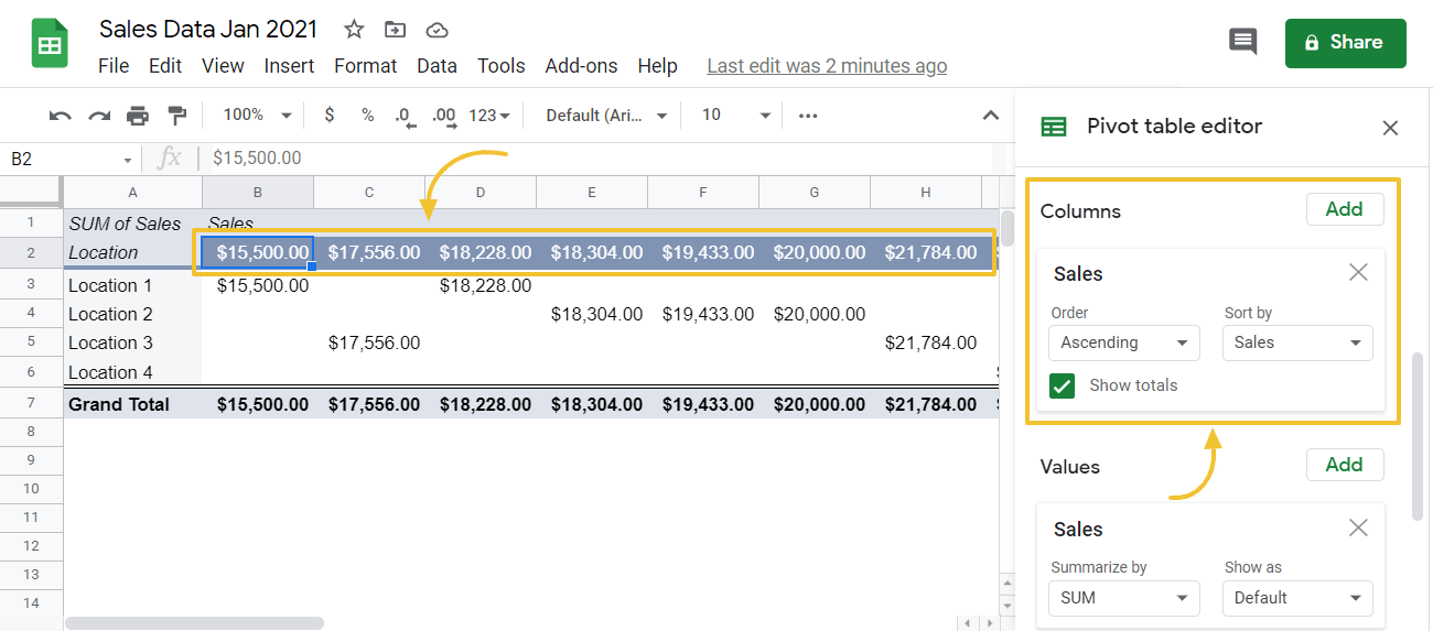
The fields within the Columns section appear as a unique list in the top box of the pivot table.
Values
Click on Values to see the same column headings list and selecting one will prompt the pivot table to summarize that specific column.
Fields in the Values category appear in the pivot table’s middle box as numbers.
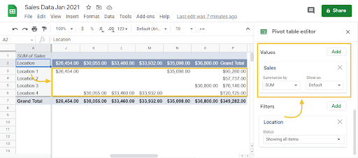
For instance, you might want to sum up or average your revenue, or if it’s a column containing text values, you might want to count them.
When you add values, you get summarized data such as getting an aggregated view of all combined individual values from each row into a single value.
Additionally, you can easily drag and drop the fields and move them around within the Pivot table editor, such as switching the fields within the Rows section with the Columns fields. The pivot table will automatically adjust your data view as you move your fields.
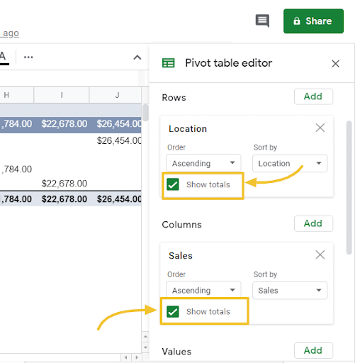
Totals
You can choose to enable or disable the totals in any of the Values columns within your pivot tables.
Click the box beside the Show totals option under the Rows and Columns category within the Pivot table editor to turn it on or off.

Supercharge your spreadsheets with GPT-powered AI tools for building formulas, charts, pivots, SQL and more. Simple prompts for automatic generation.

Use AI to Generate Pivot Tables
If you think making a pivot table in Google Sheets is easy, Coefficient’s GPT-powered pivot builder makes it even easier and faster by creating your pivot tables for you. Here’s a quick demo video.
To use GPT Copilot, you need to install Coefficient. The install process takes less than a minute.
First, you’ll get started for free by simply submitted your email.
Follow along with the prompts to install. Once the installation is finished, return to Extensions on the Google Sheets menu. Coefficient will be available as an add-on.
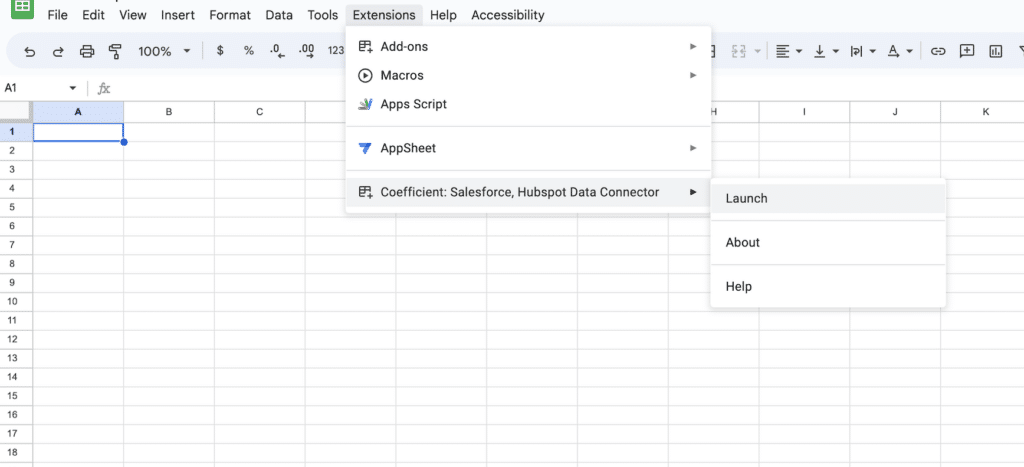
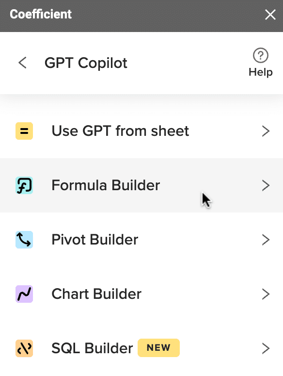
Now launch the app. Coefficient will run on the sidebar of your Google Sheet. Select GPT Copilot on the Coefficient sidebar.

Then click Pivot Builder.
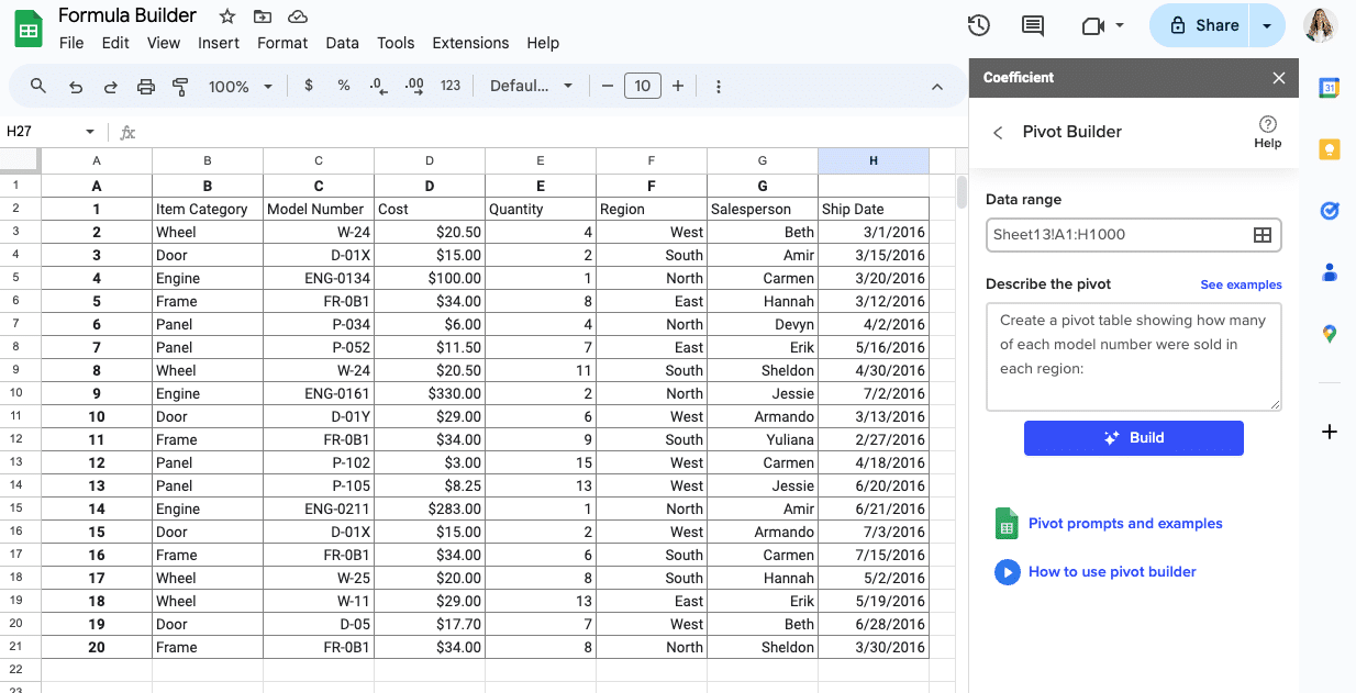
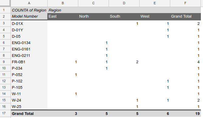
Type a description of a formula into the text box. For this example, let’s calculate the student average if the score is above 50. Let’s type: Create a pivot table showing how many of each model number were sold in each region.
Then press ‘Build’. Pivot Builder will then ask where you’d like your pivot table to be placed. Select a new or existing sheet.
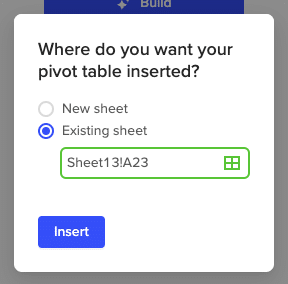
And your pivot table will be placed in your desired location.
how to refresh a pivot table in google sheets
Generally, you don’t need to manually refresh pivot tables in Google Sheets since they automatically update when you change the information on the sheets with your original data sets.
However, there are instances where you might need to manually refresh your pivot tables if the data doesn’t automatically update.
The following are a few reasons why your pivot tables don’t refresh automatically and the tips to solve the issues.
Reason 1: Your pivot tables have filters
In Google Sheets, if your pivot table has filters, your data won’t be updated when you change the original data values.
You’ll need to remove the filters in your pivot table by clicking the cross symbol beside all the fields below the Filters option within the Pivot table editor.
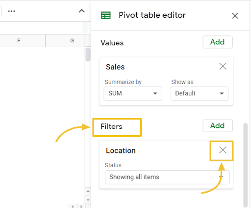
Make your desired changes to the original data set that should reflect on your pivot table. Then add back the filters within the Pivot table editor by clicking the Add button in the Filters category.
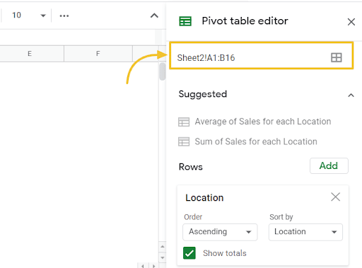
Reason 2: You’re adding new rows outside the pivot table’s range
Pivot tables use data from specific cell ranges within your original dataset’s worksheet. If you add new rows and data outside of the pivot table’s range, the information will not affect your pivot table.
Ensure your newly added rows are within the pivot table’s range by including extra blank rows for data you might need to add later or edit the range within the Pivot table editor.
However, leaving blank rows in your original worksheet will also show blank rows on your pivot tables, which might not be visually appealing.
You can add a filter to display only the rows with value or edit the range directly to include your new rows, so your pivot table automatically refreshes with the additional rows.
Reason 3: Your original dataset has functions such as TODAY, RANDOM, and others
Any changes to your original dataset won’t update your pivot tables if the original worksheet has functions such as TODAY, RANDOM, and other functions that need refreshing.
One solution is to avoid including these functions in your original dataset or use Cloud pivot tables to automatically refresh your pivot tables regardless of the functions included in the source data sheet.
Essentially, refreshing your pivot table is about using the Pivot table editor in whatever ways you require or adding or removing specific information in your source datasheets.
As long as you don’t have the issues mentioned here within your original dataset sheet, both methods will automatically update your pivot tables to your desired version.
Additional tip: Take screenshots of your Google Sheets pivot charts and tables’ before and after view to see if changes you made to the data source had any effect on your pivot table.
How to Build a Cloud Pivot Table
Before getting into the nitty-gritty details of creating a Cloud pivot table, let’s look into why Cloud Pivots are excellent solutions to supercharge your data summarization and analytics.
Information stored within a database is often too large to work with using a regular spreadsheet. Google Sheets has a five million-cell maximum capacity, which leaves you with one million rows on a five-column sheet to work with.
The performance in the spreadsheet can also diminish further when working with data of this volume.
That is why a lot of users don’t like working with more than 60,000 to 100,000 rows of information at a time in a spreadsheet because it requires creating several sheets to accommodate all the data.
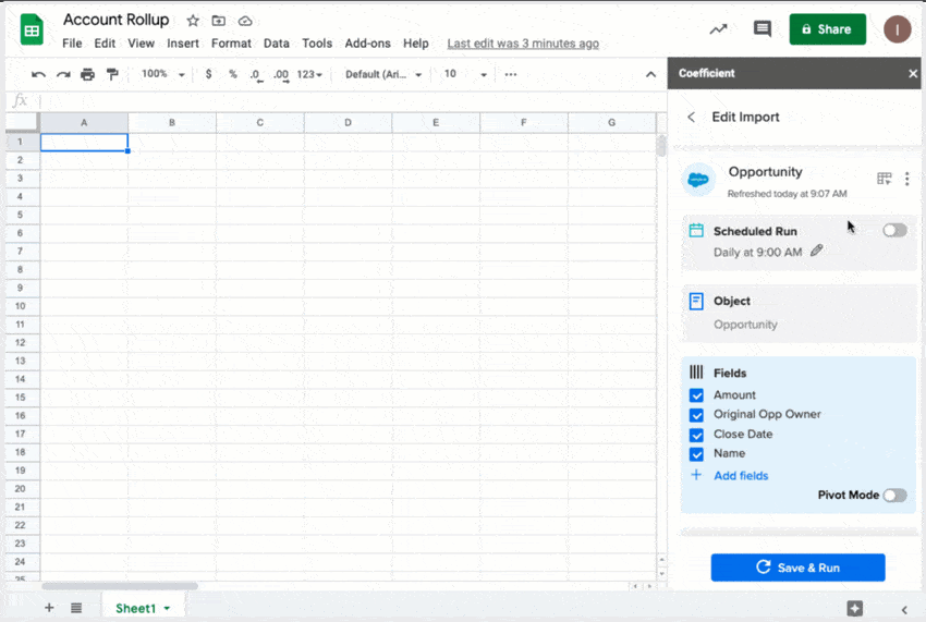
Coefficient provides a perfect solution by letting users create Cloud Pivot Tables on the fly without importing your underlying data, keeping your spreadsheet performant. It allows you to get a subset of data from large quantity tables in your database or saas application.
You can also schedule said data to automatically update every hour or at your preferred time and intervals. This makes your pivot table a live view of your data that sits directly on top of your cloud system.
Any data changes in a database that Coefficient supports, such as MySQL, Snowflake, PostgreSQL, and Redshift, will instantly reflect in your pivot table. This allows you to pivot on the data in your cloud systems.
Another problem that Cloud pivot tables address is data visualization within pivot table data, especially for executives.
Coefficient allows you to build customized views of your data sets (through pivot tables) within Salesforce, for instance, and then track it over time.
This lets you easily track your revenue by month and by looking across segments, regions, and teams. Or you can create customized views using pivot tables to monitor your leads by channel over time.
To build your Cloud pivot table, start by selecting the underlying data you wish to visualize.
If you’re using Salesforce, select the objects and fields.
For databases, the same Cloud Pivot Tables can be built. You just have to select the tables and fields.
Select the columns and rows you want to create in your pivot table, then select the values you want to pivot on.
For example, this could be Revenue, and then add a Sum aggregation to view a sum of your revenue by month.
You can add a filter to look at specific datasets, such as the close date after January 1st.
Finally, set an auto-refresh schedule, so your data automatically updates on your specified dates and times, ensuring you have live and up-to-date information at all times.
You can also change the underlying data anytime you want.
In a nutshell, a Cloud Pivot Table is an excellent solution because:
- It allows users to aggregate and visualize data upon import from Salesforce, HubSpot, databases, data warehouses, and other platforms such as the Airtable platform that hold your data.
- It makes your large data sets usable in your spreadsheet
- It can automatically refresh your pivot tables on any schedule
Conclusion
Pivot tables in Google Sheets allow you to efficiently summarize, analyze, and derive insights from your data.
With pivot tables, you get a powerful tool that helps you unlock your data’s potential. This allows you to extract information that stakeholders in your company can easily leverage without needing to use complex formulas, saving you a huge chunk of time and energy.
Learn to use pivot tables to make your data collection, analysis, organizing, summarizing, and report generating process easier, faster, and more credible. You can also opt for Cloud Pivot Tables to make this process even more efficient.
Pivot tables are easy to experiment with. After mastering the basics, try and take things to the next level by adding various fields in different parts of the Pivot table editor to see the kind of data you’ll get.
Try Coefficient for free today!