Best spreadsheet structure for creating nested Salesforce objects with relationships

Creating related Salesforce objects from spreadsheets requires the right structure to handle lookup relationships effectively. Traditional nested approaches don’t work with Salesforce’s relationship model.

You’ll learn three proven spreadsheet structures that work with Salesforce relationships and how to implement them for reliable bulk creation.

Flat structures with lookup relationships work best using Coefficient

Coefficient handles related object creation through lookup relationships and custom SOQL queries. The key is organizing your spreadsheet to work with Salesforce’s relationship patterns rather than trying to create nested JSON-like structures.

How to make it work

Step 1. Use flat structure with lookup IDs for existing relationships.

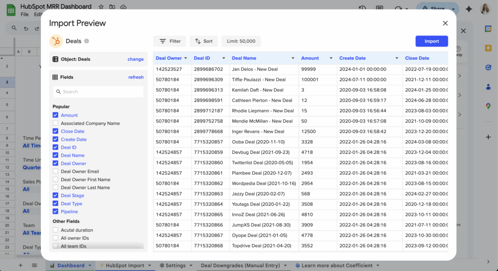
Organize your spreadsheet with related object IDs in separate columns. For Opportunities with related Accounts: Column A contains Opportunity Name, Column B contains Account ID (lookup to existing Account), Column C contains Close Date, and Column D contains Amount. This structure maintains clear relationships without nesting.

Step 2. Implement External ID method for new relationships.

Use External ID fields instead of Salesforce IDs when related records might not exist yet. Structure your columns with Opportunity Name, Account External ID, and Contact External ID. This allows UPSERT operations that create relationships even when parent records are created simultaneously.

Step 3. Set up sequential creation for parent-child relationships.

For true parent-child scenarios, create parent records first using Coefficient’s export feature. Use Formula Auto Fill Down to capture the newly created parent IDs in adjacent columns. Then create child records referencing these parent IDs in a second export operation.

Step 4. Leverage custom SOQL for complex relationship preparation.

Use Coefficient’s custom SOQL support to import related object fields through lookups (like Account.Name on Opportunity records). This gives you comprehensive data preparation capabilities and helps structure your spreadsheet for optimal relationship handling.

Structure your data for success

The right spreadsheet structure makes Salesforce relationship management straightforward and reliable. Get started with Coefficient to handle complex object relationships efficiently.

Blank header error prevents importing 100+ contacts from spreadsheet

When importing 100+ contact records, HubSpot’s blank header validation becomes particularly problematic because it blocks entire datasets over structural formatting issues. This wastes significant data preparation time and prevents large-scale contact management workflows.

Here’s how to handle bulk contact operations without header validation constraints and focus on data quality instead of structural formatting.

Process large contact datasets without structural limitations using Coefficient

Coefficient excels at bulk contact operations by separating data validation from structural requirements. You can validate contact data quality separately from formatting, ensuring your 100+ contacts are properly processed before export.

How to make it work

Step 1. Import bulk contact data without size restrictions.

Use Coefficient to handle large contact datasets (supports 50,000+ rows minimum) without the structural limitations that block HubSpot’s native import. This eliminates the single-point-of-failure that blank headers create.

Step 2. Validate contact data quality separately from structure.

Focus on contact data accuracy using spreadsheet functions to check email formats, required fields, and data completeness. This ensures your 100+ contacts are properly formatted before export to HubSpot .

Step 3. Set up systematic batch export processing.

Use Coefficient’s scheduled export functionality to process large contact lists systematically. This creates a reliable bulk import process that doesn’t fail on header validation issues.

Step 4. Automate ongoing bulk contact management.

Configure recurring exports for regular bulk contact updates. This prevents losing hours of data preparation work due to simple formatting issues that have nothing to do with contact data quality.

Scale contact imports without validation roadblocks

This separation of concerns is crucial for bulk operations – focus on contact data accuracy while Coefficient handles technical integration requirements. Prevent data preparation waste caused by structural validation errors. Start with Coefficient to streamline large-scale contact imports.

Build live Excel dashboards that pull Salesforce case data automatically

Static dashboards built from CSV exports become outdated quickly and lack the analytical power your support team needs. You can create live Excel dashboards that refresh automatically with fresh Salesforce case data every morning.

Here’s how to build comprehensive case dashboards that maintain real-time relevance with superior visualization capabilities.

Create dynamic case dashboards with morning automation using Coefficient

Coefficient enables true live Excel dashboards by establishing persistent connections to Salesforce case data with automated morning refreshes. Unlike static dashboards, these maintain real-time relevance while leveraging Excel’s superior visualization and calculation capabilities.

How to make it work

Step 1. Import comprehensive case data.

Connect to your Salesforce Case object and select fields like Status, Priority, Created Date, Resolution Time, and any custom fields you track. Include related Account and Contact information for additional context.

Step 2. Apply filters for focused insights.

Filter for specific case types, support teams, or time periods that matter most to your dashboard. Use Coefficient’s AND/OR logic to create precise data sets that match your reporting needs.

Step 3. Schedule automatic morning refreshes.

Configure daily refreshes at 7:00 AM (or your preferred time) so fresh case data is ready before team meetings. Set your timezone preferences to ensure accurate scheduling.

Step 4. Build advanced case metrics.

Create calculated columns for SLA compliance, average resolution times, case aging, and other metrics. Excel handles complex time-based calculations and trending analysis that Salesforce dashboards struggle with natively.

Step 5. Design comprehensive visualizations.

Use Excel’s unlimited chart types, conditional formatting for status indicators, and advanced pivot tables for multi-dimensional analysis. Create custom KPI calculations and flexible layouts that Salesforce dashboard components can’t match.

Step 6. Set up self-maintaining calculations.

Coefficient’s Formula Auto Fill Down feature ensures calculated metrics extend automatically to new cases, maintaining dashboard functionality as case volumes fluctuate without manual intervention.

Transform morning case reviews with automated insights

Live case dashboards eliminate the manual routine of pulling case reports before daily stand-ups while providing superior analytical capabilities. Your support team gets comprehensive case visibility automatically every morning. Build your first live case dashboard today.

Build quarterly sales performance dashboard from monthly quota data

HubSpot’s dashboard limitations prevent building quarterly performance dashboards from monthly data. You can’t create custom quarterly calculations, aggregate monthly metrics, or build the complex performance visualizations needed for strategic quarterly insights.

Here’s how to build comprehensive quarterly sales performance dashboards that transform monthly quota data into actionable quarterly insights.

Create dynamic quarterly dashboards using Coefficient

Coefficient enables comprehensive quarterly sales performance dashboards by importing real-time monthly quota data from HubSpot and enabling sophisticated dashboard metrics that HubSpot’s native dashboards can’t provide.

How to make it work

Step 1. Import live monthly data with automatic refresh.

Import real-time monthly quota data including deal values, close dates, rep performance, and pipeline metrics with automatic refresh scheduling. This ensures your quarterly dashboard always reflects current performance without manual updates.

Step 2. Build sophisticated quarterly performance calculations.

Create dashboard metrics including weighted quarterly quota attainment by rep and team, quarter-over-quarter growth percentages, quarterly pipeline velocity and conversion rates, and forecasted quarter-end performance based on current trends.

Step 3. Design interactive dashboard components.

Build quarterly performance scorecards with conditional formatting, trend charts showing monthly progression toward quarterly targets, rep ranking tables based on quarterly performance, and pipeline health indicators for quarterly forecasting.

Step 4. Add multi-dimensional quarterly analysis.

Combine monthly quota data with additional metrics for comprehensive insights: product line performance by quarter, geographic territory quarterly analysis, customer segment quarterly trends, and deal size distribution quarterly patterns.

Step 5. Set up automated updates and stakeholder distribution.

Schedule data refreshes to maintain current quarterly metrics, use snapshots to preserve quarterly dashboard data for trend analysis, and create stakeholder-specific dashboard versions tailored for executives, sales managers, and individual reps.

Transform data into strategic quarterly insights

This solution delivers dynamic, data-driven quarterly sales performance dashboards that provide actionable insights for sales management and strategic decision-making. Start building your quarterly dashboard today.

Building contact-specific ad attribution reports using HubSpot data exports

Traditional HubSpot data exports for ad attribution analysis involve multiple manual steps: downloading separate reports, manually correlating data in spreadsheets, and rebuilding analysis each time you need updated data. This process is time-intensive and creates attribution analysis that becomes stale quickly.

Here’s how to transform this manual export process into an automated, always-current system that delivers sophisticated contact-specific attribution analysis.

Replace manual exports with automated attribution using Coefficient

Coefficient transforms manual export workflows into automated, always-current systems. Instead of static exports, you get live connections to both HubSpot ad performance and contact interaction data sources with sophisticated attribution formulas that assign conversion credit across multiple touchpoints per contact.

How to make it work

Step 1. Establish live data connectivity.

Set up Coefficient to maintain live connections to both HubSpot ad performance and contact interaction data sources. Structure imports to prioritize contact-level analysis with associated campaign touchpoints.

Step 2. Build attribution model formulas.

Create sophisticated attribution calculations including first-touch (which campaign first introduced each contact), last-touch (which campaign directly preceded conversion), and multi-touch attribution that distributes conversion credit across all campaign interactions in a contact’s journey.

Step 3. Configure automated refresh scheduling.

Set up regular data updates to maintain attribution accuracy without manual intervention. Your attribution models update automatically as new contact interactions occur.

Step 4. Create advanced reporting capabilities.

Build contact lifetime value analysis by acquisition campaign using formulas like =SUMIF(Contacts!Campaign,A2,Contacts!Revenue) to calculate total revenue generated by contacts from specific ad campaigns. Create attribution path analysis to visualize common sequences of campaign touchpoints that lead to conversions.

Step 5. Set up automated alerts.

Configure notifications when attribution patterns change significantly. Get alerts when campaign efficiency scores shift or when attribution models identify new high-performing campaign sequences.

Get sophisticated attribution without manual work

This approach delivers sophisticated contact-specific attribution analysis that remains current and actionable, replacing static export-based workflows with dynamic, automated insights. You get real-time attribution updates and consistent methodology across all reporting periods. Start building your automated attribution reports today.

Building HubSpot reports with transaction data using date range filters for quarterly analysis

Building HubSpot reports with transaction data for quarterly analysis requires properly structured date fields, but HubSpot’s native reporting has significant limitations for complex date-based groupings and custom fiscal periods.

Here’s how to pre-calculate time periods and create the quarterly summaries that HubSpot reports can’t generate natively.

Pre-calculate quarterly periods for better reporting using Coefficient

Coefficient enhances quarterly reporting by letting you create custom time period columns and advanced aggregations in your spreadsheet before pushing to HubSpot or HubSpot . This overcomes HubSpot’s limitations with fiscal quarters and complex date calculations.

How to make it work

Step 1. Import transaction data and add calculated time period columns.

Use Coefficient to pull your transaction data into your spreadsheet. Create columns for different time periods using formulas like =YEAR(A2)&”-Q”&ROUNDUP(MONTH(A2)/3,0) for calendar quarters or =IF(MONTH(A2)>=4,YEAR(A2),YEAR(A2)-1) for fiscal years starting in April.

Step 2. Build quarterly aggregation tables.

Create summary tables that calculate quarter-over-quarter growth, rolling 4-quarter averages, and seasonal trends using SUMIFS and other advanced functions. For example: =SUMIFS(Amount,Quarter,”2024-Q1″) to sum all Q1 transactions or =(Q1_Revenue-Q1_Previous_Year)/Q1_Previous_Year for year-over-year growth.

Step 3. Push both detailed transactions and quarterly summaries to HubSpot.

Export your transaction records with the calculated period fields using Coefficient. Also push your quarterly summary data to company properties so HubSpot reports can access pre-calculated metrics like “Q1_Revenue” and “YoY_Growth_Rate”.

Step 4. Build HubSpot reports using pre-calculated period fields.

Create HubSpot reports that filter by your custom quarter/period properties instead of trying to use HubSpot’s limited date grouping options. Set up dashboard views for current vs. previous quarter comparisons and automated report delivery for quarterly business reviews.

Get the quarterly insights HubSpot can’t calculate

Pre-calculated time periods and aggregations give you sophisticated quarterly analysis capabilities that HubSpot’s native reporting simply can’t match. Start building better quarterly reports today.

Building MRR waterfall charts with HubSpot subscription revenue data

HubSpot can’t create waterfall charts natively and lacks the ability to categorize MRR changes into the specific components needed for waterfall analysis. You can see subscription revenue and deal changes, but building waterfall visualizations that show new MRR, expansion, contraction, and churn requires capabilities that HubSpot doesn’t offer.

Here’s how to build professional MRR waterfall charts using your HubSpot subscription revenue data with automated component categorization and dynamic visualizations in spreadsheets, whether you use Google Sheets or Excel.

Create dynamic MRR waterfall charts with live HubSpot data using Coefficient

Coefficient offers a 2-way sync between HubSpot and Google Sheets or Excel, and it’s certified on HubSpot’s marketplace. With Coefficient, you can extract subscription data from HubSpot into your spreadsheet where you can build waterfall charts that automatically categorize MRR changes and update with new data. This gives you the visual MRR analysis that subscription businesses need but HubSpot can’t create.

Here’s a quick video of how the connector works.

How to make it work

Step 1. Import comprehensive subscription data.

Connect to HubSpot and extract deals, contact data, subscription start and end dates, and revenue amounts with historical data. Include custom fields that help identify subscription changes and customer lifecycle events for accurate waterfall categorization.

pull data for MRR waterfall charts with HubSpot subscription revenue data

Step 2. Calculate waterfall components automatically.

Build formulas that automatically categorize MRR changes into beginning MRR, new MRR, expansion MRR, contraction MRR, churned MRR, and ending MRR. Use period-over-period analysis to track MRR movements between specific time periods like month-over-month or quarter-over-quarter. You can leverage Coefficient’s AI Sheets Assistant in Google Sheets if you need help with your formulas.

Step 3. Build waterfall visualizations and drill-downs.

Use spreadsheet charting capabilities to create professional waterfall charts showing MRR progression and component contributions. Create detailed breakdowns showing which specific customers or deals contributed to each waterfall component for deeper analysis.

waterfall chart for hubspot mrr

Step 4. Automate chart updates and maintain history.

Schedule regular data refreshes so waterfall charts automatically update with new HubSpot subscription data. Formula Auto Fill Down ensures that waterfall calculations are automatically applied to new data, maintaining accurate MRR categorization while preserving historical waterfall analysis.

auto refresh data for hubspot mrr waterfall chart

Visualize your MRR story clearly

MRR waterfall charts with HubSpot subscription data tell the complete story of your revenue growth and help identify which components drive or hurt performance. With automated updates and professional visualizations, your team gets clear MRR insights. Get started with Coefficient for free.

Want to get started fast? Leverage our pre-built HubSpot MRR dashboard, and it just a few clicks you can power it with your live data.

hubspot mrr dashboard powered by coefficient

Building point-based scoring dashboards in HubSpot for activity tracking

HubSpot’s dashboard blocks can only display simple metrics like counts and averages. They can’t perform the complex calculations needed for point-based scoring systems where different activities have varying weight values.

Here’s how to build sophisticated point-based scoring dashboards that automatically track and display weighted activity metrics.

Create point-based scoring dashboards using Coefficient

Coefficient enables sophisticated point-based scoring through a hybrid approach that combines HubSpot’s data with advanced spreadsheet calculations. You get the scoring functionality HubSpot can’t deliver while maintaining CRM integration.

How to make it work

Step 1. Import all relevant HubSpot activity data.

Pull calls, emails, tasks, and meetings data using Coefficient’s filtering capabilities. Focus on the activities that matter most to your scoring system and set appropriate date ranges.

Step 2. Implement your scoring logic.

Build point calculation matrices in your spreadsheet with custom formulas that multiply activity counts by predetermined point values. Create separate calculations for different activity types and time periods.

Step 3. Design real-time visual dashboards.

Create charts, gauges, and conditional formatting for score ranges in your spreadsheet. Use pivot tables to break down scores by team member, time period, or other relevant dimensions.

Step 4. Set up automated refresh schedules.

Configure hourly or daily data imports to ensure scoring dashboards reflect current activity levels. The calculations update automatically as new data flows in from HubSpot.

Step 5. Integrate calculated scores back to HubSpot.

Export calculated scores back to HubSpot as custom properties for use in native reports and workflows. This creates seamless integration between your advanced scoring and existing CRM processes.

Step 6. Configure threshold alerts.

Set up Slack or email alerts when scores reach specific thresholds. Use Coefficient’s alert system to notify team members when activity scores hit targets or fall below expectations.

Start tracking activity with point-based scoring

This approach delivers the advanced point-based scoring dashboard functionality that HubSpot cannot provide natively while maintaining integration with your existing workflows. Build your point-based scoring dashboard today.

Building real-time HubSpot advertising dashboards with contact-level conversion tracking

HubSpot’s standard advertising dashboards update with delays and lack contact-level conversion granularity. The platform shows aggregate conversion metrics but cannot display real-time individual contact conversion status or immediate identification of high-value converting contacts from specific campaigns.

Here’s how to build true real-time advertising dashboards with contact-level conversion intelligence that enables immediate strategic responses.

Enable real-time conversion intelligence using Coefficient

Coefficient enables true real-time advertising dashboards by importing HubSpot advertising and contact conversion data with frequent refresh intervals. You can track individual contact conversion status, create conversion attribution paths, and get immediate notifications when high-value contacts convert.

How to make it work

Step 1. Configure live data streaming.

Set up Coefficient to import HubSpot advertising and contact conversion data with frequent refresh intervals (every hour or custom scheduling). Import deal closure data, contact lifecycle stage changes, and conversion events linked to individual contact records.

Step 2. Build contact conversion tracking.

Create real-time tracking of each contact’s progression from ad interaction to conversion. Use formulas like =COUNTIFS(Conversions!Contact,A2,Conversions!Date,”>=”&TODAY()) to track daily conversion activity by contact.

Step 3. Create attribution integration.

Connect contact conversions back to their advertising touchpoint history for accurate attribution. Build live visualization of which advertising touchpoints contributed to each contact’s conversion.

Step 4. Build real-time dashboard components.

Create live conversion counters showing running totals of conversions attributed to specific campaigns. Set up contact conversion alerts for immediate notifications when high-value contacts convert, including their advertising acquisition history.

Step 5. Enable advanced real-time capabilities.

Build predictive conversion scoring with real-time updates to contact conversion probability based on current behavior. Create live comparison of conversion rates across different advertising campaigns and real-time mapping of conversions by location with advertising source attribution.

Transform dashboards into live optimization systems

This real-time approach transforms advertising dashboard reporting from a retrospective analysis tool into a live optimization and monitoring system. You get immediate optimization opportunities and rapid response capabilities to make advertising adjustments based on current conversion trends. Start building your real-time conversion dashboards today.

Building revenue growth forecasting models using HubSpot subscription data

HubSpot’s basic forecasting only shows deal pipeline projections and can’t model subscription renewals, churn rates, or cohort-based revenue patterns. For accurate growth forecasting, you need models that incorporate historical trends and subscription-specific metrics that HubSpot simply can’t calculate.

Here’s how to build sophisticated revenue growth forecasting models using your HubSpot subscription data in spreadsheets where advanced modeling actually works.

Create predictive revenue models with live HubSpot data using Coefficient

Coefficient pulls comprehensive subscription data from HubSpot into HubSpot spreadsheets where you can build forecasting models that incorporate growth rates, seasonal trends, and churn patterns. This gives you the historical foundation and live data needed for accurate revenue predictions.

How to make it work

Step 1. Import comprehensive subscription data.

Connect to HubSpot and pull deals, contacts, and custom subscription properties including renewal dates, contract values, and churn indicators. Import historical data to establish baseline patterns and current pipeline data for forward-looking projections.

Step 2. Build historical revenue baselines.

Use Coefficient’s Snapshots feature to capture monthly revenue data at regular intervals. This creates the historical foundation needed for accurate forecasting by preserving revenue data points over time, even as your live HubSpot data continues updating.

Step 3. Create predictive forecasting formulas.

Build spreadsheet-based models that incorporate growth rates, seasonal trends, and churn patterns using functions like FORECAST, TREND, and custom weighted averages. Create scenarios for different growth rates and model how changes in churn affect future revenue projections.

Step 4. Automate model updates and accuracy tracking.

Schedule daily data refreshes to continuously update your forecasting model with new subscription data from HubSpot. Set up automated alerts when variances between predicted and actual revenue exceed defined thresholds, helping you refine your model accuracy over time.

Transform your revenue planning process

Building revenue growth forecasting models with live HubSpot data gives you the predictive insights needed for strategic planning and investor reporting. With automated updates and historical trend analysis, your forecasts become more accurate and actionable. Start building better revenue forecasts today.