Do you want to learn how to build an executive dashboard in Google Sheets?
We’ve got you covered…
An executive dashboard gives quick high-level views of your sales, marketing, finance, and other critical data through graphical representations.
It’s an excellent way for your company’s executives to drill down, review, and analyze real-time data. You can extract actionable insights without spending too much time and effort going through reports or getting overwhelmed with nonessential information.
In this guide, we’ll cover what you need to know about executive dashboards, how to easily build one in Google Sheets, and why using the Coefficient app will streamline the process.
Want to skip the cumbersome build process? Browse Google Sheets templates, grab one to copy, and customize if you need!
What is an executive dashboard?
An executive dashboard, sometimes called a strategic dashboard, is a reporting tool and interface.
It displays a company’s metrics, Key Performance Indicators (KPIs), and critical figures and data through visualizations and graphs.
It is designed to give executives holistic visibility into business performance across all projects and departments. It also provides a high-level view of how the company is performing against the established KPIs.
Well-designed, effective dashboards are powerful tools that can summarize volumes of complex data points. These can turn data into easily digestible information snippets and help executives make better strategic business decisions.
Types of executive dashboards
You can create various executive dashboards depending on the specific use case, target audience, and KPIs and metrics you want to track.
Some of the most common executive dashboards are the following.
Finance dashboard
A finance executive dashboard provides Chief Finance Officers (CFOs) and other executives with a big picture of financial summaries.
You can see whether your targets are met and the areas of negative trending you may need to check (among others). This allows you to seamlessly link to more granular information around each team member’s performance and status.
With a finance dashboard, executives can easily access the necessary fiscal performance data all on one page. This allows you to quickly identify opportunities to make profitability grow and to proactively address issues impacting your bottomline.
CIO dashboard
A Chief Information Officer (CIO) dashboard gives Information Technology (IT) executives an accurate, consistently updated overall view of the entire IT portfolio.
The dashboard can show you whether your current portfolio spending aligns with your strategic goals and can indicate where you’re spending the money. This can help you determine your IT portfolio’s true health and see any major upcoming milestones.
Project management dashboard
Project management dashboards like the Airtable system are excellent tools to help managers organize and keep an eye on individual or multiple programs combined. These can also provide more granular details about each project as needed.
This can give you a bird’s eye view of all the projects in the program, allowing you to track their performance based on key metrics, to access various workspaces quickly, and to deep dive into more specific details with a few clicks.
Operations management dashboard
Managers and executives can easily stay on top of the company’s operations through a well-built operations management dashboard.
This dashboard can give you an overview of KPIs critical to your business operations, of whether your employees are on track with accomplishing tasks, or if you’re still within your budget.
You can include links within the operations management dashboard to allow quick access to essential documents and upcoming events.
You can also ensure the dashboard includes options that let you dig deeper into relevant details to spot areas in your processes that need improvement.
Human resources dashboard
You can track critical Human Resources (HR) projects and timelines in real time from an HR dashboard.
This gives you a centralized view of your HR activities, allowing you to monitor and check onboarding procedures, hiring statuses, department spending, employee programs and mobile recruiting initiatives (among others).
Sales and marketing dashboard
A sales and marketing executive dashboard can give you detailed visibility into activities and progress necessary to track your sales pipeline, status, and key metrics.
The dashboard can help you analyze your metrics in several ways, based on your product line, pipeline stage, or sales reps to spot strengths and potential weaknesses. This also helps executives and managers quickly respond to potential issues within the sales pipeline while keeping the big picture in mind.
What KPIs to include in your executive dashboard
It can be easy to include every metric you can find to create a comprehensive executive dashboard, but you’re better off focusing on KPIs that really matter to your business.
Consider including only those that relate directly to your company’s goals, are quantifiable and quantitative, and linked directly to measuring your business’ success.
For instance, the main metrics and KPIs you should include in your financial dashboard are operating expenses ratio and net profit margin percentage.
Below are some other crucial sales dashboard KPIs and metrics:
- Monthly sales and new customers. Monthly conversions KPI will show the number of new customers who signed up for a new account or bought your product within the current month.
- Monthly new leads and prospects. New leads can refer to people who signed up for your free trial. They can also be website visitors who spend a certain amount of time on your site without buying. This KPI can be based on your company’s definition.
- Monthly Recurring Revenue. MRR is a measure of your predictable generated revenue each month. Tracking your MRR can tell you the latest measurement of your company’s health based on your income (monthly revenue stream).
- Lead-to-sale conversion rate. This is the percentage of new customers against your new leads in Mailchimp for example.
- Cost per lead. This KPI is everything your team does to attract new leads, including advertising costs, social media management, web design, and other associated expenses that eat up a part of your company’s budget.
- Sales cycle. Tracking the average length it takes your team to close a sales cycle is crucial to determine what sales cycle length generates the highest number of closed-won deals.
For instance, if you have sales reps who close deals lightning fast but you’ve learned that their customers are dissatisfied with the solution (and often churn after eight months), implementing a longer sales cycle might produce a healthier business.
- Average Order Value. The AOV shows the average amount of money spent on each order. This could either be over a specific period or your business’ lifetime.
Sales pipeline, leads, trials, wins, and customer and revenue growth (among others) are other important KPIs that could be included in your dashboard.
Steps to create your executive dashboard in Google Sheets
While you can build many types of executive dashboards in Google Sheets, for this example, we’ll focus on creating a sales executive dashboard.
Let’s assume we’re creating a sales executive dashboard showing your monthly sales data.
Step 1: Pull your dataset using Coefficient
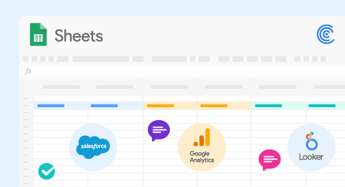
Coefficient is a powerful app that lets you sync data between Google Sheets and other tools your company use, such as Salesforce, HubSpot, databases, analytics tools, and others.
The tool lets you pull in data and schedule them to refresh automatically, all from the Coefficient sidebar within Google Sheets. This makes it almost effortless to keep your datasets and executive dashboard live and updated at all times.
The app saves you from time-consuming, tedious tasks, such as copying and pasting datasets from your systems to Google Sheets and exporting, downloading, and importing CSV files manually.
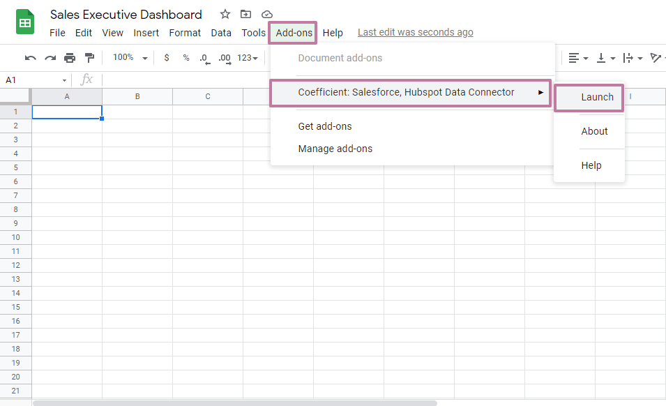
Once you’ve installed Coefficient on Google Sheets, launch it from the Add-ons menu option.

Stop exporting data manually. Sync data from your business systems into Google Sheets or Excel with Coefficient and set it on a refresh schedule.

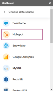
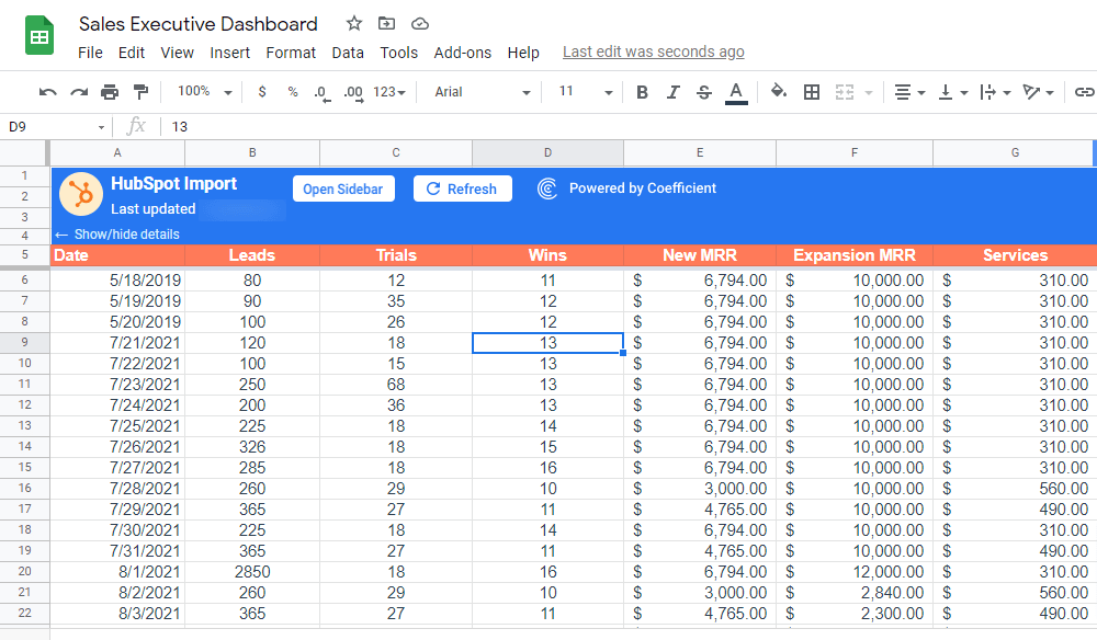
On the Coefficient sidebar, click Import Data and choose your data source. For this example, we’ll select HubSpot.
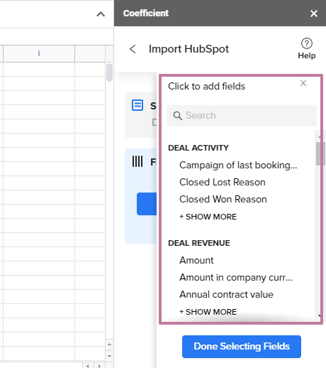
Select the object to import, then the specific fields you want to pull in. Use the search option to find each one quickly and add filters to specify the import data further.
When you’re done, click Import. Your data should populate Google Sheets almost instantly.
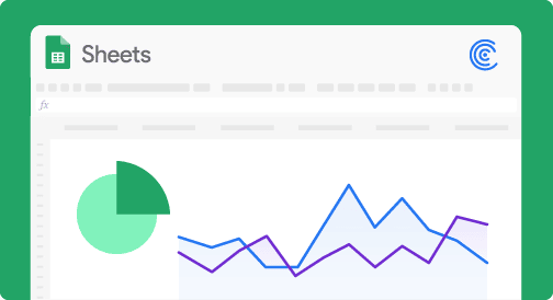
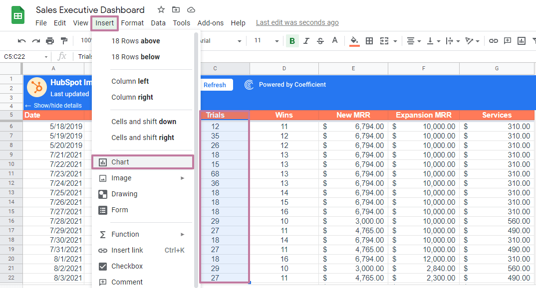
Step 2: Create your graph or chart.
To start building the sales executive dashboard, let’s create an area chart that visually presents the trend of the number of trials for the month.
Select the Trials columns from your table, including the column header. Click Insert on the Google Sheets menu and select Chart.
This opens the Chart editor with all its chart customization and editing tools.
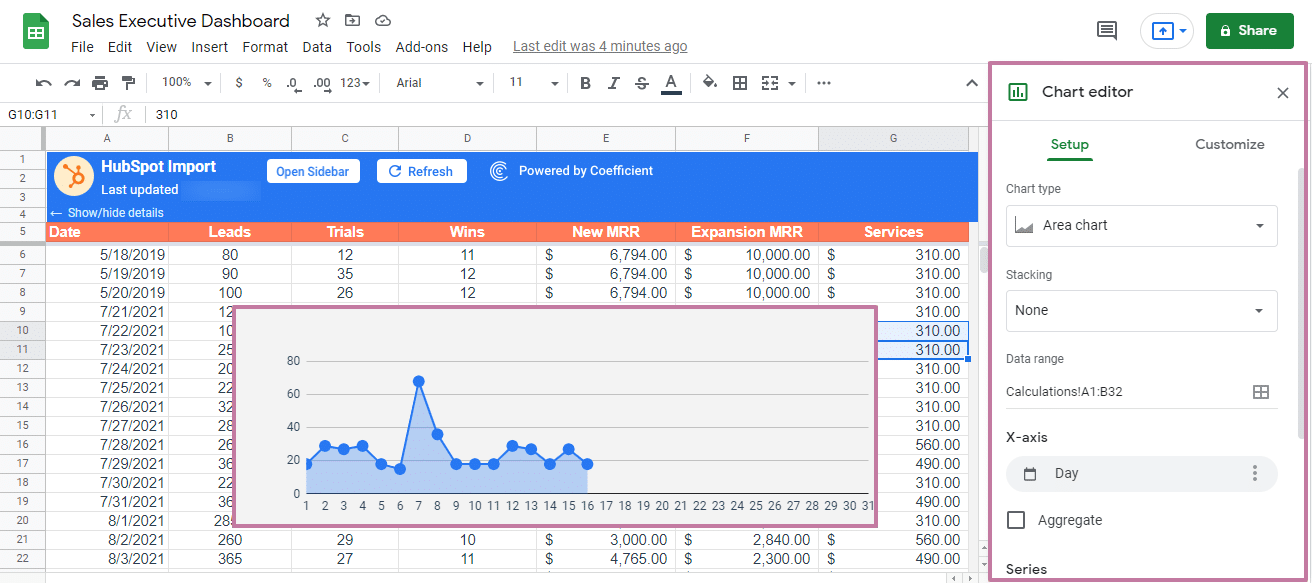
You can customize your chart’s appearance and style, add titles, texts, and legends, change the colors, and modify the horizontal and vertical axis, gridlines, and other elements accordingly.
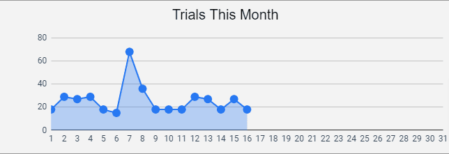
Your final chart might look like this.
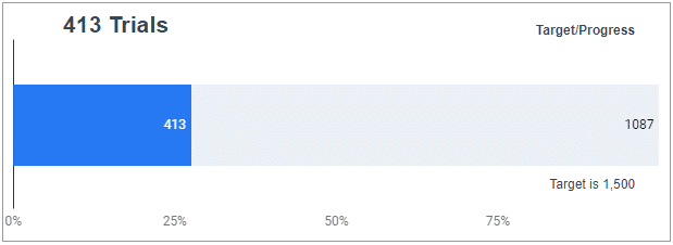
Let’s create another graph that visually shows the current number of trials (or people who signed up for your free trials) for the month against your target.
Follow the same process you did with the first graph by selecting your data range and inserting a chart — this time, choose the 100% stacked bar chart style (or any style you prefer that best represents your data).
Customize as you prefer, such as adding data labels. When you’re done, your graph can look like this.
Step 3: Build the rest of your dashboard charts and elements.
Move the charts you created to a separate spreadsheet and build the rest of your sales executive dashboard.
You can add figures, such as current sales stats, new accounts for the week, and graphs of your monthly recurring revenue (among others).
Add links to related documents on your dashboard when necessary to allow quick and easy access to these files.
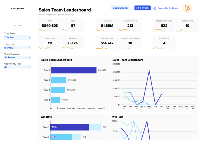
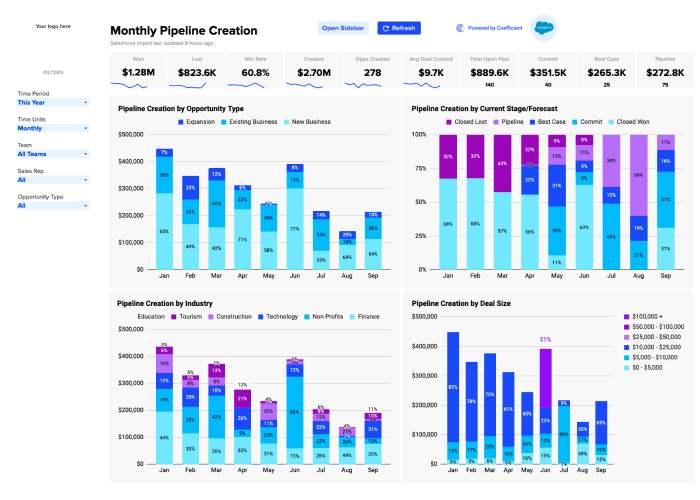
Your completed sales executive dashboard on Google Sheets can look like this. Grab advanced sales dashboards or simple spreadsheet templates to get started.
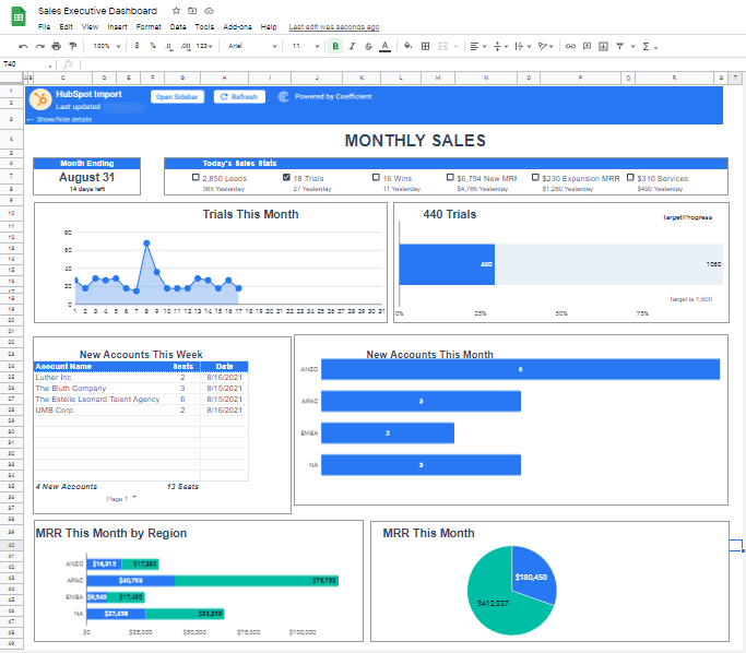
Set the Google spreadsheet file-sharing options accordingly to ensure only authorized users can access and modify the dashboard.
Building an executive dashboard can be a breeze
An ideal executive dashboard allows executives to automatically connect the necessary data to run and manage operations seamlessly.
It provides executives a high-level view and allows them to drill down on specific pieces of data. This can save huge chunks of time and help executives track enterprise performance better, gain real-time insights, and respond faster to crises and opportunities.
Using Coefficient makes building your executive dashboard in Google Sheets easier by letting you connect and update your data automatically.
This simplifies pulling your data from your data sources to Google Sheets and keeps your executive dashboard updated at all times, giving you real-time information and insights.
Try Coefficient for free today!