

The generative AI data visualization market reached $5.75 billion in 2026, growing at 14.7% annually. A Gartner survey of 403 analytics and AI leaders found that over 50% of organizations already use AI tools for automated insights and natural language querying. Every major BI platform has shipped AI features. Dozens of new tools have entered the category. The problem is not a shortage of options. It is that the options are genuinely different products solving genuinely different problems.
An enterprise analyst building governed dashboards for 500 business users, a journalist creating an embeddable chart for a news story, and a RevOps manager who needs a live pipeline dashboard by Monday morning are not looking for the same tool. This guide does not list them all together.
The tools below are organized by what they actually do and who they are built for, with verified pricing and honest verdicts on where each breaks down.
What AI Actually Adds to Data Visualization
Not every tool that puts AI in the name has changed the underlying workflow. Three capabilities mark the genuine shift.
Natural language to chart. You describe what you want to see and the tool builds the visualization without requiring you to select chart types, map axes or configure series manually. This is the most common AI feature across the category and the widest in quality range.
Automated insight detection. The tool proactively flags anomalies, trend changes and outliers without you having to look for them. The best implementations surface findings with plain-English explanations of what changed and why it matters. The weakest surface every statistical variation as an insight, creating noise rather than signal.
Live data with automatic refresh. A visualization built on data that refreshes automatically when the source changes is fundamentally different from a chart built on a file you uploaded last Tuesday. This distinction is where most lightweight AI chart tools fall short of what teams need for recurring reporting.
General AI Tools
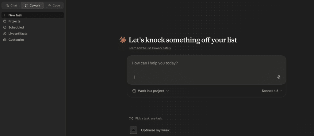
Claude, ChatGPT and Gemini can all take a dataset you paste in or upload and produce a chart within seconds. For one-time analysis or a presentation you are building this afternoon, these tools are genuinely fast and capable.
The structural limit is the same across all of them: no persistent data connection, no automatic refresh and no shareable live URL. Every time you want an updated chart, you start the session again. The pattern that repeats across teams in 2026: try an LLM for visualization, hit the data connection wall within 30 days, move to a connected tool.
Enterprise BI Platforms with AI Features
These are the most capable tools in the category for organizations with data engineering resources and governed warehouse data. The AI features are genuinely powerful when the data foundation underneath them is clean and well-structured. They are not self-serve for a team without a data engineer.
Tableau with AI
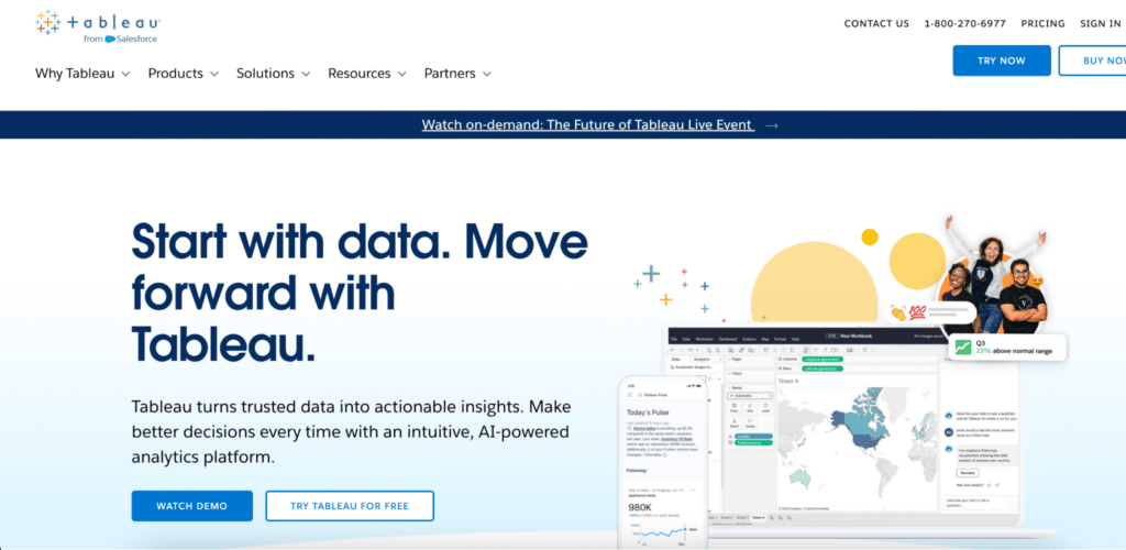
Tableau remains the benchmark for interactive visualization depth. Tableau Pulse delivers AI-generated narrative summaries and anomaly flags automatically. Tableau Agent, now generally available in 2026, handles natural language dashboard generation on top of existing data models.
KEY FEATURES
• Tableau Pulse: proactive AI-generated insight narratives and anomaly detection
• Tableau Agent: natural language dashboard and chart generation
• 40+ chart types with deep customization and animation
• Connects to 90+ data sources natively
• Tableau Prep for in-tool data cleaning and shaping
PRICING
Creator $75/user/month, Explorer $42, Viewer $15, all billed annually.
WHAT CUSTOMERS SAY
Users consistently praise the visualization quality and the depth of customization. The most common friction points are the cost for viewer seats, the setup time required before non-technical users can self-serve, and the data preparation burden that sits upstream of the tool.
Best for: organizations with dedicated data teams that want best-in-class visualization quality and AI-assisted insight delivery.
Power BI with Copilot

Power BI is the most cost-effective enterprise visualization option for Microsoft-heavy organizations. Copilot adds conversational visualization generation: describe what you want to see and Copilot generates it against your existing data model.
KEY FEATURES
• Copilot: conversational report and chart generation from natural language
• Deep integration with Excel, Teams, SharePoint and Azure
• Power BI Fabric for enterprise-scale data platform at $8,000/month (F64 tier)
• Mobile-optimized dashboards and executive scorecards
• DirectQuery for live warehouse connections without data import
PRICING
Pro $14/user/month. Copilot add-on $30/user/month. Every viewer needs a paid seat.
WHAT CUSTOMERS SAY
Teams already on Microsoft 365 report strong value because the licensing often overlaps with existing spend. The most common complaints are Copilot output quality when the underlying data model is messy, per-seat viewer costs that add up fast, and the learning curve for building and maintaining data models correctly.
Best for: Microsoft-heavy organizations with analytics resources looking to add AI visualization on top of an existing Power BI investment.
Domo
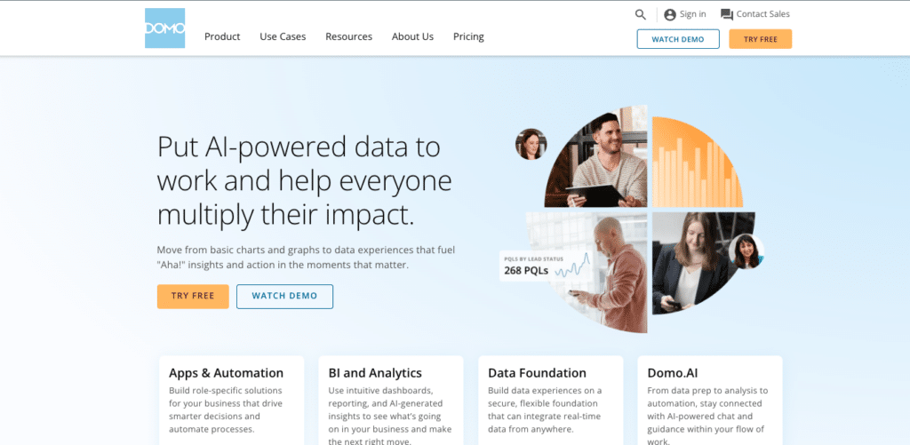
Domo combines data integration, transformation, visualization and collaboration in a single platform. Its AI features include conversational analytics, automated insight detection and predictive trend analysis. The mobile-first design makes it particularly strong for executives who check dashboards on the go.
KEY FEATURES
• 1,000+ data connectors with built-in ETL and transformation
• Domo AI: conversational analytics, automated insights and predictive forecasting
• Mobile-first design with executive scorecard views
• Domo Everywhere for embedding dashboards in external products
• Social collaboration: comment, tag and discuss directly on dashboards
PRICING
No public pricing. Based on Vendr procurement data, standard deployments start around $50,000 to $75,000 annually. Enterprise tiers run $100,000 to $200,000 or more. Credit-based model makes costs variable with usage.
WHAT CUSTOMERS SAY
Teams praise the all-in-one convenience and the mobile experience for leadership. The most consistent criticism is pricing unpredictability: the credit-based model means costs can spike as refresh frequency and data volume increase. Several reviews note that teams end up paying for a full platform while only using the visualization layer.
Best for: enterprise organizations that want a single platform for data integration, visualization and executive dashboards, and have budget to match.
AI-Native Analytics and Dashboard Builders
These tools were built from the ground up for AI-driven visualization and reporting. They are faster to set up, more accessible for non-technical users and less expensive than enterprise platforms. The trade-off is that they are less capable for complex enterprise governance requirements. This is the fastest-growing category in 2026.
Coefficient
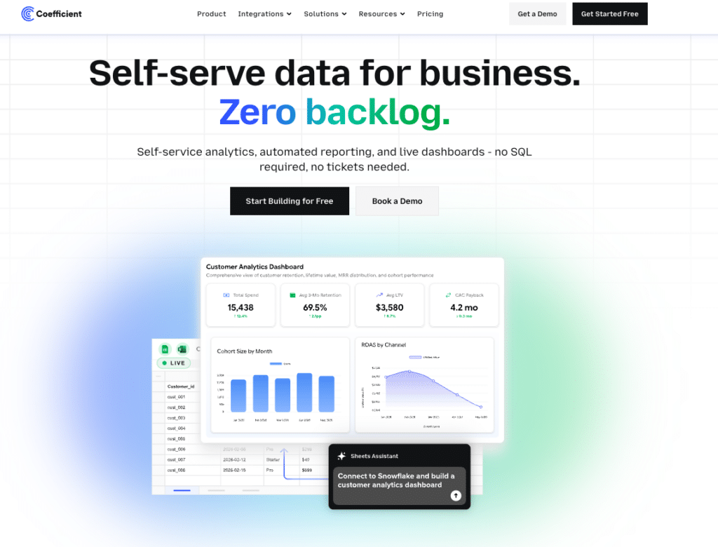
Coefficient connects 150+ data sources directly to Google Sheets or Excel, including Salesforce, HubSpot, NetSuite, QuickBooks and Snowflake, with server-side scheduled refresh that keeps data current automatically.
Describe the visualization you need in plain English and the AI builds a shareable web dashboard with SQL-backed numbers behind every chart. The Explain button traces every metric to the exact source columns it came from, making the output trustworthy enough to share with a CFO or a board. The Sheets Assistant builds charts, pivot tables and formulas directly inside Google Sheets from plain-English descriptions with knowledge of your actual data structure. Viewers of the live dashboard URL get an Ask-AI sidebar to explore conversationally without needing spreadsheet access.
KEY FEATURES
• 150+ live connectors to CRMs, ERPs, data warehouses and marketing platforms
• AI dashboard builder: plain-English to shareable web dashboard with SQL-backed metrics
• Sheets Assistant: conversational AI built into Google Sheets that understands your actual data
• Server-side scheduled refresh: dashboard stays current without anyone touching it
• Ask-AI sidebar: viewers explore live dashboard data conversationally at no extra cost
• Two-way sync: push corrections back to source systems from the spreadsheet
PRICING
Free plan available. Paid from $49/month. No per-user fees. Viewers access live dashboards for free.
WHAT CUSTOMERS SAY
Teams that previously spent hours each week pulling data from multiple systems describe the same shift once Coefficient is set up: the data is always current and the report runs itself. The most common limitation noted is the requirement for Google Sheets or Excel as the data layer, which is not suitable for teams that want a fully standalone dashboard tool.
“Our CEO couldn’t believe how clean it looked. He wants this for every department.” James Roland, Ready Education
Best for: RevOps and finance teams already working in Google Sheets or Excel who need live connected data, AI-built dashboards and shareable output without a BI stack or a data engineer.
ThoughtSpot
ThoughtSpot is the most mature AI-native analytics platform. Type a business question in plain English and get a chart back without touching SQL. The Spotter AI agent handles conversational follow-ups, proactive anomaly detection and agentic analysis. SpotterViz turns a natural language prompt into a complete, styled dashboard automatically.
KEY FEATURES
• Spotter AI agent: conversational analytics with follow-up questions and proactive insights
• SpotterViz: natural language to complete styled dashboard in one step
• Native connections to Snowflake, BigQuery, Databricks, Redshift and Azure Synapse
• Search-driven interface: type a question and get a chart without any dashboard configuration
• ThoughtSpot Everywhere for embedding self-serve analytics in external products
PRICING
Essentials $25/user/month. Pro $50/user/month. Both billed annually.
WHAT CUSTOMERS SAY
The self-serve experience for non-technical users is consistently praised as the strongest in the category when the data is clean. The most common friction is data model quality: users report that messy or rapidly evolving schemas produce unreliable search results, and getting the underlying data to a state where ThoughtSpot performs well requires real data engineering investment upfront.
Best for: enterprises with governed warehouse data that want best-in-class self-serve analytics for non-technical business users.
Julius AI
Julius AI takes the conversational data analysis model in a more accessible direction. Connect a database, upload a file or link a Google Sheet, ask a question in plain English and Julius runs the analysis, generates the chart and returns the result without any SQL or code on the user’s side.
The Notebooks feature is what separates it from a one-shot query tool: build a repeatable analysis sequence once, save it and run it against updated data each week without starting from scratch. The Python and R code behind every visualization is visible and editable for users who want to verify or extend the logic.
KEY FEATURES
• Natural language queries that return charts, tables or written summaries
• Notebooks: save repeatable analysis workflows that refresh with new data
• 40+ chart types with interactive output
• Connects to Postgres, Snowflake, BigQuery and MySQL alongside file uploads
• SOC 2 and GDPR compliant. 50% academic discount available.
PRICING
Free tier: 15 messages per month. Plus $20/month. Pro $45/month.
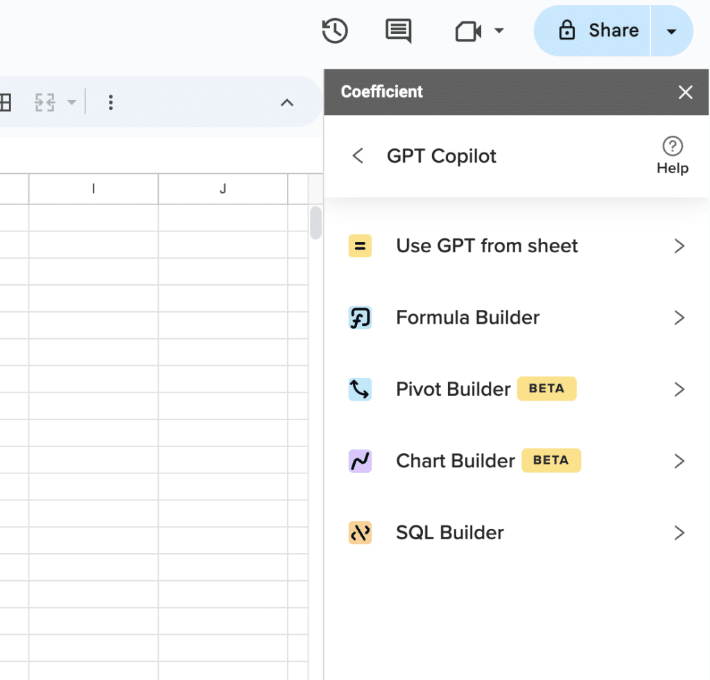
Supercharge your spreadsheets with GPT-powered AI tools for building formulas, charts, pivots, SQL and more. Simple prompts for automatic generation.

WHAT CUSTOMERS SAY
Business analysts report that the natural language interface genuinely works for standard queries and the chart quality is clean. The free tier is regularly cited as too limited for daily use. The most common limitations noted are performance on very large datasets and the lack of live server-side refresh for connected databases, meaning charts do not auto-update when source data changes.
Best for: business analysts, researchers and small teams who need fast visual insights from spreadsheets and databases without writing code, and who want the ability to save repeatable analysis workflows.
Polymer
Polymer is built for speed and accessibility. Upload a spreadsheet or connect a data source and the PolyAI feature generates charts, summaries and insights from natural language questions without any setup or data modeling.
KEY FEATURES
• PolyAI: natural language questions return charts and summaries instantly
• Auto-generated dashboards from uploaded data without configuration
• Interactive filters and drill-downs for non-technical users
• Shareable public or private dashboard links
• Integrates with Google Sheets, Airtable and CSV uploads
PRICING
Free tier available. Paid plans from $20/month.
WHAT CUSTOMERS SAY
Users praise the near-zero setup time and the accessibility for non-technical teammates. The most consistent limitation noted is depth: Polymer struggles with complex calculated fields, and users who need precise metric governance or auditable output tend to outgrow it quickly.
Best for: small teams and marketing professionals who need to turn a clean dataset into a shareable visual story without a BI infrastructure investment.
Data Storytelling and Publishing Tools
This category is often missing from BI-focused roundups. Datawrapper and Flourish serve a specific, high-value use case: creating publication-ready, embeddable visualizations for external audiences without a BI infrastructure. Journalists, communications teams and content marketers reach for these when the goal is a polished visual story rather than an operational dashboard.
Datawrapper
Datawrapper is the tool of choice for newsrooms and communications teams that need clean, accessible, embeddable visualizations quickly. Used by the UN, the New York Times, Der Spiegel and hundreds of other organizations.
KEY FEATURES
• Chart, map and table builder with no-code interface and AI chart type suggestions
• Accessibility-first output: WCAG-compliant charts by default
• Embed-ready output for web and CMS publishing
• Annotation AI for automatic chart labeling suggestions
• No data modeling or pipeline setup required
PRICING
Free tier: unlimited charts with Datawrapper branding. Team plan $599/year removes branding and adds collaboration.
WHAT CUSTOMERS SAY
Newsrooms and communications teams consistently describe Datawrapper as the fastest path from data to a publication-ready chart. The most common limitation noted is the lack of live data connectors: every chart requires a manual CSV upload, which makes it unsuitable for recurring dashboards or real-time reporting.
Best for: journalists, communications teams and content marketers creating one-off charts for external publication where quality and accessibility matter.
Flourish
Flourish extends the data storytelling concept into animated and interactive formats. 50+ visualization templates including race charts, scrollytelling narratives, interactive maps and animated timelines designed to travel well on social media and in digital publications.
KEY FEATURES
• 50+ templates including animated race charts, scrollytelling and interactive maps
• Story mode for combining multiple visuals into a guided narrative
• AI-assisted template selection and layout suggestions
• One-click embed codes for web and social publishing
• Collaboration features for team publishing workflows
PRICING
Free plan available (published work is public). Individual paid plan $99/month. Team plan $499/month. for private publishing.
WHAT CUSTOMERS SAY
Content teams and educators praise the animated formats and the social shareability of the output. The most consistent feedback is that the free plan’s public publishing requirement is a blocker for brand or client work, and that Flourish, like Datawrapper, requires manual data uploads rather than live connected sources.
Best for: content teams, educators and communications professionals who need animated or interactive visuals that perform well in digital publishing and social media.
Developer and Notebook Tools
For data scientists and engineers who want programmatic control over visualization, a separate tier exists. These tools offer maximum customization at the cost of a significant technical requirement.
Observable
Observable was founded by Mike Bostock, the creator of D3.js, and brings the notebook-based exploration model to data visualization. Teams write JavaScript or use Observable Plot to create custom, interactive visualizations with full code control.
KEY FEATURES
• Observable Plot: high-level charting library built on D3 for faster custom visualization
• AI code suggestions and chart generation inside the notebook environment
• Collaborative notebooks with version control and live editing
• Connects to databases, APIs and file uploads
• Publish notebooks as interactive documents or embed in external sites
PRICING
Free tier available. Pro plans from $9/user/month.
WHAT CUSTOMERS SAY
Data engineers and scientists praise Observable’s expressiveness and the speed advantage over building from raw D3. The most common limitation noted is the technical barrier: non-technical users cannot meaningfully engage with notebook-based workflows, which makes it a tool for data teams rather than business users.
Best for: data engineers and scientists who need custom, code-driven visualization and want the expressiveness of D3 without building from scratch.
Comparison Table
| Tool | Category | Live Data | Best For | Starts At |
|---|---|---|---|---|
| Claude or ChatGPT | General AI | No, session-based | One-time chart from data on hand | Free tier |
| Tableau with AI | Enterprise BI | Yes, with data engineering | Data teams needing best-in-class visualization | $75/user/month Creator (annual) |
| Power BI with Copilot | Enterprise BI | Yes, with data modeling | Microsoft-heavy orgs with analytics resources | $14/user/month Pro plus $30 Copilot |
| Domo | Enterprise BI | Yes, 1,000+ connectors | Enterprise orgs needing integrated platform | From $50,000/year |
| ThoughtSpot | AI-native analytics | Yes, warehouse-native | Business user self-serve on governed warehouse data | From $25/user/month |
| Julius AI | AI-native analytics | Yes, files and databases | Analysts needing fast visual insights without code | Free. Plus $20/month. Pro $45/month. |
| Coefficient | AI-native dashboard builder | Yes, 150+ business sources | RevOps and finance teams in Sheets or Excel | Free plan. Paid from $49/month. No per-user fees. |
| Polymer | AI-native chart builder | Limited | Small teams needing fast visual storytelling | Free tier. From $20/month. |
| Datawrapper | Data storytelling | No, manual upload | Journalists and comms teams, one-off charts | Free. Team plan $599/year. |
| Flourish | Data storytelling | No, manual upload | Content teams needing animated or interactive visuals | Free (public). From $99/month (private). |
| Observable | Developer notebooks | Yes, API and databases | Data engineers needing custom programmatic visualization | Free. Pro from $9/user/month. |
AI data visualization in 2026 is a wide category with a narrow answer for any given team. The enterprise platforms are genuinely powerful for organizations with the data foundation to support them. The storytelling tools are genuinely useful for external-facing publication work. The AI-native builders close the gap for business teams that need live operational dashboards without a BI stack. Start with the deliverable you actually need, then find the tool that produces it reliably.
If the deliverable is a live dashboard from connected business data, Coefficient is free to start and connects to your first data source in minutes.