Table of Contents
![]()

Originally published October 2024, latest revamp with updated tools, pricing, and content was made on March 2026.
Native Salesforce reports cap at 2,000 rows. They can only be viewed by people with a Salesforce license. They can’t pull in data from any other system. And the moment someone exports a report to a spreadsheet, the data starts going stale.
That’s why most revenue teams end up using at least one external reporting tool alongside Salesforce. The right one depends on where your data needs to go, who needs to see it, and how much your team is willing to invest in setup and maintenance.
This guide compares five Salesforce reporting tools covering the full range from native options to enterprise BI platforms to spreadsheet-native solutions.
Salesforce reporting tools at a glance
| Tool | Best For | Row Limits | Builder Cost | Viewer Cost | AI Features | Refresh | Alerts | SOC 2 |
|---|---|---|---|---|---|---|---|---|
| Native Salesforce | Teams that only need Salesforce data | 2,000 | $25-$75/user/month | $25-$75/user/month | Limited Einstein | Live | Slack / Email | Yes |
| Coefficient | RevOps and finance teams in Sheets or Excel | Unlimited (paid) | $49/user/month | Free | Yes | Hourly | Slack / Email | Yes |
| Tableau | Enterprises needing deep visualization | Unlimited | $75/user/month | $15/user/month | Einstein AI | Hourly | Slack / Email | Yes |
| Salesforce CRM Analytics | Teams wanting AI-powered analytics inside Salesforce | Unlimited | Custom pricing | Custom pricing | Yes (native) | Live | Slack / Email | Yes |
| Power BI | Microsoft-centric organizations | Unlimited | $14/user/month | $14/user/month | Copilot AI | Hourly | Email / Teams | Yes |
1. Native Salesforce Reports and Dashboards
Best for: Teams that only need Salesforce data and have licenses for everyone who needs to see reports
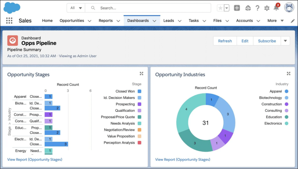
Native Salesforce reporting is built directly into the CRM. There’s no additional setup, no external tools to manage, and no data leaving the Salesforce environment. For Salesforce admins and sales managers who only need to report on CRM data and everyone who needs access already has a license, it’s the most straightforward option available.
What sets it apart
Native reporting is the only tool on this list where the data never leaves Salesforce. For organizations with strict data governance requirements, that matters. You also get real-time data with no refresh lag, built-in dashboard builder with drag-and-drop functionality, and Slack and email alert integration through Salesforce Flow. The learning curve is low for anyone already familiar with the platform.
Key features
- Report builder with tabular, summary, matrix, and joined report types
- Dashboard builder with drag-and-drop chart and table components
- Real-time Salesforce data with no refresh delay
- Salesforce Flow integration for automated Slack and email alerts
- Role-based visibility controls keeping reports within Salesforce permissions
- Limited Einstein AI access for basic predictive insights on higher editions
Pros
- Built into every Salesforce edition with no additional cost beyond the Salesforce license
- Real-time data without any sync or refresh configuration
- Easy for Salesforce admins and users who already know the platform
- Data stays inside Salesforce, which satisfies strict governance requirements
Cons
- Hard 2,000 row limit on reports makes it unsuitable for large datasets
- Only people with Salesforce licenses can view reports, which means paying for licenses just to share data
- Salesforce-only data source with no ability to blend data from other systems
- Visualization options are limited compared to dedicated BI tools
What users say
“Native reporting works well for day-to-day pipeline management, but the moment you need more than 2,000 rows or want to share with someone without a license, you’re looking for alternatives.” — Salesforce Admin, Trailblazer Community
“Great for basic reporting but the visualization options are too limited once you want to do anything beyond a standard bar chart.” — Sales Operations Manager, G2
Pricing
Included with all Salesforce editions. Salesforce licenses range from $25 to $75 per user per month depending on edition.
2. Coefficient
Best for: RevOps, sales ops, and finance teams that build and maintain reports in Google Sheets or Excel
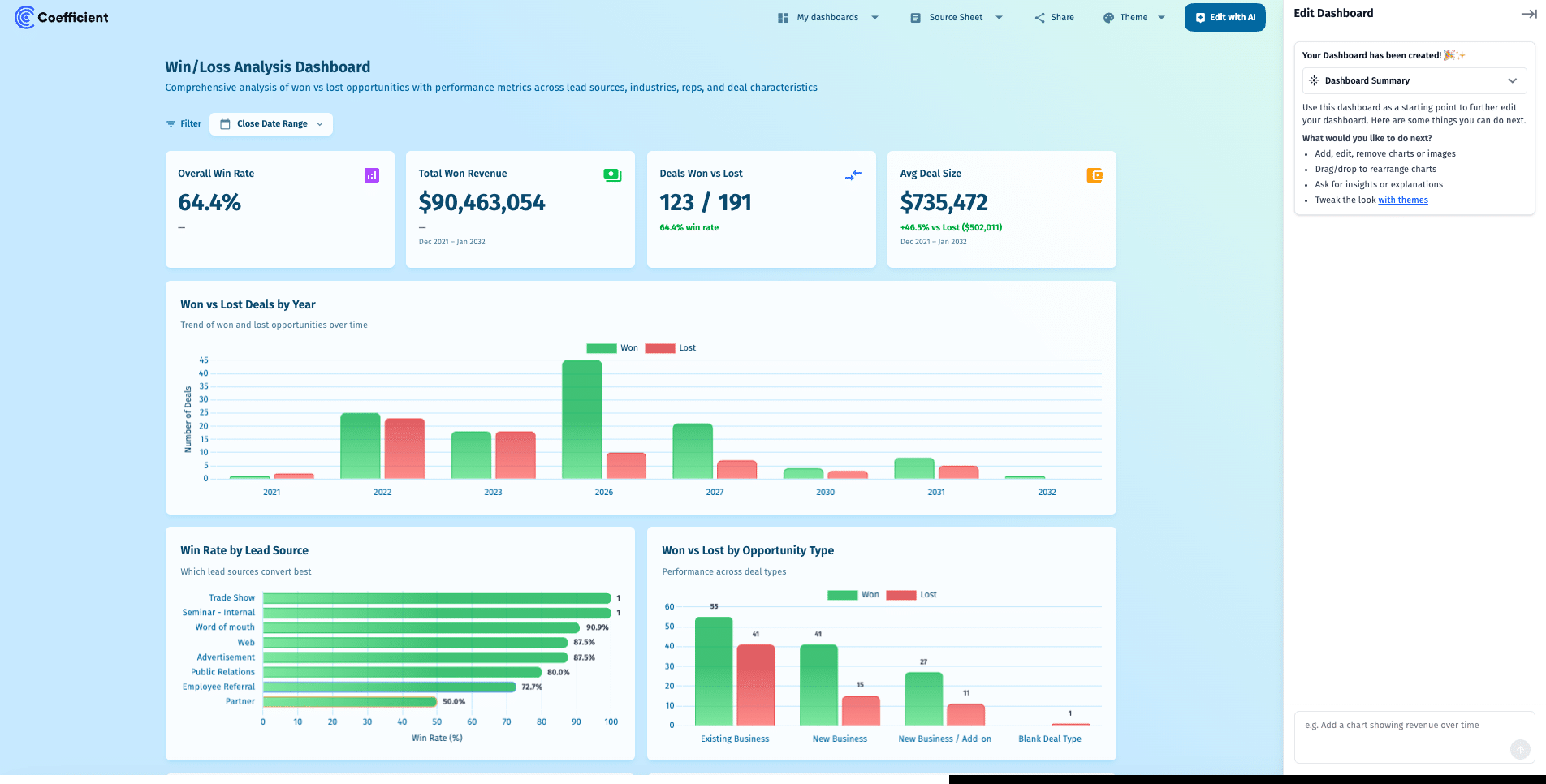
Coefficient takes a different approach from every other tool on this list. Rather than asking your team to learn a new reporting interface, it turns the spreadsheet they already work in into a live reporting layer connected directly to Salesforce. Data refreshes automatically, changes can be written back to Salesforce in bulk, and when you’re ready to share beyond the spreadsheet, an AI chat interface builds a live web dashboard from that same data in minutes.
What sets it apart
Most Salesforce reporting tools are destinations. Coefficient is a connection layer. Your team stays in Google Sheets or Excel, the data stays live, and the reports stay maintained without someone re-exporting CSVs before every meeting. Coefficient also connects to 100+ other data sources including HubSpot, Snowflake, QuickBooks, and Google Ads, so you can build reports that combine Salesforce data with every other system in your stack in a single sheet. No other tool on this list does that.
Key features
- Live two-way sync between Salesforce and Google Sheets or Salesforce and Excel
- Import from Salesforce reports, objects, or custom SOQL queries
- =salesforce_search and =salesforce_lookup formula functions for cell-level Salesforce queries
- Combine Salesforce data with 100+ other sources in the same sheet
- Auto-refresh on hourly, daily, or weekly schedules
- AI chat interface to build and publish live web dashboards from spreadsheet data
- Write Salesforce records back in bulk directly from the spreadsheet
- Slack and email alerts when metrics hit thresholds
- SOC 2 Type II compliant
Pros
- No Salesforce license required for report viewers, just share the spreadsheet or dashboard link
- Combines Salesforce with HubSpot, Snowflake, Google Ads, and 100+ other sources in the same sheet
- AI dashboard builder lets non-technical users publish BI-quality dashboards without a data team
- Two-way sync means reps can update Salesforce records in bulk from a spreadsheet
- Free tier available with no row limits on imports
Cons
- Works best for teams already using Google Sheets or Excel. Teams that don’t use spreadsheets won’t get as much value
- Advanced features including hourly refresh and unlimited rows require a paid plan
- Not suited for pixel-perfect visualization work requiring Tableau-level chart customization
What users say
“Coefficient has transformed our Salesforce reporting. The real-time sync and automation features have saved us countless hours.” — John D., Sales Manager, G2
“The sheer brilliance of easily syncing any data from any source into Google Sheets is just amazing. Dead simple to use, works smoothly, and gets the job done.” — G2 reviewer
“Coefficient has been incredibly helpful at exporting powerful reporting from various tools to share across our organization, regardless of the licenses we have for the actual tool itself.” — G2 reviewer
Pricing
Free tier available. Paid plans start at $49/user/month.
Don’t miss Coefficient’s free Salesforce Dashboard Templates to get started quickly.
Get started free with Coefficient
3. Tableau
Best for: Data analysts and enterprises where visualization depth and data storytelling are core requirements
Tableau is the benchmark for data visualization. It connects directly to Salesforce, handles large datasets without performance issues, and gives analysts precise control over how data is presented. For organizations where communicating insights through polished, interactive visuals is central to how decisions get made, Tableau delivers at a level most other tools on this list don’t match.
What sets it apart
Tableau’s visualization library is unmatched. It supports an extensive range of chart types, allows complex calculated fields and table calculations, and produces interactive dashboards that non-technical stakeholders can explore themselves. The native Salesforce connector is tight given Salesforce’s ownership of Tableau, and Einstein AI integration surfaces predictive insights directly within dashboards.
Key features
- Native Salesforce connector with live or scheduled extract options
- Extensive visualization library covering 20+ chart types
- Complex calculated fields and table calculations for advanced analysis
- Einstein AI integration for automated insights and anomaly detection
- Tableau Pulse for AI-generated data summaries in plain English
- Flexible deployment on Tableau Cloud, Server, or Desktop
- Embed dashboards inside Salesforce records and pages
Pros
- Best-in-class visualization depth for organizations that need sophisticated data storytelling
- Handles large datasets reliably without the performance issues that affect some BI tools
- Einstein AI integration adds predictive analytics and automated insight surfacing
- Can embed dashboards directly inside Salesforce records, keeping analysts in one environment
Cons
- Creator licenses at $75/user/month are expensive, particularly for teams with many viewers
- Steep learning curve for non-analysts. Building complex workbooks requires dedicated skills
- Desktop client dependency means content creators need software installed locally
- Occasional performance issues with live Salesforce connections during peak usage periods
What users say
“Best solution for complex, multi-source analytics combining Salesforce data with our data warehouse. The visualization depth is unmatched.” — BI Lead, TrustRadius
“Great product but the cost adds up fast. We had to be selective about who gets Creator licenses because the viewer count alone gets expensive.” — Sales Analytics Manager, G2
Pricing
Creator at $75/user/month, Explorer at $42/user/month, Viewer at $15/user/month. All billed annually.
4. Salesforce CRM Analytics (Einstein Analytics)
Best for: Salesforce-heavy organizations that want AI-powered analytics without leaving the Salesforce ecosystem
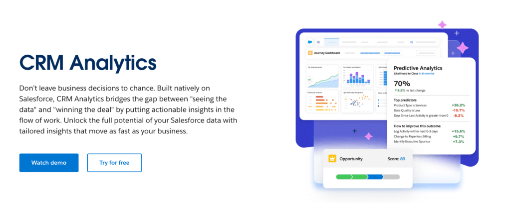
Salesforce CRM Analytics, formerly known as Einstein Analytics and Tableau CRM, is Salesforce’s native advanced analytics platform. It lives inside Salesforce, connects directly to all your CRM data, and surfaces AI-driven predictions and insights without requiring a separate BI tool. For organizations that are deeply invested in the Salesforce ecosystem and want analytics that feel native rather than bolted on, this is the most coherent option.
What sets it apart
CRM Analytics goes significantly beyond native Salesforce reports. It removes the 2,000 row limit, supports multi-object data models that native reports can’t handle, and surfaces AI predictions like lead scoring, churn likelihood, and opportunity close probability directly within dashboards. Because it’s built on Salesforce infrastructure, it respects Salesforce permission sets and data governance rules automatically.
Key features
- Removes the 2,000 row limitation of native Salesforce reports
- Multi-object data models and complex relationships native reports can’t support
- Einstein AI predictions including lead scoring, churn risk, and forecast modeling
- Industry-specific dashboard templates for sales, service, and marketing
- Lives inside Salesforce, respecting existing permissions and governance
- Data Cloud integration for unified customer data from external sources
- Mobile-first design with native iOS and Android apps
Pros
- Stays entirely within Salesforce, keeping data governance and permissions consistent
- AI-powered predictions are native and don’t require additional configuration
- Removes the row limits and data model constraints of native Salesforce reporting
- Industry templates accelerate time to first dashboard significantly
Cons
- Custom pricing makes budgeting difficult, tends to be expensive for smaller organizations
- Primarily Salesforce data only, with limited ability to blend external data sources
- Complex dashboard development still requires dedicated Salesforce analytics expertise
- Some users report that the UI feels less polished than standalone BI tools like Tableau
What users say
“CRM Analytics is the right choice if you want to stay in Salesforce and get beyond what native reports can do. The AI predictions alone justify the cost for us.” — Revenue Operations Director, G2
“The learning curve is real and the pricing isn’t transparent, but once you’re set up the AI insights surface things you wouldn’t have thought to look for manually.” — Salesforce Analytics Lead, Trailblazer Community
Pricing
Custom pricing. Contact Salesforce sales for a quote. Typically positioned for mid-market and enterprise organizations.
5. Power BI
Best for: Organizations running on Microsoft infrastructure that need enterprise BI at an accessible price
Power BI is Microsoft’s enterprise business intelligence platform. It connects to Salesforce via a native connector, handles large datasets reliably, and integrates tightly with the Microsoft stack including Azure, Teams, Excel, and Office 365. For organizations already invested in Microsoft infrastructure, Power BI is the most natural path to enterprise-grade Salesforce reporting.
What sets it apart
Power BI Copilot, rolled out in 2025, lets users build report pages, write DAX formulas, and get narrative summaries through a chat interface. Combined with the per-user pricing that’s significantly lower than Tableau, Power BI offers a compelling enterprise BI option for Microsoft-centric teams. Embedding live dashboards directly into Teams channels is a particular strength for organizations where Teams is the primary communication layer.
Key features
- Native Salesforce connector with scheduled refresh options
- Power BI Copilot for AI-assisted report building and natural language queries
- Deep Microsoft integration with Azure, Teams, Excel, and Office 365
- Row-level security and enterprise governance controls
- Embed live dashboards directly in Teams channels and PowerPoint presentations
- Custom DAX calculations for complex business logic
- 1,000+ connectors for blending Salesforce with other data sources
Pros
- Significantly more affordable than Tableau at $14/user/month for Pro
- Power BI Copilot makes AI-assisted reporting accessible without data engineering skills
- Deep Microsoft integration means dashboards live where teams already work
- Strong row-level security and governance for enterprise compliance requirements
Cons
- DAX formula language has a real learning curve for non-analysts
- Every viewer needs a paid Pro license unless you’re paying for Premium Capacity at ~$5,000/month
- Works best when you’re already in the Microsoft ecosystem. Less compelling for Google Workspace teams
- Sharing reports externally requires additional licensing considerations
What users say
“The Microsoft integration is seamless. Having live Salesforce data embedded directly in our Teams channel has changed how our sales team gets updates.” — Sales Operations Lead, G2
“Powerful but DAX takes time to learn. The Copilot feature helps a lot but you still need someone who understands data modeling to get the most out of it.” — BI Analyst, G2
Pricing
Power BI Pro at $14/user/month. Premium Per User at $24/user/month. Premium Capacity from approximately $4,995/month for organization-wide access.
How to choose the right Salesforce reporting tool
The answer depends on three things: where your data needs to live, who needs to see it, and how much setup your team can sustain.
If your team works in spreadsheets and needs live Salesforce data without manual exports: Coefficient. It works inside Google Sheets or Excel, keeps data live automatically, and lets you combine Salesforce with every other data source in your stack. Get started free.
If you have dedicated analysts and visualization depth is a priority: Tableau. The cost and learning curve are real but the output quality is best in class.
If you want to stay entirely inside Salesforce and need AI-powered analytics: Salesforce CRM Analytics. Removes the row limits and data model constraints of native reporting while keeping everything within the Salesforce ecosystem.
If your organization runs on Microsoft infrastructure: Power BI. Affordable, integrates tightly with Teams and Azure, and Power BI Copilot makes AI-assisted reporting accessible.
If you only need basic CRM reporting and everyone already has a Salesforce license: Native Salesforce reporting. No additional cost, no setup, real-time data.
If you need to blend Salesforce with multiple other sources without coding: Coefficient if you also need two-way sync and AI reporting & dashboard capabilities.
Frequently asked questions
What are the limitations of native Salesforce reporting?
Native Salesforce reports cap at 2,000 rows, can only be viewed by people with a Salesforce license, and can only report on Salesforce data. You can’t blend Salesforce data with data from other systems, and the visualization options are limited compared to dedicated BI tools.
Can I share Salesforce reports with people who don’t have a Salesforce license?
Not with native Salesforce reporting. Every viewer needs a paid license. Coefficient solves this by syncing Salesforce data to Google Sheets or Excel and letting you share the spreadsheet or a live dashboard link with anyone, no Salesforce license required. Get started free.
What is the best Salesforce reporting tool for RevOps teams?
Coefficient for teams that live in spreadsheets and need live data without manual exports. Tableau or CRM Analytics for teams with dedicated analysts who need deeper visualization and AI-powered insights.
Is Tableau worth the cost for Salesforce reporting?
It depends on how deeply your team uses it. If you have dedicated analysts building complex dashboards that leadership relies on for decisions, the $75/user/month Creator license is justifiable. If your reporting needs are moderate and your team doesn’t have Tableau expertise, Coefficient or Power BI will deliver more value at a lower cost.
What is the difference between Salesforce CRM Analytics and Tableau?
Both are owned by Salesforce. CRM Analytics lives inside Salesforce, works primarily with Salesforce data, and surfaces AI predictions natively. Tableau is a standalone visualization platform that connects to Salesforce and hundreds of other sources, offering deeper visualization flexibility and the ability to blend multi-source data. CRM Analytics is the right choice if you want to stay inside Salesforce. Tableau is the right choice if you need to go beyond it.