Navigating the evolving Software as a Service (SaaS) industry requires a reliable compass – a robust SaaS Metrics Dashboard.
But not all dashboards are created equal. Decision-makers need dashboards that reduce the noise to focus on essential metrics, while also being adaptable enough to meet evolving business needs and requirements.
This guide will explore the essentials of these dashboards, their benefits, and how to implement them effectively.
What is a SaaS Metrics Dashboard?
A SaaS Metrics Dashboard is a powerful tool that enables SaaS companies to monitor, measure, and manage their business performance. It provides real-time insights into key SaaS KPIs, helping decision-makers drive business growth based on data-driven strategies.
It’s like the cockpit of an airplane, providing the pilot with all the essential information needed to navigate the journey successfully. This interactive tool is a crucial part of any SaaS analytics strategy.
Benefits of Using an Integrated SaaS Dashboard
An integrated SaaS dashboard offers numerous benefits:
- Real-time data tracking enables prompt and effective decision-making, which allows you to respond to changes in your business environment swiftly.
- Informed decision-making: Being data-driven is no longer a goal but essential for survival. Data can significantly improve the quality of your decisions and increase the likelihood of achieving your business objectives.
- Improved productivity: By integrating all your data sources in one place, a SaaS dashboard eliminates the time and effort spent on manual data gathering and consolidation.
- A holistic view of performance: A SaaS dashboard lets you visualize all your key metrics in one place, providing a comprehensive view of your business performance.
Key Elements of a SaaS Dashboard
A robust SaaS dashboard includes key elements such as:
- Key Performance Indicators (KPIs) provide a clear indication of your performance against your strategic objectives. For example, if your goal is to increase customer retention, your KPI might be the churn rate, which measures the rate customers stop doing business with you.
- User-friendly interface: The dashboard should be easy to navigate and interpret, enabling users to take away actionable insights and make informed decisions quickly.
- Real-time data updates: The data on your kpi dashboard should refresh in real-time or near real-time, ensuring that you always have the most up-to-date information.
- Customization capabilities: The dashboard, designed with your unique business needs and user preferences in mind, should facilitate seamless integration with key business systems for on-demand metrics addition. Moreover, it should provide diverse graph styles through advanced charting capabilities to suit various visual preferences.
How to Build a SaaS Dashboard?
Building a SaaS dashboard involves a few crucial steps:
Define Your Goals:
Start by identifying what you aim to achieve with your dashboard. This could be anything from tracking sales performance to monitoring customer satisfaction. For example, if your goal is to increase customer retention, your dashboard might focus on customer behavior and satisfaction metrics.
Identify Your Key Performance Indicators (KPIs):
Choose the metrics that align with your goals and will provide meaningful insights. These could include revenue, churn rate, customer acquisition cost, and customer lifetime value. For instance, if your goal is to increase customer retention, your KPI might be the churn rate.
Choose Your Dashboard Software:
When choosing a dashboard tool, think about your needs, budget, and data complexity. It’s crucial to opt for software that offers a lean learning curve and is accessible to both non-technical and data team users. Startups may favor an affordable, user-friendly solution, while an enterprise-level organization might require a more advanced tool to manage their complex data
Design Your Dashboard Layout:
Design your dashboard keeping the stakeholders in mind. Ensure that it is visually engaging and logically arranged for easy interpretation of data and immediate recognition of key KPIs. Group related metrics or prioritize them based on importance, allowing users to draw insights at a glance.
Implement and Test Your Dashboard:
After setting it up, test the dashboard to ensure it works as expected. This will allow you to identify and fix any issues before using it. For instance, check that the data refreshes correctly, that the charts display the data accurately, and that the dashboard is easy to navigate.
Choosing the Right SaaS Dashboard Software
Several software options are available for building SaaS dashboards, each with its own pros and cons. It’s crucial to choose a tool that aligns with your business needs.
Coefficient is a powerful option that can integrate all business systems into sheets, automate data updates, and provide a comprehensive view of your performance.
Top Metrics to Add to the SaaS Dashboard
The metrics you track will depend on your specific business model and goals. However, some of the most important metrics for most SaaS businesses include:
- Churn Rate measures the rate at which customers stop doing business with you. A high churn rate can indicate problems with customer satisfaction or product quality.
- Monthly Recurring Revenue (MRR) is the amount of revenue that your business can reliably expect to receive each month. It’s a key indicator of the health and stability of your business.
- Customer Acquisition Cost (CAC): the cost of acquiring a new customer. It’s important to keep this cost as low as possible to maximize profit.
- Customer Lifetime Value (CLV) is the total revenue you can expect to receive from a customer over their relationship with your business. It’s an important measure of the long-term value of your customers.
These metrics can provide invaluable insights into your business performance, average revenue at a given time, and growth potential.
SaaS Metrics Dashboard Templates
There are various templates you can use to build your SaaS dashboard. Let’s explore some of them:
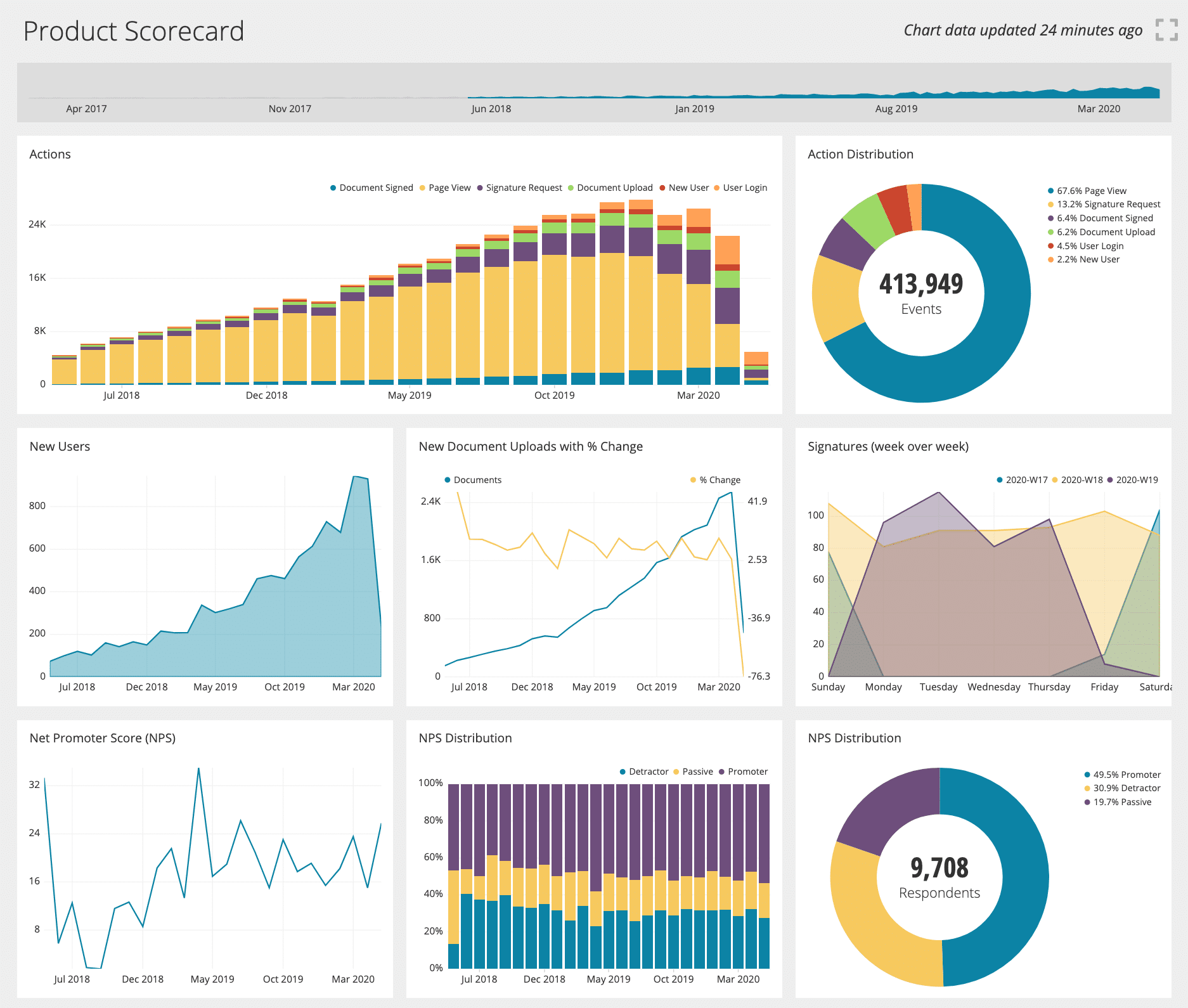
1. CEO & Senior Leadership Dashboard
Leadership requires a holistic view of business performance for strategic decision-making.
Metrics to Track:
- MRR (Monthly Recurring Revenue): A measure of the predictable and recurring revenue components of your subscription business.
- ARR (Annual Recurring Revenue): Annualized version of MRR, representing the value of the contracted recurring revenue components of your subscriptions.
- Total Logo Count: The total number of distinct logos or brands that are active customers.
- Churn Rate: The percentage of subscribers to a service who discontinue their subscriptions within a given time period.
- Net Churn Rate: Measures the loss of existing business (churn) against the gain from existing customers (expansion).
- Net Revenue Retention: Captures the changes in recurring revenue from existing customers over a specific time period, accounting for expansions, contractions, and churn.
- Churn Dates and Reasons: Specific dates when customers churned and the associated reasons for their departure.
- Deal Downgrades: Monitoring instances when a customer reduces the number of paid licenses, avails a discount, or shifts to a lower-priced tier.
- Dynamic Date Range Filter: Allows for viewing data by day, week, month, quarter, or year, adapting to the sales volume and nature of the SaaS business.
CEO and Senior Leadership Dashboard Example
Coefficient’s HubSpot MRR Dashboard is designed for SaaS and PLG companies, offering CEOs and senior leadership a comprehensive view of vital metrics like MRR, ARR, churn rates, and more. It visualizes key business health indicators and integrates live HubSpot data, ensuring timely insights and facilitating strategic decision-making.

2. Finance Dashboard
Finance teams need to monitor the company’s financial performance to ensure financial stability and guide strategic decision-making.
Metrics to Track:
- Net Profit Margin is the percentage of revenue that remains after all operating expenses, taxes, and costs have been deducted. It’s a key measure of the company’s profitability.
- Booking is the value of contracts signed in a specific period. It’s important for understanding the company’s sales performance.
- Cash Flow is the total amount of money being transferred into and out of a business. It’s important as it helps the company to understand its liquidity position and how well it can cover its short-term liabilities.
- Operating Expenses is the cost incurred from the core business operations. Monitoring operating expenses is crucial for managing profitability.
- ROI (Return on Investment): This measures the profitability of an investment. It’s crucial for understanding the return on the company’s investments.
- Realized Revenue is the revenue that has been earned and reported. It’s a key measure of the company’s financial performance.
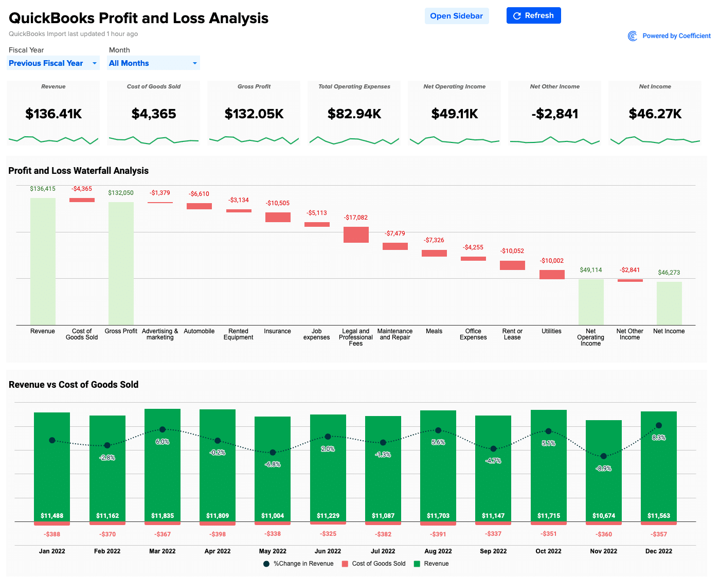
Finance Dashboard Example
Finance professionals can use Coefficient’s QuickBooks Profit and Loss template for more comprehensive financial analyses directly in their spreadsheet!

Stop exporting data manually. Sync data from your business systems into Google Sheets or Excel with Coefficient and set it on a refresh schedule.
Get Started
3. Sales Dashboard
Sales teams need to track their performance and identify opportunities for improvement.
Metrics to Track:
- ARR (Annual Recurring Revenue) is the value of the contracted recurring revenue components of your subscriptions normalized to a one-year period. It’s crucial as it provides a clear picture of the company’s financial health and growth potential.
- MRR (Monthly Recurring Revenue) is the revenue your business can reliably expect to receive each month. It’s a key indicator of the health and stability of your business.
- Sales Growth measures the increase in sales over a specific period. It’s important for understanding the company’s growth and profitability.
- Sales by Geo measures sales by geographical location, and is crucial for understanding market penetration and identifying growth opportunities.
- Sales Pipeline Velocity measures the speed at which opportunities are moving through the sales pipeline. It’s used to help businesses understand how quickly they’re generating revenue.
- Sales Conversion Rate is the percentage of sales opportunities that result in a closed deal. It’s a key metric for assessing the effectiveness of the sales process.
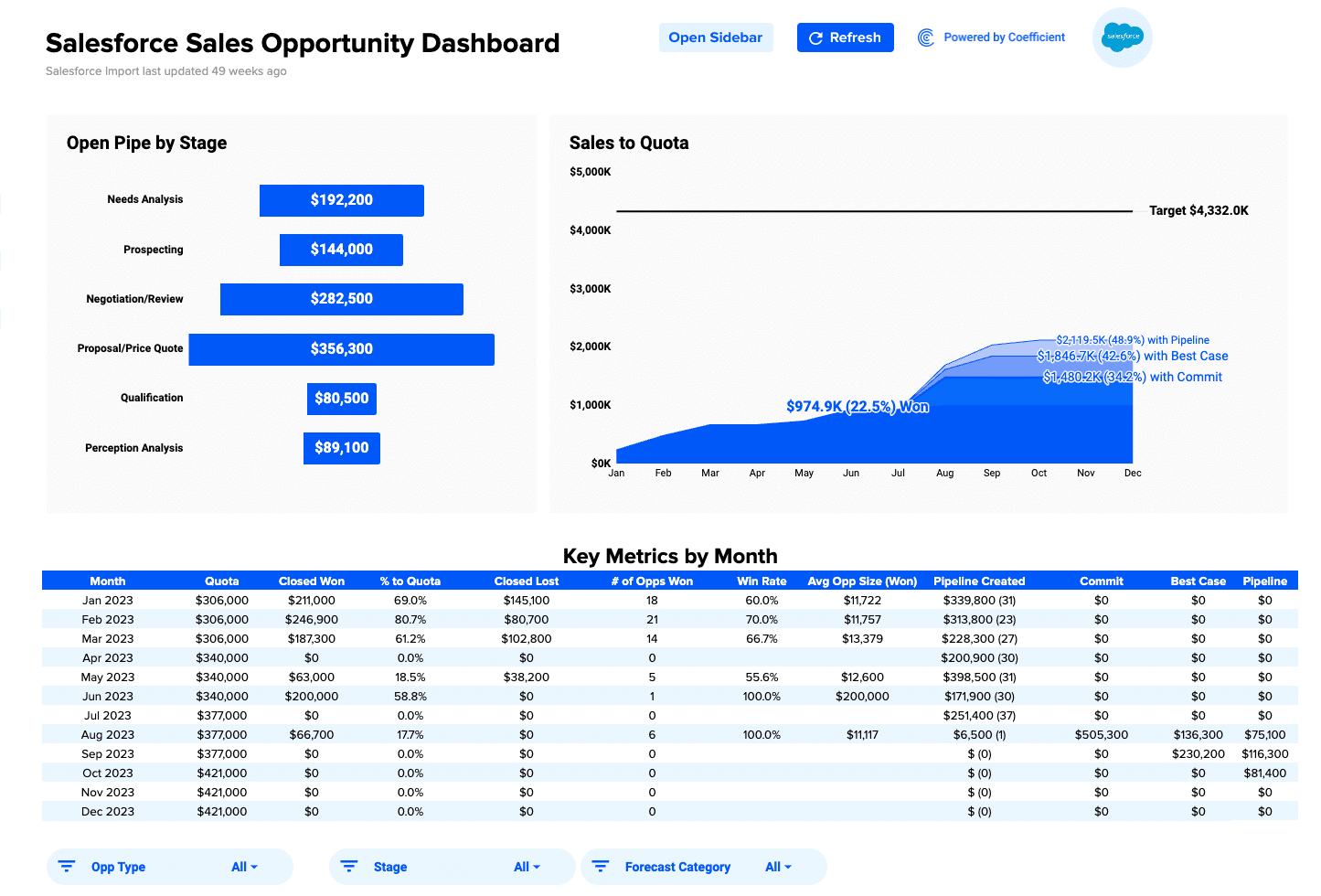
Sales Dashboard Example
Sales dashboards can take many different forms. One example is Coefficient’s Salesforce Sales Opportunity Dashboard, which gives users insight into each stage, monitoring key sales KPIs like win rate, deal size, and stage value across any time frame.
4. Marketing Dashboard
SaaS Marketing teams need to understand the effectiveness of their marketing campaigns to optimize their strategies.
Metrics to Track:
- Website Traffic To Leads Conversion measures the percentage of website visitors who become leads and the effectiveness of the company’s online marketing efforts.
- CAC (Customer Acquisition Cost) measures the cost of acquiring a new customer. It’s important to keep this cost as low as possible to maximize profitability.
- ROAS (Return on Ad Spend) measures the revenue generated for every dollar spent on advertising.
- Leads by Channel measures the number of leads generated through different marketing channels.
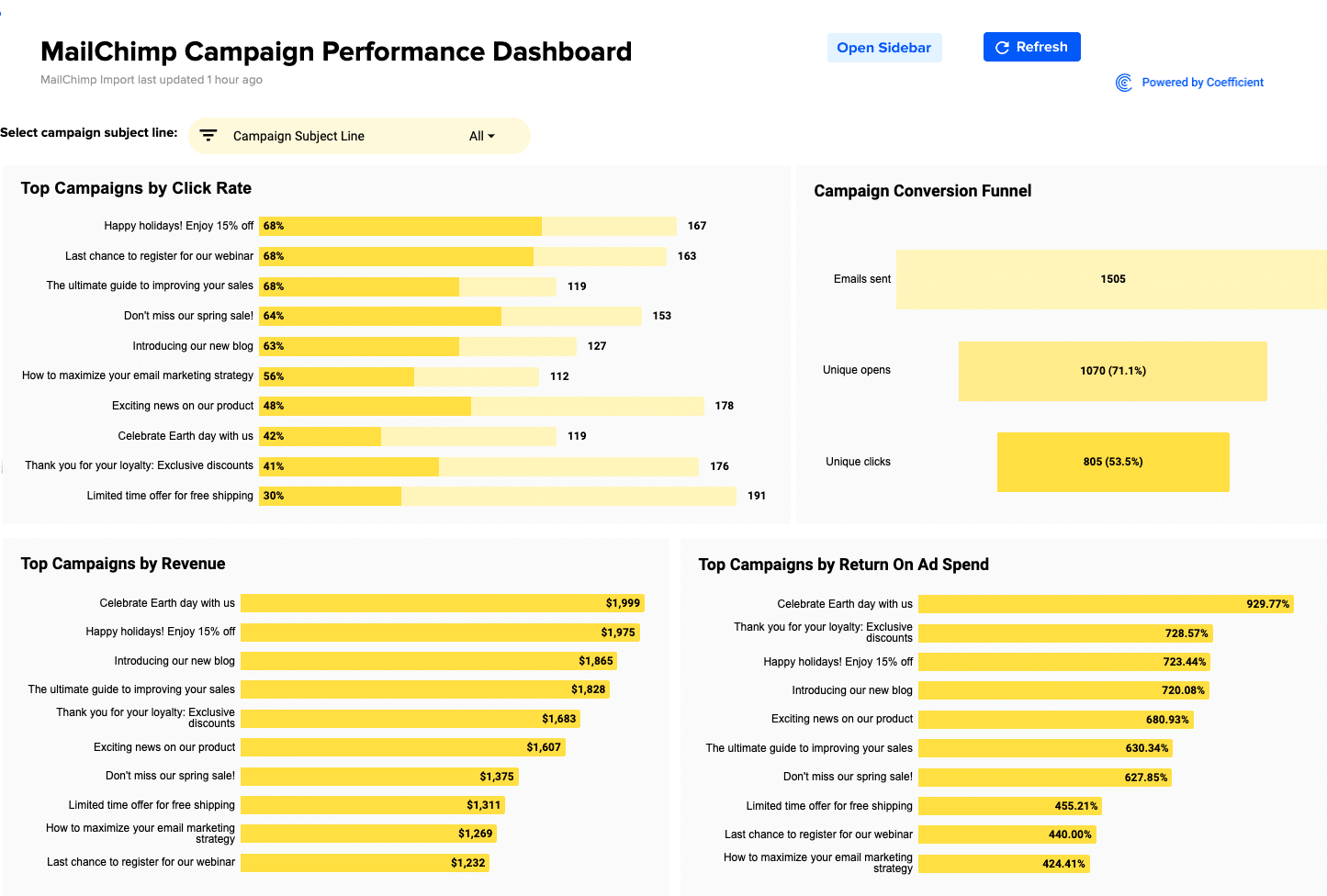
Marketing Dashboard Example
Coefficient’s Mailchimp Campaign Performance Dashboard gives marketers a holistic view of campaign performance segmented by audience.
5. Product Usage Dashboard
Product teams need to understand how users interact with their SaaS products to make data-driven product development and improvement decisions.
Metrics to Track:
- Active Users: the number of users who have interacted with the product within a specific timeframe.
- User Retention measures the percentage of users who return to the product after their first visit. It’s crucial for understanding the product’s ability to engage and retain users.
- Session Duration is the length of time a user spends on the product in a single session. It’s an important measure of user engagement.
- Feature Usage measures how often users use specific features of the product. It’s crucial to understand which features are most valuable to users.
- Error Rate is the number of errors that users encounter while using the product. It’s important for monitoring product quality and user experience.
- Adoption Rate measures the percentage of users who adopt a new feature or product. It’s crucial for understanding the success of product launches and updates.
- Churn Rate: This measures the rate at which users stop using the product. It’s a key metric for understanding user satisfaction and retention.
Product Usage Dashboard Example
Chartio’s product usage dashboard is a great example of intuitive design and efficient implementation. It offers precise audience segmentation, metric identification, and streamlined data visualization. All of this can be tested and deployed seamlessly within a single sprint.
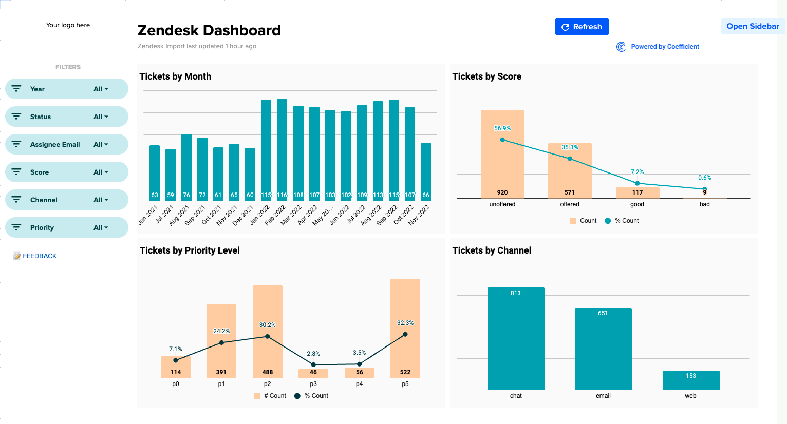
6. Customer Support Dashboard
Customer success teams need to monitor their performance to ensure they provide high-quality customer support.
Metrics to Track:
- Ticket Volume is the number of support tickets received within a specific period. It’s important for understanding the demand for customer support.
- Resolution Time is theaverage time it takes to resolve a support ticket. It’s crucial for monitoring the efficiency of the support team.
- First Response Time is the average time it takes for a customer to receive an initial response to their support ticket. It’s a key measure of the support team’s responsiveness.
- CSAT (Customer Satisfaction Score) measures customer satisfaction with the support they receive. A high CSAT score indicates that customers are satisfied with the support they’re receiving.
Customer Support Dashboard Example
Coefficient’s Zedeck Ticket Dashboard helps Customer Support teams streamline operations by providing complete visibility into their queue.
Elevate Your Business: The Impact of SaaS Metrics Dashboards
SaaS metrics dashboards are essential for tracking, understanding, and optimizing your business performance. With the right dashboard, you can keep a pulse on your key metrics, make data-driven decisions, and drive your business toward its goals.
Ready to build your own SaaS analytics dashboard? Install Coefficient (for free) and start creating your comprehensive SaaS metrics dashboard today.


