Are you struggling to present your data effectively in Excel? Do you want to create impactful visualizations that clearly communicate your insights? This comprehensive guide will walk you through everything you need to know about chart types in Excel, from the basics to advanced techniques.
Excel Chart Fundamentals
Understanding Excel Charts
Excel charts are powerful tools for visualizing data. They transform raw numbers into graphical representations, making it easier to identify trends, patterns, and relationships within your data. Whether you’re analyzing sales figures, tracking project progress, or presenting financial results, charts can help you communicate complex information quickly and effectively.
A typical Excel chart consists of several key components:
- Chart area: The entire chart, including all its elements
- Plot area: The main part of the chart where data is plotted
- Data series: The actual data being represented
- Axes: The horizontal and vertical lines that provide a frame of reference
- Legend: A key that explains what each data series represents
- Title: A descriptive label for the chart
- Data labels: Text or values that provide additional information about data points
- Gridlines: Horizontal or vertical lines that help viewers read values more accurately
To access chart tools in Excel:
- Select your data range
- Navigate to the “Insert” tab on the ribbon

- Choose from the various chart types in the “Charts” group
- Alternatively, use the keyboard shortcut Alt + F1 to create a default chart instantly
Excel offers a wide range of chart types, each designed to represent different kinds of data effectively. We’ll explore these in detail throughout this guide.
Choosing the Right Chart Type
Selecting the appropriate chart type is crucial for effective data presentation. The right chart can make your data intuitive and impactful, while the wrong choice can confuse or mislead your audience. Consider these factors when choosing:
- Data type:
- Categorical: Bar, column, or pie charts
- Time-series: Line or area charts
- Relationships: Scatter or bubble charts
- Number of variables:
- One variable: Pie or single-series column chart
- Two variables: Line, bar, or scatter chart
- Three or more variables: Bubble chart or multiple series column/line charts
- Message:
- Comparison: Bar or column charts
- Composition: Pie or stacked column charts
- Distribution: Histogram or box plot
- Trend: Line or area charts
Common mistakes to avoid:
- Using 3D charts when 2D would suffice: 3D charts can distort data perception
- Choosing pie charts for data with too many categories: Limit pie charts to 5-7 slices
- Mismatching chart types with data types: For example, using a line chart for categorical data
- Overcomplicating charts with unnecessary elements: Keep it simple and focused on the key message
Essential Chart Types
Column and Bar Charts
Column and bar charts are versatile and widely used for comparing categories. They’re excellent for showing the magnitude of different items side by side.
Types and variations:
- Clustered column/bar: Compare values across categories
- Stacked column/bar: Show the composition of each category
- 100% stacked column/bar: Display the percentage contribution of each component
Step-by-step creation guide:
- Select your data range
- Click “Insert” > “Column” or “Bar” chart

- Choose the specific subtype you want
- Right-click the chart and select “Select Data” to adjust the data range if needed

- Use the “Chart Designs” tabs to customize design and format

Formatting tips:
- Use consistent colors for each category across charts for easy comparison
- Consider using a highlight color for important data points
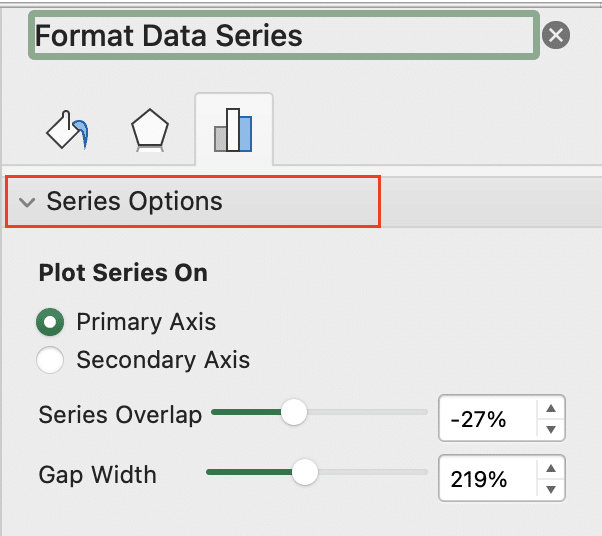
- Adjust gap width between columns/bars for readability (right-click series > Format Data Series > Series Options)
- Add data labels for precise values (Chart Design > Add Chart Element > Data Labels)

Example:
| Product | Q1 Sales | Q2 Sales | Q3 Sales | Q4 Sales |
| A | 100 | 120 | 110 | 130 |
| B | 80 | 90 | 100 | 110 |
| C | 120 | 110 | 130 | 140 |
To create a clustered column chart from this data:
- Select A1:E4
- Insert > Column chart > Clustered Column

- Add a title: “Quarterly Sales by Product“
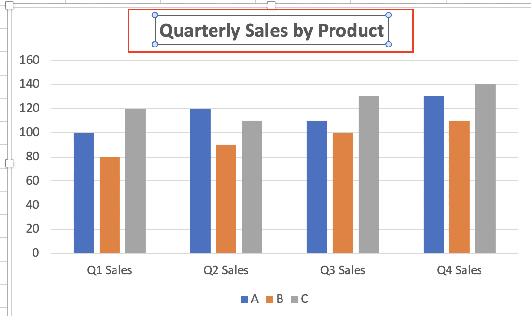
- Customize colors and add data labels for clarity
Line and Area Charts
Line and area charts excel at showing trends over time or continuous data. They’re particularly useful for visualizing how one or more variables change over a period.
Types and variations:
- Basic line/area: Show trends for one or more data series
- Stacked area: Display how multiple series contribute to a total over time
- Stepped line: Emphasize discrete changes in values
Step-by-step creation guide:
- Select your data range
- Click “Insert” > “Line” or “Area” chart

- Select your preferred subtype

- Customize the chart using Chart Tools
- Consider adding markers to highlight specific data points
Best practices:
- Use line charts when you have many data points to show a clear trend
- Consider using markers to highlight specific points of interest
- For area charts, ensure that smaller values are not obscured by larger ones
- Use different line styles (solid, dashed, dotted) to distinguish multiple series
Example:
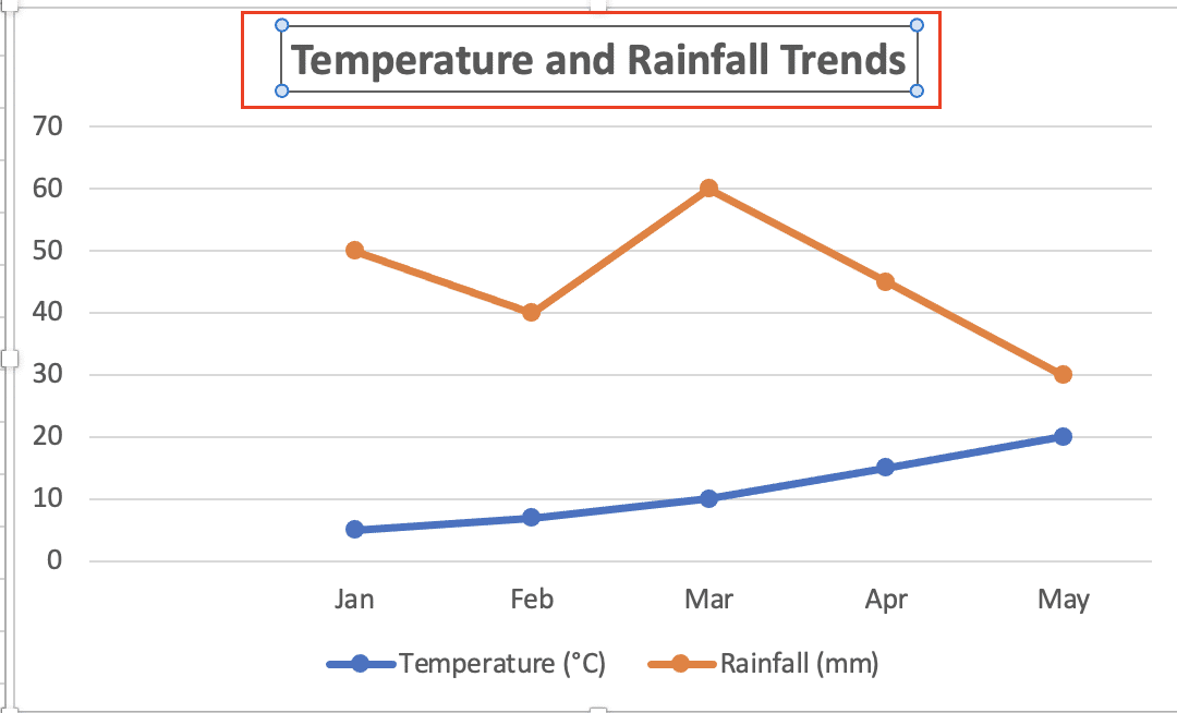
| Month | Temperature (°C) | Rainfall (mm) |
| Jan | 5 | 50 |
| Feb | 7 | 40 |
| Mar | 10 | 60 |
| Apr | 15 | 45 |
| May | 20 | 30 |
To create a multi-series line chart:
- Select A1:C6
- Insert > Line chart > Line with Markers

- Add a title: “Temperature and Rainfall Trends“
- Use the secondary axis for rainfall: Right-click rainfall series > Format Data Series > Secondary Axis

Pie and Doughnut Charts
Pie and doughnut charts are ideal for showing parts of a whole. They provide a quick visual representation of how different categories contribute to a total.
Types and variations:
- Basic pie/doughnut: Show the composition of a single data set
- Exploded pie/doughnut: Emphasize one or more slices by separating them
- Multi-level doughnut: Display hierarchical data or multiple related totals
Step-by-step creation guide:
- Select your data range (ensure it includes category labels)
- Click “Insert” > “Pie” or “Doughnut” chart

- Choose your desired subtype

- Use Chart Tools to customize colors, labels, and other elements
- Consider pulling out smaller slices for better visibility
Formatting tips:
- Limit categories to 5-7 for better readability
- Use contrasting colors to distinguish slices
- Consider using data labels for small slices (percentage and/or value)
- Rotate the chart to put the largest slice at 12 o’clock position
Example:
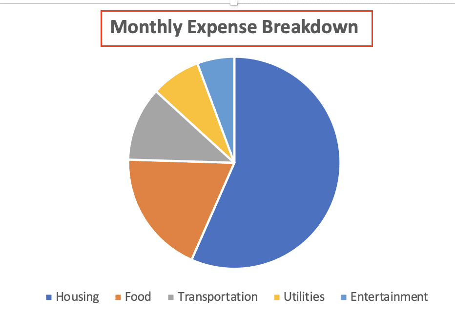
| Expense Category | Amount ($) |
| Housing | 1500 |
| Food | 500 |
| Transportation | 300 |
| Utilities | 200 |
| Entertainment | 150 |
To create an effective pie chart:
- Select A1:B6
- Insert > Pie chart

- Add a title: “Monthly Expense Breakdown“
`
- Add data labels: Percentage and category name
- Consider exploding the “Housing” slice to emphasize it
Scatter and Bubble Charts
Scatter and bubble charts are perfect for showing relationships between variables. They’re particularly useful in scientific, statistical, and financial analysis.
Types and variations:
- Scatter with smooth lines: Show trends in data with many points
- Scatter with straight lines: Connect points in order
- Bubble chart: Add a third dimension represented by bubble size
Step-by-step creation guide:
- Organize your data with X values in one column and Y values in another
- Select your data range
- Click “Insert” > “Scatter” or “Bubble” chart

- Choose your preferred subtype
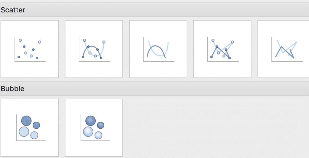
- For bubble charts, select the range for bubble sizes
- Customize the chart using Chart Tools
Best practices:
- Use scatter charts when you have two variables to compare
- Add trend lines to highlight correlations (Chart Design > Add Chart Element > Trendline)
- For bubble charts, ensure the bubble size accurately represents the third variable
- Consider using custom data labels to identify specific points of interest
Example:
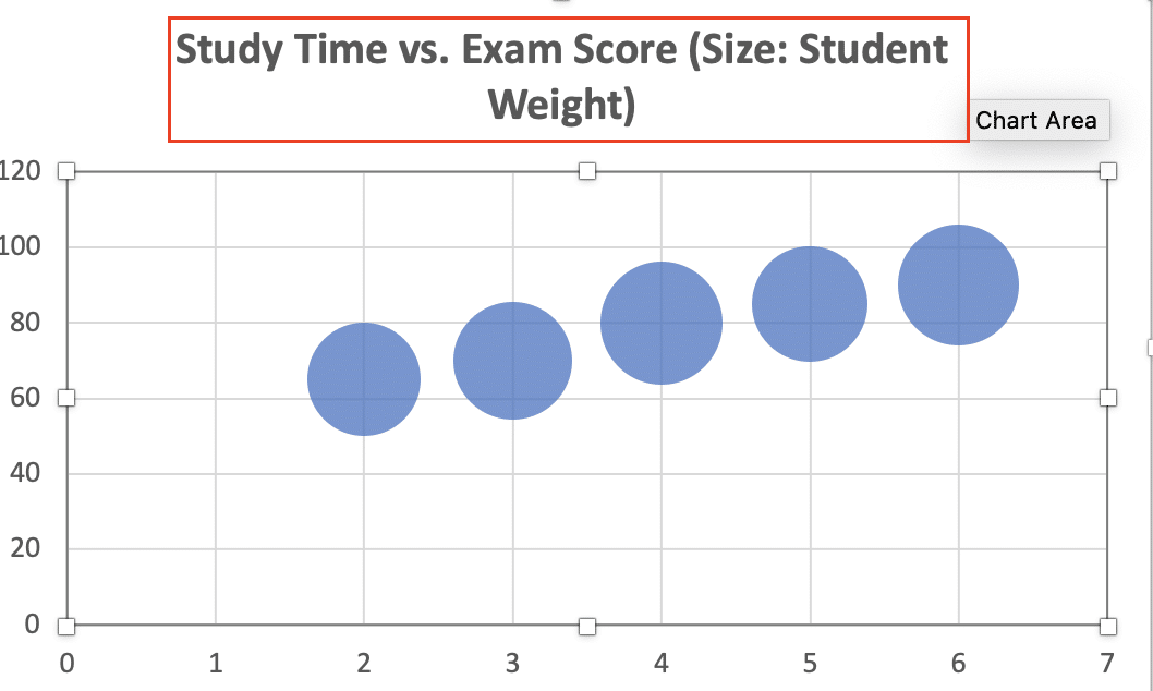
| Hours Studied | Exam Score | Student Weight (kg) |
| 2 | 65 | 60 |
| 3 | 70 | 65 |
| 4 | 80 | 70 |
| 5 | 85 | 62 |
| 6 | 90 | 68 |
To create a bubble chart:
- Select A1:D6
- Insert > Bubble chart

- Add a title: “Study Time vs. Exam Score (Size: Student Weight)“
- Add a trendline to show the correlation between study time and exam score
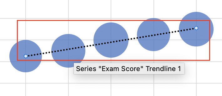
- Customize bubble colors based on exam score ranges
Advanced Chart Types
Stock Charts
Stock charts are specialized for financial data visualization, particularly for displaying stock price movements over time.
Types and variations:
- High-Low-Close: Shows the highest, lowest, and closing prices
- Open-High-Low-Close: Adds opening price to the High-Low-Close chart
- Volume-High-Low-Close: Combines price information with trading volume
Step-by-step creation guide:
- Organize your data with date, open, high, low, and close prices in separate columns
- Select your data range
- Click “Insert” > “Waterfall” or “Stock” chart

- Choose the appropriate subtype

- Use Chart Tools to customize appearance and add technical indicators
Customization for financial analysis:
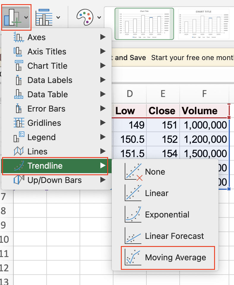
- Add moving averages as overlays: Chart Design > Add Chart Element > Trendline > Moving Average
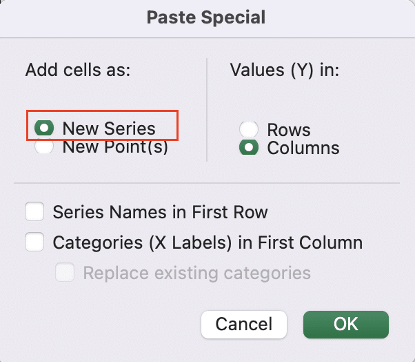
- Include volume data as a secondary chart: Copy volume data > Select chart > Paste Special > New Series
- Use color coding to indicate up and down days: Format up bars as green, down bars as red
Example:
| Date | Open | High | Low | Close | Volume |
| 2023-05-01 | 150.0 | 152.5 | 149.0 | 151.0 | 1,000,000 |
| 2023-05-02 | 151.5 | 153.0 | 150.5 | 152.0 | 1,200,000 |
| 2023-05-03 | 152.0 | 154.5 | 151.5 | 154.0 | 1,500,000 |
| 2023-05-04 | 154.5 | 156.0 | 153.5 | 155.5 | 1,300,000 |
| 2023-05-05 | 155.0 | 157.5 | 154.0 | 157.0 | 1,400,000 |
To create an OHLC chart with volume:
Stop exporting data manually. Sync data from your business systems into Google Sheets or Excel with Coefficient and set it on a refresh schedule.
Get Started
- Select A1:F6
- Insert > Stock > Volume-Open-High-Low-Close
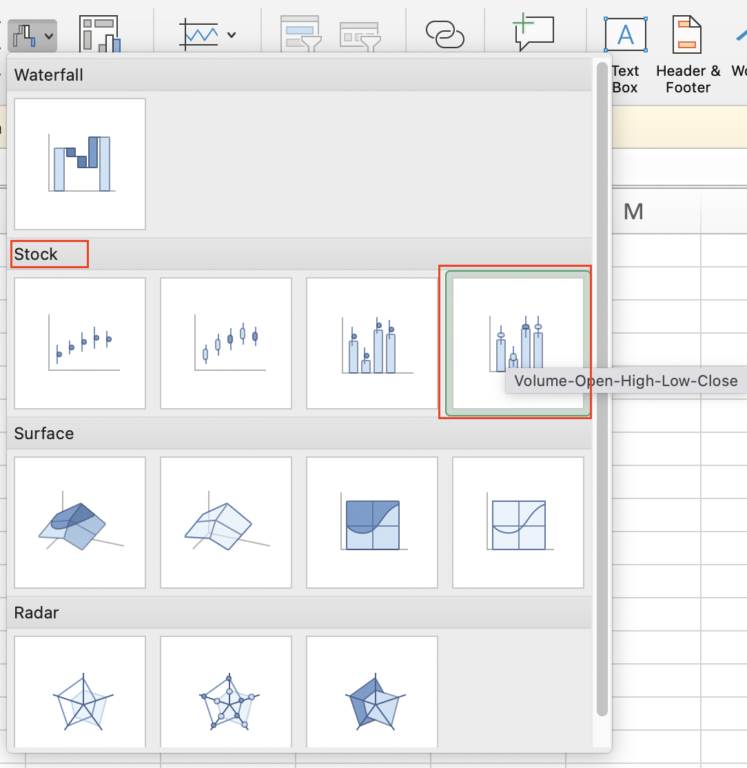
- Add a title: “Stock Price and Volume Analysis“

- Add a 5-day moving average trendline to the price chart
Surface and Contour Charts
Surface and contour charts are useful for visualizing three-dimensional data, often used in scientific and statistical analysis.
Types and variations:
- 3D surface: Shows a three-dimensional surface representing a function of two variables
- Wireframe surface: Similar to 3D surface, but only shows the outline
- Contour: 2D representation of a 3D surface, like a topographic map
Step-by-step creation guide:
- Organize your data in a grid format
- Select your data range
- Click “Insert” > “Waterfall” > “Surface” or “Contour” chart

- Select your desired subtype
- Use Chart Tools to customize colors, viewing angle, and other properties
Best practices for 3D data visualization:
- Use color gradients to represent the third dimension effectively
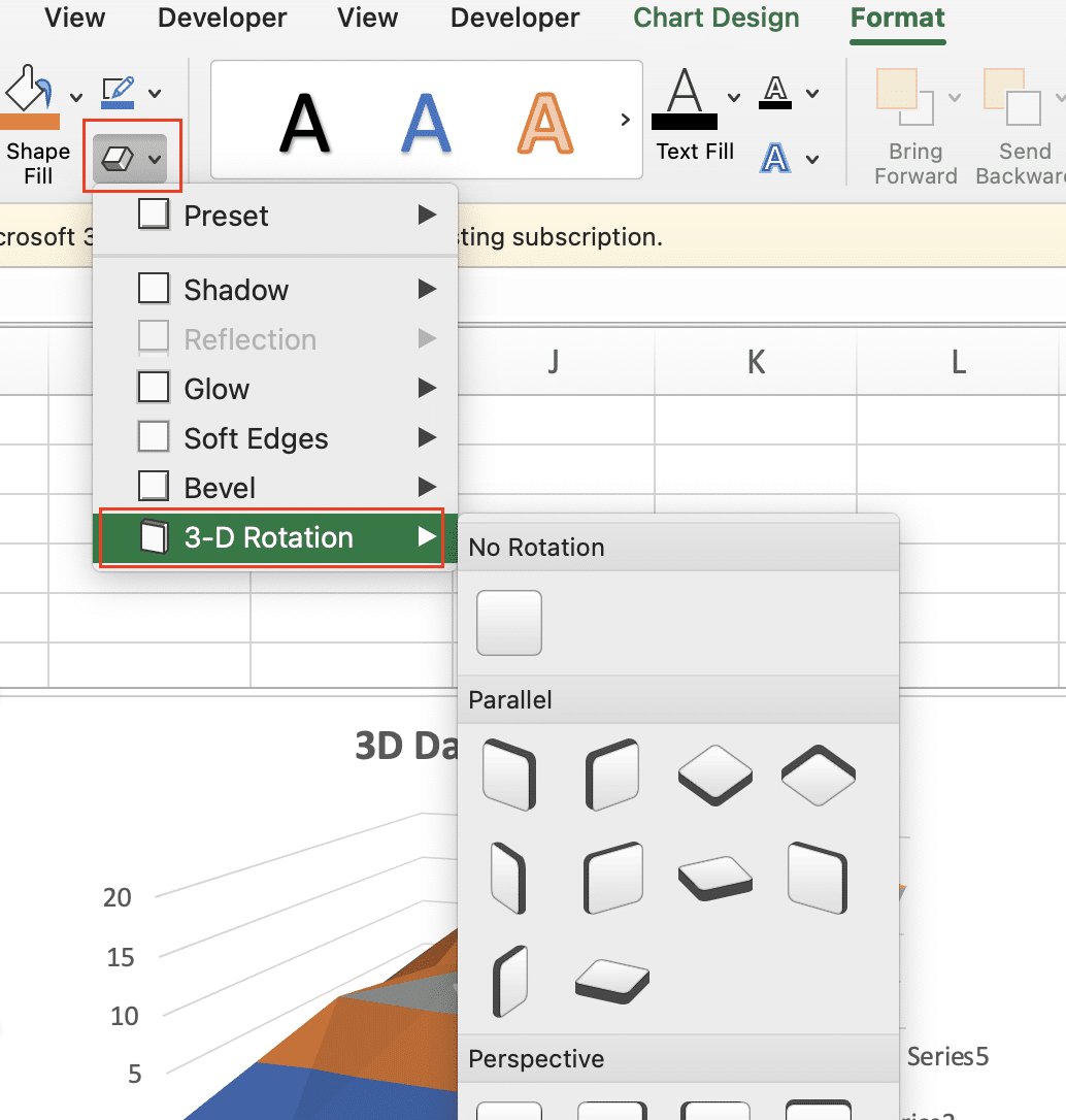
- Rotate 3D charts to provide the best view of the data (Click the chart > Format > Shape effect > 3-D Rotation)
- Consider using contour charts for a 2D representation of 3D data when precision is important
- Add a color scale legend to help interpret the values
Example:
| XY | 0 | 1 | 2 | 3 | 4 |
| 0 | 10 | 12 | 8 | 11 | 14 |
| 1 | 9 | 11 | 13 | 15 | 12 |
| 2 | 8 | 10 | 14 | 16 | 13 |
| 3 | 11 | 13 | 15 | 17 | 14 |
| 4 | 12 | 14 | 16 | 18 | 15 |
To create a surface chart:
- Select A1:F6
- Insert > “Waterfall” > “Surface” > “3-D Surface”
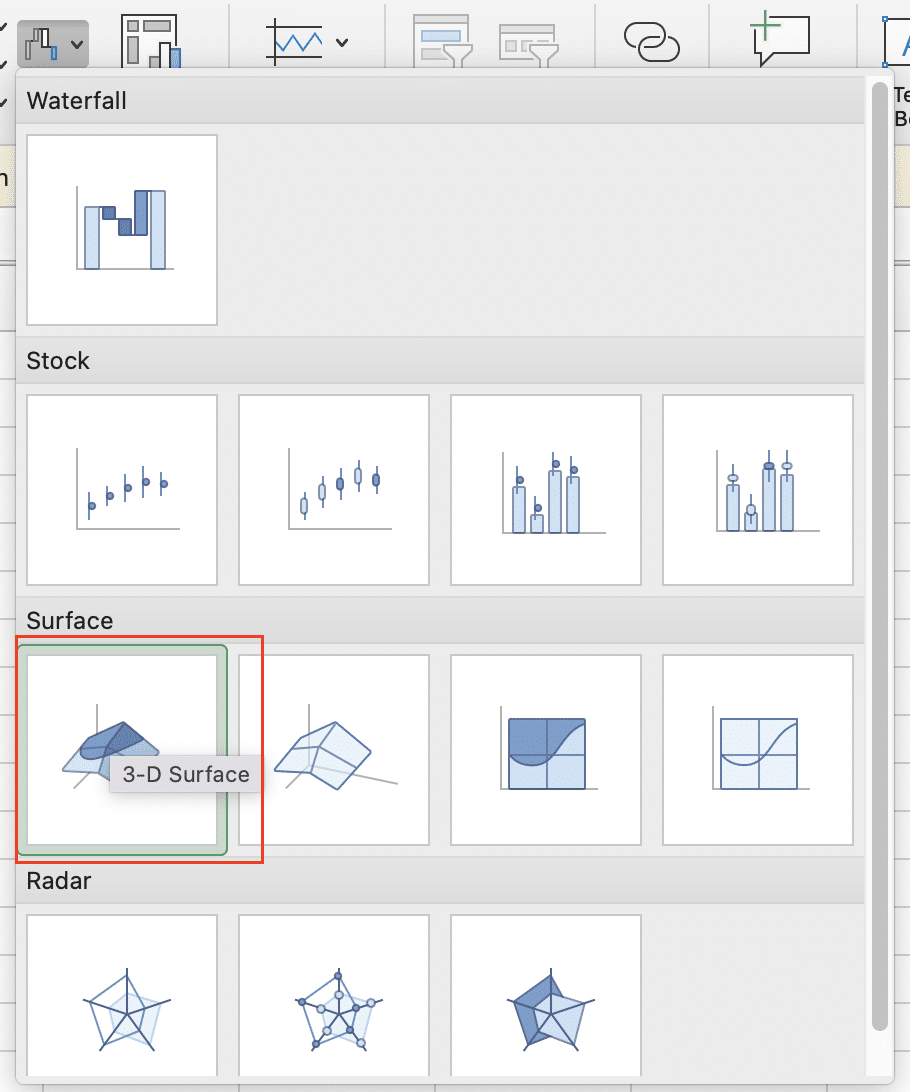
- Add a title: “3D Data Visualization“

- Adjust the color scheme and rotation for optimal viewing
Radar and Polar Charts
Radar and polar charts are effective for comparing multiple variables or showing cyclical data.
Types and variations:
- Radar with markers: Shows multiple variables for one or more data series
- Filled radar: Similar to radar with markers, but with filled areas
- Polar scatter: Displays data in circular coordinates
Step-by-step creation guide:
- Organize your data with categories in one column and values in others
- Select your data range
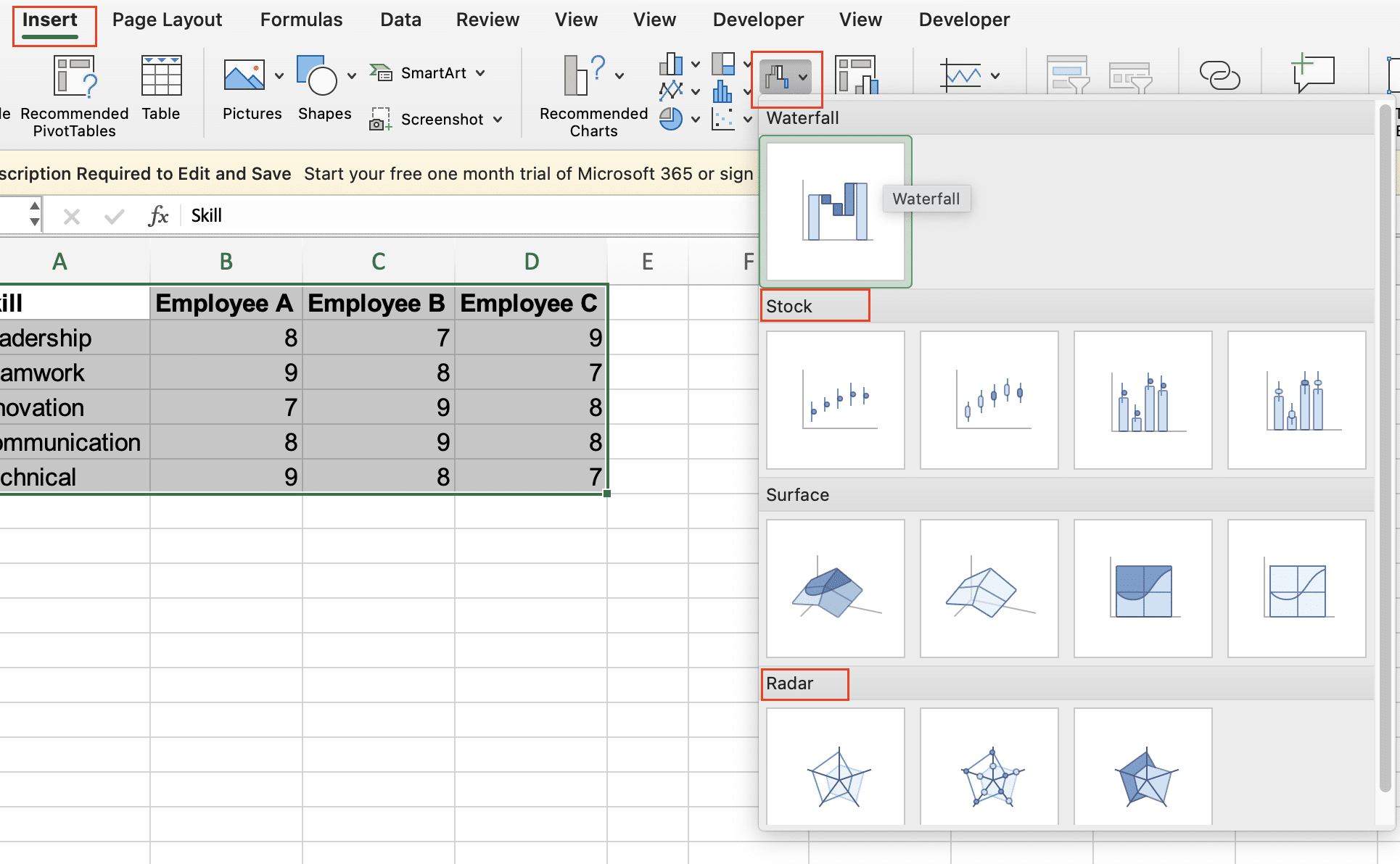
- Click “Insert” > “Waterfall” > “Radar” or “Stock” chart (for polar)
- Choose your preferred subtype
- Use Chart Tools to customize appearance and labels
Tips for effective data presentation:
- Limit the number of variables to maintain clarity (ideally 5-8)
- Use consistent scales for all variables to avoid distortion
- Consider using area filling for easier comparison between multiple series
- Add gridlines to help quantify the values
Example:
| Skill | Employee A | Employee B | Employee C |
| Leadership | 8 | 7 | 9 |
| Teamwork | 9 | 8 | 7 |
| Innovation | 7 | 9 | 8 |
| Communication | 8 | 9 | 8 |
| Technical | 9 | 8 | 7 |
To create a radar chart:
- Select A1:D6
- Insert > Waterfall > Radar > Radar with Markers

- Add a title: “Employee Skill Comparison“
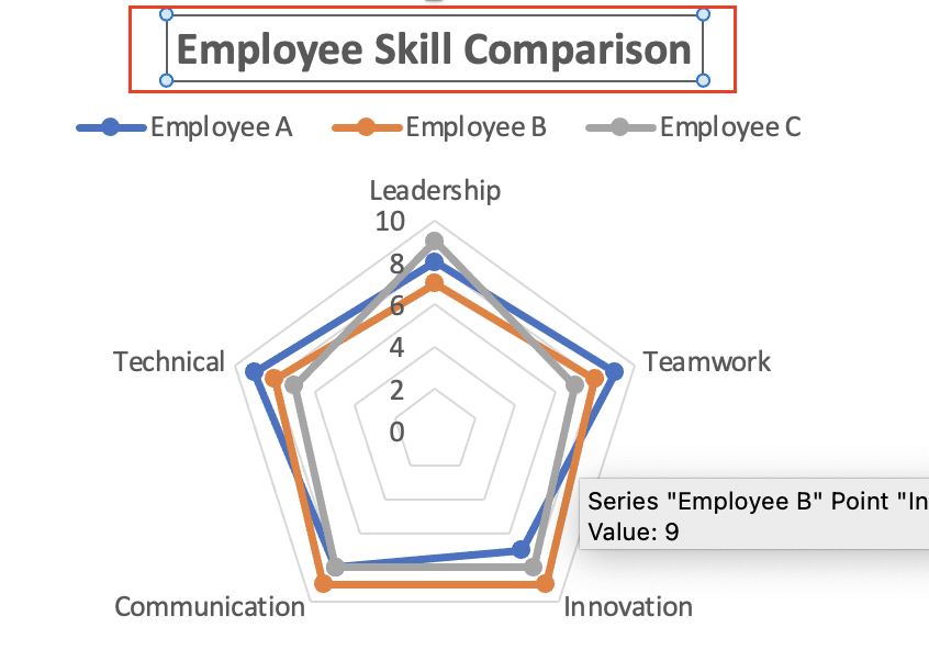
- Customize colors and add data labels for clarity
Customizing and Enhancing Charts
Basic Formatting Techniques
Enhance your charts with these basic formatting techniques:
- Change colors:
- Select the chart element
- Click “Format” tab > “Shape Fill” or “Shape Outline“

- Choose from theme colors or custom colors
- Modify fonts:
- Select the text element
- Use the “Home” tab to change font properties (type, size, color)

- For chart-wide changes, use Chart Design > Format > Chart Area
- Add and format titles:
- Click “Add Chart Elements” (+) > “Chart Title“
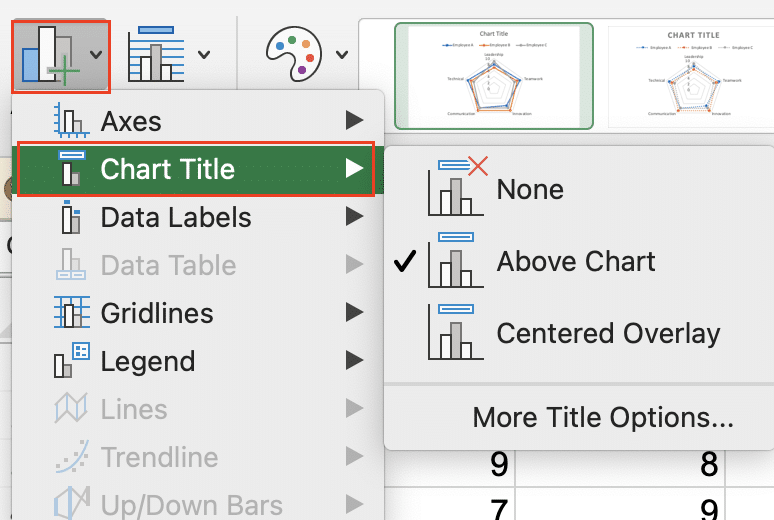
- Double-click the title to edit
- Click the chart > Format > WordArt Styles for advanced text formatting

- Customize axes:
- Right-click an axis > “Format Axis“
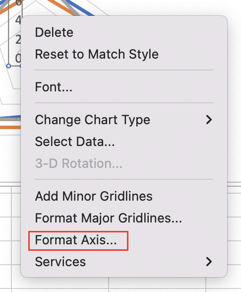
- Adjust scale, labels, and tick marks
- Consider using custom number formats for clearer labeling
Working with Chart Elements
Enhance your charts with additional elements:
- Add a legend:
- Click “Add Chart Elements” (+) > “Legend“
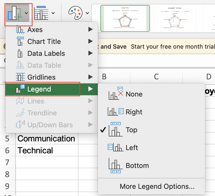
- Drag to reposition or use Layout Options for precise placement
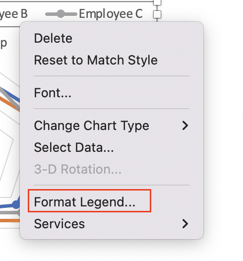
- Customize legend entries: right-click > Format Legend
- Implement data labels:
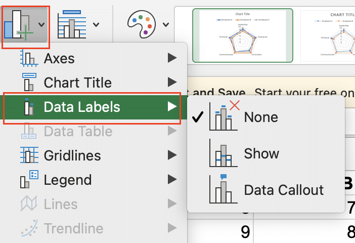
- Click ” Add Chart Elements” (+) > “Data Labels“
- Right-click > “Format Data Labels” for more options

- Consider using leader lines for clarity in pie charts
- Use secondary axes:
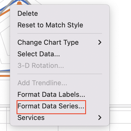
- Right-click a data series > “Format Data Series“
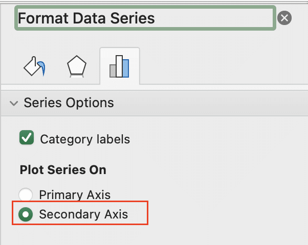
- Check “Plot Series on Secondary Axis“
- Adjust scales to ensure proper alignment between primary and secondary axes
Advanced Customization
Take your charts to the next level with these advanced techniques:
- Create combination charts:
- Insert your first chart type
- Copy additional data to the clipboard
- Select the chart and use “Paste Special“
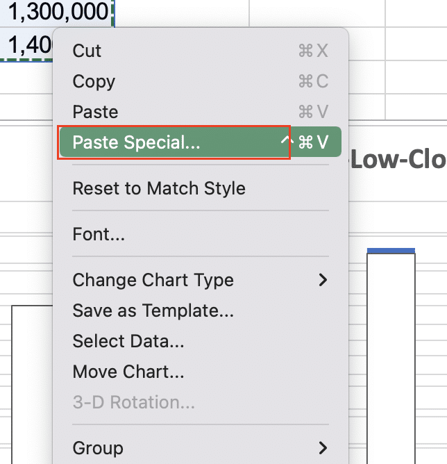
- Choose “New Series” and select the chart type

- Use secondary axis as needed for different scales
- Implement dynamic chart ranges:
- Use named ranges for your data: Formulas > Name Manager
- In the formula bar, replace static references with named ranges
- Consider using OFFSET or INDEX functions for automatically expanding ranges
- Add form controls for interactivity:
- Developer tab > Insert > Form Controls
- Choose a control (e.g., combo box, scroll bar)
- Link control to a cell
- Use cell references in your chart data ranges
- Create macros to update charts based on control inputs
Specialized Excel Chart Features
PivotCharts
PivotCharts provide a dynamic way to visualize PivotTable data, allowing for quick analysis and data exploration.
To create a PivotChart:
- Select your PivotTable
- Click “PivotTable Tools” > “Analyze” > “PivotChart“
- Choose your chart type
- Use the PivotChart Fields pane to arrange your data
Customize your PivotChart by:
- Dragging fields to different areas in the PivotChart Fields pane
- Using slicers for interactive filtering: PivotChart Tools > Analyze > Insert Slicer
- Applying conditional formatting to highlight key data points
- Creating calculated fields for advanced analysis
Sparklines and Micro Charts
Sparklines are tiny charts that fit within a cell, perfect for showing trends in a compact space.
To create sparklines:
- Select the cells where you want the sparklines
- Click “Insert” > “Sparklines“
- Choose the type (Line, Column, or Win/Loss)
- Select the data range
- Use Sparkline Tools to customize appearance
Integrate sparklines into dashboards by:
- Aligning them with related data for quick comparisons
- Using custom colors to match your dashboard theme
- Grouping sparklines for consistent formatting across multiple data sets
- Combining sparklines with conditional formatting for enhanced visual cues
Conclusion
Mastering chart types in Excel is crucial for effective data visualization. By understanding the various chart options, customization techniques, and best practices, you can create compelling visualizations that clearly communicate your data insights. Remember to choose the right chart type for your data, keep your designs clean and simple, and always consider your audience when creating charts.
As you continue to develop your Excel charting skills, don’t be afraid to experiment with different techniques and seek inspiration from other data visualization experts. Regular practice and a willingness to learn from both successes and mistakes will help you become a true Excel charting master.
Ready to take your data visualization to the next level? Get started with Coefficient (https://coefficient.io/get-started) to access powerful templates and enhance your Excel charting capabilities. With Coefficient, you can seamlessly integrate data from various sources, create dynamic dashboards, and unlock new insights from your business data.
