How to use AI in Data Visualization in 2024?
AI in data visualization is revolutionizing how we unlock the power of data in 2024. As data becomes increasingly valuable, the key to harnessing its potential lies in effective visualization. And now, by integrating artificial intelligence into your data viz toolkit, you can take your insights to the next level.
In this blog, we’ll explore the game-changing impact of AI on data visualization. Discover how AI makes data viz more intuitive, efficient, and accessible than ever before. Plus, get an inside look at the latest trends, real-world applications, and must-have tools driving this exciting field forward.
Ready to leverage the power of AI in data visualization? Let’s dive in!
How AI is Transforming Data Visualization
AI is significantly impacting data visualization by automating data analysis and making sophisticated visualizations more accessible. Here’s how AI is making a difference:
- Automation of Routine Tasks: AI automates tasks such as data cleaning and pattern identification, saving time for data analysts.
- Accessibility for Non-Technical Users: With AI, individuals without extensive data science knowledge can create detailed visualizations. AI tools can interpret simple queries and suggest the most effective visualization formats.
- Faster Decision-Making: Businesses can make informed decisions more quickly because AI-enhanced tools provide insights faster and with greater accuracy.
By automating complex processes and making data visualization more user-friendly, AI is enabling a wider range of professionals to leverage data in their decision-making.
Benefits of Using AI in Data Visualization
Integrating AI into data visualization tools not only streamlines the process but also significantly enhances the quality of insights derived from data. Here are the key benefits:
- Increased Accuracy: AI algorithms can crunch through massive amounts of data without breaking a sweat, and they never miss a detail. Say goodbye to human error and hello to spot-on insights!
- Time Management: Time is money, and AI is here to save you both. By automating tasks and spotting patterns in a flash, AI helps you create visualizations and act on insights faster than a speeding bullet.
- Deeper Insights: With techniques like predictive analytics, AI can forecast future trends based on historical data, providing businesses with a forward-looking perspective.
- User Empowerment: AI makes data visualization tools more intuitive, enabling users with varying skill levels to create complex visualizations and derive meaningful insights.
These benefits collectively enable businesses to harness the power of their data more effectively, making informed decisions that drive growth and innovation.
Top AI Data Visualization Trends for 2024
The landscape of AI in data visualization is rapidly evolving, with several key trends shaping the field in 2024:
- Real-time data streaming: See your data come to life in real-time, so you can keep your finger on the pulse of your business and react to changes as they happen.
- Interactive dashboards: Boring, static dashboards are so last year. AI-powered dashboards are dynamic, user-friendly, and begging to be explored.
- Automated reporting: Let AI do the heavy lifting of turning complex data into clear, comprehensive reports. More insights, less grunt work.
- Natural language queries: Forget complex queries. Just ask your data a question in plain English and let AI do the rest.
- Augmented analytics: AI is like a data detective, automatically uncovering hidden patterns and insights that you might have missed.
Applications of AI in Data Visualization
AI is revolutionizing how we interpret and act on data, with applications that span across industries and functions:
- Market Trend Forecasting: AI can leverage historical data to predict future market movements, helping businesses strategize proactively.
- Automated Slide Deck Creation: AI can synthesize data findings into slide decks, saving significant time and ensuring key insights are effectively communicated.
- Customer Behavior Analysis: By visualizing customer interaction data, businesses can tailor their offerings to better meet customer needs.
- Process Management: AI identifies bottlenecks and optimization opportunities in business operations, aiding in process improvement.
These applications demonstrate AI’s versatility in enhancing decision-making and strategic planning through advanced data visualization techniques.
Top AI Data Visualization Tools
The integration of AI has elevated the capabilities of many data visualization tools, making them more powerful and user-friendly. Here are some standouts in 2024:
Tableau
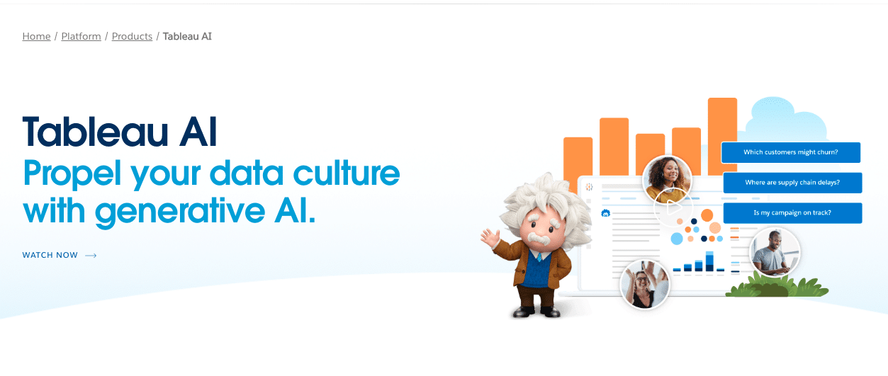
Tableau is renowned for its powerful data visualization capabilities, offering interactive dashboards that can transform complex datasets into intuitive visual representations. With the integration of AI, Tableau now provides predictive analytics and natural language processing, enabling users to ask questions and receive insights in plain English.
This makes it easier for decision-makers to derive actionable insights without deep technical expertise.
Google Sheets + Coefficient
https://www.youtube.com/watch?v=KNy4fZX_rpo
Coefficient’s GPT Copilot turns Google Sheets into your own data powerhouse. It supercharges your spreadsheets by using AI to effortlessly bring together your data, create detailed reports, and make data analysis faster and easier.
Key Advantages of AI Data Visualization with Coefficient:
- Real-Time Data Connectivity: Coefficient seamlessly syncs Google Sheets with live data from an array of sources, such as sales platforms, customer databases, and market research tools. This real-time updating ensures that your visualizations always reflect the most current scenario, allowing for timely analyses and strategies.
- Automated Insight Generation: Tap into the power of automated data analysis with Coefficient’s GPT Copilot. Instead of manually parsing through data, users can now rely on AI to highlight key trends, predict outcomes, and craft comprehensive reports. This automation extends to creating dynamic charts and visual narratives, making complex data digestible at a glance.
- Lets You Ask Questions Easily: : Coefficient allows users to interact with their data using simple, conversational language. This means you can ask questions or make requests directly within Google Sheets and receive immediate, visual answers.
Power BI
Microsoft’s Power BI is a comprehensive data analysis tool that leverages AI to enhance its analytics capabilities. It offers features like automated insights, where the system identifies trends and patterns without manual input, and Q&A, where users can query their data using natural language.
Power BI’s deep integration with other Microsoft products, like Excel and Azure, makes it a powerful tool for businesses already invested in the Microsoft ecosystem.
Salesforce

Salesforce’s Einstein Analytics uses AI to dig deeper into customer and sales data, offering predictive insights that help businesses anticipate customer needs and optimize sales strategies.
The tool seamlessly integrates with the Salesforce CRM, enhancing its capabilities by providing a more detailed analysis of sales performance and customer interactions, thus enabling more personalized customer experiences.
Looker
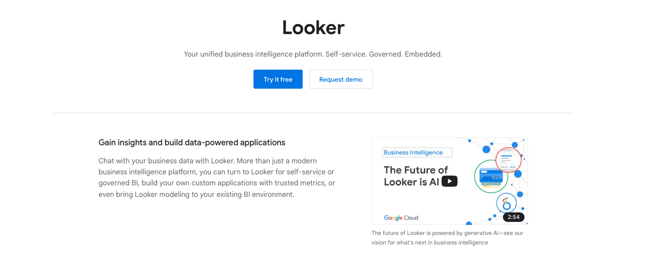
As part of the Google Cloud Platform, Looker leverages AI to offer a more customized data analysis experience. It enables businesses to build data applications tailored to their specific needs, incorporating advanced data analytics and visualization features. Looker’s integration with Google’s AI and machine learning capabilities makes it a powerful tool for businesses looking for scalable and customizable data analysis solutions.
AI Data Visualization Example
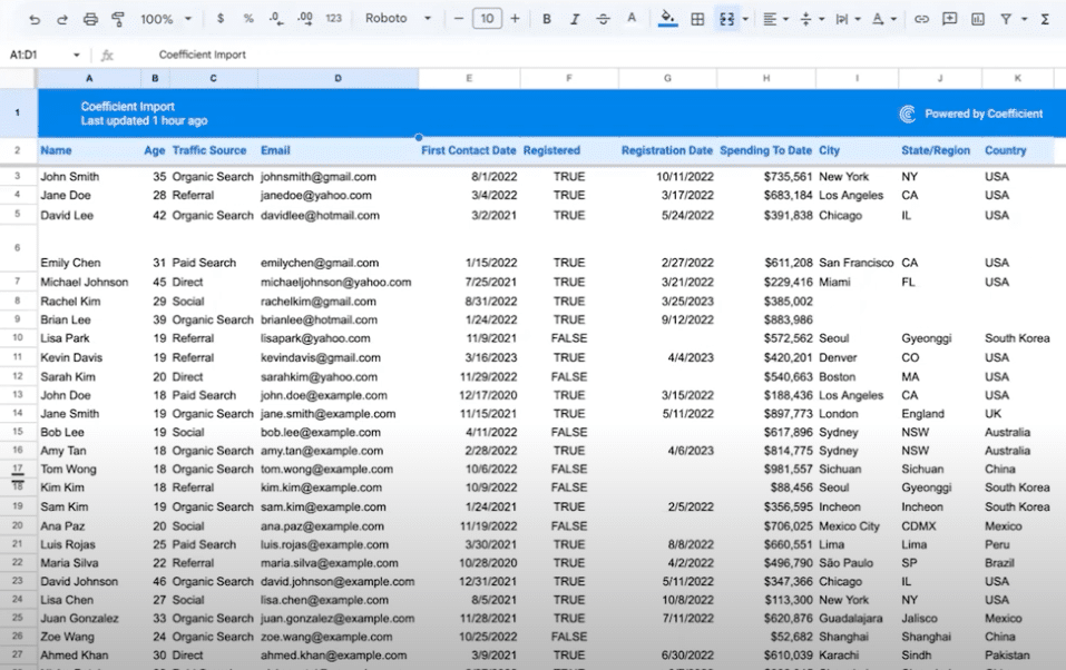
Here’s a real-life scenario where we leverage the power of AI to transform raw data into an informative and visually appealing map. All you need is Google Sheets and Coefficient.
Step 1. Select Your Data

Supercharge your spreadsheets with GPT-powered AI tools for building formulas, charts, pivots, SQL and more. Simple prompts for automatic generation.

Find the spreadsheet you want to visualize and highlight the relevant data. For this example, we’re using contact data.
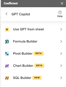
Step 2. Open GPT Chart Builder
Open Coefficient GPT Chart Builder in Google Sheets by navigating to the top ribbon.
Click Extensions > Coefficient > Launch > GPT Copilot > Chart Builder.
Step 3. Input Your Prompt
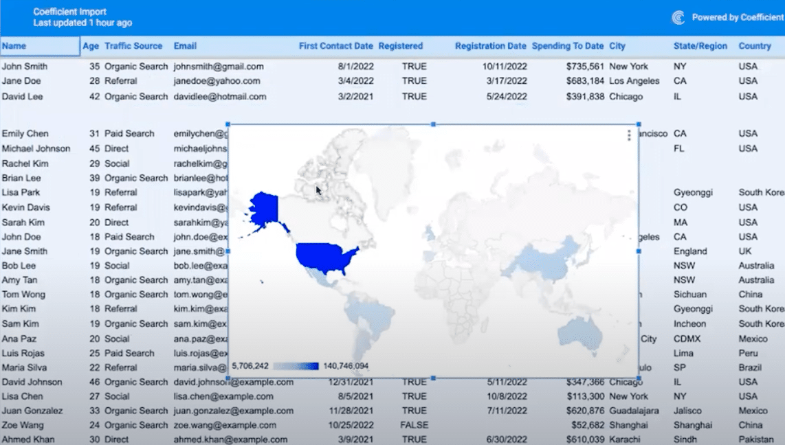
Enter “Show a map with countries colored in blue based on their total spending.”
Step 4. View Your Map
A world map appears, showcasing countries with higher spending in darker blue shades.
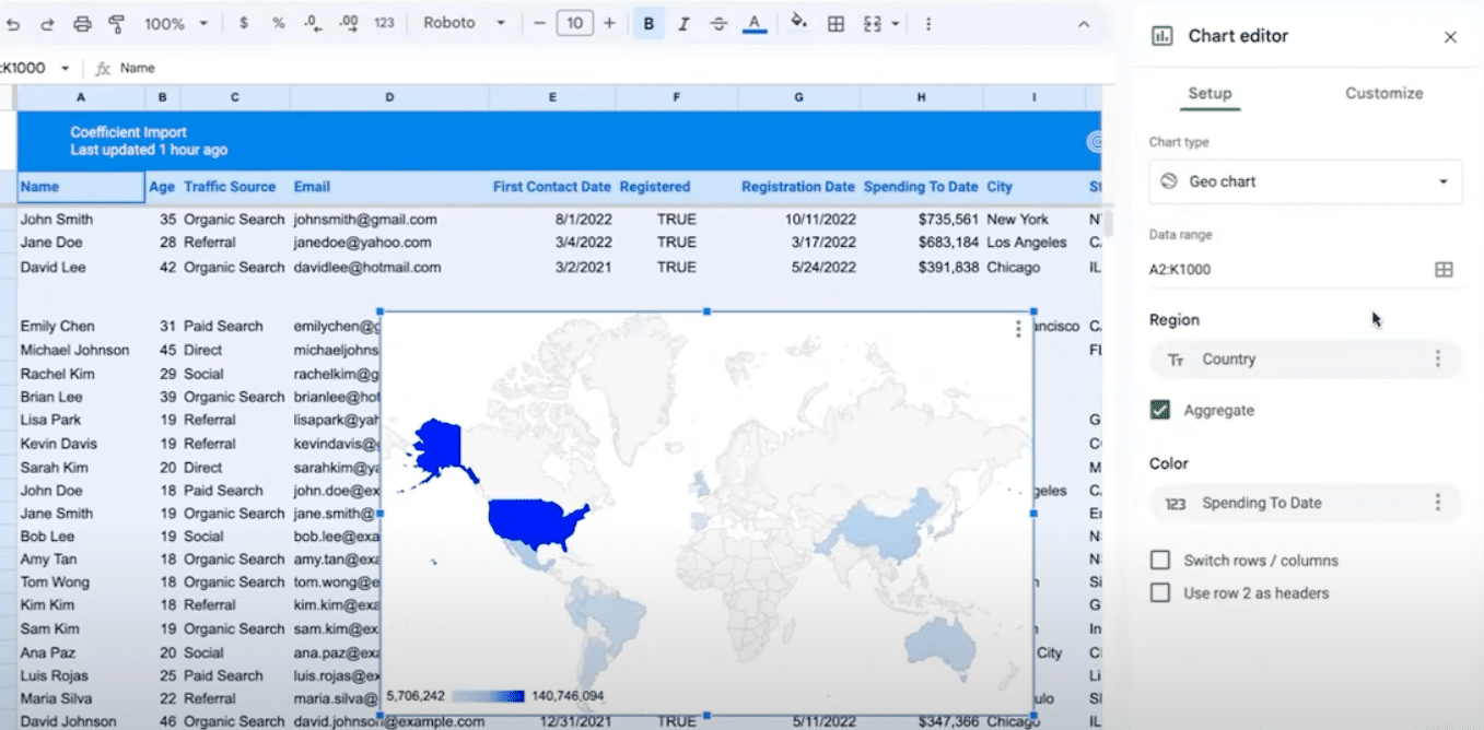
Step 5. Edit if Needed
For adjustments, click into settings and find the Chart editor to fine-tune your map.
Limitations of AI Data Visualization
While AI has significantly enhanced data visualization, it’s important to acknowledge certain limitations:
- Data Quality Dependency: AI’s effectiveness is directly tied to the quality of the underlying data. Poor quality or biased data can lead to misleading visualizations.
- Complexity and Cost: Implementing and maintaining advanced AI-driven visualization tools can be complex and costly, potentially putting them out of reach for smaller organizations.
- Overreliance Risk: There’s a risk of becoming too reliant on AI, which might lead to overlooking the value of human intuition and critical analysis in interpreting data.
Conclusion
AI is the future of data visualization, and the future is now. By harnessing the power of AI, you can create stunning visuals, uncover game-changing insights, and make smarter decisions faster than ever before.
If you’re ready to take the next step in your data visualization journey, explore how Coefficient can bridge the gap between your data and actionable insights.
Get started today at https://coefficient.io/get-started and unlock the full potential of your data with the power of AI.


