Custom reporting tools are revolutionizing how businesses handle data. But with so many options available, how do you choose the right one? This guide will help you navigate the landscape of custom reporting tools in 2024
Why Should You Use Custom Reporting?
Custom reporting is the process of creating tailored reports that present specific data insights aligned with unique business needs. It goes beyond standard, pre-built reports by allowing users to select, format, and visualize data in ways that are most relevant to their objectives.
Custom reporting tools empower businesses to make data-driven decisions by providing flexible, personalized data analysis capabilities.
Enhanced Flexibility and Adaptability
Custom reporting tools offer unparalleled flexibility, allowing you to tailor reports to your specific business metrics. This adaptability is crucial in today’s rapidly changing business environment. With custom reporting, you can:
- Create reports that focus on the exact metrics and KPIs that matter to your business, rather than being limited to pre-defined templates.
- Adjust your reporting strategy as your business evolves, adding or removing data points to reflect new priorities or market conditions.
- Design dashboards that cater to different stakeholders, from C-level executives to department managers, ensuring everyone has access to the information they need in a format they can easily understand.
Enabling Better Insight Discovery
Custom reporting tools are designed to help you uncover hidden patterns and trends in your data that might otherwise go unnoticed. This capability is crucial for businesses looking to gain a competitive edge. With custom reporting, you can:
- Cross-reference data from different departments to identify correlations and patterns that aren’t visible when data is siloed.
- Create visual representations of data, such as heat maps or scatter plots, to make complex relationships more apparent and easier to understand.
- Utilize advanced analytics features, including predictive modeling and anomaly detection, to anticipate future trends and identify unusual patterns that may require attention.
Improving Decision Accuracy
Custom reporting tools significantly enhance decision-making processes by providing comprehensive, data-driven insights. They allow businesses to:
- Combine historical data with real-time updates to provide context-rich insights for more informed decision-making.
- Create “what-if” scenarios to test different strategies before implementation, reducing the risk associated with major business decisions.
- Automate regular reports to ensure decision-makers always have the most up-to-date information at their fingertips.
Data Blending from Multiple Sources
One of the most powerful features of custom reporting tools is their ability to combine data from various systems. This capability allows businesses to:
- Create a holistic view of operations by merging data from different departments or systems. For example, combining sales data with customer support tickets can provide valuable insights for product development.
- Break down data silos between departments, fostering collaboration and enabling the identification of cross-functional opportunities.
- Improve data integration by automating the consolidation of data from multiple sources, saving time and reducing the risk of errors associated with manual data entry.
Popular Custom Reporting Tools in 2026
When evaluating custom reporting tools, look for these essential features:
- User-friendly interface
- Robust data visualization capabilities
- Real-time data updates
Coefficient + Spreadsheets (Google Sheets & Excel)
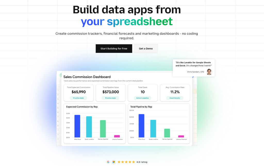
Coefficient is a powerful add-on for Google Sheets and Excel that transforms these familiar spreadsheet tools into robust custom reporting platforms. It stands out for its ability to sync live data from numerous business systems directly into spreadsheets, making it an excellent choice for organizations looking to leverage their existing spreadsheet skills.
Coefficient bridges the gap between business syatems and the spreadsheets your team already knows and uses. It’s particularly well-suited for organizations that want to enhance their existing spreadsheet-based reporting processes without investing in an entirely new system.
Best Features:
- Live data syncing from over 100+ business systems, ensuring your reports always reflect the most current information.
- Familiar spreadsheet interface that reduces the learning curve for users already comfortable with Excel or Google Sheets.
- Powerful data blending capabilities that allow you to combine information from multiple sources within a single spreadsheet.
- Automated report scheduling and alerts, enabling you to set up regular report updates and notifications for specific data changes.
- AI-driven reports & dashboard building using natural language.
Limitations:
- Very large datasets might require performance optimization to ensure smooth operation within the spreadsheet environment.
Customization Level: High
Ratings: 4.7/5 on G2
Pricing: Free trial available, with paid plans for advanced features
Tableau
Tableau is a leading data visualization and business intelligence platform known for its powerful analytics capabilities and user-friendly interface. It’s designed to help users create interactive, shareable dashboards that bring data to life through a wide range of visualization options.
Tableau is particularly popular among organizations that prioritize advanced data visualization and have the resources to invest in training and implementation. Its ability to handle large datasets and create stunning visualizations makes it a top choice for data-driven enterprises.
Best Features:
- Advanced data visualization capabilities that allow users to create complex, interactive charts and graphs with ease.
- Strong data connection options, enabling integration with a wide variety of data sources.
- Large, active user community that provides support, shares best practices, and contributes to a extensive library of resources.
- Robust mobile experience, allowing users to access and interact with dashboards on-the-go.
Limitations:
- Steep learning curve for non-technical users, particularly when it comes to more advanced features.
- Can be expensive for small teams, potentially putting it out of reach for smaller organizations or startups.
- Some customizations might require coding skills, which can be a barrier for users without programming experience.
Customization Level: High Ratings: 4.5/5 on G2
Pricing: Free trial available, with various paid plans to suit different organizational needs
Power BI
Power BI is Microsoft’s business analytics solution, designed to provide interactive visualizations and business intelligence capabilities. It integrates seamlessly with other Microsoft products, making it a natural choice for organizations heavily invested in the Microsoft ecosystem.
Power BI’s integration with other Microsoft tools makes it a natural choice for organizations already using Microsoft products. Its balance of powerful features and relatively accessible interface makes it suitable for a wide range of users, from small businesses to large enterprises.
Best Features:
- Seamless integration with Microsoft ecosystem, allowing for easy data import from Excel, SharePoint, and other Microsoft tools.
- AI-powered insights and natural language queries, enabling users to ask questions about their data in plain language.
- Competitive pricing for small to medium businesses, with a free tier available for individual users.
- Regular feature updates that continually expand the platform’s capabilities.
Limitations:
- Can be less intuitive for non-technical users, especially when setting up data models or creating complex reports.
- Some advanced features are only available in the premium version, which may necessitate additional investment.
- Can be complex to set up for large-scale deployments, potentially requiring specialized expertise.
Customization Level: Medium Ratings: 4.5/5 on G2
Pricing: Free version available, with paid plans for advanced features
Looker
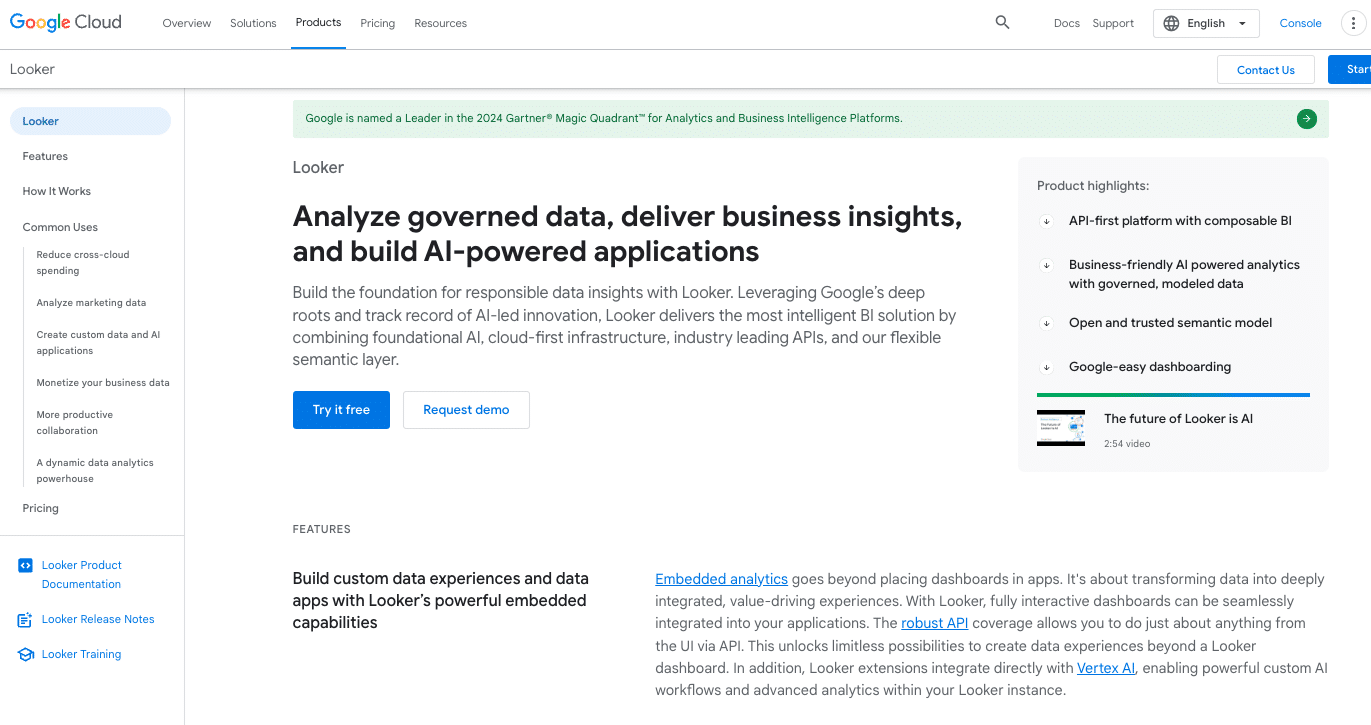
Looker is a powerful business intelligence and big data analytics platform known for its unique approach to data modeling. It’s designed for organizations that need deep, customizable analytics capabilities and are willing to invest in a more complex setup process.
Looker is particularly well-suited for large enterprises or data-driven organizations that need advanced analytics capabilities and have the technical resources to leverage its powerful features fully.
Best Features:
- Powerful data modeling language (LookML) that allows for the creation of reusable, version-controlled data models.
- Embedded analytics options, enabling businesses to integrate Looker’s capabilities into their own applications.
- Strong version control for reports and models, facilitating collaboration and maintaining data integrity.
- Robust data governance features that help ensure data accuracy and security.
Limitations:
- Requires SQL knowledge for advanced use, which can be a barrier for non-technical users.
- Higher price point compared to some other options, potentially putting it out of reach for smaller organizations.
- Can be overkill for simple reporting needs, making it less suitable for businesses with basic analytics requirements.
Customization Level: High Ratings: 4.4/5 on G2
Pricing: Paid, with pricing available on request
Looker Studio
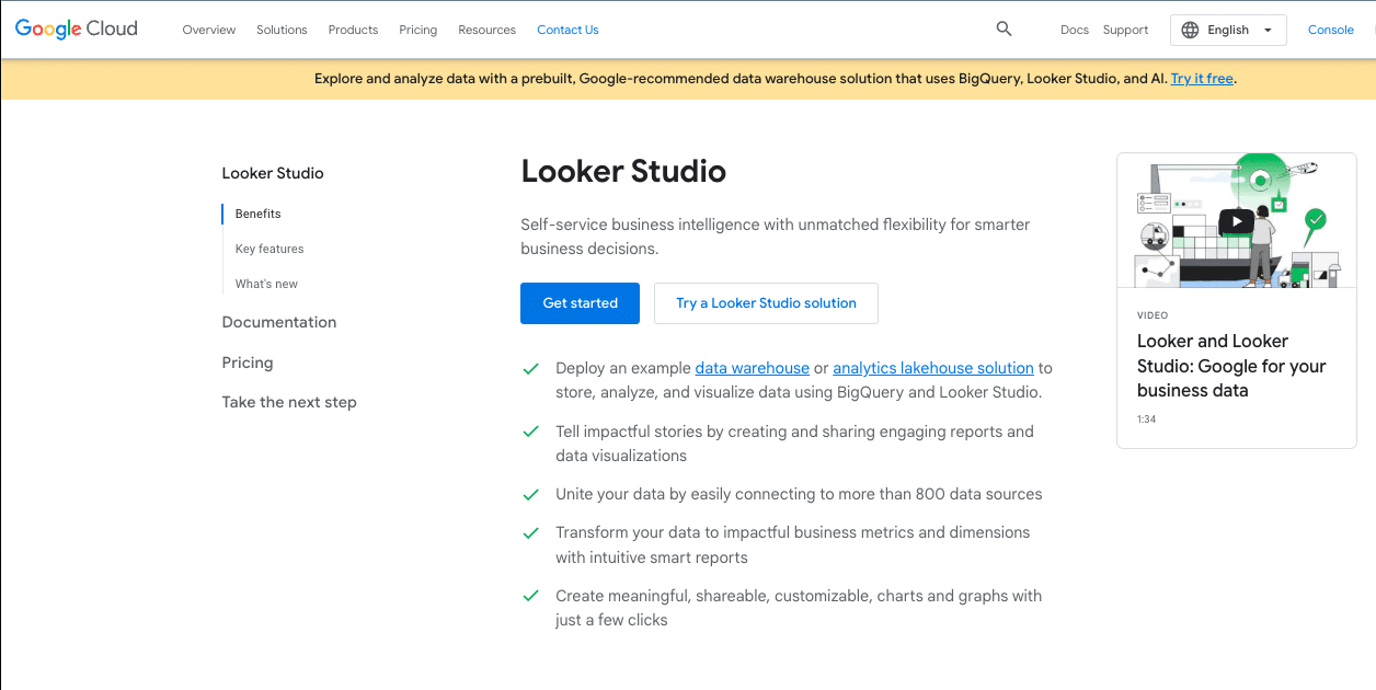
Looker Studio is Google’s free data visualization and reporting tool. It’s designed to make it easy for users to create interactive dashboards and reports, particularly when working with Google’s suite of products.
Best Features:
- Free to use, making it accessible to businesses of all sizes.
- Easy integration with Google products, including Google Analytics, Google Ads, and Google Sheets.
- Shareable, interactive reports that can be easily distributed to stakeholders.
- Community-created report templates that provide quick starting points for various reporting needs.
Limitations:
- Limited advanced features compared to paid tools, which may not meet the needs of more complex analytics requirements.
- Less suitable for large enterprises with complex needs, particularly those requiring advanced data modeling or predictive analytics.
- Data source connections can be limited without third-party add-ons, potentially restricting its usefulness for organizations with diverse data sources.
Customization Level: Medium Ratings: 4.3/5 on G2 Pricing: Free
Looker Studio is an excellent choice for small to medium-sized businesses, particularly those already using Google’s suite of products. Its free pricing and ease of use make it a great entry point for organizations looking to start with custom reporting.
Domo
Domo is a cloud-based business intelligence platform designed to help companies draw insights from various data sources. It’s known for its ability to handle large volumes of data and its strong mobile capabilities.
Best Features:
- Extensive library of data connectors, allowing integration with a wide variety of data sources.
- Robust mobile experience, providing access to critical business data on-the-go.
- Strong data governance features to ensure data security and compliance.
- AI-powered insights and recommendations to help users quickly identify important trends and anomalies.
Limitations:
- Can be complex to set up and administer, potentially requiring significant IT resources.
- Higher price point compared to some other options, which may be prohibitive for smaller organizations.
- May require professional services for full implementation, adding to the overall cost.
Customization Level: High Ratings: 4.4/5 on G2 Pricing: Paid, with pricing available on request
Domo is well-suited for large enterprises with complex data environments and the resources to fully leverage its capabilities. Its ability to handle diverse data sources and provide mobile access to insights makes it valuable for organizations with distributed teams or those needing real-time data access.
Datapine (RIB BI+)
Datapine, now RIB BI+, is a business intelligence and data visualization tool that emphasizes ease of use and advanced analytics capabilities. It’s designed to make complex data analysis accessible to users without extensive technical expertise.
Best Features:
- AI-powered data analysis and predictive analytics capabilities.
- White-labeling options, making it suitable for agencies or businesses that want to provide branded analytics to clients.
- Intuitive drag-and-drop interface for creating reports and dashboards.
- Strong data visualization capabilities with a wide range of chart types and customization options.
Limitations:
- Less well-known than some competitors, which may result in a smaller user community and fewer third-party resources.
- Steeper learning curve for advanced predictive features, which may require additional training or expertise.
- Pricing can be high for small businesses, particularly for advanced features.
Customization Level: High Ratings: 4.6/5 on G2 Pricing: Free trial available, with paid plans for ongoing use
Datapine is particularly suitable for organizations that want to leverage advanced analytics and predictive capabilities without requiring extensive data science expertise. Its white-labeling options also make it a good choice for agencies or businesses that provide analytics services to clients.
How to Choose the Right Custom Reporting Tool for Your Business
Let’s cut to the chase: picking the right custom reporting tool can make or break your data strategy. But with a sea of options out there, how do you navigate the choppy waters of vendor promises and feature lists? Let’s dive in.
Assessing Your Business Needs
First things first: what are you trying to achieve? Are you drowning in spreadsheets? Struggling to get real-time insights? Or maybe you’re tired of playing middleman between data sources and decision-makers.
Ask yourself:
- What keeps you up at night regarding your current reporting process?
- Which metrics matter most to your leadership?
- How often do your reports need updating?
Pro tip: Create a “day in the life” scenario for your ideal reporting setup. This exercise will reveal your true needs, not just your wants.
Evaluating Technical Requirements
Your dream tool is useless if it doesn’t play nice with your tech stack. Consider:
- Data sources: Can it connect to all your systems? (Hint: Coefficient syncs with 50+ business systems)
- Data volume: Will it choke on your data load or breeze through it?
- Update frequency: Real-time sync or scheduled updates? (Coefficient offers both)
Don’t just take a vendor’s word for it. Request a proof of concept using your actual data. It’s the only way to know if a tool can walk the walk.
Considering User Skill Levels
You might be a data wizard, but what about the rest of your team? The best tool bridges the gap between data pros and business users.
Look for:
- Intuitive interfaces for non-technical users
- Advanced features for data analysts (without scaring off the newbies)
- Robust training resources and support
Remember: A tool that only you can use is a tool that will gather dust.
Analyzing Cost vs. Benefits
Let’s talk money. But not just the sticker price – think total cost of ownership:
- Licensing fees (per user? per report? flat rate?)
- Implementation costs (time and resources)
- Ongoing maintenance and support
Now, the benefits:

Stop exporting data manually. Sync data from your business systems into Google Sheets or Excel with Coefficient and set it on a refresh schedule.
Get Started
- Time saved on report creation and updates
- Improved decision-making speed
- Reduced errors from manual data entry
Quantify these benefits. How much is an hour of your time worth? How about the cost of a bad decision based on outdated data?
Integration Capabilities with Existing Systems
In an ideal world, your reporting tool should slot into your workflow like the missing puzzle piece. Look for:
- Native integrations with your key systems
- API access for custom connections
- Bi-directional sync capabilities (Coefficient’s specialty)
Ask yourself: Will this tool eliminate data silos or create new ones?
Custom Reporting Do’s and Dont’s
Creating effective custom reports involves more than just selecting the right tool. It requires navigating common pitfalls and adopting best practices. Let’s explore the key challenges you’ll face and how to address them effectively.
Data Quality and Consistency
Inaccurate or inconsistent data can undermine even the most sophisticated reporting efforts. Many organizations struggle with data silos, inconsistent formats, and outdated information, leading to a lack of trust in reports.
Do:
- Implement automated data validation checks at the source
- Create a single source of truth for key metrics
- Document data lineage for all reports
- Regularly audit your data for accuracy and completeness
Don’t:
- Rely on manual data entry or manipulation
- Assume data is clean just because it’s in a nice-looking report
- Neglect to establish a data dictionary or metadata management system
Integration Complexities
Connecting disparate systems and data sources often proves to be a significant hurdle. Legacy systems, API limitations, and data format mismatches can create roadblocks in the reporting process.
Do:
- Choose a tool with a wide range of native integrations
- Look for robust API capabilities for custom connections
- Consider middleware solutions for particularly stubborn systems
Don’t:
- Ignore the importance of data lineage and auditability
- Assume all integrations will work out of the box
- Underestimate the time and resources needed for complex integrations
User Adoption and Training
Even the most powerful reporting tool is ineffective if users don’t embrace it. Resistance to change, steep learning curves, and lack of ongoing support can hinder adoption across the organization.
Do:
- Involve end-users in the selection and design process
- Implement a phased rollout with champions in each department
- Provide ongoing training and create a resource library
- Design intuitive, user-friendly reports
Don’t:
- Assume users will figure it out on their own
- Neglect to gather and incorporate user feedback
- Overlook the need for different report formats for different user groups
Scalability and Performance
As businesses grow, their reporting needs evolve. Many organizations face challenges with performance issues on large data sets, user limits, and inflexible pricing models that don’t accommodate growth.
Do:
- Test the tool with projected data volumes
- Understand the pricing structure for additional users or data
- Look for cloud-based solutions that can scale on demand
- Regularly review and optimize report performance
Don’t:
- Ignore system resource requirements
- Assume unlimited scalability without testing
- Overlook the need for regular maintenance and updates
Consistent Metrics and Data Models
When different departments use varying definitions for the same metrics, it leads to confusion and mistrust in the data. Establishing a unified understanding of data across the organization is crucial but often challenging.
Do:
- Create a company-wide data dictionary
- Establish a data governance committee
- Use a centralized data model that feeds all reports
- Regularly review and update your metrics to ensure they align with business objectives
Don’t:
- Allow departments to create their own definitions for shared metrics
- Ignore conflicts between different data models
- Assume everyone speaks the same data language
Adapting to Changing Business Requirements
Business needs evolve rapidly, and reporting systems need to keep pace. Rigid reporting structures and slow update processes can leave organizations working with outdated insights.
Do:
- Choose a flexible tool that allows for easy report modifications
- Implement a regular review process for all reports
- Build adaptability into your data model from the start
- Use version control for report development
Don’t:
- Create reports without clearly defined business objectives
- Assume current reports will always meet future needs
- Neglect to document changes and the reasons behind them
Balancing Self-Service and Governance
Organizations often struggle to find the right balance between empowering users with self-service capabilities and maintaining data governance. Too much restriction stifles productivity, while too little can lead to data chaos.
Do:
- Implement robust but flexible access controls
- Provide self-service options with guardrails
- Educate users on data best practices and governance policies
- Monitor usage patterns to identify areas for improvement
Don’t:
- Give unrestricted access to all data
- Ignore data governance and security protocols
- Assume users understand the implications of data manipulation
Focusing on Actionable Insights
Many organizations fall into the trap of creating reports that look impressive but fail to drive decision-making. The challenge lies in translating data into clear, actionable insights.
Do:
- Define clear objectives for each report
- Use appropriate visualizations that highlight key insights
- Provide context and commentary alongside data
- Design reports with a clear call-to-action
Don’t:
- Create vanity metrics that don’t inform decisions
- Overwhelm users with too much data
- Neglect to follow up on how reports are being used to drive actions
Data Visualization Effectiveness
Poor visualization can obscure even the most valuable data. Many struggle with finding the right balance between aesthetics and clarity, often leading to confusing or misleading reports.
Do:
- Follow established principles for effective data visualization
- Keep visualizations simple and focused
- Use color purposefully to highlight important information
- Provide interactive elements for users to explore data
Don’t:
- Let aesthetics override clarity
- Use 3D charts or excessive decoration
- Assume one visualization style works for all data types
Ongoing Maintenance and Updates
Many organizations underestimate the resources required to keep reports relevant and accurate over time. This leads to a proliferation of outdated, unused reports cluttering the system.
Do:
- Schedule regular reviews of report relevance and accuracy
- Automate data updates where possible
- Allocate resources for ongoing maintenance
- Establish a process for retiring outdated reports
Don’t:
- Assume once a report is created, your job is done
- Ignore user feedback on report utility
- Let your reporting system become cluttered with unused reports
By understanding these challenges and following the associated best practices, you’ll be better equipped to create a robust, effective custom reporting system. Remember, successful reporting is an ongoing process that requires continuous attention and refinement.
What’s the Best Custom Reporting Tool for Your Team?
Custom reporting isn’t just about pretty charts and real-time data. It’s about turning information into action, about making decisions with confidence, and about giving your entire organization the insights they need to excel.
The right tool – one that integrates seamlessly with your existing systems, scales with your business, and empowers users across skill levels – can be the difference between drowning in data and surfing the wave of informed decision-making.
Remember, the goal isn’t to create more reports. It’s to create impact. Choose a tool that helps you do just that.
Ready to see what real custom reporting power looks like? Get started with Coefficient today!


