
Import your data and select it in the sheet
Click Insert Chart to create a basic visualization
Use the sidebar menu to customize your chart type, colors, and formatting
Format and label your chart appropriately using the chart editor
Add filters and interactive elements to enhance user engagement
Overview of Data Visualization Capabilities in Google Sheets
Data is a sword. It is powerful, useful, and can cut through a lot of BS. But it can’t do it alone. Data analytics is dependent on visualizations to help turn well-meaning data into actionable, legible insights.
Why is it so useful to create charts? Because at the end of the day, analysts are storytellers. Their job is to provide insights and data to people who may not be able to interpret the raw numbers themselves. Data visualization tools help draw attention to a company’s Key Performance Indicators (KPI’s).
By using data visualizations, data sets become easier to understand and less intimidating. Decision-making flows naturally from a clear Excel Workbook or Google Sheet.
Analysts have a lot of options. The key chart types and visualizations covered in this article are:
- Column Chart
- Bar Chart
- Line Chart
- Pie Chart
- Scatter Plot
- Geo Chart
- Tree Map
- Gauge Chart
- Timeline Chart
We will walk through when to create different chart types. And we’ll explore AI tooling that can help in the process.
It’s no surprise that AI can be used to assist in data visualization. For example, ChatGPT-4 can even analyze images of data visualizations and accurately draw insights from them.
We’ll look at how Coefficient’s built-in, GPT-powered plugin can help us add charts directly in a Google Sheet.
Benefits of Visualizing Data in Google Sheets
Google Sheets is known for its easy-to-use interface, shareability, and collaborative tools. Creating charts and graphs from existing Sheet data is a breeze.
Some software (looking at you, Microsoft Excel😉) can feel overbearing and cumbersome with options, but Sheets strikes a good balance between powerful tooling and beginner-friendly menus.
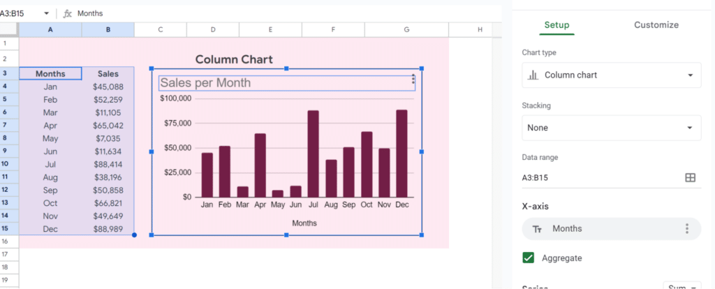
Creating a chart is as simple as importing data, selecting it in the sheet, and clicking Insert Chart. From there, customization is quick and dynamic. A sidebar menu showing all the options lets you visually change your chart or graph to match the Sheet you’re working in.
And on top of this, when you change or add data in your spreadsheet, the chart or graph will automatically update to reflect those changes.
If you are already using Sheets, creating sharp data visualizations for data analysis with charts and graphs is a no-brainer.
Here is a video walkthrough of getting started with data visualizations in Google Sheets:
How to use AI in Google Sheets for Data Visualization
If you don’t want to embed a chart in your Google spreadsheet manually, you can now use AI to help in this process without ever leaving your Sheet.
Coefficient has built a suite of tooling to automatically sync live data from many platforms including CRMs, databases, ads platforms, and more into Google Sheets. In addition, they have several AI-powered tools to use inside of Sheets.
Coefficient’s Chart Builder plugin allows you to prompt AI within a sheet by describing the chart you’d like to build and selecting the data range to use. This can be useful if you’re unsure which chart type to add or how to display the data best.
Types of Charts in Google Sheets
Here is a companion spreadsheet for this article with examples of different chart types.
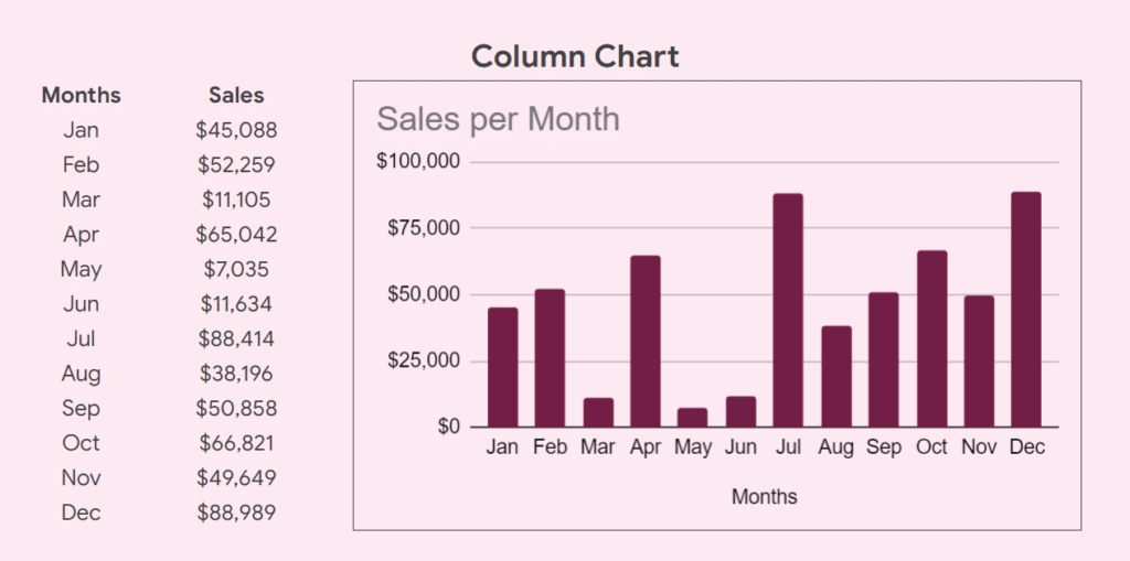
Column Charts
Column charts are best for showing changes over a period of time like monthly sales. Values are represented in vertical bars. You can customize column charts by choosing between stacked columns and regular columns, changing axis titles, adjusting chart titles, adjusting the data source(s), and changing the font, background, and border styles and colors.
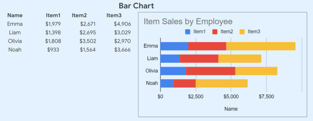
Bar Charts
Bar charts are similar to column charts, but the bars are horizontal and useful for comparing categories – for instance, to compare the number of products sold by different salespeople. Customization of bar charts is similar to column charts. One difference in my example is the inclusion of multiple data series. This also allows the sales by item to be represented by person along the y-axis.
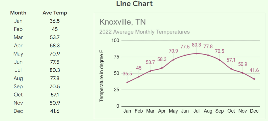
Line Charts
Line charts are useful for showing trends over time, like the average temperatures in a city over a period of time. In the example, I’ve used additional options for the data points. I’ve set their point size to 2-pixel circles and enabled data labels.
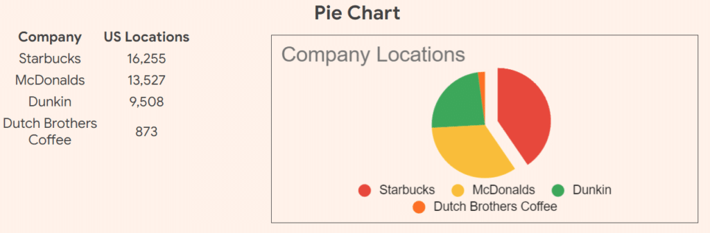
Pie Charts
Pie charts are useful for showing data as a proportion of the whole. For instance showing the market share for several brands. For simple data analysis, a pie chart quickly shows percentages of the whole but not much else. Since these charts need to distinguish between slices, there are additional formatting options for pie charts. You may change each slice’s color. And you may choose to pop out individual slices from the center.
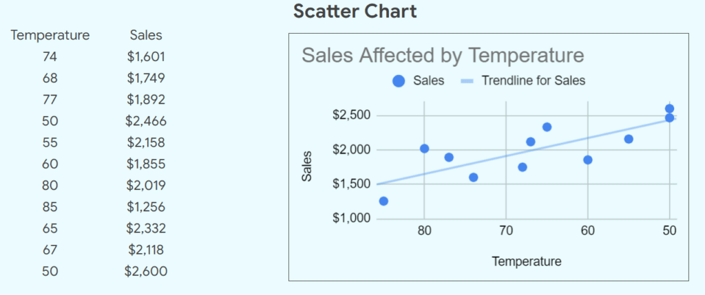
Scatter Plot
Scatter plots are useful for seeing correlations, patterns, or trends. For instance, how temperature affects sales. We can also plot a trendline in scatter plots in the chart editor. This gives us additional help in spotting patterns in our data set. The customization options are similar to column charts and bar charts.
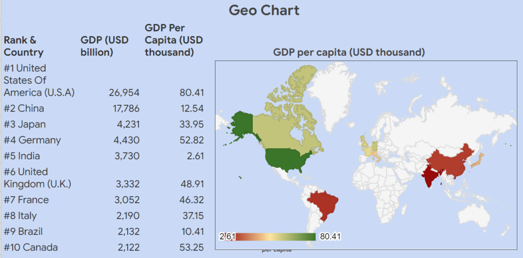
Geo Chart
Geo charts help put our Google Sheets’ data onto a map. We can then visualize a range of values by using a gradient color scale. Below is an example using the top 10 countries’ GDP charted by GDP per capita. Chart options for Geo Charts are limited to changing the colors of the gradient ranges.
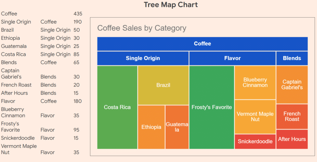
Tree Map
Treemaps are helpful when you have parent-child hierarchy in your data. Restaurant menus are good candidates for organizing data in this way. Customization of tree maps is also unique. You’ll be able to specify the object’s ID, Parent, and Size (as a numeric value) in three columns. You may add an optional fourth column as well. Similarly to geo charts, you may then select colors for each level of the hierarchy according to the size value of the items.
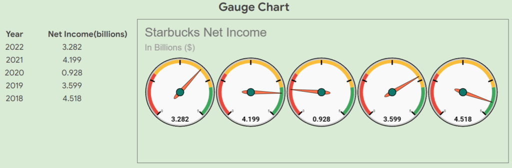
Gauge Chart
Gauge charts are a quick, bold way to represent values in a range. You could use this to show progress toward a goal, or to quickly compare sales year over year. Again, your customization options are limited to colors for each range of your values.
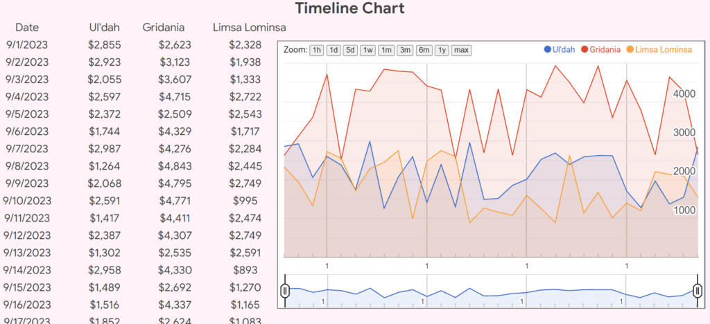
Timeline Chart
Timeline charts are helpful for seeing sales data over a period of time, and they include built in dynamic selections to modify the time visible timeframe on the fly. These charts are quite interactive, and only allow you to customize a few options like date format, line thickness and fill opacity.
How to Create a Chart for Google Sheets Data
There are two ways to create a chart in Google Sheets:
- Using Chart Builder AI
- Manually
AI Chart Builder
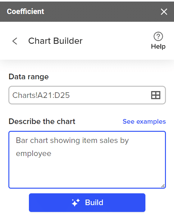
Open the Chart Builder up by selecting Extensions – Coefficient Connector – Launch. Haven’t installed the connector? Install Coefficient’s free extension now to follow along.
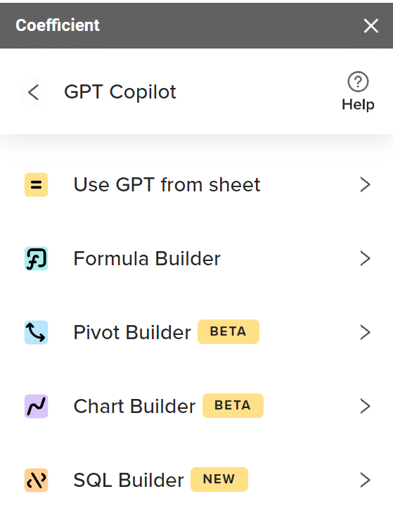
In the sidebar that opens, choose GPT Copilot and then Chart Builder.
Select your data set, and describe the chart you want. The chart builder will do the rest and then prompt you to put the chart on a new sheet or in a particular cell.
Also available in the sidebar are links to chart prompts and examples as well as an in-depth video on using the chart builder.
Using the AI Chart Builder can be a great first step to get suggestions on the type to use. The links above are very helpful if you don’t know where to start with your data.
Manual Chart
To create a chart manually is also a simple matter. Let’s walk through the column chart from our example. First, highlight the data set and click Insert – Chart from the menu bar.

Supercharge your spreadsheets with GPT-powered AI tools for building formulas, charts, pivots, SQL and more. Simple prompts for automatic generation.

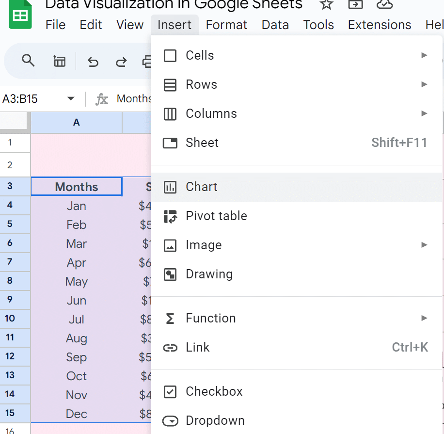
From here, the sidebar from Google Sheets will open, allowing you to select from all the chart types and options.
We’ll cover customization next.
Formatting and Customizing Charts
Whichever way you choose to create your chart, once it’s in the Sheet, you can fine-tune it. If the Sheets’ sidebar chart editor is not open already, click in your chart, select the three dots in the top right corner, and then select Edit chart.
The customize tab in the Chart editor houses all options for colors, labels, fonts, gridlines, ticks, etc.
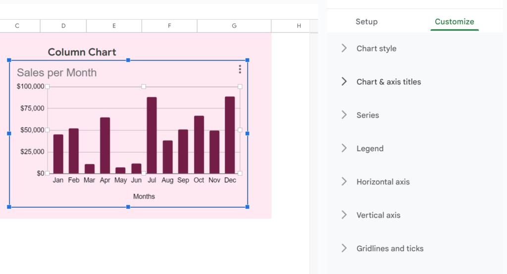
Different chart types will have different options available, but all will allow you to change at least the basic styles of your chart.
Suppose you want to filter the data in your chart. You can apply a filter directly to your data range. Do this by selecting the data and choosing Data – Create a filter from the menu.
This allows you to filter by conditions or values.
Different spreadsheets will require different types of charts and formatting. Be sure to examine all your requirements and the options in Google Sheets before settling on one tool or chart type over another.
Charts will automatically update when the filtered data is removed. You can also choose to include the filtered data in the chart if you have a reason for that.
When using charts, it is best to use the simplest chart you can to clearly present the required data. Minimize data clutter for the end user as much as possible so that your findings are clear and concise. Format and minimize colors to match any branding material.
Building Dashboards
Many data visualizations will require interactivity and filtering. Dashboards refer to a homepage of sorts for various KPIs all in one place. This will highlight important metrics for stakeholders at a glance.
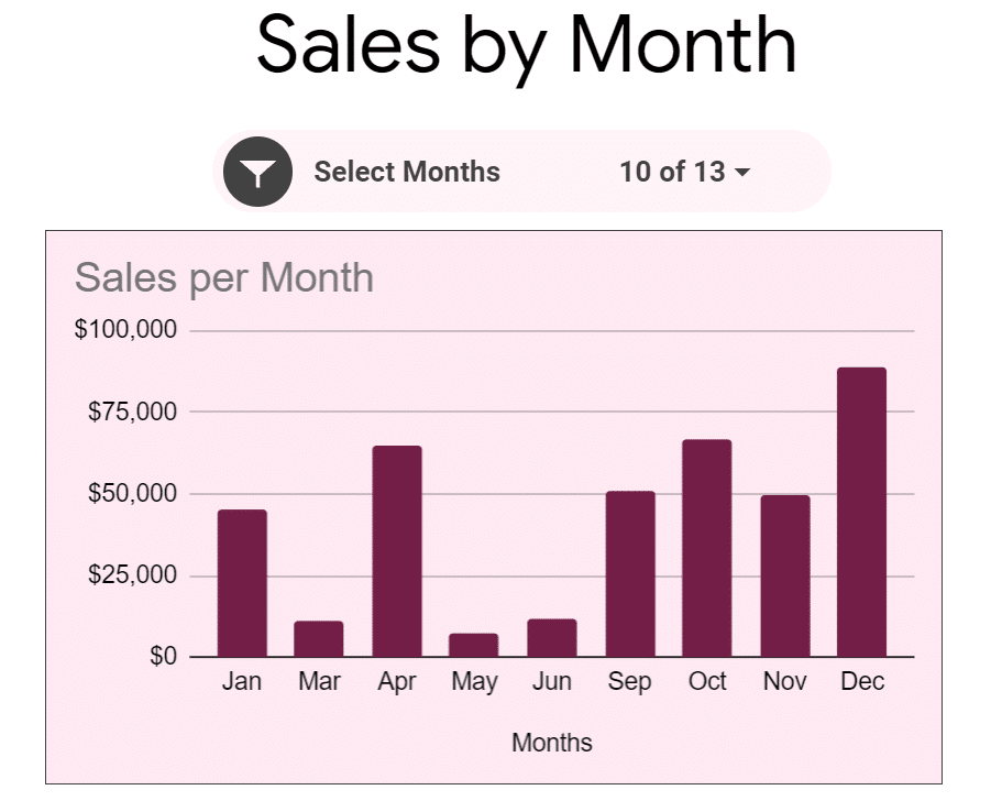
Another way to filter your chart dynamically is to add a slicer. Highlight the data again, and select Data – Add a slicer from the menu.
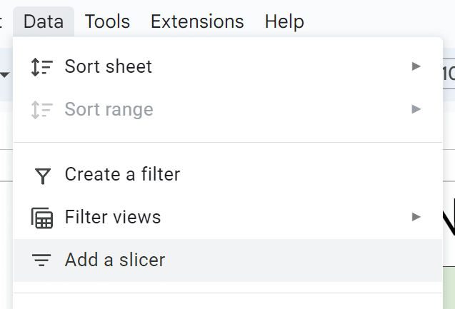
This gives you a customizable slicer to select and change data. A slicer is more of a toolbar added to your data, whereas the filter is a bit less appealing from a user experience standpoint.
For this reason, slicers make an excellent addition to dashboards, allowing even non-technical users the ability to make quick, real-time changes to the data and charts.
Best Practices for Effective Data Visualization
What story is your data trying to tell? Choosing the right chart type will depend upon a combination of the type of data you’re using and the story you need to tell.
As you build charts and dashboards in your spreadsheets, make sure that you pay attention to your design choices along the way.
If your company has a style guide, this will make things easier. If not, make sure you choose colors, fonts, and labels for your charts that make sense, are meaningful, and fit together cohesively.
In the example screenshots above, I’ve used different colors to delineate different chart styles. In a project, this could be visually confusing. It may make more sense to adopt one color scheme with two or three total colors throughout all the charts.

Label your data as necessary, but don’t go overboard. If it is obvious, you may gain some visual sensibility by omitting extraneous labels and keeping things simple.
This is after all what the purpose of data visualization is all about: making it easier to interpret the data.
Conclusion
Data analytics is used everywhere, and companies are spending more and more resources to wrangle, clean, interpret and present data to draw actionable insights about their customers, products and finances.
Google Sheets makes it very easy to get started with visualizing data, and Coefficient’s AI Chart Builder tacks on an even easier shortcut. Coefficient also has a library of advanced Google Sheets dashboards and simple spreadsheet templates you can get started with.
As you build your charts and dashboards, be sure to remember:
- Clean and organize your data sets.
- Use the most appropriate data visualization tool.
- Use the chart editor to format and label appropriately.
- Focus on highlighting the most important metrics.
- Add filters and slicers to increase interactivity.
- Get the main points across in the fewest words (charts) possible. Remember, you’re a storyteller!
Follow Eamonn on LinkedIn, and see his tutorials on YouTube.
Ready to give Coefficient’s AI Chart Builder a spin? Try it for free here.


