The AI revolution has arrived in data analytics. What used to require a data science team, multiple platforms, and days of manual work can now be done in minutes with the right tools.
The challenge is not a shortage of options. It is knowing which category of tool actually solves your problem. Some platforms are built for ad hoc natural language queries on clean, structured data. Others are built for executive dashboards, embedded analytics, or enterprise-grade data governance. And a few like Coefficient are built for the layer that most analytics tools ignore entirely: getting live, connected data out of your business systems and into the spreadsheet environment where your team actually works.
Here are the seven AI analytics tools that are actually moving the needle for business teams in 2026.
Feature Comparison Table
| Tool | Best For | AI Capability | Pricing | Spreadsheet Integration |
| Coefficient | Finance, sales ops, RevOps teams | Live data AI analysis + GPT assistant | From $49/month | Native (Google Sheets + Excel) |
| Microsoft Power BI | Enterprise BI and Microsoft-heavy orgs | Copilot for NLQ, DAX, report summaries | Free desktop; Pro $14/user/month; Copilot $30/user/month | Excel-native; publish to Sheets via export |
| Tableau | Data visualisation and exploration | Tableau Pulse + Einstein AI for NLQ and insights | Creator $75/user/month | Connects to Excel/Sheets as data sources |
| Qlik Sense | Associative data discovery, enterprise | Qlik Answers AI; NLQ; AutoML | Custom enterprise pricing | Connects to Excel/Sheets as data sources |
| Polymer | SMBs and non-technical teams | AI dashboard generation from file upload | Starter $25/month; Pro $50/month; Teams $125/month | Accepts CSV/Excel/Google Sheets uploads |
| IBM Cognos Analytics | Large enterprise, regulated industries | NLQ, automated pattern detection, Watson AI | On-Demand Standard $10/user/month; Premium $42/user/month | Go! Office for Excel integration |
1. Coefficient
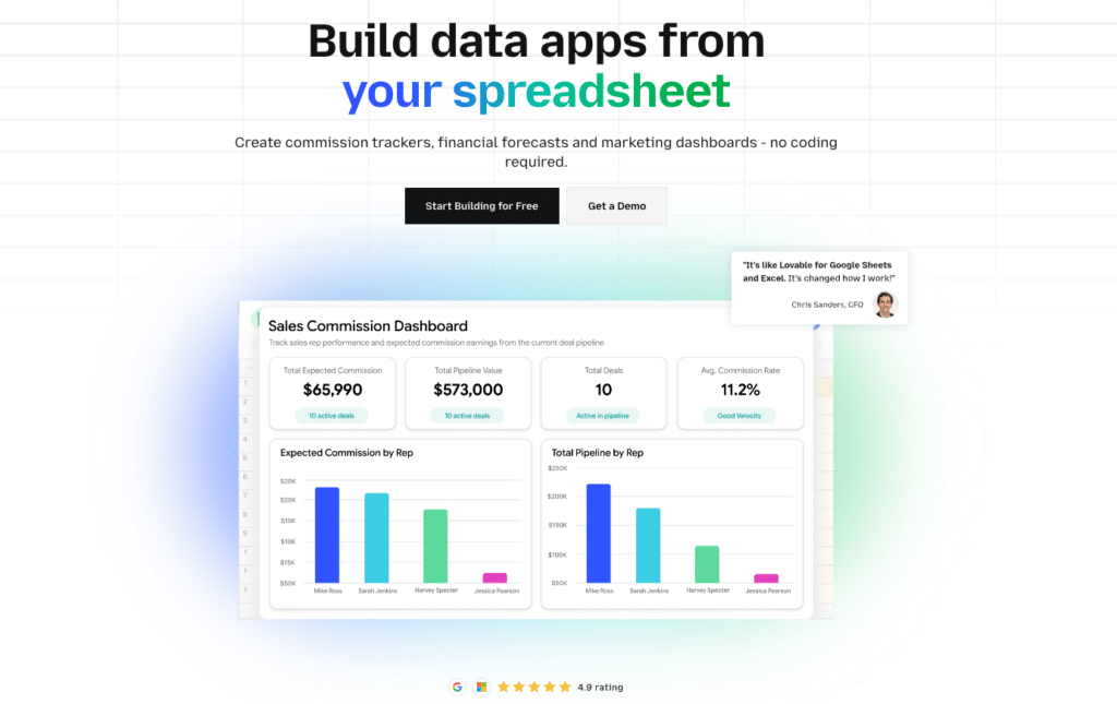
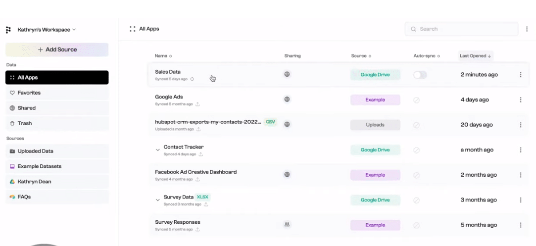
Most analytics tools ask you to move your data into a new platform. Coefficient takes the opposite approach: it brings live data from your business systems directly into the spreadsheet environment your team already uses.
Coefficient connects Google Sheets and Excel to 100+ data sources like Salesforce, HubSpot, QuickBooks, NetSuite, Snowflake, Stripe, BigQuery, and more — with scheduled auto-refresh so your data stays current without manual exports. On top of that live data layer, Coefficient’s AI Sheets Assistant generates formulas, builds charts and pivot tables, writes SQL, and surfaces insights through plain language prompts.
The result is a complete data analytics environment inside your existing spreadsheet: live data from every system in your stack, AI-assisted analysis, and dashboards that update automatically.
Highlights
100+ live data connectors: Pull from Salesforce, HubSpot, QuickBooks, NetSuite, Snowflake, Stripe, Redshift, and more. Data refreshes on a schedule you set — hourly, daily, or weekly.
AI Sheets Assistant: Generate formulas, charts, pivot tables, and dashboards from plain English prompts. Build and fix SQL queries directly in your spreadsheet.
Two-way sync: Push data back to source systems (Salesforce, HubSpot, QuickBooks) directly from your spreadsheet. Update records, insert new data, or delete entries without leaving Sheets or Excel.
Pros
- Works inside your existing tools: No new platform to learn. Coefficient adds live data and AI analysis capability to Google Sheets and Excel without displacing the workflow your team already uses.
- Covers the full analytics workflow: Connect data, build models and dashboards with AI assistance, set automated refresh schedules, and push updates back to source systems — all from one place.
- Finance and RevOps ready: Deep support for accounting systems (QuickBooks, NetSuite, Xero, Sage Intacct) makes Coefficient especially strong for FP&A, month-end close, and revenue operations workflows.
Cons
- AI analysis stays in-spreadsheet: The AI Sheets Assistant works on data already in your sheet. For organization-wide BI with formal governance layers, a dedicated platform like Power BI may complement it.
Pricing
Free plan available. Paid plans start from $49/month. Visit coefficient.io/pricing for current plan details.
What do users say about Coefficient?
Positive: “Coefficient made data collaboration effortless for our finance and sales teams. Live sync and automated reporting save us hours every week.”
Critical: “The interface can become overwhelming for new users, and advanced integrations require initial setup time.”
Support
Coefficient offers onboarding guides, a detailed help centre, and direct support tickets. Priority support is included on higher-tier plans.
2. Microsoft Power BI with Copilot
Power BI is the most widely used business intelligence platform in the world, and its Copilot AI integration has made it the default choice for enterprise teams who need formal BI reporting with natural language capabilities built in.
Copilot for Power BI lets users describe what they want to see in plain English and get back DAX formulas, complete report pages, and data summaries without writing a line of code. For organizations already running Microsoft 365, the procurement path is straightforward — Power BI connects natively to Excel, SharePoint, Teams, Dynamics, and Azure without additional configuration.
Highlights
Copilot AI integration: Describe what you want — a revenue breakdown by region, a year-over-year comparison — and Copilot generates the DAX formula, builds the visual, and writes a plain-language summary automatically.
Microsoft ecosystem lock-in (as an advantage): If your team uses Excel, Teams, SharePoint, and Dynamics, Power BI’s native integration removes the friction that plagues other BI tools. Data flows without export/import.
Pros
- Cost-effective at scale: At $14/user/month for Pro, Power BI is priced for broad internal adoption across departments — not just the data team.
- Copilot reduces the BI skills gap: Non-technical users can create reports and ask questions about their data without learning DAX or the Power BI interface. Copilot generates the technical elements from plain language.
- Strong governance and compliance: Enterprise-grade row-level security, data lineage tracking, and audit logs make Power BI suitable for regulated industries and large organizations.
Cons
- Copilot requires an add-on: The natural language AI features cost an additional $30/user/month on top of the Pro license. For large teams, this adds up quickly.
- DAX learning curve: Beyond Copilot-assisted reports, Power BI’s full analytical power requires learning DAX. Power users will hit the ceiling of what Copilot can generate.
- Limited for live ERP/CRM data in spreadsheets: Power BI is a reporting layer. For teams that need live data from Salesforce or QuickBooks flowing directly into Excel with auto-refresh, Power BI alone does not solve that problem — a tool like Coefficient complements it.
Pricing
As of 2026: Power BI Desktop is free. Power BI Pro is $14/user/month (annual). Microsoft 365 Copilot (which includes Copilot for Power BI) requires an additional $30/user/month on top of a qualifying M365 license. Power BI Premium is available for capacity-based enterprise deployments.
What do users say about Power BI?
Positive: “Copilot cut our report build time dramatically. Non-analysts can now create dashboards that used to require the data team.”
Critical: “The Copilot add-on cost on top of existing Microsoft licenses is a real barrier for smaller teams. And DAX still trips up casual users on complex calculations.”
Support
Microsoft provides extensive documentation, community forums, and enterprise support tiers. Larger organizations can access dedicated Microsoft FastTrack resources for deployment.
3. Tableau
Tableau remains the gold standard for data visualization and exploratory analysis. Its drag-and-drop interface and deep visualization capabilities have made it the go-to tool for data analysts who need to build complex, interactive dashboards and share them across organizations.
The introduction of Tableau Pulse and Einstein AI has pushed Tableau further into the AI analytics space. Tableau Pulse proactively surfaces personalized insights — it monitors your key metrics and delivers plain-language explanations of what changed and why, delivered directly into user workflows without requiring them to open a dashboard.
Highlights
Tableau Pulse: AI-powered metric monitoring that proactively notifies stakeholders when metrics move and explains the drivers in plain language. Users get insights delivered to them rather than hunting for them.
Einstein AI (Ask Data): Type a question about your data and get an instant visualization. Non-technical users can explore data through natural language without building a dashboard.
Pros
- Best-in-class visualization: Tableau’s visual depth is unmatched in the BI market. Complex, publication-quality charts and interactive dashboards that would take weeks in other tools are achievable without custom development.
- Proactive AI insights: Tableau Pulse shifts the model from reactive dashboards to proactive monitoring. Stakeholders receive alerts and explanations rather than waiting to check dashboards.
- Salesforce integration: As a Salesforce product, Tableau integrates deeply with Salesforce CRM data, making it a natural fit for revenue and sales analytics in Salesforce-heavy organizations.
Cons
- Expensive for broad deployment: Creator licenses at $75/user/month make full organizational deployment costly. Many teams end up with a small group of Tableau builders and a larger group of viewer-only users.
- Steep learning curve for custom work: Power users building sophisticated dashboards need significant training. Tableau is not a tool non-technical users can pick up and be productive with quickly.
- Limited live spreadsheet connectivity: Tableau can connect to Excel and Sheets as data sources, but it is not designed to pull live data from ERP or CRM systems directly into spreadsheets the way Coefficient does.
Pricing
As of 2026: Tableau Creator at $75/user/month (annual), Explorer at $42/user/month, Viewer at $15/user/month. Enterprise pricing available. Tableau Pulse is included with Creator licenses.
What do users say about Tableau?
Positive: “Tableau Pulse has changed how our leadership team uses data. They get answers delivered to them now, not buried in a dashboard they have to remember to check.”
Critical: “The price-to-value equation is hard to justify for SMBs. A small team cannot afford Creator licenses for everyone who might want to build a report.”
Support
Tableau provides extensive online documentation, Trailhead learning paths (via Salesforce), community forums, and enterprise support options with dedicated account management.
4. Polymer
Polymer is a no-code analytics platform built for teams that need working dashboards quickly, without a BI specialist or SQL knowledge. Upload a spreadsheet, connect a data source, and Polymer’s AI automatically identifies patterns, suggests relevant charts, and builds an interactive dashboard ready to share.
It sits squarely between spreadsheets and full BI tools — more analytical depth than a spreadsheet, less complexity and cost than Tableau or Power BI. For SMBs, marketing teams, and operations managers who need visual analytics without a data engineering investment, Polymer delivers a fast path to working dashboards.
Highlights
Instant AI dashboards: Upload a CSV, Excel file, or connect Google Sheets and Polymer’s AI generates dashboard suggestions automatically. No manual chart configuration required for a first working view.
Natural language search: Query your data in plain English directly from the Polymer interface. Ask questions about your data and get instant visual answers without building a new chart.
Pros
- Fastest time-to-dashboard of any tool on this list: From data upload to a shareable dashboard typically takes minutes. No data preparation, no modelling layer, no BI skills required.
- Accessible pricing: Starter at $25/month makes Polymer affordable for small teams and solo analysts who cannot justify enterprise BI costs.
- Connects to marketing and e-commerce data: Native connectors to Google Analytics 4, Facebook Ads, Google Ads, and Shopify mean marketing teams can get cross-platform dashboards without a data engineer.
Cons
- Surface-level analysis: Polymer’s AI identifies patterns and suggests charts, but it does not perform deep statistical or predictive analysis. For anything beyond descriptive analytics, users quickly hit the ceiling.
- Limited data source depth: The connector library is narrower than enterprise BI platforms. Teams with ERP systems, data warehouses, or complex multi-source data will find Polymer insufficient as a primary analytics tool.
- Not a replacement for spreadsheet workflows: Polymer produces dashboards from data but does not sync live data back to spreadsheets or support the in-spreadsheet formulas and models that finance and operations teams depend on.
Pricing
As of 2026: Free plan available. Starter at $25/month, Pro at $50/month, Teams at $125/month. Annual billing reduces costs. Shopify connector billed separately at $3/month per store.

Supercharge your spreadsheets with GPT-powered AI tools for building formulas, charts, pivots, SQL and more. Simple prompts for automatic generation.

What do users say about Polymer?
Positive: “I had a client-ready dashboard in 10 minutes. For quick stakeholder reporting it is genuinely impressive — no technical skills needed at all.”
Critical: “Great for surface-level exploration. The moment you need something beyond a standard chart or want to combine data in a non-obvious way, you hit walls quickly.”
Support
Polymer offers live chat support, a help centre, and email support. Priority support is included on Pro and Teams plans.
5. IBM Cognos Analytics
IBM Cognos Analytics is a long-standing enterprise BI platform with AI capabilities now fully integrated into the core product. (Note: IBM Watson Analytics, referenced in older articles, was a separate standalone tool that was discontinued and absorbed into Cognos Analytics. The AI features previously associated with Watson — natural language querying, automated pattern detection, and predictive analytics — are now built into Cognos.)
Cognos is the BI platform of choice for large enterprises in regulated industries — financial services, healthcare, government — where data governance, audit trails, and enterprise security are non-negotiable requirements. Its AI assistant helps non-technical users describe what they need and navigate to the right data, and its automated pattern detection surfaces anomalies without manual configuration.
Highlights
AI-powered natural language querying: Business users can describe data needs in plain language and Cognos generates the appropriate query, visualization, and report structure without BI expertise.
Watsonx BI assistant (latest): IBM’s latest AI layer for Cognos connects to the broader watsonx platform, enabling deeper generative AI capabilities including automated narrative generation and predictive forecasting.
Pros
- Enterprise governance and compliance: Cognos meets the strictest enterprise security and governance requirements. Data lineage, role-based access, audit logging, and fine-grained permissions are all available out of the box.
- Proven at scale: Cognos handles complex, multi-source data environments and high user concurrency at enterprise scale. It is a mature platform with decades of refinement for large organization deployments.
- Strong financial and operational reporting: Cognos has deep support for financial reporting workflows, including integration with IBM Planning Analytics (TM1) for connected FP&A and budgeting.
Cons
- Steep learning curve: Cognos is a complex platform. Report authoring, administration, and modelling require significant training investment. It is not self-serve for casual users without the AI assistant.
- Dated interface in some areas: Despite ongoing updates, parts of the Cognos interface feel legacy compared to newer BI platforms. User experience is a common criticism in reviews.
- Limited appeal outside enterprise: Cognos’s pricing, complexity, and implementation requirements make it inappropriate for SMBs or teams without dedicated BI infrastructure.
Pricing
As of 2026, IBM Cognos Analytics On-Demand offers Standard at $10/user/month and Premium at $42/user/month. Full Cloud Hosted and on-premise deployments are priced through IBM’s enterprise licensing model. Contact IBM for enterprise quotes.
What do users say about IBM Cognos Analytics?
Positive: “Our compliance and security teams would not approve any other BI platform. Cognos meets every governance requirement we have. The AI assistant has made it usable by our finance team without BI training.”
Critical: “The interface feels a decade behind Tableau and Power BI. For enterprise reporting it does the job, but the user experience is not modern. Onboarding new users takes real time.”
Support
IBM provides extensive documentation, the IBM Support portal, community forums, and enterprise support contracts. IBM Consulting services are available for deployment and customization at enterprise scale.
6. Qlik (Qlik Sense)
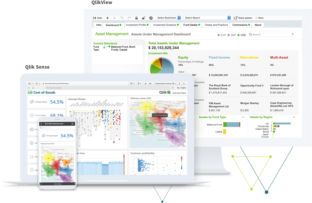
Qlik Sense is built around an associative data engine that works differently from most BI tools. Traditional BI platforms query data linearly. Qlik’s engine indexes all possible associations between data points simultaneously — meaning users can click any dimension, any filter, and instantly see how every other metric relates to that selection. No pre-built drill-down hierarchy required.
The 2024-2025 introduction of Qlik Answers AI added generative AI on top of this associative engine. Users can now query structured and unstructured data simultaneously — combining database records with PDFs, reports, and documents in a single natural language query.
Highlights
Associative engine: Explores all data relationships simultaneously. When a user clicks a filter, Qlik shows not just what matches but what is excluded — exposing patterns and gaps that linear query tools miss entirely.
Qlik Answers AI: Generative AI layer that lets users query structured and unstructured data together. Ask a question and Qlik searches database records, documents, and reports simultaneously to compose an answer.
Pros
- Discovers patterns other tools miss: The associative model is genuinely differentiated. Data relationships that would require a skilled analyst to find manually surface automatically as users interact with data.
- Enterprise governance: Qlik’s governance framework and section access model for row-level security meet the requirements of large, regulated enterprises where data access control is non-negotiable.
- Handles messy, multi-source data: Qlik is strong at combining data from many sources without requiring a clean, pre-modelled data warehouse underneath it.
Cons
- The associative model requires a mindset shift: Users accustomed to traditional SQL-style queries find the associative approach counterintuitive at first. Training investment is significant for new users.
- Custom enterprise pricing: No published pricing makes evaluation and comparison difficult. Budget conversations require a full sales process before cost clarity.
- Overkill for simple reporting needs: For teams that need straightforward dashboards and standard KPI tracking, Qlik’s associative complexity is more than they need. Simpler tools at lower price points serve them better.
Pricing
As of 2026, Qlik Sense uses custom enterprise pricing. Qlik Cloud Analytics is available with consumption-based pricing tiers. Contact Qlik for a quote tailored to your user count and deployment requirements.
What do users say about Qlik?
Positive: “The associative engine found a correlation in our sales data that we had missed for two years. No other tool surfaces those kinds of unexpected connections.”
Critical: “New users struggle with the interface. It takes real training to unlock the value of the associative model — the learning curve is steeper than dashboards suggest.”
Support
Qlik provides a comprehensive online help centre, community forums, Qlik Training courses, and enterprise support contracts with dedicated customer success managers.
Embrace the Future of AI-Powered Data Analytics
AI tools for data analytics are no longer a future promise — they are reshaping how businesses handle data today. Natural language queries, automated insight generation, and proactive metric monitoring have moved from experimental features to table stakes for any serious analytics platform.
The right tool depends entirely on where your team’s bottleneck sits. If your problem is getting live, accurate data out of your business systems and into the spreadsheet environment where analysis actually happens, Coefficient solves that problem directly. If you need formal enterprise BI with governance and Copilot-assisted reporting, Power BI is the choice. If visualization depth is what matters, Tableau. If data discovery across associatively linked datasets is the priority, Qlik.
The tools are there. The question is whether you are using them against the right problem. Start with Coefficient to put live data in your hands, then layer in the BI platform your organization needs for enterprise reporting on top of it.


