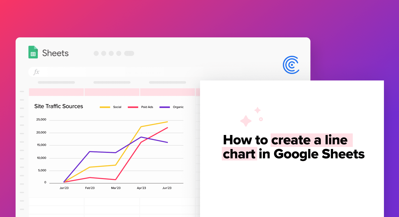
Whether it’s charting product sales across quarters, monitoring web traffic, or overseeing a project’s trajectory, line charts help convey complex information easily.
In this article, we’ll guide you step-by-step on crafting a line chart using Google Sheets, with data sourced from Jira.
Let’s get started!
What is a Line Chart?
A line chart is a type of graph that displays information as a series of data points connected by straight lines. Line charts are used to show trends over time or compare multiple data sets.
In a line chart, the x-axis represents time or categories, and the y-axis represents the values of the data being plotted. Each data point is plotted as a point on the chart and connected to the previous data point with a line. Line charts are especially useful for displaying trends over time, as they make it easy to see how a particular data set has changed over a given period.
Line charts can also be used to compare multiple data sets by plotting each data set as a separate line on the same chart. This allows the viewer to easily compare trends and identify patterns in the data.
How Organizations Use Line Charts
1. Tracking Business Performance
Line charts are commonly used to track key performance indicators (KPIs), such as sales revenue, website traffic, or customer satisfaction ratings over time. By following these metrics on a line chart, organizations can quickly identify trends and patterns that may indicate areas where improvements can be made.
2. Forecasting Future Trends
Line charts can also be used to forecast future trends by plotting historical data and using regression analysis or other forecasting techniques to predict future values. This can help organizations anticipate future demand, plan for future growth, or identify potential areas of risk.
3. Comparing Multiple Data Sets
Line charts are often used to compare multiple sets of data on the same chart. This can help organizations identify correlations or relationships between different variables or compare the performance of different products, services, or departments.
4. Presenting Data to Stakeholders
Line charts are a popular tool for presenting data to stakeholders, such as executives, investors, or clients. Organizations can effectively communicate complex data and insights to their audience by creating a clear and visually appealing chart.
Advantages of Using Line Charts in Google Sheets
1. Visualize Trends
Line charts are great for visualizing trends over time. Plotting data points on a continuous line allows you to see how the data changes over time and identify trends, patterns, and cycles.
2. Compare Multiple Data Sets
Line charts allow you to compare multiple data sets on the same chart, making identifying differences and similarities between different variables easy. This can be particularly useful for identifying correlations or relationships between different variables.
3. Highlight Key Data Points
Line charts allow you to highlight key data points, such as peaks or troughs in the data. This can help draw attention to important trends or events and make it easier to understand the data.
4. Easily Update Data
Because line charts are based on data in a Google Sheets spreadsheet, they can be easily updated as new data becomes available. This makes it easy to keep charts up-to-date and accurate.
5. Customize Charts
Google Sheets allows you to customize line charts in a variety of ways, including changing colors, fonts, and chart styles. This can help you create visually appealing charts and effectively communicate your data.
Example: How to Create a Line Chart in Sheets Using Jira + Coefficient
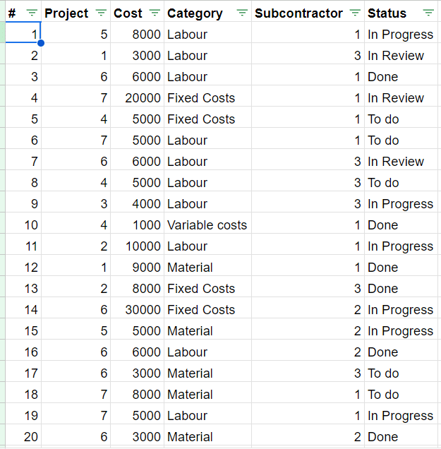
PQR Builders, a construction company, is contracted to erect seven residential buildings in Boston over a span of three years. To fulfill this, they’ve sourced materials and engaged three major subcontractors. A crucial step for PQR is to scrutinize the costs associated with each subcontractor to forecast the upcoming year’s budget.
While the company primarily utilizes Jira for project management, gleaning insights or discerning trends directly within the tool can pose hurdles.
Exporting Jira data to a platform like Google Sheets could provide a versatile and shareable solution for team-wide data access and analysis.
Importing Data from Jira to Google Sheets With Coefficient
There is a quick and easy way to connect Jira to Google Sheets with only one click so that this tool may be utilized across several platforms: Coefficient.
To export data from Jira in Google Sheets using Coefficient, all you have to do is add the Coefficient extension to your Google Sheets.

Supercharge your spreadsheets with GPT-powered AI tools for building formulas, charts, pivots, SQL and more. Simple prompts for automatic generation.

- Once your project is ready to be exported from Jira, go to Google Sheets > Extensions > Coefficient. Select the ‘Launch’ option.
- Fill up the basic details, select Jira, and click on Import.
- Next is the authorization step, where you can log in to your existing Jira account and provide the necessary permissions to Coefficient.
- Coefficient gives you four different options to import data from Jira.
- Start from Scratch
- From Saved Filters
- From Library
- Custom JQL Query
- Under each of the above options, you can customize the fields to be imported, which will be the columns of the Google Sheets, and sort the data as required.
- Once the data is successfully imported, you can choose how often you want to refresh this data. This functionality is highly useful to ensure data is always up to date.
Now, we can analyze the data imported to see the cost of the projects over the span of one year by creating an area chart in Google Sheets.
The data looks like this:
To create the line chart:
- Go to the ‘Insert’ menu and select ‘Charts.’
- Select the data range to be used in the dashboard; this will be the sheet containing the Jira data.
- Select the Line Chart type. You can customize the fields, chart titles, labels, etc. in the ‘Setup’ and ‘Customize’ options under the Chart Editor.
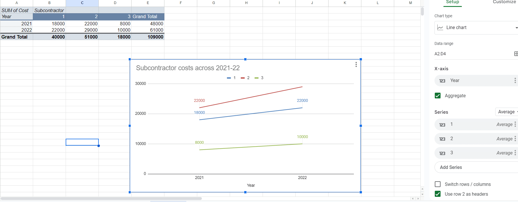
Creating a chart hinges on the right data. To examine the subcontractor costs for 2021 and 2022, we use a pivot chart that showcases the essential data points.
Some fields in our database might not be relevant to the chart. So, we refine the data from Jira in Google Sheets using a pivot, which we then convert into a Line Chart.
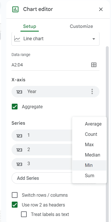
Under the Setup Tab you can:
- Define the chart type.
- Select the data range – in this case, it is from the pivot table.
- Define what is to be shown on X-axis. In this case, we have shown the year in X-Axis for easier understanding. You can change this, however.
- The Series defines the related data points that are plotted on the chart. In this example, we have used the average of the subcontractor costs across 2021-22, you can choose to show sum, median, max, min, or count.
Under the Customize tab, you can define the:
- Chart style: You can choose from several pre-defined chart styles or create a custom style by adjusting various chart elements such as the background color, line thickness, and axis labels.
- Chart and axis titles: You can add and customize titles for the chart and its axes, including the font, size, and color of the text.
- Series and legend: You can customize the appearance of each series in the chart, including the color, line style, and marker shape. You can also customize the legend, including its position, font, and size.
- Horizontal and vertical axis: You can customize the appearance of the horizontal and vertical axes, including the axis labels, tick marks, and gridlines.
- Data labels: You can choose to display data labels on the chart, which can provide additional information about each data point. You can customize the appearance of the data labels, including the font, size, and color of the text.
Once the above parameters are defined for the chart, you can view the final result and modify it as required if you wish to add or remove data points, add data labels, etc.
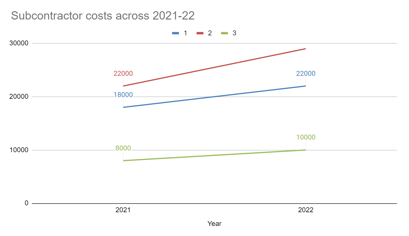
As you can see here, the costs for Subcontractor 1 are relatively lower than Subcontractor 2, across both years. Subcontractor 2 has increasing costs and is charging more than 1 and 3. Subcontractor 3 seems to be the most cost-efficient. To further analyze if the organization should go ahead with subcontractor 3, we can add data points like category of costs, status of projects, etc.
Showcase Trends Effectively with Line Charts
Line charts are a great way to quickly understand how variables evolve, making them invaluable for monitoring metrics, spotting patterns, or identifying anomalies.
Google Sheets is a robust platform for data analysis and visualization. Coefficient makes it even better by allowing seamless integration with your favorite business tools.


