Google Sheets is one of the handiest and most popular tools for creating reports and dashboards because of its familiarity and usability.
However, it can be challenging and time-consuming to build dashboards and reports using spreadsheets when you’re dealing with thousands of rows of data.
The good news is you can supercharge the process of creating a world-class dashboard in Google Sheets through dedicated software, such as the Microsoft Power BI desktop application.
Power BI is a business intelligence software that offers a simple interface for creating interactive rich reports with visual analytics and efficiently building dashboards.
This guide covers how you can create comprehensive dashboards, and Power BI reports. We’ll start with setting up your data source and using Google Sheets to fetch and store the data for the Power BI to use.
Setting up the Data Source and Google Sheets
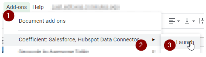
To speed up (and even automate) the fetching of data from your data source to Google Sheets, use the Coefficient app. You can then link the spreadsheet with your data to Microsoft Power BI.
Install the Coefficient add-on to your Google Sheets account by clicking Add-ons > Get add-ons. Search for Coefficient.io from the Google Workspace Marketplace and click Install.
The plugin allows for easy and seamless data integration from various platforms, such as Salesforce, HubSpot, Google Analytics, MySQL, Redshift, PostgreSQL, Snowflake, Looker, Google Sheets, and CSV files.
The screenshot shows how to launch the Coefficient app after installing it on Google Sheets.
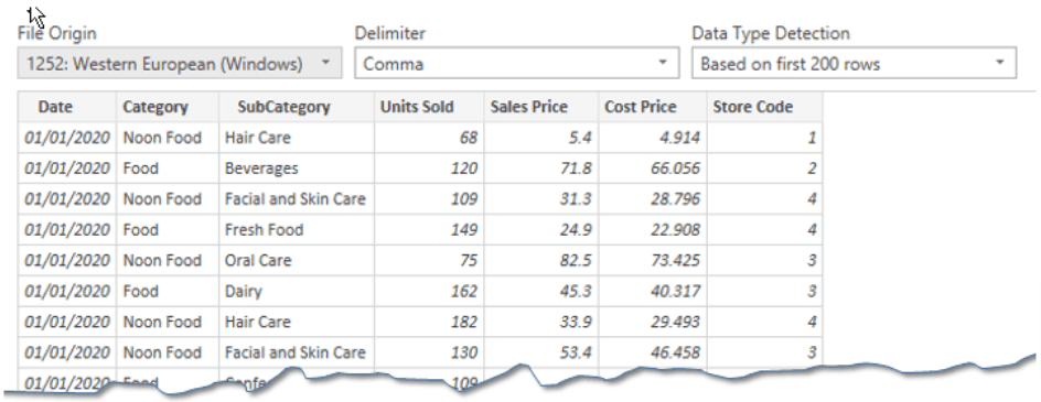
After connecting and running the plugin, the information from your data source automatically gets populated on your spreadsheet.
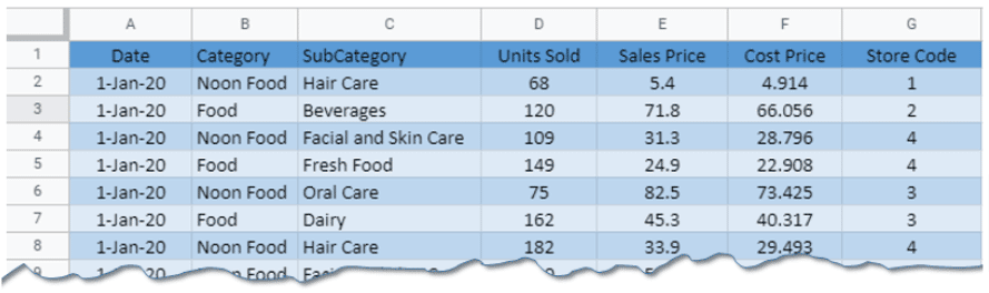
The example shows sales data from a retail chain with stores located in five cities: New Orleans, Brighton, Hamilton, Chicago, and Baltimore.
The store sells under two major categories: Food and Non-Food items, further divided into 14 different subcategories.
The table lists Sales and Cost price and the number of units sold along with the store location identifier.
Publishing the sheet to prepare data for Power BI
To connect the Google spreadsheet to the Power BI report builder desktop application, you’ll need to publish it. Ensure that you only share the link to authorized users before publishing.
Follow these steps to publish your spreadsheet.
- Navigate to the File Menu.
- Select Publish to the Web.
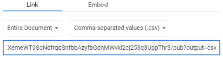
- From the following dialogue box, select Link > Entire Document, then click Comma-separated value (.csv).
Google will require you to confirm the publishing of the data. You’ll get a link ending with a .csv extension. Ensure that it is a CSV file or the steps described here won’t work.
Copy and paste the link to the Microsoft Power BI desktop application after launching the app through these steps:
- Launch Power BI desktop app.
- Go to Home > Get Data > Web.
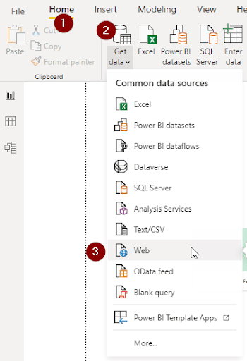
This should show a dialogue box requesting you to input the copied link and connect your published spreadsheet.
Once loaded, Power BI will display your data.
Now you’re ready to manipulate your data and create reports in Power BI.
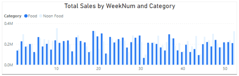
Building the first visual on Power BI: Total sales for Food and Non-Food items over a number of weeks
Plot the time-series data using a clustered bar chart to show the sales of the two categories: Food and Non-Food items over a number of weeks. There are 52 weeks in a year, and for every week, we will have two bars representing each.
In this example, we will use the Visualizations pane shown on the right side to build this.
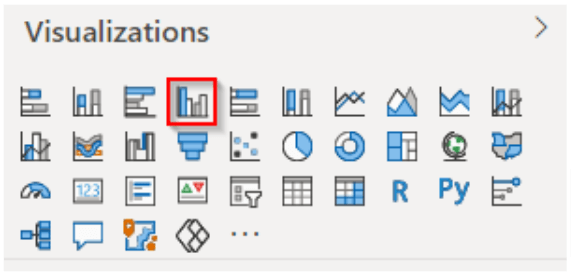
Select and drag and drop the clustered bar chart to the canvas to add your desired visual to your report in Power BI.
Add details to these visualization elements.
- Axis. This is the variable that displays something — in this case, the variable Week number.
- Value. This refers to the value you want to plot against the axis variable, which is the Total Sales in our example.
- Legend. This is the variable that adds more details to your chart. In your sample dataset, the legend is a category to show division in your sales based on said categories.
Build these chart details by dragging and dropping the variables from the right side to your desired value-holder.
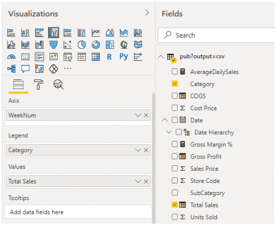
The data should translate into your visual once you add the corresponding data fields.
You can customize the chart, make it more visually pleasing and clean, and change how it displays by doing the following.
Switch off the axis titles:
Disable the axis titles by clicking the chart and navigating to the formatting. Select the X-axis (or Y-axis) to turn them off.
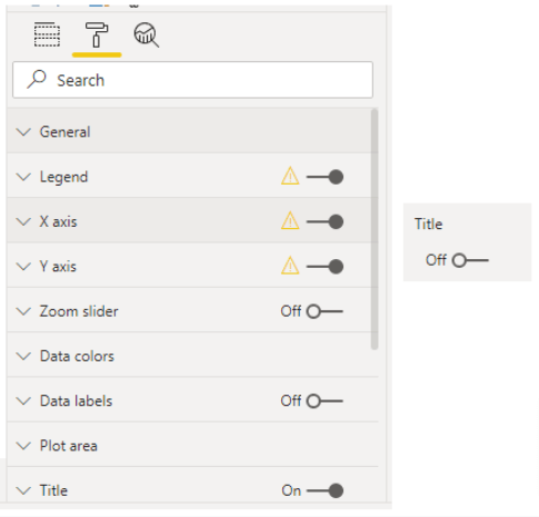
Modify and align the chart title:
Use the title options to center the chart title, enter a custom text, increase the font size from 14 to 16, and also add a chart border (among others).
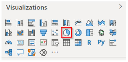
Adding a second visual to the Power BI report: The Pie Chart
Create a pie chart showing a breakdown (the percentage and the dollar value) for each subcategory of the retail chain. This visual makes it easier to understand the contributions made by each subcategory.
From the Power BI report builder Visualizations pane, drag and drop the pie chart option to the main canvas.
Add these details to your pie chart:
- Legend. Set the Subcategory as the Legend to display data in this variable.
- Values. This should be the total sales divided into each Subcategory.
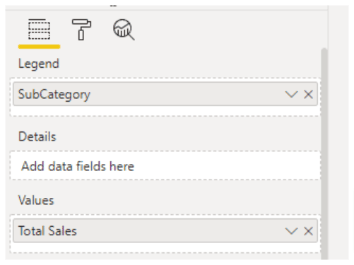
From the Format options, you can modify your pie chart’s default formatting and customize it how you want.
The final Microsoft Power BI chart or visual will look like this.
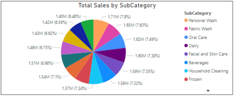
If you don’t see all your (Legend) data categories, click the dropdown arrow at the bottom to display the rest.
Adding quick visuals with the Power BI Q&A feature
Another essential Power BI report builder feature you can use if you want to create a dashboard in Google Sheets is the single figure option that displays a figure or data you want to highlight.
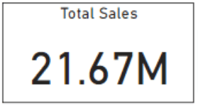
It’s a great way to display key data figures from your report in Power BI and display them on your dashboard in Google Sheets.
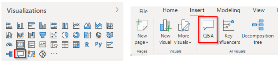
Start by selecting the Question and Answer (Q&A) option on the Power BI Visualizations pane (or the Menu bar) and adding the block to your canvas.
The Power BI report builder app lets you search for key stats in your data. For example, you can search for the Total Sales by typing in the text on the search bar that appears when you click the Q&A icon.
The result will appear if it’s already in your data. If not, you’ll need to create a measure.
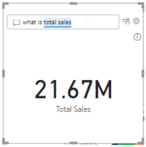
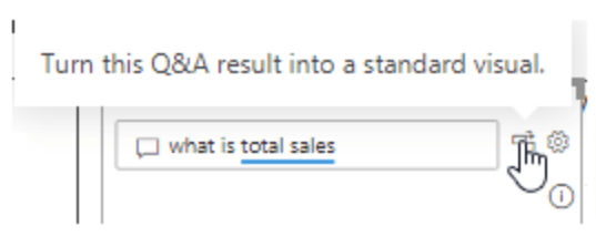
As you type the question, the Answer box displays the results. You can turn the Q&A result into a visual by clicking the icon right beside the box.
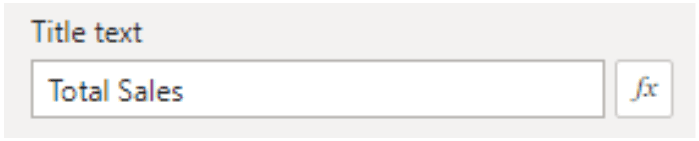
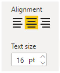
The Total Sales shown here is the subcategory’s title, and you can hide this, change the text, font size, and alignment using the formatting options.
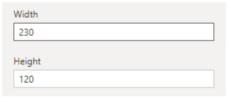
You can also adjust the height and width of your single figure visuals by going to the General tab. Select the visual > Left Pane > Style > General > Height & Width.
Adding more Q&A visuals
Let’s go over how you can add more visuals to your Power BI Reports to show essential data stats. This includes:
- Gross margin percentage
- Gross profit
- Number of stores
- Non-food sale and food sale
- Total checkouts
- Average daily sales
Gross margin percentage
Use this formula to determine the gross margin percentage from your data.
Gross Margin Percentage = (Total Sales – Cost of Goods Sold) / Total Sales
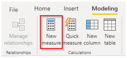
The sample dataset doesn’t have a defined gross margin percentage parameter, so you’ll have to create a “measure” for this.
Create a measure by navigating to the Modeling tab and clicking on New measure.
The formula below is equivalent to the one we described earlier.

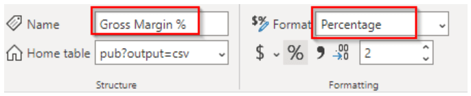
Name the formula and set the output format.
Once you’re done, insert a Q&A block, search Gross margin % from the search box, select the data, and add the block.
Gross profit
The gross profit field is also unavailable in the sample dataset. Create measures to find the value using this formula.

Follow the steps to inserting a Q&A Block (as mentioned above), and that should do the trick.
Number of stores
To show the number of stores on your report in Power BI, insert a Q&A block and use Count unique to count the unique numbers in the Store column from the data table.
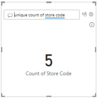
As you type, corresponding results will be automatically suggested. You can then format the visual accordingly.
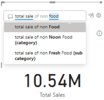
Food and non-food sales
Type in “total sale of food (and non-food)” in the Q&A search box to find the corresponding data. Add the block, format as preferred, and you should get the single figure visual in your report in Power BI.
Total checkouts
For this example, let’s assume that each row in the data table represents a “check out.” You can then count the total number of rows to display this value.

Stop exporting data manually. Sync data from your business systems into Google Sheets or Excel with Coefficient and set it on a refresh schedule.

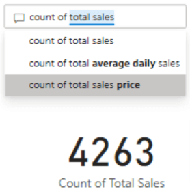
Modify the title to show the Count of Total Checkouts instead of Total Sales.
Average daily sales
The average daily sales value is not available from the sample dataset, so you’ll need to create a measure for it. Go to Modeling > New measure to insert the formula.

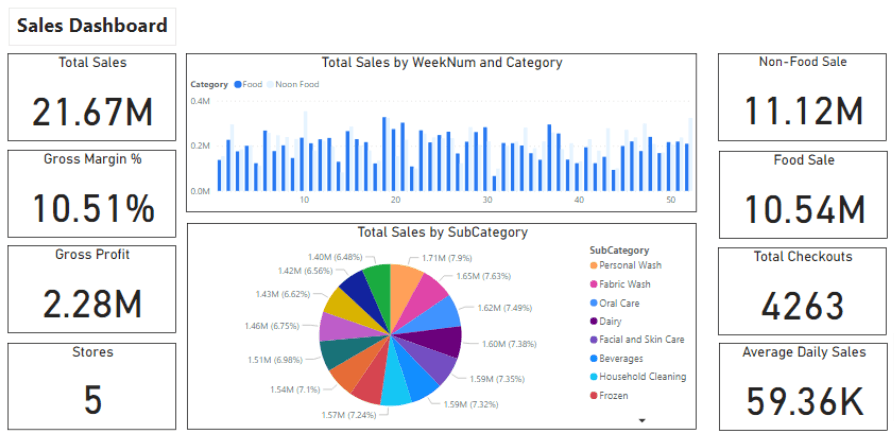
Add a text box and type in “Sales Dashboard” as the title. Your final report in Power BI should look like this.
Similar to Google Studio, when you create a report in Power BI, you can add multiple pages and numerous charts.
You can broaden your analysis and Power BI reports using specific programming languages, such as R and Python.
Also, you can add page-specific filters or filters for the entire report in Power BI (among other things).
With the Q&A box option, you can easily find critical figures and information from your data quickly, highlighting them on your dashboard.
Frequently asked questions about Power BI Reporting
Below are some of the most common questions end users have about Power BI.
What is Power BI?
Power BI is a cloud-based business analytics service that lets users analyze and visualize data with better understanding and efficiency.
Similar to alternative data modeling tools, the service connects users to a wide range of on-premise and cloud-based data via compelling visualizations, interactive reports, and user-friendly dashboards that bring your data to life.
Essentially, it’s a data-sharing environment that lets you share insights and reports using Power Pivot, Power Query, and Power View.
Power BI lets you load Excel workbooks into the cloud for easy sharing.
Users with access to your SharePoint online account can interact with your reports and apply slicers and filters to highlight the data they want.
Power BI features let you:
- Update your Excel spreadsheet from your data stored on-site or in the cloud.
- Share queries and presentations with your team members and other users with whom you grant access to.
- Query your data through natural language processing (commonly known as Q&A).
What is Power BI Desktop?
Power BI Desktop is a free application from Microsoft that works with the Power BI service. You can install the app on your laptop or PC.
The app allows you to transform and visualize your data. You can connect to various data sources and combine them into a data model.
With the data model, you can create visuals and collections of visuals that you can share as reports with people within your network, such as your co-workers.
Many users working on Business Intelligence (BI) projects utilize Power BI Desktop to build reports, then use the Power BI service for seamless report sharing.
Some of the common uses for Power BI Desktop include:
- Cleaning and transforming data and creating data models
- Connecting to data (and data sources)
- Creating visualizations, such as graphs and charts
- Building reports consisting of collections of visuals on one (or more) pages of reports
You can save your created reports on a file or publish them to your Power BI website to share with other users.
What data sources can you connect with Power BI?
Power BI can connect to many data sources that are categorized into the following.
- Content packs. These are collections of related files or documents stored as groups. Power BI offers two types of content packs: From service providers, such as Google Analytics and Salesforce and those shared and created by other users in your network.
- Files. Power BI lets you import from Excel (.xlxm and .xlsx), Power BI Desktop files (.pbix), and comma-separated value from Google Sheets (.csv).
- Database connectors. These include Server Analysis Services tabular data and other dataset connectors.
What are building blocks in Power BI?
Building blocks are Power BI key components. These include:
- Datasets. A dataset is a collection of data that the app uses to help you create visualizations. This includes Excel and Google Sheets files.
- Visualizations. These are visual representations of your data, such as line graphs, pie charts, bar charts, and treemaps (among others).
- Dashboards. A dashboard is a single-layer presentation of your multiple data visualizations. For example, you can create a sales dashboard with geographical maps, bar graphs, and pie charts.
- Reports. A report is a collection of your visualizations that are displayed on a single or several pages.
- Tiles. These are single visualizations within a dashboard or report, such as a pie chart in your sales dashboard.
Can you export Power BI data to Excel or Google Sheets?
Yes. You can export data behind any Power BI visuals to a .csv or .xlsx format by clicking the ellipses at the top right corner of your visualization.
Select the Export data icon and your preferred file format (.csv or .xlsx). If your visual is filtered, your downloaded data will also be filtered.
Once ready, you’ll get a prompt from your browser to save the file.
What are the various filter types in Power BI reports?
Power BI offers the following options to filter your data, visualizations, and reports.
- Page-level filters. These work at a report-page level, meaning different pages within the same report can have various page-level filters.
- Visual-level filters. This filter type works only on individual visualizations and it reduces the amount of data (and calculations) that the visuals display.
- Report-level filters. These are filters that work on the whole report, including filtering visualizations and pages within reports.
Power BI also offers interaction features, simplifying your report filtering. However, while these visual interactions are useful, they come with a few limitations.
Power BI filters are not saved as part of your report. You’ll need to configure or reset your preferred visual filters whenever you open a report.
Also, the filters are always visible, so they will show even if you don’t want any visual indication that the filter is applied.
Conclusion: It’s easy to create a dashboard using Google Sheets and Microsoft Power BI
Now that you have an actionable and easy-to-follow guide on how to create a dashboard using Google Sheets and Microsoft Power BI, it’s time to take action.
With the Power BI desktop application, you can create your reports (and even a dashboard in Google Sheets) efficiently and seamlessly.
You can create reports in Power BI that are easy to maintain, comprehensive, and visually pleasing. You can also access plenty of options to explore, analyze, and create visualizations of your data.
This streamlines your dashboard creation process so you can focus on applying the insights extracted from your data instead of pouring the bulk of your time and energy building reports.
Plus, with Coefficient, you can streamline your dashboard and report creation in Google Sheets and Power BI.
The app’s powerful data integration features allow you to import data from your data sources instantly. You can also schedule your data to auto-refresh, so you always work with up-to-date information when you create reports in Power BI and dashboards in Google Sheets.